What is the role of UI design? What do UI designers do? Check out this full guide and discover how interfaces are made to succeed.
UI design can have a huge impact on the user experience of any digital product out there. It can encourage users to explore, convince users to buy and convey all sorts of emotions – all of that while making the primary features shine bright.
Free UI Design Tool for individuals and teams. Unlimited projects!

But how do designers create all these powerful product interfaces? What factors come into play? How do they know a design works or that it’s good? Let’s go over one of the most misunderstood aspects of digital design today: UI design. Let’s jump right in.
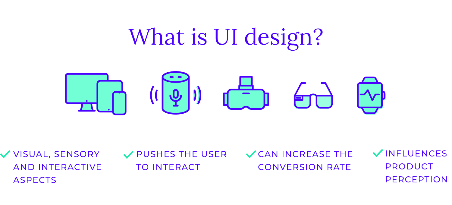
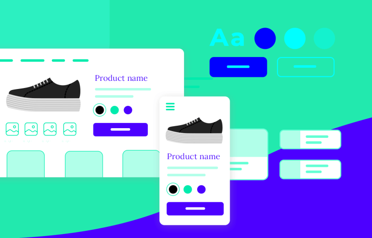
UI design is the art and science of crafting the visual and interactive aspects of a digital product, making it both user-friendly and visually appealing. Think of it as the face and the voice of your app or website.
It can boost conversion rates and leave people happy to see their tasks accomplished. It can also fail to let people carry out their tasks and put the entire product at risk when not done properly – this is particularly true for data-heavy products such as dashboard design or research surveys.
UI design falls within UX design, working to create an interface that boosts and perfects the user experience. It is not, nor has it ever been, equal to UX but rather a vital part of it. While UX deals with the big and broad, UI is all about concrete visual cues that try to get a reaction from users.
UI design focuses on the visual and interactive elements of a digital product, like buttons, colors, and how they respond to user clicks. It’s about creating a beautiful and intuitive interface that’s easy to navigate. UX design, on the other hand, encompasses the entire user experience, from the initial interaction to the final outcome. It considers factors like usability, accessibility, and overall satisfaction.
Think of UI design as the surface of a product – the look and feel. UX design is the underlying framework – the information architecture and functionality. While UI focuses on the “how” of the interaction, UX focuses on the “why” and “what” behind it. UX designers consider the user’s needs, goals, and pain points to create a product that is not only functional but also enjoyable and meaningful to use.
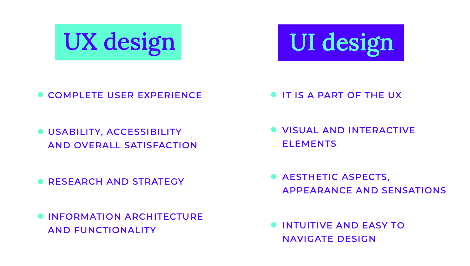
In essence, UI design is a subset of UX design. A strong UI is crucial for a positive UX, but it’s not the only factor. UX design also involves research, strategy, information architecture, and ongoing evaluation to ensure that the product meets the needs of its users and provides a valuable experience. The differences between UI and UX design are actually not that subtle once you grasp each concept.
Clarity is the cornerstone of effective UI design, ensuring users can effortlessly understand and interact with the interface. It should feel like when you step into a well-lit room where every object is clearly visible and easily accessible. The trick is to create an intuitive experience that minimizes confusion and frustration for users.
Achieving clarity involves several key aspects. First and foremost, effective communication is paramount. Using simple, straightforward language and avoiding jargon ensures that users of all backgrounds can easily grasp the information presented. Visual cues, such as icons and images, can significantly enhance understanding and provide valuable context.
Secondly, establishing a clear visual hierarchy is crucial. Designers direct users’ attention to the most crucial information by carefully highlighting key components using strategies like font size, colour contrast, and space. This organized presentation prevents visual clutter and makes the interface easy to scan and understand.
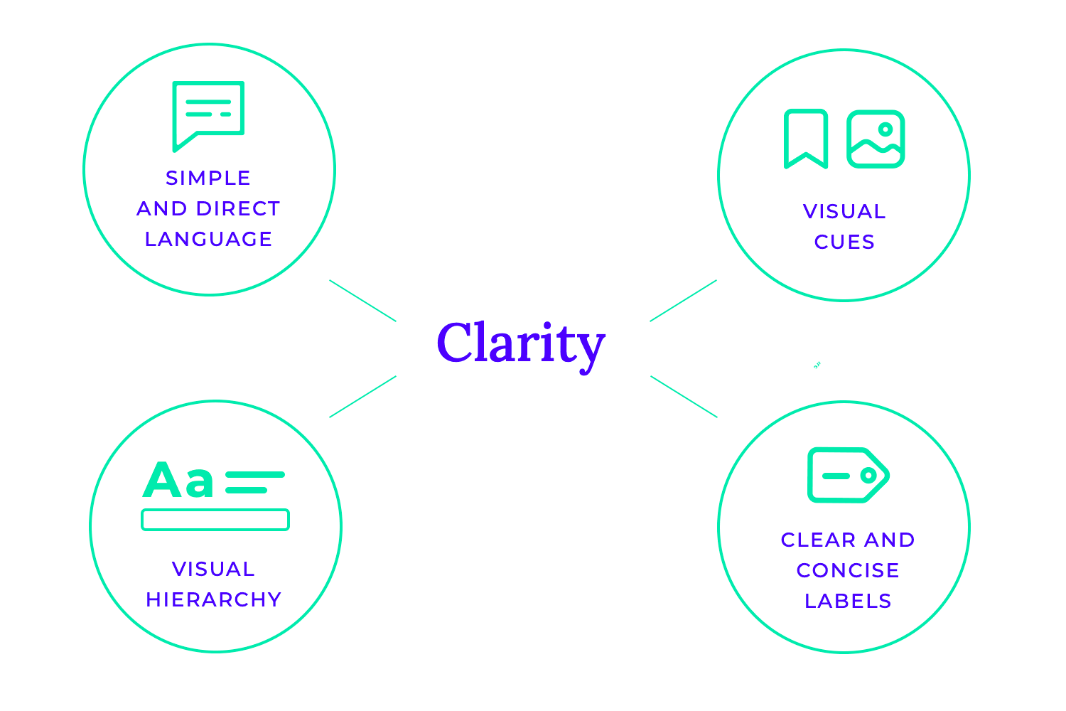
Finally, minimizing ambiguity is essential. Clear and concise labels for buttons, fields, and other interactive elements leave no room for confusion. Consistent use of icons across the interface further enhances recognition and predictability.
Consistency is a fundamental principle in UI design, ensuring a smooth and predictable user experience. Just as a symphony relies on harmonious melodies and rhythms, a successful UI thrives on consistency in its visual elements and interactions.
Maintaining consistency across all aspects of the interface creates a sense of familiarity and predictability for users. Designers may guarantee that colours, fonts, icons, and layouts are constant across the application by following a consistent style guide. Users may more easily identify and comprehend patterns and interactions thanks to this homogeneity, which also increases usability.
Furthermore, adhering to platform-specific guidelines, such as Google’s Material Design or Apple’s Human Interface Guidelines, ensures compatibility and a familiar experience for users across different devices and operating systems. These guidelines provide a common language and set of conventions that users have come to expect, making the interface feel intuitive and natural to navigate.
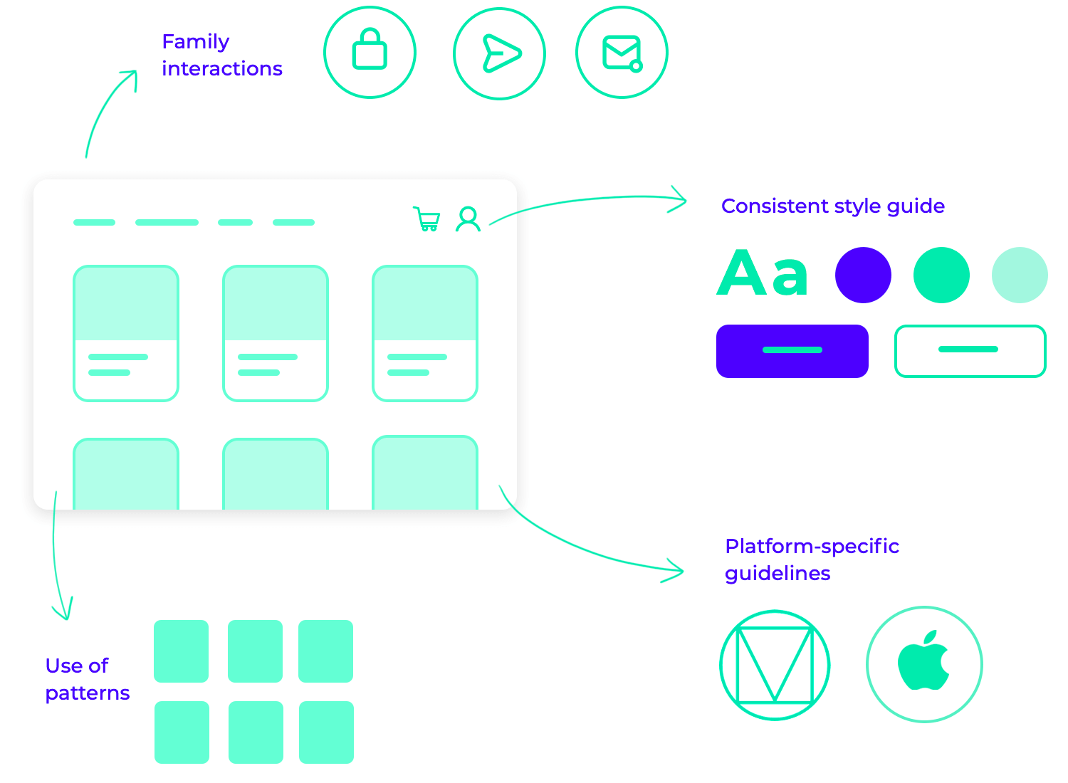
Basically, if you design a user interface with familiar patterns and interactions, users can focus on accomplishing their tasks without the distraction of unexpected or inconsistent behavior.
Simplicity is a cornerstone of effective UI design, emphasizing clarity and ease of use. Just as a master chef elevates a dish with minimal ingredients, a skilled UI designer creates impactful interfaces by focusing on the essentials.
Striving for simplicity means removing unnecessary elements and reducing cognitive load on the user. Cluttered interfaces can overwhelm users and hinder their ability to find and interact with the information they need. When designing, carefully consider each element and its purpose to help you create a clean and uncluttered interface that users can navigate easily.
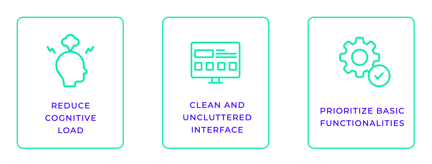
Focusing on essential features is key to achieving simplicity. Prioritizing core functionalities and eliminating unnecessary bells and whistles ensures that the interface remains focused and user-friendly. This approach improves usability and enhances the overall user experience by making it easier for users to achieve their goals quickly and efficiently.
Accessibility is another fundamental principle in UI design, ensuring that digital products are usable by everyone, regardless of their abilities. It’s about creating inclusive experiences that empower all users to access and interact with information and the latest tech.
This means that designing for accessibility involves considering the needs of users with disabilities, such as visual, auditory, motor, cognitive, and speech impairments. You can do this by adhering to accessibility guidelines, such as the Web Content Accessibility Guidelines (WCAG), to create UI interfaces that are inclusive and usable for a wider audience.
Key aspects of accessible design include ensuring sufficient color contrast for readability, providing keyboard navigation for users who cannot use a mouse, and ensuring compatibility with screen readers for users with visual impairments.
Additionally, using clear and concise language, providing alternative text for images, and creating interactive elements that are easily identifiable and operable contribute to a more accessible user experience.
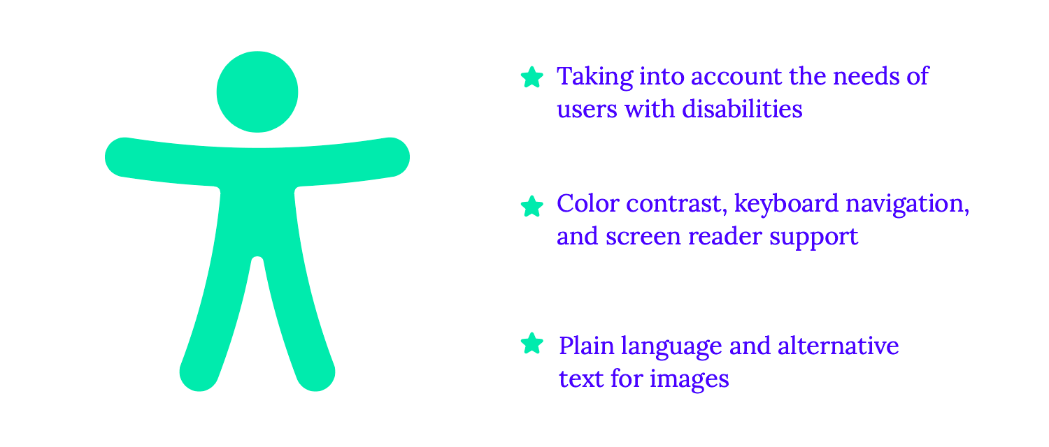
When you prioritize accessibility in UI design, you not only comply with legal and ethical standards but also create a more inclusive and equitable digital world. When everyone can access and use your product, you foster a sense of inclusivity and empower a broader range of users to engage with your brand and services.
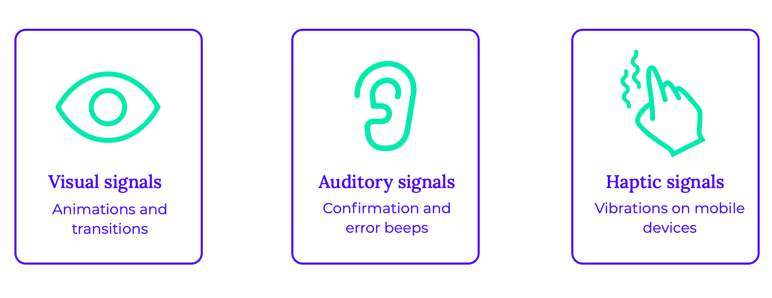
Feedback is a crucial aspect of UI, especially when considering interaction design, ensuring that users understand the outcomes of their actions and feel in control of their interactions. Just as a conversation thrives on clear communication and acknowledgment, a successful UI design provides continuous feedback to users.
Effective feedback can be delivered through various modalities, including visual cues, auditory signals, and haptic sensations. Subtle animations, such as button presses or page transitions, provide visual confirmation of user actions.
Auditory cues, like confirmation sounds or error beeps, can further reinforce the interaction. In some cases, haptic feedback, such as vibrations on mobile devices, can add an extra layer of sensory engagement.
When errors occur, providing clear and actionable feedback is essential. Instead of simply displaying an error message, the UI design should guide users towards a solution. This might involve highlighting the problematic field, suggesting possible corrections, or offering helpful hints to resolve the issue.
Free UI Design Tool for individuals and teams. Unlimited projects!
The research and discovery phase is the cornerstone of any successful design project. It’s where the magic happens – where you delve deep into the minds and lives of your users to truly understand their needs and challenges. This crucial stage involves a meticulous investigation, encompassing user research, competitive analysis, and market research.
Through user interviews, surveys, and observations, you gather invaluable insights into user behaviors, preferences, and pain points. You might find chances to stand out and develop a distinctive and alluring customer experience by examining the goods and services of your competitors. Market research provides a broader understanding of industry trends, emerging technologies, and the competitive landscape.
This phase seamlessly aligns with the empathize and define stages of the UX design process, a framework that emphasizes user-centered design. This user-centric approach ensures that the final product not only meets user expectations, but rather, exceeds them.
Wireframing is an essential step in the design process, acting as a blueprint for the user interface of a website, mobile app, or any other digital product. Think of it as sketching the skeleton of your design before adding the flesh and blood – the colors, fonts, and imagery. Wireframes help visualize the structure, navigation, and arrangement of elements, ensuring a user-friendly and intuitive experience.
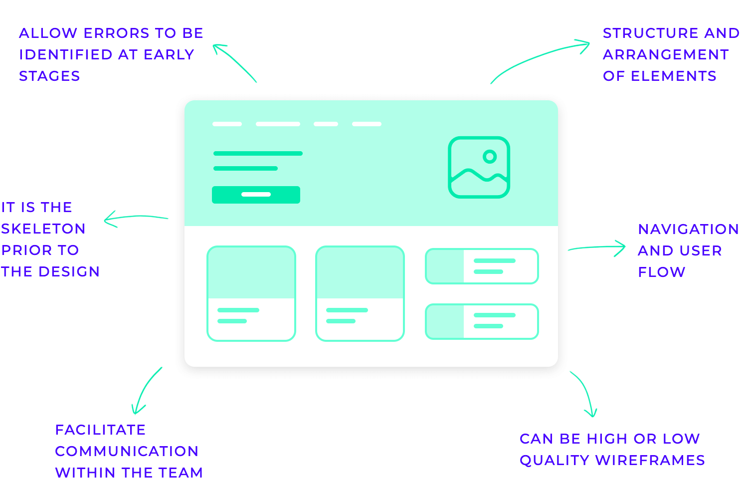
These blueprints come in various levels of detail. Low-fidelity wireframes are simple UI sketches, often created by hand, used to quickly explore different ideas and gather initial feedback. Mid-fidelity wireframes provide more detail, incorporating specific UI elements and a more defined structure. High-fidelity wireframes are highly detailed, almost like interactive prototypes, used for thorough usability testing and fine-tuning the user experience.
Wireframing is a collaborative effort, often involving UX/UI designers, product managers, and developers. These visual representations facilitate clear communication within the team, ensuring everyone is on the same page regarding the design direction. By visualizing the user flow and identifying potential issues early on, wireframes help prevent costly redesigns later in the development process.
In today’s digital landscape, numerous tools are available to assist in wireframing, ranging from simple sketching software to sophisticated design platforms. Popular choices include Justinmind, Figma, Sketch, Adobe XD, and InVision, each offering unique features and functionalities to suit different design needs.
Prototyping is a crucial step in the design process, allowing designers to bring their ideas to life and test them before investing significant time and resources in development. Imagine building a house without first creating blueprints or a model – it would be chaotic and prone to costly errors. Prototyping serves as a blueprint for digital products, enabling designers to visualize the user interface, test its functionality, and gather valuable feedback.
Prototypes come in various forms, from simple sketches and wireframes to highly interactive simulations. These prototypes allow designers to experiment with different layouts, interactions, and functionalities, identifying potential usability issues and areas for improvement early on. Through testing prototypes with real users, designers can gain valuable insights into user behavior and preferences, ensuring the final product meets their needs and expectations.
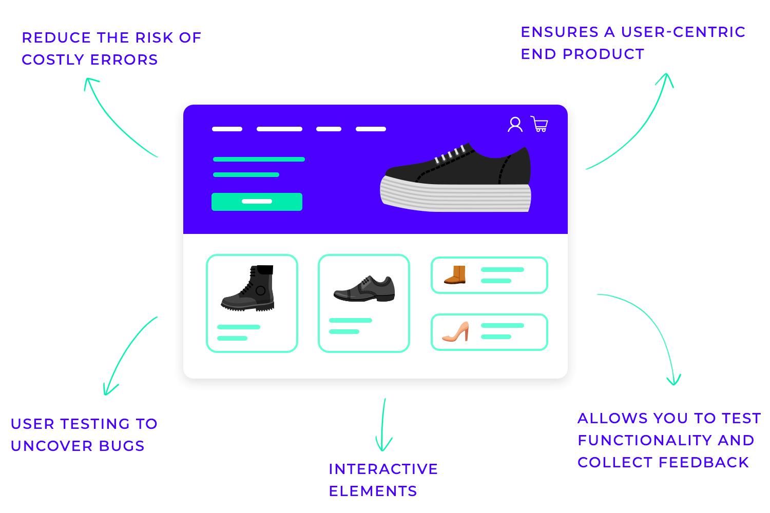
Ultimately, prototyping is a cornerstone of successful design. It fosters collaboration among team members, reduces the risk of costly mistakes, and ensures that the final product is user-centered, intuitive, and enjoyable to use.
Visual design is the heart and soul of any successful UI design. It’s not just about making things look pretty; it’s about crafting a visually engaging and intuitive experience that guides users seamlessly through the interface. Think of it as the visual language that communicates with users, conveying information, evoking emotions, and ultimately shaping their perception of the product.
At its core, UI visual design focuses on the strategic use of visual elements like color, typography, imagery, and space. It’s about creating a harmonious and functional layout that prioritizes user needs and enhances usability.
Beyond aesthetics, UI visual design plays a crucial role in user experience. A well-designed interface is intuitive to navigate, reducing user frustration and increasing engagement. It can guide users toward their goals, highlight important information, and provide a sense of delight and satisfaction.
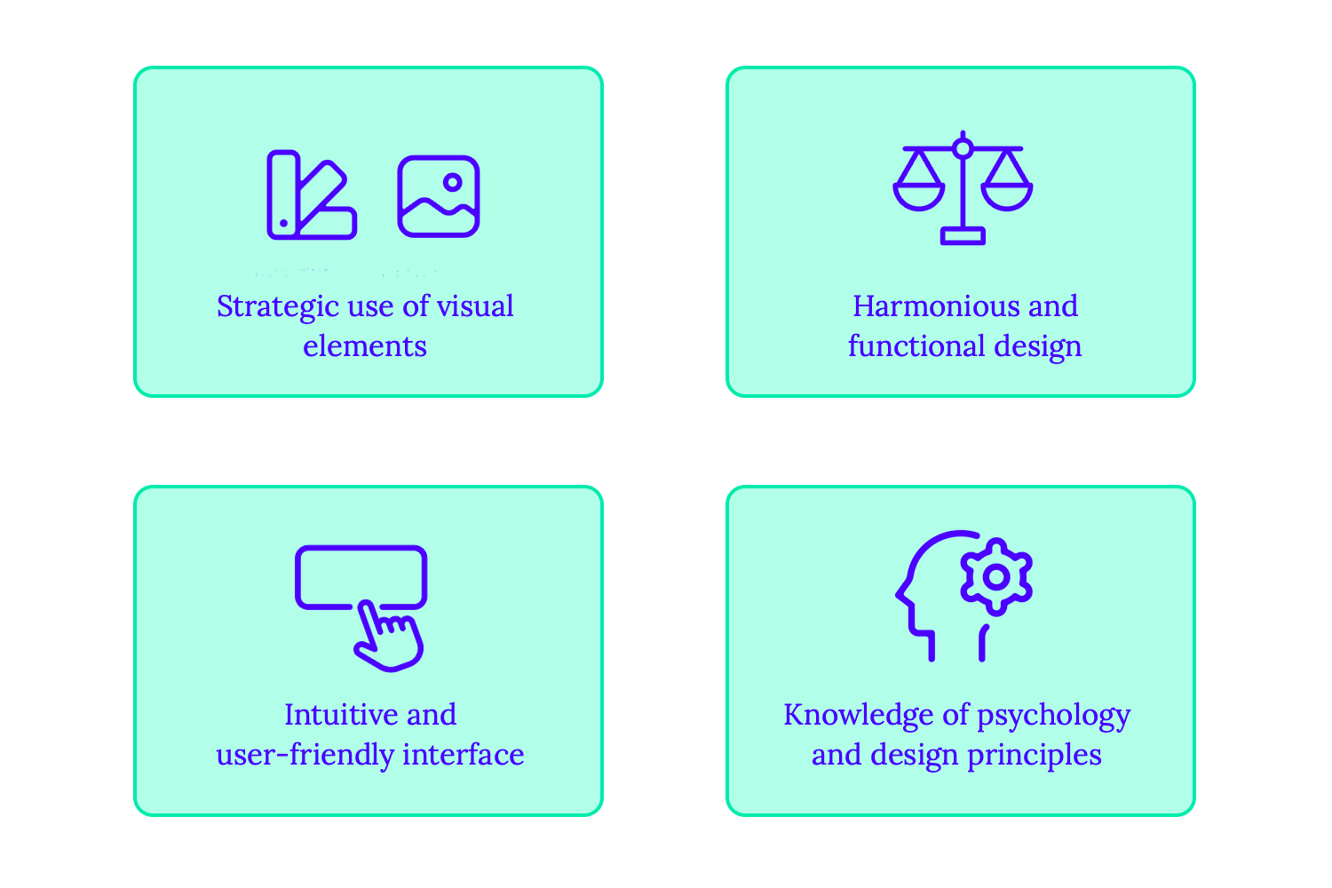
Ultimately, effective UI visual design is a blend of art and science. It requires a deep understanding of user psychology, design principles, and the nuances of visual communication.
Testing and iteration are not just tasks; they are the very heartbeat of the UI design process. They provide a crucial feedback loop, allowing designers to refine their work based on real-world user interactions. It’s about continuously evaluating, learning, and adapting to create the best possible user experience.
At its core, this phase involves gathering user feedback through various methods such as usability testing, A/B testing, and user surveys. Observing users interact with prototypes and the final product provides invaluable insights into their behaviors, pain points, and overall satisfaction. This data-driven approach helps identify usability issues, areas for improvement, and opportunities to enhance the user experience.
Based on this feedback, designers iterate on their designs, making necessary adjustments and refinements. This iterative process is cyclical, with designers continuously testing, analyzing, and improving the interface until it meets the needs and expectations of the target audience.
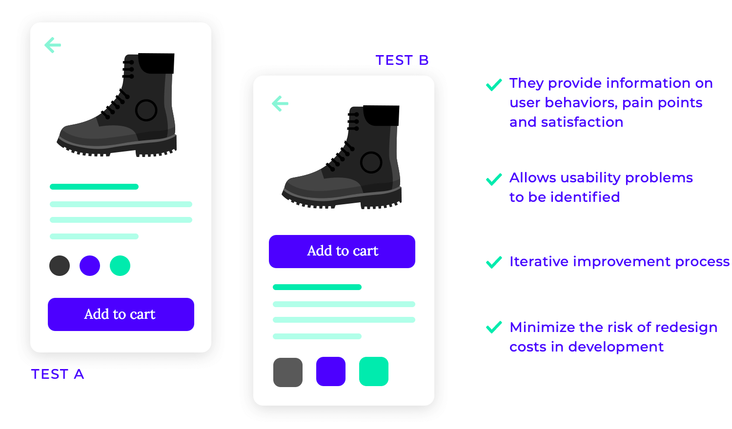
This iterative approach not only ensures a high-quality user experience but also minimizes the risk of costly redesigns later in the development process.
In essence, testing and iteration are not just about finding and fixing bugs; they are about creating a user-centered design that evolves and improves over time.
Free UI Design Tool for individuals and teams. Unlimited projects!
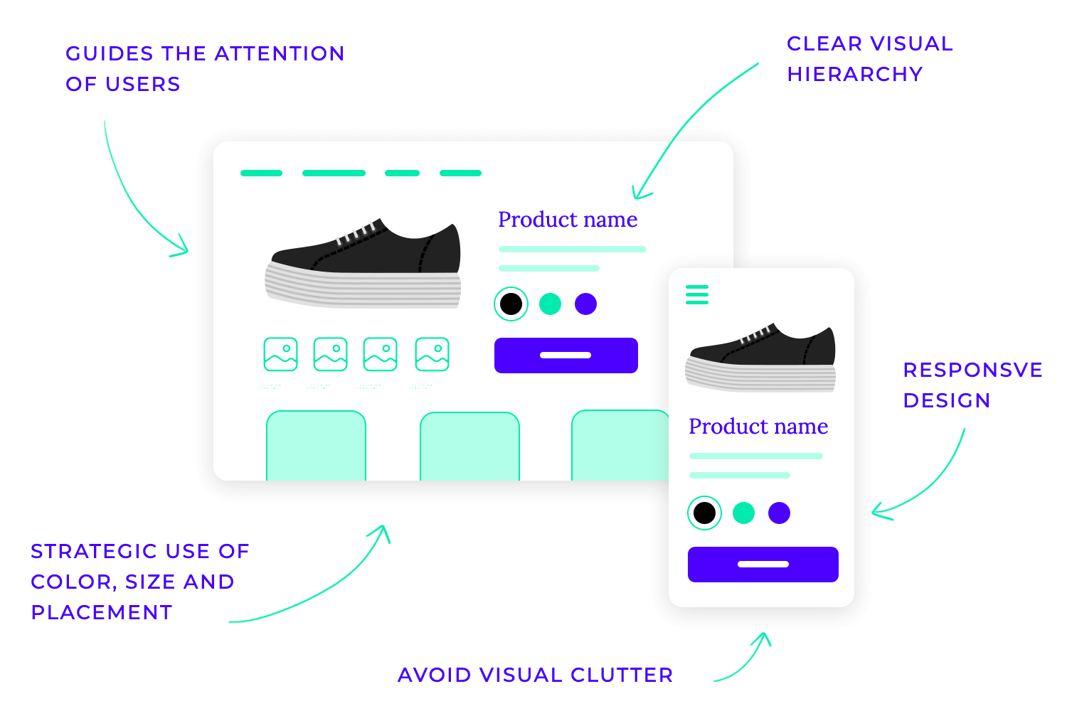
Layout and structure are the foundational elements of any successful UI design. They determine how content is organized and presented to users, guiding their eyes and interactions within the interface. Think of it as the architectural blueprint of a digital product, ensuring a clear and intuitive user experience.
Effective layouts prioritize clarity and simplicity, avoiding visual clutter that can overwhelm users. They establish a clear visual hierarchy, guiding the user’s attention to the most important information through strategic use of size, color, and placement. Consistency is key, ensuring that users feel comfortable and familiar as they navigate through the interface.
In today’s multi-device world, responsive design is paramount. This involves creating layouts that seamlessly adapt to various screen sizes, from smartphones to desktops. Fluid grids, flexible images, and media queries enable designers to create interfaces that look great and function flawlessly across all platforms.
Text and fonts are the foundational elements of any UI design, conveying information, establishing tone, and ultimately shaping the user experience. They are not mere aesthetic choices; they play a critical role in how users perceive and interact with the interface.
Choosing the right fonts is paramount. Clear and legible fonts like sans-serif options are generally preferred, ensuring easy readability across different screen sizes and resolutions. Establishing a visual hierarchy through font variations, such as using different sizes and weights for headings and body text, guides the user’s attention and improves comprehension.
Consistency is key. Maintaining a limited font library throughout the interface creates a cohesive and professional look and feel. Furthermore, considering accessibility is crucial. Ensuring sufficient color contrast, providing options for font size adjustments, and considering dyslexia-friendly fonts are essential for creating inclusive user experiences.
Using a brand new product takes a lot of work from users’ brains. There are things to learn, to process and decisions to be made as to which tasks the user should approach. You want users to focus on the right elements, using all sorts of visual cues to highlight the most important areas of the screen, like a crucial CTA.
Altogether, lowering the cognitive load is great for usability. Your product will operate without leaving users feeling frustrated or exhausted, allowing users to focus on the experience itself or simply keep their minds on the tasks at hand. This is particularly true for crucial pillars of the product, like primary feature functionality, navigation and information architecture.
You don’t want people thinking about your navigation design and how much like a maze it felt. You want people to navigate their way around the product without ever focusing on the navigation system itself. The experience ought to be effortless and easy, not demanding.
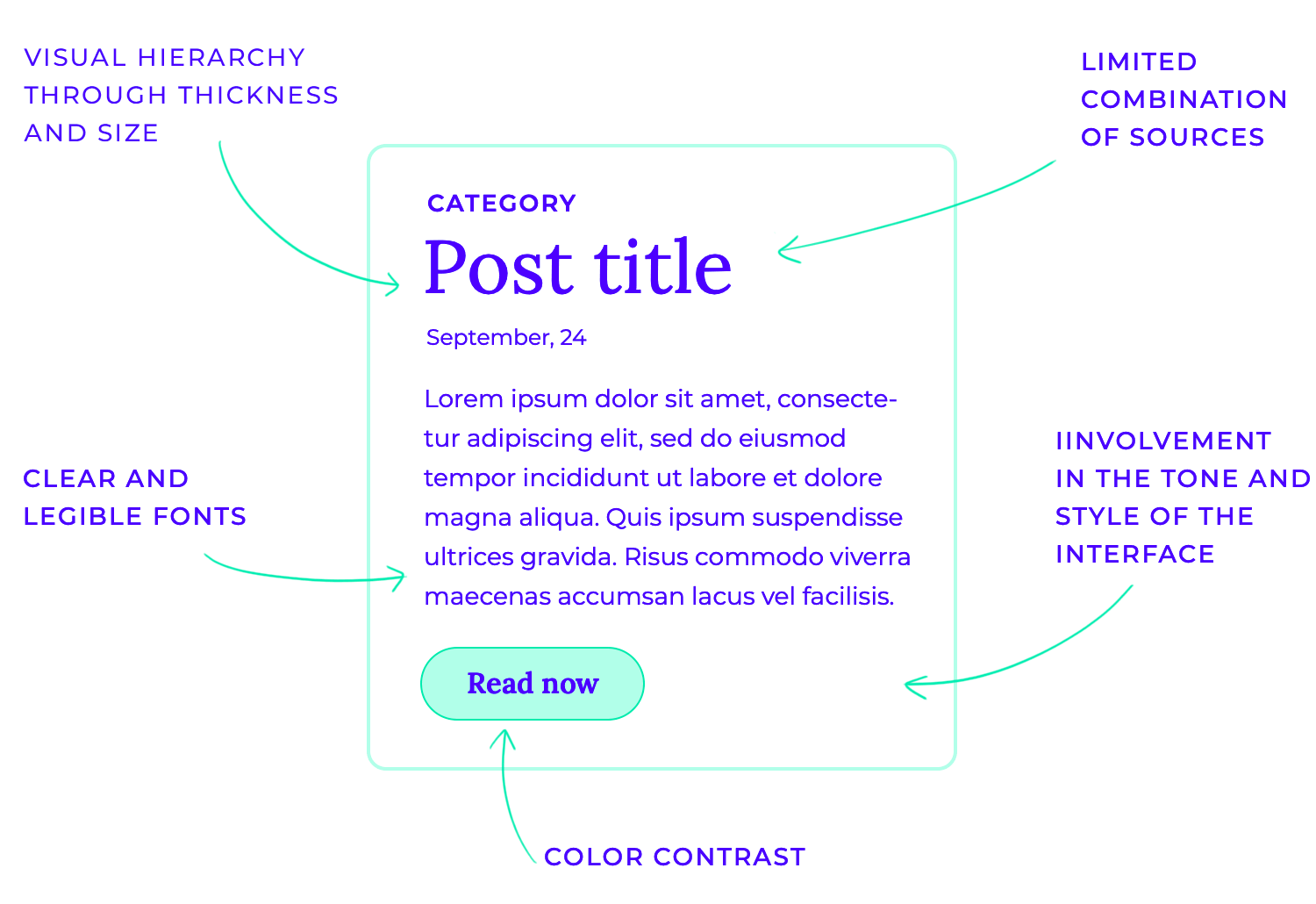
Beyond functionality, typography can also evoke emotions and contribute to the overall brand identity. The choice of font can significantly impact the perceived tone and style of the interface. For example, a playful script font might be suitable for a children’s app, while a bold sans-serif font could be more appropriate for a professional business application.
Color is more than just an aesthetic choice in UI design; it’s a powerful tool that shapes user experience. It evokes emotions, guides attention, and reinforces brand identity. Understanding the psychology of color is crucial, as different colors carry distinct meanings and connotations across cultures. For instance, red often symbolizes passion or danger, while blue conveys calmness and trust.
To create visually harmonious and effective interfaces, designers must carefully consider color choices. This involves creating a limited but versatile color palette that maintains a consistent look and feel throughout the product. Sufficient contrast between text and background is essential for readability and accessibility. Moreover, color can be strategically used to create a visual hierarchy, guiding users’ attention to the most important elements within the interface.
Ultimately, successful color implementation in UI design requires a balance of aesthetics, functionality, and accessibility. Understanding the psychology of color, adhering to accessibility guidelines, and considering the overall brand identity leads to a more cohesive experience for the user.
Icons, images, and illustrations are more than just decorative elements in UI design; they are powerful tools for communication. They convey meaning quickly and efficiently, enhancing user understanding and engagement.
Icons, in particular, play a crucial role in simplifying complex interactions. They provide visual cues for actions, such as “play,” “pause,” or “delete,” making the interface more intuitive and user-friendly. Well-designed icons are instantly recognizable, reducing cognitive load and improving overall usability.
Images and illustrations can add depth and personality to the interface. They can break up large blocks of text, making the content more visually appealing and easier to digest. Illustrations can also be used to convey complex concepts in a simple and engaging manner, making the interface more memorable and enjoyable to interact with.
When incorporating imagery, it’s crucial to prioritize quality and relevance. High-resolution images that are visually appealing and relevant to the content enhance the user experience.
Navigation is the backbone of any successful website or app. It guides users through the digital landscape, helping them find the information and features they need. Think of it as the roadmap that directs users to their destination. That’s where navigation design and UI patterns come into play.
Navigational design, in the realm of user interfaces, is the art of crafting intuitive pathways that seamlessly guide users through digital experiences like websites and applications. It’s akin to designing a city map, ensuring visitors can effortlessly locate their destinations.
This involves meticulously organizing content into a logical hierarchy, similar to a city’s well-structured neighborhoods. Effective navigation relies on clear and concise menus, acting as signposts that point users in the right direction.
Visual cues and labels, much like street signs, help users orient themselves within the digital landscape. Furthermore, interactive elements like buttons and links serve as the pathways, leading users smoothly from one point to another on their digital journey.
A well-conceived navigation system is paramount for a positive user experience. It minimizes frustration by enabling users to quickly find the information they seek, much like a reliable map prevents travelers from getting lost. This streamlined navigation enhances usability, allowing users to efficiently complete their tasks within the digital environment.
Ultimately, a user-friendly navigation system can significantly boost conversions, encouraging users to take desired actions, such as making a purchase, by making it effortless to navigate and explore the digital space.
Websites and webapps
Let’s explore the building blocks of a user-friendly website! This list highlights the key navigation components, like menus and breadcrumbs, that help visitors smoothly find their way around and enjoy their online experience.
- Dropdown menus expand to reveal further options.
- Sidebars, typically on the left or right, offer secondary navigation with categories and subcategories.
- Hamburger menus, often used on mobile devices, condense navigation into a compact icon.
- Breadcrumbs provide a trail of links, showing users their current location within the site.
- Footers typically contain copyright information, contact details, and links to important pages.
- Tabs allow users to switch between different sections of content, while lists provide a structured way to navigate through options.
- Lists provide a structured way to navigate through options.
- Other navigation components can include accordions; pagination, which enables users to navigate through multiple pages of content; search bars, allowing users to quickly find specific information; carousel navigation that allows users to cycle through a series of items; and sticky navigation, which as the name suggests, remains fixed in place as the user scrolls down the page.
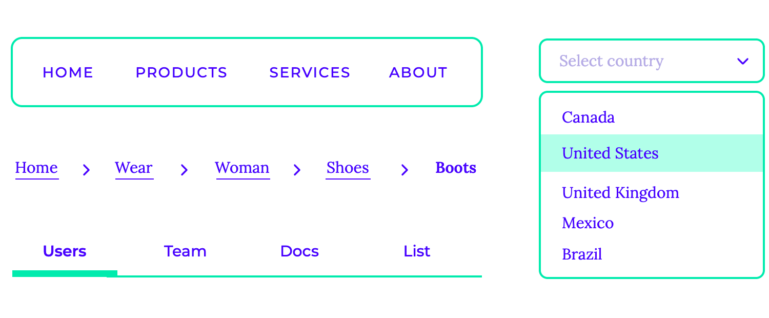
The effectiveness of these navigational components depends on several factors, including clarity, consistency, and accessibility. A well-designed navigation system is intuitive and easy to use and helps users achieve their goals quickly and efficiently.
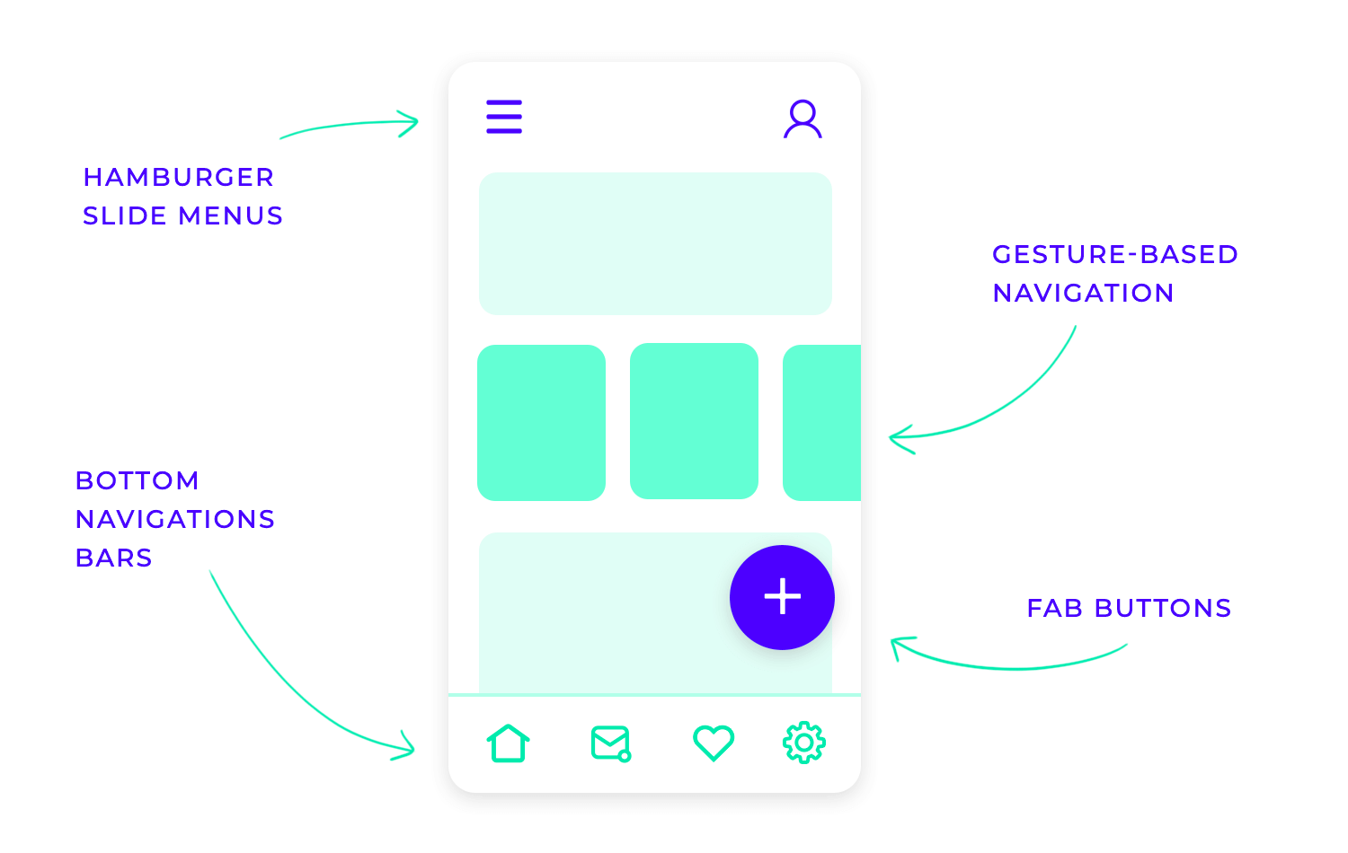
Mobile apps
Mobile app navigation plays a crucial role in user experience, guiding users effortlessly through the app’s features. Common patterns include:
- Slide menus that gracefully appear from the side, offering a comprehensive list of options.
- Top and bottom navigation bars provide quick access to core sections, while tab bars offer a horizontal selection of key areas within the app.
- Floating Action Buttons (FABs), often positioned in a corner, provide a prominent call to action, such as creating a new item or accessing primary functions. Gesture-based navigation, such as swiping and tapping, further enhances the intuitive flow.
Forms are the gateways to user data within any web or mobile application. They allow us to gather information efficiently, whether it’s for making a purchase, registering for an account, or filling out a survey. These digital forms rely on a variety of components:
- Input fields: The most basic form elements. They allow users to enter various types of data, such as text, numbers, emails, and more. Make sure to choose the right input type for the data being collected and implement proper input validation (e.g., email format, number range).
- Dropdown select: Present a dropdown list of options within a menu that unfolds when clicked. Use them when the number of options is manageable and ensuring the list is well-organized and easy to navigate.
- Checkboxes: Let users to select multiple options from a list. Group related checkboxes logically and provide clear and concise labels for each option.
- Radio buttons: Users can select only one option from a group of options. Use radio buttons when only one option can be selected from a set (e.g., gender, size).
- Toggle buttons: Present a visual on/off state, often used for binary choices (e.g., enable/disable, subscribe/unsubscribe). Ensuring the on/off toggle buttons are clearly visually differentiated.
- Text areas: Allow users to enter multiple lines of text. Set appropriate dimensions to prevent scrolling and providing clear instructions for the expected input length.
- Date pickers: Provide a user-friendly interface for selecting dates (and sometimes times). Choose a format that is easy to understand and considering accessibility for users with disabilities.
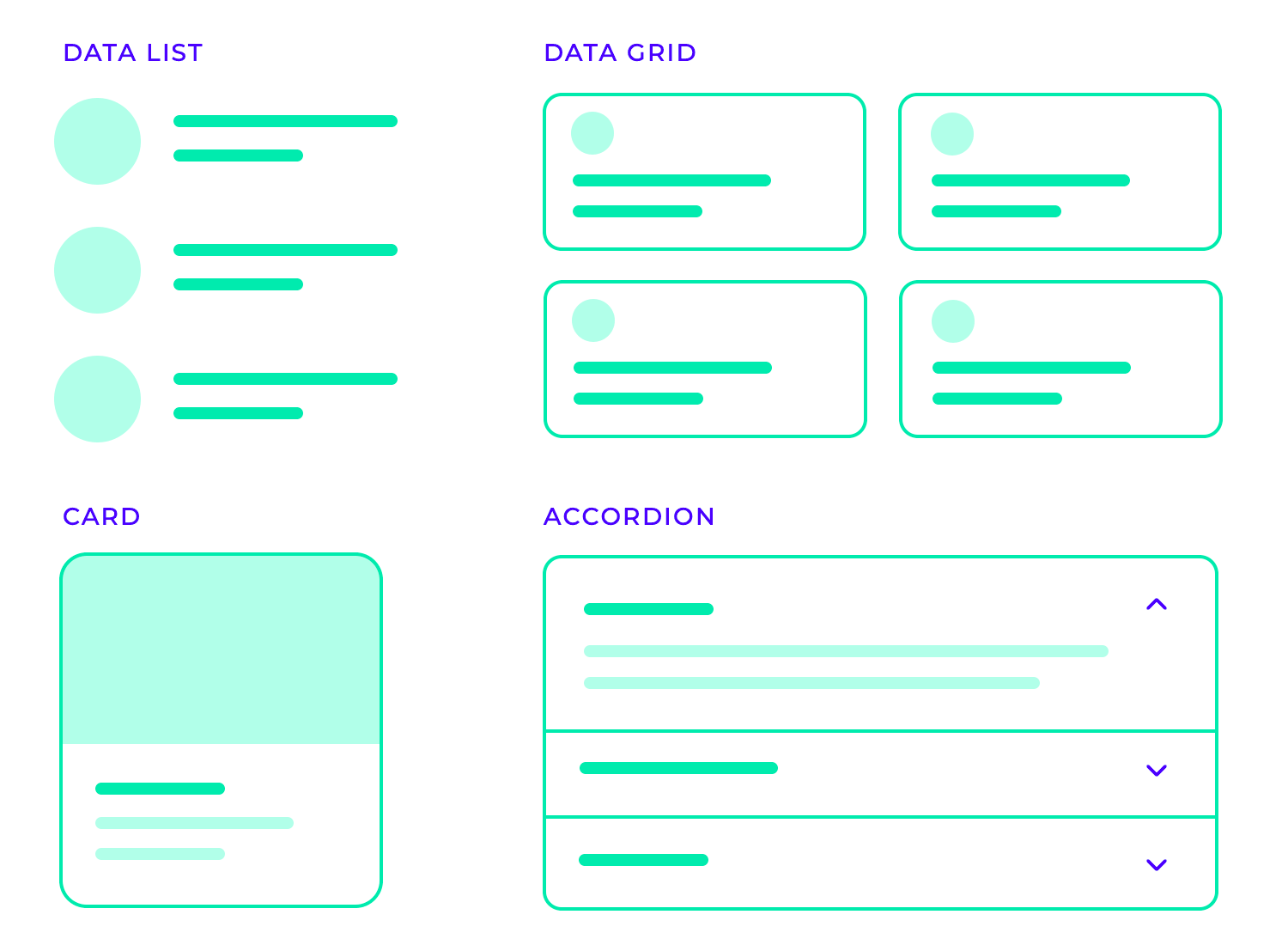
- Data lists present information in a clear and concise manner, making it easy for users to scan and find what they need. Key considerations include maintaining consistency in design, establishing a clear visual hierarchy, and ensuring the list is easily searchable and sortable.
- Data grids excel at displaying large datasets in a structured and organized format, such as spreadsheets or databases. Clear column headers, data formatting, and features like filtering and sorting are essential for user-friendliness.
- UI cards offer a visually appealing and engaging way to present diverse content, from product information to blog articles. Consistency in card design, clear visual hierarchy, and appropriate spacing are crucial for creating an effective and visually pleasing presentation.
- Accordions provide a space-saving mechanism for displaying detailed information. Clear and concise headers, smooth animations, and accessibility considerations are key to their effective use.
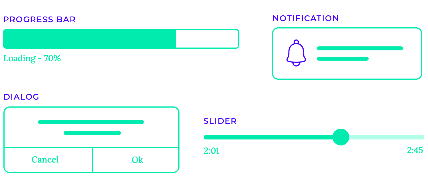
- Progress bars visually represent the progress of an ongoing task, such as file uploads, downloads, or software installations. They provide valuable feedback to users, reducing anxiety and giving them a sense of control over the process. Well-designed progress bars should be clear, accurate, and provide an estimated time to completion whenever possible.
- Notifications alert users to important events, such as new messages, incoming calls, or system updates. They can appear as pop-ups, banners, or subtle alerts within the interface. Effective notifications are unobtrusive, deliver information concisely, and allow users to easily dismiss or interact with them.
- Sliders allow users to adjust values within a defined range, such as volume levels, brightness settings, or image zoom. This provides a more intuitive and engaging control mechanism compared to traditional input fields. Sliders should provide clear visual feedback to the user, such as a thumb that moves along the track as the value changes.
- Dialogs present users with important information or require a decision before proceeding. They can be used for confirmations (“Are you sure you want to delete this file?”), warnings (“This action may have unintended consequences.”), or displaying error messages. Dialogs should be concise, clearly communicate the message, and provide clear options for the user to take.
- Tooltips provide brief and helpful explanations when users hover over or focus on specific elements within the interface. They offer contextual information without cluttering the screen. Tooltips should be concise, easy to read, and appear only when necessary to avoid distracting the user.
Flat design is a minimalist style that emphasizes simplicity and functionality. It eschews unnecessary ornamentation like gradients, shadows, and textures, focusing instead on clean lines, bold colors, and strong typography. Think of Google’s Material Design with its vibrant color palettes and emphasis on geometric shapes. This approach prioritizes usability and readability, making information easy to digest and interact with.
In contrast to flat design, skeuomorphism aims to mimic the appearance and feel of real-world objects. This style often incorporates textures like leather, wood, or metal, and utilizes 3D effects to create a sense of depth and realism. Early versions of iOS apps, with their leather-bound book interfaces for iBooks, exemplify this approach. While initially popular, skeuomorphism has somewhat fallen out of favor as it can sometimes feel overly gimmicky or distracting.

A more recent trend, neumorphism blends elements of flat design and skeuomorphism. It creates the illusion of depth by using subtle shadows and highlights to make elements appear to be slightly embossed or recessed. This technique adds a subtle dimension to interfaces while maintaining a minimalist aesthetic.
This style, inspired by frosted glass, creates a sense of transparency and depth. Elements appear to be layered on top of each other, with soft shadows and highlights suggesting a three-dimensional effect. It’s often seen in modern mobile app designs and gives interfaces a light and airy feel.
Offering users the choice between light and dark modes significantly enhances user experience. Light mode provides a classic, bright interface, while dark mode reduces eye strain in low-light conditions and can improve battery life on some devices. Many operating systems and applications now offer this option, allowing users to customize their interface to their preferences.

This design philosophy prioritizes functionality and clarity by stripping away unnecessary elements. Minimalist interfaces often feature clean lines, ample whitespace, and a limited color palette. This approach focuses attention on the essential information, making the interface easy to navigate and use.
These designs break free from established trends, exploring unique visual expressions and pushing the boundaries of creativity. They often incorporate innovative use of color, unconventional layouts, and interactive elements to create a truly distinctive and memorable user experience. These designs are a testament to the power of human ingenuity and the ever-evolving nature of UI design.
Free UI Design Tool for individuals and teams. Unlimited projects!
Designing effective websites and e-commerce platforms requires careful consideration of information architecture, navigation, and visual hierarchy. A well-organized information architecture ensures that users can easily find what they need, while effective navigation helps guide them through the site. Visually prioritizing important content and streamlining the checkout process are crucial for a positive user experience.
With their increasing complexity, web applications demand thoughtful design for advanced interactions and data visualization through dashboard design. The UI layout encourages people to read the right things, buttons that convince people to click on the right component, and visual hierarchy that communicates better than words can. This makes designing intuitive interfaces for data entry and ensuring seamless navigation through multiple screens essential. One challenge you can face is balancing feature-richness with simplicity.
Mobile apps face unique challenges due to limited screen space and touch-based interactions. Designing intuitive gestures, optimizing layouts for different screen sizes, and creating smooth onboarding experiences are crucial for mobile app success.
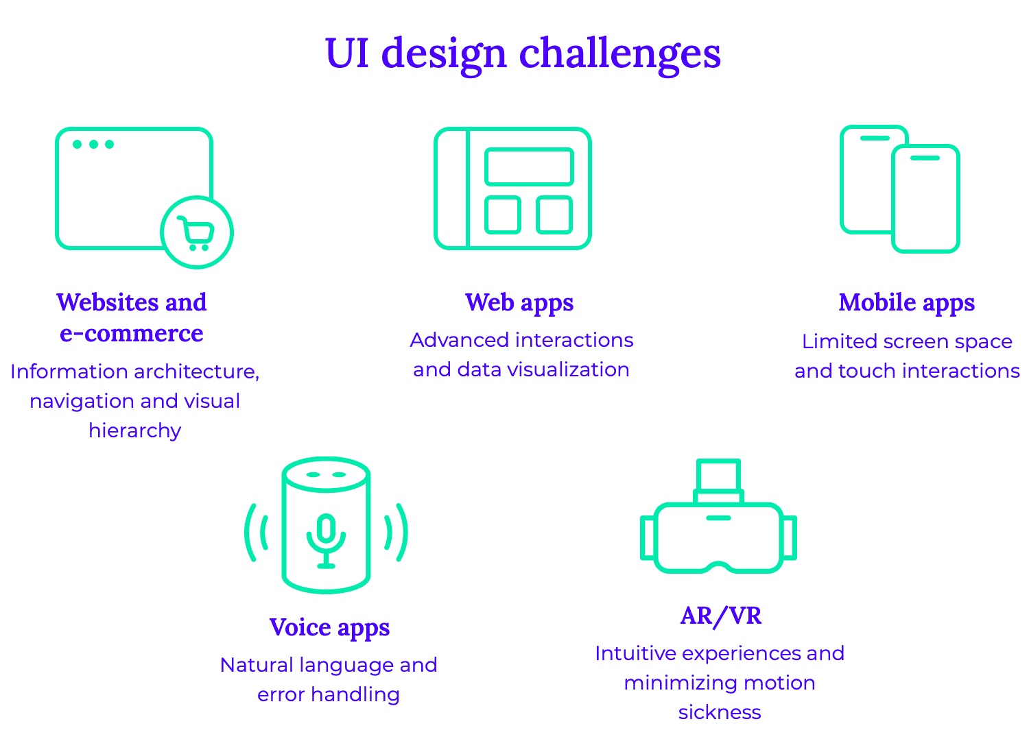
Voice apps present a new paradigm for user interaction, requiring careful consideration of natural language understanding and error handling. Designing voice interfaces that are intuitive, efficient, and provide clear feedback is essential for a positive user experience.
AR and VR applications push the boundaries of user interaction, demanding innovative design approaches. Creating immersive and intuitive experiences that minimize motion sickness and provide clear visual cues is a significant challenge.
Regardless of the platform, designers face common challenges such as accessibility, performance, cross-platform consistency, and user testing. Ensuring that interfaces are accessible to users with disabilities, optimizing performance for smooth interactions, and maintaining a consistent user experience across different devices are essential.
Designing for multiple platforms requires a strategic approach to ensure a seamless and consistent user experience. By prioritizing user needs, maintaining visual consistency, and optimizing for different devices, designers can create engaging and effective interfaces.
A key challenge is ensuring a consistent user experience across various platforms, from desktop computers to smartphones and tablets. This involves carefully considering factors like screen size, input methods, and performance limitations. By adhering to platform-specific guidelines and utilizing responsive design principles, designers can create interfaces that adapt seamlessly to different devices.
Effective collaboration between designers, developers, and other stakeholders is crucial for successful multi-platform design. Utilizing version control systems and conducting regular design reviews can help maintain consistency and efficiency. User testing is also essential to gather valuable feedback and identify areas for improvement.
Creating effective interfaces that users can love doesn’t come free of effort – but it does come with great satisfaction. UI designers are uniquely talented in both the visual area as well as the more theoretical and research-focused aspect of interface design. Hopefully, with this guide you’ll have a good idea of what the bulk of UI design is and how designers approach their work on a daily basis.
PROTOTYPE · COMMUNICATE · VALIDATE
ALL-IN-ONE PROTOTYPING TOOL FOR WEB AND MOBILE APPS
Related Content
 Find the best free and paid SVG editors available online and desktop, including Mac, Windows and Linux.24 min Read
 Finding the right icons to use in your app prototypes can be difficult given the vast array of choices out there. That's why we've narrowed down the best places to find free app and website icons!10 min Read
 Splash screens give UI designers the chance to make a bold first impression and reinforce brand identity11 min Read

