Skeuomorphic design helped an entire generation find their footing with technology, but is it really past its prime? Read on to find out!
Even though it’s no longer as relied upon as it was, there is a case to be made for skeuomorphic design’s impact on usability thanks to its instant comprehensibility. No matter which UI design trends you follow or use when prototyping, it’s clear that skeuomorphism did great things back when we were getting started with apps and digital products.
Design flat or skeuomorphism prototypes with Justinmind.
But how does this style measure up to today’s standards and preferences? What exactly is skeuomorphic design to begin with?
Don’t worry! In this post, we’ll define what skeuomorphism is, what made it popular and why it seems to have disappeared from popular products. But keep your favorite UI design tool at hand, in case you feel inspired!
Have you ever noticed how some digital things look and feel a bit like their real-world counterparts? That’s skeuomorphism in action! It’s a design idea that helps us connect with technology by making it familiar. Think of it as building a bridge between the things we already know and the digital world. Designers use visual clues, like textures and shapes, to make digital interactions feel more natural and easy to understand.
So, what exactly is a skeuomorph? Simply put, it’s a copy of something else, an imitation designed to represent the original. A great example is the calculator app on your phone. It looks and works just like a real calculator, right? That’s a skeuomorph!
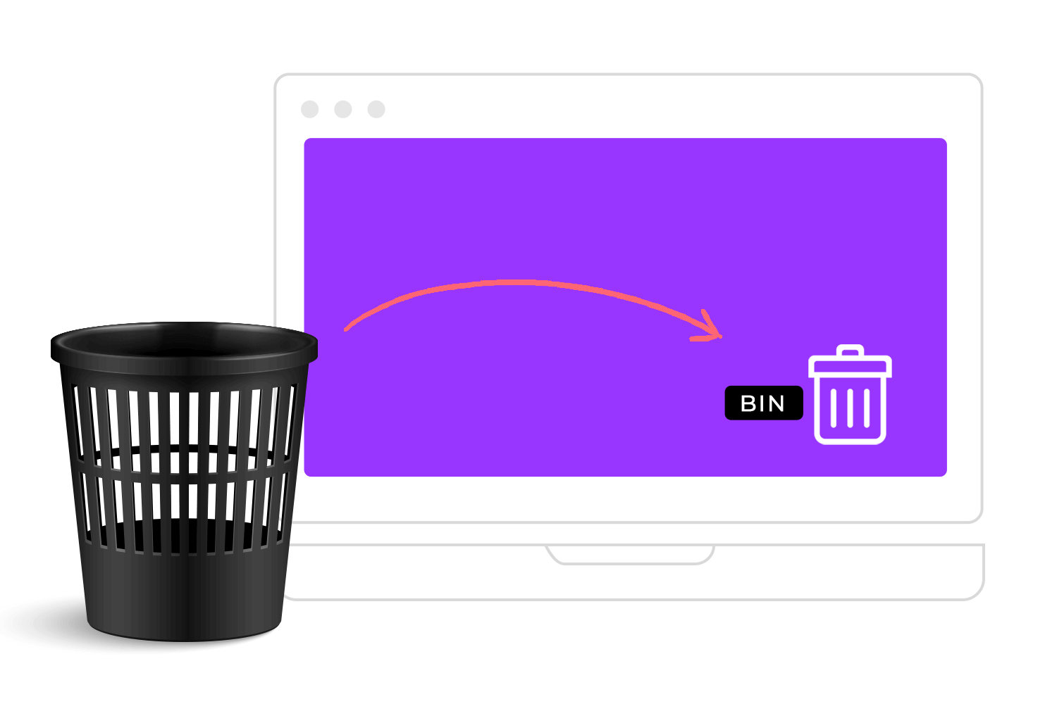
Think about how easy it is to use the “Recycle Bin” on your computer. It looks just like a little trash can, right? That’s skeuomorphism at work! By making the digital icon resemble something we already understand, it instantly tells us what it’s for – tossing out unwanted files. Even if you’ve never used a computer before, you probably have a pretty good idea how to delete something. Skeuomorphism makes technology easier to use by building on what we already know about the real world.
Another great example is the way books were displayed in early versions of Apple’s iBooks app. They weren’t just listed on a screen; they were shown on a virtual bookshelf! This design mimicked the experience of browsing a real bookshelf, making the app feel familiar and intuitive. By using these kinds of real-world visual cues, skeuomorphism helps us understand and interact with technology more naturally.
Let’s explore the fascinating world of interface design styles! We’ll start with Skeuomorphism. Think of those early iPhone interfaces with realistic textures like wood grain and leather, complete with shadows and highlights. The goal was to make technology feel familiar and intuitive by referencing things we already understood.
Then came Flat Design, a reaction against skeuomorphism’s realism. Flat design embraces simplicity and minimalism, stripping away all unnecessary decorations and focusing on clean lines, geometric shapes, and bold colors. It’s all about clarity and usability, prioritizing function over visual flair. Microsoft’s Metro design language is a great example.
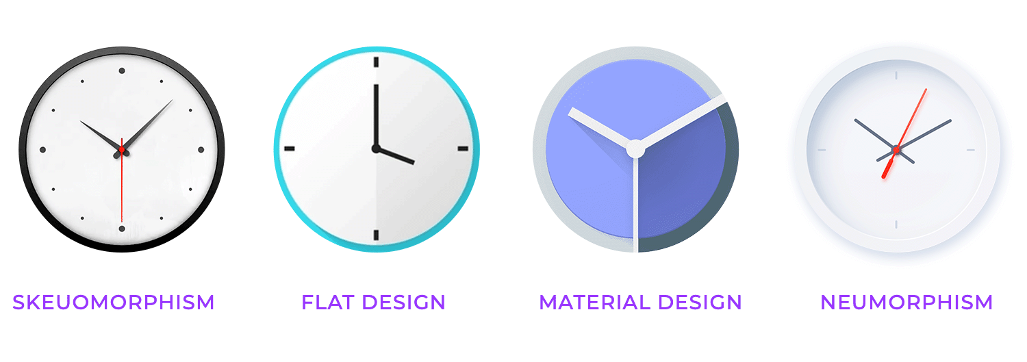
Next up is Android Material Design, a system created by Google that blends the best of both worlds. It takes the clean aesthetic of flat design and adds subtle realistic cues, using “material” as a metaphor for digital objects.
These objects have properties like elevation and shadows, creating a sense of depth and hierarchy. Material Design also emphasizes animation and transitions, making interfaces feel more dynamic and engaging. You’ll see this style throughout Google’s Android operating system and its apps.
Finally, we have Neuomorphism, a more recent trend that combines aspects of flat design and skeuomorphism in a unique way. It creates a soft, extruded look, where elements appear to pop out from the background using subtle shadows and highlights.
Neumorphism often uses limited color palettes, sometimes even sticking to a monochromatic scheme, to achieve a modern and tactile feel. It’s a bit like a digital reimagining of physical buttons and controls. Each of these styles offers a different approach to designing digital experiences, each with its own strengths and visual language.
At the heart of skeuomorphic design lies the principle of real-world metaphors, a clever way of making digital interfaces feel instantly familiar. It’s all about using recognizable objects from our everyday lives to represent digital functions.
This approach leverages our existing knowledge of how things work in the physical world, making it easier to understand and interact with digital elements. Using these visual shortcuts, skeuomorphism helps bridge the gap between the tangible and the digital.
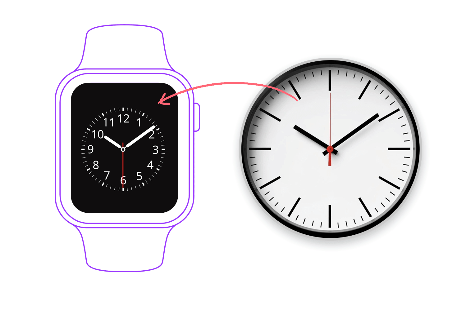
The same logic applies to other interface elements like toggle buttons, sliders, and dials. If you consistently use familiar visual cues, this skeuomorphism will help your users develop a mental model of how the interface works, making it easier to navigate and use. It’s like creating a visual language that everyone already understands.
In essence, the principle of real-world metaphors in skeuomorphism is all about making technology more approachable and user-friendly. Grounding digital experiences in the familiar, it reduces the cognitive load on users and makes interactions feel more natural.
It’s a design philosophy that recognizes the power of visual cues and leverages our existing knowledge to create seamless and intuitive digital experiences.
The principles of texture and depth are crucial for creating the realistic and tactile feel that defines skeuomorphic design. This involves carefully selecting and creating realistic textures, like wood grain, metal, or fabric, to give digital elements a tangible quality.
It’s about more than just adding a flat image; it’s about simulating the way these materials look and feel in the real world. This also includes creating simulated 3D effects, making digital objects appear to have volume and dimension.
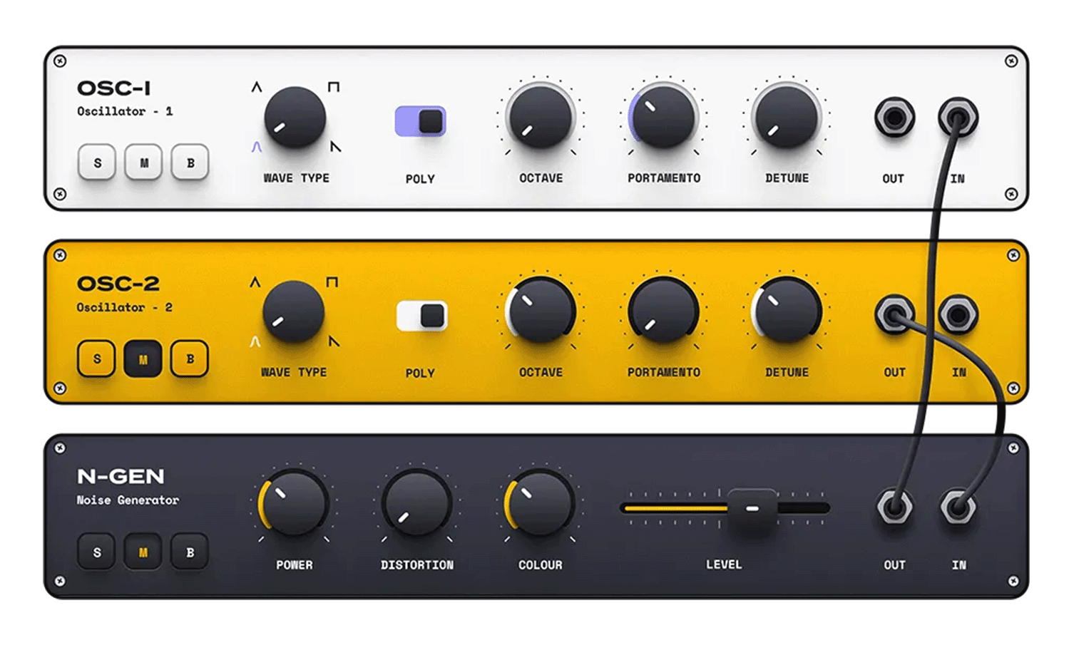
To achieve this sense of depth, designers employ techniques like layering, shadows, highlights, and gradients. Layering involves placing elements on top of each other to create a sense of hierarchy and visual interest. Shadows, both drop shadows and inner shadows, are used to simulate the way light interacts with objects, creating the illusion of depth and separation.
Highlights mimic the reflection of light on surfaces, adding to the realism and giving objects a polished or reflective appearance. Gradients, smooth transitions between colors, are often used to suggest rounded edges or curved surfaces, further enhancing the 3D effect.
A key consideration within texture and depth is properly scaling textures to avoid visual clutter. If a texture is too large or too small, it can look distorted or distracting, detracting from the overall design. The scale of the texture should be appropriate for the size of the element it’s applied to, maintaining a sense of realism and visual harmony. Finding the right balance between detail and clarity is essential.
Think about an online bookshelf on an e-commerce site selling books. It’s not just a flat list of titles; it actually looks like a bookshelf, with rows of book covers lined up. This is skeuomorphism using affordances. The bookshelf affords a certain type of interaction. You instantly understand that you can probably click on a book cover to see more details, just like you’d pick up a book from a real shelf. The visual cues, like the “spine” of the book and the way it’s positioned on the shelf, mimic how we interact with physical books.

Even though you’re just clicking on a screen, the design makes it feel more intuitive because it’s similar to browsing a real bookstore. The bookshelf design affords browsing and selection, making the online experience more user-friendly by leveraging our existing understanding of how real bookshelves work.
The use of lighting & shadows is a crucial technique in skeuomorphic design for achieving a sense of realism and depth. It’s all about mimicking how light interacts with objects in the physical world, making digital elements appear more tangible and three-dimensional.
A key aspect of this is simulating natural light sources.
By envisioning a light source—whether it’s coming from above, the side, or even behind—you can create realistic lighting effects. This involves strategically placing highlights where light would naturally hit a surface and creating shadows in areas where light would be blocked. This technique adds volume and dimension, making objects look less flat and more like they exist in a physical space.
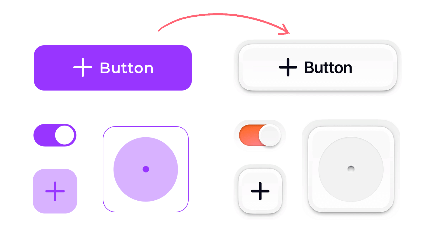
To further enhance the three-dimensional effect, the skeuomorphic design uses subtle drop shadows, inner shadows, and highlights. Drop shadows create the illusion that an object is raised above the surface it sits on, casting a shadow beneath it. Inner shadows, conversely, create the impression of depth or a recessed area within an object.
Highlights mimic the reflections of light on a surface, adding a sheen or polished look. The emphasis here is on subtlety. The shadows and highlights shouldn’t be overly dramatic or artificial; they should be used judiciously to enhance the realism without being distracting. When done well, this creates a convincing illusion of depth and tangibility, making the digital interface feel more connected to the physical world.
Gradients and highlights are essential tools in the skeuomorphic designer’s toolkit. They play a key role in conveying the three-dimensionality and surface qualities of digital elements.
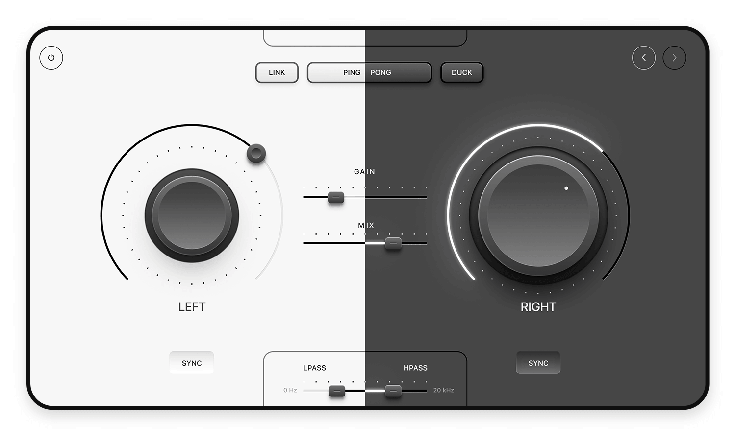
One of the primary uses of gradients is to suggest rounded edges or a curved surface. In the real world, light doesn’t fall evenly on curved objects; it transitions smoothly from brighter areas to darker areas.
Gradients mimic this effect by smoothly blending colors, creating the illusion of a rounded or curved shape. This technique is particularly effective for elements like buttons, knobs, and dials, making them appear more tactile and inviting.
However, simply adding gradients isn’t enough. To maintain a convincing sense of realism, it’s crucial to ensure that highlights align with the overall lighting scheme. This means that the brightest parts of the gradient should correspond to where the light source is imagined to be hitting the object.
If the light source is coming from above, the top part of the gradient should be brighter, gradually darkening towards the bottom. This consistency in lighting and shading is what makes the skeuomorphic effect truly believable. When gradients and highlights are used thoughtfully and in accordance with a consistent lighting scheme, they can significantly enhance the realism and visual appeal of skeuomorphic designs.
Iconography is a cornerstone of skeuomorphic design, as it provides immediate visual cues that connect digital functions to real-world objects. The core principle is about creating icons that look like real-world objects.
For instance, a camera icon might resemble a classic point-and-shoot camera, a notes app icon might look like a notepad with a pen, or a calendar icon might mimic a traditional wall calendar. This direct visual connection helps users quickly understand the purpose of the icon and the function it represents.

However, there’s a crucial balance to strike. While the goal is to evoke a real-world object, it’s equally important to ensure that icons remain intuitive and not overly detailed. Overly complex or cluttered icons can become difficult to recognize at small sizes and can distract from the overall user interface. The key is to capture the essence of the real-world object in a simplified yet recognizable form. Think of it as creating a visual shorthand that instantly communicates the icon’s meaning without overwhelming the user with unnecessary details.
Here’s why this balance is so important:
- Recognition: Simple, clear icons are easier to recognize and understand at a glance, especially on smaller screens.
- Usability: Overly detailed icons can be visually confusing and slow down user interaction.
- Aesthetics: Clean and well-designed icons contribute to a more polished and professional look for the overall interface.
Design flat or skeuomorphism prototypes with Justinmind.

Consistency is absolutely key in skeuomorphic design. After all, the goal is to create a realistic and familiar experience, and inconsistencies can shatter that illusion, creating a jarring effect for users. To maintain this crucial consistency, there are a few important guidelines to keep in mind.
First and foremost, focus on maintaining consistent lighting angles, texture styles, and shadow depths. Imagine a single, consistent light source shining on all the elements within the interface.
This means that highlights and shadows should fall predictably and uniformly across all icons, buttons, and other visual elements. When it comes to textures, if you’re using a wood grain for one element, ensure that any other wooden elements use a similar style, maintaining consistent color, grain size, and level of detail. Mixing drastically different wood textures can look unnatural and break the cohesive feel.
Similarly, the depth and intensity of shadows should be consistent. If one button casts a certain type of shadow, all comparable buttons should follow suit. This creates visual harmony and reinforces the 3D effect.
For larger projects or when working across multiple products, style guides and design systems become indispensable. A style guide acts as a comprehensive document outlining all the visual elements used in the design, including specific textures, colors, shadow styles, and lighting angles. It serves as a single source of truth, ensuring that all designers working on the project are on the same page and adhering to the same visual language.
Taking it a step further, a design system provides reusable components and patterns that can be used throughout the interface or across multiple products. This not only guarantees visual consistency but also streamlines the design and development process, saving time and effort.
Making skeuomorphic designs work seamlessly across different devices is a key challenge in today’s diverse digital landscape. This is where responsive and adaptive layouts come into play. The core challenge is preserving the sense of realism, no matter the screen size or orientation.
Simply shrinking a highly detailed skeuomorphic element can lead to clutter and make it hard to recognize, while enlarging it can cause textures to look blurry or pixelated. Even rotating a device can throw off the perceived lighting and shadows, potentially ruining the realistic effect.
To tackle these issues, adjusting texture sizes and resolutions for various devices is essential. Using vector graphics whenever possible is a great way to maintain crispness and detail, regardless of how much the interface is scaled. In some cases, creating different versions of textures optimized for specific screen sizes or resolutions might be necessary to ensure they always look sharp and appropriately scaled. This is known as using adaptive textures.
Sometimes, more drastic measures are needed, and the layout of the interface itself might need to be adjusted for different screen sizes or when the device is rotated. This could mean rearranging elements, simplifying details, or even using entirely different visual metaphors depending on the context. By carefully considering these factors, designers can create skeuomorphic interfaces that are not only visually appealing but also functional and user-friendly on everything from tiny phone screens to large desktop monitors.
Over-decoration is a common trap in skeuomorphic design, and it’s essential to understand how to avoid it. While the style thrives on visual richness, there’s a delicate balance to maintain between that richness and overall clarity. The goal is to create an engaging experience without overwhelming the user with unnecessary visual noise.
Striking a balance between visual richness and clarity is key. This means prioritizing functionality above all else. Visual details should serve to enhance usability, not detract from it. A good approach is to focus on the essential details that truly contribute to the sense of realism and avoid adding anything that doesn’t serve a clear purpose. Using visual hierarchy—employing cues like size, contrast, and spacing—can help guide the user’s eye and create a clear flow of information, even within a detailed design.
When too much detail can hinder navigation and performance is a serious concern. Over-decoration can lead to several problems. It can cause cognitive overload, making it difficult for users to focus on their task.
It can also lead to performance issues, as highly detailed textures and complex 3D effects can increase file sizes and strain device resources, resulting in slow loading times, lag, or choppy animations. This is especially important to consider on mobile devices with limited processing power. In short, finding the sweet spot between realism and simplicity is crucial. Visual details should enhance the user experience, not make it frustrating or slow.
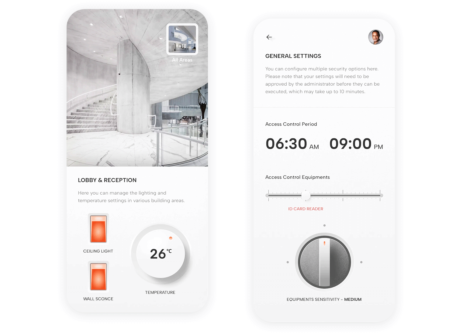
Because this style often involves prominent textures and visual details, ensuring that text remains legible and that user attention is guided effectively is crucial for a positive user experience. Maintaining text legibility against textured backgrounds requires careful consideration. While those textures add to the realism, they can easily make text difficult to read if not handled properly.
Text size and weight also play a role. Using a larger font size and a bolder font weight can significantly improve readability, especially against busy backgrounds. Sometimes, it’s necessary to implement background treatments to further enhance contrast. This might involve slightly darkening or lightening the area directly behind the text to create a more solid backdrop. A subtle, semi-transparent overlay can also be very effective in providing that necessary separation.
Color and contrast are also powerful tools for creating a clear visual hierarchy. Highlighting key elements, such as interactive buttons or links, with contrasting colors makes them stand out and draws the user’s eye. By using different levels of contrast, you can create a clear visual hierarchy, guiding the user through the interface and emphasizing important information. Finally, and perhaps most importantly, accessibility considerations must be taken into account. When choosing colors and contrast levels, always refer to accessibility guidelines to ensure sufficient contrast for users with visual impairments. This ensures that your design is usable by the widest possible audience.
Performance is a crucial factor in any user interface, and skeuomorphic design, with its emphasis on visual richness, is no exception. While high-quality images and textures are essential for achieving that realistic look, they can easily become a bottleneck if not handled carefully. The key is to find the sweet spot between visual fidelity and smooth, responsive performance. No one wants an interface that looks stunning but takes forever to load or feels sluggish to use.
One of the main concerns is ensuring that those high-quality images and textures don’t bog down the interface. This is where optimization techniques come into play. Image compression is a powerful tool for reducing file sizes without drastically sacrificing visual quality.
Choosing the right file format—JPEG for photos, PNG for graphics with transparency, and newer options like WebP for even better compression—is essential. For repeating textures, using smaller, tileable images can significantly reduce file sizes and improve performance. And for elements that aren’t immediately visible, lazy loading can be a lifesaver, ensuring that resources are only loaded when they’re actually needed.
Beyond image optimization, there are other strategies for minimizing asset sizes and loading times. Using vector graphics whenever possible is a great way to maintain crispness and detail at any scale while keeping file sizes small. Combining multiple small images into a single “sprite” image can also reduce the number of HTTP requests, leading to faster loading times.
Finally, implementing caching mechanisms can store frequently used assets locally, so they don’t have to be downloaded repeatedly. By carefully considering these performance factors, designers can create skeuomorphic interfaces that are not only visually captivating but also fast, responsive, and a joy to use.
One of the biggest advantages of skeuomorphism is its intuitiveness, especially for users who are new to technology or unfamiliar with digital interfaces. Users can quickly grasp the functionality of digital elements by drawing on their existing knowledge of how similar objects work in the physical world. This can significantly reduce the learning curve and make technology more accessible.
Skeuomorphic design can also tap into users’ emotions and create a sense of nostalgia. By referencing familiar objects from the past, such as a rotary-dial phone or a classic radio, skeuomorphic interfaces can evoke positive memories and create a more engaging and enjoyable user experience. This emotional connection can be particularly powerful for certain target audiences or for products that aim to evoke a sense of heritage or tradition.
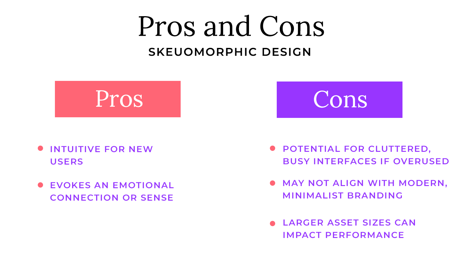
One of the main drawbacks of skeuomorphism is the potential for cluttered and busy interfaces if the design is overdone. Because the style relies on detail and realism, it can be tempting to add too many visual elements, leading to a visually overwhelming experience. This can make it difficult for users to focus on the essential information or navigate the interface effectively.
In today’s design landscape, many brands prioritize a clean, minimalist aesthetic. Skeuomorphism, with its emphasis on detail and realism, may not align with this branding approach. For brands that aim to project a modern, sophisticated, or cutting-edge image, a more minimalist design style might be more appropriate.
Another significant drawback of skeuomorphism is the potential for larger asset sizes. High-resolution textures, detailed 3D effects, and complex icons can significantly increase file sizes, impacting loading times and overall performance, especially on mobile devices or slower internet connections. This can lead to a frustrating user experience and may even deter users from using the product or service.
Let’s talk about how to gracefully transition from skeuomorphism to more contemporary design styles like flat or Material Design. It’s not simply a matter of stripping away textures and shadows; it requires a thoughtful approach to preserve the core functionality and user experience while updating the visual language.
When redesigning skeuomorphic apps, a good strategy is to start by removing extraneous details like overly realistic textures, dramatic shadows, and excessive highlights. Focus on simplifying the shapes and forms of the elements, moving from 3D representations to 2D ones.
This means opting for flat colors and sharp edges instead of gradients that simulate curves. Refining the iconography is also crucial. Simplify icons while retaining their core visual metaphors—perhaps by reducing the level of detail or using more abstract representations.
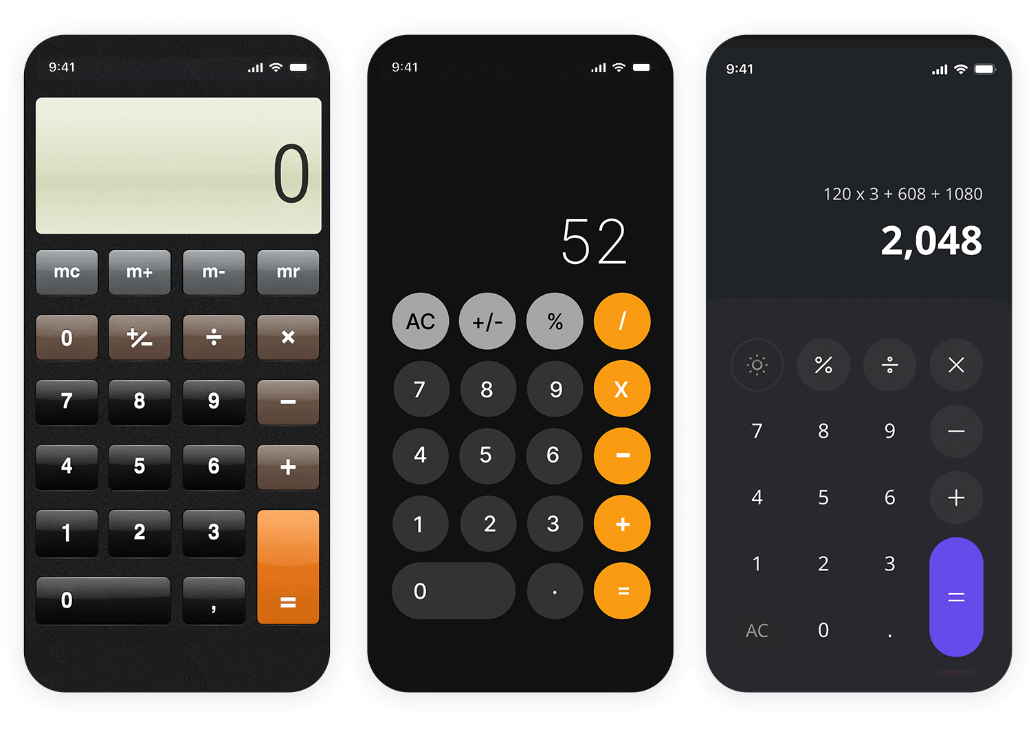
A key aspect of this transition is maintaining recognizable metaphors even without the heavy reliance on textures. The intuitive nature of skeuomorphism stems from those familiar visual cues, so preserving them is important. Even without textures and shadows, the basic shape and form of an element can still convey its meaning. A button can still look like a button, even if it’s a flat rectangle with a simple label. Color and contrast can also play a vital role in differentiating elements and creating a sense of depth and hierarchy, even in a flat design.
Sometimes, a complete shift to flat design isn’t necessary or even desirable. A hybrid approach, combining elements of skeuomorphism with flat design principles, can be very effective. This involves softening the skeuomorphic elements by using subtle shadows and gentle gradients instead of heavy drop shadows and dramatic gradients. This adds a touch of depth without overwhelming the design. Similarly, textures can be used sparingly and in a more abstract way, avoiding highly realistic textures that can clutter the interface.
Design flat or skeuomorphism prototypes with Justinmind.

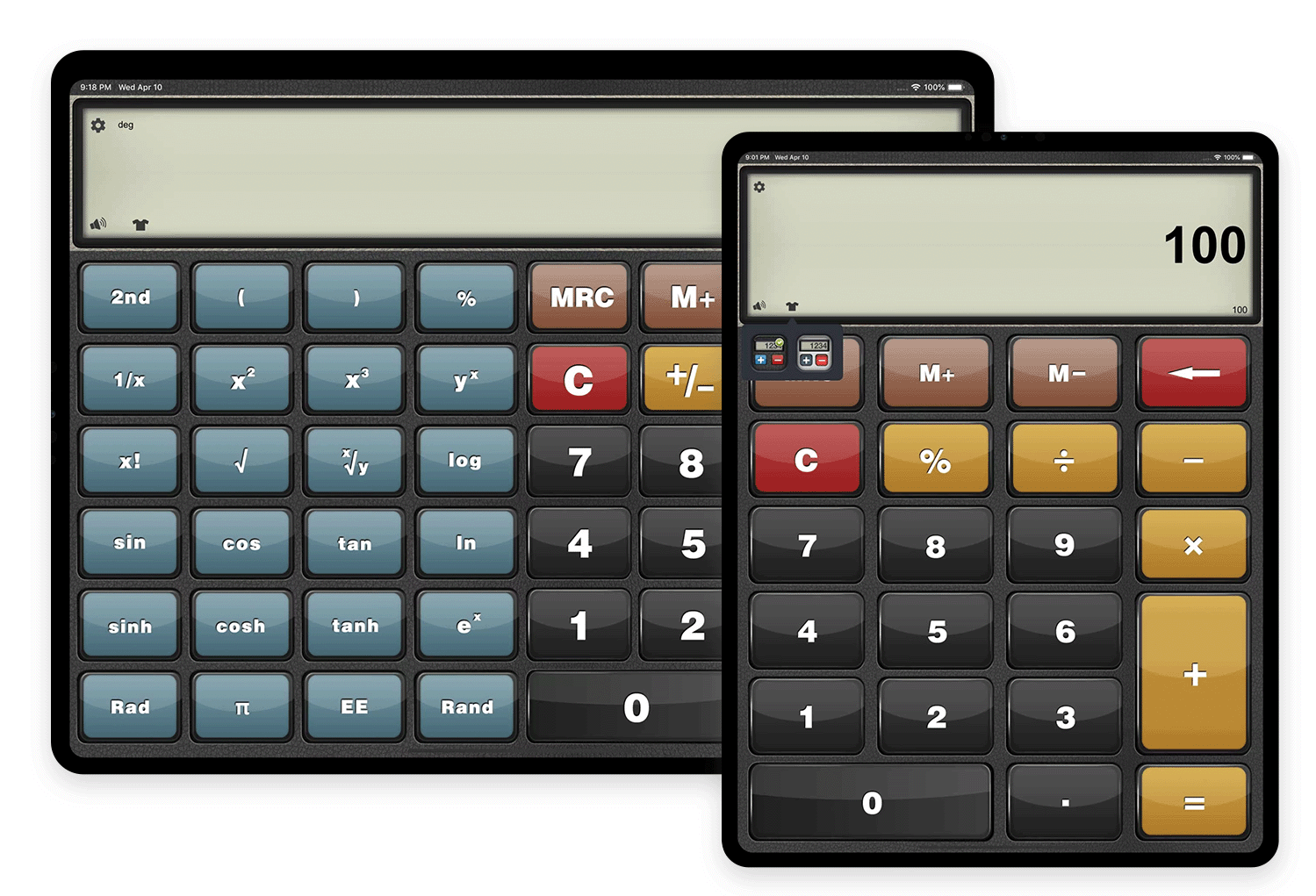
This iPad calculator app uses large, clearly defined buttons with shading and highlights, making them look and feel like real calculator keys. It’s a classic example of skeuomorphism applied to a utility app.
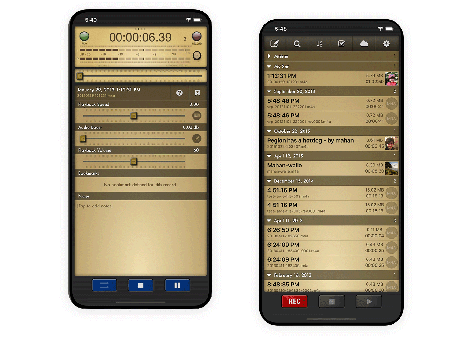
Voice record pro offers optional “skins” that mimic reel-to-reel tape recorders, with spinning reels and bouncing VU meters that react to the audio. It’s a fun, nostalgic take on voice recording.
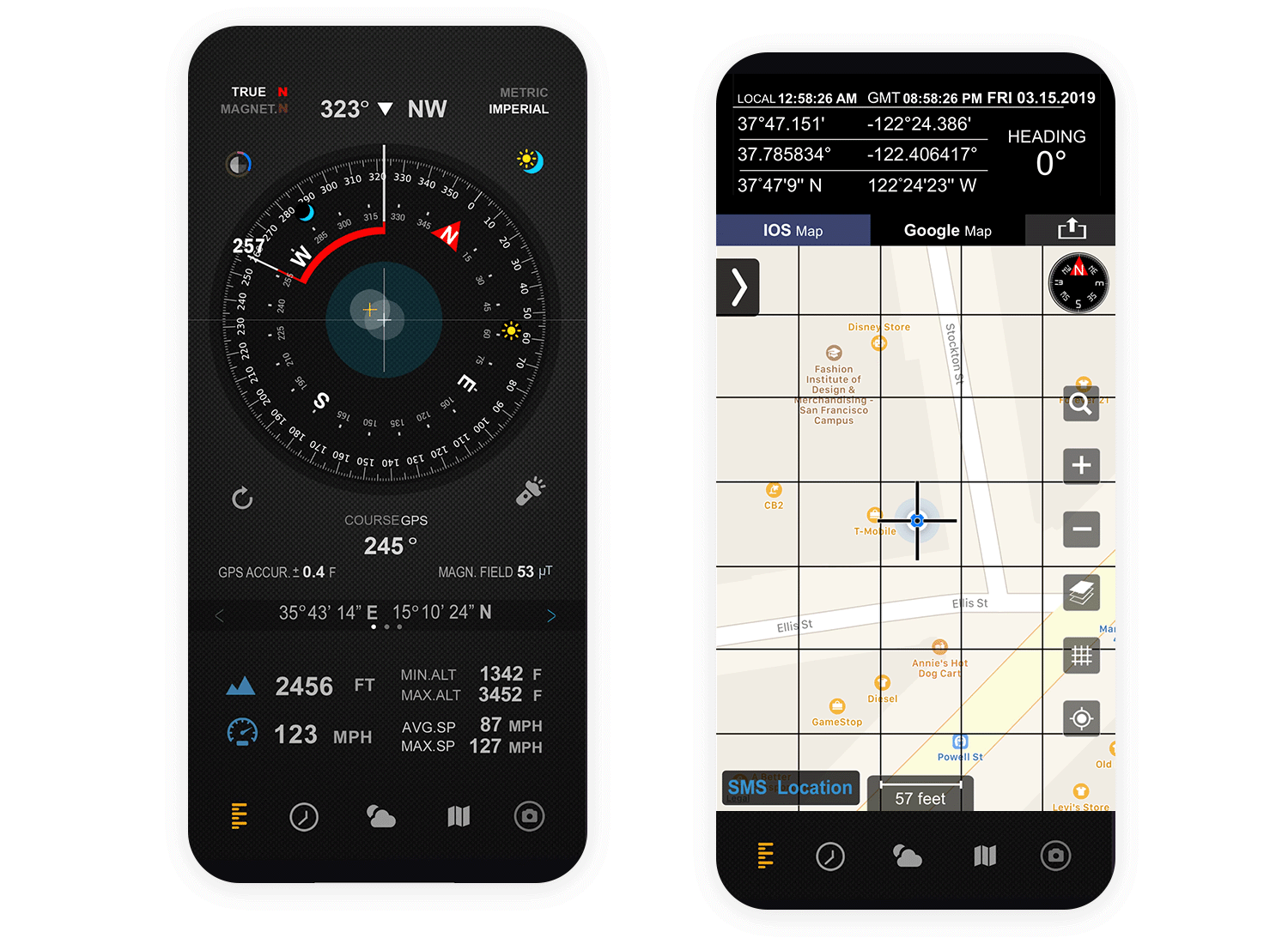
This compass app uses a traditional compass design with a detailed rotating needle, clear directional markings, and even a subtle metallic sheen, making it feel like you’re holding a real compass.
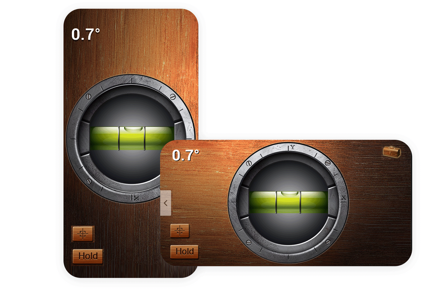
iHandy Level is an app that perfectly replicates a physical bubble level, with a green “bubble” that moves realistically within a clear vial as you tilt your phone. It’s a practical use of skeuomorphism for a tool app.
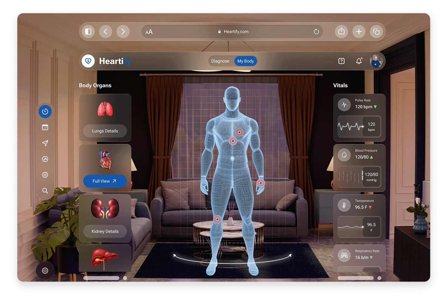
Instead of a flat, abstract interface, this website put together by Dheeraj Dabhi places the user in a virtual 3D living room. This includes realistic textures on the furniture and walls, like wood grain and fabric, and even a window with a view to add depth.
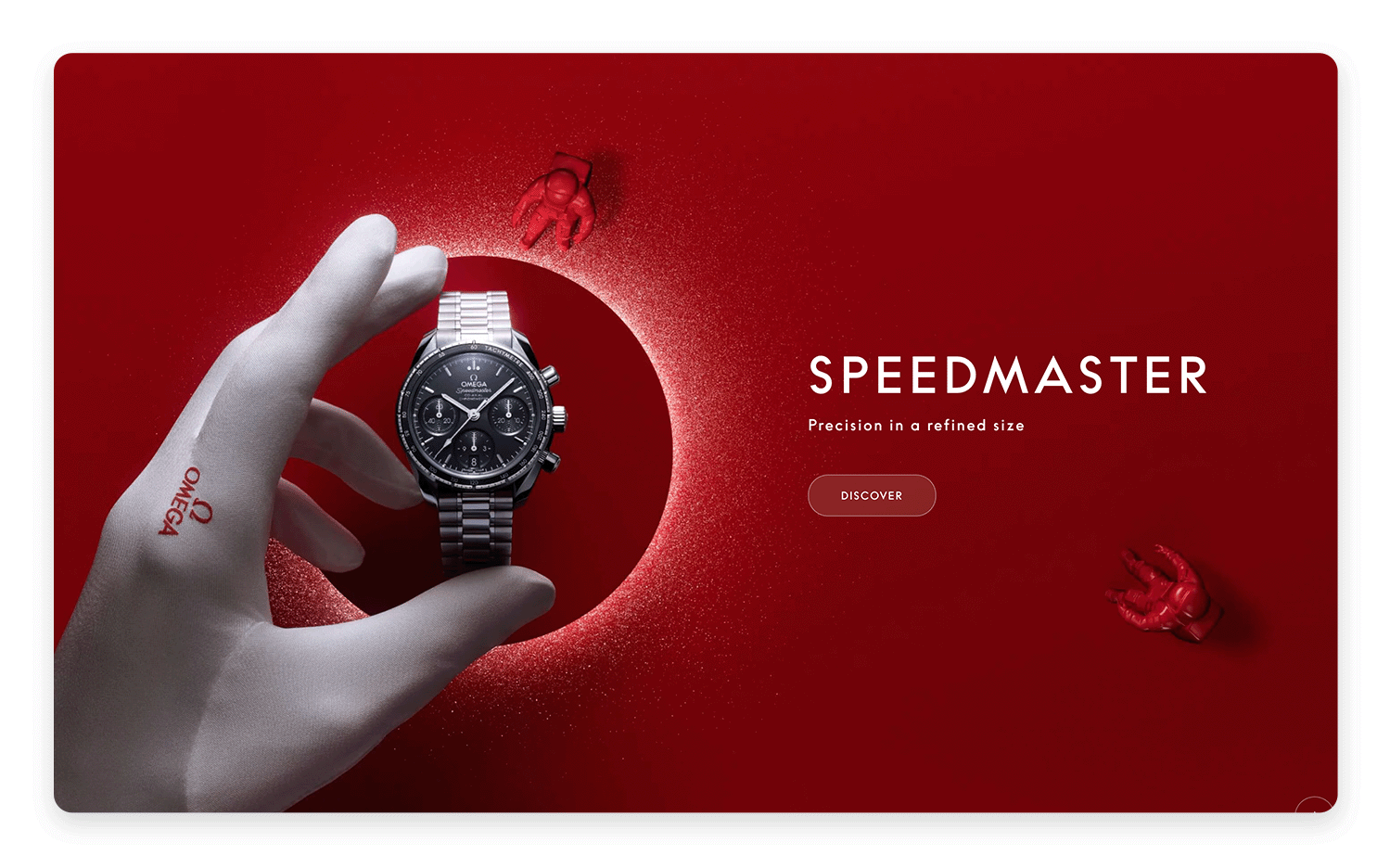
Omega uses clever techniques to make their Speedmaster watch look incredibly real. Notice how the realistic lighting and shadows give it depth and make it pop off the screen, just like a real watch would under a light. The shiny metal surfaces, like the band and bezel, reflect light beautifully, drawing your eye to the intricate details.
Rolex’s website makes their watches look incredibly real using clever tricks of the eye. This close-up of the Datejust practically jumps off the screen thanks to realistic lighting and shadows that give it a convincing sense of depth. You can almost feel the cool metal and admire the different textures, from the smooth, polished surfaces to the intricate details on the dial.

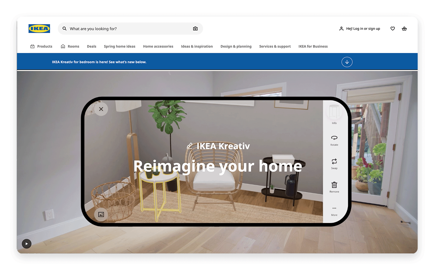
IKEA has a very well-known room planning tool. You can create a virtual room with your dimensions and then drag and drop IKEA furniture into it to see how it looks. This is a classic skeuomorphism UI design example of a digital tool mimicking a physical process (arranging furniture).
Wayfair also offers room planning tools and often uses augmented reality (AR) features in their mobile app, allowing you to “place” furniture in your actual room using your phone’s camera. This blends skeuomorphism UI design with AR technology.

With its stitched leather background, realistic page-turning animations, and red marker-style date circles, this iOS calendar app was a prime example of skeuomorphism UI design, making the digital calendar feel like a physical planner.
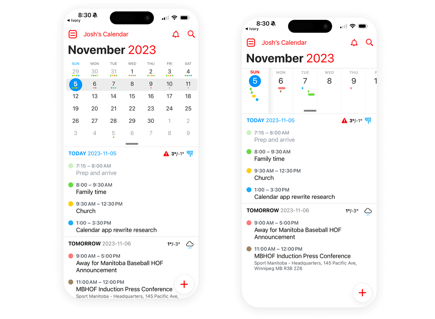
Early versions of iOS’s notepad application adopted a highly realistic visual style, emulating a physical paper notepad through the inclusion of textured lines and a simulated leather binding.
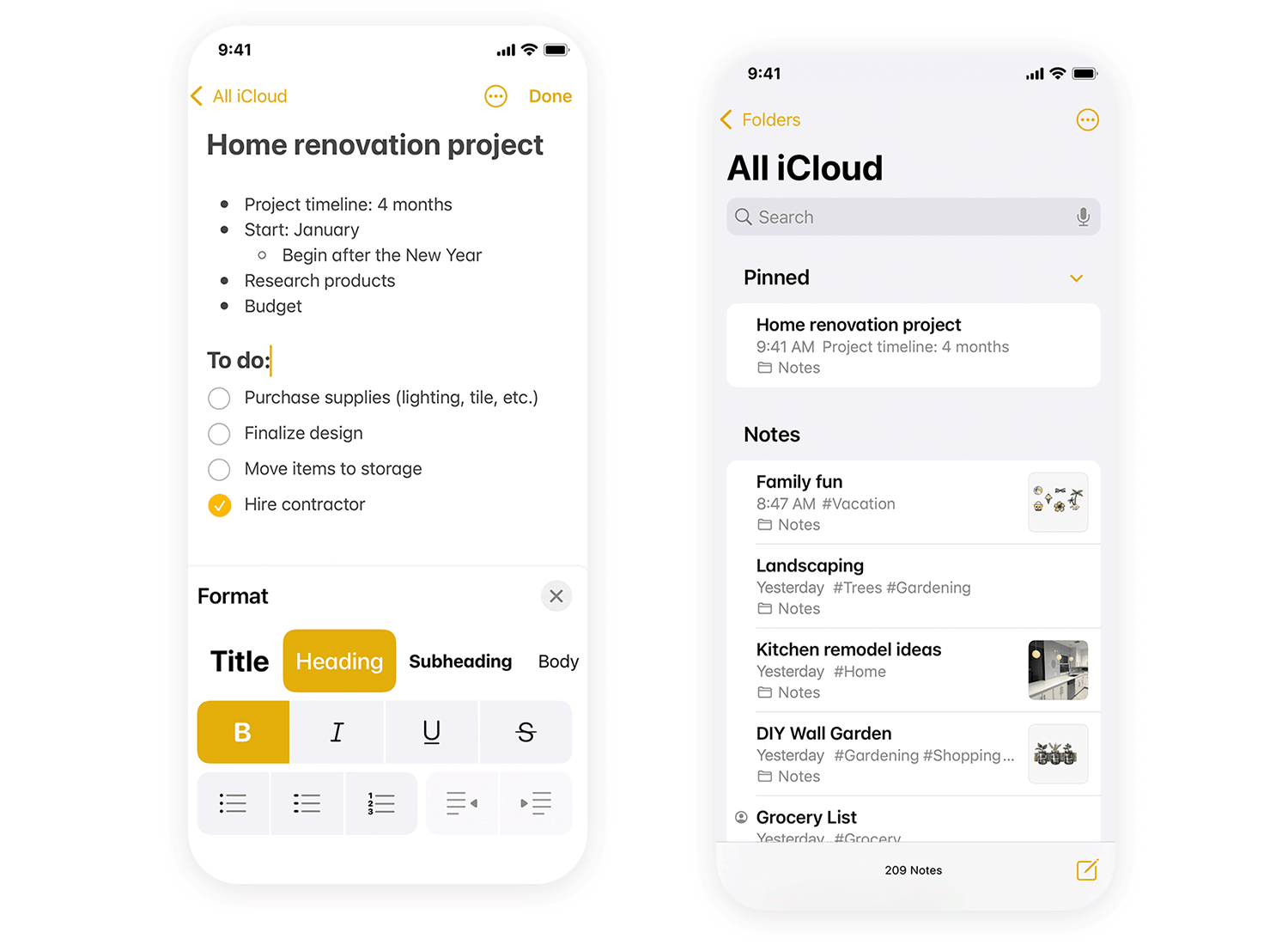
Pizza Hut once employed an unconventional topping selection method. Users were prompted to choose toppings and then tilt their phones horizontally to supposedly arrange them on a virtual pizza.

Early iterations of Amazon’s Kindle Fire tablet featured a user interface that integrated 3D renderings of wooden bookshelves. This skeuomorphic design choice aimed to evoke the experience of browsing a physical library, influencing user perception and navigation within the digital environment.

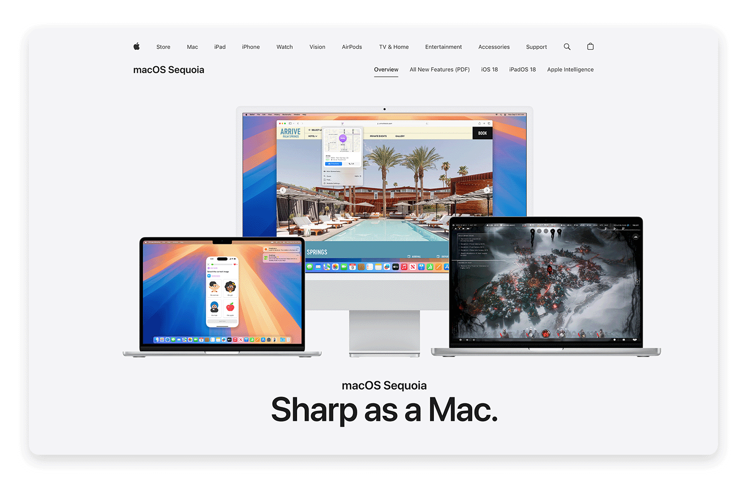
Even in contemporary digital interfaces, echoes of skeuomorphism persist. Apple’s macOS, for instance, continues to employ the visual representation of a physical file folder as the primary metaphor for digital file storage.
Let’s peer into the crystal ball and explore the potential future of skeuomorphism! One interesting development, as we mentioned previously, is neumorphism, a sort of “soft” take on traditional skeuomorphism. Neumorphism uses subtle shadows and highlights to create a 3D effect, but avoids the heavy textures and hyper-realism of classic skeuomorphism.
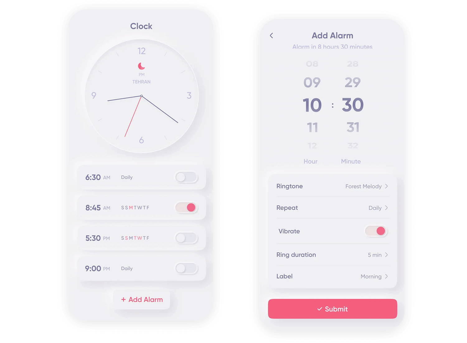
Image taken from: https://dribbble.com/shots/23923305-Neumorphism-Alarm
However, while neumorphism can create a clean, modern, and tactile user experience, it also carries potential risks, particularly regarding accessibility. The low contrast between elements and the background can make it challenging for users with visual impairments to perceive the interface.
Design flat or skeuomorphism prototypes with Justinmind.

As we move further into the realm of Mixed Reality & 3D Interfaces, with the increasing popularity of augmented reality and virtual reality technologies, skeuomorphic principles could find exciting new applications. Imagine interacting with virtual objects that feel truly tangible and familiar.
In these immersive environments, skeuomorphism could be used to create virtual dials that look and feel like real-world knobs, or virtual documents that have the appearance and texture of actual paper.
Combining these skeuomorphic visuals with haptic feedback, such as vibrations or other tactile sensations, could further enhance the immersive experience, blurring the lines between the digital and physical worlds.
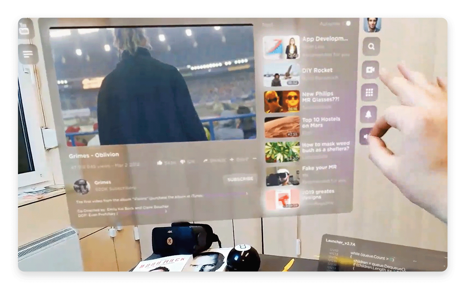
Image taken from: https://dribbble.com/shots/10168572-Mixed-Reality-UI-Concept
Finally, it’s important to remember that design trends are often cyclical. Design innovation cycles tell us that styles go in and out of fashion over time. Skeuomorphism, after its initial boom and subsequent decline, is already showing signs of a resurgence, albeit in a more refined and subtle form.
Skeuomorphism will likely continue to evolve and adapt to new technologies and design trends. Perhaps it will resurface in entirely new forms, possibly integrated with AI or other emerging technologies. It’s also possible that it will continue to be used in niche applications where its strengths are particularly relevant, such as in educational apps or interfaces designed for specific hardware.
The future of skeuomorphism is likely to be one of adaptation and reinvention, constantly finding new ways to connect digital experiences with the familiar world around us.
Skeuomorphic design was a useful stepping stone as we ventured into unchartered territory. It acted as a useful guide as we became accustomed to unfamiliar UI components and design patterns.
As we matured, so has our understanding of UX design and user interfaces. What remains to be seen, at least in the case of skeuomorphic design, is whether we’ll evolve beyond ever needing it or whether it’s something that we can rely on as new technologies emerge to help us come to grasp their inner workings.
One thing is certain, at least, is that skeuomorphic design has its place within UX design and should be something all designers are familiar with – even if they feel like it’s beyond its sell by date.
PROTOTYPE · COMMUNICATE · VALIDATE
ALL-IN-ONE PROTOTYPING TOOL FOR WEB AND MOBILE APPS
Related Content
 Communicating UI design ideas isn't easy. Mood boards project your creativity in a visual way, letting you get back to what you do best: designing. They also serve as a useful style guide as you work. Here are some great examples and tools for your next brainstorming session!10 min Read
 Find the best free and paid SVG editors available online and desktop, including Mac, Windows and Linux.24 min Read
 The growing importance of mobile banking app design brings with it the need for more engaging UIs so that financial institutions can stay competitive. If you’re wondering what constitutes a great banking app UI design, check out these 10 great examples.10 min Read
