
Creating a web of links that the user can navigate isn't easy. Check out these 30+ websites that not only did it, but did it in style!
Website navigation design. It’s such a crucial building block of any website prototype – when was the last time you experienced a website that had no navigation at all? In contrast, we all have gone through certain websites only to be confused or annoyed by the navigation design.
Design and prototype website navigation with Justinmind. It's free!

The ability to not just move around the website, but to explore and find what they need. But what makes a good navigation design? That is the tricky part: the things your navigation design needs to achieve will change from website to website. Like many aspects of UX design, there isn’t a one-size-fits-all approach.
With that said, many designers seek help in commonly used UI patterns, using these structures to create the bare bones of their navigation.
Even though we can’t make a checklist for the perfect navigation design, we can make a list of websites that got it right! Either due to how easy it is to navigate, how pretty it looks or how cool the experience is – all of these websites stood out because users are free to move around and enjoy their time on the website. Check them out and feel the inspiration!
Signing up has never been more fun! Justinmind’s designers put together this free form that demonstrates a smart way to make signing up for a website more user-friendly. Instead of overwhelming users with a long form, it breaks the process into two easy steps. First, you simply enter your email address or log in with your preferred social media account. Once you click “Next,” you’re presented with a second, smaller form to create a password. This interactive approach keeps users engaged and focused, making the sign-up process a piece of cake!

This free design web summit example by Justinmind shows a cool website navigation menu. When you click on a link, like “Presentation” or “Schedule,” the page automatically scrolls down to that section. It’s a straightforward way to navigate and find the information you need. The menu looks great, too, with a nice logo and clear labels.

Looking for a more classic look? This wireframe demonstrates a timeless navigation menu for an e-learning website. The menu bar features a simple design with four essential links: “Home,” “Event,” “Members,” and “About.” This classic layout is easy to navigate and understand, making it a great choice for websites that prioritize a clean and user-friendly experience. Get it for free!

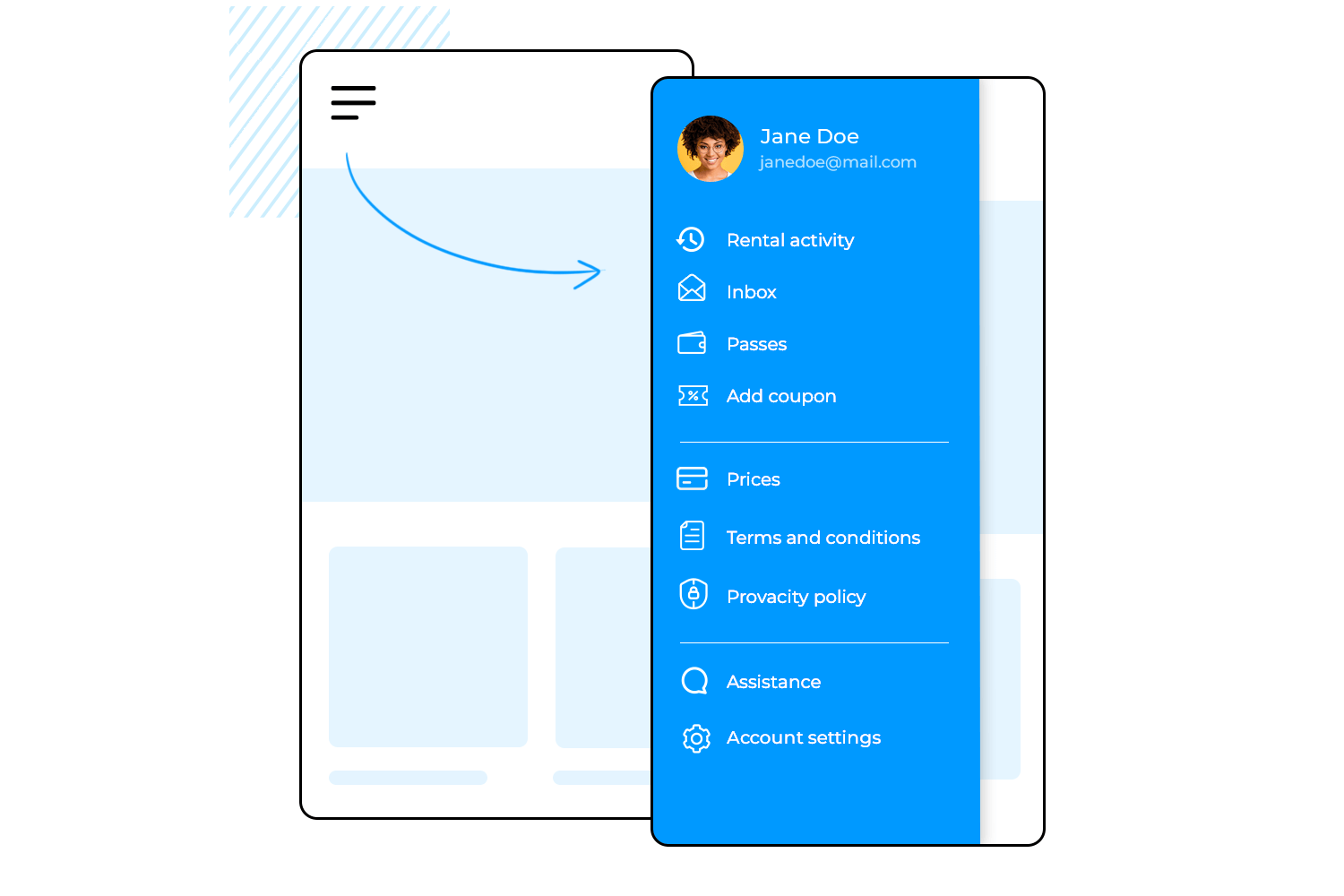
Justinmind’s showcases a cool side menu with subcategories for an Angular HR web app template. It has a clear title, “HR Acme,” and a list of main categories that you can click on to see more options. It’s a great way to keep everything organized and easy to find. Also, it’s free. Use it for your project today!

Justinmind’s complete responsive web example features a cool Parallax scrolling effect that adds a touch of magic to the website. As you scroll down, the background moves at a different speed than the text and images, creating a 3D effect that’s both visually appealing and fun to interact with. The website navigation bar stays fixed, making it easy to navigate, and the header looks sharp with a clear logo and user-friendly menu. This Parallax effect makes this our favorite website navigation example on our list!

The Justinmind online florist template’s menu navigation bar has an intuitive user interface (UI) that blends design and functionality. The horizontal layout’s clean lines and minimalist design provide a straightforward and user-friendly interface. The menu items are presented with an easy-to-read typeface set against a soft, pastel background.
A subtle hover effect adds a visual cue that the user has an option, suggesting some level of interaction. The whole design ties in with the flowery motif, and the navigation is both visually pleasant and simple to use.

Design and prototype website navigation with Justinmind. It's free!
The navigation menu layout on an e-learning website template by Justinmind is slick and intuitive, with a UI that welcomes students into a world of learning and exploration. The InsideBox logo, a simple cube, establishes the tone for an orderly and systematic learning process right away. The primary navigation options, such as dashboard, courses, assignment, and calendar, are displayed in an easy-to-use list beneath the logo, enabling visitors to actively seek out particular courses or resources.
The assignment option, which is shown by a tiny orange dot, gives students a sense of urgency and motivates them to complete their assignments on time. Overall, the menu’s design creates a visually appealing and captivating entrance by perfectly balancing practicality and aesthetics.

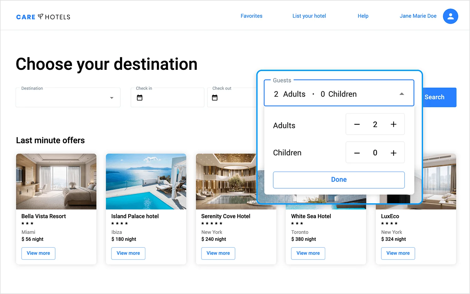
Justinmind’s hotel booking website template showcases a simple and aesthetically pleasing design that is also very user-friendly. At the top, the term guests is easily observable, as well as the current selection of 2 Adults – 0 Children.
The menu can be extended, as indicated by the small arrow icon. Upon clicking, the menu displays two distinct fields labelled “Adults” and “Children,” each with “-” and “+” buttons to modify the quantity of attendees in each group. Users are able to confirm their option and continue the booking process by clicking the “Done” button at the bottom. Simple, chic and effective!
Imagine a beauty wonderland where every product is just a click away. That’s the vision behind the wireframe megamenu for the ACME makeup shop, crafted by Justinmind. This visually stunning menu is more than just a navigation tool; it’s a portal to a world of cosmetics.
The “ACME” logo takes center stage, inviting you to embark on a beauty adventure. As you hover over the “Make Up” category, a sub-menu unfolds like a magical treasure chest, revealing a treasure trove of subcategories: “Face,” “Lips,” “Makeup Removers,” “News,” “Eyebrows,” “Nails,” “Accessories,” “Offers,” “Eyes,” and “Palettes.” A captivating placeholder image on the right side hints at the exciting products that await.
But this menu is not just there for eye candy. It’s designed with functionality in mind, featuring clear categorization, quick access, and a search bar for those who know exactly what they want. With a single click, you can dive into the world of lipsticks, eyeshadows, and more, making your shopping experience a delightful and efficient one.

A helpful sidekick is always ready to lend a hand. That’s the role of the dropdown menu in the bootstrap helpdesk wireframe designed by Justinmind. With a single click on the user avatar icon, a world of support unfolds.
From “View profile” to “Close session,” the menu offers a personalized toolkit for navigating the platform. Need help? A click away. Want to report a bug? Just a few taps. The design is clean and uncluttered, ensuring that every option is easily accessible and instantly understandable.
This menu puts the user in control, allowing them to customize their experience and find answers whenever they need them. It’s the ultimate helpdesk hero, always ready to lend a hand and make your journey smoother.

Picture a trail of delicious breadcrumbs leading you straight to your dream furniture piece. That’s the magic of the breadcrumb design in the furniture webshop template crafted by Justinmind.
A simple yet powerful navigational tool, the breadcrumb is your guide through the labyrinth of furniture options. The home icon marks the starting point, and each “>” symbol represents a step closer to your desired destination. From the homepage to the “Collection” category and finally to the “Furniture” subcategory, the breadcrumb leaves a clear trail, ensuring you never feel lost.
With its minimalist design and intuitive functionality, the breadcrumb is your path to furniture bliss, guiding you effortlessly to the perfect piece for your home.

Step into a world of words with the slide menu design for the online bookshop template crafted by Justinmind. This visually stunning menu is more than just a navigation tool; it’s a literary showcase.
The top section, bathed in a dark hue, presents the main navigation options: “Books,” “Authors,” “Events,” and “Pricing,” inviting you to explore the shop’s offerings. But the real magic lies in the bottom section, where two featured books take center stage. “The Flowers of Evil” by Charles Baudelaire and “Why the World Does Not Exist” by Markus Gabriel are showcased with captivating images and brief descriptions, enticing you to delve deeper into their pages.
This slide menu is more than just a way to navigate; it’s an invitation to discover new worlds, meet fascinating authors, and find your next favorite read. It’s a literary slide show that will leave you eager to explore the shelves of this online bookshop.

The footer menu on the restaurant landing page, crafted by Justinmind, is more than just a collection of links; it’s a culinary masterpiece of design. The “The Culinary Heaven Group” logo, a beacon of culinary excellence, takes center stage, inviting you to explore the restaurant’s offerings.
To the right, a subtle yet essential array of links awaits: “Terms and Conditions,” “Privacy Policy,” “Cookies Policy,” and “Cookies Settings.” These links are not just legal necessities; they’re a testament to the restaurant’s commitment to transparency and customer satisfaction.
The design is a perfect blend of elegance and functionality, ensuring that essential information is easily accessible without detracting from the overall aesthetic. It’s a footer that leaves a lasting impression, reflecting the same attention to detail and quality that you’ll find in the restaurant’s cuisine.

The side navigation bar of the Angular HR web app, crafted by Justinmind, is your trusty machete in the jungle of HR tasks. With its clean design and intuitive layout, this menu is a breeze to navigate.
The side navigation bar offers a clear path of options, including “Home,” “Calendar,” “Files,” “Companies,” “Tasks,” and “FAQ.” Additionally, the “Views” and “Holidays” sections provide dropdown menus with various options, such as different calendar views and leave management tools.
And when you’re ready to customize your experience, the “Settings” option awaits, your personal toolkit for tailoring the app to your needs. This navigation bar is more than just a menu; it’s your guide through the HR jungle, ensuring you always stay on track and find what you need when you need it.

The tabs menu on the online florist template, crafted by Justinmind, is a visual treat for the eyes. The “Flower Obsession” logo, a delicate flower bud, invites you into a world of floral beauty.
The main navigation options, “Home,” “Inspiration,” “Shop,” “Contact,” and “RSVP,” are presented in a clean and uncluttered manner, guiding you through the florist’s offerings. The highlighted “Inspiration” tab promises a feast for the senses.

As you explore the sub-menu, “Home,” “Weddings,” “Events,” “Bouquets,” and “Christmas” beckon, each offering a glimpse into the florist’s expertise. The design is a perfect blend of elegance and functionality, ensuring that you can easily navigate through the website and find the inspiration you need for your floral arrangements. It’s a menu that’s as beautiful as the flowers it represents!
Design and prototype website navigation with Justinmind. It's free!
NKI is a studio that specializes in visual effects: CGI, animation and VFX, located in France. Due to the sheer awesome nature of their business, one would already have high expectations for the visuals one experiences on their website – and NKI lives up to the task.
The website navigation itself is innovative and almost game-like: full screen navigation, using scrolling to change screens. You get a feel of their personality, in the way that users experience something different, something exciting.

We are fans, particularly, of the Works screen where we can find their previous projects. Users see a grid of images, and when they try to click on one, he or she will find that the screen uses the cursor for navigation too. This unexpected treat makes looking at their previous work entertaining, and awakens a desire to explore.
Unconventional? Absolutely. But does it work? Oh yes, it does. It makes people want to look around and find more cool things about the website navigation itself – an achievement many ecommerce websites would kill for.
Great things don’t have to be complicated. VERK shows us just how powerful keeping things to the point can be – the clean lines and white space on each screen gives users nothing to get distracted or confused by.

Users are faced with a brief navigation bar on the top of the screen, that holds the two major categories of products VERK carries: watches and watch straps. We also have a modern hamburger-like menu that stands out while still being recognizable. Aside from a couple more screens that aim to introduce the brand and their philosophy, that’s the entire website.
Users also have a sitemap in the footer that holds every page of the website that might interest the user. Even with the footer, Verk does a great job at making sure navigation is a breeze when it comes to ecommerce. Users have the freedom to stroll around, while not having too many options that would warrant concern of the paradox of choice.
Among the website navigation examples, Petersham Nurseries stands out for its two navigation bars at the top of the screen – plus the navigation bar footer.
We love that the visual aspect of the navigation controls are such a direct hit on the personality of the brand – the thin green lines makes us feel like the smells of a garden are invading the office. But on a more functional level, we appreciate that the two navigation bars at the top are clearly differentiated: one for new customers and one for members.

The expandable menu that opens from the second top navigation bar is a good example of navigation design at work. It’s simple, well organized and covers all the important spots in their website. That means that a user who wants to see the homepage of the store and a user who seeks tableware can reach their destinations within the same time-frame: one click.
We particularly like the categorization of their big, expandable menu. Labelling pages and items is one of the most challenging aspects of navigation design. A big factor behind that difficulty is the idea that one item can belong to two categories.
Petersham Nurseries established a clear hierarchy among categories, and includes the same sub-category in more than one category.
Simply go to their expandable menu, and see how you have “Decoratives” under “Homewares”. You also have another “Decoratives”, however, under “Uniques” – which means some decoratives are unique pieces while others are not. And more importantly, users can reach one or the other directly, depending on what they are after.
This design agency is a wonderful website navigation example. Folks over at Punk Ave delivered a great navigation bar at the top of all screens in the website. It doesn’t just have the main concept, but also a very brief description on what users will find in each screen.
Even better when it comes to user orientation: the secondary navigation bar comes up just below the header of the screen. For the “Our work” page, for example, users will find several other subcategories listed – depending on what kind of work users would like from Punk Ave.

The interactions are discreet but noticeable due to the bright colors at work. Animations are short and oriented towards adding to the navigation experience, in a subtle way.
The website itself is small, which means there was a small number of actual pages that designers needed to account for when creating the navigation design. Punk Ave is, however, a wonderful website navigation example for companies who don’t have hundreds of items or categories.
It’s not about getting as many pages as possible on that navigation bar – it’s about making every page there count.
Navigation design is not easy – and it doesn’t get any easier when you have hundreds and hundreds of items or pages to account for. Hence, why navigation design in big websites like Amazon serve as points of reference: because it’s tough to get it right. That is why we decided to include POLITICO in our list of website navigation examples.
The cool thing about the navigation design in POLITICO is their expandable menu. It occupies the entire screen and holds no visual distractions. Instead, users have straightforward groups of categories to the most important corners of the website. POLITICO has an enormous amount of content, which makes their navigation all the more impressive.

Users can find content based on the topic, the area, the author… The true challenge here is to offer users enough options that they can find the area of content they like or want – much the way Amazon would want shoppers to find the right category for that item they need.
And so, it’s a wonderful idea to offer not just top categories such as “Defense” or “Trade” – but to also keep a flexible stance on the menu. “2020 elections” is a top category which is likely to disappear after the elections – but it’s sure to be a crowd pleaser until then.
Dataveyes has one of the most known website navigation examples out there. They have quite a following for the design of their website and it’s no wonder why: it ticks all the right boxes. It’s innovative while not being confusing and is very visual with a touch of scientific charm.
This website navigation example has a classic element such as the navigation bar at the top, but also unconventional elements.

For instance, on the homepage users have the option to click an arrow that initiates an introduction to the agency and their philosophy – to let the data talk, and translate it into experiences. By clicking the small arrow or simply scrolling, users go through pages that have wonderful visuals and animations that are all but hypnotizing.
ETQ is all about white lines and the minimalist vibe. Users will find that their eyes are naturally drawn to the items on the page, guided by the negative space all around their screen. Following the same style as the rest of the website, ETQ delivers a straightforward navigation experience that doesn’t take away from the larger experience at hand: shopping.
This website navigation example uses a navigation bar at the top of the screen as a highway to the reduced number of categories. The result is that the navigation bar leaves plenty of negative space – even with the expandable menu users see once they hover over the bar.
Read more on minimalist websites in our post.

Another interesting detail about navigation on the ETQ website is their product page. In a similar way to Amazon, ETQ carries out cross-selling in a smooth way users won’t even notice.
Under “You might also like”, users find 3 different products that somehow relate to the main product on the page. It’s subtle, and allows users to reach these additional suggestions in a natural way. No pressure, huh?
We love that in all their simplicity, ETQ managed to find a voice. The very idea behind the brand is making products that aren’t covered in branding – so why should their website be covered in visuals?
This website navigation example is also simple in its structure – but its done beautifully. Made for a creative agency based in San Diego, the Alfa Charlie website is all about elegance and interactions.
The homepage itself works as an introduction to the agency, with a burger menu on the top right. The burger menu icon itself doesn’t have any interaction, but once users open the menu, it’s all about the interaction. The menu opens to take up the entire screen, with the four more important pages listed to the right.

Here is the cool part: not only does the screen change as the user hovers over the different links, but the cursor itself works as a progress bar to show how far down the user is. The cursor works the same way throughout the website. The state of the links change and it works, not just to add clarity for the user, but to also add on to the personality of the website.
This burger-making company is a wonderful website navigation example. The Good Burger (TGB) managed to deliver something that is both functional and oozing with personality at the same time. It ticks all the right boxes: it’s interactive, easy to learn, unique and enjoyable – that is, if you enjoy a sudden craving for a burger.
The homepage has a burger menu icon that includes the top part of the bun – which in itself is awesome. Once users open the expandable menu, they are greeted by 5 different links to the most crucial pages. The interaction and visuals as users hover over the different options makes the entire navigation process entertaining and memorable.

Our favorite aspect of the navigation design in this example, however, is their “Menu” page. It lists all the categories of products TGB offers, but with a twist: horizontal scrolling, complete with illustrations and interactions. It’s smooth, easy and offers a pleasant surprise when users would expect a grid or a usual list with regular scrolling.
We also love that when users are looking at a specific product page, they are also offered a navigation bar on the left side of the screen that expands. Even when it’s not expanded, the icon of the category in question has its own progress bar to give users an idea of how much of the menu they have seen. Great idea!
Design and prototype website navigation with Justinmind. It's free!
Wood fire grill Gusto! Is quite the website navigation example. Their website is bright, colorful, friendly and everything the restaurant itself represents. It showcases not just the food but also the people who work to make that happen – it’s like a complete overview of the company.

Their “Menu” page navigation design is quite interesting. It works as a walkthrough of the menu where users build their order step by step: beautiful shots of the food combined with parallax scrolling. The interactions make the pages dynamic, even if they are subtle.
Not only does it include a burger menu icon on the top right of the screen, it also has a footer with all the same links we’d find on the expandable menu – along with a few more such as social media links.
Terra Outdoor is a fantastic website navigation example because of its clear and organized design. It uses a drop-down navigation menu that lets users easily browse listings by product groups, materials, and collections.

This structure makes sure that users can find what they’re looking for without any hassle. When a user clicks on a category, the products are further sorted into subcategories, making the browsing experience intuitive.
Additionally, the site offers filters to help visitors refine their search, ensuring they quickly find exactly what they need.
Airbnb’s website navigation is a perfect example of how to handle a large amount of content without overwhelming the user. The primary navigation bar is sticky and always visible at the top, offering quick access to the main sections such as “Places to Stay”, “Experiences”, and “Online Experiences”.
The search bar is prominently placed, encouraging users to start their journey by searching for what they need.

Amazon’s navigation design is one of the best website navigation examples, perfectly suited for handling a vast range of products and categories. The top navigation bar includes links to the most popular categories, making it easy for users to find what they need quickly.
On the left side, a detailed sidebar offers more specific categories and subcategories, helping users narrow down their search. One of the best features is the mega menu, which shows many options at once without overwhelming the user.

This layout makes Amazon one of the easiest websites to navigate, as users can see a lot of information at a glance and find exactly what they are looking for efficiently.
Apple is always famous for its simplicity and elegance, and their website is no exception and extends to its navigation design. At the top of the page, there is a minimalistic navigation bar that includes key sections like Mac, iPad, iPhone, and Watch.
When users hover over each of these sections, a drop-down menu appears, showing specific products and services. This makes it easy for users to find what they need without any confusion.

The clean design and intuitive layout make Apple’s website one of the best examples of easy-to-navigate websites. The use of white space and high-quality images adds to the overall user experience, making the website not just functional but also visually appealing.
Design and prototype website navigation with Justinmind. It's free!
Rapha’s website navigation example is great as its structure strategically guides users through their main product categories. The bold visuals and clear, concise white hyperlinked headings make it easy for users to shop and browse sales.

The design features a visible search function and a prominent navigation menu at the top right of the screen. Breadcrumb navigation at the top allows users to easily go back to previous category pages. This combination of elements creates a smooth and intuitive shopping experience.
The Mercedes-Benz website gives us a great example of easy-to-use navigation through its well-organized drop-down menu. At the top of the page, there is a prominent navigation bar with links to key sections.

Hovering over these links reveals a drop-down menu that displays specific subcategories and models, making it simple for users to find the exact information they are looking for. The site also includes a visible search bar for quick access to specific content, and breadcrumbs at the top help users easily navigate back to previous sections.
This structured and user-friendly navigation makes exploring the vast range of Mercedes-Benz offerings straightforward and enjoyable.
The What Is Missing website makes exploring content fun and engaging. The top navigation bar is simple, with sections like About, Projects, and Get Involved. When you hover over these links, cool visual effects highlight your choices, making navigation more interactive.

The drop-down menu gives easy access to more detailed subcategories, ensuring you can find what you’re looking for quickly. There’s also a search bar at the top for quick access to specific content. This engaging design makes What Is Missing one of the best website navigation examples for an interactive user experience.
If we talk about engaging and elegant navigation, Cartier’s example is one of the best. The top navigation bar includes key sections like Jewelry, Watches, and Gifts. When you hover over these sections, a sleek drop-down menu appears, showing different subcategories.
This makes it easy for users to explore and find products. The search bar is also prominently placed, making it simple to locate specific items quickly. This blend of beautiful design and user-friendly features makes Cartier’s site a prime example of effective and luxurious website navigation.

Uber app is a good example of a great hamburger menu. At the top right of the screen, you’ll notice the familiar three-line icon. When you tap it, a menu smoothly slides out from the side, displaying options like “Sign In,” “Register,” “Ride,” and “Drive.”

These options are clearly labeled, making it easy to find what you need. The design keeps the main screen clean and focused on booking rides. This simple yet effective navigation helps users get where they need to go quickly and without confusion. Uber’s hamburger menu shows how to make navigation easy and user-friendly.
Our last example nails the minimalist drop-down navigation; Nike’s website. At the top, you’ll find simple categories like “Men,” “Women,” “Kids,” and “Sale.” Hover over these, and a clean, organized drop-down menu appears, showing subcategories and popular items.
It’s straightforward and keeps the main page tidy, making an easy to navigate website. The drop-downs are easy to navigate, helping you quickly find what you need. Nike’s sleek design makes browsing a breeze and shows how effective drop-down navigation can be.

Clear and intuitive website navigation is a key factor in user experience and search engine optimization. Here are some recommended best practices to make sure your website’s navigation is both user-friendly and effective.
Simplifying your navigation helps users find what they need quickly. To prevent overloading your visitors, limit your primary navigation menu to seven items. Avoid using dropdown menus excessively, but if necessary, use a mega menu to categorize links clearly.
Make sure your navigation is easy to find and read. Place the main menu at the top of the page where users expect it. Use contrast to make the navigation stand out against the background. For mobile sites, the hamburger menu is a recognizable and effective solution.
Label links clearly to show exactly what each page is about. This is helpful for both visitors and for showing up in search results.
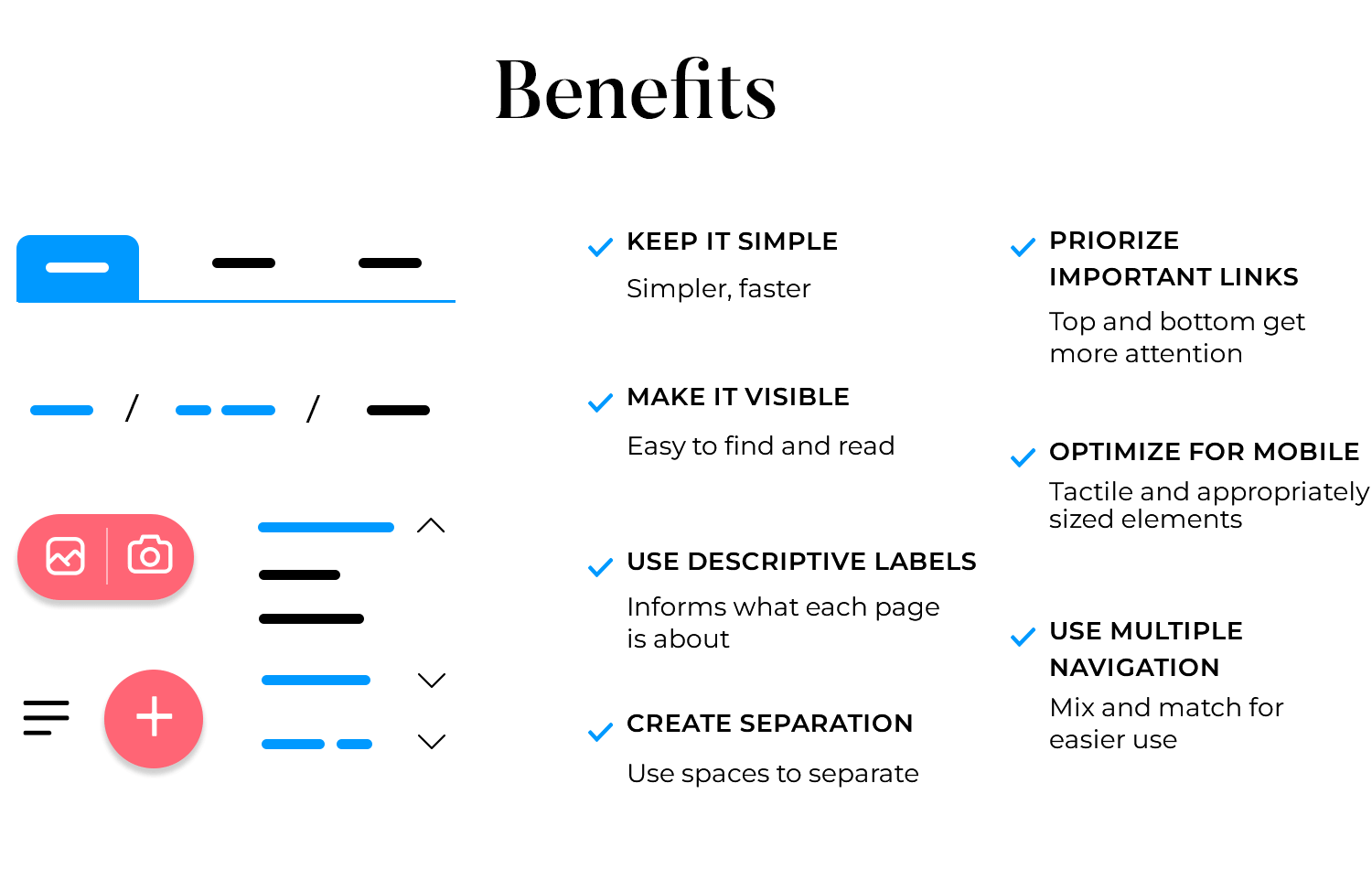
Use whitespace effectively to separate navigation elements from other content. This helps users easily distinguish the navigation from the rest of the page and reduces cognitive load.
Place the most important links at the top and bottom of your navigation menu, as these positions get the most attention. Typically, the first link is your home or services page, and the last one is a call to action like contact or checkout.
With the increasing use of mobile devices, make sure your navigation is mobile-friendly. Use touch-friendly elements and ensure that links are large enough to tap easily. The hamburger menu is an effective solution for mobile navigation.
Mix and match different ways for users to get around your site. Top menus, footer menus, sidebars, and breadcrumb navigation designs all have their own jobs and can make your site even easier to use.
To create a user-friendly website, it’s important to have a well-designed navigation system. At Justinmind, we offer a variety of UI components that can help you create a seamless navigation experience for your users. Let’s take a look at some examples and specifications for each component.
Design and prototype website navigation with Justinmind. It's free!
Top navigation bars are a common and user-friendly feature found at the top of most websites. They provide a quick and easy way to access the main sections of a website, including Home, About, Services, and Contact. The website button design should be minimalistic yet compelling enough to ensure easy navigation, enhancing both the aesthetics and functionality of the site.
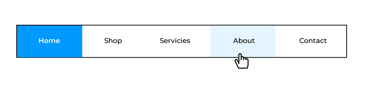
- Position: Fixed at the top of the page.
- Content: Logo on the left, main links centered or right-aligned.
- Style: Minimalistic design with clear, readable fonts and high contrast.
- Interaction: Links change color on hover to indicate interactivity.
Side navigation bars provide an alternative to top navigation, especially useful for content-heavy websites. They are typically placed on the left side of the screen.
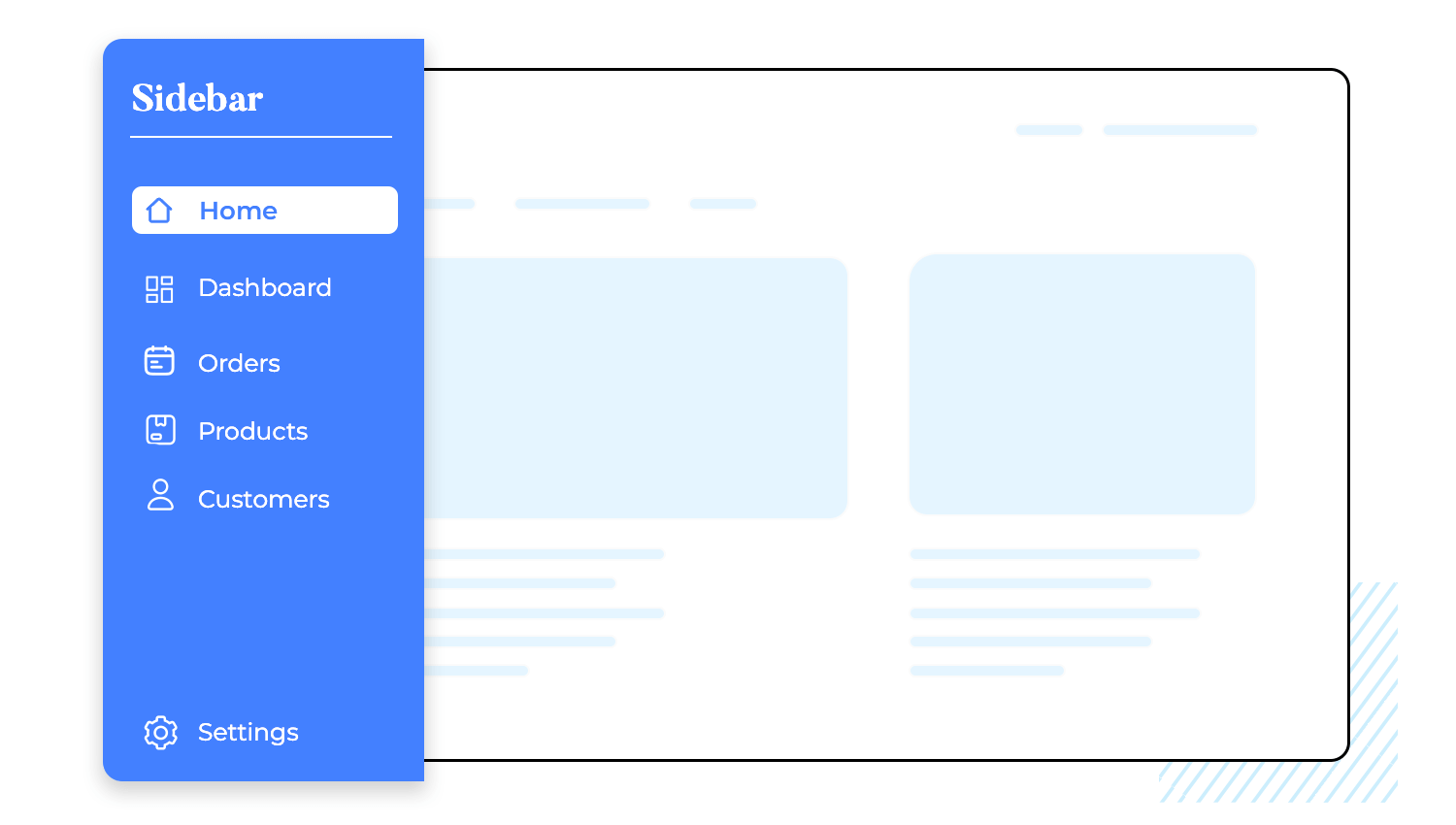
- Position: Fixed on the left side.
- Content: Vertical list of links.
- Style: Collapsible/expandable sections for subcategories.
- Interaction: Subcategories expand/collapse on click.
Hamburger menus are common in mobile design but can also be used on desktop sites to save space.
- Icon: Three horizontal lines.
- Interaction: Expands to show menu items on click.
- Style: Simple and intuitive design for easy access.
Mega menus offer a big picture of what the site has to offer, great for websites with many categories.

- Layout: Grid format with categorized links.
- Size: Full or half screen on hover/click.
- Interaction: Sections highlighted on hover for clarity.
Dropdown menus provide secondary navigation options within the main navigation.

- Trigger: Hover or click on parent item.
- Style: Consistent with the main navigation bar.
- Interaction: Smooth dropdown animation for a seamless experience.
Breadcrumbs show you where you are on a website and how you got there. It’s like leaving a trail of digital crumbs so you can find your way back.

- Structure: Linear trail of links.
- Placement: Typically below the main navigation bar or header.
- Style: Small, unobtrusive links that blend with the page design.
Footers provides additional navigation and important links, such as contact information and legal notices.

- Content: Links to site map, privacy policy, terms of service, and contact.
- Style: Minimalistic with clear typography.
- Interaction: Links change color on hover for accessibility.
FABs are eye-catching buttons that offer users a shortcut to the most important actions on a screen.

- Position: Floating at the bottom right corner.
- Style: Circular with an icon, elevated with a shadow.
- Interaction: Button expands or animates on hover/click.
Search-centric navigation components help users quickly find specific content.

- Placement: Prominently placed in the header or as a floating element.
- Functionality: Includes autocomplete and suggestion features.
- Interaction: Real-time search suggestions as the user types.
Design and prototype website navigation with Justinmind. It's free!
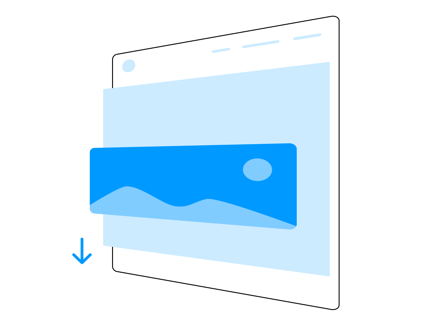
Parallax scrolling makes websites feel more lively by moving background and foreground images at different speeds.
- Implementation: CSS and JavaScript.
- Effect: Background and foreground images moving at different speeds create a feeling of depth and make websites more engaging.
Tabs are buttons, typically located at the top of a page, that allow users to easily switch between different sections of content. They are a great way to organize information in a small space and help prevent users from having to navigate away from the page.
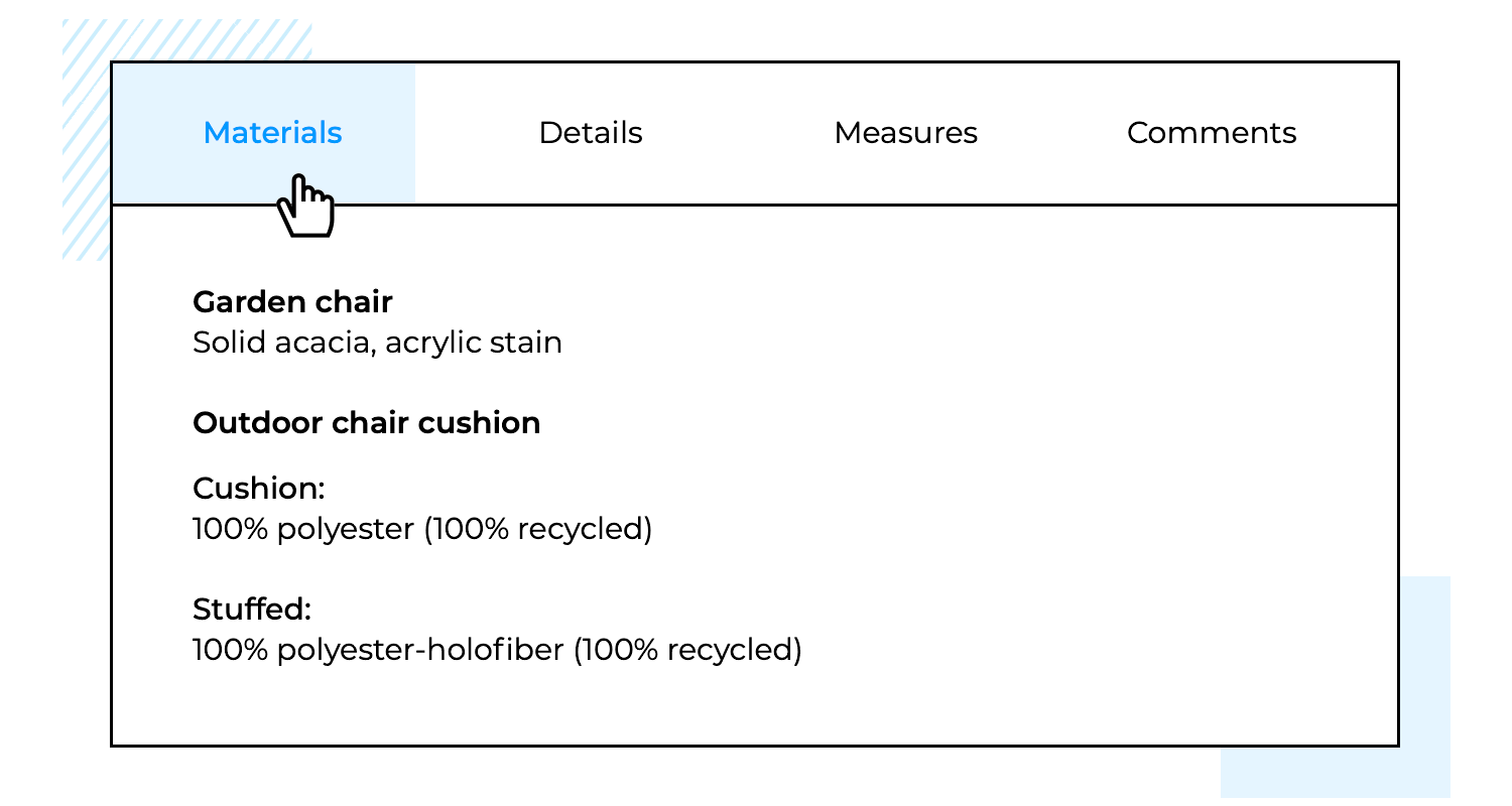
- Position: Usually at the top of the content section.
- Style: Clearly defined tabs with labels.
- Interaction: Content changes on click, with the active tab highlighted.
Carousels or sliders are a popular way to showcase multiple pieces of content (like images or text) within a limited area on a website. They let users easily browse through the content, one item at a time, often with arrows or dots for navigation.
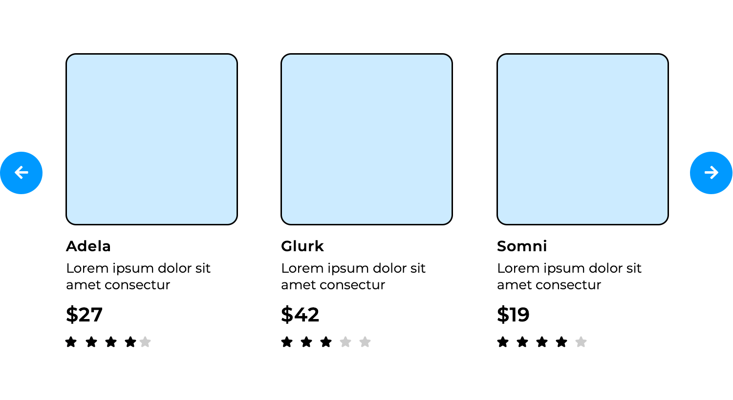
- Position: Typically in the hero section or within content.
- Style: Panels with navigation arrows or dots.
- Interaction: Auto-scroll or manual navigation through arrows/dots.
Pagination breaks large amounts of content into smaller pages for easier navigation.
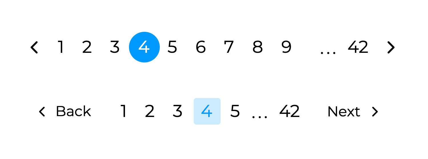
- Position: At the bottom or top of the content list.
- Style: Numbered links with next/previous buttons.
- Interaction: Clicking a number or button loads the corresponding page.
Incorporating these UI components from Justinmind’s libraries into your website design will enhance user navigation and overall user experience. For more detailed specifications and examples, explore our comprehensive UI library on the Justinmind website.
Navigation design is key in any website. Even though it will largely depend on what kind of website or the amount of pages the website needs to have – there is a clear feel to a successful navigation design. Most users won’t be able to pin out exactly what makes a navigation design good, but they would be able to recognize it when they experience it.
Getting it right is a must. Yes, getting it right can be quite challenging but hopefully with this list you’ll find yourself with ample inspiration! And remember: navigation design is closely connected with other aspects of the website, such as information architecture or interaction design.
Related Content
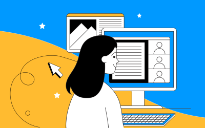 Learn how to design better e-learning platforms with user-centered UX principles, real examples, and high-fidelity prototyping tips to boost engagement and learning outcomes.13 min Read
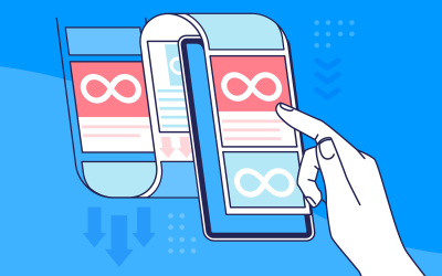
 Infinite scroll keeps users engaged, but it’s not always the best choice. This guide breaks down when to use it, when to avoid it, and how to design it right.14 min Read
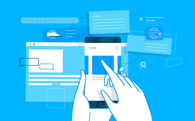 Learn how to design web and mobile app prototypes, how to test them and what to look for in a prototyping tool in this complete guide.15 min Read


