Navigation design is about creating a system that empowers your users to interact with and use your product. This is everything you need to know
There is a lot of talk in the UX design community about UX being ‘invisible’. What people generally mean by that is designers should be crafting UX that goes so smoothly that the user barely notices that they’re having an experience.
Design and prototype web and mobile navigation with Justinmind. It's free!

Since we’re still light years away from a no interface world, designers still have create and design useful, intuitive and coherent navigation for their users. In this post, You will learn the basics of navigation UI design, common navigation patterns, prototyping your own navigation and just what makes navigation great. Let’s go!
Navigation design involves creating, analyzing, and implementing ways for users to navigate through a website or app. Effective navigation design is central to good UX as it directly impacts user interaction and product use. It helps users move from point A to point B (and beyond) with minimal frustration by employing UI patterns such as links, labels, and other elements to provide relevant information and facilitate easier interactions.
Easy-to-use navigation is key. Confusing menus and hard-to-find pages frustrate users and drive them away. That’s why good navigation is so important for a positive user experience. Here’s why:
- Enhances understanding: Good navigation guides users effortlessly through your product, making it a breeze to find what they’re looking for and achieve their goals. This seamless experience is key to keeping users engaged.
- Builds confidence: When paths are clear and menus are simple, users feel more comfortable and confident navigating your product. This ease of use encourages them to explore more.
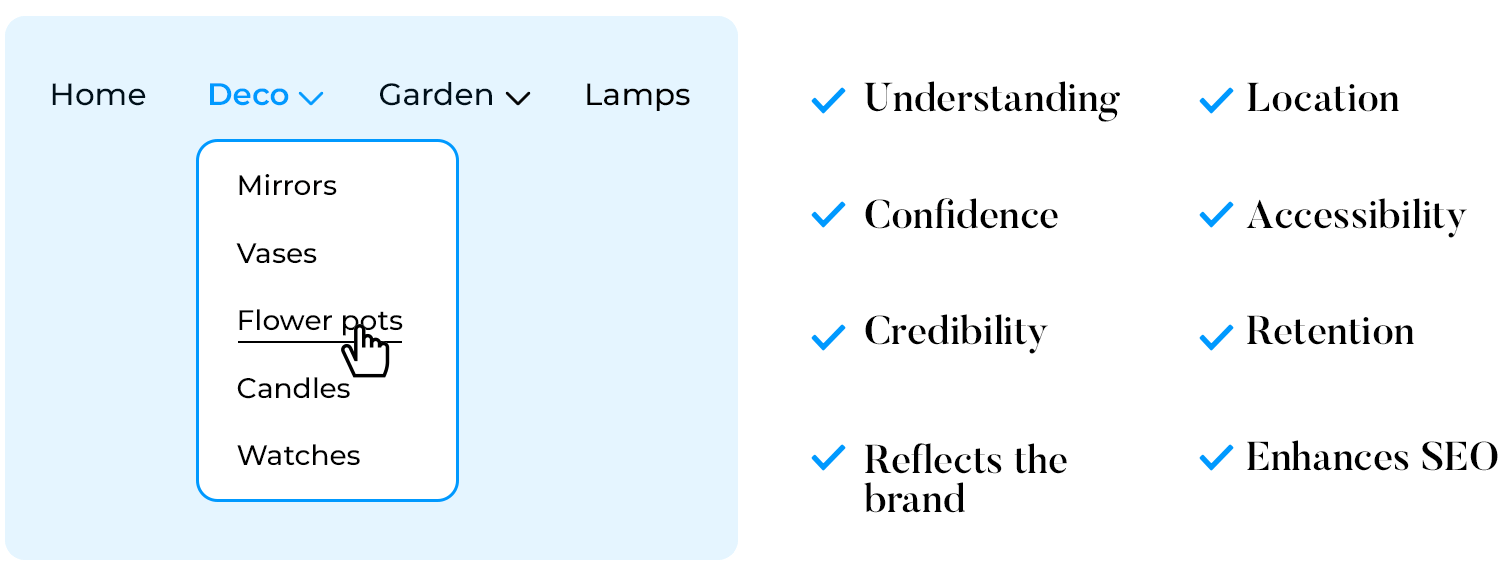
- Provides credibility: Smooth navigation doesn’t just help users; it also adds a touch of professionalism and trustworthiness to your product, showing that you care about their experience.
- Reflects your brand: A clear, easy-to-use design creates a great first impression, helping to build a strong brand identity. Users will associate your brand with quality and attention to detail.
- Tells users their location: Think of navigation as a map that shows users where they are and how to get to other places. This reduces frustration and helps users feel more in control.
- Supports accessibility: Inclusive navigation design is crucial. It ensures that everyone, including users with disabilities, can effectively use your product, broadening your audience and promoting inclusivity.

- Improves user retention: When navigation is easy, users can achieve their goals smoothly and are more likely to return to your product. This repeat usage is essential for long-term success.
- Enhances SEO: Finally, well-organized navigation helps search engines understand and rank your site better, improving visibility and driving more organic traffic your way. This not only boosts your audience but also strengthens your online presence.
Now, let’s dive into the different design patterns you can use to create effective navigation.
Navigation design offers many different styles to help people use your product. Each style solves common problems in its own way. Some common navigation design patterns include:
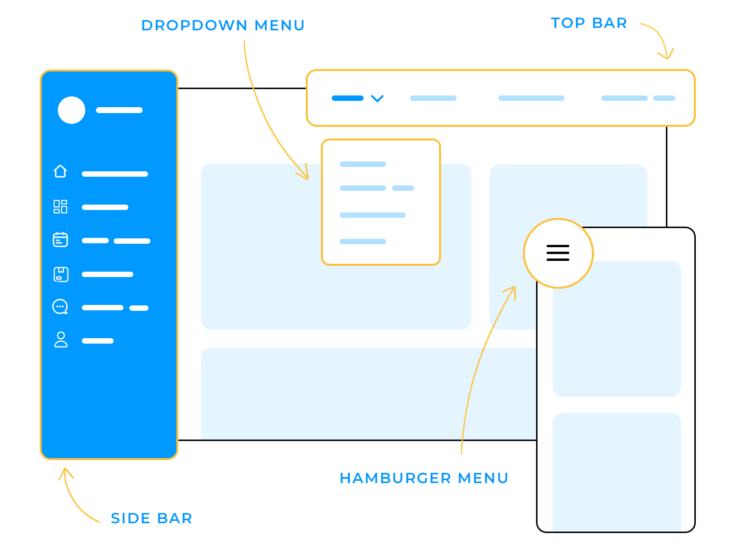
- Top bars: Great for simple websites with just a few main sections.
- Side bars: Perfect for complex websites with lots of different areas.
- Dropdown menus: Keep similar items organized together.
- Hamburger menus: Save space on mobile devices.
There’s no pattern better than others, it just depends on your specific product and your users. Experimenting with different styles helps you find the perfect fit to make your product easy to use and successful.
For those considering alternatives, you can explore modern options to the traditional navigation tree.
The best way to design navigation is to focus on the user. This means always thinking about what the people using your product want and how they act. By doing this, you can make navigation feel easy and natural. This involves:
- User research: Learn about your users’ needs, what they like, and how they behave.
- Usability testing: Ask real users to try out your navigation and see if it’s easy to use.
- Iterative design: Keep improving your navigation based on what you learn from users and tests.
Ideally, you want to approach navigation from a user-centered design perspective.
Check out our full guide to designing your own information architecture and see how to build your designs from the ground up.
To improve your navigation design, try these tips:
- Keep it simple: Start by using clear labels and grouping related items together. This way, users won’t feel overwhelmed by too many options.
- Be consistent: Make sure your navigation looks and works the same way across all pages and devices. Consistency helps users know what to expect no matter where they are on your site.
- Design for all devices: It’s essential that your navigation is easy to use whether someone is on a computer, phone, or tablet. A seamless experience across devices keeps users happy and engaged.
- Use visual cues: Use size, color, and spacing to guide users’ attention to key elements. These visual cues help users quickly find what they’re looking for.

- Test, test, test: Continuously test your navigation with real users. Their feedback is invaluable for making adjustments and improvements.
- Offer options: Finally, provide multiple ways for users to find information, like search bars, menus, and links. Different users have different preferences, so offering options ensures everyone can navigate easily.
Collectively, Apple and Android’s app stores are home to over 5.5 million apps. Every single one of those apps will have its own navigation design built right into it.
Whether it’s in the form of a breadcrumb menu, a dropdown or tabs, every product needs to have a user flow that a person can navigate to achieve their goals.
Without well thought out navigation, your user may have trouble using your product and abandon you altogether. The reason that navigation design is so important is because it is a method by which your user is able to explore and enjoy your product.
As Alan Cooper highlighted way back in his 2001 article Navigating isn’t Fun:
“A well-designed business program must make its structure and organization as clear as possible. Users don’t want to waste time solving the mystery of where resources and information are hidden.”
The same principle applies to navigation design on the web and in apps. Without a good navigation system in place, users will struggle and leave, possibly never returning.
Design and prototype web and mobile navigation with Justinmind. It's free!
There exist many mechanisms to help users navigate. Many products will use a combination of these mechanisms in their designs because some patterns work better depending on the circumstances at hand.

For example, a breadcrumb menu might be useful for an ecommerce website with a large number of sub-categories which are structured in a hierarchical manner.
Whereas something like a tag cloud would not be suitable here – although, the jury is still out whether tag clouds are ever suitable.
What other navigation patterns are there? Aside from search, let’s take a quick look at some of the most common navigation design patterns for desktop and mobile. It’s also worth mentioning that many designers are now using dropdown menus as a means of navigation as well, but that comes with certain risks to the usability of the product.
Description: The hamburger menu is often found on mobile, although it is increasingly becoming popular with desktop. The hamburger menu icon is 3 lines and can be clicked or tapped to reveal more navigation options.
Best for: Mobile applications and websites with limited space.
Example: Mobile apps, responsive websites.

Hamburger menu (left) and Tabs (right)
Description: Horizontal tabs at the top of a page or section that switch between different views or sections.
Best for: Content that can be categorized into different sections.
Example: Settings pages, profile sections.
Description: A vertical bar on the left or right side of the screen with links to main sections or sub-sections. Displays a list of global navigation links and can include primary, secondary, and tertiary navigation levels.
Best for: Applications with many sections or complex hierarchies. Helpful when the user already has a lot to digest on the screen, such as in dashboard designs.
Example: Dashboard applications, content management systems.

Vertical navigation menu
Description: Buttons used to persuade, motivate, and move your audience into an action, whether it’s a sign-up, a purchase, or a download.
Best for: Websites aiming to drive specific user actions.
Example: Ecommerce sites, landing pages.

A prominent call to action button
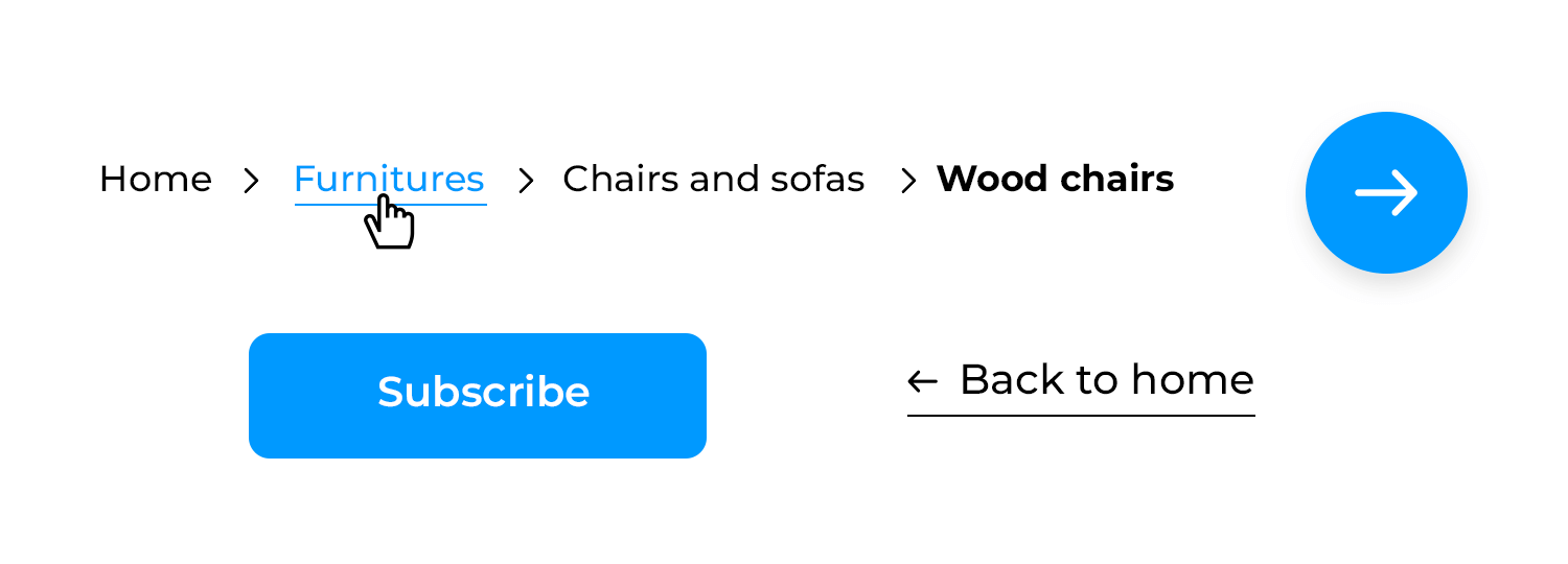
Description: A trail of links showing the user’s path from the homepage to the current page.
Best for: Websites with deep hierarchies to help users understand their location.
Example: Ecommerce sites, documentation sites.

Breadcrumb menu on Walmart's website
Here are your tips for getting breadcrumb navigation right.
Description: A horizontal bar at the top of the screen containing links to the main sections of the site.
Best for: Websites with a small to moderate number of top-level navigation items.
Example: Company websites, blogs.

Description: A vertical bar on the left or right side of the screen with links to main sections or subsections.
Best for: Applications with many sections or complex hierarchies.
Example: Dashboard applications, content management systems.

Description: Links placed in the footer section of a webpage.
Best for: Secondary navigation options or when space is limited in the main navigation.
Example: E-commerce sites, blogs.

Description: A large, expandable menu that displays multiple links and sometimes content like images and descriptions.
Best for: Websites with many categories and subcategories.
Example: E-commerce websites, news portals.

Description: A menu that appears when a user hovers over or clicks on a link, revealing sub-navigation items.
Best for: Providing access to secondary options without cluttering the main navigation.
Example: Corporate websites, online services.

Description: Navigation bars that remain fixed at the top of the screen as the user scrolls down.
Best for: Ensuring navigation options are always accessible.
Example: Blogs, long-form content sites.

Description: A navigation menu that takes up the entire screen, often triggered by a button or icon.
Best for: Sites with a visually immersive experience or when primary navigation needs emphasis.
Example: Portfolio websites, interactive experiences.

Description: Uses a grid of cards, each representing a different section or link.
Best for: Visually driven interfaces or content-heavy sites.
Example: News sites, online galleries.

Description: A circular button that hovers over the content and provides quick access to a primary action or menu.
Best for: Mobile applications with a primary action that users frequently perform.
Example: Email apps, task managers.

Description: Makes the search bar the most important way to find things, often with filters and categories to help narrow down the results.
Best for: Content-heavy sites where users are likely to search for specific items.
Example: E-commerce sites, knowledge bases.

Description: Navigation options that appear based on user context or specific actions.
Best for: Complex applications where navigation needs change based on user tasks.
Example: Editing software, project management tools.

Description: A list where each item has a title you can click to show or hide more information.
Best for: Organizing content into sections that you can open and close, particularly on mobile devices.
Example: FAQ sections, help guides.

Description: A menu that’s hidden until you tap a button or swipe your finger, then it slides out from the side of the screen.
Best for: Mobile applications or websites where space is limited and you want to provide a clean interface.
Example: Mobile web apps, modern responsive websites.

Hierarchy: Define the order and placement of navigation elements. Main sections should be easy to find and access, while sub-sections should be logically grouped.
Spacing and alignment: Maintain consistent spacing and alignment to ensure a clean and organized appearance. Elements should be evenly spaced and aligned to create a balanced layout.
Color scheme: Specify colors for different states of navigation elements (normal, hover, active). For example, use a distinct color for active links to show the current page.
Typography: Define font styles, sizes, and weights for navigation text. Use readable fonts and ensure the text stands out against the background.
Icon usage: Provide guidelines for using icons in navigation. Icons should be consistent in size and style, and spaced appropriately from text and other elements.
Button design: Decide how your button design would be.. There should be a clear difference between main action buttons and less important ones. Make sure all buttons are easy to see and use.
Hover and focus states: Specify styles for hover and focus states to enhance accessibility and usability. For example, change the background color or underline text when a user hovers over a link.
Transitions and animations: Set clear rules for how animations and transitions should be used in your navigation. Smooth transitions can make things look better, but they shouldn’t be too flashy or distracting.
Design and prototype web and mobile navigation with Justinmind. It's free!
We know why navigation design is important but what makes navigation design successful? Multiple things contribute to a good navigation system design.
Since it’s a make or break aspect of UX design, these are some ways to make your navigation design better:
Navigation should be clearly labeled and signposted so that users understand where they are and where they can go to.
By using appropriate and familiar copy for your navigation elements throughout your product’s design, your users will feel more comfortable navigating your website. When consistency is maintained and clarity promoted, it makes the navigation easier to comprehend.
For example, a navigation bar will usually link to designated landing pages which are labelled with the right text that makes the most sense.
Making sure that you maintain clarity is even more important when it comes to designing and creating games, which can bring a lot of compressed information into the experience. Learn more about on our post on game UI.

Clearly labeled navigation items bring clarity
If you’re designing the navigation for a museum and you want users to be able to access a landing page dedicated to Collections, then labeling that landing page “Collections” in the navigation bar makes it clear to the user what they can expect from clicking that link.
There are times when you can deviate from convention but when it comes to navigation it’s best to maintain clarity.
Aurora Harley of Nielsen Norman Group found that “past experiences and repeated practice inform user experience and that any deviation from a learned routine can lead to user errors”.
Create clarity in your design with these must-know mobile UI patterns.
Your navigation bar is an opportunity to boost SEO and provide more relevant information to your users.
If you navigate to a website that sells watches and their navigation menu has ‘products’ written in it, is that telling you anything? Not really. People don’t tend to search for ‘products’. It’s a broad, catch-all term.

Meaningful labels help users understand better
Now, what if you read ‘analog watches’ or ‘smart watches’? These are more meaningful, less ambiguous labels because they explain exactly what the user is going to find on that page.
By using more meaningful labels, you’ll improve your SEO because you’re using descriptive language and users are more likely to search for something specific like a ‘smart watches’ rather than ‘products’.
Of course, if you have a dedicated page under your product label for each of those pages and their keywords, good. That’s better than simply having all your products on one page.
We’ve already mentioned that no one navigation pattern is better than the other. However, there are some patterns which perform better or are more usable depending on the context.

Mega menus offer context and links to extra content
Despite their widespread use, drop down menus suffer poor usability. Andy Crestodina writes that avoiding drop down menus is good for two reasons:
- Drop down menus can be difficult for search engines to crawl.
- Drop down menus encourage users to skip important pages.
Mega menus, on the other hand, are more user-friendly because they are:
- Bigger
- Divided into contextual groups
- Visible at once
Mega menus also remove the need for the user to scroll, which users generally hate. Speaking of scroll, why not prototype your own scrolling patterns?
Ideally, good navigation will cater to a primary group of people who have primary goals. User personas are a way of capturing these primary groups.
In a way, when you align your navigation with your user goals, you’re dabbling in reverse engineering. By identifying the needs of your group, you’ll be able to create a navigation that helps them.
How do you identify the needs of your users? You ask questions. Questions, like the ones James Kalbach outlines in Designing Web Navigation:
- How can I quickly find specific information or product I want?
- How do I know that information is up-to-date?
- Is the site’s content trustworthy
- How can I contact the site owner?
- How can I send information I find to people I know?
To make aligning your navigation with your user goals easier, try creating your own user scenarios. This will give you the context and information you need to help align your navigation with your goals.
When you think of navigation, the back button on your web browser might spring to mind. It’s a great feature, saving millions of users from getting lost or going down paths they didn’t mean to. Jakob Nielsen called it the “lifeline of the web user and second-most used navigation feature”.
For a lot of people, that is navigation. But there are plenty of other elements on the screen which can help orient a user and offer them navigational guidance. We’re talking about navigational cues.
Navigation cues, or ‘You-Are-Here’ navigation, are features found on websites and products which aren’t necessarily navigation patterns but are broad design features that complement or enhance navigation.

Navigation cues help anchor the user and give sense of place
Those navigation cues are:
- Your product’s logo and branding
- The title of the tab on your browser
- Visual design changes
- URLs
- Breadcrumbs
- The date, time, icons or tags
All of these cues contribute to creating a calm state of mind for the user as they navigate your product or website.
Prototyping is a valuable UX methodology. Prototyping can help you understand:
- Your product
- The direction of your product
- Your users
- What success and failure means
Your navigation design also plays a big role in achieving those same things for your product.
Prototyping your navigation flow can help you to iron out any chinks in the user flow. With prototyping you can test the navigation design of:
- Your signup flow
- Finding a particular item within your product
- Purchase flows
- Navigation of the entire product
Prototyping gives you the opportunity to try out different navigation designs and test them.
You might think that your product would perform better with a breadcrumb menu but unless you prototype different options and test them, you’ll be making a guess.
Even if your guess is the most informed guess in the world, unless it’s backed by reliable data, there’s still risk. Using data can mitigate that risk.
When creating a design or prototyping a navigation flow, try a prototyping tool that comes with user testing tools already integrated. Tools like CrazyEgg, UserTesting and HotJar. This will not only save you time and money but will enable you to get the data you need with the fewest headaches.
Laura Klein in her book UX for Lean Startups writes that when it comes to testing, you don’t need swathes of people either – simply find 3-5 people and conduct a user testing session.
Eager to start creating awesome navigation patterns? Start with these 5 navigation patterns for great UX.
Designing the navigation for your websites and apps can be simple and effective with Justinmind. Here’s how you can do it.
Justinmind offers a variety of templates to get you started. Choose one that fits the style of your project. Using templates can save time and provide a solid foundation for your navigation design.

Outline the structure of your website or app. This will help you decide how many navigation elements you need and where they should be placed. A clear sitemap ensures that your navigation design is logical and user-friendly.
Use Justinmind’s drag-and-drop feature to add navigation elements like menus, buttons, and links. You can easily customize these elements to match your design style. Additionally, you can create interactive and dynamic navigation using dynamic panels and nav-tab menus.
Define the color scheme, typography, and button styles for your navigation. Make sure that these elements are consistent throughout your project to create a cohesive look and feel. You can also create specification documents to ensure all design elements are accurately implemented.
Add icons to enhance your navigation. Justinmind allows you to include icons that are consistent in size and style, improving the overall usability of your navigation.
Specify hover and focus states for your navigation elements. This improves accessibility and makes it clear to users where they are navigating. Justinmind lets you easily define these states.
Use Justinmind’s interactive prototypes to test your navigation design. Get feedback and make the necessary adjustments to ensure your navigation is intuitive and effective.
There is a lot that goes into perfecting navigation design, and getting it right means it usually has to go unnoticed.
By aligning your user goals, content strategy and navigation design, you’ll be able to create a cohesive and consistent user experience that your users will love.