
Toggle buttons are a classic UI component - but what makes a good toggle button in the UI design? Read on to rediscover an old friend!
Toggle buttons, just like checkboxes, dropdown UIs or radio buttons, are classic UI components that most of us know and love. They can be usually found in settings pages, be it for an overall system or for an app. They seem quite simple at first, but are they?
Design and prototype with fully-interactive toggle buttons

What makes a toggle button usable? Is a toggle button the same as a toggle button? What does a creative toggle UI design look like?
Let’s take a closer look at an element that can be easily overlooked for its simplicity, but that can still surprise some of us upon closer inspection. From the theory of toggles, testing and designing them with a UI design tool, to some truly unique toggle buttons out there – this post has it all.
We’re pretty used to seeing them everywhere, but just what are they truly meant for? A toggle button implies that the user must choose between two mutually exclusive options. Toggles are the digital equivalent of an actual button. When the user presses the button, there’s a brief interaction, with the chosen option taking immediate effect. Nice and easy, right?
If you want to discover more in-depth discussions about components, check out this post on the eternal debate between the radio button vs checkbox.
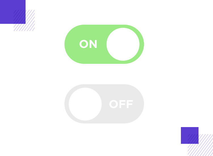
Toggle design can be a bit confusing at first, which is surprising for an apparently simple UI component. Much like checkboxes or radio buttons, toggle buttons can be a misunderstood art. We see them everywhere, including places they shouldn’t be. They represent a potentially easy tool for designers to make users choose an option out of two – but toggle UI design does have game rules.
Design and prototype with fully-interactive toggle buttons
This section gets into the nitty gritty of the best practices to consider when designing toggle UI buttons that are both visually appealing and user-friendly. These key aspects will help you create toggle buttons that add some magic to the UX of your application or website. Let’s dig in!
Consider a real-life light switch. Just imagine how odd it would be to hit the light switch, then having to press a separate button for the lights to actually turn on. A toggle button works as a simple and straightforward UI component because it mimics a real-life one – making it something absolutely anyone can understand and use.
This is why it’s important that your toggle button has an immediate effect. In practice, this means that it should never depend on any “submit” or “save” buttons, acting as a stand-alone control.
A well-designed toggle button should get straight to the point. The idea is to avoid overly complex interactions that might leave users scratching their heads. For desktop and laptop users, a simple click should do the trick, and on mobile devices, consider intuitive swipe gestures for a more natural feel.
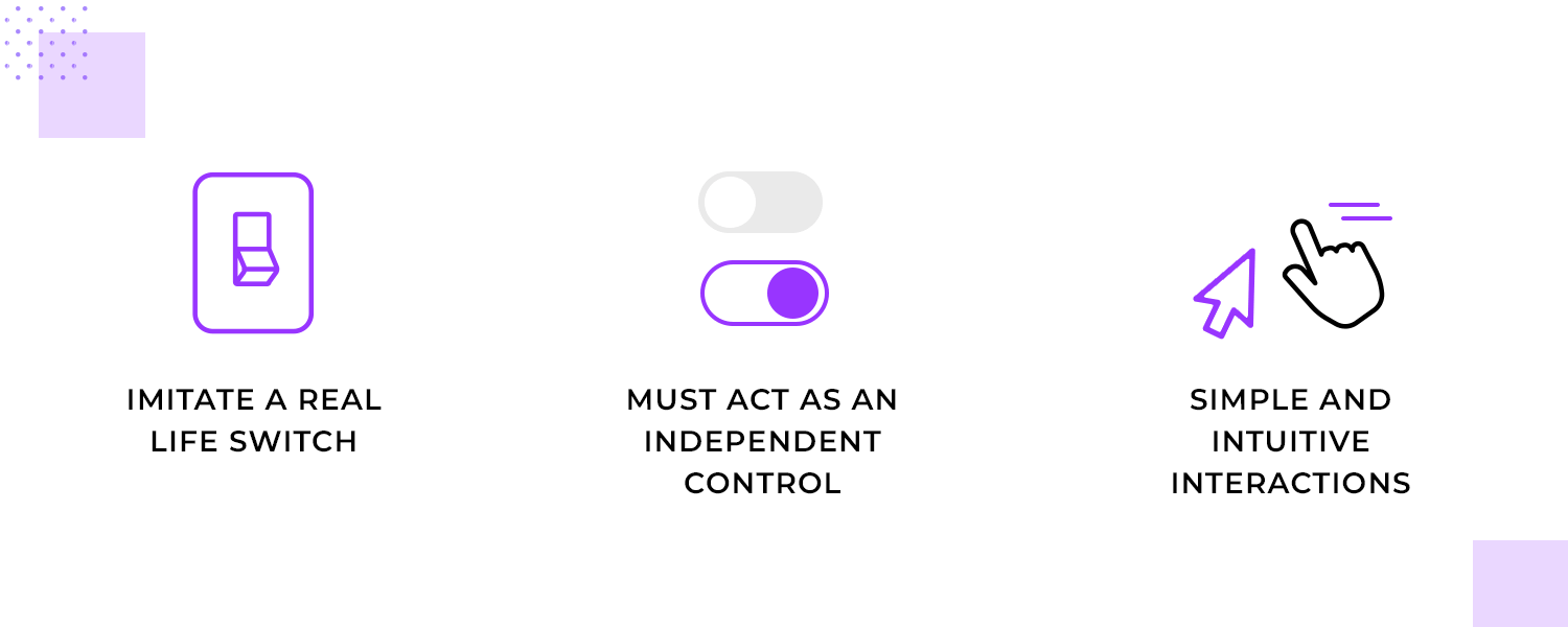
Remember, the fewer steps a user needs to take to achieve their goal, the better. When you prioritize simplicity and intuitiveness, you make your toggle buttons accessible to a wider range of users and create a more enjoyable experience for everyone.
Remember that toggle buttons are meant to be two mutually exclusive states. Usually, the button is accompanied by a straightforward and concise label. That text is very important, as users should be able to see and understand the function behind the button. One of the most important aspects of this is that it can’t be interpreted in different ways. Your label can’t be ambiguous, forcing users to flip it in order to truly discover its function.
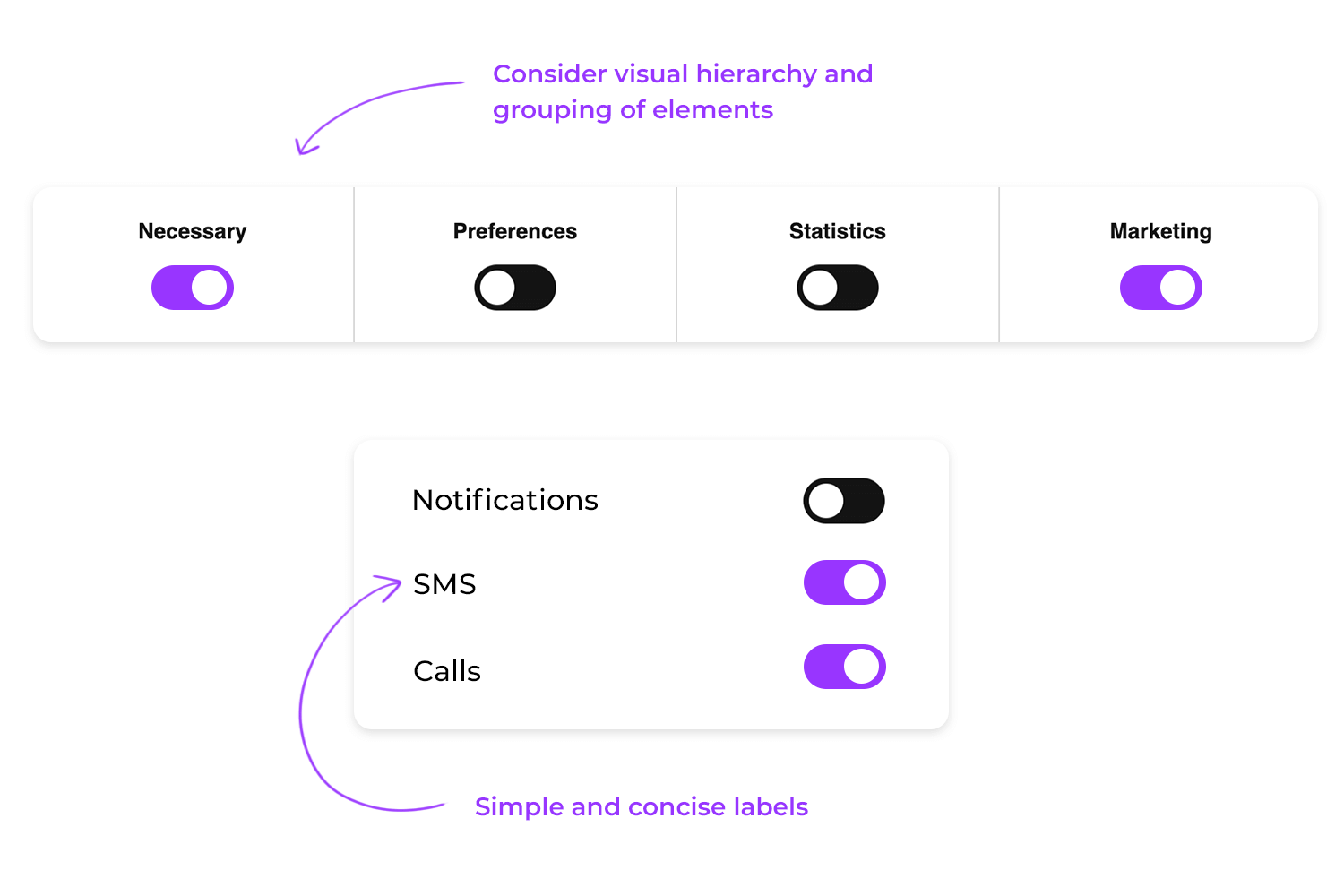
The only thing designers must bear in mind here is that the visual hierarchy and grouping of elements needs to be clear to the user. It can seem like a minor detail, but the last thing you want is for users to not understand the connection between the labels and the button! This is particularly dangerous in desktop screens, where there’s plenty of space for spreading components and harming the visual grouping of elements in the UI design.
Trying to find a toggle button that blends seamlessly into the background is like trying to find a needle in a haystack! To make your toggle buttons stand out and be easily identifiable, color plays a crucial role.
A bright, contrasting color for the active state and a more subdued color for the inactive state create a clear visual hierarchy. It’s a lot like a traffic light: the green light stands out, signaling “go,” while the red light warns us to “stop.” Similarly, a well-designed toggle button uses color to instantly communicate its state.
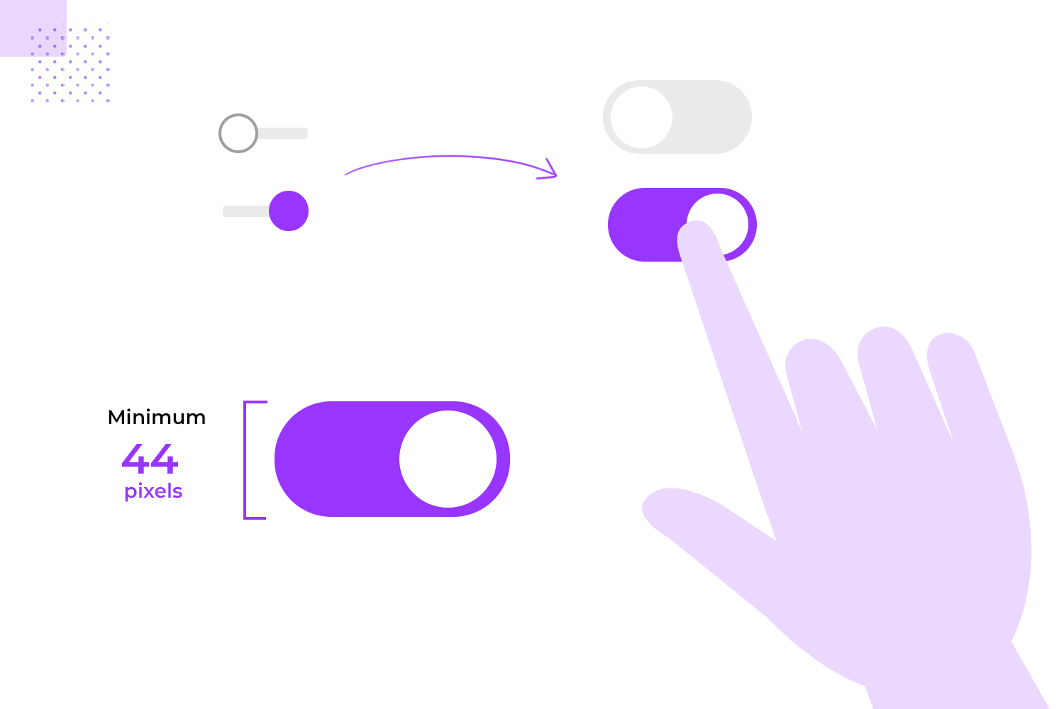
But color isn’t the only factor to consider. Size matters too! A button that’s too small can be frustratingly difficult to target, especially on mobile devices. Make sure your buttons are large enough for users to easily click or tap, even with their fingers. A general guideline is to aim for a minimum size of 44 pixels wide and tall.
Finally, consistency is key. A hodgepodge of shapes for your toggle buttons can create a jarring and confusing experience. Choose a consistent shape that aligns with your overall design aesthetic. Whether it’s circles, squares, or rectangles, a unified shape helps users recognize the button’s function and understand how to interact with it.
In today’s world, it’s crucial to ensure that our designs are accessible to all digital users, regardless of their abilities. Toggle buttons, as essential UI elements, should be no exception.
One of the key aspects of accessibility is ensuring that toggle buttons can be operated using keyboard shortcuts. This is especially important for users who cannot use a mouse or touch screen, such as those with motor impairments. By assigning keyboard shortcuts to toggle buttons, you can make them accessible to a wider range of users. For example, you might assign the spacebar or Enter key to toggle the button.
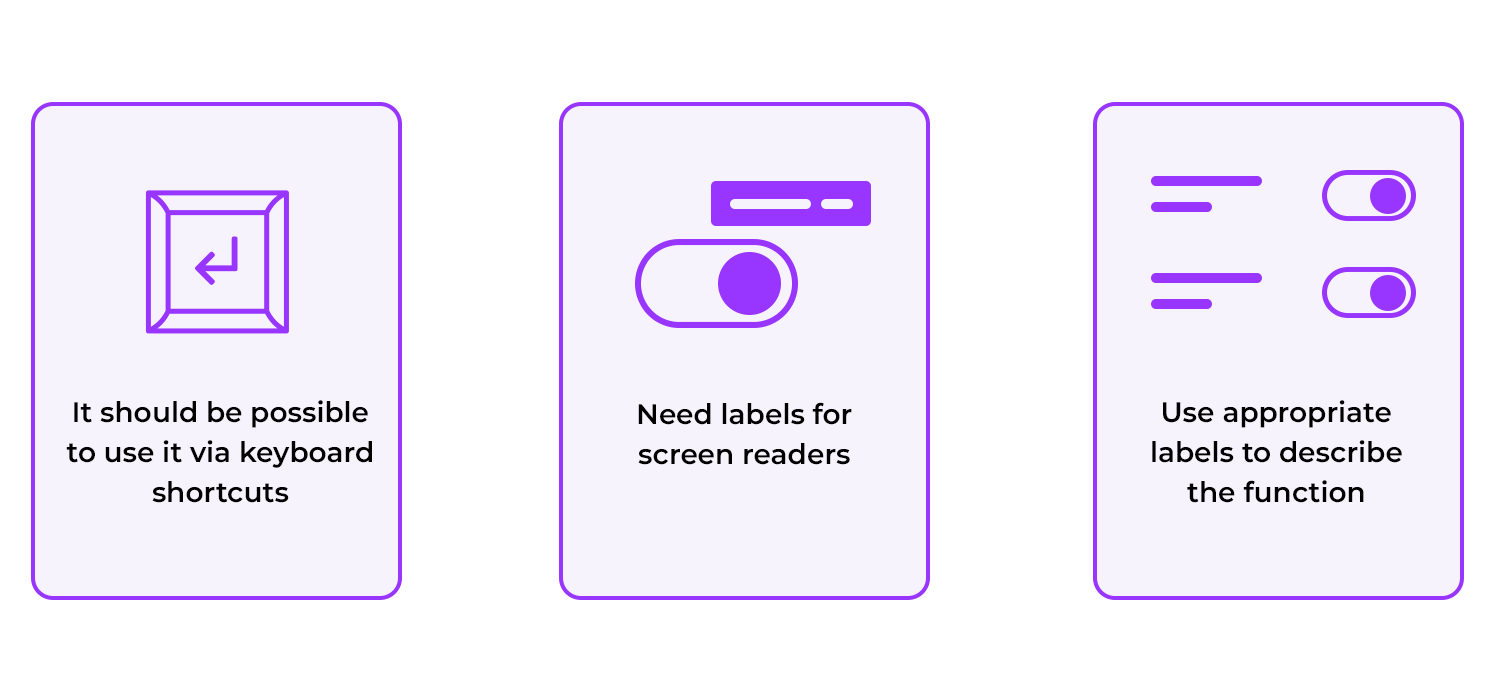
Another important point is providing appropriate labels and descriptions for screen readers. Screen readers are software applications that read the content of a web page aloud, making it accessible to users with visual impairments.
And finally, you can also use meaningful labels that accurately describe the button’s function and are easy to understand for screen reader users. If the button’s function is not immediately obvious, you should consider providing additional context through a tooltip or label.
Imagine a cluttered drawer full of tools. It’s difficult to find what you need because everything is jumbled together. Now picture a drawer where tools are neatly organized into compartments, each labeled with its purpose. This is the power of effective grouping.
Similarly, grouping toggle buttons with related elements can significantly improve the user experience. By placing buttons that control similar settings or functions together, you help users understand the relationships between them and find the ones they need more easily. For example, if you have toggle buttons for notifications, sound settings, and display options, grouping them under a “Preferences” heading provides a clear structure.
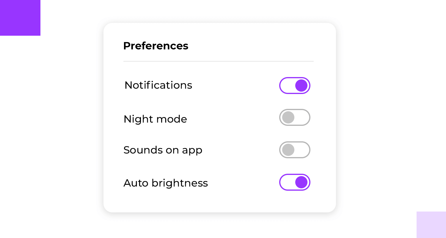
Think about how users in their journey will naturally progress through your interface and arrange buttons accordingly. A logical sequence can guide users through the settings process and prevent confusion. For instance, if users typically adjust notifications before changing display settings, placing the notification toggle button first would make sense.
For more logical contextual designs, use our user flow tool to bring your ideas to life.
Creating a great toggle button isn’t just about aesthetics; it’s about functionality and user experience. That’s where testing and iteration come into play.
User testing is basically a reality check. By observing users interact with your toggle buttons, you can identify potential pain points, areas of confusion, and opportunities for improvement. It’s like having a mirror held up to your design, revealing its strengths and weaknesses.
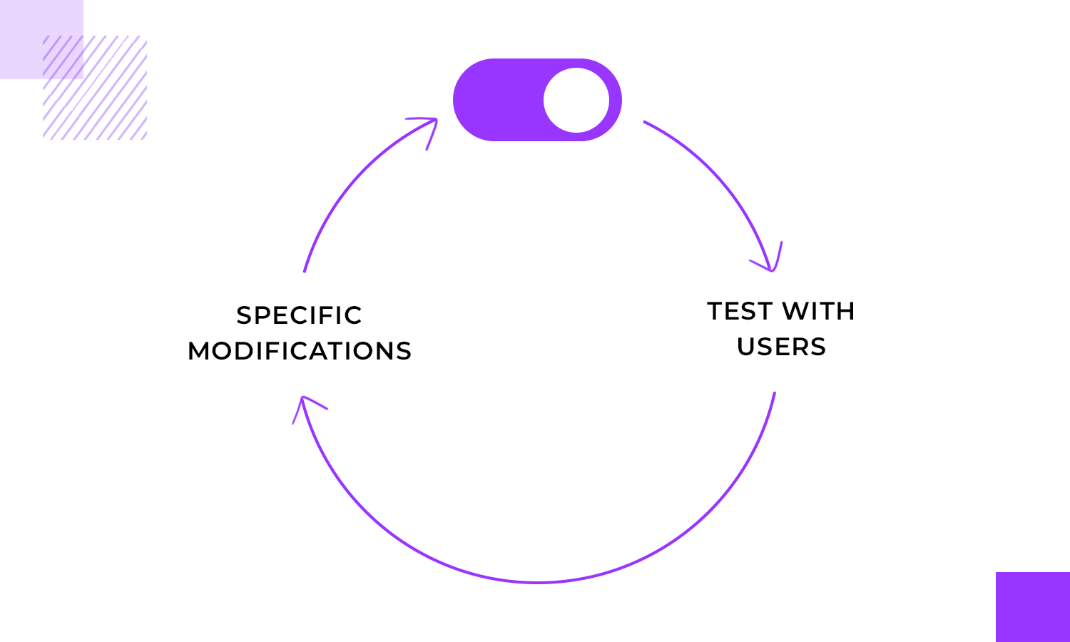
Gathering feedback from users is invaluable. What do they think of the button’s appearance? Is it easy to use? Do they understand its function? Their insights can provide you with a fresh perspective and help you uncover issues you might have overlooked.
Once you have feedback, it’s time to iterate on your design. This doesn’t mean starting from scratch; it’s about making targeted improvements based on user insights. Perhaps you need to adjust the button’s size, change the color scheme, or refine the accompanying microcopy.
Remember, design is an iterative process. It’s okay to make mistakes and learn from them!
Design and prototype with fully-interactive toggle buttons
For more inspiration, check out this list of awesome UI design examples and expand your design materials!
Max Rudberg created this toggle button, reminiscent of a kitchen appliance, that offers a tactile and engaging way to choose between Metric and US measurements.

It aligns perfectly with the culinary theme of the Plantry meal planning app. Even in a minimalist interface, this physical element adds a touch of delight and makes the simple task of selecting measurement units feel more satisfying.
Alex Muench offers a variety of visually appealing and intuitive toggle buttons. From simple on/off buttons to more expressive icons representing different states or choices, these buttons provide a clear and engaging way to interact with digital content.

The use of color, shape, and symbolism ensures that each toggle conveys its intended meaning effectively, enhancing the overall user experience.
The toggle design from Booking.com uses a simple and clear layout to allow users to change between displaying listings in a list or grid format.

The text labels “List” and “Grid” directly indicate the function of each option, leaving no room for confusion. Whether you’re a visual explorer who prefers the grid layout or a detail-oriented traveler who needs the list format, Booking.com ensures your journey is as smooth as a hot air balloon ride over a Tuscan vineyard.
Jan Hoffman designed a toggle that features charming icons of a crescent moon on one side and a sun on the other. The blue background indicates the active state, likely representing the “on” position.

This design is a clever and engaging way to control dark mode or light mode settings, allowing users to customize their viewing experience and find the perfect balance between comfort and clarity.
Design and prototype with fully-interactive toggle buttons
Aaron Iker is a sparkling beacon in the digital sea, inviting users to mark their cherished discoveries with a touch of stardust. With a simple click, this dynamic element transforms, leaving a trail of stardust in its wake.

The gleaming star and the warm word “Favorite” create an irresistible combination, beckoning you to add a personal touch to your online adventures. It’s a delightful way to save and revisit your most beloved finds, turning your online experience into a personalized constellation of favorites.
The Google Greats designed a toggle button that lets you effortlessly change between light and dark modes on Chrome, tailoring your experience to match your mood and preferences.

With a tap, you can transform your screen from a bright, sunny day to a cozy, moonlit night. It’s a small change with a big impact, making your online adventures even more enjoyable and personalized.
The Netflix app puts the power of personalized viewing at your fingertips. The dynamic toggle button lets you effortlessly add or remove shows from your watchlist, creating a virtual bookmark of your cinematic favorites.

Whether you’re a binge-watching enthusiast or a casual viewer, this handy feature keeps your beloved programs front and center, ready to be enjoyed whenever you desire.
Airbnb‘s mobile app puts the power of notification customization right at your fingertips. These toggle buttons are like a personal assistant, allowing you to effortlessly control what type of notifications you receive. Want to stay up-to-date on the latest offers? No problem.

Need travel tips to plan your next adventure? Just a tap away. Or perhaps you’re looking for a daily dose of inspiration? It’s all at your command. Tailoring your notifications is as easy as flipping a switch, ensuring you only receive the information that matters most to you.
Narendra Prasath‘s button design offers a choice between “Developer” and “Designer,” visually emphasizing the contrast between these two roles. The “Developer” option is adorned with a stylized greater-than sign, a common symbol in programming, hinting at the technical and logical nature of development.

This clever use of iconography not only enhances the button’s aesthetic appeal but also provides a visual cue that aligns with the associated role, making it easier for users to identify and select their desired path.
Inspired by the iconic choice presented to Neo in The Matrix, this toggle button designed by Itti Joseph offers a decision between two contrasting options: “Red Pill” or “Blue Pill.” The translucent outer shell, reminiscent of the mysterious capsule offered by Morpheus, hints at the transformative nature of the choice.

This visually engaging toggle could be used in a virtual reality or augmented reality application, allowing users to choose between different levels of immersion or experience.
Airbnb‘s website feature toggle buttons that allow you to choose between searching for stays and exploring unique experiences. Whether you’re seeking a tranquil retreat or an adventure-filled escape, Airbnb puts the power of choice at your fingertips.

With just a click, you can effortlessly switch between searching for cozy stays and exploring unique experiences that will leave you with memories to cherish. This intuitive design lets you tailor your journey to match your desires, making it easier than ever to plan the perfect Airbnb adventure.
Design and prototype with fully-interactive toggle buttons
Tim Silva brings us this clean, white slider against a dark background, which creates a clear contrast, making it easy to distinguish between the two options. The design emphasizes the core functionality of the toggle, allowing users to quickly shift between light and dark modes for their interface.

The simplicity and clarity of this toggle make it a versatile and user-friendly choice for a variety of applications, from sleek websites to sophisticated software.
The next toggle button is by yours truly. Justinimind makes it easy to alternate between subscription-based and perpetual licensing options, tailoring your software purchase to fit your needs and budget.

With a simple click, you can decide whether you prefer the flexibility of a subscription or the ownership of a perpetual license. It’s a simple choice that empowers you to select the payment plan that best aligns with your goals.
This series of toggle buttons by Material UI, each represents a different alignment option for text. The first button aligns text to the left, the second centers the text, the third aligns text to the right, and the fourth justifies the text, evenly distributing it across the entire width of the container.

These buttons are commonly used in text editing tools and layout software to allow users to quickly and easily adjust the alignment of their content.
Evan Place‘s toggle button is a masterclass in simplicity, offering a no-nonsense approach to user interaction. With labels neatly integrated within the button itself, there’s no ambiguity about its function. The on and off states are crystal clear, leaving no room for confusion.

This design is a testament to the power of minimalism, proving that sometimes less is more. The toggle’s straightforward nature ensures that users can effortlessly achieve their goals, making it a shining example of effective UI design.
Alternate between two states with a simple yet effective toggle button by Alisa Maiboroda. The contrasting colors of green and gray immediately indicate the “On” and “Off” positions, respectively.

The button’s rounded shape and smooth animation create a visually pleasing and tactile experience, adding to the overall satisfaction of interacting with the interface.
Mohsen‘s toggle buttons potentializes an integrated label in the button itself. We love that the animation in the transition between states is quick but smooth, making for a great user experience with the UI design.

The combination of these elements results in a toggle button that is both, visually appealing and highly functional!
Yet another design by Aaron Iker. With a simple tap, the image in the button transitions from empty to full, adding a touch of visual interest to the interaction. The subtle animation and clean design make these buttons a delightful addition to any interface, providing a satisfying and intuitive way to save and revisit your most cherished finds

All in all, we can safely say that these buttons a welcome addition to any interface. Saving and revisiting your most cherished finds has never been so enjoyable.
Get ready for takeoff with a playful plane themed toggle button! Featuring a charming airplane icon, enjoy a fun and intuitive way to change between different travel modes.

The first button, with a blue background and a cloud, represents air travel, while the second button, with a gray background and a runway, symbolizes ground transportation. With these whimsical buttons, your travel planning becomes an enjoyable adventure.
SHEIN‘s website chose toggle buttons that make it easy to add items to your cart and save your favorites. With a simple tap, you can effortlessly build your shopping list and keep track of the pieces that have caught your eye.

It’s a convenient way to better organize your shopping experience and ensure you never miss out on the latest trends. So, indulge in the joy of online shopping with SHEIN and let these toggle buttons be your guide to a fabulous fashion journey!
While many prototyping tools offer basic toggle elements, Justinmind’s UI kits go a step further by providing fully interactive toggle buttons that save you time and effort.
With built-in interaction, you can immediately test the functionality of your toggle buttons without the need for additional coding or scripting. This is especially valuable when working on complex projects with multiple interconnected elements.
That’s why Justinmind makes sure to bridge that gap and offer designers toggle buttons that are fully functional from the get-go. Instead of designers taking a simple image and adding interaction, they simply place the toggle in the interface and that’s that!
Design and prototype with fully-interactive toggle buttons
This may seem like a small detail at first, but it makes a huge difference in time and effort needed for prototyping the product as a whole – especially large products that hold many small components in the UI design.
Justinmind’s toggle buttons are designed to be highly customizable, allowing you to tailor their appearance and behavior to match your specific design needs. Whether you’re creating a minimalist e-commerce app or a feature-rich dashboard, our toggle buttons can help you achieve your desired look and feel.
What exciting new project are you going to be working on? Regardless of what it is, check out the selection below and find what you’re looking for!
These kits can help you quickly and easily incorporate toggle buttons into your projects, saving you a whole bunch of time and effort.
The JustinMind Material UI Kit offers a collection of stylish toggle buttons inspired by Google’s Material Design principles. Their clean lines, subtle animations, and intuitive functionality help these buttons provide a visually appealing and user-friendly way to control various settings and options in your web apps.

Looking to create stunning and responsive web applications with Vue.js? Our Vuetify UI Kit’s beautifully designed toggle buttons seamlessly integrate with your Vue.js projects. The buttons feature a clean, modern aesthetic and provide a smooth user experience, making them a valuable addition to your toolkit.z

This Angular Material UI Kit offers a collection of sleek and functional toggle buttons that align perfectly with Google’s design guidelines. With their clean aesthetics, intuitive interactions, and accessibility features, the toggle buttons provide a modern and user-friendly way to control various settings and options in your projects.

Still haven’t found what you’re looking for? Check out our PrimeFaces UI Kit that offers a collection of robust and customizable toggle buttons. The buttons provide a variety of styles and options, allowing you to create a unique and engaging user interface.

Need a quick and easy way to let users choose between options? The toggle buttons in the JustinMind Bootstrap UI Kit are your go-to solution. Plus, they’re fully customizable, so you can match them to your brand’s style and create a seamless user experience.

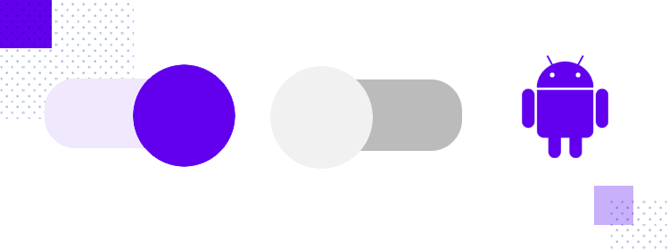
In the Justinmind Android UI kit, you can find two toggles: one whose default state is on, and another with the off state as the default. The toggle itself is made of a small bar in the back, with a larger button that rests over the bar.
The Justinmind iOS UI kit also offers toggle buttons that are tailor-made to fit in with the iOS aesthetic and feel. Just like the Android UI kit, this super-pack of UI components comes with toggles that rest in either the on or off default mode. The button itself is inside a bar, as it becomes visually clear when it is on.

Toggles are a solid UI component that rarely fails at delivering a good experience. It’s straightforward and familiar to everyone, and works to an important end in giving the user control to customize a system. All in all, toggles can be unfairly forgotten in the search for more edge-cutting UI design.
But let’s not forget that even something classic and simple can be turned into a unique experience. Even though toggle buttons have a certain common feature, designers can still use it as an opportunity to add personality and glamour to a screen. Hopefully, though, with this post you’ll be feeling inspired to make the most of this old friend we all share!