
Buttons are a fundamental component of any UX design and as such, deserve proper planning. Check out these ground rules for perfect button design
A button is a fundamental UI element that will heavily affect your interaction design. Buttons have the power to compel users to convert, to carry out an action. Buttons are a middleman between the user and the product, and are charged with keeping the conversation between person and machine going.
Design buttons for web and mobile apps with Justinmind. It's Free!

But how can you make sure your button design allows for great usability while still making creative waves in users’ screens? It’s all about minding the details while making use of your favorite prototyping tool. Read on to find out how to up your button design game.
PS. If you want to read about creating actual games, check our post on game UI.
A fundamental aspect of button design is making sure that it looks clickable. Users should be able to recognize a button immediately and understand that it can be interacted with. Familiar shapes like rounded squares with shadows are effective because they add depth, indicating clickability. Adding microinteractions, such as color changes or slight movements on hover, further reinforces this. Rediscover a classic UI pattern that is often underestimated: list UIs.
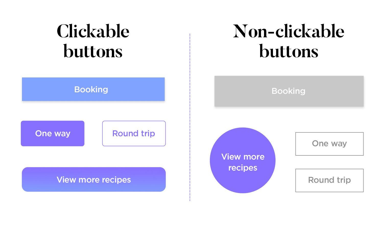
Buttons should be easy to locate and predict. Users have pre-formed expectations about where buttons should be placed on a screen. Aligning with these expectations enhances usability by making your UI more intuitive. Use contrasting colors and negative space to draw attention to buttons, and maintain consistency in button design and placement across all screens.

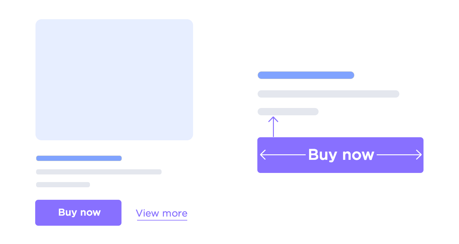
Using clear, descriptive text on buttons makes websites and apps easier to use. Instead of generic labels like “OK” or “Cancel,” use specific terms such as “Delete Permanently” or “Cancel Booking.” This clarity helps users understand the button’s action, making interactions smoother.

Make sure buttons are big enough to tap or click easily. Especially on phones, small buttons can be hard to use. Make the most important buttons bigger than the less important ones, so people can quickly find them. MIT’s Touch Lab published a study back in 2003 that found most fingertips to be 8-10mm wide.

Avoid overcrowding your interface with buttons. Too many options can overwhelm users, leading to decision paralysis. Instead, prioritize functionalities and guide users logically through the interface. Proper information architecture helps in creating a clear, user-friendly path to the desired outcomes.

Feedback is essential in button design. Users need to know that their actions have been registered. Implement buttons that change upon interaction, and use microinteractions to provide real-time feedback. This ensures users understand the system’s response to their actions, enhancing the overall experience.

Adhering to basic UI design principles ensures that buttons are functional and accessible. When designing buttons, focus on their purpose. Throughout the evolution of UI button design—from the three-dimensional rage of Skeuomorphic design to the flat design revolution and Floating Action Button fever—accessibility has always remained a priority for users. Buttons need to look like buttons, with considerations for size, shape, and padding.
For mobile apps, Android’s Material Design principles recommend touch targets of at least 48 x 48dp with at least 8dp spacing to ensure balanced information density and usability. Padding, which provides white space around content or components, gives the UI breathing space and avoids overwhelming the user. For more on creating minimalist designs, refer to our article on flat website design.

Color and contrast are powerful tools in button design. They guide users toward meaningful actions by making buttons easily recognizable and interpretable. High contrast is ideal for primary actions, while medium and low contrasts can be used for secondary and neutral actions, respectively.

Reduce friction in the user journey by using visual hierarchy techniques such as layering, shadows, and highlights. These elements can draw attention to primary actions and differentiate them from secondary ones. Ghost buttons can also be effective in keeping the UI clean while highlighting primary content.
Consider the following example, taken directly from the official guidelines for Material Design. It plays with the visuals for each button, in order to create a visual hierarchy that clearly represents the importance of each button.

“Shadows are invaluable cues in telling the human brain what user interface elements we’re looking at.”
Erik D. Kennedy - UX Designer
Providing visual feedback at each step of the user journey keeps users engaged and informed. Remember that buttons are not one-state objects; they should always provide feedback on the task the user is about to perform or has just performed.

A particularly important time to reward user interaction is right before they click on a primary button to perform an important task, such as signing up for a newsletter or downloading a free trial. Color changes, subtle animations, and motion indicate that an action has been accepted, encouraging users to follow through and continue interacting with the UI.
Design buttons for web and mobile apps with Justinmind. It's Free!
Usage: emphasize the most important actions.
Design: bold colors and larger size.
Example: submit, save.
Usage: supporting actions that are less critical than primary buttons.
Design: subdued colors and smaller size.
Example: cancel, back.

Usage: optional actions, often for additional features.
Design: minimal styling, often text-based.
Example: learn more, details.
Usage: common actions that can be easily represented by icons.
Design: clear, recognizable icons.
Example: edit, delete.
Usage: highlight primary actions on mobile interfaces.
Design: prominent, circular buttons with shadow for elevation.
Example: add, compose.
Usage: ensure consistent sizing across the interface.
Design: small, medium, large.
Usage: ensure legibility and comfort by providing space within the button.
Usage: prevents clutter and maintains clarity by providing space around the button.
Usage: follow minimum touch area guidelines to ensure adequate size for touch interactions.
Usage: maintain brand consistency and visual hierarchy using primary, secondary, and tertiary colors.
Usage: ensure readability and accessibility with sufficient contrast between text and background.
Usage: use clear and legible text on buttons with appropriate font style, size, and weight.
Design: normal appearance with standard colors and size.
Design: appearance changes slightly when the cursor hovers over the button, usually with a slight color change or shadow.
Design: normal appearance with standard colors and size.
Design: appearance changes slightly when the cursor hovers over the button, usually with a slight color change or shadow.
Design: appearance when the button is clicked, often with a darkened color or depressed effect.
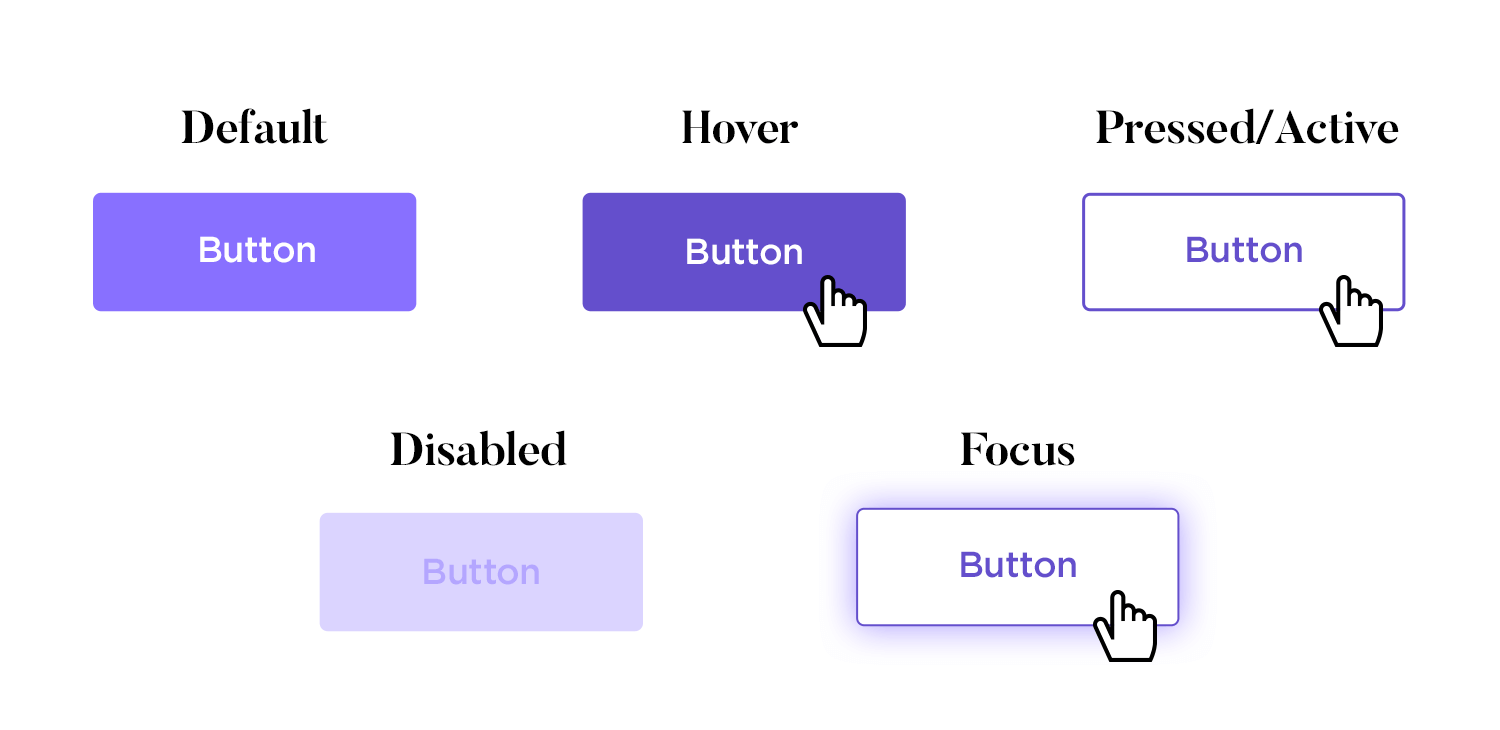
Design: indicates when the button is inactive, typically with a faded color and no interactions allowed.
Design: outline or glow to indicate when the button is focused.
Usage: provide feedback on user actions through small, interactive animations.
Usage: indicate ongoing processes with spinners or progress indicators on buttons.

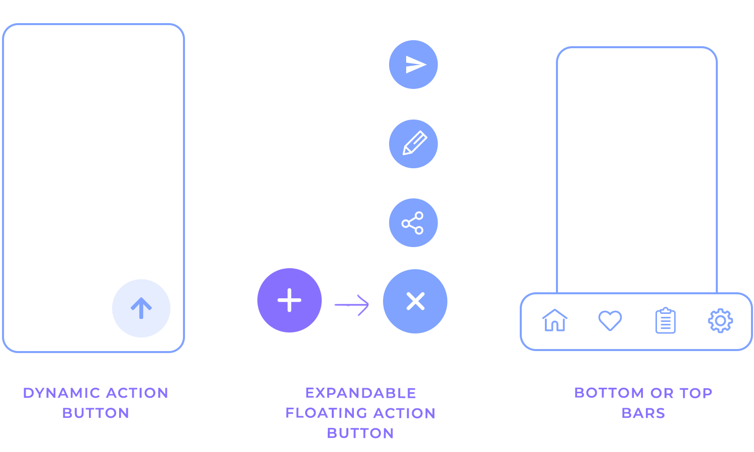
While the floating action button is a popular UI element, it isn’t always ideal. It can block important content, clash with iOS guidelines, or create confusion when multiple actions are needed. Here are some smoother alternatives:
1. Dynamic action button: this button appears only when needed. For instance, it can hide when the user scrolls to avoid blocking important content and reappear when they stop. This approach keeps the interface clean and prevents accidental clicks.
2. Floating action expansion button: this expands into multiple options when tapped, but it’s important to keep the choices relevant and minimal (no more than three). For example, in a note-taking app, the button could expand to offer options like “Create a new note” or “Edit note,” helping users perform related tasks without overwhelming them. This method ensures smoother transitions and intuitive functionality.
3. Bottom or top toolbar: sometimes, the classic toolbar is the most efficient solution. It works well for apps with multiple actions or those that are content-heavy, ensuring primary actions remain accessible without taking up too much space. A bottom toolbar is especially thumb-friendly and doesn’t conflict with iOS guidelines, making it a reliable alternative.
When choosing the right alternative, consider the specific needs of your app’s user experience. Each of these options can improve usability, depending on your app’s complexity and the user’s journey.
Justinmind’s modern button designs are like little gems that elevate your user experience! Their smooth, rounded corners and subtle animations make interacting with them a joy. The clean, organized layout, with plenty of breathing room, keeps things simple and easy on the eyes. These buttons aren’t just functional; they’re visually appealing and make your app or website feel more polished and professional.

Justinmind’s button template is a designer’s dream come true! This comprehensive collection of pre-designed buttons offers a wealth of inspiration and saves you precious time. With just a few clicks, you can add polished, professional buttons to your designs. From subtle hover effects to bold, eye-catching styles, this template offers endless possibilities. Say goodbye to design fatigue and hello to stunning, user-friendly buttons!

These vibrant purple buttons by Justinmind are sure to add a touch of fun and personality to your designs! With a variety of shapes, sizes, and styles, you can create buttons that are both eye-catching and functional. Whether you need simple call-to-action buttons or more complex interactive elements, this collection has you covered.

Justinmind’s corporate buttons are a designer’s dream come true! These versatile and professional buttons are perfect for creating a polished and modern look for your website or app. The subtle color palette and clean lines create a sophisticated and timeless design. So, say goodbye to design fatigue and hello to stunning, functional buttons that will take your projects to the next level!

These dashboard buttons by Justinmind are a testament to the power of simplicity and elegance. Each button is thoughtfully designed to convey its purpose clearly and efficiently. The consistent use of color, typography, and spacing creates a harmonious and visually pleasing design language. Whether you’re building a personal dashboard or a complex enterprise application, these buttons will help you create a professional and intuitive user interface.

Elevate your designs with Justinmind’s collection of sleek and modern material buttons. These carefully crafted elements adhere to Google’s Material Design guidelines, ensuring a consistent and visually appealing user experience. The use of subtle elevation, soft shadows, and vibrant colors creates a sense of depth and dimension. From simple call-to-action buttons to complex interactive elements, these buttons are designed to guide users seamlessly through your interface.

Here’s a simple but effective design for navigation. The “Back” button has a neat outline with a purple arrow, making it easy to spot without being too bold. The “Next” button is filled in a strong purple, grabbing your attention. Together, they make moving through the page super smooth and clear. Perfect for guiding users through steps, like in a customer support journey.

This button design feels welcoming and straightforward. The bright blue “Next” button stands out, encouraging users to continue with ease. What’s cool here are the small up and down arrow icons next to it, offering extra navigation options without complicating things. It’s a friendly and efficient design that’s perfect for forms or multi-step processes, ensuring users feel guided every step of the way.

Here we have an example of website button design for selecting guests easy and intuitive. The “+” and “–” buttons let users adjust the number of adults and children, keeping things simple and clear. The “Done” button at the bottom stands out just enough, letting users confirm their choices without overthinking. It’s a practical and user-friendly way to handle selections for booking websites, ensuring everyone can make adjustments smoothly.

These buttons make it easy to sign in using Google, Facebook, Apple, or LinkedIn. Each one features the familiar logo, so you instantly know which account to choose. When you click on one, a blue outline highlights your selection, making the process clear and straightforward. It’s a quick and user-friendly way to log in.

These buttons offer two clear choices: “Get started” in bold black and “Watch the video” in warm orange. The contrast between them draws attention, and the play icon on the video button gives it an interactive feel. The rounded edges make both buttons feel approachable, guiding users to either take immediate action or explore more first.

This example of website button design showcases a range of purple button designs, including solid, outlined, and uniquely shaped buttons. Each button is designed to maintain a cohesive brand appearance while offering diverse interactive elements. These versatile buttons are ideal for various uses on websites, enhancing the user experience with consistent yet varied UI button design.

These buttons make trading super easy on mobile. The “Buy” button is dark with a subtle arrow, while the “Sell” button pops with a light blue shade. The rounded edges and clear icons make them easy to tap, and the color contrast ensures users know exactly what action they’re taking. It’s a simple and intuitive design that’s perfect for quick buying and selling in finance apps.

Here’s a great example of a floating action button used in mobile navigation. The purple “+” button sits right in the center, making it super easy to spot and tap for quick actions. The icons around it keep things clear and simple, with a nice balance between function and style. This setup works perfectly for apps where you want the main action to stand out without overwhelming the screen.

This one’s all about quick actions. The heart and share buttons on this product card make it super easy to save or share items you like. The heart turns solid blue when clicked, giving instant feedback, while the share icon stays light and unobtrusive until needed. It’s a simple, user-friendly design that helps users interact with products quickly and easily.

Here’s a great example for media apps. The “Play now” button pops in a bold purple, making it super inviting, while the “Add to my list” button has a subtle heart icon that turns purple when clicked, giving instant feedback. The change from “Add to my list” to “Added to my list” feels satisfying and keeps the user informed. This setup is ideal for encouraging interaction while browsing content.

This music player’s button design is all about clear control. The central green play/pause button is big and easy to tap, making it the main focus. The smaller shuffle, skip, and repeat buttons are subtle but still recognizable, helping users navigate their music effortlessly. The green accents keep the look consistent and tie all the buttons together nicely, perfect for apps where quick control is key.

This set of 3D social media buttons features a unique, glossy design for platforms like Facebook, WhatsApp, YouTube, Twitter, Instagram, and Telegram. Each button stands out with a distinct color and a three-dimensional effect, making them visually appealing and engaging.

These button designs are perfect for websites looking to integrate social media links in a modern and eye-catching way, enhancing both functionality and aesthetics in UI button design.
The UI buttons in this example are great for websites that have both light and dark modes. They show how buttons look in different states like default, hover, click, and disabled. The light mode uses simple black and orange buttons on a white background, while the dark mode uses white and orange buttons on a black background. This website button design example makes sure the buttons are easy to see and use no matter what mode the user chooses.

Highlighting the importance of user feedback, these website buttons showcase different states such as default, active, disabled, and hover. With a fresh color palette and straightforward design, each button state is easy to identify. The inclusion of both solid and outlined styles adds versatility, making these buttons suitable for various sections of a website. This approach ensures users have a smooth and intuitive experience.

These “Pay Now” website buttons feature a vibrant design, available in green, white, and blue variations. Each button includes a checkmark icon to indicate action confirmation, enhancing user confidence and clarity. The bold colors and clear text make these buttons stand out on any website, ideal for payment or checkout processes. This design ensures a smooth and intuitive user experience, making it perfect for e-commerce websites looking to improve their UI button design.

In this call-to-action design example, we can see buttons with phone icons in different states: default, hover, and disabled. They are easy to understand and use, perfect for websites that need clear action buttons. The design is clean and simple, making it ideal for guiding users through phone call actions.

This website button design highlights how different button states can improve user experience in UI button design.
These bright, gradient buttons are great for adding fun to your website design. The buttons say “sign up,” “login,” “play,” and “settings,” with each having a unique color. The clear, bold text is easy to read, and the rounded, shadowed edges make them look 3D. Perfect for websites that want to be user-friendly and engaging. This is a perfect example of a creative and effective website button design.

These eye-catching bold arrow buttons will enhance your website’s navigation and user experience. Featuring a striking red and white design, they effortlessly guide users with their large, clear arrow icons and intuitive directional cues. The high-contrast color scheme ensures maximum visibility and engagement, making them ideal call-to-action elements for any website seeking a powerful UI button design.

Our last example of website button design features gradient buttons with a friendly smiley icon, creating a visually appealing and inviting design. With multiple states for a smooth user experience, they add a modern touch to any interface.

The rounded corners and soft color transitions enhance the overall user interaction, making them perfect for websites aiming to create a welcoming and approachable feel.
Design buttons for web and mobile apps with Justinmind. It's Free!
In this UI button design example for a mobile app from Margo Lunina, are designed for a platform that offers different courses. They include main actions like “Get Course” and navigation options like “Create” and “Build.” The bright colors and icons make the buttons easy to see and use. The rounded shapes and consistent colors give the app a friendly and smooth look, making it simple for users to find and start courses. These buttons are perfect for educational apps that want to be user-friendly and engaging.

Designed to immediately capture attention, these app launch UI buttons for a bicycle selling platform combine bold colors and clean icons for maximum impact. The main “Launch App” button stands out with its bright green hue and clear arrow, guiding users effortlessly to open the app. This streamlined and modern design ensures a smooth user experience, encouraging quick interactions and easy navigation from the get-go.

These buttons make finding and booking accommodations a breeze. The “Where To?” button is big and easy to tap, helping users quickly start their search. The “Next” buttons guide users smoothly through each step of the booking process. With clear icons and simple text, these app button designs are perfect for travel apps that want to offer a fun and easy user experience. The friendly design helps users navigate effortlessly, making the app enjoyable to use.

Designed to make telehealth simple and quick, these app buttons offer easy access to self-health checks and doctor consultations. Each button is clearly labeled with provider names and logos, helping users choose their preferred service with ease. The design is clean and intuitive, ensuring users can find what they need fast. Perfect for health apps, these buttons make the user experience smooth and stress-free, encouraging users to take advantage of online health services.

Designed for a storage app, this app button design makes managing your storage simple. The bright orange “Confirm” and “Book” buttons stand out, making actions quick and clear. With a clean design and soft colors, these buttons guide users effortlessly through booking and scheduling tasks, perfect for a smooth, user-friendly experience.

These buttons make using a rental and booking app easy and fun. The “Done” button stands out, making it clear when tasks are finished. Calendar buttons help users quickly pick dates, and the green color scheme keeps everything calm and consistent. Users can easily find items, manage bookings, and complete tasks without any hassle. This app button design is perfect for apps that want to make complex tasks simple and user-friendly.

In this UI button design for an interactive exercise app, the vibrant green buttons are designed to encourage users to engage with a fitness app. The “Übung machen” (Do Exercise) and “Hören” (Listen) buttons are prominently displayed, making it easy for users to start their workouts or listen to instructions. The clear icons and modern design create a seamless and enjoyable user experience. Ideal for health and fitness apps, this app button designs help users stay motivated and easily navigate through their exercise routines.

These UI buttons simplify phone optimization with a stylish design. The inviting “Get Started” button stands out, making it easy to begin. With a crisp blue and white look and simple icons, users can effortlessly navigate options like “Images” and “Videos.” This design ensures users can quickly manage their phone storage, providing a smooth and efficient experience.

We chose this app button design by Norch Studio for its sleek and easy-to-use appointment buttons design. The prominent “Appointment” button helps users schedule with a single tap. The dark theme with bright text ensures clarity and style. Perfect for health apps, these buttons offer a smooth and straightforward user experience.

This button design example definitely has a unique and engaging look. The UI buttons design feature a captivating space theme with vibrant colors and star motifs. The playful design, with its smooth curves and glossy finish, makes these buttons perfect for apps targeting a younger audience or for those wanting a whimsical touch.

The bright purple and orange gradients, combined with the star icons, create a visually appealing and interactive experience, making these buttons stand out in any app interface.
Design buttons for web and mobile apps with Justinmind. It's Free!
Need a quick start for web projects? This kit has over 500 components, including buttons that are super easy to work with. Great for sketching out clean, classic wireframes.

For that smooth iOS look, this kit has all the buttons that match Apple’s design style. Great for building iPhone or iPad apps with the authentic iOS feel.

Ideal for Android app designs, this kit follows Material Design guidelines, giving you buttons that feel right at home in any Android app.

If you’re prototyping mobile apps, this kit’s got you covered with buttons suited for both iOS and Android layouts, making it super versatile.

This kit brings colorful, fun button options, perfect for web designs that need a bit of extra flair. You’ll find both classic and modern styles here.

Designed for Material Design projects, the MUI kit offers sleek, interactive buttons that fit effortlessly into modern app designs.

For Angular projects, this kit has a wide variety of buttons following Material Design principles, making it perfect for responsive web apps.

Designed for Vue.js projects, Vuetify offers a wide range of button styles that add both functionality and style to your designs.

With buttons that fit PrimeFaces projects, this kit offers a mix of stylish and practical options for web applications.

Looking for something different? The Sketching kit has hand-drawn-style buttons, perfect for adding a creative, artistic touch to your designs.

Now we know what button states are, it’s time to prototype our own.
To get started on your own button states, download Justinmind’s UI design tool. Once downloaded, create a new web prototype. There is now an empty canvas in front of you.
To make our normal button state, drag the button widget from the widget palette onto the canvas. Adjust the size to your liking. This will form the basis of your button UI design.

Select the rectangle you placed on the canvas. In the Properties tab, you will see some options like General, Position, Size, etc.
These options allow us to customize the rectangle that we have placed on the canvas and turn it into a button.
We have made our button 150px by 40px which you can do in the Size property. You can make your button responsive by changing the pixel value into a percentage in the drop-down menu.
Next, let’s round the border so it has a curved edge. In the Border property, give your rectangle a solid border. In the Round field, write a value of 40. Choose your border color, too.

In the General property, by double-clicking on the button text, you can easily edit it. We changed it to “Subscribe!” in our example.
In the Background property, add your own color, you can adjust the font, size, weight, and other text properties as needed.
Now you have a normal state button.
We have our base normal state button. It’s our foundation. We can create different states using the wireframe tool Properties tab and the Events tab.
Right click and copy the button you made. Paste it onto the canvas.
Select the button you pasted on the canvas and click Add Event in the Events palette below. Choose your Trigger in the Dialog. For the hover state choose Mouse > On Mouse Over > Change Style.
While still in the Dialog, select the button you copied on to the canvas. There is a drop down menu which allows you to select which styles to change. Go to Background > Color. Choose the color you wish the button to change to when the mouse pointer hovers over it. Then click OK.
Now you have a hover state button.

There are a few pointers you can learn so your button states follow convention. In Dan Saffer’s book Microinteractions: Designing with Details, Don Norman writes, “Microinteractions are about the critical details that make the difference between a friendly experience and traumatic anxiety.”
We don’t want to make our users anxious. We want to create a user experience that is painless and effortless. Sound button design is even more important in data-heavy products, such as dashboard design. Here are 3 best practices to follow when you design your own buttons and their interactions:
It may sound obvious, but there are websites with buttons that look nothing like buttons. Users shouldn’t have to click the button to see if it is a button. They shouldn’t hover over it to find out either.
On a desktop, users expect hover states. But there are times when hover states would be useless. They are redundant on mobile devices, for example. UI designers have to build UI elements in a way that they afford clickable behavior from the user. It’s also important to have the button fit in with the broad visual hierarchy of the screen.
How do you make something look like a button? Use bold colors. Make it button-shaped. A button should stand out from the other UI elements on the screen. If it blends in, users won’t recognize it as a button. Read more about accessibility design in our post.
Icons are very helpful because it’s easier for us to recognize an image than process language. But not everyone interprets icons in the same way. There is no current standardization for icon usage. It’s a user’s previous experience that informs their understanding of an icon. Use text labels for clarity. If you forego a text label, it’s imperative to add a tooltip so that people can still find out what the button does.

Most people understand a danger sign. But a button with a lock icon? What does that mean? Save? Share? Secure? Encrypted? Who knows. If you do use an icon, pair it with text. This technique is used frequently in long forms, such as surveys. Check out how it works in our research survey examples post.
With buttons, use action specific language. Verbs work better. Your button text should be concise. Buttons have limited space so it’s not the time to bring out your inner poet.
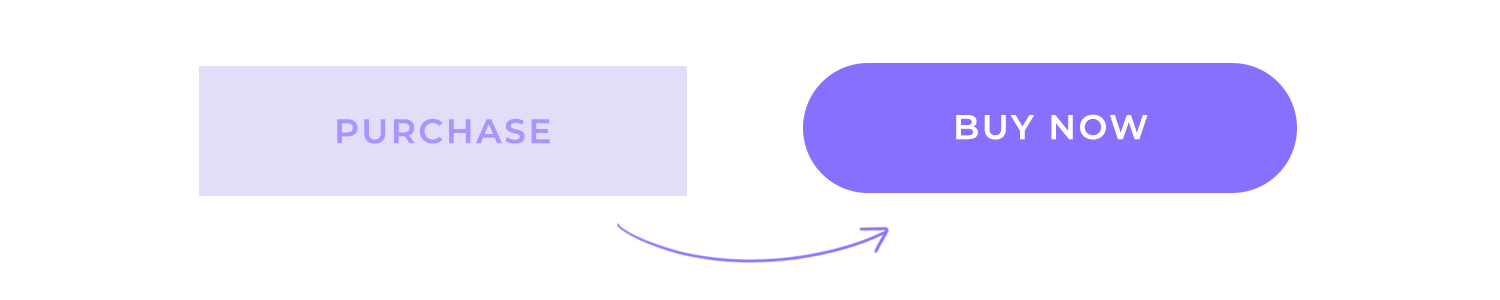
Strong and short verbs like “Share”, “Buy”, “Install now”, “Start” are preferable. They’re direct, understandable and compel the user to action.
Design buttons for web and mobile apps with Justinmind. It's Free!
User testing any design is a topic that deserves it’s own guide – which is why we made one for you! If you want a more in-depth look at the theory and practice of testing, check out our guide to user testing. For a more summarized chat, let’s go over some great ways you could test how users interact and react to your buttons.
Before you can start to worry about how to make your buttons look great, you have to cover your bases and validate your basic navigation design. It’s absolutely crucial that all your main navigation buttons do their job and carry the user around the design without any major issues.
We always advocate for making quick wireframes of the bare bones of your product, and start testing that the navigation and information architecture make sense. Armed with your wireframe, you can start some form of user testing to answer basic questions like:
- Can users find all the main features?
- How long does it take them on average, for each feature?
- Do users understand how each feature relates to the others in matters of importance?
- Is the navigation logical for users?
When it comes to fine-tuning button design, perhaps few methods are as enlightening as A/B testing. A particular favorite among marketers for CTA buttons, this kind of testing is all about testing two different versions of the same button and comparing their performances. If your team wants to test many different button designs at the same time, multivariate testing might be a quicker and more practical option.
Here are some UI kits that come with several different styles of button design – maybe here you can find the perfect match for your latest project or a solid base that can start off your next design.

While heatmaps may not be as direct in giving us answers when compared to A/B tests – this method of user testing can still have a huge impact on your product. It has a very visual way of telling us where users are focusing on the most, which can come in really handy when it comes to testing your button design.
Button design is important, both because buttons help users navigate your product and because they can compel users to convert to any desired outcome. They need to be planned with care, so that your users can both know where the buttons are instantly and at the same time never once stop to think about that button. Make it flashy, make it useful – and let users enjoy your product to its full glory.