
Sliders can be a fun way to lighten the cognitive load of a page. But what makes a good slider? Find out in this post!
Sliders can be a welcome sight on many user interfaces out there. There’s something truly dynamic about them, even if they can’t beat a regular input field sometimes. Over the years, users have grown increasingly used to seeing sliders in a certain context, with their popularity soaring.
Design web and mobile UIs with interactive sliders

But why are they popular? Surely, there’s more to it than a simple slider that users can drag with their finger? In this post, we’ll look at how and when to use UI slider design in your product for the best user experience possible, with some real-world examples. We’ve also thrown in some free kits with UI slider designs you can use in your prototyping tool.
A slider is a UI component representing a tuning or volume control dial from an analog radio. It lets the user slide a knob, handle or bar from left to right and vice versa along a straight track. UI sliders are great for allowing users to explore many different options or values quickly and simultaneously. Above all, they’re practical components for users when quantities or values don’t need to be exact.
UI slider design helps users select a range of values or adjust settings like brightness or volume, among other uses. They take inspiration from the typical video playback control seen on the likes of Youtube, Vimeo or Netflix, though they come in a range of different styles.
Sliders can be single or dual-point (double sliders), the latter of which we often see in price or budget range selectors. In terms of movement, they can be snappy or continuous, that is, they snap to different points along a track or they slide smoothly.
UI slider designs are all about utility and efficiency. Furthermore, in addition to being a practical component, these UI controls present a more visually-appealing and interactive way for a user to accomplish a goal in your website or app.
Interactivity helps keep users engaged, while the fact they can work with value ranges as opposed to entering fixed values into input fields means a reduction in cognitive load.
But steady on! UI slider designs aren’t always the correct solution when it comes to letting users select values. While they can have many benefits when we get them right, get them wrong and they can break your design.
The burning question is when to use UI sliders in your website prototyping tool. Firstly, let’s focus on the main goal of a UI slider design: to help the user complete a task as fast and as easily as possible, while boosting interactivity.
So which tasks work best with a slider? Sliders can, after all, serve many tasks, going far beyond the simple volume slider control. They can be a handy way of helping users narrow down their search without getting into the minor nitty-gritty details. For example, you may have come across slider controls that let you select a price range for mortgage down payments or the even dimensions of electro domestic items.

However, while UI sliders are versatile controls with many possible applications, pinning down the perfect use is easier said than done.
After all, UI sliders tend to be a controversial component in the design world. The opportunities for using them with tasks aren’t as abundant as when it comes to elements like toggle UIs, dropdowns and radio buttons. If you apply UI sliders in the wrong situation, they can destroy your digital product’s UX. Get them right though, and you can really enhance it.
Here’s when you might want to use UI slider designs:
- When presenting many options
- To let users to explore/limit lots of options quickly
- When values don’t need to be precise
- For explaining options
- To zoom in or out
- For volume control
- To adjust brightness, contrast and saturation/transparency control
- To rotate of a 3D object
- When walking through a set of options
Finally, never use a UI slider control in a design where you could easily use an alternative UI design element. For example, imagine you have to make it possible for the user to select from a list of options. When possible, and if there’s space to do so, it’s always best practice to display all available options from the start.
Consider a delivery specification, in which the user has to choose between four options, ranging from standard to express. There’s some debate as to whether this is a good use of sliders, because most classic slider design doesn’t allow the user to see all the available options right away. A better alternative here would be a simple radio button design.
Design web and mobile UIs with interactive sliders
When designing sliders, one key aspect is making sure they feel natural and responsive, no matter what input method the user is using. Whether it’s a mouse or a finger on a mobile screen, the slider should move smoothly without any delays or jittering. For this, keeping a close eye on how the slider interacts with different types of hardware or screen sizes is crucial. It’s all about giving users the control they expect without any friction.

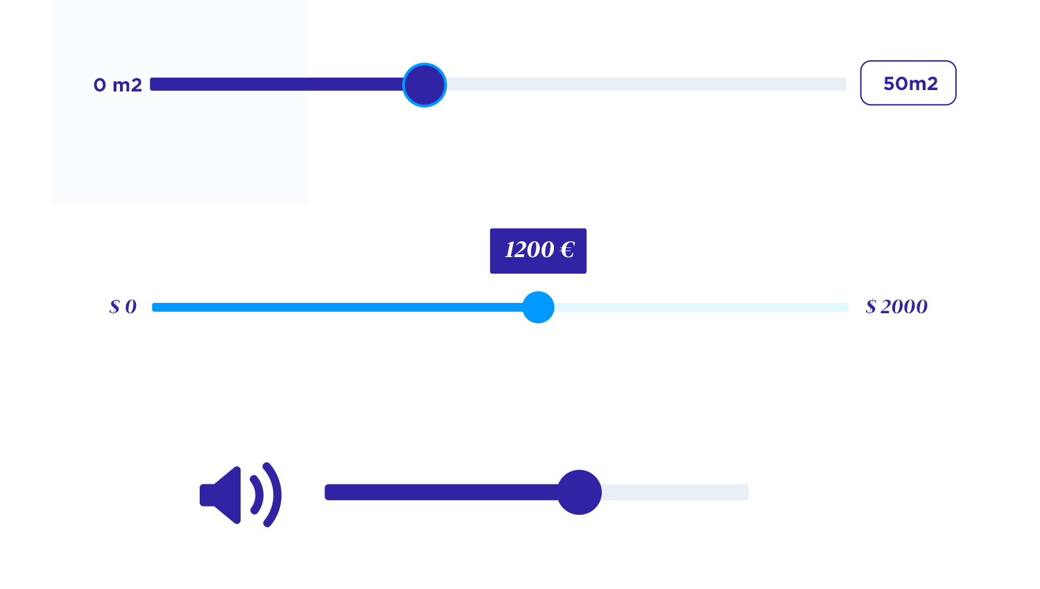
Price filtering is one of the most common use cases for sliders, and it’s easy to see why. With just a quick drag, users can set their preferred price range without needing to manually input exact numbers. This makes the interaction feel smooth and simple, especially when users are browsing a wide variety of options.
In this example, the user can easily adjust the price while seeing the current selection clearly displayed. For extra flexibility, always include the option for users to reset or see all price ranges again.

When users need to filter by more than one criterion, like price and distance, sliders offer a streamlined and efficient solution. In this example, two sliders are used – one for price and one for distance – letting users set their maximum limits in a clear and intuitive way.
By displaying the current value next to the slider, users can make quick adjustments without the need for manual input. This combination of multiple sliders not only saves time but also offers a visually engaging way to refine search results.

Sliders are a great way to let users pick a number without overthinking it. In this example, users can easily drag the slider to set how many participants they want, with the number displayed right below. It’s straightforward and keeps things from getting too complicated. Instead of typing in a number, users just slide, making it faster and more fun to pick a value.

When it comes to setting a budget, sliders help make the process easy and quick. In this example, users just drag the slider along the bar to choose how much they want to spend, with the current value shown clearly below. It’s a straightforward way to help users visualize their budget range without needing to type anything in. Sliders like this keep the experience smooth and hassle-free, giving users more control without overwhelming them.

Pairing sliders with other filters, like categories, helps users narrow down their options effortlessly. In this example, users can choose a price range while also selecting a specific category, such as “Vegan.” The slider makes it easy to set a price limit, with the exact amount shown clearly as users adjust.
This combination gives users full control over their search, letting them quickly find what they need without hassle. Including a reset option adds an extra layer of convenience, letting users start over if they need to.

Dual-point sliders, like this one for selecting a monthly price range, are perfect when users need to define both minimum and maximum values. Instead of using two separate sliders, this approach combines everything into a single, easy-to-use component.
Users can drag each handle to set their desired range, and the values are displayed clearly on both ends, helping them stay informed while making adjustments. This kind of slider is especially handy for situations like budget planning or subscription services.

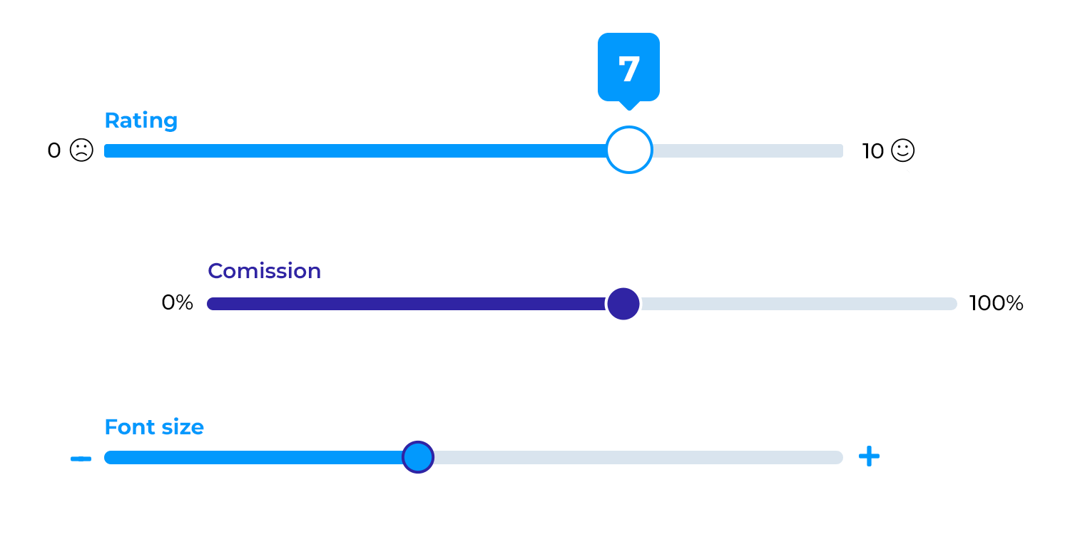
A UI slider can be a great way to help users explore new options or understand the option they want better. However, a slider by itself can leave users confused as to its function in the screen. You want users to understand the options on each extreme of the slider, as well as any currently selected option.
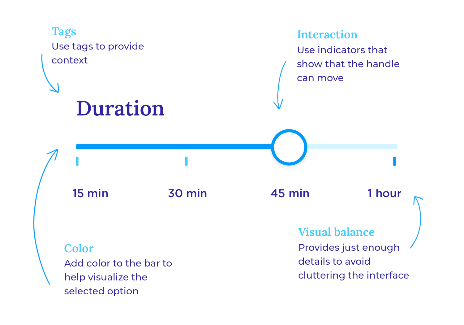
It’s clear that a slider design, no matter how clever, can’t offer users too much detail without cluttering the interface. This is particularly true when it comes to mobile sliders. In this sense, designing a good slider can result similarly to designing a good form. It’s about using the space to hold labels that add true value and add context to the slider itself.
Sliders are perfect for calculating costs interactively. Like in this example, the slider allows users to adjust their monthly revenue to see how it impacts their premium estimate.

Image source: Dribbble
This design helps users quickly understand how changes in input affect their costs, making it a great tool for financial or pricing calculations.
Sliders can look great on desktop but might feel cramped on mobile. The amount of space depends on how complex the slider is, like in the example shown.

For simple sliders, like volume controls, it’s important to make sure they work well on both big and small screens. If your design has more elements, like icons or buttons, test it to ensure everything fits neatly on mobile.
Design web and mobile UIs with interactive sliders
Dual-point UI slider designs, like in the flight duration example below, can be a clever way to avoid having two separate sliders that refer to the same aspect of the search, combining them in a single relevant slider.
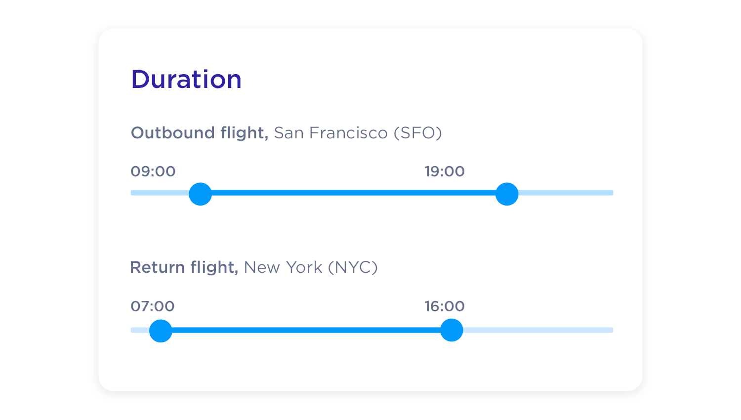
They are particularly effective when it comes to filtering price ranges, to define minimum and maximum prices. It’s true that the same effect can be achieved with other UI components, with websites using things like dropdown menus that also define a price range. But this is one of those cases where, if you have the space for it, the slider is the best option to go for.
Blue Nile is a well-known online diamond retailer. The brand prides itself in helping clients all over the world choose the right stone and create their own ideal jewelry.
We love that Blue Nile created a filtering system with dual-point sliders, allowing users to be extremely selective with the search results, choosing from price range, carat, cut, color, etc. It’s also a great example of using an alternative to the typical knob control.

However, best of all, they manage to display the perfect amount of information with each slider. The cut, color and clarity selectors are all marked in intervals, so it’s not a guessing game for the user as they move the slider along.
SkyScanner uses dual-point UI slider designs in order to help users narrow down the acceptable departure and arrival times of the shown options. On top of that, we also find that there’s a single-point slider that specifies the amount of acceptable time spent in layovers. Another excellent example of slider used to filter searches!

One thing that we’d change, though, is the fact that the times are down to the half hour. Remember, sliders are best when users just need to define rough quantities. The reason is that it can be hard to physically drag the slider to exact amounts.
Here, we have another great UI slider design example. Tylko uses several sliders, not to filter options but to help users visualize the available options. Each slider controls an aspect of the shelf, such as height or width. It works well, because it doesn’t just give users an immediate feel of the available options but also puts the currently selected option into context.

Additionally, displaying the values on the knob/thumb control is a good way to show information in a small space, yet we should take care to ensure that the thumb is large enough that the value won’t be obscured by the user’s cursor.
Spotify’s UI design has earned both praise and criticism, but there’s no denying their UX design pushes boundaries.
We like their use of a discrete slider, because it doesn’t refer to any filter or volume setting. Spotify uses slider design in order to help users configure the crossfade in the transition between songs. It’s simple, easy to understand and to interact with.

Yes, we know we said that it’s good to display as much information as possible to the user. But that’s only when they’re performing a task that implies a slightly larger cognitive load than adjusting the crossfade between songs. Otherwise that information is surplus to requirement and clutters the screen. In this case, the discrete slider is perfect for the job.
The New York Times has a buy-vs-rent calculator which is one of the most creative and innovative that we’ve seen to date, if we’re being honest.
Their slider takes the form of a graph. The track and knob represent the x-axis, where the user can slide the knob along to choose the home-price value while showing them the equivalent rent.
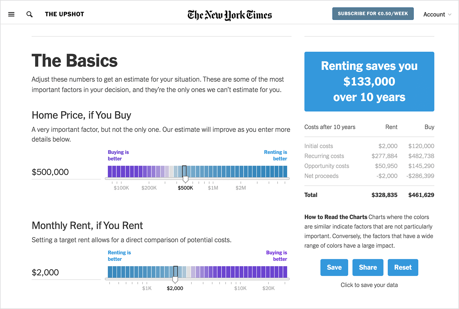
However, the user is also free to manually enter a home price into the calculator, which automatically moves the knob to the equivalent point on the slider. In doing this, they’re giving the user the choice to be as specific or as vague as they want. Wherever you can, try and include a manual input field!
Always make sure that the knob or handle or bar is large enough for the user to be able to easily click on it with a mouse. The above is a great example of how this simple graphic design tweak can help improve usability and reduce frustration.

The padding around the knob becomes even more important if you’re going to be using a mobile UI slider design, as a thumb or finger is typically larger and less precise than a cursor.
Adding a microinteraction is always a great idea to boost the impact of this highly interactive UI component. However, if you are going to add in a microinteraction design, just make sure there is not too much visual information going on at the same time.

Image source: Dribbble
Image source: Dribbble
What do we mean with that? For example, if there’s a value that changes as the user moves the knob along the track, it might be just enough to simply change the color of the knob or the track so the user knows they’ve activated it. Giving the user too many details to focus on can increase cognitive load.
However, a discrete slider, like we referred to above, gives a bit more freedom in this respect. The example above is a simple but impressive way to add extra life to a slider and is just the right amount of detail.
This one is quite easy to forget, but remember that it’s totally possible to have vertical sliders as well. The problem, however, comes in deciding which type to use, with horizontal sliders being a much more common feature. In fact, nine times out of ten, you’ll probably choose a horizontal slider.
At first, we might think it comes down to space, and we wouldn’t be entirely incorrect in assuming that. But the truth is, it’s a little more complex than that, especially for a website if we consider that most users might find sliding a knob up a vertical track is harder physically with a mouse than moving it horizontally.

On the flipside, on mobile devices, this movement tends to be easier, yet a horizontal slider is what people are used to, and in our opinion, it’s more visually appealing.
If distribution of space is a problem and you must use a vertical scrollbar, make sure you place it near the right side of the screen. The reason for this is that most users are right handed and therefore, will tend to use their thumb to move the knob.
Spinning a three-dimensional object a full 360 in space is just another one of the many practical applications we can apportion the UI slider control. In the example tomorrow, the user can spin the Peugeot around from left to right using the slider.

What makes this slider extra user-friendly are the directional “<>” symbols on the knob, in addition to the “L” and “R” buttons on either side. The latter helps add context but also serve as a way of manually adjusting the slider.
Design web and mobile UIs with interactive sliders
In truth, many of the classic guidelines for web sliders also apply to mobile sliders. However, much like other aspects of UI design, a mobile design means there are other factors to consider. When discussing how mobile slider design differs from those used on websites, the most crucial factors to bear in mind are the user’s touch and the lesser space available.
There are two things to consider here: the size of the user’s finger and its effect on the user experience. Ultimately, UII slider designs that are handled with a finger need to allow enough space for the slider handle to move freely.

Additionally, the knob needs to be extra sensitive to stoppage, that is, when a user lifts the finger off. Many slider controls are susceptible to nudging as a result of not being sensitive enough or being oversensitive. This means that lifting the finger means that the knob gets nudged into a different position. This tends not to be a problem so much in website slider design as the mouse is more precise than a finger.
Another practical effect of mobile slider design is that labels must be placed properly in the space available. When users handle the slider in order to complete a task, it’s important their finger doesn’t cover the relevant labels. This means that labels need to go either on the sides or above the slider itself. That way, the user can see everything while they interact with the component.
The web wireframing UI kit from Justinmind is packed with slider options that can help speed up the design process for any web project. It includes a variety of pre-built interactions, making it a versatile tool to jump-start your design work. Perfect for teams focused on wireframing ideas before diving into high-fidelity prototypes.

For mobile projects, the mobile app wireframing UI kit has everything you need. It’s full of interactive sliders that can help you quickly visualize how your mobile app will behave. If you’re designing for mobile, this kit will definitely come in handy.

The iOS UI Kit is a must-have if you’re designing iOS apps. It comes with three types of sliders: one for text size, one for volume, and a classic simple slider. All of them are ready to use, helping you get started on your design in no time.

The material design UI kit is perfect for Android app designers. It includes a classic Material UI slider that follows Google’s guidelines, making it super easy to integrate into your Android designs.

The angular UI kit is full of interactive sliders perfect for Angular-based projects. If you’re designing for Angular, this kit makes it easy to create a smooth, functional UI in no time.

If you’re working with primefaces, this UI kit has all the sliders and components you’ll need to design a sleek and user-friendly interface that integrates smoothly with primefaces.

The forms and surveys UI kit is packed with everything you need to design interactive sliders, input fields, and forms for surveys and questionnaires. It’s a great tool for visualizing how users will interact with forms on both desktop and mobile.

A slider can change the initial impression of an interface and change the effort needed to interact with the design. It makes for a typical UI component that users have grown used to, with most of us knowing exactly how to use it when we see it. But of course, no aspect of UI design is free of its own rules and guidelines.
Luckily, slider design can be both a simple component and an opportunity to add flair to the product. It’s all about spotting the right opportunities to use a slider in the design!
PROTOTYPE · COMMUNICATE · VALIDATE
ALL-IN-ONE PROTOTYPING TOOL FOR WEB AND MOBILE APPS
Related Content
 A fun look at different data table designs, from basic lists to smart, interactive ones, based on how complex the data is and what users need.18 min Read
 Single page design v multi-page design – everything you need to help you choose the right design for your site’s content18 min Read
 Website backgrounds can be a powerful tool in creating an experience. But what kind of experience can you convey and how? We got the full run-through for you!14 min Read


