
Navigation is known to be the backbone of any app - but how can we make it intuitive and seamless? What patterns are most popular? Read on to find out!
Mobile navigation design is all about getting users where they want to go, with the least amount of friction possible. There’s a wide selection of tools that designers can implement in order to create an entire navigation system in their mobile app – but the best one to use, of course, is an app prototyping tool.
Design and prototype mobile navigation with Justinmind. It's free!

We put together a list of the most common UI components and patterns that designers all over the world use when prototyping their navigation. Read on to find why they work and the things each one does best! As a bonus, we also included a list where these components can be seen in action in a section of serious UI design inspiration.
There are so many ways to describe navigation in mobile apps and how important it is. The navigation is the way your users will get from point A to point B. It’s how they’ll discover the design and interact with the product. Designers and writers often compare navigation to the road system of an app, describing it as the highways users rely on to enjoy the product.
The navigation design of any product is crucial. While it’s tempting to think of the goal of the navigation as “getting from A to B in the least amount of time possible”, that would be a mistake. Your navigation isn’t about getting users there quickly – it’s about making the way there logical and easy.

Each of these examples demonstrates the versatility of mobile navigation patterns and how they can be combined to create a seamless and intuitive user experience. Whether using a bottom navigation bar, hamburger menu, cards, or gestures, the key is to ensure the mobile navigation pattern is clear, consistent, and user-friendly. Here are 20 excellent mobile app navigation examples:
This example keeps it simple and easy. You’ve got five main icons at the bottom: Home, Favorites, a big plus in the middle for adding new stuff, Messages, and Profile.
The plus button stands out, making it super clear where to tap if you want to create something. It’s a neat, no-fuss design that keeps all the important things right at your fingertips. Perfect for apps where you want quick, easy access without any confusion.

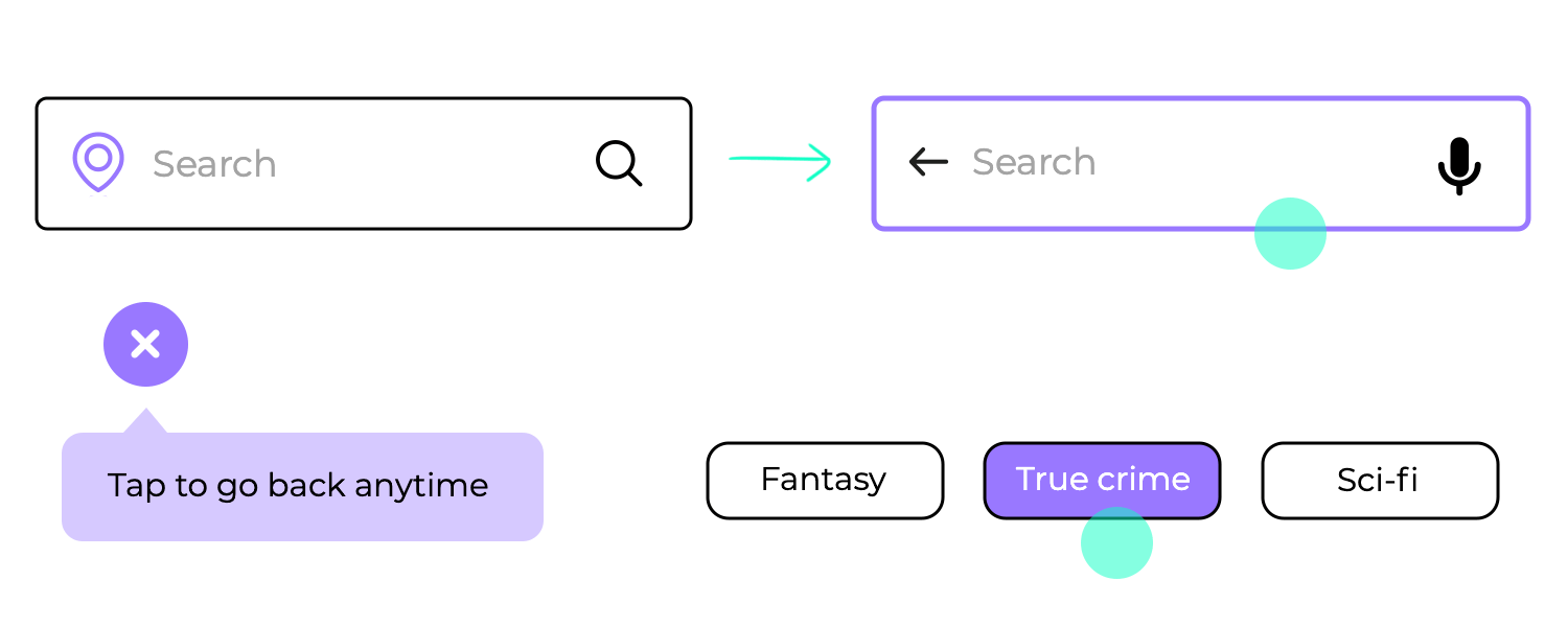
Now, let’s talk about the search experience in the same app. It’s all about keeping things straightforward. The search bar sits right at the top, always ready for you to start typing, with no distractions. Below that, your recent searches are displayed, making it super convenient to jump back to something you looked up earlier.
Each recent search has a tiny label showing its category, so it’s super easy to recognize what you’re looking at. It’s an effortless and intuitive setup, making your search journey feel smooth and easy, just like the rest of the app.

Here’s a great example of a side menu that feels super easy to use. It slides out smoothly, showing everything you need at a glance. Right at the top, you’ve got the user’s profile and a clear Sign out option – no need to hunt around for it.
Below, there’s a neat list of different magazines and sections, making it really simple to find exactly what you’re looking for. It’s like flipping through a directory – just tap, and you’re off! The icons next to each item add a nice touch, helping you spot things quickly. This design keeps things organized and super easy to explore, perfect for apps with lots of content.

What’s great about this navigation bar is how it keeps everything within easy reach. It features four simple icons: Home, Assets, Trade, and Profile.
The bold Assets icon shows exactly where you are, while the others stay light, so there’s no confusion. It’s an effortless way to move around, making sure you always know where to tap next. Perfect for staying focused and finding what you need in no time.

This recommendation setup really shines with its easy-to-swipe, card-style layout. Each card showcases a different movie or show giving you a quick peek into what’s on offer.
What makes this navigation design stand out is how effortlessly it encourages exploration. You don’t need to open menus or scroll endlessly – just a simple swipe, and you’ve got a new option in front of you. It feels like flipping through a personal movie catalog, making the experience both engaging and intuitive. It’s perfect for discovering something to watch without any hassle, all while keeping things visually exciting.

What we love about this navigation example is how easy it is to see all your flight options at a glance. Right at the top, the big, clear labels for Tokyo (TYO) to San Francisco (SFO) make sure you know exactly where you’re headed. The date choices with their prices are lined up just below, letting you quickly compare and pick the best deal.
Moving down, you get all the important details like departure and arrival times, total flight duration, and even the flight number – all laid out neatly. This design keeps everything in one place, making it super simple to find the right flight easily.

You’re going to love how easy this makes finding your music. Right up top, you’ve got your main categories – Songs, Albums, and Playlists – so you can jump to what you’re in the mood for. The Albums tab is lit up in green, showing exactly where you are.
As you scroll, the album covers pop up with clear titles, making it super easy to spot your favorites. It feels just like flipping through a record collection, but way more convenient. Everything’s right there, ready for you to explore easily.

Here we have again a navigation example from the Magazine App that is all about showing you interesting content in an easy way. Under “Featured for you”, you get big, eye-catching cards with headlines like “Four ways to stop deforestation in the Amazon” and “The crossroads of the largest library in the world.”
Each card has a little tag, like Science or Culture, so you know what it’s about right away. It’s simple, clear, and makes you want to tap and find out more. A super smooth way to browse through featured content.

Here’s another example from the Mobile Magazine App, and it keeps things super simple. You’re greeted with a clean search screen where you can do a custom search across all articles. The big, bold text encourages you to dive right in, while the little illustration adds a friendly touch.
The search bar sits right at the top, always ready for your input, making it easy to start your search. It’s a straightforward and welcoming design that helps you find what you’re looking for without any fuss – just type and go.

We’ve already seen how the Secondhand app keeps things simple, and this messaging section follows the same approach. On the left, there are two easy-to-switch tabs: Messages and Notifications. Each message is clearly listed with a name, a small image, and a bit of the conversation, making it easy to spot who’s contacting you.
Just like before, the big plus button is there when you’re ready to start a new message, opening up a clean, blank chat window on the right. It’s another great example of how this app keeps things straightforward, letting you stay connected without any hassle. Everything’s right where you need it.

This navigation keeps things simple and organized with a clean search bar at the top, making it easy for users to look up specific titles or authors in seconds. Right below, there’s a featured section showcasing highlighted books, laid out in an engaging horizontal scroll. This setup feels intuitive and fluid, allowing users to browse effortlessly without feeling overwhelmed.
It strikes a balance between a minimalist design and functional navigation, inviting users to discover more as they swipe through recommendations. A clear bottom navigation bar complements the experience, providing quick access to other essential sections like the library and reading updates.

Design and prototype mobile navigation with Justinmind. It's free!
Continuing with the theme of intuitive navigation, this Fitness App takes a straightforward approach to data presentation. Users can easily toggle between week, month, and year views through simple tabs, which are highlighted when active for better visibility.
Below, key stats like steps, elevation, and time spent are displayed with clear comparisons to past performance, making it easy to track progress. The bottom navigation bar ties it all together, providing seamless access to other key sections. It’s an elegant way to keep navigation simple and insights accessible.

The back button in this TV shows tracker app is a standout navigation element, positioned perfectly at the top left for easy access. It makes returning to previous pages feel natural and effortless, making sure users can browse through their shows and tracking details without losing their place.
This thoughtful design keeps navigation simple and intuitive, making sure that exploring the app feels smooth. It’s the kind of feature that blends in but makes a big difference in how easily users move around.
Navigating this meeting room booking template is a breeze, thanks to its clear step-by-step layout. Users start by filling in simple details like the name of the meeting room, their email, and time slots for the reservation.
Each field is straightforward, guiding users through the process with minimal effort. The “Continue” button at the bottom acts as a friendly nudge, signaling when it’s time to move forward with the booking. This setup keeps the experience intuitive and ensures that reserving a meeting space is as seamless as possible.

The Second App adds a touch of simplicity to browsing with its horizontal scroll for filter options. Positioned just below the search bar, these filter icons let users quickly sift through different categories. The icons are clear and visually distinct, making it easy to find what you’re looking for at a glance.
This smooth scrolling feature keeps navigation light and user-friendly, giving users the flexibility to explore content tailored to their interests without overwhelming the interface.

Instagram keeps things fresh and engaging with its navigation, just like a never-ending stream of captivating content. It blends the ease of a bottom bar with the intuitive flow of gestures. Think of the bottom bar as your personal command center, with five trusty icons for Home, Search, Reels, Shopping, and Profile, all within easy reach.

No matter what kind of Instagram experience you’re craving, it’s just a tap away. And if you’re feeling spontaneous, swipe through tabs like flipping through a stack of intriguing photos – from your feed to stories, the world of Instagram unfolds seamlessly. It’s a navigation style that’s both familiar and fun, perfect for getting lost in the discovery of endless possibilities.
Google Maps isn’t afraid to chart its own course when it comes to navigation – and that applies to its interface too! Picture a map unfurled before you, ready for exploration. At the top, like a trusty compass, sits a search bar to pinpoint any destination. Account settings are tucked away there too, keeping things uncluttered. But the real adventure happens down below. A handy bottom bar acts like your travel kit, offering quick access to finding nearby places or diving straight into navigation.

Need more details? No problem! Google Maps avoids dead ends with a clever trick. A quick swipe up reveals a bottom sheet, packed with additional information without ever leaving the map itself. This layered approach keeps you in control, letting you access everything you need without getting lost in a maze of menus. It’s navigation that’s as smooth and intuitive as a well-planned road trip!
YouTube is your portal to a world of video entertainment, and its navigation is like a friendly tour guide, showing you the way around. Anchoring the experience is a trusty bottom bar, like a control panel at your fingertips. Home, Shorts, Subscriptions, Library, and Premium – all these options are just a tap away, making it easy to jump between your personalized feed, the latest trending bites, your favorite channels, and even saved videos or premium features.

But YouTube doesn’t stop there! While you’re engrossed in a video, the magic of gestures takes over. A simple swipe adjusts the volume or brightness, as smooth and intuitive as dimming the lights at a movie theater. It’s navigation that puts you in control, letting you focus on the content without ever breaking the spell.
Netflix throws open the curtains to a world of cinematic delights, and its navigation is like a welcoming host, guiding you through the experience. A handy bottom bar acts as your personal concierge, offering access to key areas: Home, Search, Coming Soon, Downloads, and More – all within easy reach.

But the true magic unfolds on the main stage. Here, row after row of enticing cards – representing shows and movies – beckons you to explore. It’s a visual feast, making it easy to discover new content and dive into something that sparks your interest. This layout is like a friendly conversation, intuitive and familiar, inviting you to browse and settle in for a night of entertainment.
Amazon’s app welcomes you to a vast marketplace, and its navigation is like a friendly shop assistant, guiding you to what you need. A handy bottom bar acts as your shopping cart, offering quick access to essential sections: Home, Your Orders, Cart, Profile, and More – all within easy reach.

But wait, there’s more! For those less common items, a trusty hamburger menu awaits, stocked with additional options like settings and specific categories. This clever combination keeps the interface clean and organized, while ensuring everything you need is just a tap or two away. It’s navigation that’s as efficient as a well-stocked store, perfect for finding exactly what you’re looking for.
Google Calendar on Android keeps things organized and accessible with its bottom navigation bar. This bar, like a handy toolbox at your fingertips, offers quick access to essential views: Day, Week, Month, and even Year.

Switching between your schedule’s different scales is a breeze, just a tap away, letting you focus on what matters most without getting lost in menus. It’s a clear and simple system, much like a well-organized desk, perfect for staying on top of your busy life.
LinkedIn transforms your phone into a professional networking powerhouse, and its navigation is like a skilled personal assistant, keeping everything organized and accessible. Down below, a trusty bottom bar acts as your command center. Icons for Home, My Network, Post, Notifications, and Jobs are all within easy reach, letting you jump between key tasks with a tap.

But don’t forget your connections! Up top, a search bar helps you find specific people, while a dedicated messaging icon ensures you can stay in touch with your network seamlessly. This dual navigation approach keeps everything you need at your fingertips, empowering you to build and manage your professional world efficiently.
Design and prototype mobile navigation with Justinmind. It's free!
Pinterest isn’t just a digital bulletin board, it’s a treasure trove of inspiration waiting to be unearthed, and its navigation is like an enthusiastic guide, leading you on an adventure of discovery. A handy bottom bar acts as your map, with clear icons for Home, Search, Create, Notifications, and Profile, all readily available.

But the true magic lies in the presentation! Pinterest throws open its doors with a visually stunning display of cards, each representing a unique pin. It’s a feast for the eyes, making exploration effortless and enticing. This card-based design is like wandering through a curated museum, where every corner holds the potential for something new and captivating. It’s navigation that’s both intuitive and engaging, perfect for sparking your creativity and fueling your inspiration.
Airbnb whisks you away to a world of unique stays, and its navigation is like a friendly travel companion, ensuring a smooth and stress-free journey. Up top, a search bar acts as your compass, guiding you towards your dream destination. Meanwhile, a handy bottom bar keeps all your travel essentials within reach. Explore, Wishlists, Trips, Inbox, and Profile – all these options are just a tap away, letting you browse listings, manage your saved destinations, and keep track of confirmed stays.

Also, to make this app one of our favorites, instead of dry text listings, Airbnb presents its rentals like a visual travelog. Each property is showcased with beautiful cards, tempting you to swipe through and discover hidden gems. This intuitive and interactive design makes finding the perfect accommodation a breeze, letting you explore and book your dream stay with just a few taps.
Slack transforms your workplace into a streamlined hub, and its navigation keeps everything organized for clear communication. Down below, a handy bottom bar acts as your mission control center. Icons for Home, DMs, Mentions, and You are all within easy reach, letting you jump between conversations, stay on top of @mentions, and access your profile with a tap.

But there’s more to Slack than meets the eye! Tucked away, accessible by a swipe or a tap on the hamburger menu, a sidebar awaits. This is where you’ll find all your channels neatly organized, along with additional settings to fine-tune your Slack experience. This clever combination keeps the interface clutter-free while ensuring everything you need is close at hand.
Dropbox keeps your digital life organized and accessible, no matter where you go. Imagine a pocket briefcase for all your important files. That’s what the navigation feels like! A clear and simple bottom bar acts as your filing cabinet. Home, Files, Photos, and Account – everything is neatly categorized, just a tap away.

Need to add something new to the mix? Look no further than the handy floating action button, like a trusty pen at your fingertips. Uploading files or creating new ones is a breeze, letting you capture and store important things on the fly. This simple and effective approach puts everything you need within easy reach, making Dropbox your go-to companion for managing your files on the go.
Facebook is known for many things – one of which is its mobile navigation. This great example shows the power of combining different mobile navigation patterns. Facebook uses a hamburger menu, a top navigation bar as well as a bottom navigation bar.

It’s true that, in theory, this all sounds like a bit too much – but Facebook makes it work. By now, most users know exactly what goes where in the three navigation options, without anyone getting overwhelmed. With this approach, the social media giant manages to clearly separate the primary things from the secondary.
The platform uses 5 destinations in its navigation bar below. These buttons are persistent, which means they don’t change and are always present, creating consistency across the app.
Spotify has grown to be a giant in the music streaming business, and their UI design reflects it. This mobile navigation example is all about cards in the homepage, using them as a dynamic way for users to discover content. Spotify is known for encouraging users to discover new musical horizons, which improves the entire user experience.

The cards are done in a highly visual way, highlighting the key idea behind each card. As a bonus, we also have a bottom navigation bar that does the heavy lifting when it comes to the main navigation of the app. Overall, it’s easy to understand and explore even for new users.
The App Store is a wonderful example of using tabs for mobile navigation. We can see that it reflects the theory behind navigation design perfectly, with the tabs touching on different aspects of the same content. Within the Top Charts section of the App, a user has the ability to explore explore apps by category – creating coherency and awareness of alternative views.

The bottom navigation bar covers the more primary features of the entire store, creating a highway that gets users to where they need without an overall theme to the buttons. Classic mobile navigation art!
Telegram keeps things delightfully simple with its mobile navigation, prioritizing ease of use for everyone. While the iconic hamburger menu has seemingly stepped aside, a new bottom navigation bar has taken center stage. This easily accessible bar provides quick access to the core functions you’ll use most: Contacts, Chat, and Settings.

This focus on user-friendliness remains core to Telegram’s design philosophy. The bottom navigation bar is instantly recognizable and takes just a tap to access the features you need. Plus, its compact design keeps the interface clean and clutter-free, ensuring a smooth and intuitive experience for users of all technical backgrounds.
Oh, Tinder. We are all familiar with it, with the app having a huge impact on how people perceive online dating. Gesture-based navigation wasn’t invented by Tinder, but the app definitely brought it to the masses. The classic swipe left or right pattern is all about keeping things dynamic, easy and entertaining. No matter how you feel about the app, there’s definitely merit to its mobile navigation design!

Brought to you by Patrick Wong, this is a great example of full-screen navigation at work. In fact, we can appreciate that the “navigation hub” pattern can be adapted to suit different needs. Any way you want to go about it, Patrick’s work goes to show that this approach can render a wonderful user experience when done right.

For us here at Justinmind, a good navigation hub is all about spacing, good visual hierarchy and usability. These three aspects can be thought of as pillars of the hub, making it possible for users to process and interact with the screen – opening up the entire product in a single swing.
Yelp takes a slightly different approach when creating a full-screen navigation experience. Dividing the screen into two different areas, Yelp doesn’t actually dedicate the entire screen to the navigation options, using the top part for navigation options and leaving more negative space at the bottom.

We like that the platform uses the navigation options to funnel users into the category they’re truly interested in, making the road dynamic and easy. For example, for users looking for restaurants, there’s no real need to take the time to type the “restaurants” category.
This Trello concept design is a great example of card-based mobile navigation. The cards aren’t squares but rather elongated rectangles that fill up the screen space without overwhelming users. The card system is a good representative of Trello’s ability to simplify complex workflows, keeping everything tidy and easy for the people involved.

X’s mobile app (formerly known as Twitter) is another good example of more than a single navigation pattern at work. The app focuses its navigation on the bottom bar, covering the four main aspects of the entire platform. It’s broad and covers all the relevant ground.

In contrast, we have the tab system on the notifications screen. With three tabs, the app classifies the notifications according to their nature. This helps users filter the notifications so they can find the more relevant ones quickly, instead of scrolling endlessly. It’s specific and while all three tabs deal with notifications, the tabs deal with different contexts that surround the notifications.
Design and prototype mobile navigation with Justinmind. It's free!
Navigating through mobile applications presents unique challenges compared to traditional web interfaces. With smaller screens and touch-based interactions, the design of mobile navigation systems demands a heightened level of clarity and user-centricity.
In this section, we delve into essential best practices that aim to optimize mobile navigation, ensuring it remains intuitive, accessible, and supportive of users’ expectations. From accommodating diverse hand positions to maintaining legibility and visual hierarchy, each guideline is crafted to minimize friction and enhance the user journey.
Consistency is key when it comes to mobile navigation. Users should always feel confident about where they are within the app and where they can go next. This is achieved through clear and consistent labeling of navigation elements. Each button, link, or icon should have a specific purpose that is immediately understandable to the user.

Effective navigation design also involves providing users with clear feedback and affordances, which are visual cues that indicate how an element can be interacted with. When a user taps a button or a link, there should be immediate visual or tactile feedback, such as a color change, animation, or vibration, confirming that their action has been registered.
This helps users feel more in control and reduces the likelihood of errors. Affordances, like raised buttons that appear clickable or links that change color when hovered over, guide users intuitively on how to interact with the app, enhancing their overall experience and satisfaction.
This is true for all sorts of navigation, it’s true. However, everything is made more noticeable in mobile devices because of the reduced space and increased interaction cost. That means that any mistake made in the navigation of an app can have a bigger impact on the experience than a web-based app.

Users don’t want to wonder what buttons do or where links will go. From a usability point-of-view, it’s crucial that the navigation is intuitive to your target users. This means rigorous testing and lots of research. You want to understand users’ mental models, and carry out tree tests and card sorting tests. This is the time to pull out all stops and create a mobile navigation system that works with users instead of against them.
Even after the bare bones of the navigation design are put together, you’ll still want to double-check that it truly is intuitive. From low to high-fidelity prototypes, this type of validation is standard procedure.
This is of vital importance for mobile apps. Users’ fingers aren’t always slim but everyone has to be able to use the app comfortably. Nobody wants to waste time by trying to tap on an icon repeatedly and not being able to get anywhere. It’s frustrating, distractive and can ruin the carefully planned experience the design team had worked so hard to create.
This means that your links and buttons need to be big enough for most people to be able to tap them successfully on the first try. The general advice is to install a minimum 10mm size to all buttons. To know more about creating wonderful buttons, check out our post on button design.

Another thing to consider is the spacing between elements that support the navigation. You want to make sure not just that everything is big enough so users won’t stress themselves out when they try to tap them. You want available space so they don’t tap on random elements that are nearby.
Mobile screens are much smaller than computers – which creates the issue of readability for the content at play. The navigation in most apps is text-based, even if they rely on icons like the hamburger menu icon for some of it.
You want users to not have to struggle to read anything, from the actual content to the links and button texts. When it comes to mobile navigation, size matters! It’s worth taking the time while you’re still prototyping the navigation to test it out and see how users interact with it. This is a solid reason to invest in a prototyping tool that allows for realistic navigation simulation and can work with your favorite user testing platforms.
Small screens mean that it’s much easier to fall into the clutter trap. Mobile app design requires designers to forsake anything that isn’t absolutely crucial for the user experience, trimming any extra fat the design might have. Minimalism may be a specific style of UI design, but all designers dabble with it when it comes to creating mobile apps.

Even with a small number of elements, users can still get a feeling of chaos if the elements don’t have a visual balance. It’s very important that the UI layout, the content and even the navigation work together to guide the user’s eyes around the screen. This includes having the content maintain a certain hierarchy, analyzing the proximity between elements and allowing plenty of empty space for visual relief.
Design and prototype mobile navigation with Justinmind. It's free!
Each component serves a unique purpose, just as you would think. Understanding these components and their strategic implementation is crucial for creating cohesive and user-centric mobile interfaces. Here, we explore 10 essential UI components tailored for mobile navigation, offering insights into their benefits and best practices for integration.
Avoid using jargon or overly technical terms that could confuse users. Instead, opt for simple, descriptive language that aligns with users’ expectations and mental models. Regularly review and update these labels to ensure they remain relevant and useful as the app evolves.
The floating action button (FAB), often seen as a circular icon hovering above the app’s content, is a staple in mobile navigation for its ability to offer a primary action within the app. Typically used in apps like messaging or email, the FAB provides a quick and prominent way to perform a common task, such as composing a new message or creating a new document.

Its standout appearance draws attention, making it clear to users what the main action of the screen is. The FAB’s design ensures it doesn’t clutter the interface while remaining easily accessible, contributing to a streamlined and user-friendly experience.
The side drawer, also known as a side panel or slide-out menu, is another popular navigation component in mobile apps. Accessible by swiping from the left or right edge of the screen, it reveals a hidden menu that typically contains secondary navigation options or additional app features. This approach keeps the main screen uncluttered, allowing users to focus on primary content while still having quick access to other functions.

The side drawer is especially useful for organizing settings, profiles, or other less frequently accessed options, ensuring they are out of the way but still easily reachable when needed. This method balances a clean interface with comprehensive functionality, enhancing overall usability.
The infamous hamburger menu. Some designers love it, others simply tolerate it (and a small number want to eradicate it from existence).
Whatever your thoughts are on the humble hamburger menu, those three little horizontal lines which sit comfortably in the corner of a mobile app can be extremely useful. With such a limited amount of real estate to play with, the hamburger menu is a method of hiding more elaborate navigation so users can enjoy more screen space.
Like so many other UI components that designers have come to rely on, the hamburger menu brings another great advantage to the design. Most users are already familiar with it. They know what it is, how it works and what to expect from the icon.

Of course, everything has its downsides. With the hamburger menu, some designers say that in hiding away the navigation options we may hinder the user experience instead of improving it. Some arguments against it include that users may not notice it unless they actively look for it in the UI. Others focus on the fact that in hiding away crucial links and buttons, we may make it more difficult for the user to discover the product upon first encounter.
While there’s still a debate surrounding the hamburger menu, most in the design community have surrendered to its charms. The hamburger icon has become so popular, most designers will be at ease simply using a good color scheme that ensures a contrast between icon and background.
Bottom navigation is exactly that – a navigation bar that gathers the primary or secondary navigation links. With a simple tap, users can intuitively explore and negotiate between top-level views.

The reason why bottom navigation is so popular for mobile apps is that most users will be able to navigate with their thumbs comfortably while holding their device. It requires less strain and reduces the need to change the method of grasping the device, improving the usability of the entire product.
To reduce fatigue, most bottom navigation bars have between three and five destinations for quick access. Another argument in favor of bottom navigation is that it takes less effort to reach certain destinations within the design, with only a single tap being needed.
The other side of the same coin as bottom navigation. This also consists of a navigation bar, only located at the top of the screen. It still offers most of the benefits from bottom navigation, minus the ease of use while holding mobile devices. With larger phones, many users will have to use both hands or change their grasp in order to reach all the links.

Like many components on this list, top navigation is often used in combination with other ways of navigation. A silly but practical example might be when mobile apps use both top navigation (for primary links) and secondary navigation (for secondary links). The top bar can convey to users that the links it contains are very important, especially if they remain visible as the user scrolls down.
Card UI design is a brilliant design pattern and can really make your mobile UI pop as a result of their highly visual and customizable nature. They come in all shapes and sizes and are a great way to showcase various elements such as text, a link, or a photo in one place and have become very popular in mobile app navigation.
As content has become more compartmentalized and personalized over the last few years, cards have been proven to be a great way to aggregate individual pieces of information in one place.

In an effort to improve your UX design, cards can be personalized to display different content. Another upside is that cards can help users notice immediately when the cards can be scrolled horizontally, improving general usability. Yet another argument in favor of cards is that they can be easily adapted to different screen sizes, making them a great option for responsive apps.
Tabs are not too different from navigation bars when it comes to UI patterns. They share the same layout, that is to say, a tab will be a row of multiple options leading to different screens. Where they differ, however, is a navigation bar will contain options that are unrelated to each other. Tabs, on the other hand, tend to have an overlying theme to them.
For example, in a navigation bar, you might have a home button. Next to the home button may be a search function or even a favorites button which will take you to those respective views. While unrelated, these buttons represent key features of the app.
Essentially, tabs are used to switch between alternative views within the same context. To illustrate, consider a tab system for an email platform. The first tab shows “primary” senders who are in your contact list, while the second shows other senders who you may not know. Two different sides of the same coin that deal with incoming emails.

Gesture-based navigation enables users to quickly swipe in their desired direction to navigate through an app or perform a particular action. As a UI navigation pattern, it has been around for decades but gestural navigation really gained traction among mobile app users with the advent of popular dating app Tinder. Swipe right, anyone?

Using gestural navigation helps to create a journey between different scenes within an app and gestures, including touching and dragging both horizontally and vertically, as well as zooming in and out. It’s highly immersive and interactive, creating a dynamic experience.
The great thing about this UI design pattern is that it’s relatively simple to grasp for even the most inexperienced user as the gestures are often intuitive and only require a little experimentation to get right.
Many of the navigation patterns on this list are all about minimizing the use of space. This is a completely opposite approach, dedicating the majority of the screen exclusively to mobile navigation. Sometimes referred to as a “navigation hub”, this approach works well to funnel users from broad sections of the product to very specific ones.
It’s true that sometimes, so much navigation can be a little overwhelming. Some designers are adventurous enough to dedicate an entire screen to the app’s navigation, using careful visual hierarchy to avoid overwhelming users. It’s a way to offer a lot of the navigation options in a coherent way, immediately helping users understand the product’s features all at once.

And last but not least, we have 3D touch. It was first brought to users by Apple, who found a way to offer direct options from the homescreen of the iPhone. It’s a way to create a navigation shortcut, showing the key actions for the selected app.
Another common use for this mobile navigation is the preview of content. When dealing with a list of options for content, like an email inbox or a list of articles, this can be a good way to give the user a preview.

It’s worth remembering that central features shouldn’t be accessible only via 3D touch. Mobile navigation should still provide a clear path so users can find the primary features without having to discover the 3D touch option.
Design and prototype mobile navigation with Justinmind. It's free!
If you’re into UX design (which is likely since you’re still reading this) you know how crucial prototyping is. It lets you see and test your ideas before they go into development, making sure everything works smoothly. Justinmind offers some awesome UI kits that make this process easier.
Using these UI kits, you can speed up your prototyping process and make sure your mobile app’s navigation is smooth and user-friendly. Each kit gives you the tools you need to create prototypes that look awesome and work well, helping you bring your app ideas to life.
Here’s a quick look at three essential UI kits for mobile navigation prototyping:
The mobile wireframing UI kit is perfect for creating basic prototypes. It includes a bunch of wireframe components designed specifically for mobile apps. With this kit, you can quickly sketch out the basic structure and navigation of your app. It’s great for focusing on how things work without getting distracted by detailed visuals.

The iOS UI kit is a must-have if you’re designing for iPhones. It includes all the iOS-specific components you need, like navigation bars, tab bars, buttons, and icons. Everything in this kit follows Apple’s design guidelines, so your prototypes will look and feel like a real iOS app. It’s perfect for making high-fidelity prototypes that help you and your stakeholders visualize the final product.

For Android apps, the Android material design UI kit is a game-changer. It includes components that follow Google’s Material Design principles, which focus on clean and functional design. You’ll find all the key UI elements like navigation drawers, floating action buttons, and cards. This kit helps you create detailed prototypes that look and behave like actual Android apps.

Most designers will tell you that mobile navigation needs to respect the same key principles of classic web navigation design – but it does require a lot of creativity. The limited amount of space along with users’ high expectations regarding usability make a good mobile navigation design a tall order.
Hopefully, with the key components in this post, you’ll be ready to create a navigation system that has your users smiling the entire time. The examples in this post add a nice bit of context around the components and patterns, offering a wonderful injection of inspiration into the mix!
PROTOTYPE · COMMUNICATE · VALIDATE
ALL-IN-ONE PROTOTYPING TOOL FOR WEB AND MOBILE APPS
Related Content
 Learn how to design better e-learning platforms with user-centered UX principles, real examples, and high-fidelity prototyping tips to boost engagement and learning outcomes.13 min Read
 Infinite scroll keeps users engaged, but it’s not always the best choice. This guide breaks down when to use it, when to avoid it, and how to design it right.14 min Read
 Learn how to design web and mobile app prototypes, how to test them and what to look for in a prototyping tool in this complete guide.15 min Read


