
Splash screens give UI designers the chance to make a bold first impression and reinforce brand identity.
Splash screens may be an innocuous part of the user experience. It’s just a launch screen, there’s not much to it. But first impressions count and the devil is in the details. With the right prototyping tool, you can even make your own in a matter of minutes.
Start designing new products today. It's free!

Before you do, let’s take a closer look at splash screens, and 50 inspiring examples to get you started.
A splash screen, also known as a launch screen, is the initial screen displayed when you open an app. It usually features the app’s logo, company name, and sometimes a motto. It transitions to the main screen once the app has loaded.
Splash screens are typically visible for only a brief moment, making them easy to miss if you’re not paying attention. Despite their fleeting nature, they are crucial for strengthening brand identity and making a positive first impression. According to Google’s Material Design guidelines, the splash screen is the user’s first experience with your application, underscoring the importance of making it count.
For example, Skype’s splash screen prominently displays its logo with a soft gradient background. As the app loads, the icon animates and bounces, adding a touch of whimsy to the user experience. In contrast, apps like Medium and Etsy use bespoke illustrations that align perfectly with their brand identity, whether it’s for a dashboard design or a social media platform. This is a great splash screen example of how different brands use this feature effectively.
In cases where an app loads quickly, you might find a placeholder UI instead of a traditional splash screen. If reinforcing brand identity is not a priority, the app might display its core structural elements without additional branding content like so:

Splash screens are simple but highly effective elements that help strengthen your brand’s identity and give users something attractive to look at while your app loads. Here are some best practices for creating a great splash screen.
Minimize distractions: Keep the design clean and simple, and consistent with branding. Avoid unnecessary elements and multiple logos to maintain strong brand recognition.
Subtle animations: If you choose to include animations, make sure they are subtle and don’t extend the loading time. Overly complex animations can be distracting and counterproductive.
Early integration: Incorporate the splash screen design early in the development process, starting from the low-fidelity wireframe stage. This ensures it aligns well with the overall product design.
Prototyping: Allocate time and space in your paper prototype for the splash screen. Early consideration helps in maintaining consistency with the rest of the app’s design.
Check out our full guide to designing your own wireframe and see how to build your designs from the ground up.
Keep it concise: Aim for a quick splash screen display, ideally under 3 seconds. No one likes to wait too long before diving into the app!
High-quality graphics: Use high-resolution images and graphics to ensure the splash screen looks professional on all devices.
Let users know what’s up: Consider including a progress bar or loading indicator. It helps users understand the app is working behind the scenes, not frozen solid.
Speak the app’s language: Make sure the splash screen design reflects the app’s purpose and content. It creates a smoother experience for users as they transition from the intro to the main action.
Creating a splash screen in Justinmind is straightforward and easy. When you download Justinmind and start a new prototype, you have at your disposal a treasure trove of awesome pre-built UI widgets.
Using a default mobile screen, you can just drag an image widget and a text widget onto your canvas in the desired positions. Add your own images and color preferences, and voilà! Combined with interactions, your screen will change after the set time (it’s a splash screen, so don’t leave your users waiting!).
Go here for more on prototyping mobile UI animations with free downloadable examples.
Looking for other types of inspiration? Don’t miss our post on wonderful wireframe examples or this list of creative UI design examples.
We have two very different approaches to splash screen design here. Amazon’s splash screen focuses on branding with simplicity, while Etsy’s splash screen communicates creativity and brand identity.

While it may immediately appear so, this is another example of different takes on splash screen design. Booking.com makes an impact with its background color, while Airbnb keeps things light with nothing but its logo on the screen.

This splash screen for Uber is actually a Dribbble concept from Bryant Jow, but we love it so much we included it here. Like Cabify, this aims to make a visual impact.

Both Netflix and Disney+ make the most of their background, creating a sharp contrast between the background and the logos. It’s dramatic in the best way!

Start designing new products today. It's free!
Another good example of different takes. 8Fit keeps things light and clean, including only their logo. VG-FIT goes in the opposite direction with a dramatic background and their name as well as their logo.

Both social media networks go for a dramatic background that reflects their brand. It’s what is expected, sure. However, it still delivers a great impact and makes for a visually pleasing experience.

Spotify uses a simple black background with their green logo to make their website look modern and clean. This matches their brand well. On the other hand, SoundCloud uses a bright orange background with their white logo, which is eye-catching and reflects the lively music they offer. Both websites effectively use images to showcase their type of music and entice users to engage with their service.

The Vueling splash screen was created by Victor López Gonzàlez, resulting in a screen that points to the brand identity and culture of origin. Ryanair goes for something simpler, aiming to create a nice contrast between logo and background.

The splash screen design that King offers users relies on a big visual impact of the background, creating a contrast with the logo. The Pokémon splash screen goes for a white background, allocating more space to their logo – establishing a visual experience that relies on the graphic design and not the palette.

Start designing new products today. It's free!
Skype uses its splash screen in order to reinforce its brand identity, relying on its classic blue and adding a gradient for extra flare. Discord, on the other hand, does something interesting: the splash screen colors will reflect the setting of the palette that users have on their device. It’s a smart way to customize every aspect of the experience!

Dropbox went for a bright splash screen that draws the eye, establishing a strong visual cue. Google Drive took a different approach, offering a soft white background that lets the logo shine bright.

Once again, we have contrasting choices of splash screen design. Twitch offers a bright purple background that reflects its brand color, with a white logo. Youtube maintains a fully white background, making its red logo stand out visually.

The Bitly splash screen, we confess, was uploaded by Matt Delac and not by the company. But we couldn’t leave it out of this list! It reinforces the brand identity and biggest selling point, making for a very smart use of the space. Owly relies on a solid black background that makes its logo stand out.

Start designing new products today. It's free!
Bear offers a bright red background that contrasts sharply with the white logo, and strikes an interesting disparity with Evernote. Although it used to have a splash screen that offered an illustrated green background, Evernote switched it up for a classic white background with a simple green logo.

Linkedin took a page from other social media networks’ books, creating a background that is of solid color. Tik Tok took a slightly different approach, using color but also creating a certain gradient style to the background.

In the splash screen examples of these social media giants, Pinterest keeps things simple with a bright red logo on a white background, reflecting their bold and friendly brand. X goes for a more modern vibe with a clean white logo on a sleek black background.

Slack’s splash screen pops with a multicolored logo on a white background, just like their lively communication style. Trello, on the other hand, keeps things calm and focused with a cool blue background and a clean white logo. It’s like a digital whiteboard ready to help you organize your next big project!

Opening Reddit feels like walking into a friend’s place. This splash screen example throws some orange and white alien vibes your way, setting the mood for fun and hanging out with your online community. Quora, on the other hand, is more like a cozy library. Their deep red background and clean white logo say “let’s get down to learning something new” right from the start.

This splash screen example is all about making learning fun. Duolingo’s splash screen is a breath of fresh air with a green background and their cute owl pet. It feels more like playing a game than studying. ️Rosetta Stone, on the other hand, is all business. Their blue and yellow background with a sleek logo gives a more serious vibe. It’s like walking into a fancy classroom, ready to get down to some serious language learning.

Gmail keeps things classic with a bright white background and their colorful logo front and center. It’s pure Google – clean and familiar. Outlook, however, goes for a more professional vibe. Imagine a crisp blue suit – their blue background with a clean white logo sets the tone for getting down to some serious business (or just catching up on emails!).

Waze is all about the fun of getting there together. Their splash screen explodes with color and their logo, reflecting the community aspect of navigating with real-time updates. Google Maps, on the other hand, keeps things clean and simple. Their white background with the multicolored pin logo says “we’ll get you there clearly and efficiently,” no fuss, no muss.

Start designing new products today. It's free!
Shopify’s splash screen is all about business with its green background and crisp white logo, creating an energetic vibe that’s perfect for those ready to dive into serious sales. Meanwhile, WooCommerce takes a more artistic route, using a cool purple background and a clean white logo to highlight the platform’s creative flexibility and potential for innovation.

Coursera feels like a classic professor’s lecture. This splash screen example is calm and collected with a blue background and clean white logo. It says “let’s get serious about learning.” Udemy is more like a vibrant marketplace of ideas. Their white background bursts with color thanks to their logo, reflecting the variety of courses and the fun you can have while learning something new.

Strava feels like a neon sign on a bustling running trail. Their bright orange background with the clean white logo says “get out there and crush it!” all in one go. Nike Run Club, on the other hand, is more like a sleek locker room before a big race. Their black background with the contrasting white logo sets a serious tone, letting you know it’s time to focus and unleash your inner athlete.

Splash screens can be a way to bring a little delight to your users or an opportunity to reinforce your brand identity. Whatever reason you design your splash screen for, make sure that it doesn’t cause the loading time to go on any longer than it should.
Our last example is PayPal, which keeps things clean and secure with its splash screen. A white background and blue logo – it’s like a virtual handshake, reassuring you that your money is safe. Wise’s splash screen, on the other hand, goes for a fresh and simple vibe. Imagine green juice for your finances! Their vibrant green background with a sleek black logo says, “sending money internationally is easy and transparent.”

Shopify’s splash screen is all business with a green background and their crisp white logo. It feels like a “go, go, go” kind of vibe, perfect for those ready to make some serious sales. WooCommerce, on the other hand, is more artistic. Their splash screen uses a cool purple background with a clean white logo, hinting at the platform’s flexibility and room for you to unleash your creativity!
PROTOTYPE · COMMUNICATE · VALIDATE
ALL-IN-ONE PROTOTYPING TOOL FOR WEB AND MOBILE APPS
Related Content
 A fun look at different data table designs, from basic lists to smart, interactive ones, based on how complex the data is and what users need.18 min Read
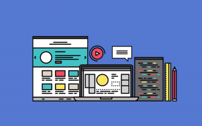
 Single page design v multi-page design – everything you need to help you choose the right design for your site’s content18 min Read
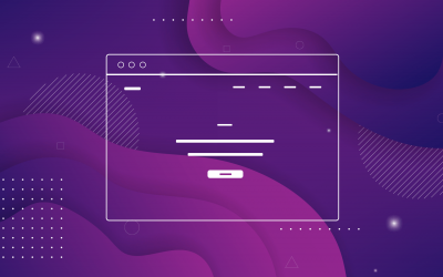 Website backgrounds can be a powerful tool in creating an experience. But what kind of experience can you convey and how? We got the full run-through for you!14 min Read


