
What does neumorphism look like in UI design and what can it do for your product? Learn about the key principles and best practices of this design style.
Neumorphism was born from skeuomorphism and went on to create an entirely new UX style. Designers from all over the world have seen catchy neumorphic designs on Dribbble and Behance — and now, it’s a design style in its own right.
Design and prototype neumorphic websites with Justinmind. It's free!

But what is neumorphism? How does one apply that to UI design? What impact does this style have over the feel and usability of the interface?
We’re ready to dive deep into neumorphism, starting by what it is, what it means and listing out some great (and free) UI kits for neumorphic screens. You’ll love them so much, you’ll want to keep your favorite UI design tool open and at hand!
Neumorphism is a new take on skeuomorphic design. Even though it relates to skeuomorphism, there is a new focus in the entire UI design style with neumorphism. This focus is not necessarily on the contrast or similarity between the real and digital worlds, but rather the color palette.
Yes, you read that right. Neumorphism is all about the color of the entire screen, and delivering an entirely unique experience for users.

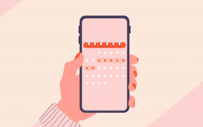
From Filip Legierski.
Imagine your classic iOS or Android interface for a music player. You have the background, on which we place several components, adding layers and creating depth. With neumorphism, you’d be creating a soft interface, in which the UI elements aren’t placed on the background — but behind it.
It gives a feel that components like buttons or cards are actually inside the background, and are only visible because they’re protruding from within. The general style is all about solid colors, low contrast and the right play of shadowing in the UI design.
One of the most interesting things about neumorphism is that it draws from both skeuomorphism and other massively popular styles, such as flat design. Yes, both of those are opposite to each other — and neumorphism falls somewhere in between.

Calculator elements from Mojimomo and William Tapp.
This design style focuses on getting rid of all flashy aspects of the interface, creating a soft visual that stays consistent throughout the entire product. It doesn’t focus on recreating reality in the digital world, like skeuomorphism. Instead, it tries to create something completely new in the universe of UI design.
Let’s take a closer look at the difference between the two concepts and their combining factor before diving in deeper:
To truly understand neumorphism design’s subtle charm, let’s take a quick trip down memory lane and explore its predecessors: skeuomorphism and flat design. Keep reading to understand how it took certain elements from both:
Putting the digital world on the side for a second, let’s look at skeuomorphism from a general perspective. Skeuomorphism can be found in the design of everyday objects. Modern jeans rarely require the rivets at the stress points (pockets, corners) for structural reinforcement.
Originally, these rivets were crucial to prevent rips and tears on denim workwear. Today, the metal rivets are often just a decorative element, a nod to the past functionality and the heritage of denim as a tough, working-class fabric. They add a visual cue and maintain the classic, rugged look of jeans.
This concept can also be found in the early days of the digital world, where real-life objects were mimicked to help users identify the elements in the design that serve their specific needs. This, in theory, was meant to make the UX more intuitive as users are already familiar with the functions of the objects displayed.

Think of a digital bookshelf mimicking a physical one, or the 3D trashcan icon on your old iPhone that is literally an image of your everyday garbage bin. Basically, skeuomorphism was used to help users adapt to the digital world. With the emergence of newer styles like flat and neumorphic design, and with users already familiar with the functions of their softwares, there became less need to mimic real-life in digital.
However, a skeuomorphic comeback has recently been witnessed with the use of augmented reality (AR), where reality has to be mimicked for the user to experience real life blended in AR. In this case though there is no other way to recreate what we see and interact with on a daily basis outside of our screens. This is one of the few times where skeuomorphic design is preferred over other simplistic designs like flat design.
Flat design came as a breath of fresh air after the complexity that was skeuomorphism. It was inspired by Swiss Style graphic design with its clean lines, solid colors and a highlighted focus on functionality. The trend quickly picked up, becoming a game-changer, and was highly preferred over skeuomorphism.
The goal was to enhance usability and clarity, eliminating clutter and emphasizing the core elements of an interface. In other words, reducing distracting elements that might confuse the user way more than actually guiding them. 3D became 2D, and shadows and textures were put aside for an overall cleaner and more minimalistic look.

What might have taken designers months to complete could now be finalized within weeks. Also, having real-life mimicked in digital meant that a plethora of information needed to be processed, which clearly also affected UX and loading speed.
This shift towards simplicity paved the way for neumorphism, a style that merges some of skeumorphic design’s depth elements with flat design’s core principles.
Enter neumorphism: the design world’s answer to “what if flat design had a touch of class?” It’s the subtle rebellion against the stark simplicity of flat design, a whisper of dimension in a world of right angles.
Neumorphism UI takes the core tenets of flat design—clean lines, minimalist aesthetic, and an emphasis on function—and infuses them with a hint of playful depth. Imagine flat design elements gently carved into the background, or softly extruded from it, all achieved through the magic of shadows and highlights. The effect is subtle, never garish, a mere suggestion of three-dimensionality that adds a touch of intrigue without sacrificing clarity.

Neumorphism isn’t about mimicking the real world like skeuomorphism’s clunky buttons and leather textures. It’s a new language entirely, one that speaks of clean lines and a hint of refinement. It’s the design equivalent of a well-tailored suit — sharp, modern, and with just the right amount of detail to turn heads.
Design and prototype neumorphic websites with Justinmind. It's free!
What exactly makes neumorphism design tick? In this section, we’ll peel back the layers and explore the core design principles behind neumorphism, equipping you to create your own captivating and user-friendly interfaces.
Neumorphism is all about subtle contrast and solid colors. But how can we create an interface that delivers a wow-factor without any flashy elements? The answer lurks in the shadows. It’s not just a single, flat shadow — it’s a dance between inner and outer shadows, creating the illusion of elements being gently “pushed” in and “pulled” out from the background.
In broad strokes, the main ingredient is making sure that your element and your background are the same exact color. Picture a button. With a single outer shadow, it might appear to float slightly above the surface. But with the addition of a well-placed inner shadow, it takes on a whole new dimension (pun intended!). The inner shadow creates a subtle indentation, suggesting the button is being pressed into the background.

This is so that we can then create the feel that these components are coming out from inside the background, using shadowing to create the protruding look.
You’ll want to ensure your background and components’ color works well in solid form, as you’ll need to apply this same color all around the UI design. For the shadow game to work, your background can’t be fully black or plain white.
Some color will be needed for the shadow to deliver on the visual trick. Once you have the main color, you can then look for two shadows: dark and light. To do this, a single, designated light source is the key to maintaining a sense of order and uniformity throughout your design.

From the man himself, Michal Malewicz.
Just like a room bathed in natural light streaming from a single window. All the objects within the room will cast shadows in a predictable direction based on that light source. The same principle applies to neumorphism. By keeping the light source consistent, the shadows on your buttons, cards, and other elements will all “fall” in the same direction, creating a sense of cohesion and visual harmony.
Rounded corners are the cornerstone of neumorphism’s soft, inviting aesthetic. Sharp edges simply wouldn’t do. They’d create a harsh contrast, shattering the illusion of gentle depth.
Think of a cloud — fluffy, soft, and inviting. That’s the feeling neumorphism strives for, and rounded corners are the key. They soften the edges of elements, creating a seamless transition between the element and the background. It’s like gently carving shapes into the canvas, maintaining a sense of unity and connection.

This isn’t just about aesthetics, though. Rounded corners also enhance usability, especially on touchscreens. They provide a larger target area, making buttons and other interactive elements easier to tap and navigate. It’s a win-win — a design that’s both beautiful and functional!
Neumorphism isn’t just about fancy buttons. Although this is a good place to start, this design style can be applied to a whole range of UI elements, adding a touch of modern depth and dimension. Let’s delve into the world of neumorphic UI components and see how they can elevate your user interface.
Neumorphism is all about subtle changes in contrast and discreet UI components. But no matter how much importance you place on the visual side of your prototype or general designs, all designers know to put usability at a higher priority than the mere aesthetics. And nowhere is this issue felt more strongly, than in neumorphic buttons.
Buttons are a key UI component in any interface. They need to be very noticeable, and need to change button states as users interact with them. Users need to be able to not just notice buttons in less than a split second, but they need to change colors — in a way, they communicate with users.

However, this simple characteristic of buttons in neumorphism becomes problematic. Michal Malewicz, co-creator of neumorphism, saw the issue immediately. You have a very defined style that is based on a slim margin in shadow effects. It’s a narrow window into neumorphism, and it can be difficult to fit button states through that tiny window.
Neumorphic cards are different from other design styles that we are familiar with such as cards in Material Design, for example, because they don’t look like they are floating. There is no shadow to create that floating effect, not even when the user hovers above that card.
That’s because they extrude from the background, creating a raised look.

The way to achieve this is by taking the light and dark shadow you’ve established that will accompany the background — just like the shadow concept in buttons — and using them on opposite sides of the cards. You can play with the positioning of these two shadows, so it feels as if the cards are seen in certain angles by the user.
Design and prototype neumorphic websites with Justinmind. It's free!
We don’t want the input fields to scream for attention, but rather feel like natural indentations in the canvas. The secret weapon for achieving this recessed look is the inner shadow.
A box wouldn’t be a box without the borders and the shadows created by its edges that highlight the area where you can fill with makeup, tobacco, or whatever you choose to use boxes for.
By applying a well-placed inner shadow, we create the illusion that the input field is gently pushed into the background, similar to the box example. It’s like a soft indentation on the surface, just waiting for your text to fill it.

This subtle depth cue is recreated in neumorphic UI design to improve usability. Users see an input field and can instinctively understand where to click and interact thanks to the inner shadow.
Now that we got the neumorphic principles and UI components cleared up, let’s take a look at some incredible examples we found online that showcase the power of neumorphism, offering a fresh perspective for your own design endeavors.
This neumorphistic UI design oozes elegance like a well-tailored tuxedo. The dark color scheme whispers intrigue, while the clean layout speaks volumes about professionalism. Forget gaudy patterns — here, a touch of modern flair is delivered with a subtle wink.

This website doesn’t just look good, it works beautifully. The dark color scheme is a bold choice, ensuring a memorable first impression. And let’s not forget the details – the designer’s keen eye for aesthetics shines through in every element, solidifying this site as a perfect example of neumorphism UI design.
Picture this: a backdrop bathed in a cool, gray hue, with design elements like islands gently rising from it, thanks to the clever use of white as a background shadow. It’s a stroke of genius, making the elements themselves pop without resorting to harsh outlines. Pure neuomorphic excellence.

De Oliviera, the designer behind this neumorphic design, knows the power of a well-chosen color palette, too. Royal blue and black text and CTAs add a touch of regality, perfectly complementing the subtle animations and image scrollers. These elements keep the user engaged, like a captivating dance that showcases both Solomid.Tech’s services and its impressive global reach.
Check out the neumorphism in this app! The cards and buttons for the gamepad specs, battery meter, and game list have a lighter shade of black around them so it seems like they are slightly blended into the black background, giving off the neumorphism design effect. They all cast these soft, light shadows that make them resemble chic, little raised cards.

But here’s the cool part: these shadows are subtle, not in-your-face. They add just the right touch of depth to the design without going overboard. This is neumorphism done right, and it’s a big reason why this app looks so darn snazzy and easy to navigate!
Sam Xie’s website embodies a refreshing approach to user experience through neumorphism UI design. His services are presented with a minimalist elegance, where clear and concise information takes center stage. The website uses large fonts with concise copywriting, and a consistent design and color theme for a holistic feel.

In essence, Sam Xie’s website exemplifies the power of a minimalist aesthetic, where user experience reigns supreme, and where neumorphism serves as a subtle accent, elevating the overall presentation.
This website caught our eye for its clean and modern aesthetic. It’s a great example of neumorphism UI in action. Notice how the text and icons pop off the dark blue background, thanks to their bright white color. The cards and buttons take it a step further with a slight lift, almost like they’re gently hovering above the surface.

The designer does a fantastic job of using white space effectively. It’s like a breath of fresh air — everything has its own place, and nothing feels cluttered. Plus, the pops of orange throughout the design add a nice touch of vibrancy and help those call to action buttons stand out. This website is a great source of inspiration if you’re looking to incorporate neumorphism UI design into your own projects.
Just remember, as everything in life, keep it balanced!
These are all free groups of UI components that follow a neumorphic style. We found these in the depths of the internet, but the true heroes are the designers who posted them in the first place! Let’s check them out.
This freebie consists of a mobile app created by Sans Famillie. You’re offered both light and dark versions of the design, following neumorphic lines all the way.

Russian Post App comes with 3 screens of the app UI design: dashboard, login form and a recipient screen where we can see financial information. UI elements go from cards to graphs.
Design and prototype neumorphic websites with Justinmind. It's free!
This UI kit comes with some of the greatest components in neumorphic style, those we are all used to. These include radio buttons, regular buttons, tabs, a search bar, a volume bar as well as a few others.

The cool thing about neumorphic elements is that it doesn’t come in PSD or Sketch files. The entire kit is available in HTML right on the spot.
Another great UI kit that makes life easy, by offering the components directly in code. In Neumorph UI kit, the components already come with some basic interaction such as the expanding dropdown menu.

We like that the general UI design feels simple, resulting in a classic neumorphic design. UI components include things like radio and toggle buttons, as well as input fields and buttons. All the basics, covered!
Neumorphic UI elements is simple but sometimes, simple works best. The entire UI kit surrounds the concept of a music player UI design, including components like play and fast forward buttons, as well as progression bars, radio buttons and checkboxes.

We love that the color scheme focuses on a light, grey color with flashes of red. It captures the idea that neumorphism can also make room for flashy color in the midst of all that solid background color!
This neumorphic UI kit is all about bringing your website to life! It uses a 3D effect to make buttons, menus, and even calendars look soft and interactive. There’s a variety of elements here, like progress bars that fill up with a satisfying blue and buttons that come in all shapes and sizes like a triangle, star and even a pentagon!

The whole thing feels modern, thanks to the clever use of light, shadow, and a touch of blue throughout. It’s like the website itself is inviting you to explore and interact – pretty cool, right?
These are interesting times indeed, and neumorphism reflects that fact perfectly. It was born out of skeuomorphism and minimalism, but aims to deliver an experience users have never been through.
Will we see more of this style in upcoming products? Is this the new Material Design? The truth is that neumorphism comes with a set of flaws that represent a real problem. As it is now, the usability issues it brings about are too great for any product to risk it.
But here is the great thing about UX design: neumorphism, like many other styles, is but a simple building block of the future. Here at Justinmind, we’re excited to see just where the road of neumorphism leads, and what changes are made to this particular style along the way.
PROTOTYPE · COMMUNICATE · VALIDATE
ALL-IN-ONE PROTOTYPING TOOL FOR WEB AND MOBILE APPS
Related Content
 Calendar app design can be simple or complex. In this post, we show you 25 of our favorites and how you can make a start on your own27 min Read
 Splash screens give UI designers the chance to make a bold first impression and reinforce brand identity11 min Read
 Finding the right icons to use in your app prototypes can be difficult given the vast array of choices out there. That's why we've narrowed down the best places to find free app and website icons!10 min Read

