
UX design has changed all of our lives forever - but what does it entail, exactly? What do designers do to create incredible products? Read on and find out!
UX design is all around us. It’s a booming industry, with digital products growing ever more important in people’s lives. Demand for UX designers has never been higher and shows no sign of slowing.
Design the UX of your web and mobile app with Justinmind. Try it free!

The world of UX design is wide and diverse, including things like navigation design but also usability testing. It creates entire experiences for people, solving problems and creating digital bridges. It’s exciting, fast-paced and ever-evolving.
That’s why we created this full guide on UX design. We bring you a full introduction to the UX game, going from the basic theory going all the way to interviews and presentations by real designers. Let’s dive in and find out what makes UX design one of the most exciting industries right now.
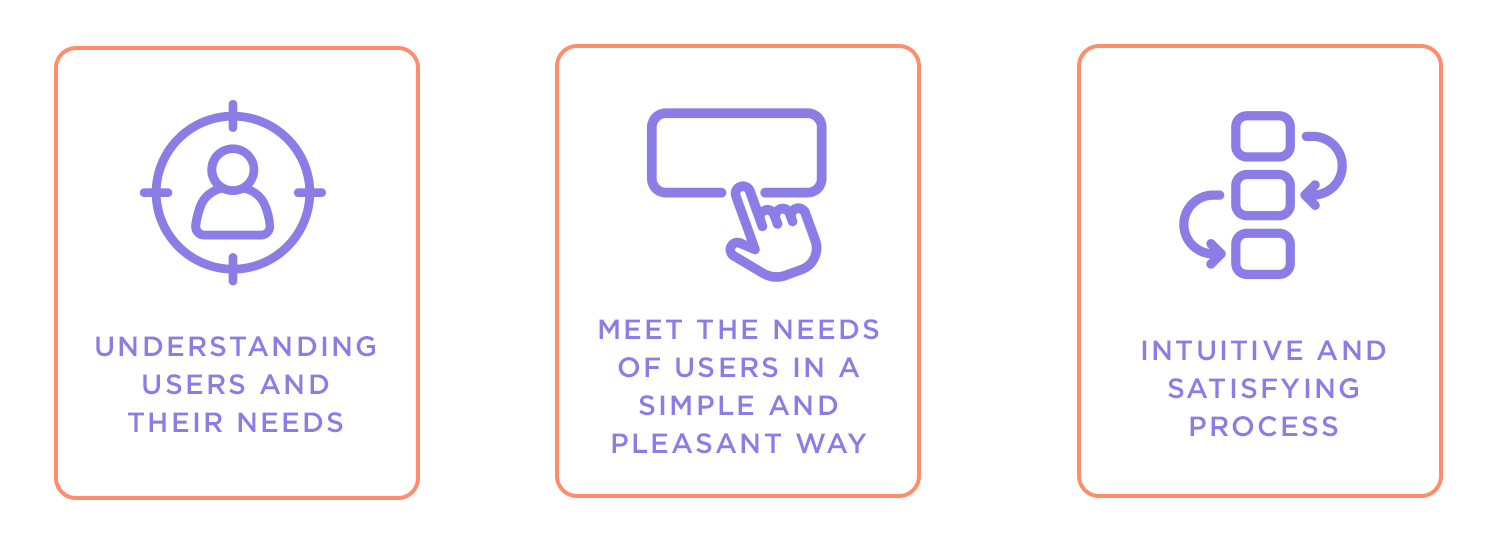
UX design, or user experience design, is about making things work for users. It’s what makes sure that when you open an app, visit a website, or use a gadget, everything just makes sense. You don’t have to overthink it, search for buttons, or wonder what to do next, it feels natural, like it was made just for you.
At its core, UX design isn’t about flashy graphics or fancy animations (though those can be part of it). It’s about understanding people like what they need, what they struggle with, and what makes their lives easier. Then, it’s about crafting experiences that meet those needs in the simplest, most enjoyable way possible. It’s problem-solving with a touch of empathy.
Think about the last time you got frustrated trying to fill out an online form or couldn’t find the right menu option in an app. That’s bad UX. Now think of a time when something felt so smooth, maybe ordering food in just a few clicks or finding exactly what you were looking for on a website. That’s good UX, and you can find plenty of UX design examples that illustrate this difference. It’s the difference between a clunky chore and a seamless experience.
Technology is woven into nearly everything we do, and we’ve come to expect it to work effortlessly. When an app or website feels intuitive, we stick with it. When it doesn’t, we quickly move on. That’s where UX design comes in… it’s the reason some products just click with us while others fall flat.
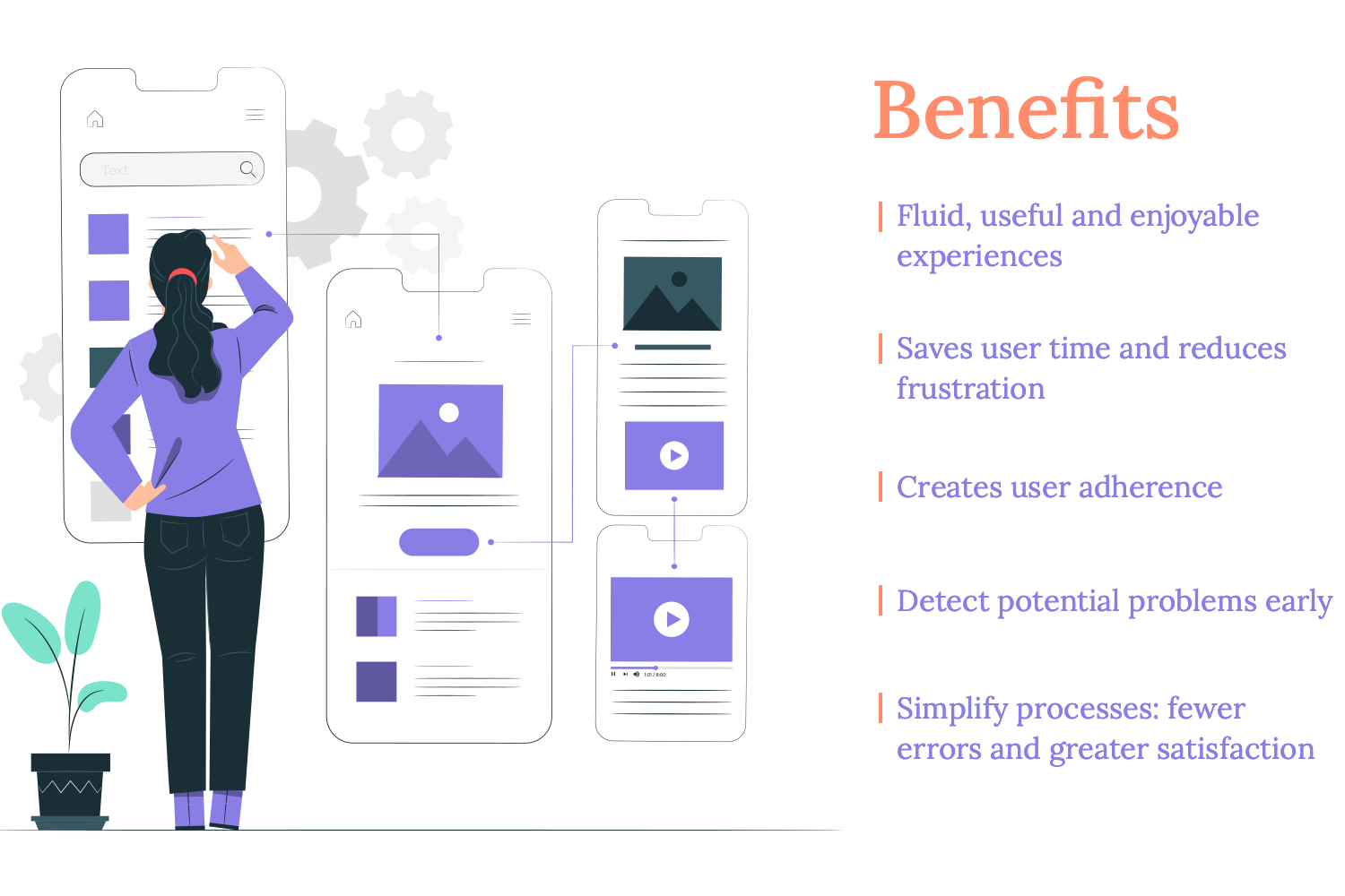
Good UX design goes beyond making things easy to use; it creates experiences that feel smooth, helpful, and even enjoyable. It saves us time, reduces frustration, and gives us confidence in the tools we rely on every day. For businesses, this translates to happy customers who keep coming back, spreading the word, and staying loyal.
It also has practical benefits behind the scenes. A well-thought-out UX design catches potential problems early, saving companies time and money on fixes down the road. It simplifies processes, which means fewer mistakes for users and smoother operations overall. And as technology and user expectations evolve, UX design ensures that products stay relevant, keeping people engaged and connected.
In the end, UX design matters because it puts people first. It’s not just about keeping up with trends, it’s about meeting real needs in a way that feels natural and satisfying. And in a world where every interaction counts, that makes all the difference.
Design the UX of your web and mobile app with Justinmind. Try it free!
To fully appreciate UX’s impact, it’s essential to diferenciate it from related fields like UI design. UX and UI are two terms that often get lumped together but are actually quite different. If you’ve ever wondered where one ends and the other begins, you’re not alone. Even within the design industry, the lines can get blurry. So, let’s break it down in plain terms.
UX design encompasses the broader experience a person has when interacting with a product or service, focusing on their emotions and ease of use. Does it make sense? Is it easy to use? Does it solve the problem it’s meant to solve? UX designers focus on the entire journey a user takes, from start to finish, ensuring every step feels intuitive and smooth.
UI (user interface), on the other hand, is more like the details, the look and feel of the product. It’s about creating the buttons, layouts, typography, and visual elements that bring the experience to life. If UX is the blueprint, UI is the paint, furniture, and decor. Both are essential, and when they work together, they create something truly seamless.
Imagine designing an app to help people track their fitness goals. The UX designer starts by mapping out the user’s journey: how they’ll set up their profile, track workouts, and review progress. They think about functionality, flow, and the overall experience.
Once that’s in place, the UI designer steps in to make it visually appealing and easy to navigate. They choose the colors, icons, and button styles that guide the user and make the app enjoyable to use. While the UX makes sure the app works well, the UI guarantees it looks and feels great.
To put it simply:
- UX is about the whole experience. It’s big-picture thinking: the structure, functionality, and purpose of the product.
- UI is about the interface. It’s the tangible design elements that users see and interact with.
The two are deeply connected and one can’t succeed without the other. A beautifully designed interface (UI) is pointless if the product is frustrating to use (UX). And a great user experience (UX) will fall flat without a well-crafted interface (UI).
For a deeper dive into this topic, check out the guide on UI vs UX design. It’s a great resource to explore how these two roles complement each other and where they overlap.
UX design can be a varied field with many factors to consider. So, here’s a detailed look at key UX design principles that help create memorable and functional user experiences.
User-centered design starts with the user. It’s all about understanding their needs and preferences, not just what the designer thinks is best. You need to really get to know your users to create something they’ll love.
Example: what works
Amazon’s personalized recommendations make shopping easier by suggesting products based on what users have previously bought or browsed.

Example: what doesn’t
A music app that suggests random genres without considering what the user usually listens to can feel frustrating and irrelevant.
Information architecture acts as the foundation of your design, structuring content to ensure users can navigate easily and locate what they need effortlessly.
Example: what works
Google’s clean and simple search layout helps users quickly find what they’re looking for.

Example: what doesn’t
A website with cluttered menus and too many options can overwhelm users, making it hard for them to navigate.
Understanding the situation in which your design is used is key. Whether it’s on a mobile device in a busy environment or at home on a desktop, context affects how users interact with your design.
Example: what works
Uber’s app design is great for users on the go, making it easy to book a ride quickly. The app utilizes effective microinteractions, which guide users seamlessly through the process, making it intuitive even in a rush.

Example: what doesn’t
A website designed for desktop that doesn’t adapt well to mobile can be frustrating for users trying to access it on their phones. Poor form design on mobile can especially hinder usability, making the experience cumbersome and less user-friendly.
Consistency is what helps users learn how to use your product faster. When everything looks and works the same across the board, it’s easier for users to navigate, improving the overal learnability of the design.
Example: what works
HBO’s consistent design across devices makes it simple for users to switch between a tablet and a phone. The familiar look and navigation help users feel comfortable no matter which device they’re using.

Example: what doesn’t
An app where buttons and icons change style and function from screen to screen can confuse users and slow them down.
Users like to feel in control, but too many choices can overwhelm them. The trick is to offer enough options to make them feel empowered, but not so many that they feel lost. Techniques like progressive disclosure can help manage this balance.
Example: what works
Spotify’s simple controls let users create and manage playlists easily, giving them freedom without overloading them.

Example: what doesn’t
A website that throws too many customization options at users can make them feel lost and unsure of what to do.
Usability is the foundation of good design. It’s about making sure users can get things done easily. If your design isn’t usable, it doesn’t matter how good it looks.
Example: what works
Gmail’s interface is intuitive, allowing users to manage emails quickly with helpful shortcuts.
Example: what doesn’t
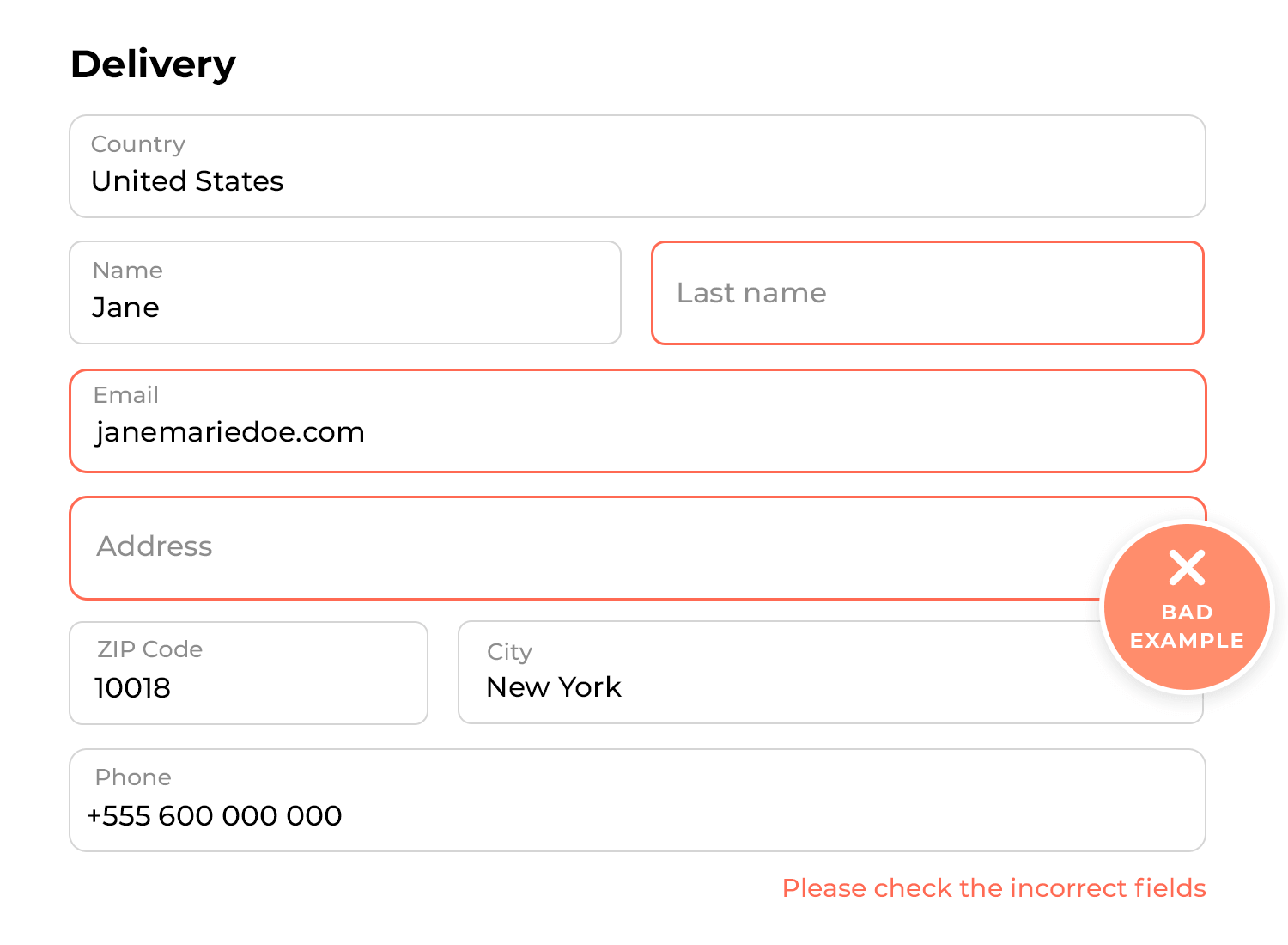
A poorly labeled form with no error messages can frustrate users, making it hard for them to complete it.
Testing your design with real users is the best way to see what works and what doesn’t. It helps you spot issues early and make improvements before launch. Techniques like A/B testing can be particularly effective in comparing different design options and understanding user preferences.
Example: what works
Microsoft regularly tests new features with users to ensure they’re easy to use and meet their needs.
Example: what doesn’t
Launching a feature without testing can lead to user frustration and negative feedback.
A simple design often works best. Too many features or visual elements can clutter your interface and confuse users. Focusing on what’s essential can make your design more effective.
Example: what works
Google’s minimalist homepage is a good example. The search bar is front and center, making it easy to use and not cluttered with unnecessary information.

Example: what doesn’t
A news site filled with ads and pop-ups can distract users from the content they came to read, making the experience frustrating and less enjoyable.
Visual hierarchy is all about guiding users’ attention by making certain parts of your design stand out more than others. It helps users quickly see what’s important.
Example: what works
On Amazon, the product name, price, and “Add to Cart” button are easy to spot, helping users make decisions quickly.

Example: what doesn’t
A website where everything looks the same can confuse users because they don’t know where to focus.
Mental models are the ideas and expectations users have about how things should work based on their past experiences. When your design matches these expectations, users find it easier and more intuitive to use.
Card sorting can help you understand these expectations by showing how users naturally group information, guiding you to design in a way that feels right to them.
Example: what works
Apple’s swipe gestures are a great example. Most users are already familiar with swiping actions on their devices, so using these gestures in apps feels natural and easy.
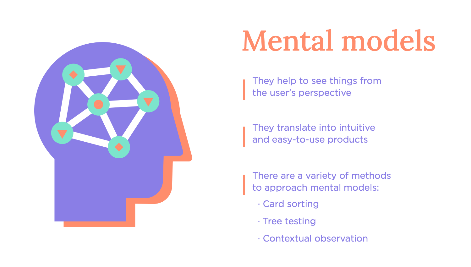
Example: what doesn’t
A banking app that uses unfamiliar icons for common actions, like transferring money, can confuse users and lead to mistakes. If the app designers had used card sorting, they might have discovered how users expect these actions to be represented, avoiding confusion.
Design the UX of your web and mobile app with Justinmind. Try it free!
Storytelling in design is like telling a story through your product. It keeps users engaged and makes the experience memorable. Visual storytelling plays a big part here – using images, colors, and layout to create a narrative that resonates with users.
This approach is also important in areas like dashboard design and user onboarding, where clear and compelling visuals help users understand data and navigate your product easily.
Example: what works
Nike’s website uses powerful images and stories to inspire users and connect them to the brand.

Example: what doesn’t
A confusing product tutorial that jumps around can frustrate users, making it hard for them to understand how to use the product.
Every seasoned designer knows that jumping straight into a detailed prototype without testing is a mistake. It’s tempting to dive into the final product right away, but it’s smarter to start simple. Begin with sketches and basic wireframes to test ideas and make changes before adding all the details. This way, you save time and avoid big headaches later.
Example: what works
A team starts with rough sketches and simple wireframes, testing different ideas early on. This lets them tweak the design bit by bit, making sure everything works smoothly before going into the final, detailed version.

Example: what doesn’t
Jumping straight into a polished prototype without testing can lead to wasted time if it doesn’t meet user needs. You might end up with something that looks great but doesn’t function well, causing major delays and a lot of rework.
Accessibility testing is essential to make sure everyone, including people with disabilities, can use your product comfortably. It’s not just about ticking boxes- it’s about making your product welcoming and easy to use for everyone.
Example: what works
A website that works seamlessly with screen readers and can be fully navigated using a keyboard is a great example of inclusive design. It ensures that people with visual or motor impairments can access everything just as easily as everyone else.
Example: what doesn’t
A form that only uses color to show which fields are required can be really frustrating for color-blind users. Without other cues, they might not realize what’s needed, which can lead to mistakes and a bad experience. Small details like this can make a big difference in whether your product feels accessible or not.
By now, we know that offering users a consistent design helps users feel comfortable and reduces the time they need to learn how to use your product. UI design principles also play a crucial role in achieving this consistency across platforms.
For example, there are certain UI components that most users will immediately recognize. This means that they will instinctively know what that component will do and more or less how it will behave. Classic examples include the hamburger menu icon or radio buttons.
Example: what works
Most websites put the shopping cart icon in the upper right corner, where users expect it to be.

Example: what doesn’t
A new app that places common icons in unusual spots can confuse users who are used to finding them elsewhere.
UX deliverables, like personas, wireframes, user journey maps, and prototypes, are key tools that help share ideas and guide the design process. They keep everyone on the same page and focused on creating something users will love.
Example: what works
Creating user personas helps the design team stay clear on who they’re designing for. It’s easier to make decisions when you know exactly what your target audience needs and wants.

Example: what doesn’t
Skipping a sitemap can make a website feel messy and hard to navigate. Without a clear plan, users might struggle to find what they’re looking for, leading to a frustrating experience.
Having a solid prototyping tool is crucial for quickly creating, testing, and refining your designs. It’s what helps you turn ideas into something tangible and lets you make adjustments based on user feedback.
Example: what works
Using a UX design tool like Justinmind allows teams to collaborate in real-time, making it easy to adjust designs and test them with users immediately. This speeds up the design process and ensures that everyone is aligned and working towards the same goal.

Example: what doesn’t
Relying on basic drawing tools for prototyping can really slow down progress. These tools often lack the necessary features to fully test your design, which can lead to issues that are harder to fix later on.
Keeping track of what needs to be done is super important for staying on course with your project. By regularly requirements management, you make sure that everything important is covered, and the project stays focused on its goals.
Example: what works
Having a clear and regularly updated list of what needs to be done helps the team stay in sync with both user needs and project goals. This organized approach avoids misunderstandings and keeps things running smoothly.
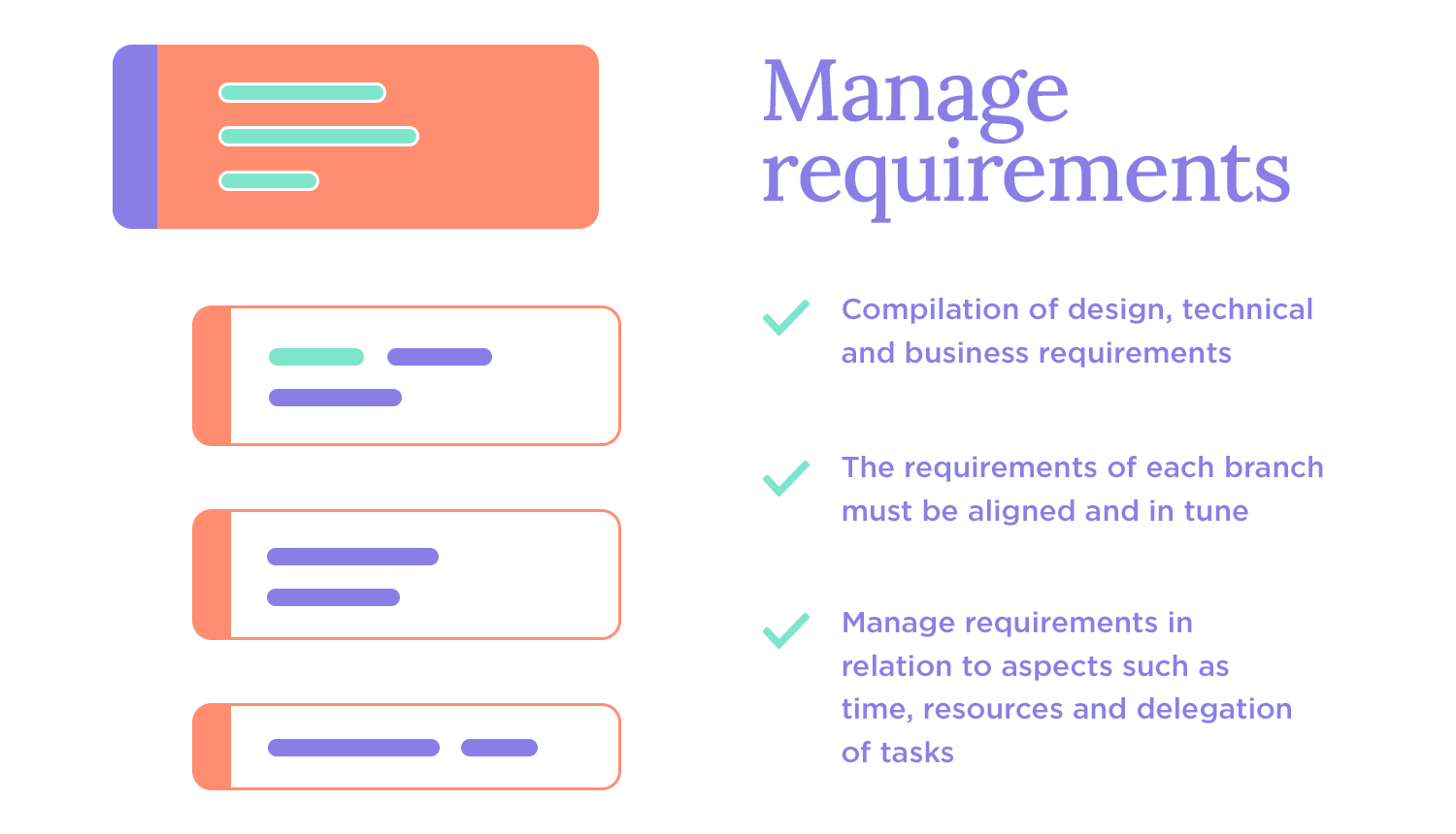
Example: what doesn’t
If the technical and design requirements don’t match up, you could end up with a product that looks good but doesn’t work right. This mismatch can cause big delays and expensive rework.
As we mentioned before, designing for mobile and web isn’t the same. Different screen sizes and how people use these devices mean you need to design differently to make sure everything works well.
Example: what works
A mobile banking app with big buttons and clear icons makes it easy for users to navigate and get things done on a small screen. This kind of design considers the unique needs of mobile users, making the experience smooth and easy.
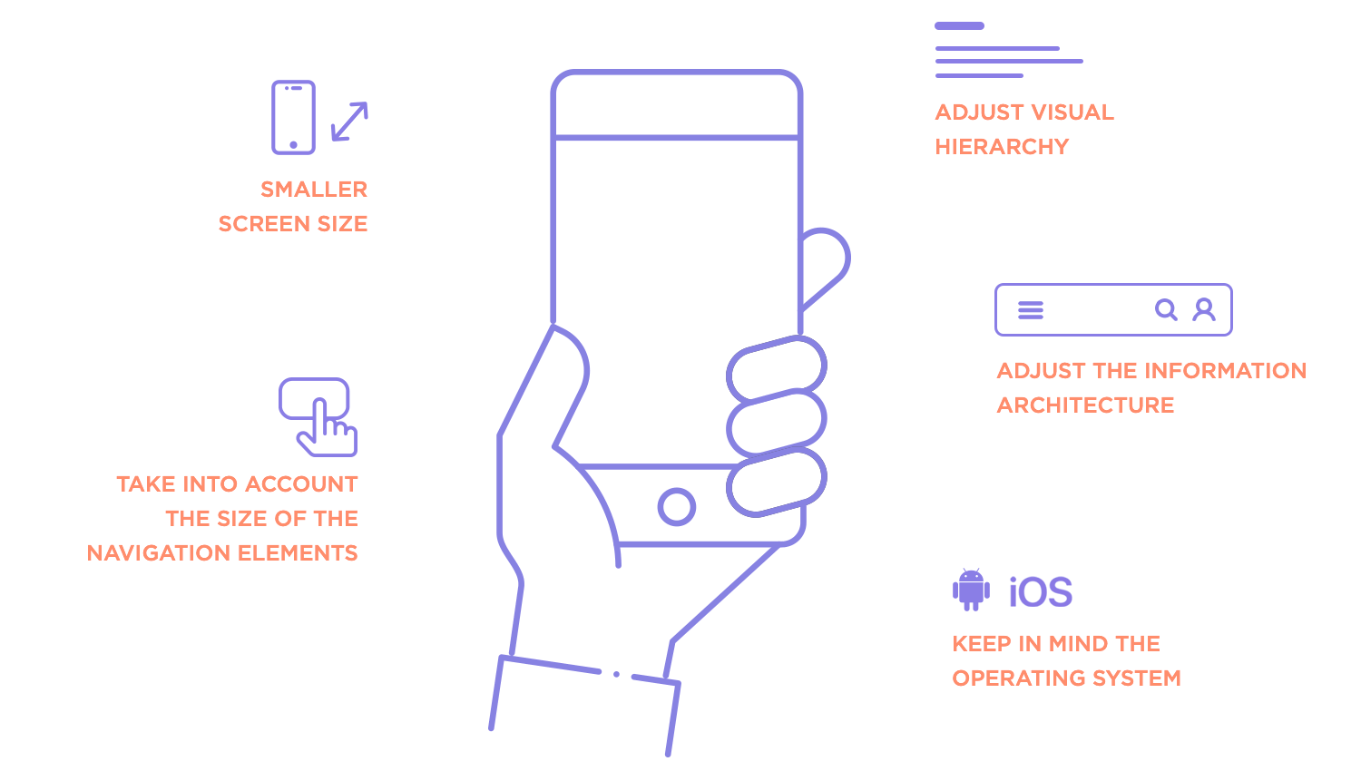
Example: what doesn’t
A mobile site that’s just a shrunken version of the desktop site can be frustrating, especially if it doesn’t work well with touch screens or small displays. This can lead to a bad experience for mobile users.
UX design patterns are tried-and-true solutions for common design problems. Using these patterns can save time and make sure your product is easy to use because they’re based on what has worked well before.
Example: what works
Adding “infinite scroll” on a social media app keeps users engaged by letting them keep discovering new content without stopping. This pattern makes the experience seamless and keeps users hooked. However, if the infinite scroll is not implemented carefully, it can lead to frustration.

Example: what doesn’t
Skipping established design patterns to create something totally new can make your product harder to use. Users might spend more time trying to figure out how it works instead of enjoying it.
Design the UX of your web and mobile app with Justinmind. Try it free!
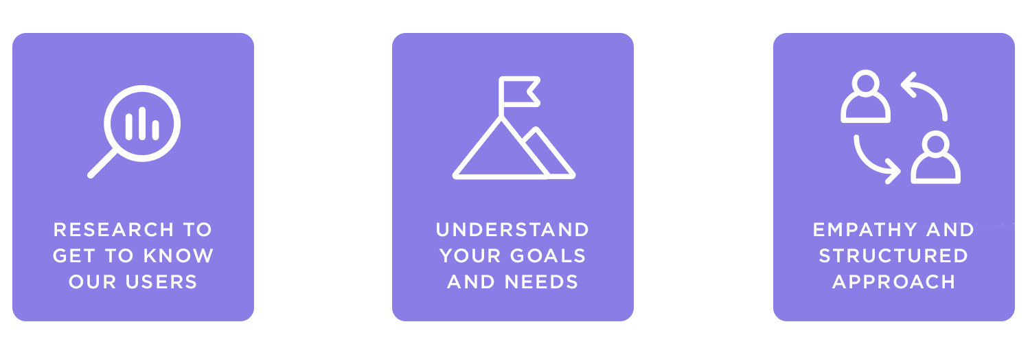
Discovery is where the UX design process begins, a deep dive into understanding the people you’re designing for, the problems they face, and the goals they want to achieve. Some call it Understanding or Exploring, but the essence is the same: it’s about getting to know the project, the users, and the context that ties them together.
This phase is all about user research, which is the foundation of everything that follows. It’s a time to set aside assumptions, step into the user’s shoes, and immerse yourself in their world. Who are they? What challenges do they face? What solutions will truly make a difference? Answering these questions takes empathy, curiosity, and a structured approach.
By using clear and simple language, you help increase not just your users’ comprehension, but also accuracy in carrying out certain tasks. Remember – with today’s fast-paced lifestyle, users are often in a hurry and tend to have shorter attention spans. There’s no benefit in using convoluted jargon or trying to be wordy.
The first step in discovery is identifying your target users and defining the core problems your design will solve. It’s not enough to have a vague sense of your audience, you need to know their behaviors, goals, and pain points in detail. This clarity is essential for creating solutions that feel tailored and intuitive.
User research also shines a light on requirements, which often come from multiple angles. It’s not just about what users need but also about aligning those needs with business goals and technical constraints. Balancing these requirements early prevents costly missteps down the line.
To truly understand your users, you need to go where they are. This might mean sitting down for interviews, observing them in their natural environment, or even watching how they interact with competing products. Each research method offers unique insights:
- Interviews and focus groups: great for diving into personal experiences and uncovering emotional pain points.
- Surveys: perfect for gathering broader, quantitative data.
- Observational studies: help you see what users do, not just what they say.
- Usability testing: even early on, testing competing products or existing workflows can highlight gaps and opportunities.
Every method brings something valuable to the table, and the choice often depends on the context and resources available.
Once the research is done, it’s time to make sense of the findings. This is where tools like user personas and empathy maps come into play.
- Personas are detailed profiles of your target users, complete with their goals, frustrations, and motivations. They give your team a clear picture of who you’re designing for.
- Empathy maps take it a step further, visualizing what users think, feel, say, and do. They help humanize the design process, keeping real people at the heart of every decision.
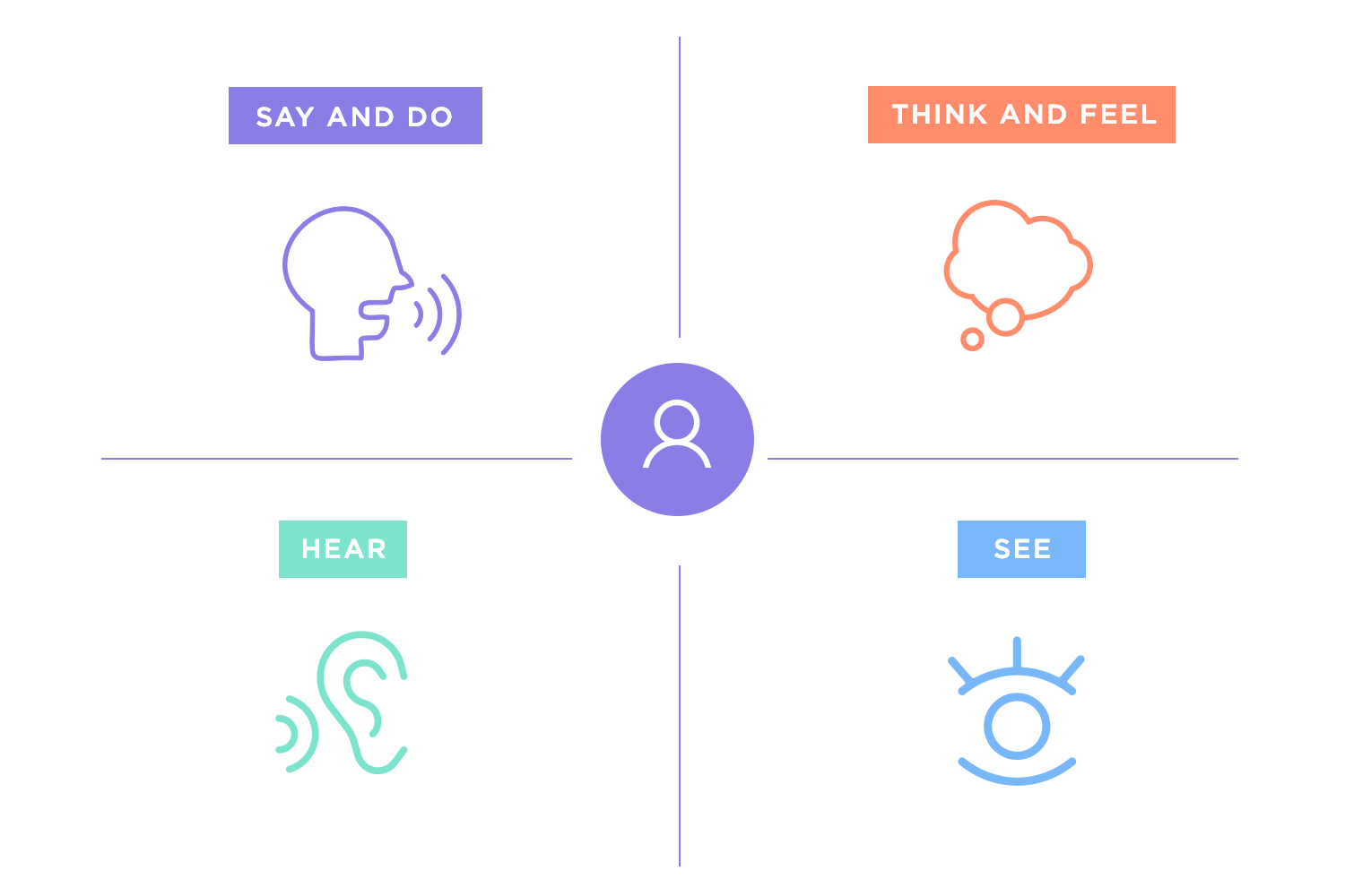
These deliverables aren’t just for reference, they’re tools to inspire empathy and guide design. They make the user feel present in every meeting and decision.
The final piece of the discovery puzzle is making sense of all the data you’ve collected. Patterns begin to emerge: common frustrations, shared goals, recurring behaviors. Synthesizing this information helps turn raw data into actionable insights.
For example, you might discover that a core problem isn’t just navigating a website but the emotional frustration of not finding what they need quickly. Insights like these shape the requirements for your solution, bridging the gap between user needs and design goals.
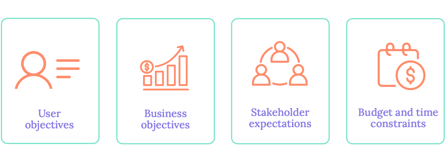
Discovery naturally flows into identifying and aligning requirements. Here, you’re not just listing features, you’re creating a roadmap. Requirements often span multiple areas:
- User needs: what does the product need to do for the user?
- Business goals: how will it drive success for the organization?
- Technical constraints: what’s feasible with the current technology and resources?
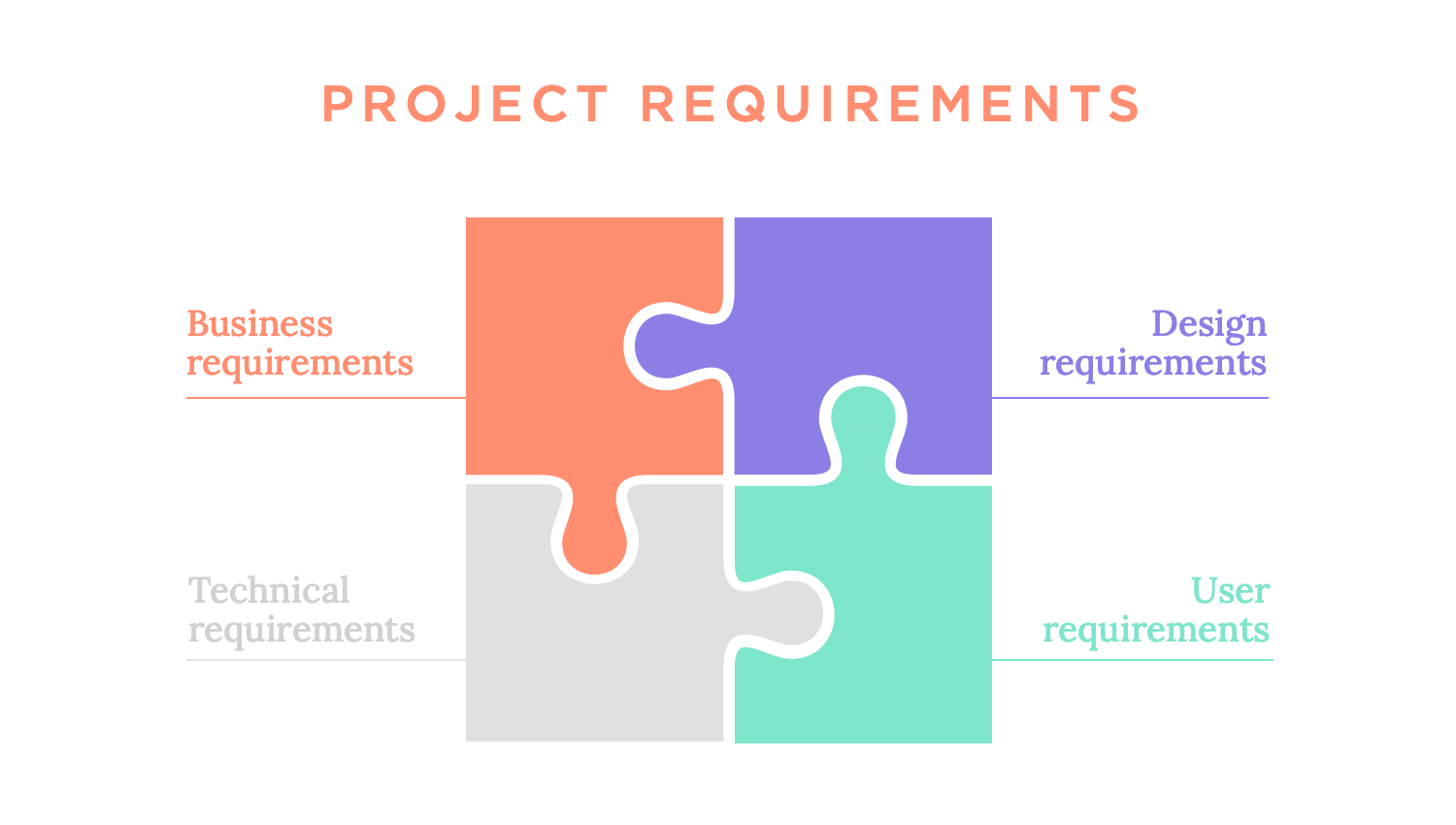
Balancing these elements can be tricky. Sometimes business goals might conflict with user needs, or technical constraints might limit what’s possible. Resolving these tensions early guarantees smoother sailing later in the project.
At this point in the UX design process, the design team knows who they’re designing for, what the problem is and what the solution needs to do. Now that the context in which the solution will act is also clear, the team can start to imagine what it will look like and do. This is the time when having the right UX design tool plays a huge part.
It’s no secret that there’s a lot of margin in UX design for design teams to approach the phase in their own way. Some of them separate the ideation process from the wireframing and prototyping process, others simply accept the entire process as the time to bring their ideas to life. Regardless, the ideation phase tends to have modest beginnings in any UX design process.
Before busting out the fancy prototyping tool, most teams will focus on the functionality of the theoretical product, using diagrams and paper drawings for the first few ideas. Crucial steps include things like defining the information architecture or the general navigation, which helps the team direct their efforts when the time comes to wireframe the bare bones of the product. It also results in a better workflow for the entire UX design process.

Creating paper plans and drawings means time won’t be wasted by creating dozens of wireframes of the ideas, allowing the team to know more or less what they want by the time they start wireframing.
Once the time comes to put it all into a digital wireframe, the team can focus on creating a tangible and concrete representation of their paper drawn ideas. The wireframe focuses on the more visual functionalities, like the layout and the visual hierarchy of elements. Slowly, the design team will build on this wireframe and add details both visual and behavioral. Ultimately, a prototype emerges from the wireframe, paving the way for a high-fidelity representation of the finished design.
At the heart of UX design is a simple but powerful idea: the user comes first. User-centered design (UCD) revolves around understanding user needs and tailoring solutions to meet them. It’s not just about building functional products, but about creating experiences that resonate, delight, and solve real problems. Let’s break it down:
Every great design starts with a clear structure, and that’s where information architecture (IA) comes in. IA organizes content and features so users can navigate easily, find what they need, and achieve their goals without frustration. Imagine it as the roadmap that ensures no one gets lost along the way. Tools like a UX flowchart can help visualize these structures, ensuring everything is well-organized and intuitive.
Once the structure is in place, it’s time to visualize the product. Wireframes are the initial sketches like the bare bones of your design that focus on layout and functionality rather than aesthetics. Starting with low-fidelity wireframes, you test basic ideas, refining them into high-fidelity prototypes that look and feel closer to the final product.

These prototypes allow teams to experiment, validate ideas, and make improvements before development begins. With the right UX design tools, designers can efficiently create, test, and refine these prototypes, ensuring a seamless process from concept to reality.
Interaction design is where the magic happens. It’s about how users move through the product, what happens when they click, swipe, or hover. Well-crafted interactions don’t just guide users; they make the experience intuitive and enjoyable. Buttons that respond smoothly or animations that provide feedback are subtle yet powerful elements that build trust and keep users engaged.
User-centered design thrives on an iterative, flexible, and empathetic approach, closely aligning with the principles of design thinking. This methodology emphasizes understanding users’ challenges, brainstorming creative solutions, and refining ideas through continuous testing and feedback. At every stage, the user remains the focal point.
- Empathize: start by observing and engaging with users to understand their needs, frustrations, and goals.
- Define: clearly articulate the problems you’re solving, based on your research.
- Ideate: brainstorm solutions that address user pain points while meeting business goals.
- Prototype: create tangible representations of your ideas, starting with low-fidelity wireframes and advancing to detailed prototypes.
- Test and iterate: validate your designs with real users, refining them until they align with user expectations.
This process makes sure the product evolves with user feedback, maintaining its relevance and usability.
Design isn’t a solo act; it’s a team effort. For a product to succeed, designers and developers must collaborate together to be effective.
Prototypes often serve as a shared language, helping both teams stay aligned on how the product should function and feel. Regular communication ensures technical constraints are addressed early without compromising the user experience. Engaging in meaningful talks about challenges and best practices can inspire fresh approaches to teamwork and problem-solving.
When designers’ understanding of user needs merges with developers’ technical skills, the outcome is a product that seamlessly balances functionality and an enjoyable user experience.
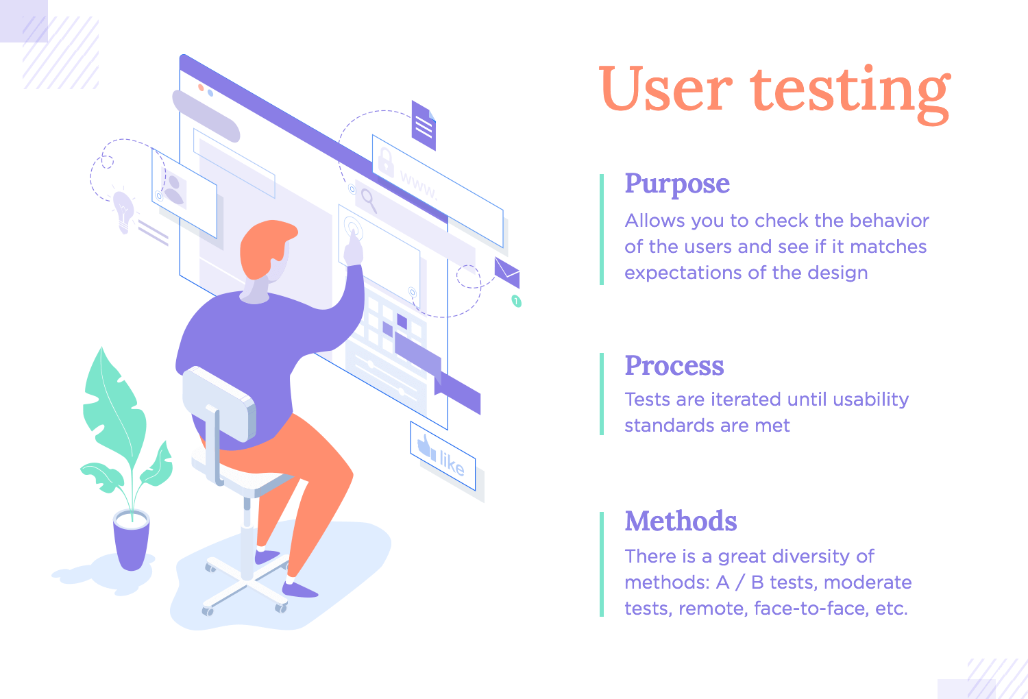
Creating a great design means more than just making it visually attractive. It requires crafting an experience that is practical, intuitive, and easy for users to navigate. Usability and user testing play a crucial role in this process, helping designers validate their ideas, identify pain points, and refine products to meet real user needs effectively.
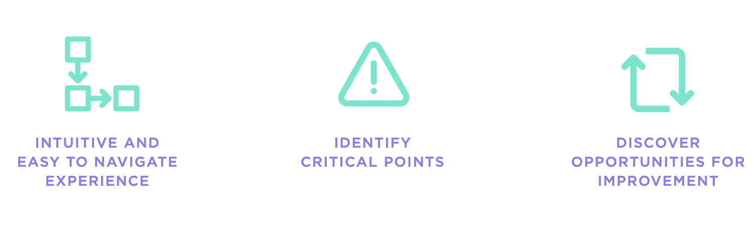
Usability testing is exactly what it sounds like. It’s testing how easily users can interact with your product to achieve their goals. It’s not about testing users but rather testing the design itself to see how well it supports them.
Imagine watching someone try to find their way through your app or website. Are they navigating smoothly, or are they stumbling? Usability testing, supported by the right usability testing tools, helps you answer these questions, identifying pain points and opportunities for improvement.
It’s a vital step in ensuring that your design is practical, intuitive, and aligned with user expectations.
Usability testing comes in many forms, each offering distinct insights. The best approach depends on your specific goals, timeline, and available resources.
- Moderated usability testing: a facilitator guides users through specific tasks, observing their interactions and asking follow-up questions. This method provides deep insights into user behavior and thought processes.
- A/B testing: test two or more design variations to see which performs better. This is perfect for deciding between competing ideas or optimizing specific features.
- Guerrilla testing: quick, informal testing with random participants in everyday settings. It’s a fast way to gather initial impressions without needing a full-scale setup.
- Remote testing: conduct tests with users in their own environment using online tools. This method is especially useful for reaching diverse user groups.

Each method has its strengths, and often, combining them provides the most comprehensive insights.
The insights gathered during testing fall into two categories, each offering valuable perspectives:
- Qualitative feedback: these are user comments and observations that highlight frustrations, successes, or confusion during their interaction. For example, feedback like, “I wasn’t sure where to click next,” pinpoints usability gaps.
- Quantitative feedback: this includes measurable data such as task completion rates, time on task, and error rates, offering a performance snapshot of the design.
When you combine these insights, you can identify not just what users struggle with, but also why it happens.
User testing doesn’t end with gathering feedback; it’s the starting point for refining and improving your design. After analyzing the results:
- Address usability challenges. For instance, if users struggle with a particular feature, consider redesigning or simplifying it.
- Enhance areas that users found engaging or intuitive to further elevate the experience.
- Re-test the updated design to confirm the changes effectively resolve the issues and improve overall usability.
This cycle of testing and iteration is essential for achieving a design that feels polished, effortless, and genuinely user-friendly.
Once you get your product in front of real users and the test results are in, it’s time to interpret those results and translate them into concrete actions that can be taken to improve the user experience. There are many things that can go wrong with a design, from error-prone forms to failures in business conversion, designers will often be surprised at how people react to the design.
The last stage of the UX design process can be slightly confusing to newbies in the UX game – mainly, because it tends to not be the end of a linear process. It is, in fact, one step in a cycle.
As most experienced designers will tell you, there’s many waves of testing and designing in a product before the actual end of the project. Designers ideate and prototype. The design is put to the test, and the outcome is that implementing change in the design requires further testing to validate it all.
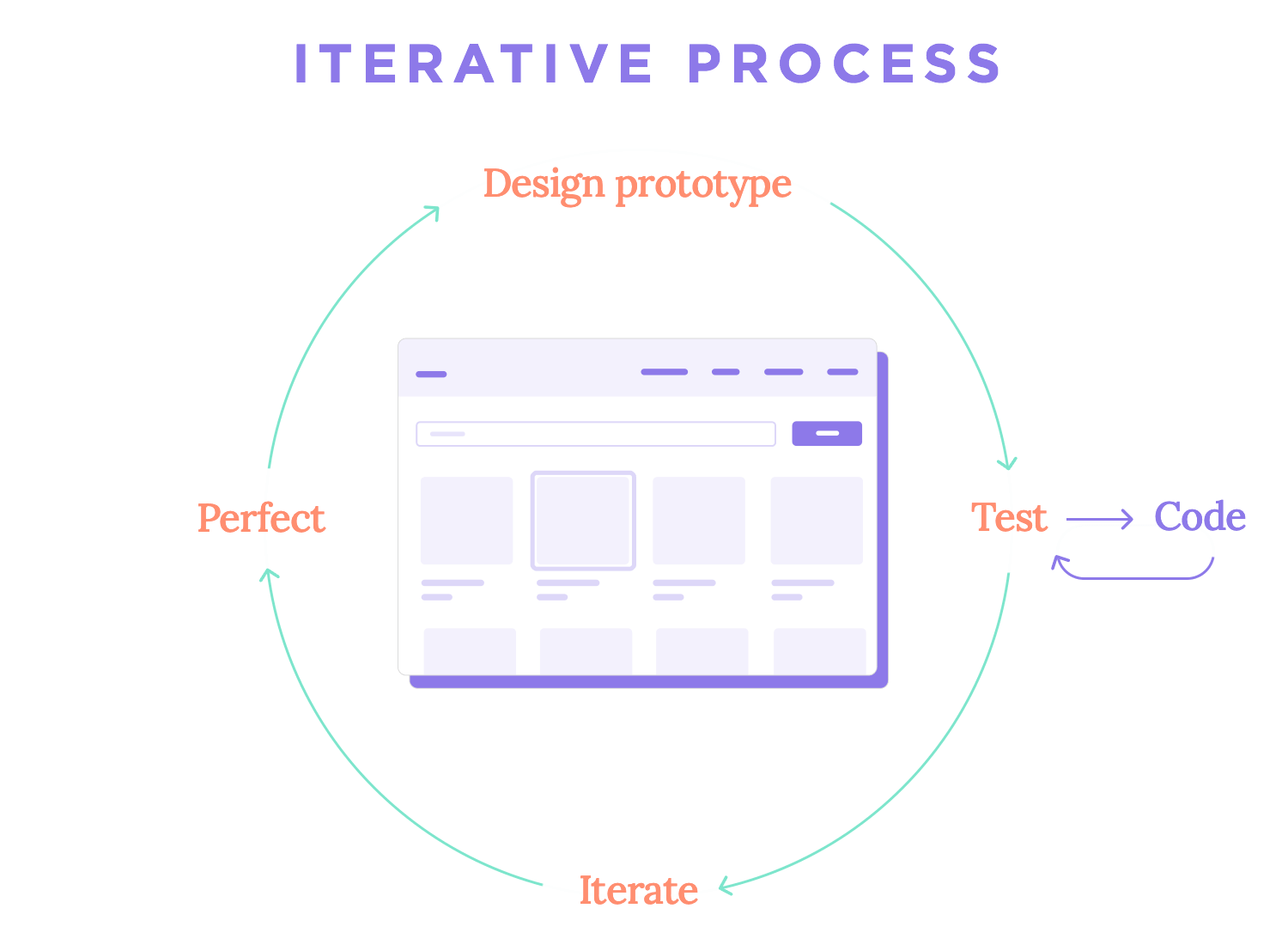
This repetition and iteration process can seem senseless and feel like a bit of a waste of time, but nothing could be further from the truth. Iteration is key in the UX design process. With each new version of the design, improvements are made and elevating of the entire product is achieved. This is why experienced designers will tell newbies to look at each iteration as a step forwards, not backwards.
With that said, once everyone is happy with the performance of the design we can safely say that the end of the design process has arrived. At this point, there’s a handoff from the design team to the development team, who takes the prototype as well as other deliverables and uses it to code the product into life. It’s true that many design teams continue the cycle of testing and improving the product long after the handoff, even after the launching of the product into the market.
If you want to take a look at how that works in real life, check out our UX talk with folks over at UserZoom. The talk, UX research at UserZoom, is all about using testing and data to keep improving the product with new updates that users can love. It’s great stuff.
Iteration is the cycle of refining and improving your design based on real user feedback. It’s not a one-time task but a continuous loop that ensures the product evolves to meet user needs and expectations.
When feedback highlights areas for improvement, be it navigation issues, unclear instructions, or underused features, designers prioritize changes and refine the product. Each adjustment is then tested to validate its effectiveness, ensuring a seamless and user-friendly experience.
How it works:
- Collect feedback: gather insights from usability testing, analytics, and post-launch reviews.
- Refine and improve: adjust designs based on findings, revisiting earlier stages if necessary.
- Test changes: validate updates through user testing, ensuring they solve the identified issues effectively.
Iteration doesn’t end with launch. As user habits shift and new technologies emerge, continuous iteration keeps the product relevant and valuable over time.
The journey of UX design isn’t without its hurdles. Along the way, designers face challenges that require balance, communication, and creative problem-solving. Here are a few common ones and how teams navigate them:
At the core of UX design is a delicate balancing act. On one hand, the goal is to create experiences that genuinely satisfy user needs. On the other, the product must align with business objectives like increasing revenue, building brand loyalty, or reducing costs.
Stakeholders bring diverse perspectives and priorities to the table, from marketing goals to technical feasibility. While their input is invaluable, it can sometimes conflict with user needs or stretch the scope of a project.
To navigate this, effective communication becomes crucial. Designers must articulate the value of UX decisions, backed by data and user research. It’s not just about defending a design choice; it’s about showing how it aligns with both user expectations and business success.
Regular updates, prototypes, and user testing insights can help bridge gaps and keep everyone aligned.
Every project comes with constraints such as budget limits, tight timelines, or technical restrictions. These boundaries can feel like obstacles, but they often inspire creative solutions.
Imagine a limited budget might rule out extensive user testing, but guerrilla testing or remote sessions can still provide meaningful insights. In the same way, technical limitations might prompt innovative approaches to achieve a feature’s core functionality in a simpler way.
Constraints challenge teams to prioritize what truly matters, focusing on the features and experiences that deliver the most value.
Design the UX of your web and mobile app with Justinmind. Try it free!
When it comes to UX design, it’s easy to see it as a single job title, but the truth is far richer. UX design thrives on collaboration, and the process involves a wide range of professionals, each contributing their expertise to bring an exceptional user experience to life. Let’s explore how these roles come together and what each brings to the table.
Business Analyst
Business analysts bridge the gap between the business side and the UX process. They often play a pivotal role in the discovery phase, defining the business goals, understanding the problem domain, and translating business needs into actionable requirements. Their deep understanding of the organization guarantees that the final product aligns with strategic objectives.
UX Researcher
UX researchers are detectives of the design world. They go into user behaviors, needs, and motivations through methods like interviews, surveys, and usability testing. Their findings form the foundation for user-centered designs by shedding light on pain points and opportunities.
Product Manager
The product manager orchestrates the overall process, especially during the discovery and requirements phases. They know the business inside and out, making sure that the solution aligns with both user needs and organizational goals. Product managers are the glue that holds cross-functional teams together.
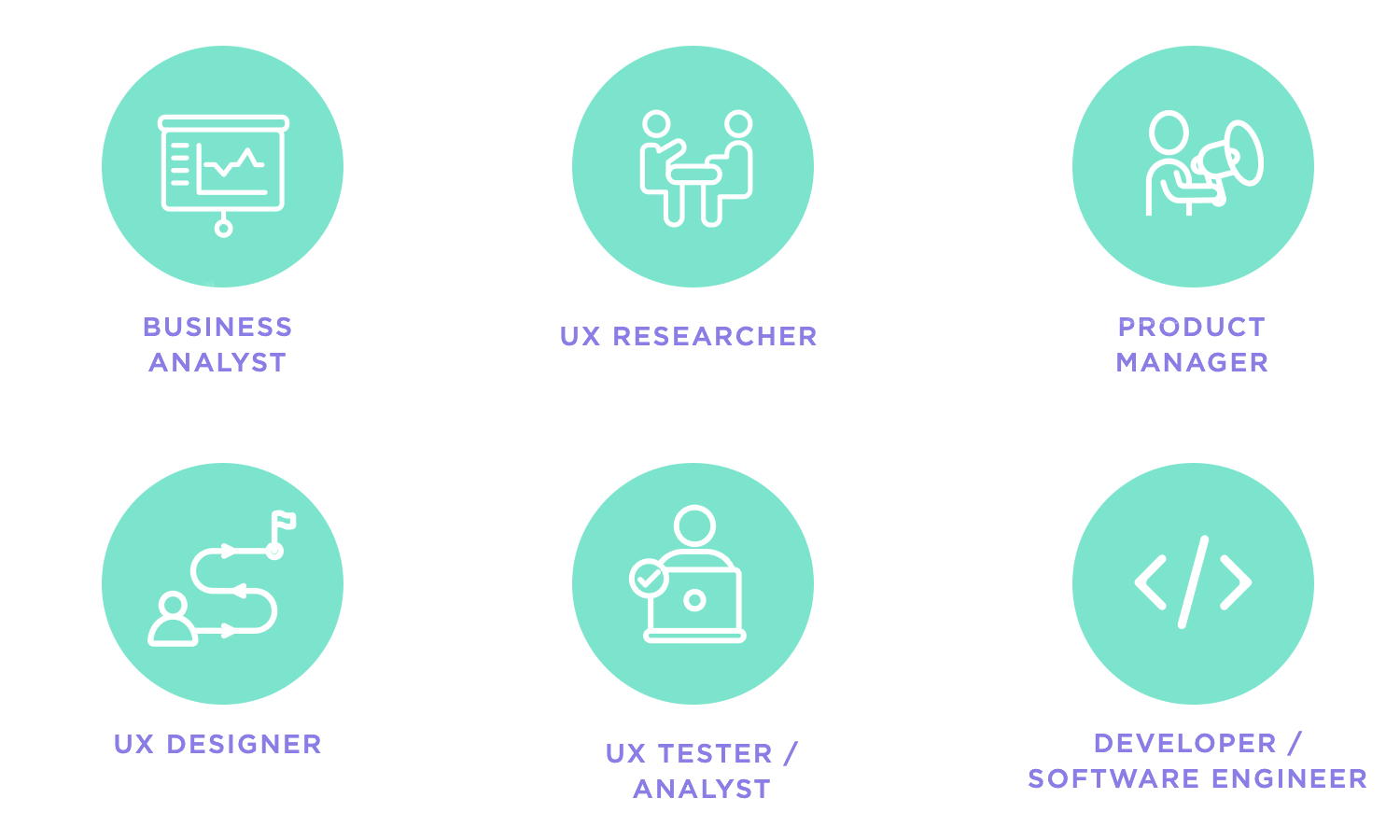
UX Designer
UX designers are at the heart of creating experiences that feel seamless and intuitive. They dive deep into understanding user pain points and turn those insights into wireframes, prototypes, and polished designs. To excel in this role, honing essential UX designer skills is key because it’s what allows them to craft solutions that not only look great but also work effortlessly for the people using them.
UX Tester / Analyst
UX testers or analysts focus on validating the design. They conduct usability tests, analyze user feedback, and identify areas for improvement. Their insights guide designers and developers in refining the product to better meet user expectations.
Developer / Software Engineer
Developers are the ones who turn the design vision into reality. They code the final product, making sure it functions as intended and aligns with the UX specifications. Collaboration between developers and designers is critical to maintaining the integrity of the user experience during implementation.
While understanding these roles is crucial, knowing where to find opportunities and how to navigate the job market is equally important.
Finding the perfect UX role starts with knowing where to look. The following platforms are excellent starting points for landing your next opportunity:
- LinkedIn: a networking powerhouse, LinkedIn is great for finding UX roles and connecting with industry professionals.
- Indeed and Glassdoor: popular job boards where you can explore roles across industries while gaining insights into company culture through reviews.
- Dribbble and Behance: perfect for showcasing your design portfolio and discovering creative opportunities.
- AngelList: a great platform for those interested in startups, offering unique and dynamic roles.
- UX-specific job boards: platforms like UX Jobs Board and Just UX Jobs focus exclusively on UX opportunities, guaranteeing a tailored job search experience.
Breaking into the UX job market goes beyond sending out resumes. It’s about positioning yourself as a well-prepared, dynamic candidate who brings value to the table. Here’s how to make your mark.
Your resume is your chance to showcase what makes you stand out as a UX designer. To make an impact, focus on highlighting your expertise with tools and methods that matter, like the user research techniques you’ve mastered or the prototyping tools you know inside and out. Don’t just list skills like illustrate your achievements with tangible results, such as how you improved task completion rates or reduced user drop-offs.
And remember, every job is unique, so tailor your resume to align with the specific role by emphasizing the experiences and skills that fit what the employer is looking for. This personalized approach shows that you’re not just qualified, but also invested in the opportunity.
A UX design portfolio is your golden ticket, so invest the time to make it comprehensive and compelling.
- Show variety: include projects that demonstrate a range of UX skills, from user research to prototyping.
- Focus on storytelling: walk potential employers through your process, what the challenge was, how you approached it, and the results.
- Use visuals wisely: incorporate clear diagrams, prototypes, and case studies, but keep the focus on the story and your contribution.

In the world of UX, building connections can often take you further than a polished resume. Attending events like local meetups, conferences, or webinars is a great way to meet like-minded professionals and potential mentors who can inspire and guide you.
Social media platforms, especially LinkedIn and Twitter, are also invaluable tools. Share your work, join conversations, and make your presence known in the UX community. And don’t be afraid to reach out to your network for referrals or advice; sometimes, a simple introduction can open up unexpected opportunities and lead to your next big break.
The UX field evolves quickly, so staying up-to-date is essential.
- Take courses: online platforms like Coursera or UX Academy offer specialized training.
- Read and explore: follow blogs, podcasts, and books to stay informed about trends and tools.
- Practice regularly: work on personal projects or volunteer for design opportunities to keep your skills sharp.
With the right preparation, you’ll stand out not only as a skilled designer but as someone who is adaptable, connected, and ready to contribute to any team.
Design the UX of your web and mobile app with Justinmind. Try it free!
Starting in the world of UX design is an adventure full of opportunities, whether you’re just getting started or sharpening your expertise. There are plenty of fantastic courses out there to help you along the way. Here’s a look at some of the best free and paid options to grow your skills and confidence in UX design.
Google UX Design Professional Certificate – Coursera
Offered through Coursera, this comprehensive program covers the essentials of UX design, including user research, prototyping, and testing. It’s designed for beginners aiming to build job-ready skills in UX design.

UX Design Program – CareerFoundry
This free, self-paced course provides a solid introduction to UX design principles, making it ideal for those considering a career in UX. CareerFoundry course covers the basics and offers hands-on exercises to apply your learning.

UX Design Course – Springboard
Springboard offers a foundational exploration of user experience principles, providing a taste of the dynamic world of UX. This free course covers essential UX design techniques, including user research, prototyping, and wireframing.

UX Academy – Designlab
Designlab’s UX Academy is an intensive, mentor-led program that explores the UX design process. It includes hands-on projects and portfolio building, making it suitable for those serious about a career in UX design.

User Experience Design Certificate – BrainStation
The BrainStation’s UX Design Certificate provides a focused, project-based curriculum that covers key UX principles. Participants gain practical experience with tools like Figma and learn methodologies such as design thinking and user research, making it ideal for those looking to build a strong UX foundation.

Introduction to UX Design – Domestika
This course on Domestika is perfect for beginners who want a clear introduction to UX design. It explores key concepts such as user research, prototyping, and usability testing, with practical insights to get you started on the right path.

If you’ve started your journey with UX courses, books can be the next step to consider in this field. They offer timeless insights, real-world examples, and expert advice that help you sharpen your skills and broaden your perspective. Here are some must-reads to keep you inspired and growing.
A true classic in UX design, this book simplifies the concept of usability. Krug’s conversational tone and practical examples make it easy to grasp why creating intuitive designs matters and how to approach it.

Don Norman’s masterpiece goes beyond digital design to explore how people interact with products in everyday life. It’s an essential read for understanding human-centered design and the principles behind successful, intuitive creations.

This book explores the psychology of why some products become part of our daily lives. If you’re curious about designing experiences that engage users and keep them coming back, Eyal’s framework is a game-changer.

For those working in agile environments, Lean UX offers a practical guide to integrating design into iterative workflows. It’s all about collaboration, speed, and focusing on real user needs.

About Face is a deep guide about interaction design, making it a go-to resource for those who want to understand the principles behind creating engaging and effective digital products.

UX design is at the heart of how people interact with the digital world, shaping experiences that solve real problems and make technology accessible. From understanding user needs to iterating on feedback, every step in the process serves to bridge the gap between users and solutions.
This guide has walked through the essentials, what UX design is, why it’s relevant, the tools and roles involved, and how to navigate the field. No matter if you’re just exploring UX principles, going deeper into the iterative process, or preparing to enter the job market, the key takeaway is clear: UX is about creating experiences that work, both for users and for the businesses behind them.
As technology evolves, so does the need for thoughtful design. For designers, this means staying curious, learning continuously, and always putting users at the center of the process. With the right mindset and tools, you’re well-equipped to take on the challenges and opportunities of UX design.
PROTOTYPE · COMMUNICATE · VALIDATE
ALL-IN-ONE PROTOTYPING TOOL FOR WEB AND MOBILE APPS
Related Content
 Learn how to design better e-learning platforms with user-centered UX principles, real examples, and high-fidelity prototyping tips to boost engagement and learning outcomes.13 min Read
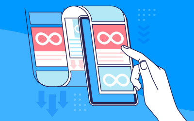
 Infinite scroll keeps users engaged, but it’s not always the best choice. This guide breaks down when to use it, when to avoid it, and how to design it right.14 min Read
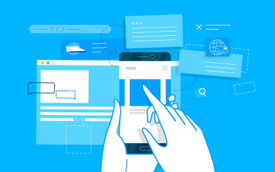 Learn how to design web and mobile app prototypes, how to test them and what to look for in a prototyping tool in this complete guide.15 min Read


