Great UX design can come in many forms. Check out these 30 incredible UX design examples that deliver a unique experience!
UX design is quite a diverse art. Users and designers all have a big margin to find products that thrill, help, solve, organize and even bewilder. But what makes a truly great example of UX design?
Free UX Design Tool for web and mobile apps. Try it now!

For us here at Justinmind, a great UX design example can look like a lot of things. It can be a beautifully planned form, a creative navigation system or an efficient use of screen space. Ultimately, there are so many cases where design teams created products that truly communicate with users and help countless people all around us.
That’s why we created a list of 30 wonderful examples where the UX design was on point. Keep your favorite UX design tool at hand – you’re about to get inspired!
Miro uses pop-up banners during the onboarding process to offer helpful advice to new users. This extra layer of support can significantly improve the user’s initial experience and help them get the most out of the platform.
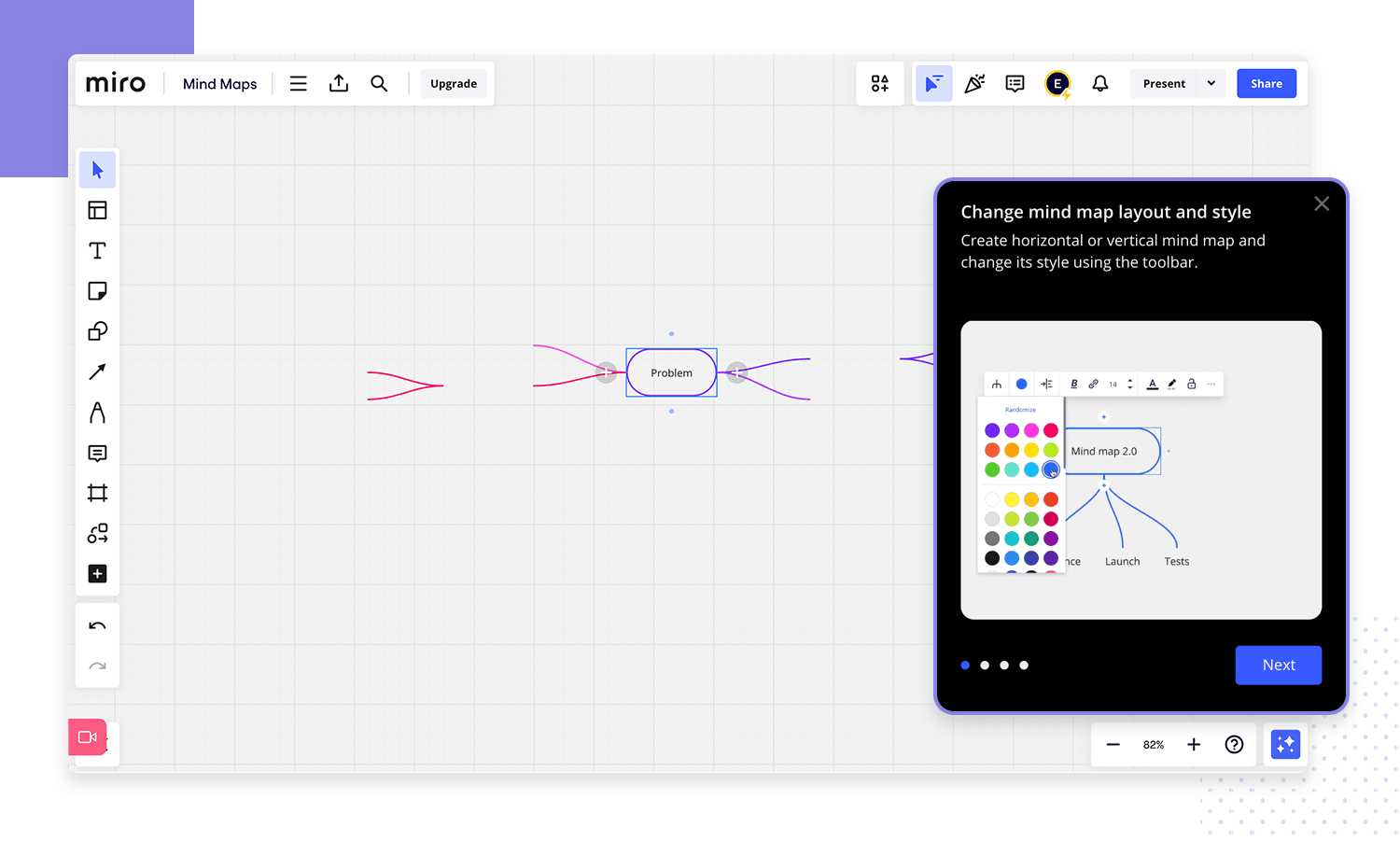
These pop-ups, often called banners, allow you to deliver targeted messages to users based on their actions within the interface. Imagine a user encountering a new feature in your app. A well-designed banner can appear at that specific moment, offering a quick tutorial or highlighting key functionalities. This “in-the-moment” approach ensures the information is most relevant and helpful to the user, making this UX design example worthy of saving in your inspiration file.
Transforming mundane tasks into engaging experiences is a powerful strategy known as gamification. This approach incorporates game-like elements such as checklists, leaderboards, badges, and progress levels to motivate users and boost engagement. Gamification can serve a dual purpose: it can entertain users while simultaneously celebrating their achievements within the product.
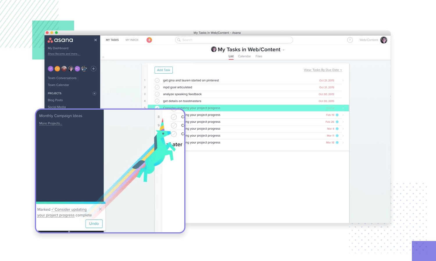
Take Asana’s UX design for motivation as an example. When a user completes a task, a playful animation, like a celebratory unicorn crossing the screen, might appear. This touch of whimsy adds a delightful element of surprise and motivates users to keep coming back and accomplishing more. We are living for it!
Babbel streamlines its language learning interface to create a laser focus for users. Right from the first interaction, the app aims to immerse learners in a flow state conducive to effective learning. This focus on user needs is driven by a blend of educational research and user feedback. The result?
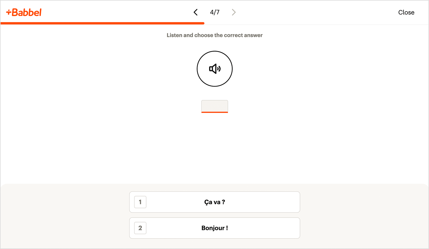
A distraction-free, full-screen learning environment that seamlessly combines written, visual, and audio elements to maintain user engagement and prevent boredom. Learning becomes a game! Babbel incorporates gamification elements, rewarding users with points and positive reinforcement. Lessons are carefully calibrated to provide a satisfying challenge, ensuring users stay motivated and avoid discouragement. We absolutely love this UX design example by Babble!
Revolut understands that managing your money shouldn’t feel like a chore. That’s why they’ve prioritized user experience by offering a highly customizable app interface. Just like Babbel caters to different learning styles, Revolut empowers you to tailor the app to your financial preferences.
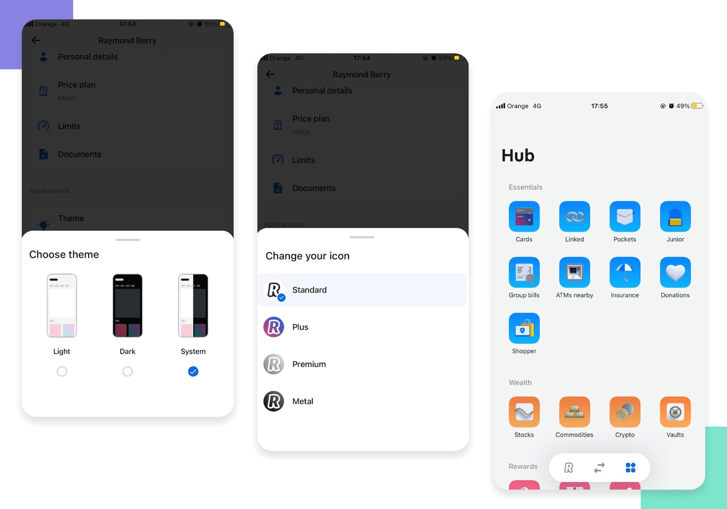
Imagine a home screen that displays the features you use most often, with clear visuals and intuitive navigation. Gone are the days of wading through irrelevant information. Revolut puts you in control, allowing you to personalize your experience and streamline your financial management journey.
An excellent UX design example is Mailchimp’s welcome form that prioritizes a friendly and frustration-free approach to security. The checklist turns green as you include the required characters in your password, offering highly gratifying and immediate feedback for adjustments to help guide you better.
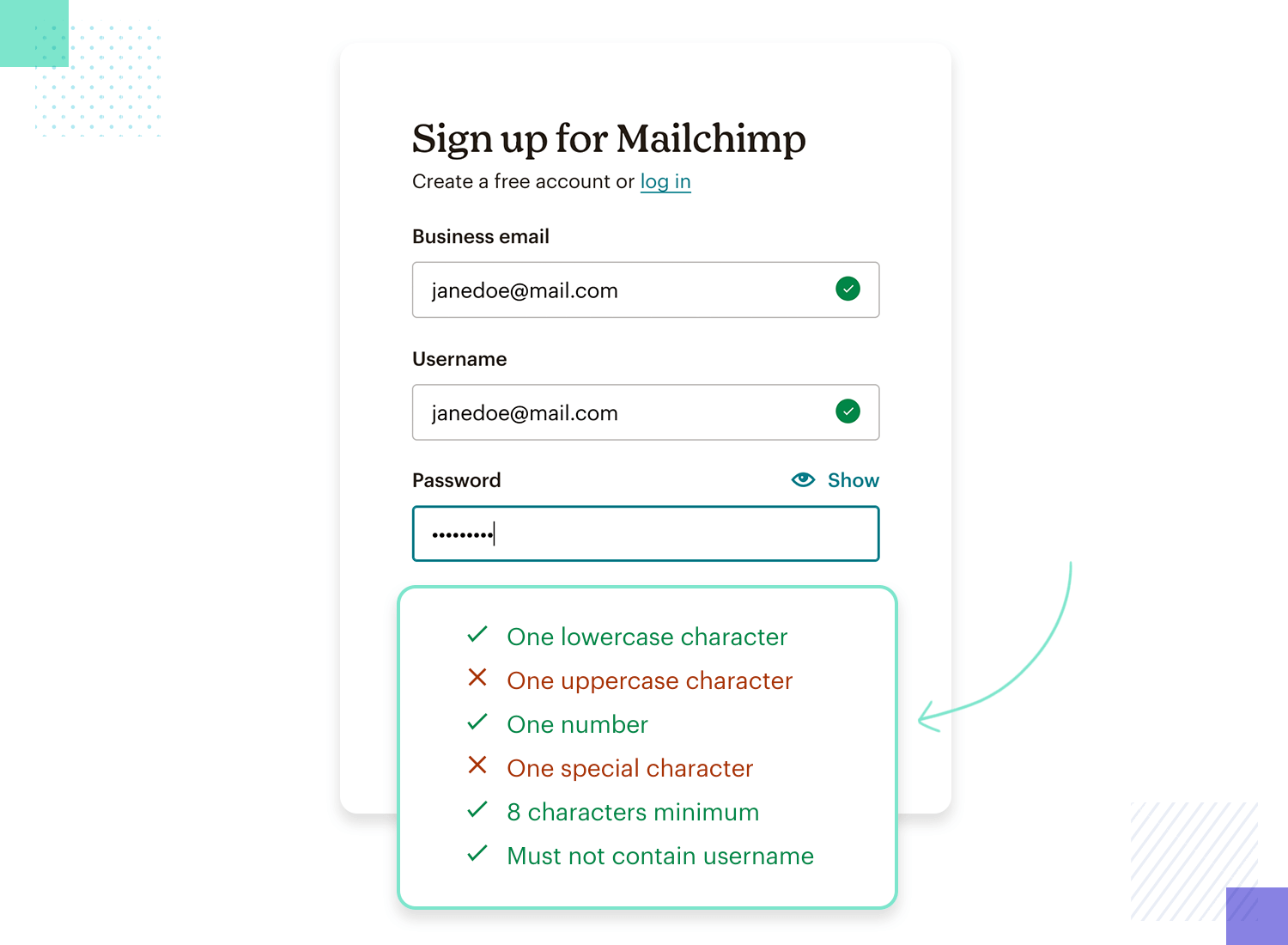
And just in case you can’t be bothered to create your own password, a built-in generator does that for you. Even if you forget your login down the line, an intuitive reset flow gets you back in with minimal hassle!
Jira, the work management powerhouse, isn’t just about powerful features – it’s about making those features feel effortless. Their task prioritization, for example, lets users organize tasks with two simple motions, drag-and-drop.
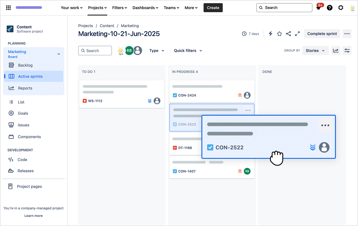
This intuitive superpower lets you adjust the order of tasks based on urgency or dependencies in a snap. No technical jargon, no wrestling with confusing interfaces – just a clear visual representation of your project flow that you can adapt with ease. Everybody loves a good drag-and-drop!
Forget juggling different apps for walking, cycling, or public transport. Google Maps boasts a superhero feature: multi-modal route planning. This innovative UX design example streamlines the exploration of your travel options, whether you’re a cycling enthusiast or a public transport pro.
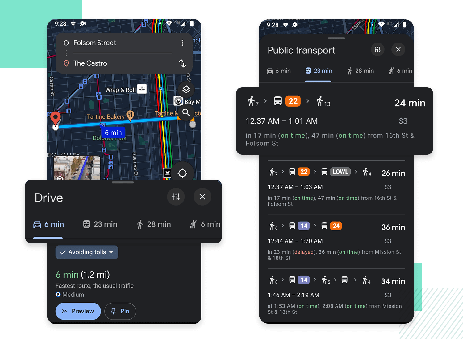
Simply enter your destination and let Google Maps craft the perfect route for your chosen mode of travel. This eliminates the hassle of switching between apps and ensures a smooth, frustration-free journey, all within a single, user-friendly interface. Google, you just can’t stop giving us reasons to love you, can you?
Free UX Design Tool for web and mobile apps. Try it now!

Understanding that users often seek the app to manage stress, anxiety, and improve sleep, Headspace prioritizes a user experience that’s as smooth and calming as the meditations themselves.
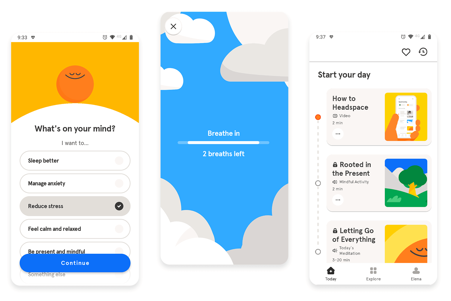
One aspect we find particularly engaging is their use of gamification to promote user retention. Similar to Duolingo’s approach, Headspace injects a touch of friendly competition into the world of self-improvement. The app incorporates goal setting and a daily streak system, gently nudging users to maintain a consistent meditation practice and experience the long-term benefits. We love this winning example of good UX design!
With millions of users relying on it for daily communication, Slack understands the importance of clear and organized conversations. That’s where their threaded conversations feature shines. It wasn’t that long ago that we had forums and chat rooms overflowing with messages on various topics. Traditional chat formats can become overwhelming, making it difficult to follow specific discussions.
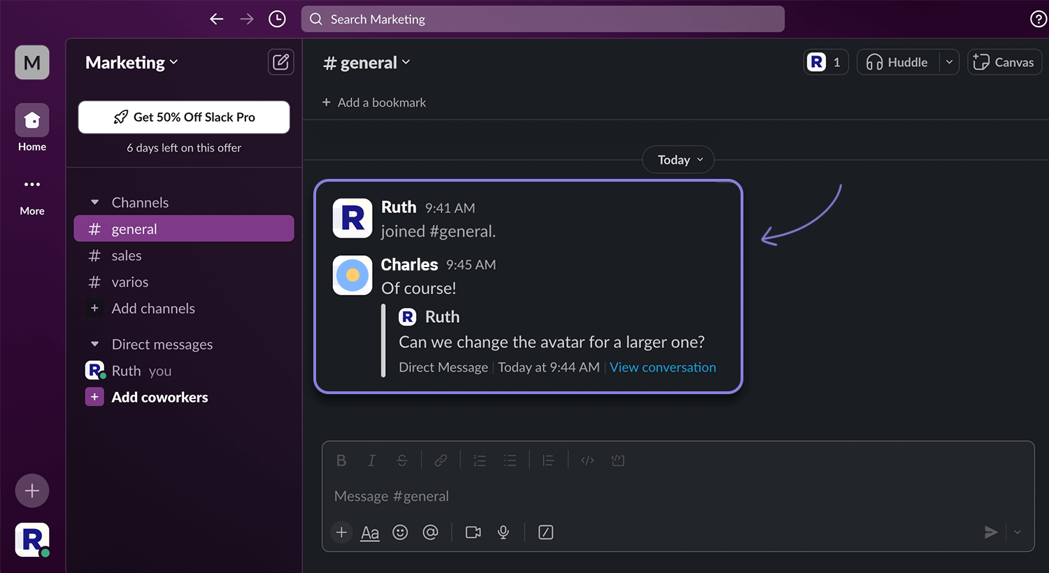
Slack’s threaded conversations tackle this head-on. Users can reply directly to specific messages, creating a branching conversation tree that keeps everything neatly organized. This puts Slack in our top 10 of our 30 UX design examples to get inspired!
Forget endless trips to the store with measuring tape in hand. The IKEA Place app utilizes cutting-edge Augmented Reality (AR) to transform your furniture shopping experience. This innovative UX gem empowers you to virtually place furniture models right within your own home using your smartphone camera. Imagine sofas, tables, and bookshelves seamlessly integrated into your living space – all before you swipe that credit card.
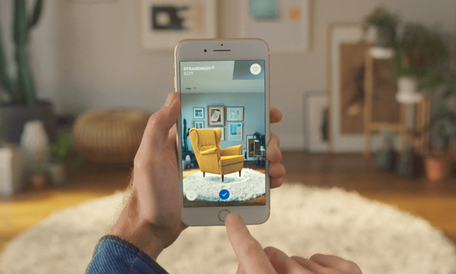
This isn’t just about browsing pictures; it’s about visualizing scale, style, and layout in real-time. Putting users first and foremost is what makes this IKEA Place app a winning UX design example. The app empowers you to make informed decisions with confidence, ensuring your new pieces perfectly complement your existing décor.
Instagram has become such a popular app. Its design makes it easy for users to spend long hours scrolling through the endless stream of visual content, never overwhelming users in any way. In fact, there’s something truly wonderful about the visual hierarchy and balance on Instagram, even if most users couldn’t quite put their finger on what it is.
Due to the visual nature of the content on Instagram, it should come as no surprise that the majority of screen space is dedicated to the content posted by users. It goes to show that the general layout of Instagram’s screens was carefully planned to showcase the content and allocate a bit of space for other features. There’s no visual noise, no unnecessary elements at all.
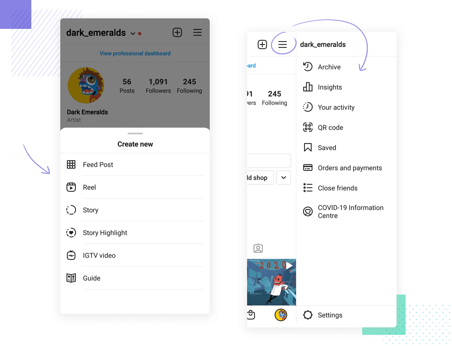
Instagram makes for a prime user experience design example that makes the maximum from the available space. The app doesn’t compromise its features and settings in order to maintain this beautiful visual minimalism, either. Instead, the design team found great ways to stow these options away, so they wouldn’t be in the way but within reach. Using familiar faces like the hamburger menu, the app offers users a comfortable way to enjoy Instagram and all its features.
Booking.com is another huge name in the travel industry. The website is carefully put together in order to help users not only search through the thousands and thousands places to stay but to also book things easily. We included it in this list of UX design examples because of how efficiently everything was orchestrated – especially the forms.
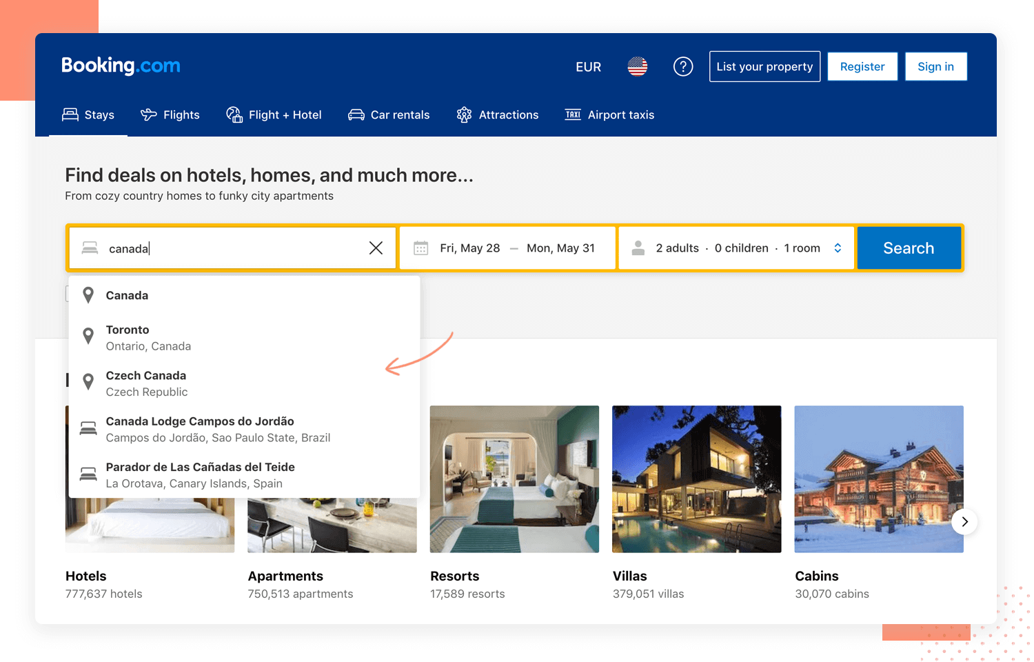
To start, we love the search bar. It’s fast and efficient, helping users with suggestions that adapt from countries to cities and even areas. It’s the design pattern of lazy format at its finest. In a similar fashion, the entire check out process is smooth and requires very little effort from the user. Among the great UX design examples on this list, Booking rightfully takes its place alongside Amazon for having one of the best checkout processes in the UX game.
Spotify is one of those user experiences that can divide people. To some, the general UX is overrated and has plenty of room for improvement. To others, the app has a well-planned flow that helps users to explore new music. No matter how you feel about the general experience, there’s no denying that Spotify has some truly great UX design.
For us here at Justinmind, it’s all about the details. We love that every little detail in this UX design example follows a consistent trail of behavior and appearance. Regardless of if a user wants to hide a song, add a song to a playlist or when a song is liked – the app behaves consistently throughout.
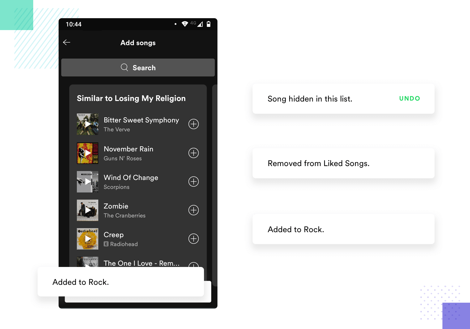
This makes it easier for new users to learn their way around the app, because once they’ve seen the behavior of the app in response to one user action that’s it. They don’t need to learn about other reactions and behaviors of the app – which significantly shortens the learning curve. This results in an app that is easy to understand and requires very little cognitive effort to learn.”
It’s no secret that Airbnb takes its UX design very seriously. The company famously created its own font, Cereal, that itself signifies a young and fun identity. The real magic, however, lies in the interface design of both its website and app.
First, the minimalism of the general interface is quite impressive. Mainly, because Airbnb manages to create a clear and minimal interface while still displaying a huge amount of information – which is no walk in the park. Secondly, there’s that same consistency that we praised Spotify for. Both in terms of behavior and visual cues, Airbnb makes it easy for users to predict how it will react and so requires very little effort from the user.
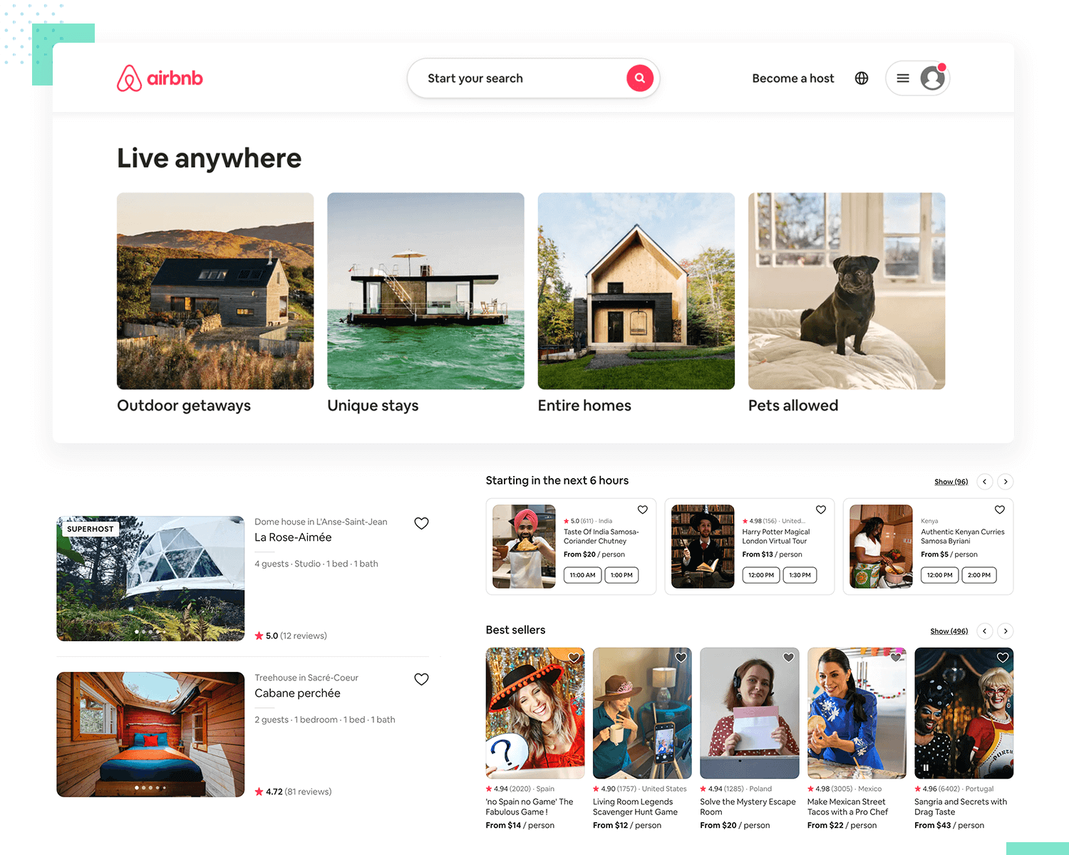
This UX design example also has a truly wonderful use of cards. UI cards, as they are, can make for a powerful way to display information in a way that is both responsive and effective. Users can easily recognize them and process the information offered in each screen. It’s smooth, easy to grasp and offers wonderful readability.
Free UX Design Tool for web and mobile apps. Try it now!

Uber is a prime UX design example of a product that is all but split down the middle. Uber, in truth, needs to cater to two sides of the same coin: the riders and the drivers. This situation creates the need to understand two fundamentally different types of users – each with their own objectives and goals.
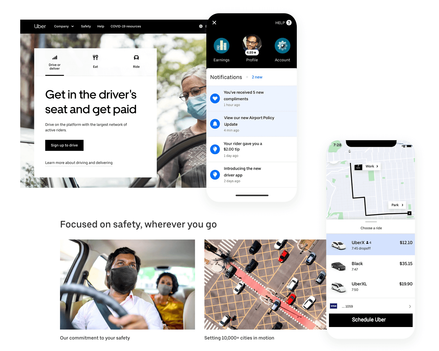
And that is, in part, what we here at Justinmind love about Uber. Any UX designer can tell you that understanding one user’s mental model and persona can be complex stuff. Uber does it with two – and does it very well. We love that the app understands how to deliver an effective and practical experience for both users, cementing the usability for both prime users. This sort of thinking represents the very foundation of the sharing industry as we know it.
Duolingo has changed the lives of many people out there. The ability to practice a language completely alone, in their own device, skyrocketed in popularity during the confinement due to the pandemic. And when it comes to a wonderful example of UX design, Duolingo makes it easy to see why it’s grown to be so popular.
It breaks complicated topics into chewable pieces and simplifies the entire learning experience, using UX design. There are two huge pieces of the UX puzzle here: breaking a long process into small bits and visual hierarchy.
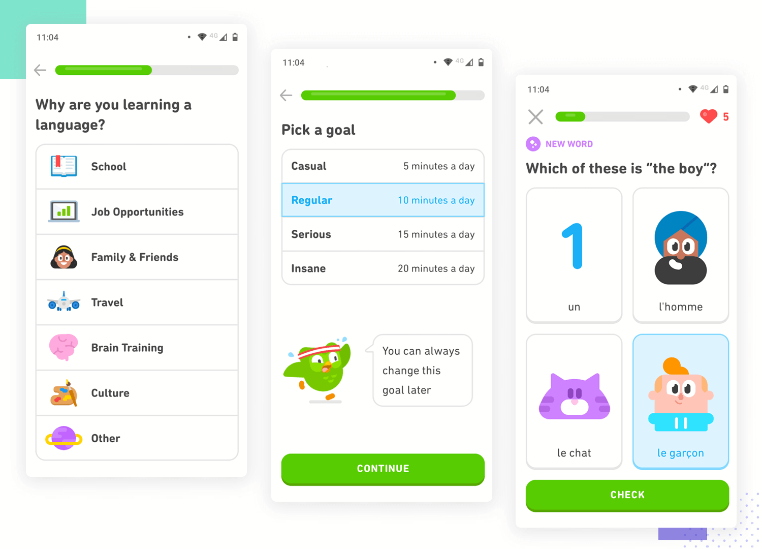
Duolingo keeps everything simple by asking one question at a time, which maintains clarity and reduces the cognitive load. This means that users aren’t overwhelmed and don’t lose focus on the matter at hand. On the other hand, Duolingo’s UI design manages to play with many elements and use things like the law of proximity, offering clear questions and guiding the eye of the user.
This can even be seen at the very beginning of the user experience, when users establish their preferences and language goals. A form that would otherwise be long and boring becomes quick and easy with UX design at its finest.
Disney+ has made quite the splash since its debut in the world of streaming content. It’s true that its UX design had a bit of a rocky start, but changes and updates have changed the user experience for the better. There is one aspect of the user experience that we think this UX design example got absolutely right: error prevention.
No user enjoys having to take the time to type out information. This is particularly true for users on a smart TV, who need to rely on the remote for all interaction with the app.
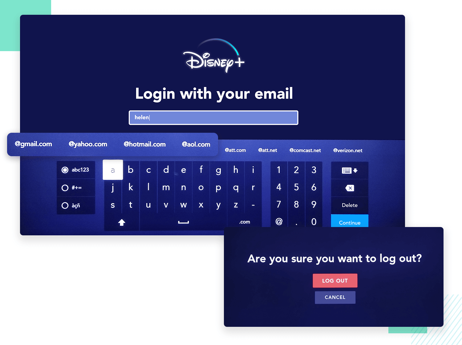
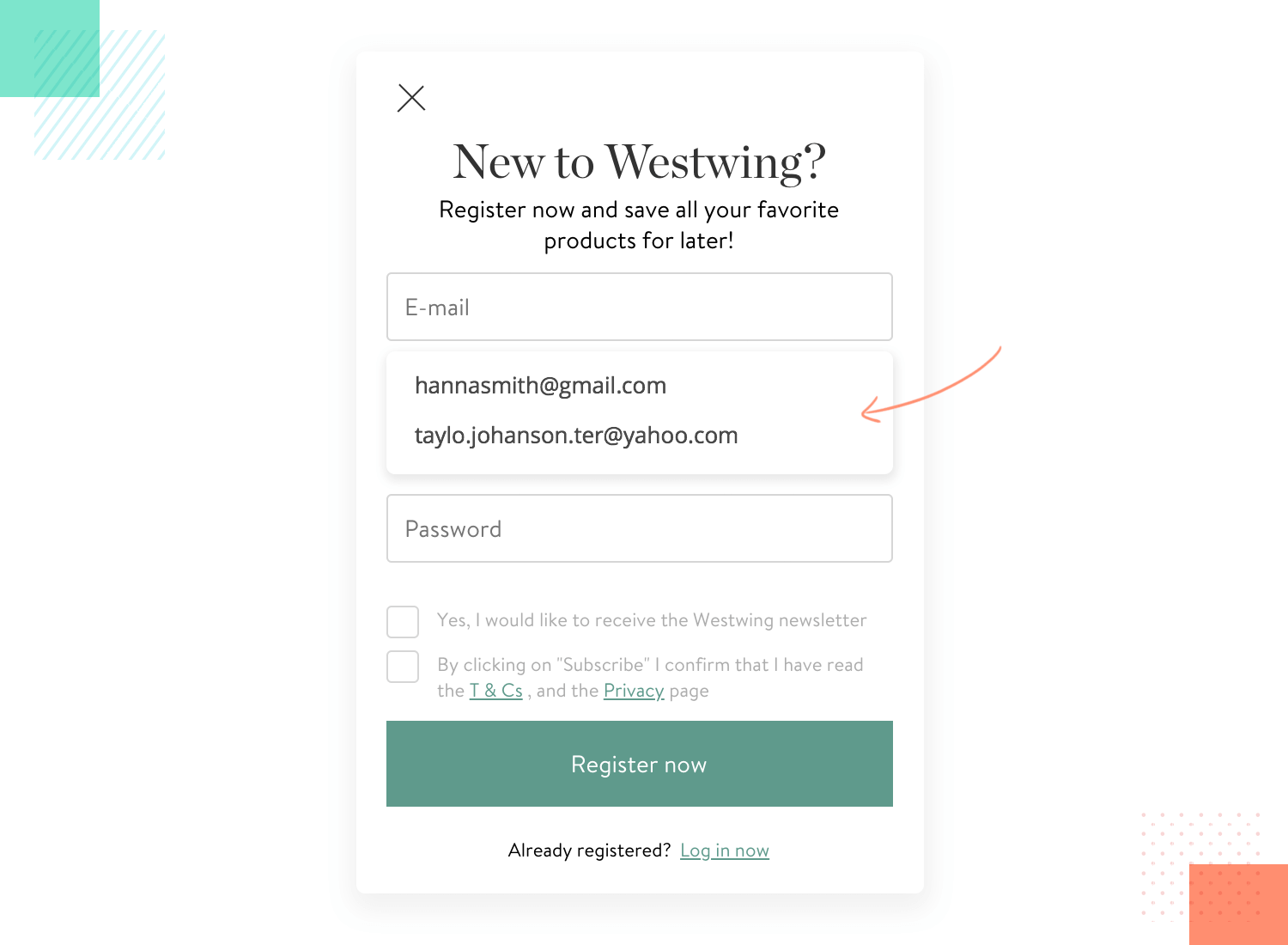
Disney understood this simple fact and created measures to help users to type less and make more progress. Things like typing out your email are made easier by the app suggesting the most common email providers, like “@gmail.com” as a suggestion for users logging in or registering. This may seem small, but to users it makes a real difference. Another way in which Disney minimizes errors is by including confirmation messages when tasks are accomplished with success.
It’s true that some of the UX design examples on this list have more eye-catching features, but preventing users from making errors can be quite complex. It’s about allowing users to get to the end of forms faster while also avoiding common mistakes like “gnail” or “hmail”. By simply suggesting the right thing, the app allows users to move forward without any friction or stress. Kudos!
Twitch is a huge name in the gaming business. The platform focuses on video game live streaming, including even e-sports events like massive competitions. It also works as a prime UX design example for UX designers out there.
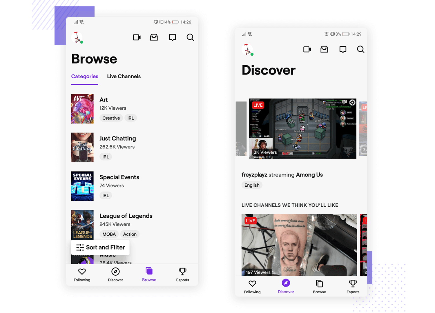
When users watch a stream using their mobile device, Twitch was a pioneer in making it so that users could leave the app and the video would stay active on the screen. Most video streaming apps will require users to stay on the app, but Twitch went the extra mile. Now, users can even lock their phones and the video will still be there when they unlock it. It’s about keeping the user experience going, allowing the real world to interrupt but not quite break up the experience.
Calm is another app that works as a UX design example that simplifies long forms. The app starts off with a carefully planned form in a series of screens, offering a set up that doesn’t require a lot of cognitive effort.
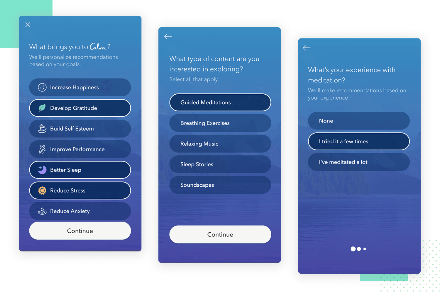
It makes a wonderful first impression, because it establishes a simple and easy-going relationship with the user. This kind of design thinking tends to lead to a lower abandonment rate and results in products that users don’t need to invest a lot of effort to use. It sends a message to new users that the user experience here will be straightforward, intuitive and comfortable.
Free UX Design Tool for web and mobile apps. Try it now!

Telegram may not be quite as popular as its nemesis, Whatsapp. However, there’s no denying that its UX design offers a planned out experience that minds the little things – a classic trait of a good UX design example.
First, there’s the brilliant use of a tab system to help users manage their uploaded files. Second, there’s the wonderful option of group chat owners to pin messages in the chat, to be easily found by any user in it.
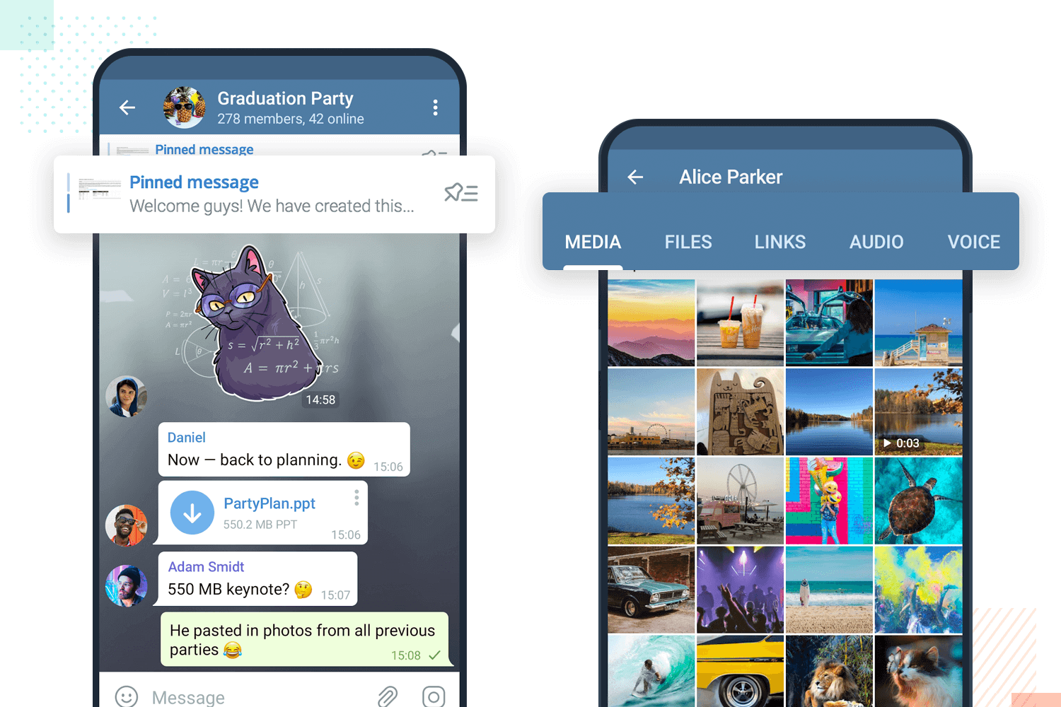
Together, these two features show us that the design team at Telegram invested a lot of effort into giving users control and creating an efficient product.
H&M is a classic example of UX design that needs to handle a huge amount of content. The store itself offers a wide variety of items for customers, creating a need for exceptional navigation design that connects it all.
For the design team over at H&M, it’s all neatly brought together with their mega menu. The entire menu is huge, and opens up to show just about every corner of the store. We love it, because it manages to keep everything organized, showcasing outstanding information architecture and labelling of items.
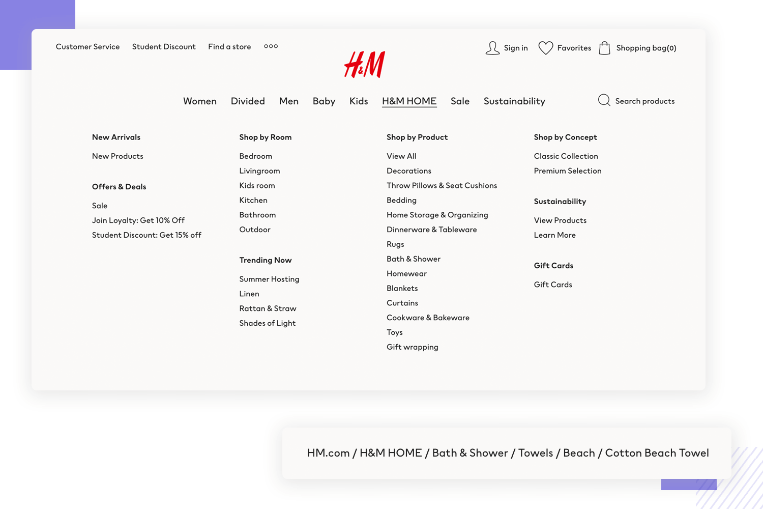
Another thing that we love about H&M’s website is their breadcrumb navigation. It’s done so that it’s noticeable but not eye-catching, offering a way for users to jump around categories and levels within the store. It’s about helping users see where they are in that moment and helping them find where they want to go, working as a wonderful secondary form of navigation.
Amazon Kindle has been in the ebook game for a long time now. Since its beginning, it’s grown into a huge market that includes all sorts of people. It should come as no surprise, then, that Amazon invested a great deal of effort into making Kindle accessible.
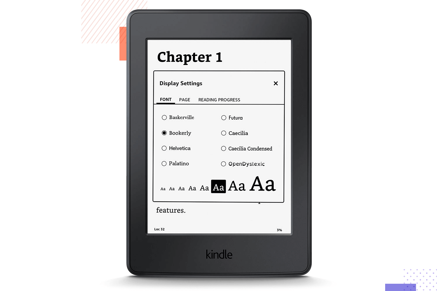
In fact, Amazon’s Kindle helps users with its own assistive technology, VoiceOver. This is aside from having a range of settings that are meant to not only make it comfortable to read, but to also make it easier for users with moderate visual impairments. Add to the equation features like an actual reading ruler that users can rely on to help guide their eye – and you got a very accessible product design. It’s a fine UX design example that caters to everyone!
Skyscanner is the preferred choice for many people when it comes to air travel. The website itself has a lot of features that most UX designers will appreciate, from its consistency in visual design to its visual hierarchy in search results.
There is, however, one aspect that we quite enjoy here at Justinmind. Skyscanner always tells users what is going on. A prime example is when a user makes a search with specific requirements, which can take a few moments. During this wait time, users are reassured that the search is taking place, that the wait isn’t due to some error in the system.
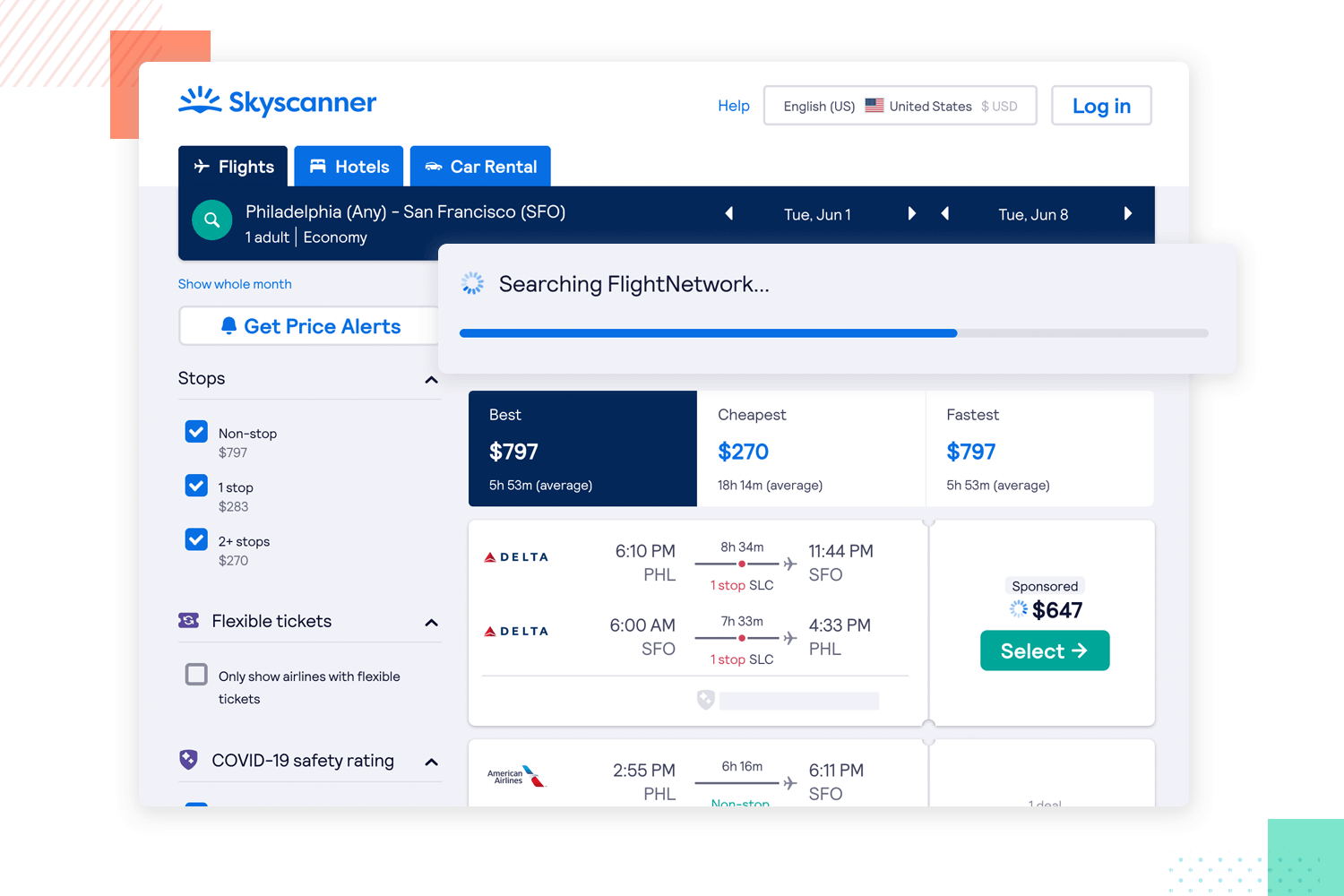
The outcome from this fine detail is that users remain calm and don’t become frustrated or confused. It instills trust that the platform is working and the abandonment rate is lowered.
Tripadvisor knows that most people will have a very specific set of requirements for their preferred stay on a trip. From basic things like the number of guests to fine details like breakfast or pool preferences, the website offers it all to users.
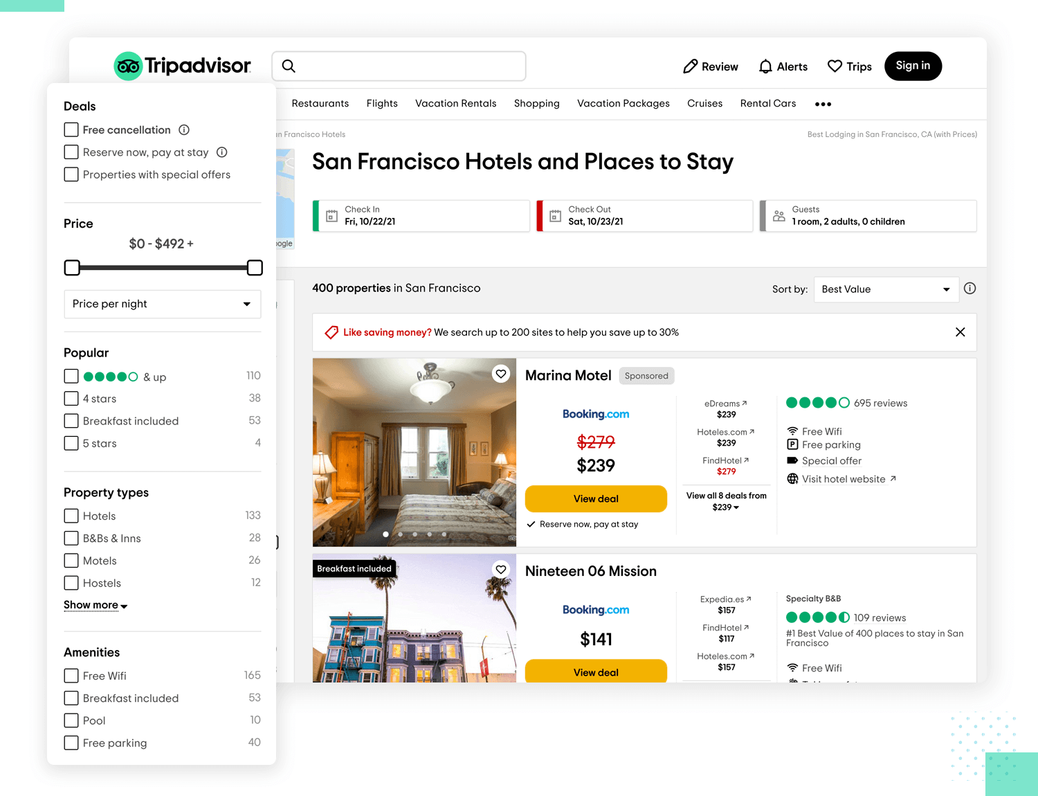
It makes for a great UX design example of allowing users to customize their searches to perfection. Using a smart vertical system, Tripadvisor allows users to add all the preferences they could possibly think of. By using the right UI elements, the website manages a very clear communication to users, be it in selecting the style of the hotel or the area they wish to explore.
Free UX Design Tool for web and mobile apps. Try it now!

Trello is one of those UX design examples that took user control to a whole new level. Both the app and the web app go much further than the competition when it comes to letting users do what they want.
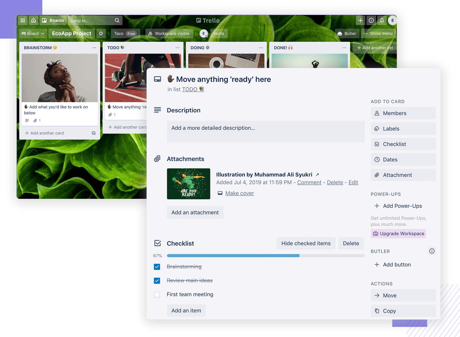
Ultimately, it can be challenging to create a product that is meant to help people in their daily work. Workflows, tasks and responsibilities all change drastically from team to team – which is why we love Trello so much. By giving users complete control over their boards and user permissions, the app effectively blends into the workflow of the user without any friction.
Bla Bla Car works as a great UX design example when it comes to visual balance and minimalism on the interface. The app sticks to a certain simplicity all around its design, relying on only a few key elements to get the features at the user’s fingertips. It makes for a user experience that is free of any visual noise and allows users to focus on the task at hand.
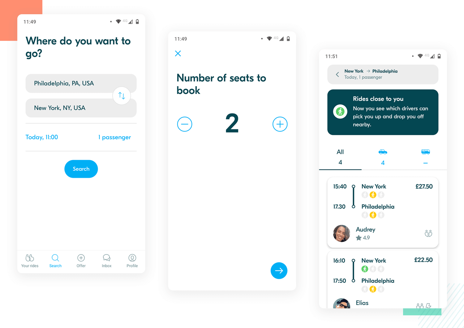
Another thing about Bla Bla Car that we love is how the app breaks information up into small bits, much like Duolingo. Despite the amount of information that the app needs to share with users, it all remains easy because this information isn’t given all at once.
Vueling is a prime example of a UX design that nailed the tab navigation right on the head. We’re huge fans of a well designed tab system here at Justinmind – because they can be surprisingly tough to get right and deliver a huge impact on the user experience.
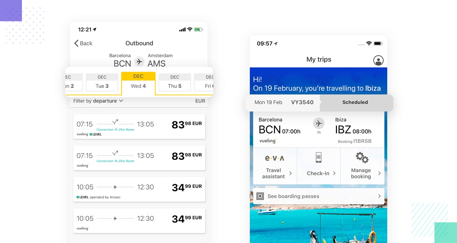
And so, it’s no wonder that we included Vueling in this list of UX design examples. Its tab system checks all the right boxes. It’s consistent, it’s visually pleasing and comes in a reasonable size. The tabs are organized in a way that makes sense and users can move around them with nothing more than their intuition.
Nike’s website understands how proximity and visual cues play a huge part in the user experience. There’s a lesson to be learned here by design teams everywhere: hierarchy and proximity can sell items. In this case, Nike’s individual product pages are a wonderful example of UX design that converts.
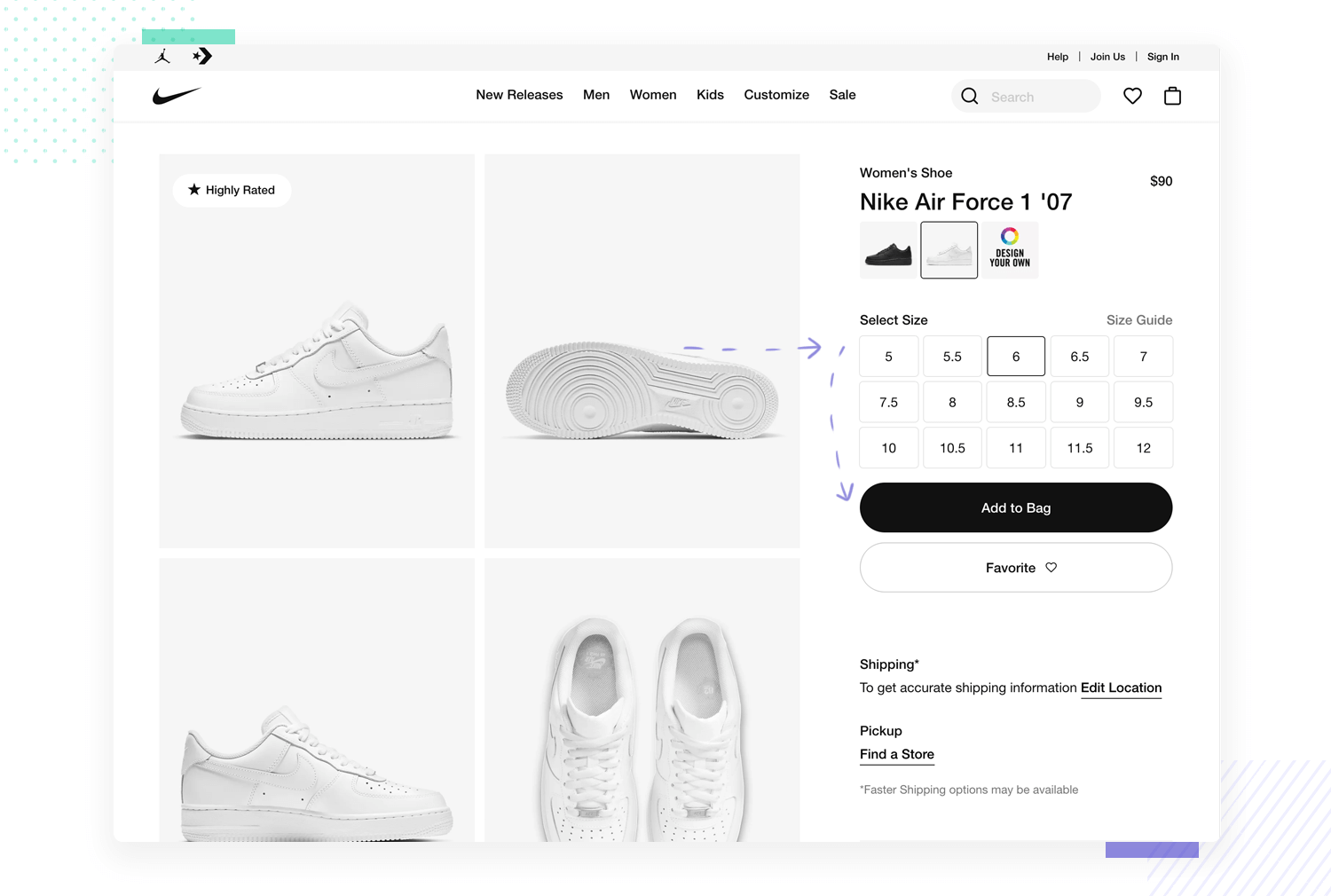
More specifically, the relationship and proximity of the sizes of the items, the product pictures and the Add to Cart button is something we love. It means that users barely need to move their cursor and their eyes in order to make the decision to purchase the item or not. It’s about encouraging people to buy things, both because of how the design showcases the products and because it doesn’t offer any resistance to users. It’s just so easy to add items to the cart – might we say, it’s even tempting!
WestWing is another UX design example for a system that runs efficiently. Much like Disney+, this website works to shorten the time users need to spend typing things. When it comes to signing up or signing into WestWing, users barely need to invest any effort. The form itself is short and sweet, with the website working to get people shopping as quickly and efficiently as possible.
Who doesn’t love HBO? We here at Justinmind love it both for the awesome series and for its thoughtful UX design. It’s clear now that HBO took some notes from veterans in the streaming service business, like Netflix.
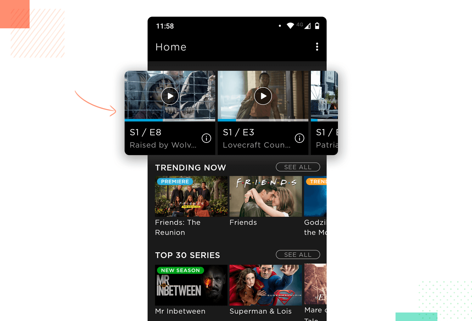
Users can always see what is happening with the system and know exactly where things were left off. The system status visibility works well with the HBO app, because it always tells users when the system is working to react to a user action – in a similar way to Skyscanner, HBO keeps users calm.
Coming in first place of UX design examples that the world can do without is WhatsApp. WhatsApp’s “delete message” feature suffers from a critical UX flaw. While intended to give users control over sent messages, it often backfires. When a message is deleted, the recipient sees a notification stating “This message was deleted.” This creates confusion and frustration – the recipient knows a message existed but can’t access its content.
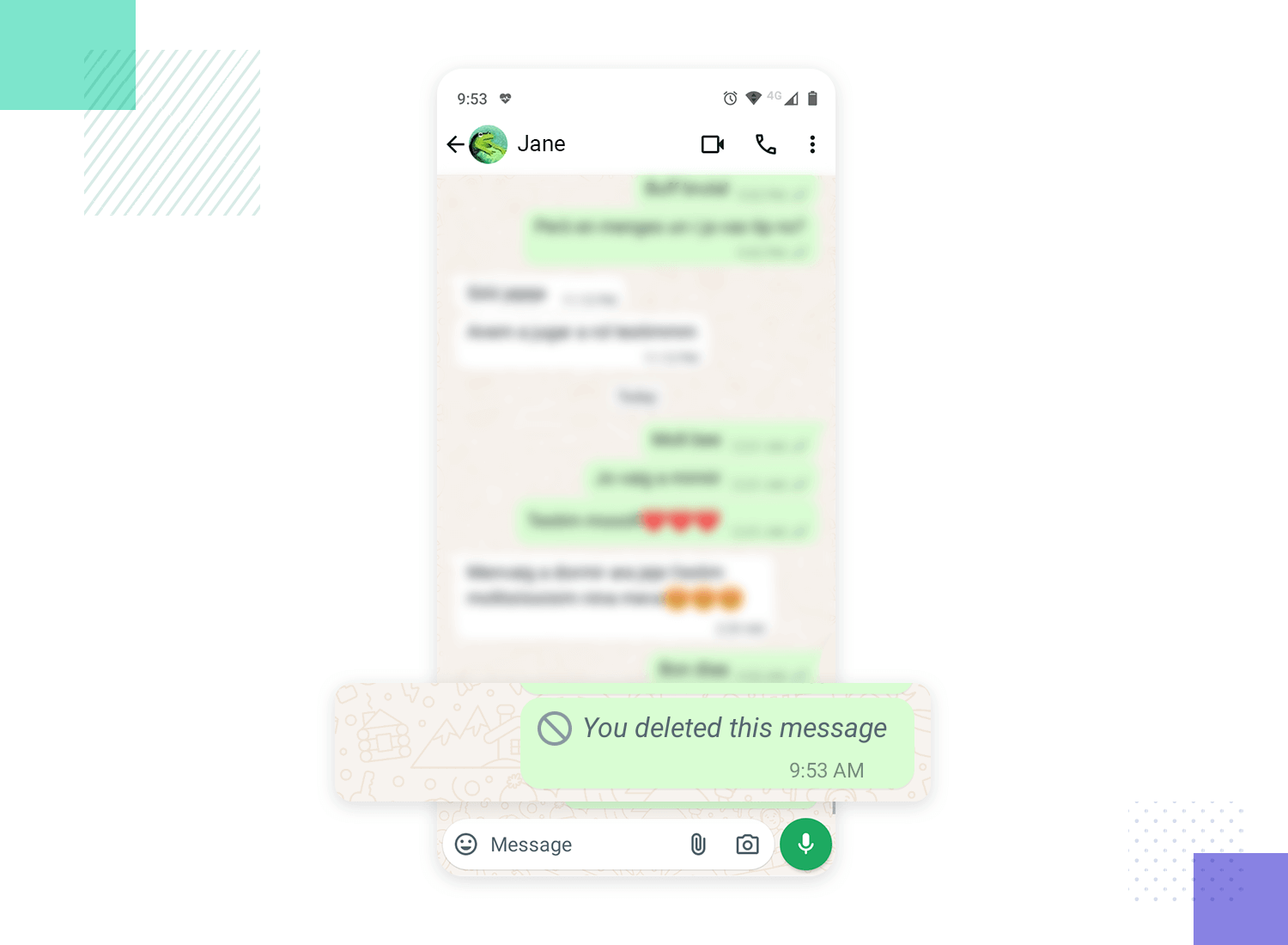
A better solution would be a true “delete for everyone” option with a limited window of opportunity. This timeframe would allow senders to unsend accidental messages without leaving a confusing trace, like in Instagram’s DMs or in Gmail’s unsend option.
Free UX Design Tool for web and mobile apps. Try it now!

Not too long ago, frequent flyers of Ryanair might have told you that booking a simple trip felt like navigating a maze. This frustration stemmed from the platform’s use of dark UX patterns. Dark UX patterns refer to design choices that intentionally obfuscate or complicate the user experience. Imagine searching for a budget-friendly getaway, only to encounter a booking process riddled with hidden costs. Key options, like opting out of travel insurance, were buried within unrelated menus, making them difficult to find, like in the UX design example below.
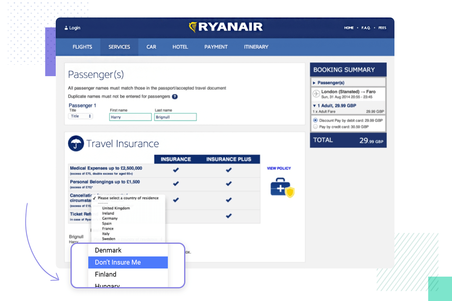
This approach prioritized the company’s bottom line over user experience. Instead of a clear and user-friendly platform, dark UX patterns were used to confuse and mislead users into making choices that benefit the company, which often resulted in unintended (and unwanted) additional expenses. Thankfully, the company has since opted for cleaner UX practices that put the user first. Good on you Ryan Air!
Automatic features can be a double-edged sword. While intended to streamline the user experience, they can backfire if not implemented thoughtfully. Imagine visiting a website and being bombarded with auto-playing sounds, redirected to unexpected pages, or having files downloaded without your consent. This lack of user control can feel intrusive and disrupt your browsing experience, a perfect example of bad UX design.
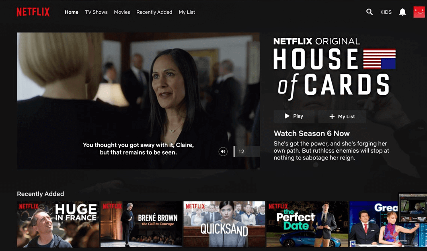
Take Netflix’s auto-play feature for trailers. Designed to pique user interest, it automatically plays a preview when you hover over a movie poster. However, many users find this disruptive and prefer to choose when they want to see a trailer.
Apple prides itself on user-friendly design, but their storage management system stumbles when it comes to clear communication, making it deserve a spot on this list for bad ux design examples. Not so hard to picture the frustration of snapping a picture on your iPhone, only to be greeted with a cryptic message: “Storage Almost Full.” This notification offers no guidance on how much space needs to be cleared or what actions you can take. This lack of information leaves users feeling lost and frustrated. Should they delete precious photos? Uninstall rarely used apps? The notification offers no clues, forcing users to navigate through settings on a hunt for solutions.
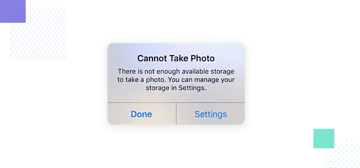
A user-friendly approach would be to provide actionable steps within the notification itself. Imagine the notification displaying, “Storage Almost Full. Delete 10 photos to free up space” or “View storage breakdown and manage apps.” This empowers users to address the issue immediately with clear and actionable steps.
UX design is a trade that takes many forms. In part, that’s the allure of the industry. There’s something truly masterful about a product that fits users’ lives and grasps their attention. Hopefully, this post has got you inspired to create your own incredible experiences for users!
PROTOTYPE · COMMUNICATE · VALIDATE
ALL-IN-ONE PROTOTYPING TOOL FOR WEB AND MOBILE APPS
Related Content
 Learn how to design better e-learning platforms with user-centered UX principles, real examples, and high-fidelity prototyping tips to boost engagement and learning outcomes.13 min Read
 Infinite scroll keeps users engaged, but it’s not always the best choice. This guide breaks down when to use it, when to avoid it, and how to design it right.14 min Read
 Learn how to design web and mobile app prototypes, how to test them and what to look for in a prototyping tool in this complete guide.15 min Read
