What are micro-interactions? How do they get users hooked and how do you use them? Here’s all you need to know
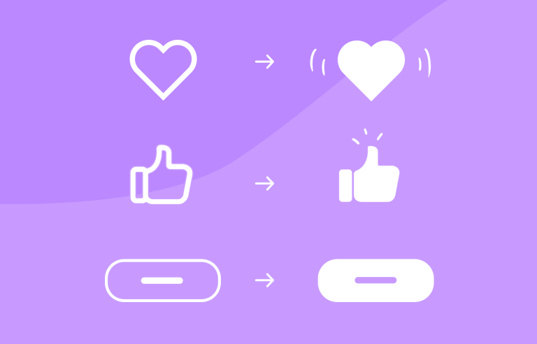
Ever heard the saying “sometimes, less is more”? With micro-interactions, this statement couldn’t be truer. They come under the umbrella of interaction design and they’re all about the little details – subtle interactions whenever the user does something like a gesture on an app or a click on a website. Be it a little heart that pulsates when pressed or a thumbs up icon that turns blue after it’s selected.
Micro-interactions are all around us because they boost the user experience. In fact, most of the time, you wouldn’t even realize you’re experiencing one, unless you’re a UX designer. Yet these little interactions start to shape the user experience, keeping us engaged, shedding clarity and sometimes even making us smile.
In this post, we’ll look at some great examples of what micro-interactions can achieve when done right, as well as how to design micro-interactions in a prototyping tool.
Imagine how much of a better place the world would be if every interaction, no matter how small, brings joy and delight? It can be this way, digitally at least! Micro-interactions are these subtle moments that are often overlooked, be it the satisfying click of a button or a subtle animation that indicates a successful action. Micro-interactions are the unsung heroes of UX design.
Not only are micro-interactions used as eye candy, but they also, as most elements in UI design, serve a practical purpose. They provide instant feedback, keeping users informed and in control.
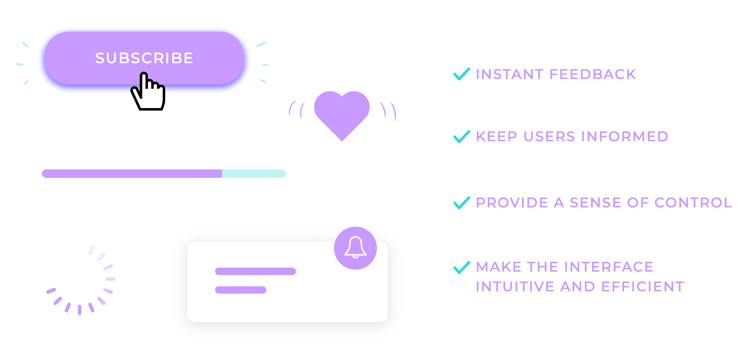
They can also create a sense of delight, making the user feel valued and appreciated. Carefully crafted micro-interactions can transform mundane tasks like checking off a to-do list into a good time.
You can find micro-interactions everywhere if you start to look, from buttons and forms to loading indicators and notifications. To add to their awesomeness, they also enhance the usability of interfaces, making them more intuitive and efficient.
User frustration in UX design is a big deal. It’s the biggest deal. A well-designed loading indicator, for example, can alleviate user frustration and keep them engaged.
Similarly, a playful animation on a button can add a touch of personality and make the interaction more enjoyable.
At the heart of every micro-interaction lies the trigger, the catalyst that sets the interaction in motion. Triggers can take many forms, from a simple click of a button to a subtle swipe on a touchscreen.
The choice of trigger depends on the context and the desired user experience. For instance, a hover-triggered tooltip might provide additional information without interrupting the user’s flow, much like a helpful stagehand offering a quick suggestion to an actor.
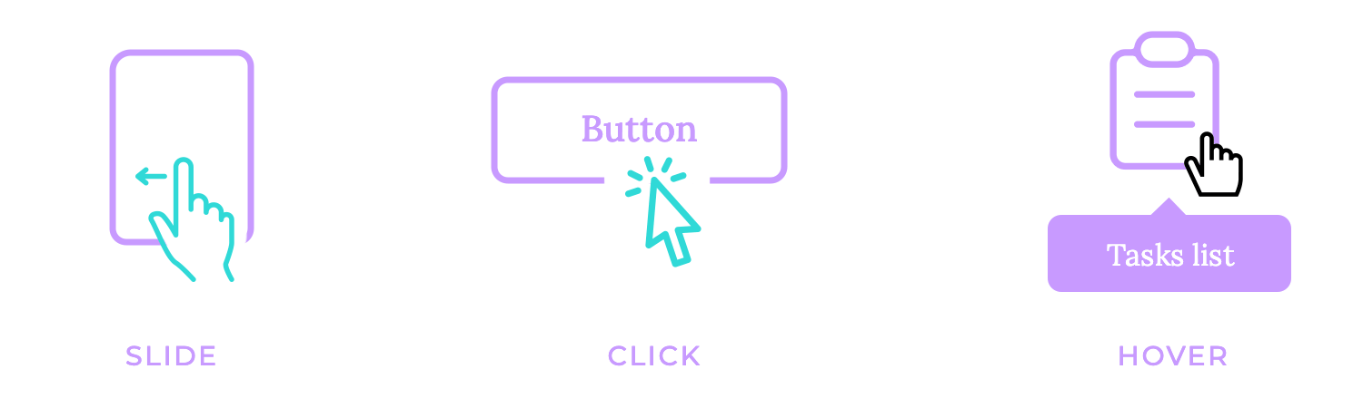
A click-triggered animation, for example, could offer a satisfying and amusing confirmation of an action. The trigger is basically the starting point, the spark that ignites the micro-interaction.
Rules are the backbone of micro-interactions, providing the structure and logic that guide their behavior. They’re like the conductor of an orchestra, ensuring that every element plays its part in harmony. Just as rules in a classroom keep things orderly, rules in micro-interactions ensure that the interaction unfolds as intended.
For example, a button might change color on hover, but only if the user hasn’t already clicked it. This rule prevents the button from appearing activated when it’s not, ensuring consistency and predictability.
These rules are there to guide users’ behavior and ensure they align with the overall design intent.
How awful does it feel when your actions go unnoticed and your efforts unrewarded? That’s the void feedback fills. Feedback is the echo of interaction, the response that reverberates back to the user after they’ve taken action. It’s the confirmation, the acknowledgment, the reward.
Be it a subtle change in a button’s color or the intricate dance of an animation, feedback provides a vital link between the user and the digital world. It informs, it guides, it reassures.
Effective feedback is like a friendly nod, a pat on the back, or a warm handshake. It lets the user know, “You’ve been heard. Your action has been acknowledged.”
Feedback is not just about informing; it’s about engaging. It creates a sense of accomplishment, a feeling of satisfaction. When a user sees a progress bar fill up or hears a satisfying click, they know they’re making progress, and that their actions are impactful.
This engagement keeps users invested and motivated to continue interacting with the digital world. In essence, feedback is the bridge that connects the user’s actions to the system’s responses.
It’s the communication used that helps users understand the consequences of their choices and navigate the digital landscape with confidence.
Think of the loop and mode as the rhythm and tempo of a micro-interaction. They determine how long the interaction will last and whether it will be a one-time event or a recurring performance.
Some interactions, like a button click or a tooltip appearance, are triggered only once and then disappear. These are like brief musical phrases, played and then forgotten.
Other interactions, such as loading indicators or toggle buttons, have a more enduring presence. They may loop continuously, like a catchy tune that plays on repeat, or they may just alternate between different states.
The choice of loop and mode depends on the nature of the interaction and the desired experience. A loading indicator that loops continuously keeps the user informed about the progress of a task, while a toggle button that alternates between two states provides a clear visual cue for users to change settings.
A well-designed micro-interaction should be immediately understandable to the user. They should serve as a clear signpost guiding them through the digital landscape.
Avoid ambiguity, which leads to confusion and obscures the user’s path.
Use simple language, like a friendly guide pointing out the way. Also employ clear visual cues, like well-lit landmarks, to ensure users don’t get lost.
Clarity prevents doubting and hesitation, fosters confidence, and ensures users can easily navigate the digital world.
Micro-interactions should be concise, focused, and non-intrusive. Just like a well-crafted haiku, micro-interactions should pack a punch in a few well-chosen words.
Avoid lengthy animations or complex interactions that can distract the user from their primary task. Remember, micro-interactions are meant to serve as supporting characters, not the main attraction. They should enhance the user experience without overshadowing it.
Keep the interaction focused and to the point. Avoid unnecessary flourishes or distractions. A simple, effective micro-interaction is far more valuable than one that’s overly complex and confusing.
Brevity is the soul of micro-interactions. By keeping them concise and non-intrusive, designers can create interactions that are both effective and enjoyable.
In a symphony orchestra, each musician plays their instrument, but they all follow the same conductor and play the same sheet music. This creates a harmonious and cohesive performance. In the world of micro-interactions, consistency plays a similar role.
Micro-interactions should align with the overall design system and user expectations. Just like musicians in an orchestra, all micro-interactions should follow the same conductor, the design system.
Use consistent visual elements, animations, and sounds to create a cohesive and familiar experience. This is like all musicians playing the same instruments and following the same tempo.
Consistency helps users feel comfortable and confident as they navigate the interface. It’s like stepping into a familiar room where everything is in its place.
When users encounter consistent micro-interactions, they know what to expect, they feel in control, and they can focus on their tasks without being distracted by unfamiliar elements.
Micro-interactions should be noticeable, but not overwhelming. They shoud provide feedback without drawing undue attention. Think of them as gentle reminders, not loud proclamations.
Use subtle animations, color changes, or haptic feedback to indicate the outcome of the interaction.

A subtle animation can provide visual confirmation without distracting the user. A color change can signal a switch in a state without overwhelming the interface.
Haptic feedback can provide a tactile sensation that reinforces the visual cue. The goal is to provide feedback without interrupting the user’s flow. Micro-interactions should be like a supportive side-kick. Think Robin, playing his role without stealing the spotlight from Batman.
In a world where users are always in control, they can pause, rewind, or fast-forward at will. Making their experience a priority.
That’s why it is essential to either give users the ability to control or cancel the micro-interaction if needed. A loading indicator that allows users to dismiss it, a tooltip that can be closed, or a toggle switch that can be turned off – these are examples of user control in action.
Empowering users to take control fosters a sense of agency. Users feel more in charge, more confident, and more engaged.
When users have the option to cancel or modify a micro-interaction, they know they’re not at the mercy of the system; they’re the ones taking the bull by the horns.
How boring would it be if buttons were just lifeless, static elements on a screen? Button animations add a touch of life, and a sprinkle of delight to the user experience.
A slight bounce, a color change, a subtle glow – these animations are like the applause that follows a well-delivered line. They confirm the user’s action, providing a satisfying visual cue that says, “Your input has been received.”
Button animations can also help prevent accidental clicks. A subtle animation can indicate that the button is about to be activated, giving the user a chance to reconsider. It’s like a gentle nudge, a friendly reminder that says, “Are you sure you want to do this?”
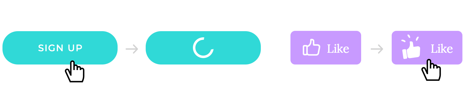
Button animations are a small but powerful tool in the designer’s toolkit, however it is advisable to use them judiciously.
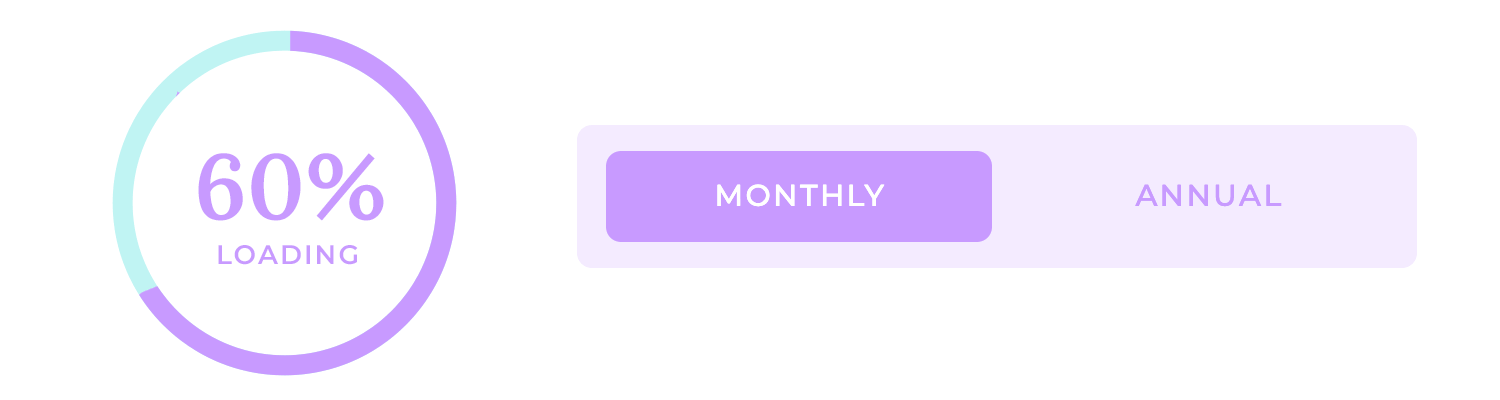
Loading indicators, like a progress bar, are like a countdown timer. They help ease the tension. They tell you, “You’re getting closer.”
Loading indicators communicate the status of an operation, letting users know that the system is working and that their request is being processed. This helps alleviate user frustration and keeps them engaged.
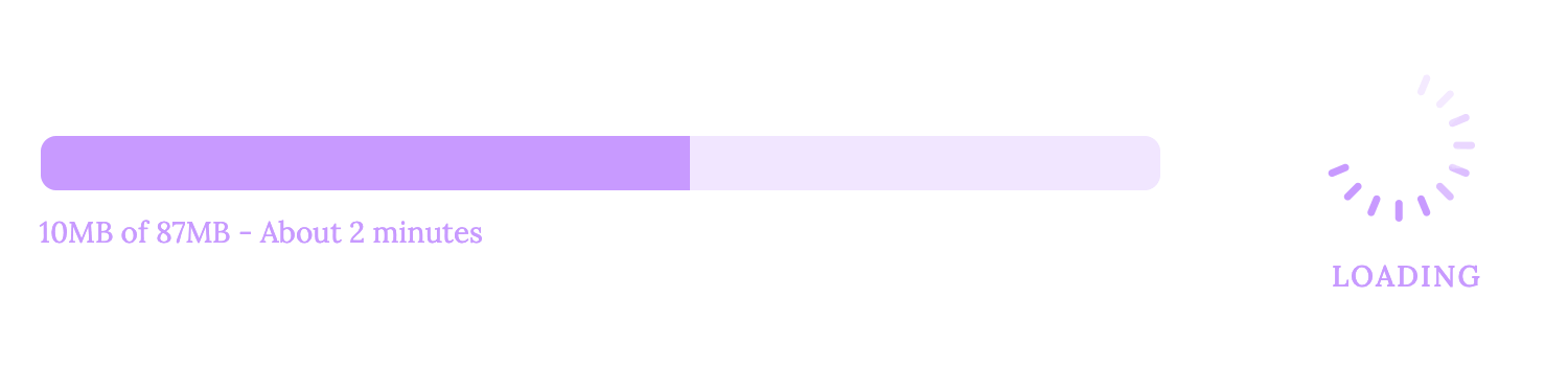
Choose appropriate animations or progress bars to suit the context. A simple spinning wheel can indicate that the system is busy, while a progress bar can show the percentage of completion.
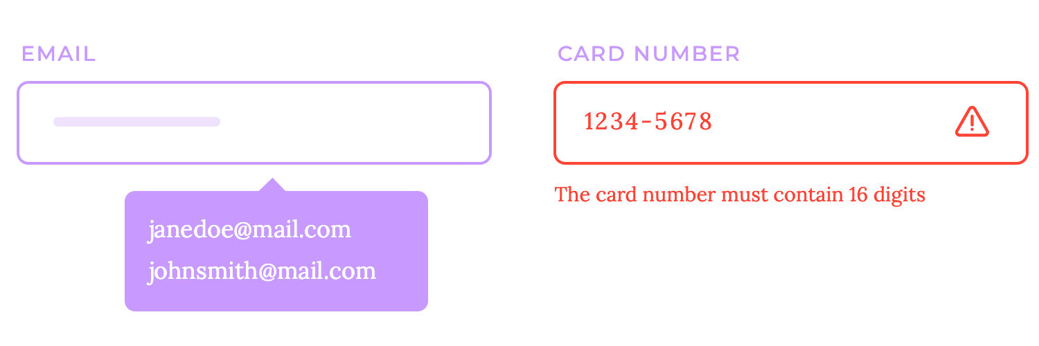
Imagine filling out a form and having the system guide you every step of the way, highlighting errors, suggesting correct inputs, and even filling in fields for you. That’s the power of form field interactions.
Providing real-time feedback in form fields can significantly improve the user experience. A color change or a tooltip can instantly indicate whether an input is valid or invalid, saving users time and frustration. Features like autofill and autocomplete can streamline the form filling process, making it faster and more accurate. It’s like having a personal assistant helping you fill out paperwork, ensuring everything is done correctly and on time.
Exploring a labyrinthine forest without a map would be disorienting, wouldn’t it? That’s why navigation feedback is so crucial in the digital world. It’s like the breadcrumbs Hansel and Gretel left to find their way home.
Clear navigation feedback helps users understand their current location and the available options. Hover effects, active states, and breadcrumbs are like signposts guiding users through the digital landscape. Hover effects can highlight menu items or links when the user’s cursor hovers over them, while active states can indicate the currently selected page or tab.
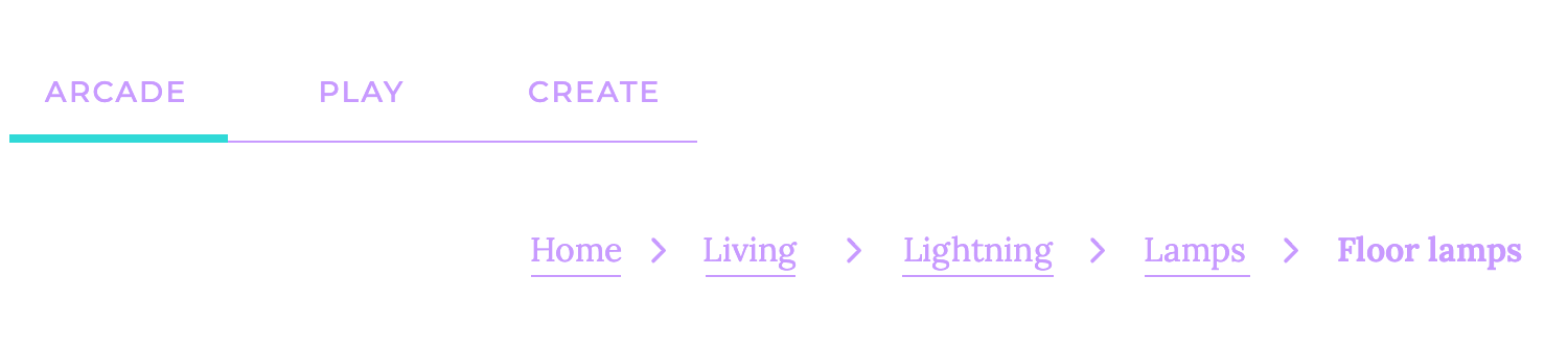
Breadcrumbs, like the crumbs left by Hansel and Gretel, show the user’s path through the website, allowing them to easily navigate back to previous pages.
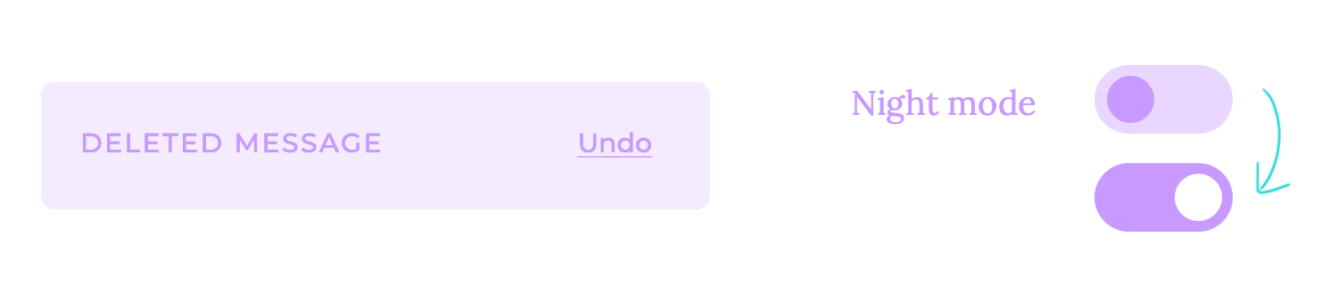
If a light switch blends seamlessly into the wall, it would be difficult to tell whether it’s on or off, right? That’s why toggle switches need to provide clear visual feedback.
Toggle switches should change their appearance to indicate their current state. A simple color change can be effective, such as turning green when activated and gray when deactivated. Alternatively, a toggle switch might change orientation, flipping from horizontal to vertical or vice versa.
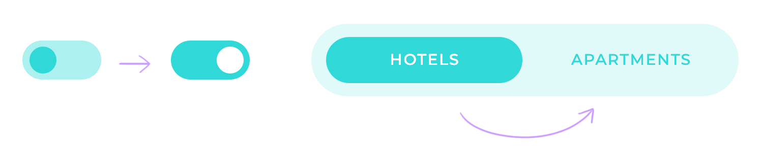
This visual feedback helps users understand the state of the switch at a glance, preventing confusion and errors. It’s like a traffic light that clearly indicates whether you can go or stop.
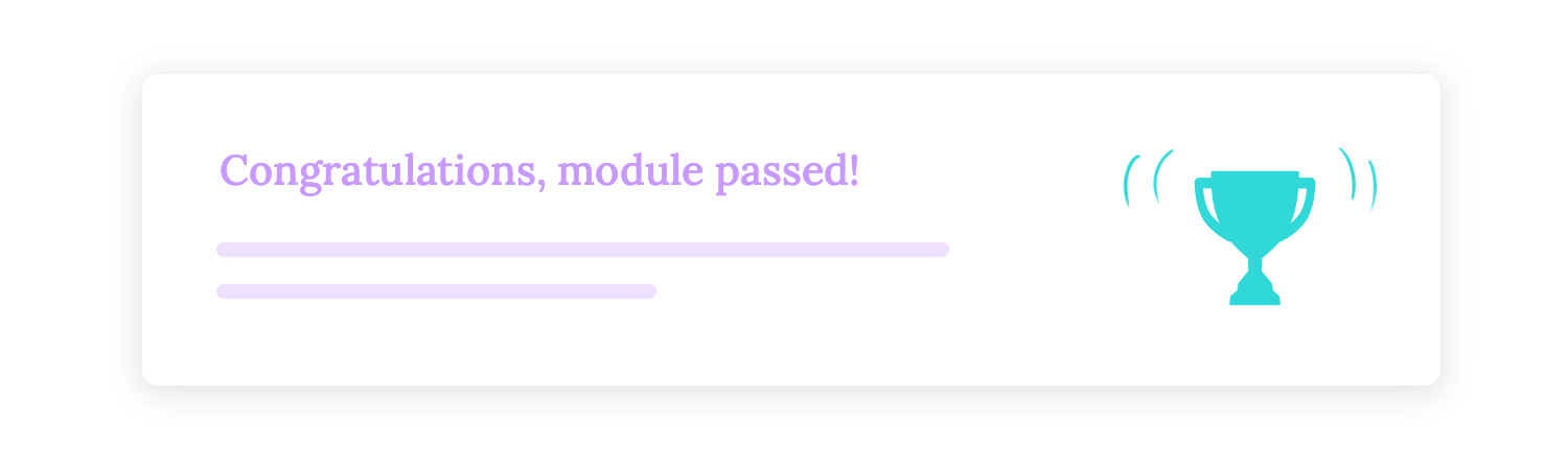
It’s so frustrating when you receive a text message that’s so long and convoluted, that you have to scroll through it several times just to understand the main point! That’s exactly why error and success notifications should be clear and concise.
When users encounter errors or complete successful actions, you have to provide them with the information they need. Avoid overly intrusive messages that can distract or annoy users, and just focus on delivering the essential message: what went wrong, what went right, and what the user should do next.
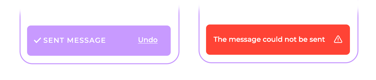
A well-crafted error message can help users quickly identify and resolve issues. A successful action notification can provide a sense of accomplishment and encourage further engagement.
Just like a perfectly choreographed dance routine, micro-interactions should be timed with precision. If the dancers were too slow, the performance would drag; if they were too fast, it would be chaotic. Timing is everything.
The duration of animations should be carefully chosen to provide feedback without distracting the user. Generally, animations should last between 200 and 500 milliseconds.
Shorter durations can feel abrupt, like a sudden jolt, while longer durations can be perceived as slow and frustrating.

Easing functions help create natural-looking animations by controlling the acceleration and deceleration of the movement. It’s basically like adding a touch of finesse to the interaction.
- Ease-in: This function starts slowly and accelerates, creating a gentle start to the animation. It’s like a runner gradually picking up pace.
- Ease-out: This function starts quickly and decelerates, creating a smooth ending to the animation. It’s like a car slowing down to a stop.
- Ease-in-out: This function combines both effects, starting slowly, accelerating, and then decelerating. It’s like a runner starting slowly, sprinting, and then finishing with a leisurely jog.
A short delay can give the user a moment to process the initial action before the animation starts, preventing them from feeling overwhelmed. But the duration of the animation is equally important.
If it’s too long, the user might lose focus and miss the point. If it’s too short, the animation might feel abrupt and jarring. A well-timed duration ensures that the animation completes before the user’s attention wanders.
Finding the right balance between delay and duration is like finding the perfect recipe for a dish. Too much of one ingredient can ruin the flavor, but the right combination can create a masterpiece.
It’s important to use restraint when incorporating animations. Overloading the user with animations can be distracting and overwhelming. Remember, micro-interactions are meant to enhance the user experience, not distract from it. Focus on using animations where they add value, where they clarify, inform, or delight.
Choose animations that are relevant to the interaction, and that make sense in the context. Avoid using flashy animations just for the sake of it.
Subtlety is often more effective than overt displays. And most importantly, choose animations that are easy to understand. Avoid complex animations that can confuse or frustrate users.
In this section, we will explore some of the best micro-interactions examples that have been implemented in various digital products. These examples will showcase how thoughtful design and attention to detail can transform ordinary interactions into memorable and delightful experiences. From subtle animations to haptic feedback, we will delve into the techniques that designers and developers use to create engaging and effective micro-interactions.
Nowadays, we’re never far from inspiration when it comes to interesting UX/UI design. This button micro-interaction example demonstrates an interesting concept for users to click on a button to continue filling out their application for whatever they want to apply to.
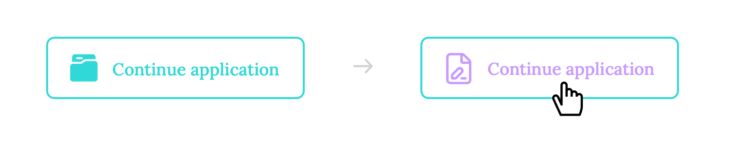
It’s taken to the next level by adding an element to the left which consists of a dynamic icon that changes from a folder to a form as the user hovers over the button. It not only indicates that it’s clickable but also takes what might have been a boring button and turns it into a micro-moment of delight.
This form micro-interaction example shows how simple little details can make filling out a form that little bit more intuitive. For example, the currently active form, where the user is inputting text is highlighted slightly with its borders colored in blue.
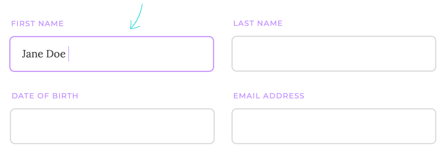
Highlighting the fields in this way is a great way to confirm that a field is actively selected and is ready to be written in. This can already be confirmed with the blinking line, but in a form full of fields, the more clarity, help and feedback that you can provide to the user the better.
Providing a subtle vibration or physical sensation on a mobile device can offer immediate feedback to the user, even without visual cues. This can be especially useful in situations where visual feedback might be difficult to perceive or distracting.
When you receive a text message on your phone, you’ll feel a subtle vibration in your hand. This haptic feedback alerts you to the incoming message without requiring you to look at your screen. It’s particularly useful when you’re in a noisy environment or when you want to discreetly check for message.
A well-chosen sound effect can provide instant auditory feedback, reinforcing a visual cue or conveying a specific emotion. When someone likes your Instagram post, you’ll hear a satisfying “like” sound effect. This audio feedback reinforces the visual cue of the heart icon filling in, providing a more complete and satisfying experience.
The sound effect is designed to be pleasant and unobtrusive, adding a touch of delight to the interaction without being overwhelming. It’s a subtle but effective way to enhance the user experience and make the app more engaging.
When you download a Netflix series to watch offline, you’ll see a progress bar -in this case, a fun little progress circle, that indicates the percentage of the series that has been downloaded.

This helps you track the progress of the download and avoid closing the app prematurely. Once the download is complete, you can enjoy the series offline without an internet connection.
YouTube’s iconic circular loading spinner is a familiar sight to millions of users worldwide. This simple yet effective animation provides visual feedback, indicating that the platform is working to retrieve and display the requested content. As the spinner rotates, it reassures users that their request is being processed and that the content will be available shortly.

The circular loading spinner’s design is both visually appealing and informative. Its continuous rotation creates a sense of motion and activity, suggesting that the system is actively engaged in the loading process. The spinner’s neutral color and simple design prevent it from distracting users from the main content.
eBay is a popular online marketplace that often uses countdown timers to create a sense of urgency and encourage bidding on auction items.
For example, when you’re viewing an auction item, you might see a countdown timer indicating how much time is left before the auction ends. This can motivate bidders to place their bids quickly before the auction closes.
The list wouldn’t be complete without mentioning the micro-interactions of many messaging apps like WhatsApp, Slack, Discord and Skype that show that one of our contacts is writing to us or replying to a message.
The reason for this is that it is a great example of system feedback in that it lets the user know that they should be expecting a message from that person soon, so they’re not left in limbo about whether their message has been replied to.

Another micro animation that some users either love or hate, is the blue double check from WhatsApp that confirms whether a contact has seen your message or not. It’s another brilliant example of system feedback from WhatsApp and gives us closure as to whether or not the person has read our message so that we can know that, even if they don’t respond in that moment, they’ve seen the contents of the message.
Facebook, for example, lets users choose between tapping on the original thumbs up button to like something, the same icon that’s always been there to like posts and comments, or tapping and holding to get a full list of interactions.

Plus, to add a bit of extra pleasure in that moment, each of the emojis are animated and moving in real time, with the laughing emoji actually laughing. Tapping and holding takes a little longer than a tap, so Facebook rewards the user by producing a list of fun, animated emojis.
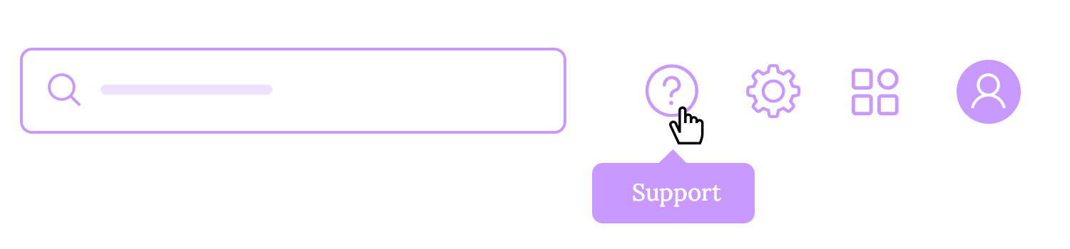
When you hover your cursor over a product image on Amazon, a tooltip often appears with a brief description of the product. This tooltip provides additional information without requiring you to click on the product and open a new page. It’s a convenient way to quickly learn more about a product before deciding whether to view its details.
Nudges are subtle prompts that encourage users to take a particular action. For example, you might display a small notification or a call-to-action button to encourage users to sign up for a newsletter or try a new feature.
Many websites display a pop-up window inviting visitors to sign up for their newsletter. This is a common nudge that encourages users to subscribe and stay updated on the latest news or promotions.
Limited-time offers and deals are a powerful tool for creating a sense of urgency and motivating users to take action. A countdown timer, in particular, can be a highly effective psychological trigger. It’s like a ticking clock, urging users to seize the moment before it’s too late.
For example, a website might display a message like ‘Offer ends soon’ alongside a countdown timer that shows the remaining hours and minutes of the sale. This combination creates a sense of urgency and encourages users to make a purchase before the opportunity slips away.

Autofill suggestions can help users quickly and accurately fill out forms by suggesting possible values based on their previous input or other data.
When filling out a Google Form, you’ll often find that the form suggests possible values based on your previous input or other data. For example, if you’ve previously filled out forms with your address, Google Forms might suggest your city, state, and zip code as you start typing. This can save you time and reduce errors, especially when filling out repetitive forms.
SurveyMonkey is a popular online survey platform that uses checkboxes to allow respondents to select their answers.
When you click on a checkbox, a checkmark appears next to it, indicating that your choice has been registered. This clear visual feedback helps prevent accidental selections and ensures that your answers are accurately recorded.
This password error micro-interaction by Mailchimp makes it onto the list merely because it is an outstanding example of how to alert the user in a subtle and non-imposing way that they’ve got something wrong.

A satisfying checklist appears as soon as users start typing their passwords. One by one they turn from grey to green as each item is included in the password. Not only is this a great way to make sure your users’ passwords are strong, but it also has a positive vibe to it due to the absence of the dreaded color red.
Google Forms is a shining example of how to design forms with accessibility in mind. The platform goes beyond the basic requirements, offering a comprehensive suite of features that cater to users with diverse needs.
One of the standout features of Google Forms is its clear and concise labeling. Each form element has a clear and descriptive label that explains its purpose, making it easy for users to understand what information is required. Additionally, Google Forms supports keyboard navigation, allowing users to navigate through the form using keyboard shortcuts instead of a mouse. This is particularly helpful for users with motor impairments.
Crafting captivating user experiences demands a delicate balance between visual appeal and functional clarity. Overindulging in animations can quickly transform a delightful interface into a chaotic spectacle, overwhelming users and hindering their ability to accomplish tasks.
Animations should be employed judiciously, reserved for moments that truly enhance the experience. Prioritize subtle, relevant, and easily comprehensible animations that seamlessly integrate into the overall design. Remember, the primary goal is to guide users effortlessly through the interface, not to dazzle them with unnecessary flourishes.
A cluttered interface, filled with distracting animations, can quickly erode the user’s focus and create frustration. Strive for a harmonious blend of visual appeal and uncluttered navigation, ensuring that animations enhance the experience rather than detract from it. By adhering to these principles, you’ll create interfaces that captivate users and leave a lasting positive impression.
Crafting an awesome user experience requires careful consideration of feedback timing and animation speed. Delayed feedback can leave users feeling frustrated and uncertain about the outcome of their actions.
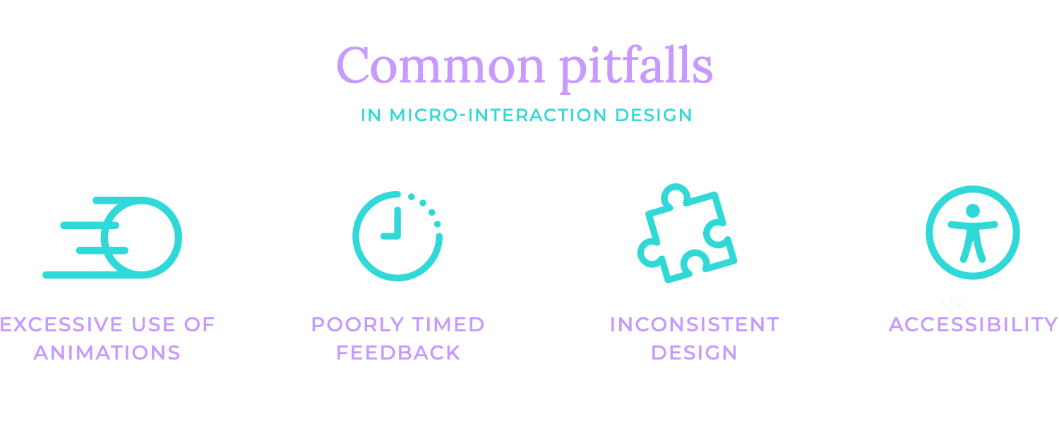
It’s essential to provide timely acknowledgment of user inputs, reinforcing the sense of responsiveness and control. Conversely, animations that are too rapid can hinder comprehension and lead to missed details.
The key is to strike a balance, selecting animation speeds that align with the context and the capabilities of the user’s device.
Consistency is key to a harmonious user experience. Visual inconsistencies can disrupt the flow and familiarity of the interface, leaving users feeling disoriented.
Adhering to a unified visual style and employing consistent colors, fonts, and animations helps create a cohesive and inviting environment.
Functional inconsistencies, on the other hand, can lead to confusion and frustration. Ensuring that micro-interactions behave predictably, such as buttons responding consistently to clicks and tooltips appearing in the same location, helps users navigate the interface with confidence.
Remember, a consistent approach to both visual and functional elements fosters a sense of trust and familiarity.
Designing micro-interactions with accessibility in mind is crucial for creating inclusive experiences. Barriers such as inaccessible animations or sound effects can significantly hinder the usability of interfaces for users with disabilities.
Ensuring compatibility with assistive technologies like screen readers and keyboard navigation helps users with diverse needs to interact effectively with your designs.
Inclusive design goes beyond mere compliance. It’s about considering the unique requirements of all users and avoiding elements that may be challenging to perceive.
All in all, think of web micro-interactions as a UX designer’s best friend, and it’s worth communicating their importance to stakeholders. They’re an almost invisible way of improving the quality of your users’ experience and, if implemented correctly, rarely ever get in the way. Knowing how and when to take advantage of these subtle interactions is crucial.
Remember to focus on clarity, brevity, consistency, subtlety, and user control. And avoid common pitfalls like overuse of animations, poorly timed feedback, inconsistent design, and neglecting accessibility.
You made it till the end! Good for you. This is just about everything you need to know about web micro-interactions. Now, it’s time to harness their power and create standout digital experiences that make users come back for more!