
Accessibility testing is often put on the back-burner in web design but that's starting to change. Read on to see how you can make websites more accessible!
Websites are more usable than they were 20 years ago, but there are still millions of users left in the dark – people with disabilities.
However, there’s a subgroup of usability testing that’s quickly starting to gain importance and recognition: accessibility testing. This means testing that a website is usable by everyone, especially those with disabilities.
Changes to legislation, along with a plethora of lawsuits in recent years has prompted more awareness of the need to cater to people with disabilities, as they have equal rights to access online content.
Read on to learn more about the importance of accessibility testing and how it’s done!
Accessibility testing usually involves using software tools to establish if a website or prototype falls short in terms of accessibility. It checks whether a website’s content is suitable to be consumed using assistive technology (AT).
Accessibility testing usually also includes some form of disabled user testing and interviewing. Some companies even hire an expert in the field of accessibility testing to oversee the accessibility side of the design as a website is being developed.
Website accessibility testing is an often overlooked aspect when it comes to website design and development. Reasons why it’s overlooked generally boil down to ignorance about its importance and fears over additional cost and labor time.
Let’s talk about why accessibility testing is important. According to an accessibility-focused study by Nuclear Research, disabled users represent over one billion users globally.
70% of websites are inaccessible to people with disabilities
That means there’s an enormous global population that isn’t being catered for, and a market that’s not being leveraged to its fullest potential. To emphasize this missed opportunity, that same study discovered that two thirds of top US ecommerce companies are losing up to $6.9 billion in potential revenue as a result failing to cater to this demographic.

VX Design by Adam Trybuła
Additionally, they found that blind users tend to abandon two thirds of online transactions in favor of websites that cater to their disability. Adding further weight to these findings is the sobering statistic that 70% of websites are inaccessible to people with disabilities.
That leaves a huge opportunity still to be exploited by most ecommerce companies, but also for most websites looking to boost their traffic, not to mention their SEO.
Accessibility also raises questions for official government websites where information about important services such as public transport or medical services (which users have a basic right to access), is displayed. That brings us on the next big reason why accessibility testing is important: legality.
Each country has its own laws regarding the reasonable accessibility of websites created within their jurisdiction. In the US, for example, Section 508 applies to government or federal websites offering information or services to the general public. Being section 508 compliant means that your website has a high degree of accessibility for all users, minimizing discrimination based on disability.
Section 508 also extends to websites of companies that work with government agencies, such as law firms. Outside of that sphere, however, things turn a little greyer in terms of who is legally obliged to carry out accessibility testing, or even the degree to which it has to be accessible. As a general rule, however, all websites being designed should incorporate accessibility testing for one important reason: the American Disability Act (ADA).
The ADA was set up to make all ensure people with disabilities don’t face any discrimination and have equal acess to the same services and information as non-disabled people. There are three titles to the ADA, the latter two of which apply to websites and specify that all online information should be rendered accessible for everyone.
As a result of these titles, it’s not completely clear to which degree certain websites should be accessible. And so, it’s a safe bet to ensure it at least has the minimum requirements when carrying out accessibility testing. That’s where the Web Content Accessibility Guidelines (WCAG) guidelines come in.

Bird justice by Mason Phillips
The WCAG was created by the World Wide Web Consortium (W3C) to establish an international standard of website accessibility testing. The neat thing about these guidelines is that most national laws and standards are based on them, such as section 508. Complying to WCAG standards automatically makes you section 508 compliant, in turn rendering you ADA compliant. Two birds, one stone!
The WCAG provides three grades of accessibility: A, AA and AAA, with the latter meaning full accessibility. To be on the safe side, and if you’re not sure what category your website falls into, Deque’s Guide to accessibility recommends designing your website to have at least an A or AA grade of accessibility to comply with legal standards and avoid lawsuits, such as the one below.
The Disability Rights Advocates (DRA) taught an important lesson to all ecommerce sites by making an example out of Target Corporation. When the DRA brought a case against Target Corporation in 2006 on behalf of the National Federation of the Blind, it brought about a permanent change in legislation.
Previous to the case, Target Corporation had prevented blind people from using their assistive technologies (ATs) to access the site. This prompted a shift in national awareness, resulting in both the ADA and multiple states to stipulate that all ecommerce sites must be accessible to people with disabilities. It also resulted in Target having to fork out six million dollars!
Not complying with these regulations can attract hefty lawsuits!
We’ve seen that accessibility testing is important, but where do we start? To really understand what’s required for accessibility testing, we first need to look at the types of disabilities users may have, along with the ATs they typically use.
Here are some of the main disabilities users of your website might have:
- Blind/visually impaired
- Deaf /hard of hearing
- Cognitive disability
- Physical disability/impaired motor function
- Speech impediments
In order to be able to access content, whether that be text or multimedia, or to do online shopping, people with disabilities often avail of the following AT software:
- Refreshable braille output
- Speech recognition software
- Screen magnification software
- Screen reader
- Style sheet software
- Alternative keyboard
Let’s look at some common problems users with disabilities face when accessing content on the web, along with the techniques and tools they use to overcome these problems. Here are two scenarios of people with visual disabilities:
Mark is a typical teenager. He’s been blind since birth and, like many teenagers, uses the internet as one of his main forms of entertainment. He and his friends like a certain band whose concert they wish to attend in a week. Mark’s friends told him that the band’s website contains lots of information, in addition to soundbytes.
To browse the web, Mark uses a screen reader that informs him of all the elements on the screen. For input purposes, he uses speech recognition output, as well as a refreshable braille output. Websites can facilitate the user of this technology by taking it into account during the design process.

Braille Writer - Braille Keyboard by Nikola Kirev
Luckily for Mark, this band’s website is modern and up-to-date with accessibility regulations. All element strings are named with the screen reader in mind, so there’s no unnecessary detail about decorative elements, such as “fancy border”. In addition to this, all images have descriptive alt text and expansions of any acronyms or abbreviations at the start of the website.
Unfortunately, not all websites perform proper accessibility in the development stage and so are not fully optimized for people like Mark, essentially denying them access to the same content their peers would have access to.
Catherine has colorblindness and likes online shopping. She frequently buys accessories, bracelets, hair bands, scarves and handbags. However, she has just a couple of ecommerce sites bookmarked for exclusive use. The reason? Because most other sites she’s come across were unusable for her.

The two right quadrants replicate Deuteronomy; By Johannes Ahlmann
Certain websites might show error and success messages in the usual red and green, but this all looks brown to her due to her red-green color blindness, typical of deuteranopia. Discount prices are shown in red which, to her, means nothing. The items she browses don’t have the colors described.
The websites she has saved, however, put a slash through original prices next to the discount percentage, along with an asterix in the required fields of forms. They use ✓ and ✕ symbols for feedback, as well as having descriptions next to items such as “red leather handbag”. Their HTML is also composed with CSS stylesheets, meaning she can override them with her own or switch them off if she chooses.
The scenarios mentioned above don’t even scratch the tip of the iceberg when it comes to the range of disabilities users can have. You might feel some trepidation about designing a website that’s compatible with so many kinds of AT. However, catering to all kinds of disabilities within your designs can be relatively straightforward if you follow the WCAG accessibility testing standards.

There’s no special coding required when it comes to making a website compatible with these technologies, and the design patterns they require are actually quite simple. Your website just needs to be highly usable; isn’t that a UXer’s job anyway?
WCAG’s guidelines are commonly shorthanded to P.O.U.R, which stands for Perceivable, Operable, Understandable and Robust. Here’s a little more detail about what each of these means:
“Perceivable” in the context of websites refers to a clear interface with transparent content. Satisfying this criterion means having alt texts for non-text content, such as transcripts, as well as captions and subtitles for multimedia. It also means that content should provide clear contrast and be magnifiable.
It’s with standards like these that trendy new styles never truly take off in the market, such as neumorphism.
By being “operable”, WCAG is referring to the ability of all people with disabilities to interact with your website. That means being able to navigate the interface with just a keyboard and no mouse, as well as being able to use other inputs to navigate such as dictation software. It should also be suitable for screen readers, with functional navigation options being clearly distinct from decorative elements.
Another important aspect of being operable is not including any content that might bring about seizures in certain users such as flashing lights.
To achieve what WCAG regards as an “understandable” website, its text should be readable by all users. If you follow the two steps above, this should be attainable.
It also means the website should be easy to navigate for all users. Part of making a website UI easy to navigate means making content and navigational links behave in ways that are predictable.
Another way to help make your website understandable is to help users avoid making errors by providing clear inline prompts and placeholders when filling out online forms. It also means using error messages to tell a user how they can correct any errors they’ve just made, as opposed to simply telling them that they’ve made one.
When talking about robustness, WCAG stipulates that your content should be compatible with all forms of AT.
This doesn’t mean you have to keep up to date with the latest developments in the field of AT. As we mentioned above, all you need to do is ensure you’re always following the latest version of WCAG, which outlines the web standards required by the latest AT.
Accessibility testing can be done at two different stages: during website design or after. We recommend you do accessibility testing even before you develop your website to avoid large redesign overhauls. By doing so, you’ll likely save time and money.
Here are some points to bear in mind while designing your website prototype:
Create personas. You don’t just have to create personas that are non-disabled. After all, user personas are supposed to represent a whole segment of your audience – it’s highly unlikely that none of them will have any disability!
Just follow the procedure of creating a normal user persona, but with a disability and see how that affects their user journey.
Your website should have a highly contrasting UI. That means colors should have the appropriate level of contrast specified for WCAG AA and AAA. Color.co is a great free resource offering designers custom color palettes especially designed with WCAG accessibility testing procedures in mind.

ADA Compliant Gradient Color Palette by Kaitlyn Malson
Doing this will enable people with color blindness or low vision to easily see the content on your website and use it. This will also help ensure that it is viewable in high contrast mode.
Make sure that the information hierarchy is in the simplest structure it can be in. If you want to learn more about how to get the best navigational hierarchy for your specific website design, check out this guide on information architecture.
Focus indicators make elements stand out against the background. Drawing attention to your elements on hover will render them more visible for your users. This is particularly important for users with impaired motor function that navigate with a keyboard, or people with sight difficulties.

Digital growth by Patswerk
You can create focus indicators in a variety of ways by adding interactions to each link and elements that act as a button, such as:
- Highlighting
- Outlining
- Shadowing
- Fading
- Adding movement
Creating focus indicators will help users to easily tab through your webpages, using tab and shift+tab buttons.
Design forms that are intuitive. While this is great for all users, it’s of particular benefit to those with impaired cognitive function and color blindness. In required fields, consider using an asterisk and use a ✓and a ✕ symbol to denote error and success.
Ask questions in a logical way, like you would in a normal conversation, such as name, age and then work profession. Don’t ask for more information than is needed.
Make sure the structure layout of your content is easy to understand and could stand alone without images. Make sure each image you use has a descriptive alt text. This will be a great step to ensuring your site will be usable by blind people.
Furthermore, it makes sense to use images that complement the text and vice-versa. You’re aiming to create a marriage of sorts between text and images. Each image should also ideally have captions. By doing this, you’ll ensure that people affected by impaired cognitive function can better comprehend your website’s content.
If you’re planning on creating your own captions for media players, make sure you design fonts that don’t absolutely cover any audio visual media that you use. They should be in a highly contrasting color, such as white, and should ideally be located at the bottom of the video. They should also be in a relatively neutral font, such as sans serif.
Users are the best metric for testing the accessibility of your website prototype. They may also be able to bring along their own assistive software, such as screen readers to test your prototypes directly with.
Observe your users as they interact with your prototype and carry out a post-testing interview about their experience.
When it’s time for the developer handoff, you need to make sure the visual design is included in the form of CSS stylesheets. Why? Because stylesheets are among the most efficient ways of displaying web content.
Stylesheets work well for accessibility because they can be turned off or overrun by someone with visual problems. It also enables color blind users to also apply their own custom-made stylesheets to the website.
So how do you integrate accessibility testing into your team’s Agile workflow? The good news is that introducing this form of usability testing doesn’t have to be difficult or time consuming. The key is doing it early on. It’s actually an old programmer’s mantra: test early, test often.
By first getting your designers onboard with accessibility testing, you make it easier for the developers. At the development stage it’s also important to spot potential issues. There are three ways of doing this: manually, automatically, or a combination of the two. We recommend the latter.
First, let’s explain what we mean by manual and automatic. Manually carrying out accessibility testing on a website that’s online involves going through a checklist of every stipulation in WCAG, then checking the code, which can be a tedious task.
Automated accessibility testing involves using tools that trawl through many pages of code on your website, dramatically reducing your workload. It does have its downsides, however.

Shift Patterns by Brian Douglas Hayes
One example would be that automated accessibility testing software often throws up false positives (testing positive for bad accessibility) out of context, when there’s no issue. Constantly checking up on false positives wastes time. This can happen when an automated accessibility testing tool hasn’t got all the latest WCAG metrics integrated into its software.
Another problem posed by automated accessibility tools is that it often isn’t designer friendly, meaning that it will often use technical jargon that’s only decipherable by developers.
You’ve probably guessed what this one means. That’s right – a combination of manual and automated accessibility testing. In short, using an automated tool, together with human analysis.
There are many automated accessibility testing tools out there that work pretty well and rarely throw false positive curveballs into the mix. Combine this with human intuition and you can pretty quickly get through the accessibility testing process with optimum results.
For that reason, we’ve gathered together a list of the 5 best free accessibility testing automation tools out there to try out today.
Accessibility testing automation tools often come in the form of plugins and extensions. Others are literally accessibility testing websites that only require a web page URL to create a report. Read on to find the tool that works best for you!
Axe is a product by accessibility testing company Deque, which has worked with corporate giants like Microsoft. It’s available as a free plugin for Google Chrome, Firefox and Android.

Using the Axe plugin accessibility tool allows you to test the accessibility of any webpage while in your browser. It immediately throws up a list of accessibility issues that are explained in further detail when you click on them, as well as tips on how to fix them.
Deque prizes AXE on being one of the few accessibility testing automation tools that doesn’t constantly throw up false positives!
TAW is a free website accessibility testing automation tool that’s been around for more than 15 years. The tool provides free AA standard accessibility testing that’s suitable for HTML, CSS and JS software.
TAW lets you get a full report of accessibility errors via a report straight to your email. All you need to do is enter the URL of the webpage you want to test into a search bar on their landing page, type in your email and hit “Analyze”.

The accessibility testing reports are organized into tables that represent all of the metrics of P.O.U.R. For example, in the “Perceivable” table you have “non-text content”. In that subcategory you might see possible issues for images, such as “no alt text”.
The reports tell you exactly what the issue is with any element on the page, and also gives you a link to the relevant part of the WCAG along with tips on how to fix it.
Color Contrast Analyzer is another Chrome Plugin accessibility testing tool that does exactly what it says on the box: it lets you test the color contrast of any web page against WCAG. After downloading the extension, all you have to do is navigate to the page you want to check and click on the icon in your browser’s toolbar.

You simply select the level WCAG grade of contrast you want to check for, such as AA or AAA and a scan will automatically start. When it’s finished, it’ll render the page in black and white. The Color Contrast Analyzer checks if the elements and text on a web page have sufficient color contrast in grayscale, and that the text is sufficiently legible.
WAVE is a free website accessibility testing tool checker like TAW. But instead of providing a list of errors in tabulated list format, it allows you to enter a web page URL and view it through WAVE’s UI, with a summarized report on all the issues to the side of the screen.
The great thing about this website accessibility testing tool is that by using one you don’t have to enter the URL for every page that you want to check, because through the WAVE UI, you can navigate to other parts of that website simply by clicking on the elements.
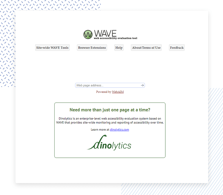
When you run the report, beside each element you’ll see an icon which, when you click on it, reveals what the accessibility issue is in plain English, along with the precise impact it could have on your users and gives you advice on how to tackle it.
Lighthouse is an open source accessibility testing plugin for the Google Chrome browser. It allows you to check all kinds of web page performance metrics just by pasting in a web page URL. Accessibility is one of the areas that it tests.
Lighthouse’s accessibility testing report is a great way to find out what’s wrong (or could be wrong) with a web page fast. It provides a very simple jargon-free list possible errors. Errors it may draw your attention include contrast, names and labels of elements etc. In contrast, it may say that background and foreground colors don’t have sufficient contrast ratio, for example and that here, legibility can be improved.

It also provides you a list of aspects that you should check manually for optimum results, such as logical tab order and that the user’s focus is easily directed to new content on the page.
Designing a website that’s usable by everyone is just good UX. It’s also a way to maintain a clean legal slate and a path to more profitability.
Accessibility testing shouldn’t be seen as a chore. We recommend integrating accessibility testing into your team’s agile workflow from the start and using a hybrid method of manual and automated testing.
Whichever way you go about your accessibility testing, the key point to remember is disabled users are users too.
PROTOTYPE · COMMUNICATE · VALIDATE
ALL-IN-ONE PROTOTYPING TOOL FOR WEB AND MOBILE APPS
Related Content
 Learn how to design better e-learning platforms with user-centered UX principles, real examples, and high-fidelity prototyping tips to boost engagement and learning outcomes.13 min Read
 Infinite scroll keeps users engaged, but it’s not always the best choice. This guide breaks down when to use it, when to avoid it, and how to design it right.14 min Read
 Learn how to design web and mobile app prototypes, how to test them and what to look for in a prototyping tool in this complete guide.15 min Read


