Visual storytelling is a powerful tool in a designer’s arsenal. Let’s see how it affects users and how you can get started, along with some great examples
Web users are becoming impatient. There’s a lot of content on the internet nowadays. This makes it harder for businesses to stand out and leads to shorter attention spans in users. Merely providing a dry list of features that your website or product offers no longer cuts the mustard.
Start your UX visual storytelling journey with Justinmind.
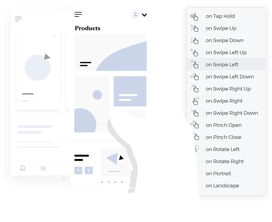
People crave stories. But stories can be long as well, and as we’ve said, most users are pressed for time and have less patience. That’s where visual storytelling comes in. Ever hear the cliche a picture tells a thousand words? Visual storytelling is a powerful way of quickly resonating with your users.
The possible impact on your website’s UX from using visual storytelling is astronomical. It has the ability to turn your website into something relatable for the user and help it stand out from the rest of the competition.
In this post, I’m going to explore how visual storytelling affects people and why it’s such a successful method. I’ll also look at some techniques to get you started, along with some shining examples from across the web! Good storytelling and a powerful prototyping tool are allies you definitely want.
We see visual storytelling at play everyday in infographics, commercials and social media. But to nail down the idea for websites isn’t so straightforward. To some, the term “visual storytelling,” synonymous with “visual narrative,” might sound a little abstract and open to various interpretations, especially if we don’t know the industry context. To truly understand how the concept relates to UI and UX design, it might help to identify and contrast it to what it is not.
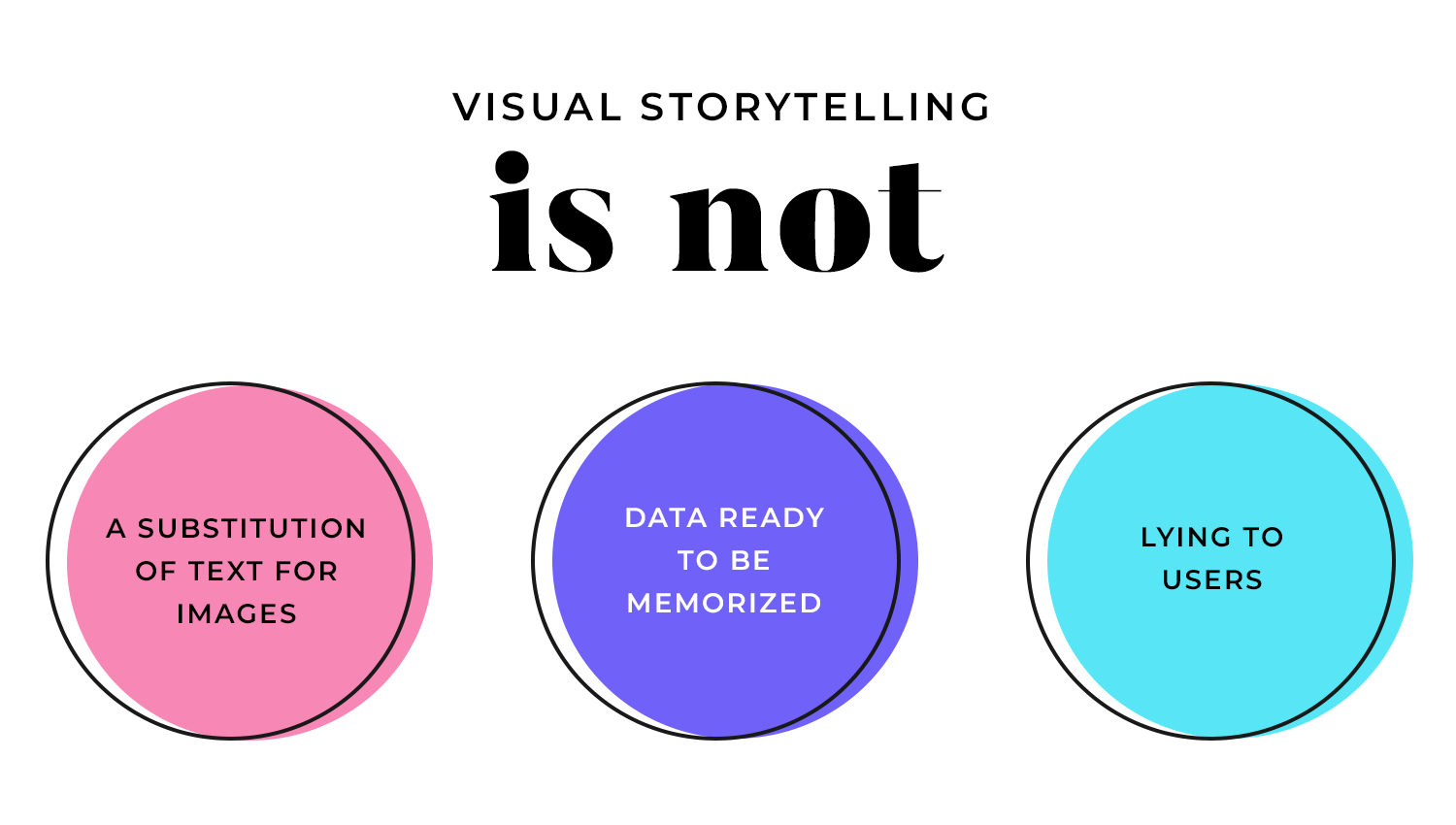
Visual storytelling is not a complete avoidance of words and text, nor is it a substitution of the former with imagery. It’s not a company or brand presenting the user with a list of facts about their product to rote-learn. It’s not about ricocheting cliches right left and center off the wall, telling the user everything they want to hear. And it’s not about fooling or lying to your users.
Now, let’s look at visual storytelling for web design. It’s a concept that gained popularity in the nineties as a graphic way of telling the user, based on user testing and research, what they need to hear when they visit your site.
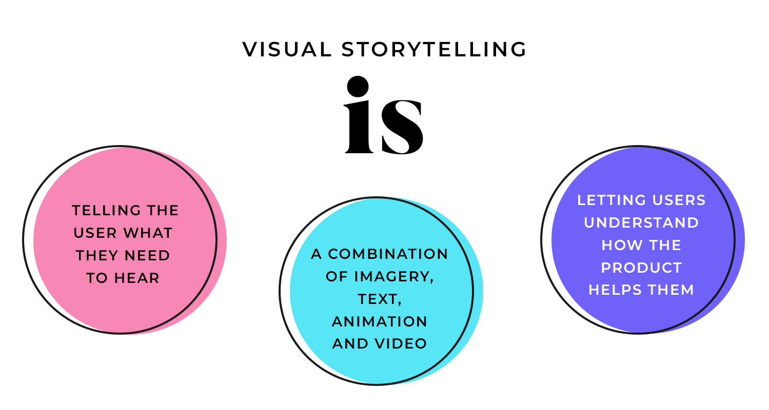
You might need to help your users understand how your website, app or product helps them. Visual storytelling is a technique to help you achieve this in the easiest and most exciting way possible, as people relate better to stories. This can involve a combination of imagery, text, animation and video, using some or all of these elements.
Ideally, you’ll incorporate visual storytelling in your designs early on, even at the low-fidelity prototype phase.
Imagine you’re in a food delivery company that wants to include visual storytelling on its homepage. The first consideration should be “what does the user need to hear?”
Let’s say Brendan, the athletic working dad, hasn’t got enough time between work, raising his kids and hitting the tennis court to cook, meaning he has to hang up the racket indefinitely. Your message might be that if he subscribes to your service, he can get healthy, customized meal plans delivered to his door everyday and resume his hobbies again.
Instead of including a paragraph that lists off everything your service has to offer Brendan, you could show a poignant video, or a timeline of images depicting how busy people’s lives improve after using your services.
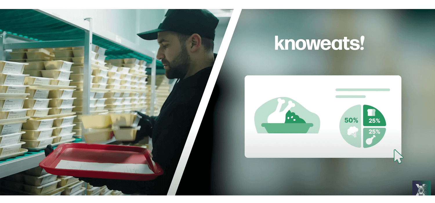
Whatever the purpose, visual storytelling should improve UX and leave your users with a resonating message – all in a visual way. It can be complex, or it can be simple (the latter is always best where possible). You can convey it all in one image or in a 20 second video. It should invoke emotion or stoke interest.

That’s visual storytelling in a nutshell. Now let’s look at some of the benefits of using it!
Walking users through the features of your product with a progressive story composed of imagery and text, or with a hero video that starts playing automatically as soon as they land on the home page can be an engaging way to reel users in.
It can help them understand your goal, message and product much better than giving them a boring list of features and technical specs. It’s also a wonderful opportunity to implement your brand’s character immediately – first impressions count!
Think about the infographic trend, which is also a form of visual storytelling. This phenomenon has its roots in information design. Its main goal is to present data in visually compelling way, usually touching on some best practices linked to dashboard design.
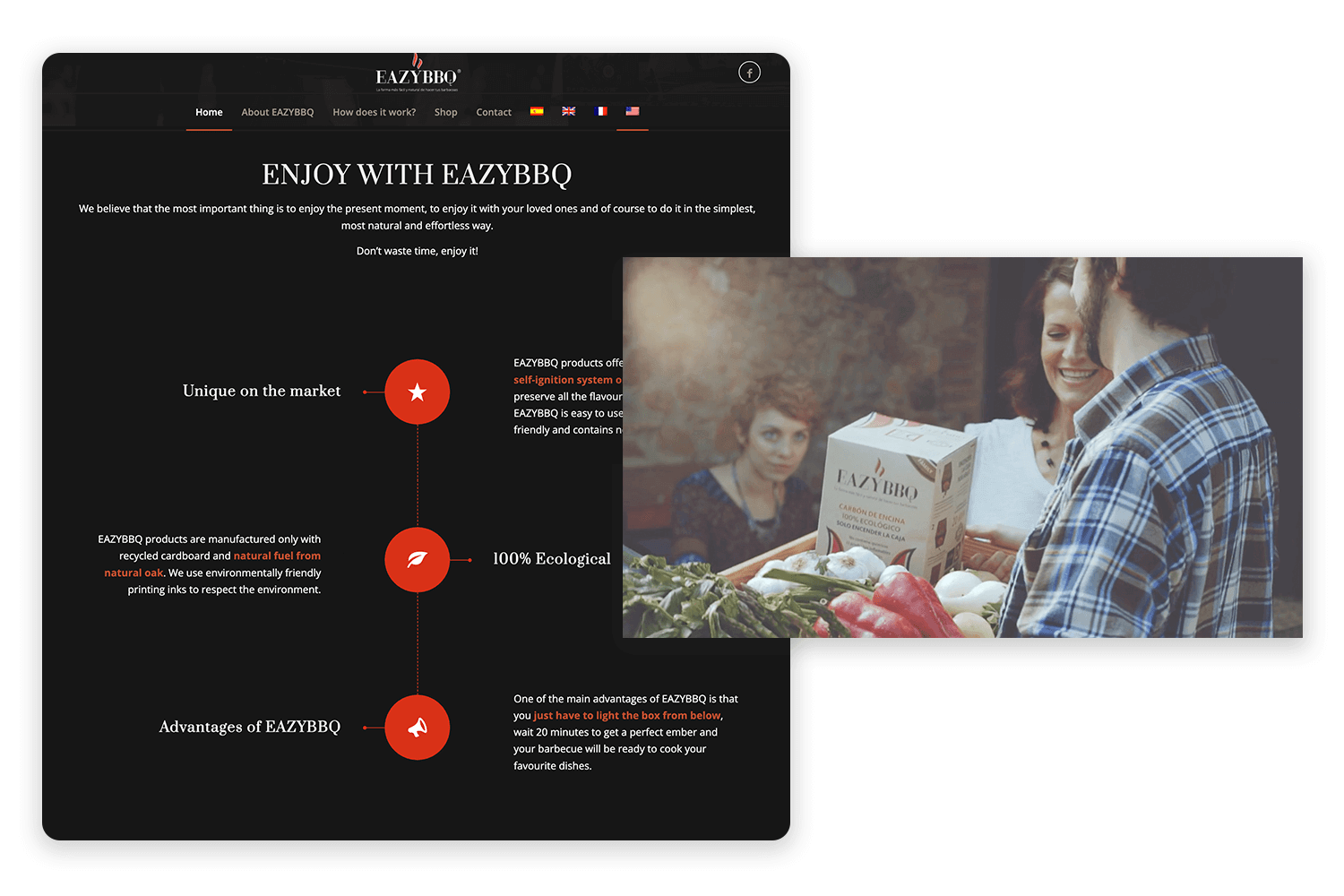
Converting data into an eye-friendly story helps the user assimilate and remember it in the future, humans being the visual creatures that they are.
Imagine you want to dedicate a page or section of your website to helping a user get to grips with your product. Sure, you could present them with a list of boring instructions. Or, you could opt for prototyping it, perhaps even a comic book strip, cartoon, or a video of a real person using the product.
A great visual interface is a real pleasure to use—it’s like having a perfectly organized map to guide you. When a design uses smart visual hierarchy (so you know what to look at first), has clean layouts, keeps things looking consistent, and uses color thoughtfully, it creates a smooth and intuitive experience.
Basically, when visuals are done right, they effortlessly guide you through the interface, making everything feel natural and easy. This makes people happier using it, keeps them engaged, and makes them want to come back for more.
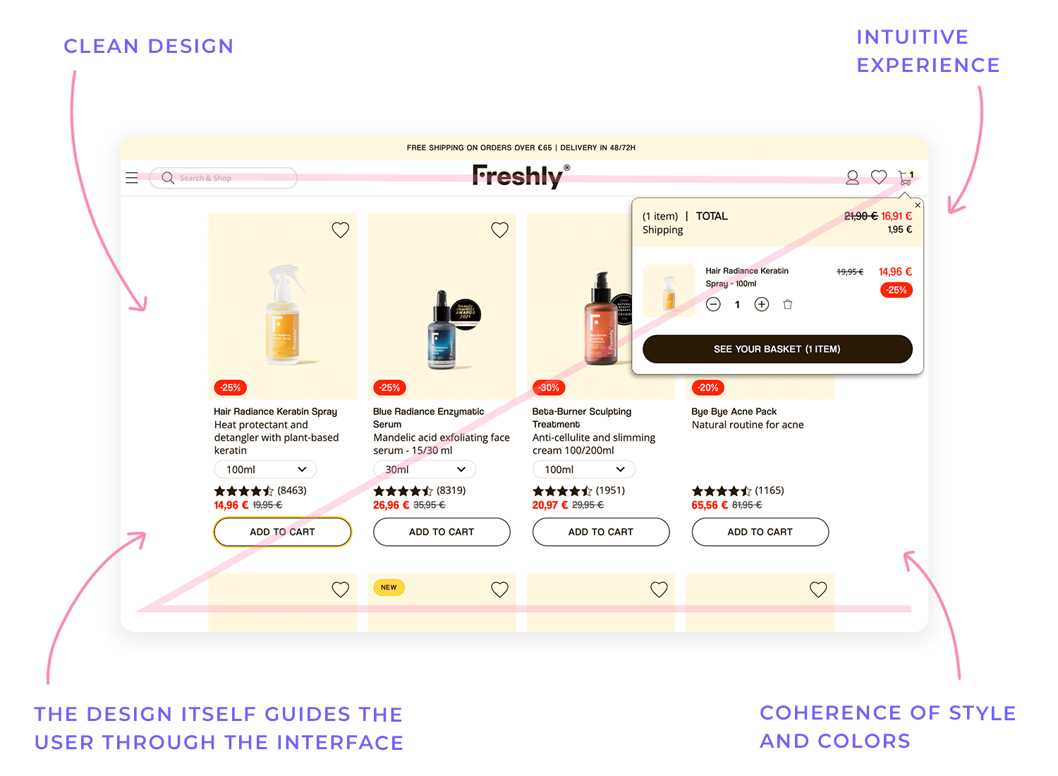
In today’s super-fast digital world, it’s really tough to grab and keep people’s attention online. That’s why having great visuals and incorporating interaction design is so important—they help you cut through all the noise and create a real connection with people.
Think about it: cool animations, eye-catching pictures, and things you can actually interact with—those are the things that draw people in and make them want to explore more. When you create content that looks good, you’re not just grabbing attention; you’re creating a more memorable and fun experience, which makes people want to come back for another look.
At the end of the day, good visual storytelling in UX design is all about helping people make smart choices. By showing information clearly and simply through visuals, you get rid of any confusion and help people quickly see what their options are.
Things like comparison charts, visual demos of how products work, and interaction design can be super helpful for simplifying tricky decisions and making people feel more confident. When people feel like they have the information they need to make good choices, they’re much more likely to have a great experience with your product or service.
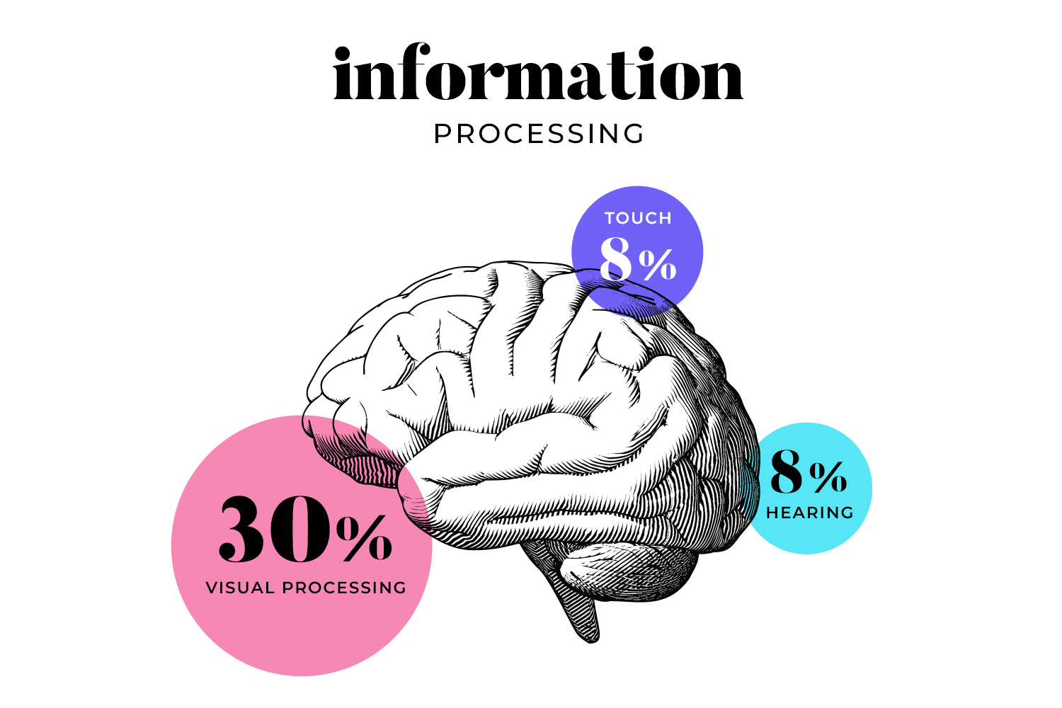
If, like me, you have a burning need to understand why people are visual creatures, we need to take into account the sciency part. Let’s open up the typical human head and examine the hardware:
- The human brain is fine-tuned for processing visual information, and dedicates 30% of the cortex to visual processing, compared with 8% for touch and 3% for hearing.
- The brain can identify images after as little as 13 milliseconds, far less time than it takes us to recognize and interpret a verbal cue.
- 65-80% of us learn better visually.
- Humans remember pictures incredibly well. In fact, we can remember 2,000 pictures to 90% accuracy over several days.
Incredibly, it’s not just that our brains are receptive to images and other visual stimuli. Research has found that the visual cortex makes simple interpretive decisions on its own, without waiting for the ‘decision making’ part of the brain to kick in!
But it’s not just images that humans retain well. There are a few people in the world who are notoriously good at remembering numbers, with one of them being Yanja Wintersoul. Yanja appeared in The Mind in Netflix’s Explained series and could remember a page full of random numbers in 10 minutes.
Our first conclusion might be that she is gifted with photographic vision, but as she points out herself, that isn’t the case. She converts each number 1 through 10 into a sound and creates words with those sounds, ergo turning the numbers into a story.
What does that tell you? That, in addition to being moved more by images, your average human is also much more likely to remember stories than a list of facts or numbers!
Start your UX visual storytelling journey with Justinmind.

Imagery plays a crucial role in UX design, encompassing photos, illustrations, and icons, each serving a distinct purpose. High-quality photos evoke emotions, create a sense of realism, and showcase products or services in context, fostering a personal connection with the brand. Travel websites use stunning landscape photos to inspire wanderlust, while food delivery apps display mouthwatering images of dishes to entice users.
The key is relevance, high resolution, and authenticity. Illustrations offer a stylized and versatile alternative, crafting unique brand identities, simplifying complex concepts, and injecting personality into the interface. Duolingo’s playful owl and Mailchimp’s quirky illustrations exemplify this, adding charm and humor to the user experience.
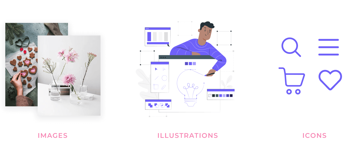
Icons, which are small, symbolic images representing actions, objects, or ideas, are necessary for intuitive navigation and clear communication. The magnifying glass for search, the shopping cart for checkout on e-commerce websites, and the hamburger menu icon are universally recognized examples. Effective icons prioritize simplicity, recognizability, and consistent styling, ensuring users can quickly understand and interact with the interface.
Typography in UX design goes beyond simply selecting a font; it’s the art of arranging type to ensure legibility, readability, and visual appeal. It’s crucial for establishing visual hierarchy, communicating brand personality, and providing a comfortable reading experience.
Different fonts evoke distinct feelings: serif fonts, like Times New Roman, often convey tradition and formality, while sans-serif fonts, such as Arial or Helvetica, tend to project a modern and clean aesthetic.
Font size and weight (bold, regular, light) are essential tools for creating a clear visual hierarchy, guiding the user’s eye through the content.
Proper line height (vertical spacing between lines) and letter spacing (horizontal spacing between letters) significantly impact readability. Insufficient spacing makes the text feel cramped and difficult to read, while excessive spacing can make it appear disjointed and equally challenging to follow.
Color in UX design is another powerful tool for evoking emotions, creating visual interest, and establishing a strong brand identity. Contrast, the difference in luminance or color that distinguishes objects, is equally vital for both readability and accessibility. A well-chosen color palette reflects the brand’s personality and creates a cohesive visual experience. This often involves using a primary color for branding, secondary colors for accents, and neutral colors for backgrounds and text, creating a balanced and harmonious design.
Sufficient contrast between text and background is a must-have for readability, especially for users with visual impairments. The Web Content Accessibility Guidelines (WCAG) provide specific contrast ratios to ensure accessibility standards are met. Furthermore, color psychology plays a significant role in UX design, as different colors are associated with different emotions and meanings.
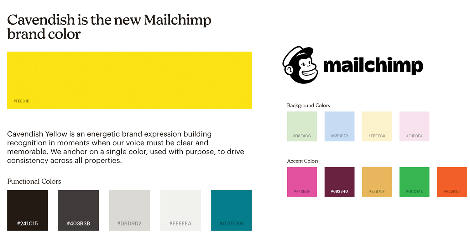
For instance, blue is often linked to trust and stability, while red can evoke feelings of excitement or urgency.
Layout and composition in UX design refer to the strategic arrangement of visual elements on the screen. Effective layout and composition are essential for creating a clear visual hierarchy, guiding the user’s eye through the interface, and ensuring easy navigation. This involves several key principles.
Grid systems provide structure and consistency to the layout, ensuring that elements are aligned and spaced evenly, creating a sense of order and professionalism. Whitespace, or negative space, refers to the empty space surrounding elements. It’s crucial for creating visual breathing room, improving readability by preventing visual clutter, and drawing attention to key elements by isolating them.
Finally, visual hierarchy uses size, color, contrast, and placement to guide the user’s eye through the content, making it easy to understand the information presented and complete desired tasks.
Just like a good story, a good user experience should have a clear narrative arc. This means defining a beginning (the user’s initial encounter with the product), a middle (the user’s interaction and journey through the product), and an end (the user achieving their goal or completing a task).
This structure provides context and direction, making the experience more intuitive and satisfying. For example, in an e-commerce flow, the beginning is browsing products, the middle is adding items to the cart and proceeding to checkout, and the end is confirming the purchase.
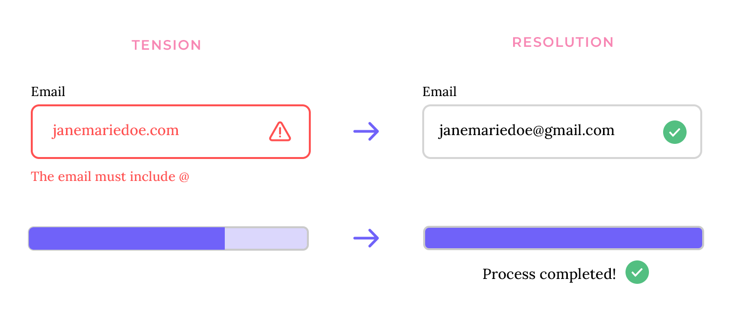
Creating a narrative arc involves creating a sense of anticipation or challenge (tension) followed by a satisfying resolution. In UX, this could involve presenting a problem or task and then providing a clear and effective solution.
For instance, an error message (tension) followed by clear instructions on how to resolve the issue (resolution). This creates a sense of accomplishment and reinforces positive user behavior. Another example is a progress bar (tension) that fills up as a task completes, leading to a sense of accomplishment upon completion (resolution).
Metaphors and symbols can be powerful tools for conveying complex ideas simply, while also being memorable. A metaphor compares one thing to another to explain its meaning (e.g., a “shopping cart” to represent items being purchased).
Symbolism uses an object or image to represent an idea or concept (e.g., a lock icon to symbolize security). These techniques can make interfaces more intuitive and engaging by leveraging existing mental models.
Visuals are excellent for simplifying complex information. Instead of using lengthy text explanations, designers can use icons, illustrations, or diagrams to communicate ideas quickly and effectively. This is particularly useful for explaining technical concepts, onboarding new users, or providing instructions. For example, a simple icon of a cloud with an arrow pointing upwards can effectively convey the concept of uploading data.
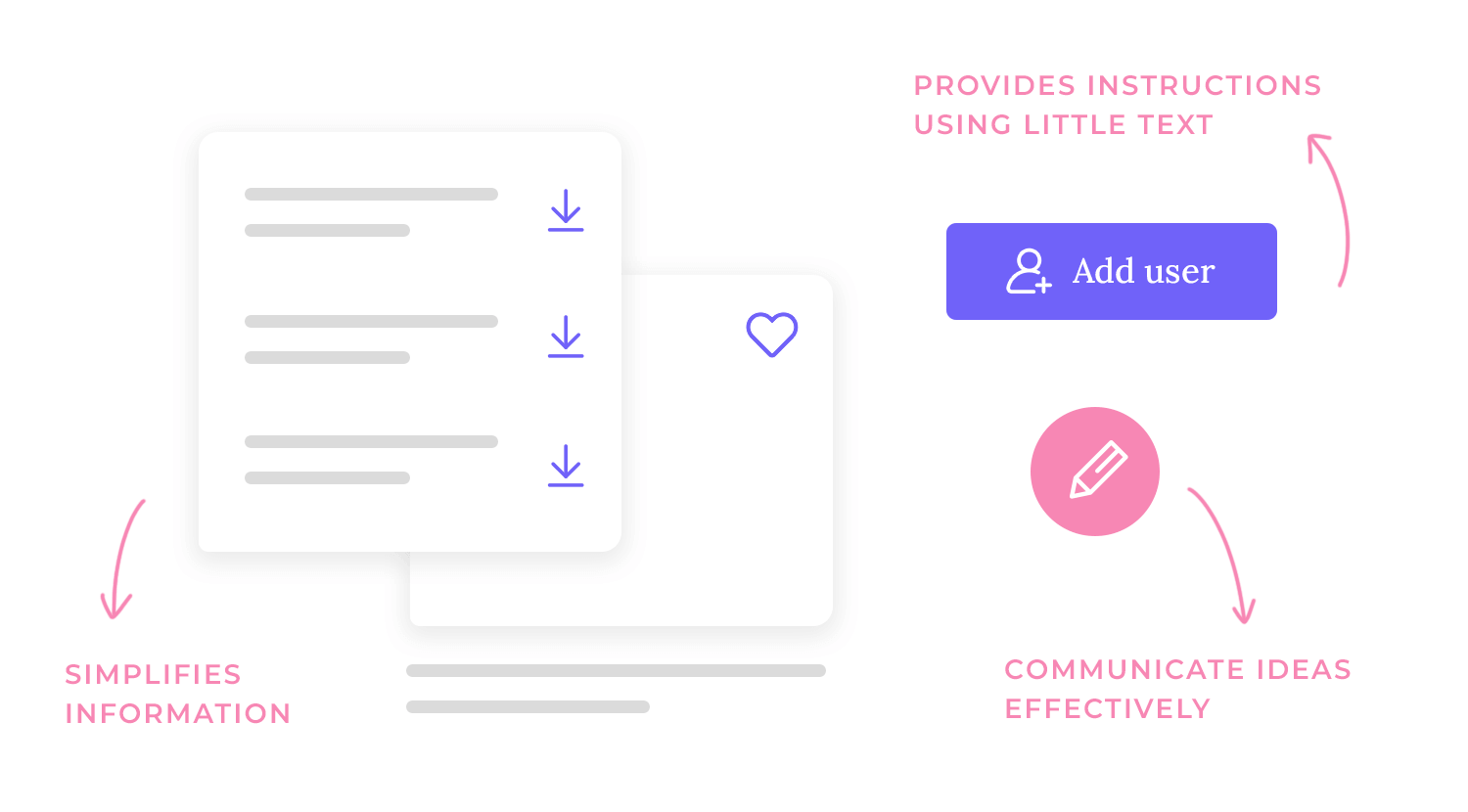
Effective visual storytelling can evoke a range of emotions in users, such as joy, excitement, trust, or even empathy. This emotional connection can significantly enhance the user experience and build brand loyalty.
Using appropriate imagery, color palettes, and even micro-interactions can create these emotional responses. For example, a heartwarming image on a charity website can encourage donations.
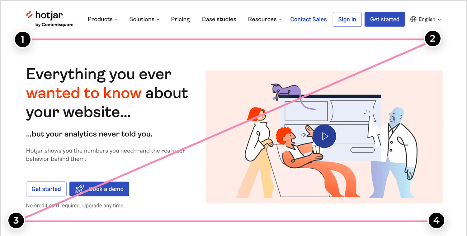
So, how do we relate the above techniques to web design? One of the factors evident from most website heatmaps is that users tend to scan and read in patterns. At least for speakers of left-to-right languages, those patterns are Z and F.
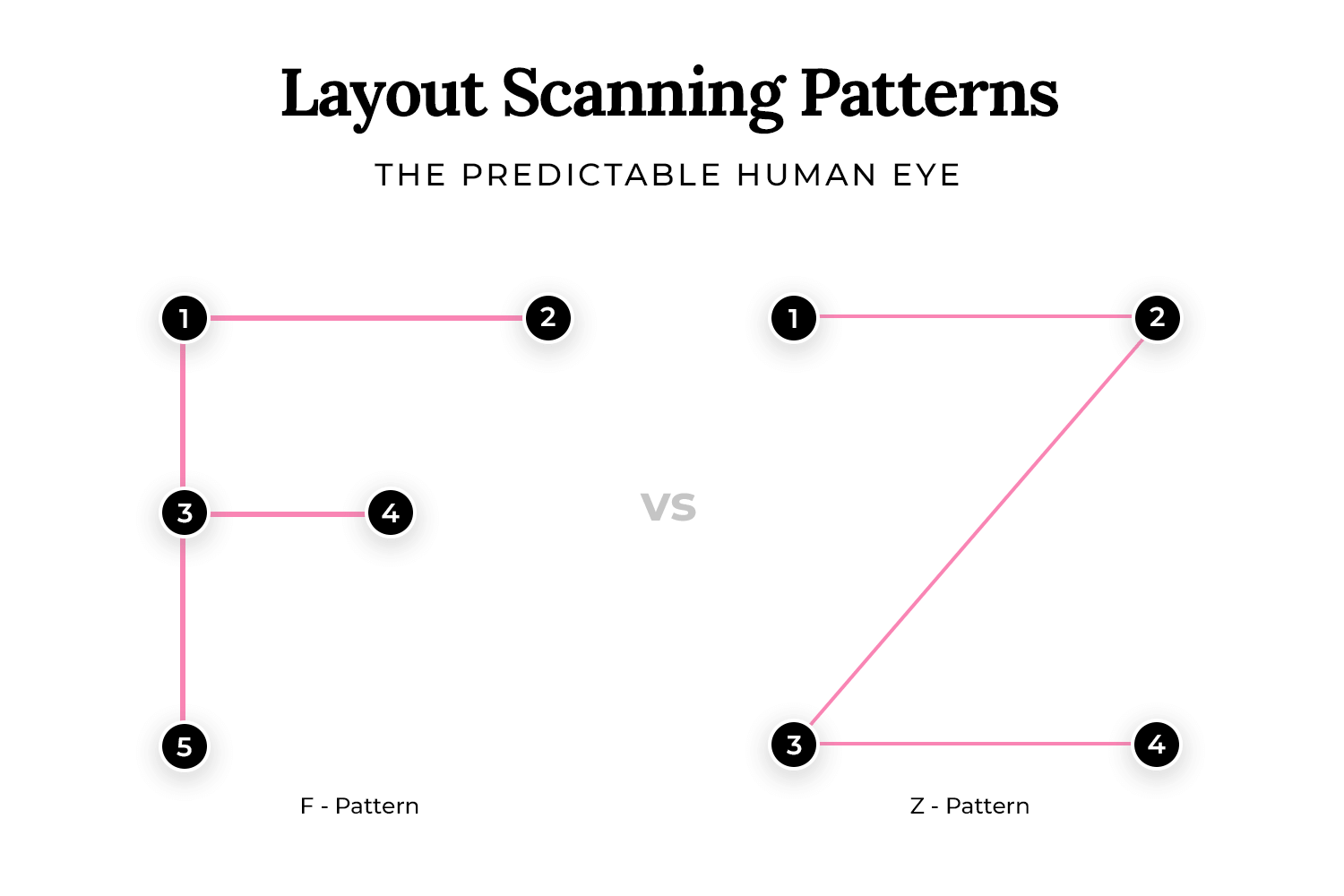
In both patterns, the eye explores from left to right and then down the page, with occasional left-to-right horizontal scans. That’s why it’s important to structure your content and your visual storytelling in a way that matches how your users read.
Here are some tips for leveraging F and Z patterns in visual storytelling for UI-UX design:
- Make sure the rext is in a central column or slightly left of center. This helps the eye find its way comfortably.
- Keep text to a maximum of around 75 characters per line
- Limiting line length can dramatically improve a reader’s level of comfort, encouraging them to stay on the page and read more.
- For progressive storytelling, use a Z pattern, like on the Justinmind homepage
- Break up text with images, headings and other elements
With that knowledge, let’s look at how you might go about creating a visual narrative for a web page (or entire website!).
Content is important for visual storytelling. But guess what’s equally important? No content! Or rather, space. Many designers forget just how powerful a tool space is when it comes to simplifying content and rendering it more intuitive.
You can use space to your advantage to guide your users’ eyes from one section to another. Think about the F and Z patterns mentioned earlier. These patterns wouldn’t be possible without the space inbetween.
Start your UX visual storytelling journey with Justinmind.

Calls to action (CTAs), on the other hand, are the guiding lights of your user interface, prompting users to take desired actions like “Sign Up,” “Learn More,” or “Buy Now.” Making these CTAs visually prominent is paramount for a smooth and effective user experience.
Think of them as the destination signs on a road trip – they need to be clear, easy to spot, and point in the right direction. To achieve this, we use visual hierarchy to make CTAs stand out from the crowd. One key aspect is size and shape; CTAs should be large enough for easy tapping or clicking, especially on touchscreens, and distinct shapes help differentiate them from other page elements.
Color and contrast play a vital role here too. Using contrasting colors ensures the CTA pops against the background and surrounding elements, making it instantly noticeable. Strategic placement is also essential; placing CTAs in prominent locations like above the fold (the immediately visible part of the screen) or at the end of a content section ensures they’re seen at the most opportune moments.
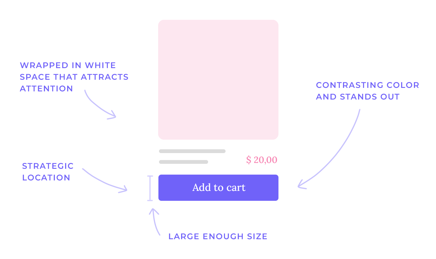
Finally, surrounding CTAs with ample whitespace provides visual breathing room, preventing clutter and drawing attention to these crucial interactive elements.
Imagine trying to tell a joke to someone who doesn’t understand the language or context—it just falls flat. The same principle applies to visuals. To truly connect, you’ve got to step into your audience’s shoes. What are their challenges? What are they passionate about? What do they already know about the topic?
For instance, if you’re creating an infographic about climate change for a group of scientists, you can use technical jargon and complex data visualizations. But if your audience is the general public, you’ll need to simplify the information and use more relatable imagery or friendlier number fonts.
Understanding their existing knowledge prevents you from either talking over their heads or boring them with overly basic concepts. By tapping into their needs and interests, you make your story relevant and engaging, ensuring it resonates on a personal level.
Tailoring visuals to your audience’s specific preferences is crucial for effective communication. It’s about more than just delivering the right message. This means considering aspects beyond the core content, such as the overall style, tone, and format of your visuals.
For instance, age and cultural background play a significant role. Different generations and cultures often have distinct visual languages. What’s trendy and appealing to a younger demographic might feel jarring or irrelevant to an older one.
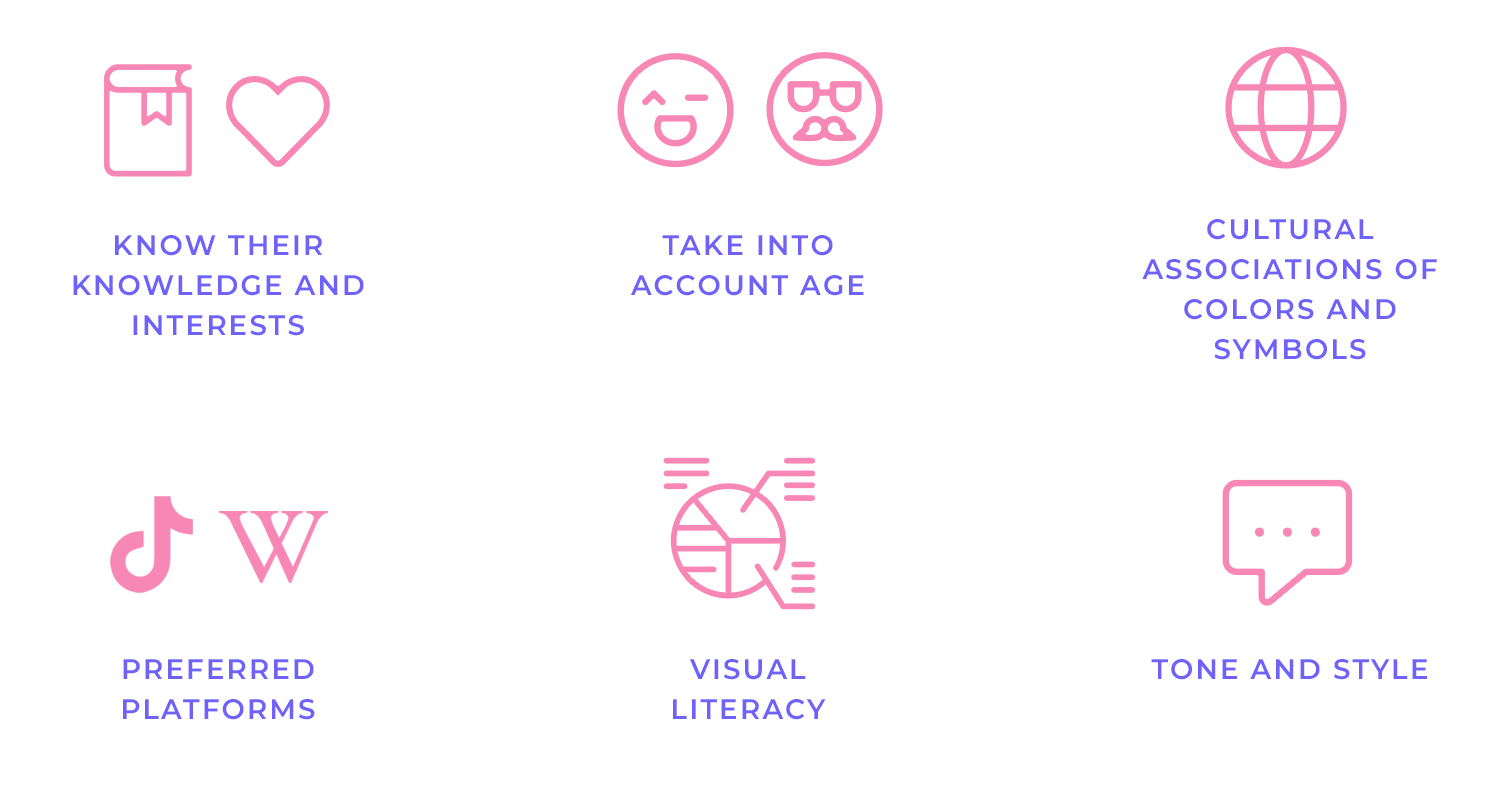
Similarly, cultural associations with colors, symbols, and design styles can vary dramatically. Using a symbol that has positive connotations in one culture might be offensive or confusing in another. Therefore, understanding these nuances is essential for creating visuals that are both, understood and appreciated.
Beyond cultural and generational considerations, it’s vital to think about preferred platforms and levels of visual literacy. Where does your audience spend their time online? Are they more likely to engage with short, snappy videos on platforms like TikTok or Instagram Reels, or do they prefer more in-depth content presented in formats like detailed infographics on websites or long-form articles? This will dictate the format and delivery of your visuals.
Additionally, consider their visual literacy—how comfortable are they interpreting complex data visualizations, abstract imagery, or intricate charts? If your audience isn’t accustomed to these formats, simplifying the visuals or providing clear explanations will ensure your message isn’t lost in translation.
For example, a younger audience might respond well to bright colors, dynamic animations, and an informal tone, while a more traditional audience might prefer a classic design with clear typography and professional photography.
Defining your story is the crucial second step in effective visual storytelling. It’s about establishing a clear direction and ensuring your visuals have a purpose. This involves two key components:
Clearly articulate your message or the key takeaway: Before you even start thinking about visuals, you need to know exactly what you want to communicate. What’s the core message you want your audience to remember? What action do you want them to take? This should be distilled into a concise and memorable statement.
Think of it as the “headline” of your visual story. This clarity acts as your compass, guiding all subsequent design choices. If your message is fuzzy, your visuals will likely be confusing and ineffective.
For example, instead of a vague message like “Our company is good,” a clearer message might be “Our company provides reliable and affordable renewable energy solutions for homeowners.” This specificity provides a strong foundation for your visuals.
Develop a narrative structure with a beginning, middle, and end: Every good story, whether told through words or visuals, has a narrative arc. This structure provides context, builds engagement, and makes your message more memorable.
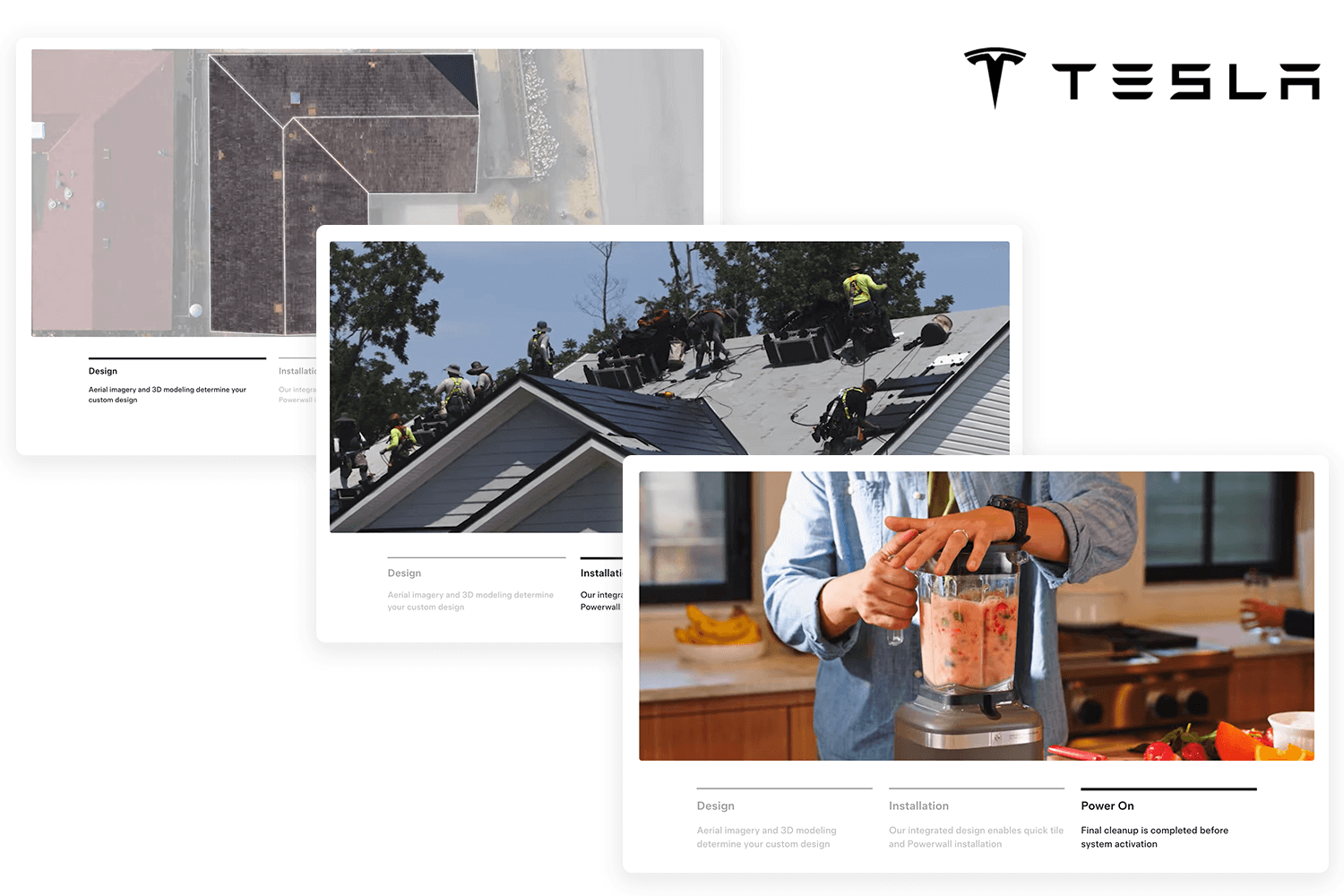
The beginning sets the scene, introduces characters (if any), and establishes the context or problem. The middle develops the story, presents information or solutions, and builds tension or interest. The end provides a resolution, a takeaway, or a call to action.
This structure helps guide the viewer’s eye and ensures a logical flow of information. For instance, if you’re creating a visual story about the benefits of recycling, the beginning could show the problem of overflowing landfills, the middle could illustrate the recycling process, and the end could highlight the positive impact on the environment. This clear narrative structure makes your message more compelling and easier to understand and remember.
Choosing the right visuals is where your story truly comes to life. It’s about finding the perfect visual elements that support and enhance your narrative. This involves careful consideration of several factors:
Select images, illustrations, or videos that align with your story: This seems obvious, but it’s crucial to emphasize the importance of relevance.
Avoid using generic stock photos or videos that don’t have a clear connection to your narrative. Instead, look for visuals that illustrate specific points, evoke the right mood, and help move the story forward.
For example, if you’re telling a story about the impact of deforestation, a powerful image of a barren landscape would be much more effective than a generic picture of a forest. The visuals should act as a visual representation of your narrative, making it more tangible and impactful.
Ensure the visuals are high-quality, relevant, and evoke the desired emotions: The quality of your visuals directly impacts the credibility and effectiveness of your story. Blurry, pixelated, or poorly composed images can distract viewers and undermine your message. Invest in high-resolution images, professional illustrations, or well-produced videos to ensure a polished and professional look.
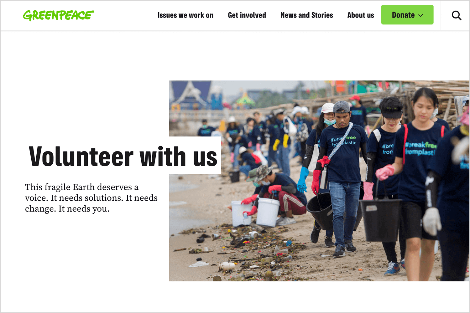
Beyond quality, relevance is paramount. The visuals should not only align with your story but also resonate with your target audience. Finally, consider the emotional impact of your visuals.
Do they evoke the feelings you want to convey? Do they create a sense of empathy, excitement, or curiosity? Choosing visuals that evoke the desired emotions can significantly enhance the impact of your story and create a deeper connection with your audience.
Visual hierarchy, which we touched on briefly previously, is all about guiding the viewer’s eye through your design in a way that emphasizes key information and creates a clear flow. It’s like a roadmap for the eyes, ensuring that the most important elements are noticed first and that the overall message is easily understood. Here’s how you can achieve this using various techniques:
- Size: The size of an element is one of the most effective ways to establish hierarchy. Larger elements naturally attract more attention than smaller ones. Use size to highlight headlines, key figures, or calls to action. For example, a large headline will immediately draw the viewer’s eye, while smaller text can be used for supporting details.
- Color: Color can be used to create contrast and draw attention to specific elements. Bright or contrasting colors stand out against more muted backgrounds. Use color strategically to highlight important information, create visual interest, and guide the viewer’s eye through the design. For instance, a brightly colored button on a neutral background will immediately attract attention.
- Typography: The choice of font, size, and style can significantly impact visual hierarchy. Use different font weights (bold, regular, light) and styles (italic, underlined) to create contrast and distinguish between different levels of information. For example, a bold headline in a larger font size will stand out from the body text.
- Placement: The placement of elements on the page or screen also plays a crucial role in visual hierarchy. Important elements should be placed in prominent positions, such as the top left corner or the center of the design. Use the natural flow of the eye (often from top left to bottom right) to guide the viewer through the information.
- Contrast: Contrast is the difference between elements in terms of color, size, shape, or texture. High contrast creates visual interest and helps elements stand out. Use contrast to highlight important information and create a clear focal point. For example, dark text on a light background or a large, bold element next to smaller, thinner elements will create a strong contrast.
By cleverly using things like size, color, fonts, where you put things on the page, and how much things stand out from each other (that’s contrast!), you can really make sure your most important messages and what you want people to do (like click a button or visit a website) really pop!
For instance, to make key elements, like a CTA button, stand out, you can make “click here” buttons or other calls to action larger and use colors that really pop so people see them right away.
You can also use bold text or a different, eye-catching font to make key info within your text jump out at the reader. Finally, put the really important stuff where people’s eyes naturally go first, like at the top of a design or right next to a picture that relates to it.
Basically, good visual hierarchy helps you create a clear “look here!” spot for your audience, so they don’t miss the best parts of your story.
Using strong composition is like creating a well-composed photograph or painting. This involves creating balance, harmony, and a clear focal point. Here’s a breakdown:
Arrange elements in a visually pleasing and balanced way: A well-composed design feels harmonious and easy on the eyes. It avoids feeling cluttered, chaotic, or unbalanced. Balance doesn’t necessarily mean perfect symmetry; it can also be achieved through asymmetry, where elements of different sizes or visual weight are arranged to create a sense of equilibrium.
Take the overall flow of the design and how the different elements relate to each other. A good composition will guide the users’ eye through the design logically.
Consider the rule of thirds, golden ratio, and other compositional techniques: These are tried-and-true guidelines that can help you create visually appealing compositions.
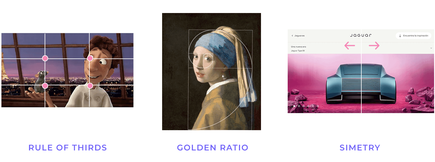
- Rule of Thirds: Imagine dividing your design into a 3×3 grid. Placing key elements along these lines or at their intersections creates points of interest and a more dynamic composition.
- Golden Ratio: This mathematical ratio (approximately 1.618) is found in nature and art and is often used to create aesthetically pleasing proportions. Applying the golden ratio to your design can create a sense of harmony and balance.
- Other techniques: include leading lines (using lines to guide the viewer’s eye), symmetry and asymmetry (creating balance through mirrored or contrasting arrangements), and negative space (using empty space to create emphasis and balance).
Leveraging color psychology is a powerful way to add depth and meaning to your visual storytelling. Colors aren’t just decorative; they have the ability to evoke emotions, influence perceptions, and create a specific atmosphere. Here’s how to use them effectively:
Use color to evoke specific emotions and create a desired mood: Different colors are associated with different emotions and feelings. For example:
- Red: Often associated with passion, energy, excitement, but also danger or anger.
- Blue: Often associated with calmness, trust, stability, but also sadness or coldness.
- Green: Often associated with nature, growth, health, but also envy or money.
- Yellow: Often associated with happiness, optimism, energy, but also caution or deceit.
Consider color theory and cultural associations. Color theory provides a framework for understanding how colors relate to each other and how they can be combined effectively.
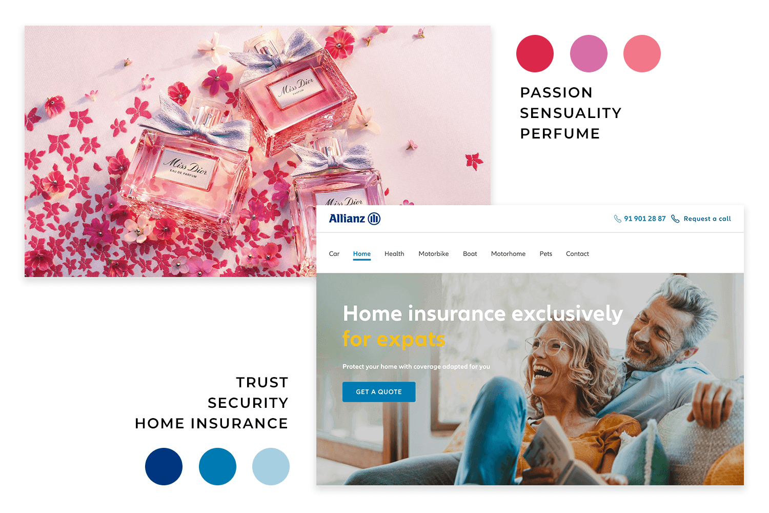
Understanding concepts like complementary colors, analogous colors, and color temperature can help you create harmonious and visually appealing color palettes.
It’s also crucial to be aware of cultural associations with colors. Different cultures may have different interpretations of the same color. For example, white is associated with purity and weddings in Western cultures, but it is associated with mourning in some Eastern cultures.
Keeping it simple is a golden rule in visual storytelling. It’s about clarity, focus, and allowing your visuals to truly shine. Here’s why it’s so important:
Avoid clutter and information overload: In today’s world, we’re bombarded with information. A cluttered design can overwhelm viewers, making it difficult for them to grasp your message. Too many elements competing for attention can create confusion and dilute the impact of your story.
Focus on the essential elements and let the visuals do the talking. Powerful visual storytelling often relies on the principle of “less is more.” By focusing on the essential elements, you create a stronger focal point and allow your visuals to communicate more effectively. Instead of trying to cram in every detail, prioritize the key information and let your visuals convey the rest.
This approach not only makes your design more visually appealing but also makes your message more memorable and impactful. When you let the visuals do the talking, you create a more immersive experience for your audience.
Telling a story is at the heart of effective visual communication. Here’s how to make your visuals tell a compelling story:
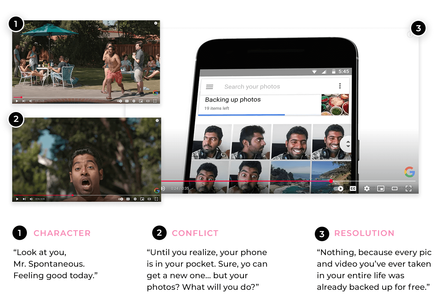
Use a narrative structure to engage the viewer. Create characters, conflicts, and resolutions: Even if your story isn’t about people, you can still create a sense of character, conflict, and resolution.
For example, a data visualization could present data points as “characters” that face the “conflict” of changing trends, with the “resolution” being the final outcome or insight. This adds a layer of depth and interest to your visuals, making them more relatable and memorable.
https://www.youtube.com/watch?v=6Al4nZThwZY
Evoke emotions and create a connection with the audience. The most effective stories are those that manage to do this. Consider the emotions you want to evoke and choose visuals that align with those feelings.
This could involve using imagery that evokes empathy, joy, curiosity, or even a sense of urgency. When you connect with your audience on an emotional level, you create a more lasting impression and increase the likelihood that they will remember and act on your message.
Testing and iterating is the final, but most crucial, step in creating truly effective visual stories. It’s about recognizing that your first draft is rarely your best and embracing the process of refinement.
This involves gathering feedback from your target audience. The best way to know if your visual story is working is to get feedback from the people you’re trying to reach. Show your work to members of your target audience and ask them for their honest opinions. Ask questions like:
- What is the main message you take away from this?
- Does the story make sense to you?
- Does it evoke the emotions I intended?
- Is there anything that is confusing or unclear?
Their feedback will provide valuable insights into what’s working and what needs improvement.
Make adjustments based on the feedback to improve the effectiveness of your visual storytelling. This might involve:
- Revising the composition or layout.
- Changing the color palette or typography.
- Replacing or modifying images or videos.
- Clarifying the narrative structure.
Don’t be afraid to experiment and try different approaches until you find what works best. This iterative process of testing and refining is essential for creating visual stories that truly resonate with your audience and achieve your communication goals.
Start your UX visual storytelling journey with Justinmind.

Nike has become a top name in sports and fitness gear, and a big part of that is their knack for telling powerful visual stories. Their visuals often capture amazing moments of triumph, real determination, and personal growth, frequently sharing inspiring stories of athletes who overcome challenges and push themselves to their limits.
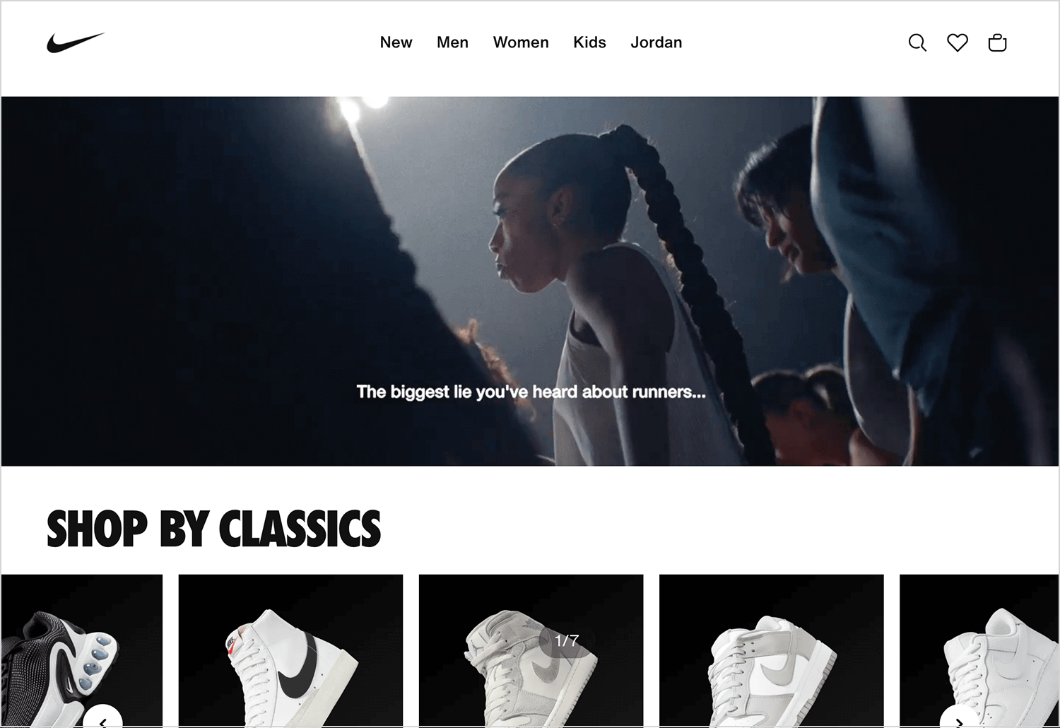
When you look at Nike’s websites and apps, you’ll notice their visual storytelling is usually pretty simple and focused, which really lets the main story shine. They tend to use clean designs, bold headlines, and striking images to grab your attention and get their message across clearly.
The Calm app has become a go-to for anyone looking to boost their wellbeing, offering a bunch of tools and resources to help people relax, de-stress, and sleep better.
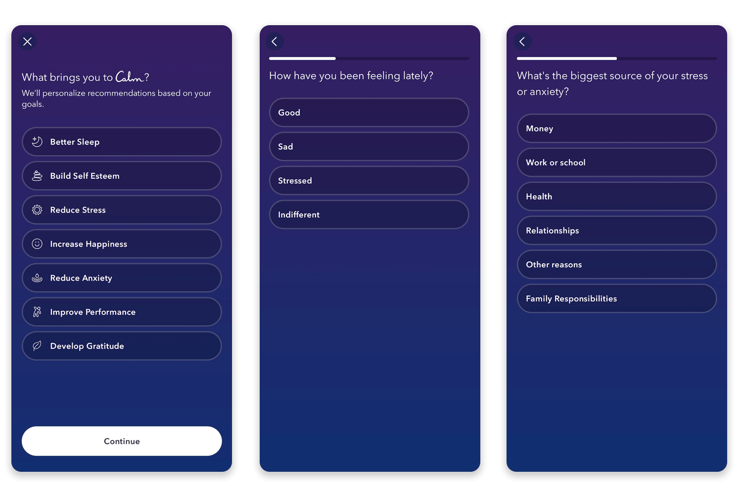
One thing Calm does really well is their visual storytelling, creating a truly immersive experience that’s available with just a tap (which is no small feat on a mobile device!). The app uses a calming color scheme of soft blues and greens—colors we naturally associate with peace and harmony. They also use gentle animations that add a nice touch of depth and make the scenes feel more engaging.
Calm’s content also uses visuals that fit perfectly with each activity. So, if you’re looking at sleep content, you’ll see cozy bedrooms or starry night skies, and for meditation sessions, you’ll find peaceful landscapes.
For brands to effectively advertise on Twitch, they first need to get a good grasp of what the platform is all about.
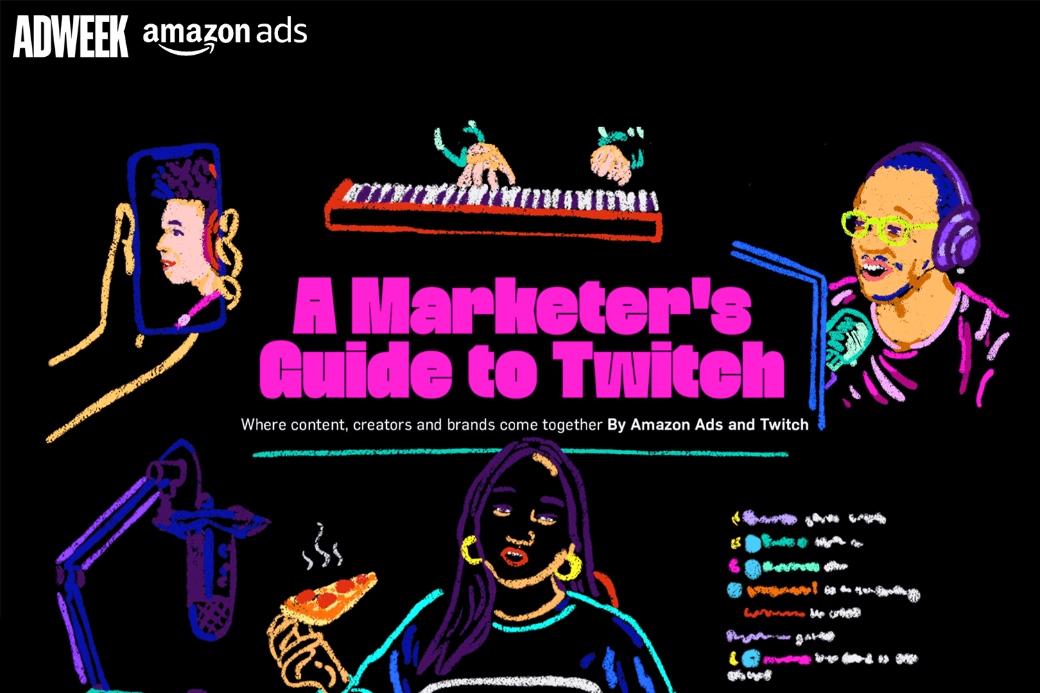
Twitch itself uses visual storytelling—things like illustrations and videos—to explain how its service works. They even use video right on their landing page to keep people engaged.
Emergence Magazine uses visuals to highlight just how important healthy forests are, while also showing how climate change affects them. They combine writing, photos, videos, and graphics in a scroll-triggered timeline that really brings the story to life.

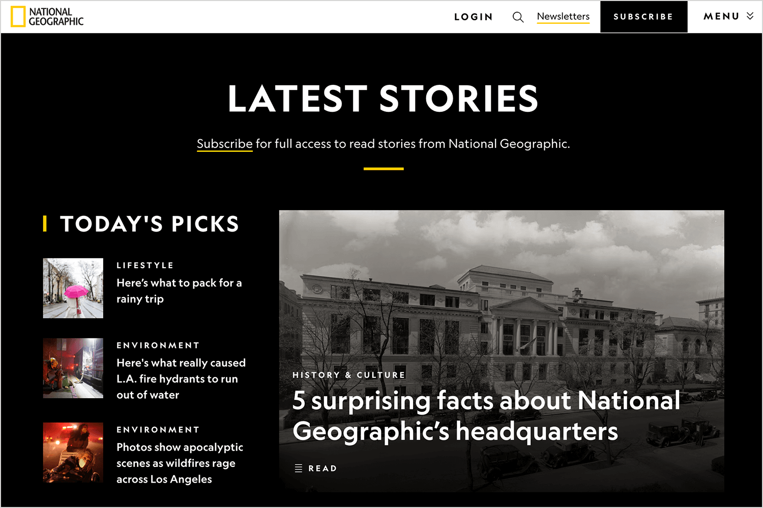
National Geographic is famous for its breathtaking photos and videos, and their website uses these amazing visuals to tell fascinating stories about the natural world, science, different cultures, and history. Their immersive photo essays and documentaries are like virtual trips to far-off places, and they really help you connect with the people and places they feature.
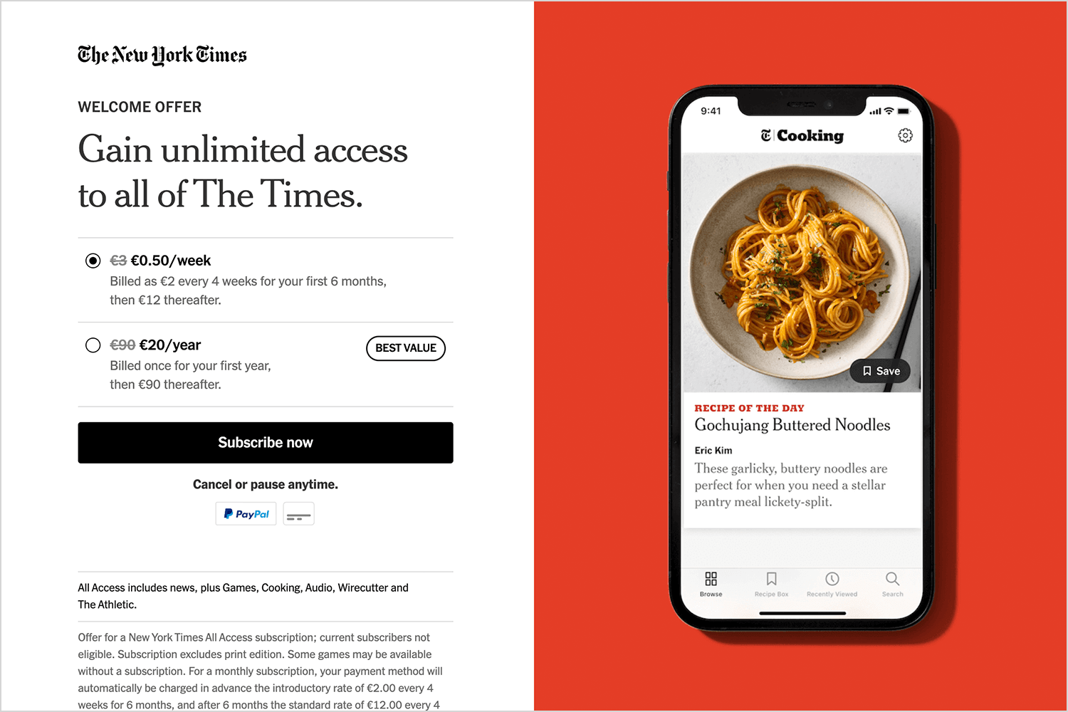
The New York Times is great at using interactive elements to tell stories. They often use things like interactive graphics, maps, and ways to visualize data to make complicated news stories easier to understand. A really good example of this is their “Snow Fall” project, which combined words, video, and animation to tell the gripping story of an avalanche. It’s a classic example of how they’ve pushed the boundaries of visual storytelling.
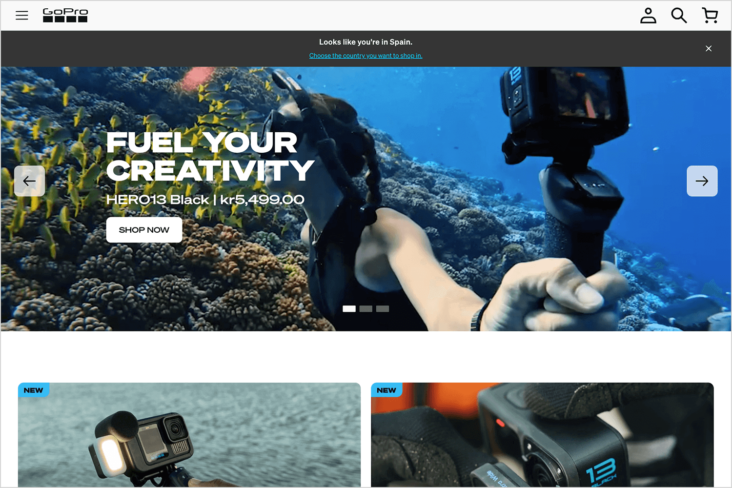
GoPro‘s website is basically a showcase of awesome action shots and videos—all taken with their cameras, of course! It’s packed with incredible feats and adventures from GoPro users around the world. These visuals are super exciting and really inspire you to go out and capture your own amazing moments.
Mailchimp does a great job of using fun illustrations and animations all over their website. It’s how they explain what they do and create a brand that feels friendly and easy to connect with. Their visuals are really good at breaking down complicated stuff into simple terms, and they even manage to add a bit of humor to make things more enjoyable.

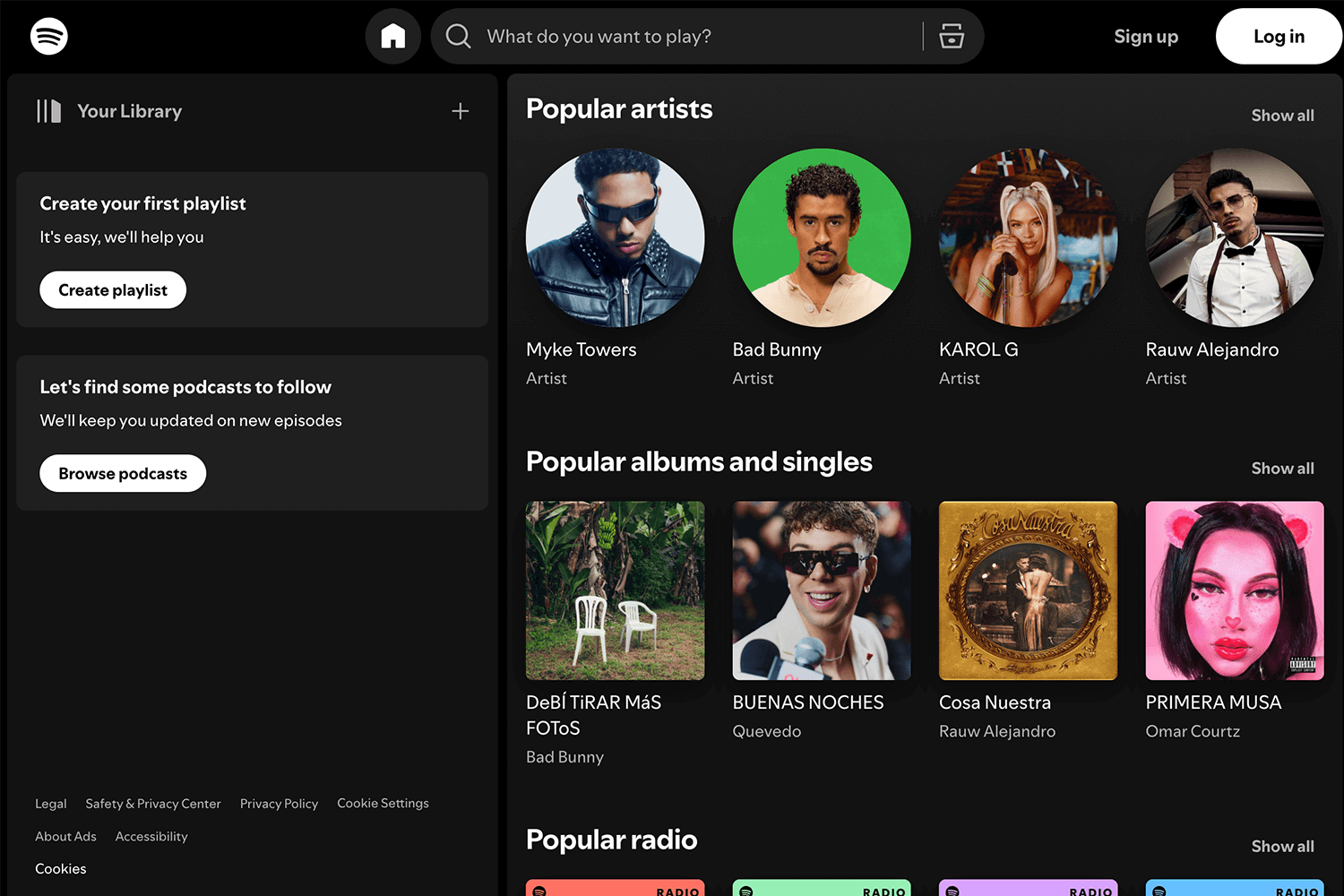
Spotify uses things like album covers, artist photos, and cool, moving visuals to make listening to music even better. These visuals don’t just give you some background on the music; they make the whole experience more engaging and immersive.
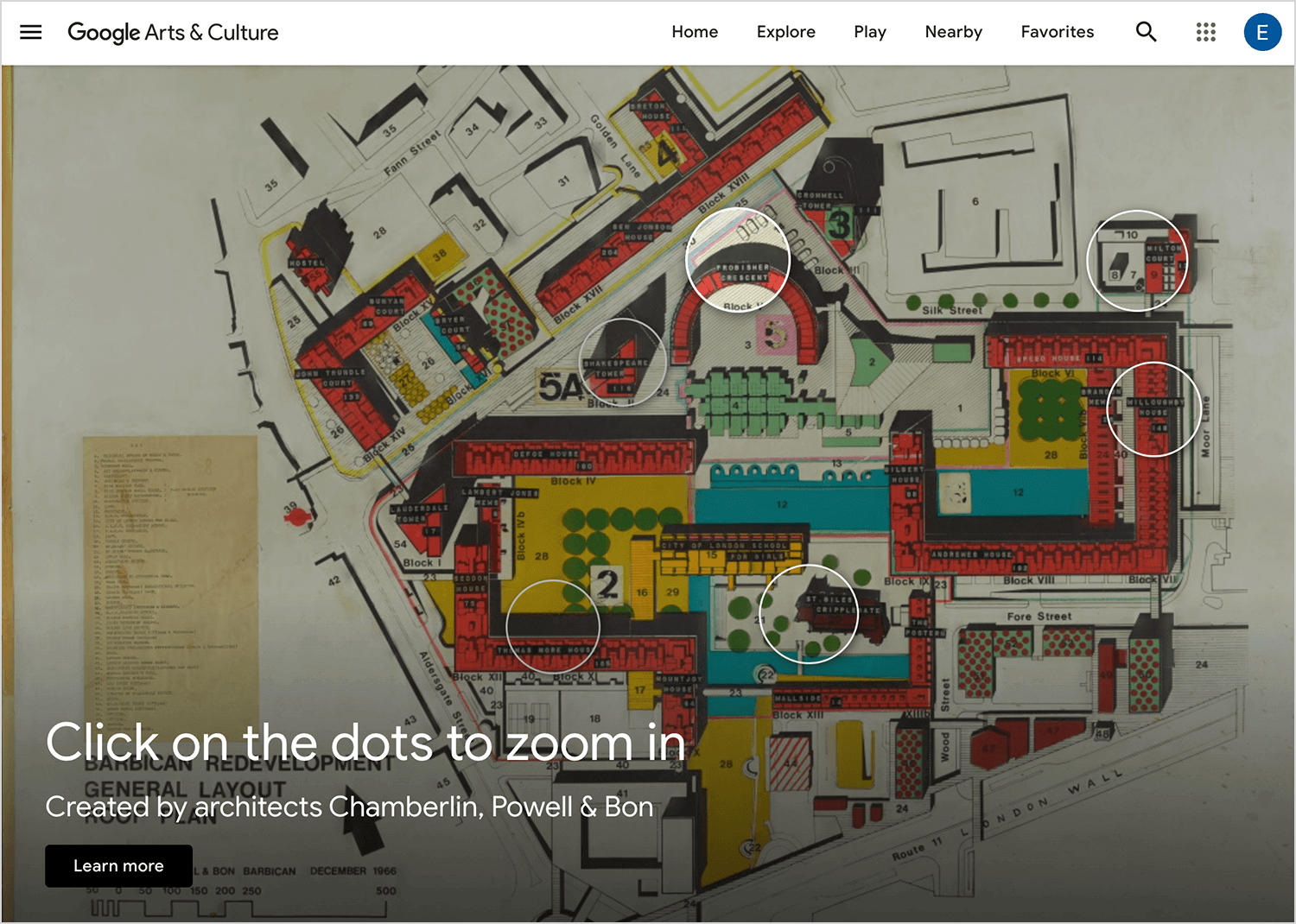
Google Arts & Culture is like a virtual museum and cultural center all rolled into one. They use super high-quality images and virtual tours to show off amazing artwork, historical objects, and important landmarks from all over the globe. The visuals are so rich and immersive that you can practically feel like you’re there, exploring different cultures and even traveling back in time.
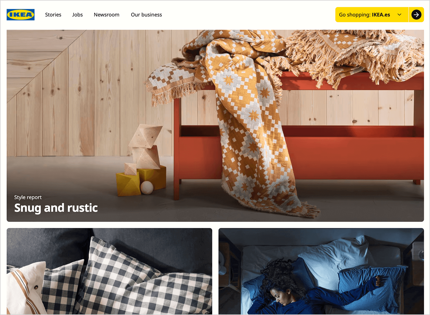
IKEA is a real pro at visual storytelling, especially on their website and in their catalogs. They create these amazing room setups and lifestyle scenes that really get you thinking about how you could decorate your own place. They use photos and even 3D images to show off their furniture and home decor in a way that feels both realistic and inspiring. It’s like they’re giving you a sneak peek into a perfectly styled home, and it makes you want to create something similar yourself.
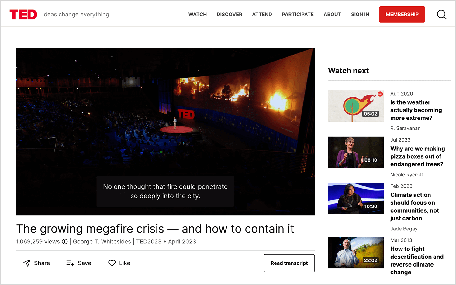
TED‘s website is where you can find recordings of all those fascinating TED Talks. What’s cool is that the speakers often use visuals like slides, animations, and even demonstrations to go along with what they’re saying. These visuals really boost the presentations and make their ideas more engaging and easier to remember.
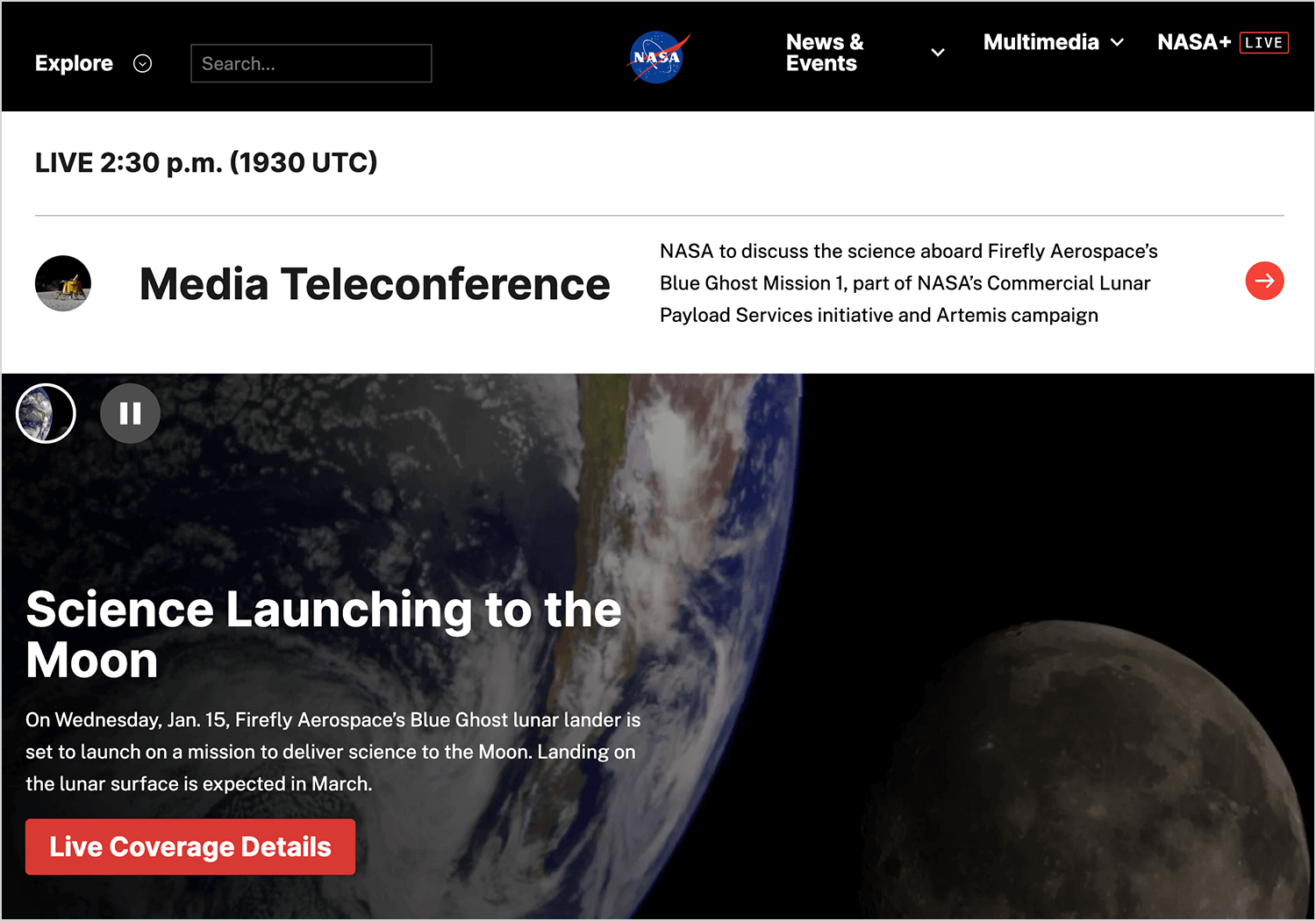
NASA‘s website is a treasure trove of stunning images and videos of space, planets, and astronomical phenomena. Their visuals inspire awe and wonder, and they help to communicate the excitement of space exploration.
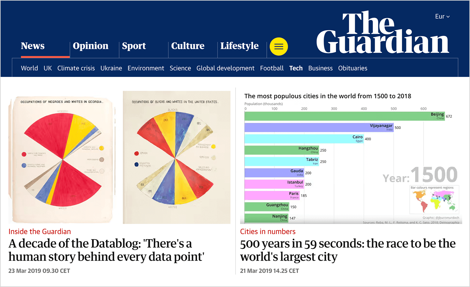
The Guardian is really good at using visuals to make their news stories more interesting and easier to understand. They often use things like interactive graphics that you can play with, ways to visualize data so you can see the numbers in action, and photo essays that tell a story through pictures. These visuals are usually pretty innovative and engaging, which helps make even complicated topics accessible to everyone.
This excellent longform article from Huffpost’s Highline combines great writing with an inventive form of visual storytelling to deliver a truly original experience.
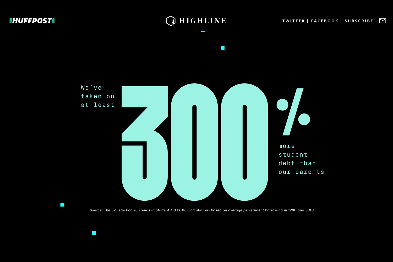
The visual narrative, tracking virtual millennial Becky on her quest to understand structural disadvantage, makes an 8000+ word article feel light and readable. All you have to do is scroll and read. Despite the subject matter, a truly delightful user experience.
Copywriting Studio Rule of Three uses a mysterious, esoteric visual narrative to engage potential customers.
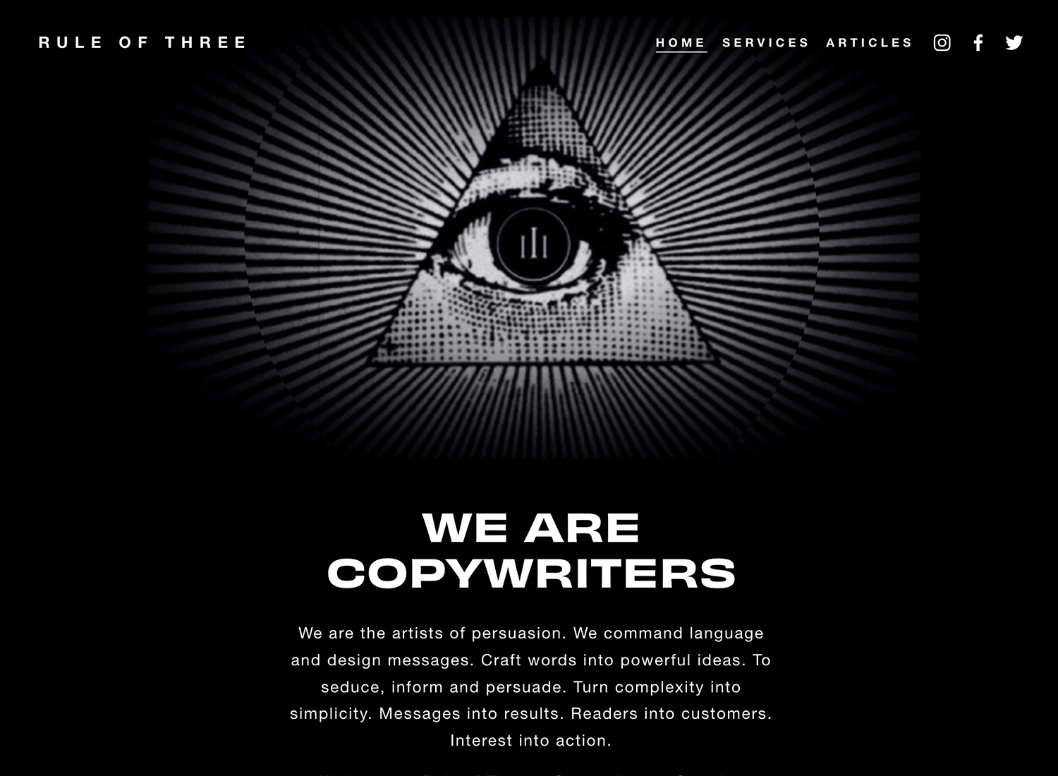
Navigating through layers of black and white imagery, with punchy copy, Rule of Three’s site is captivating in every sense. The only disappointment is: there are four of them in the agency. Still, you can’t have everything.
Outdoor clothing and equipment label Patagonia builds its values into its value proposition from the very start.
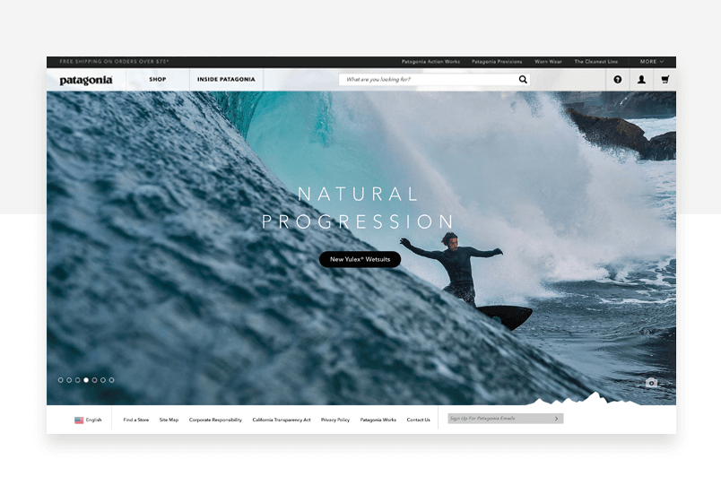
The brand’s commitment to social and environmental causes shines through in their new clothes repair campaign, which cleverly reinforces their values. It’s a well-executed idea that hits the mark.
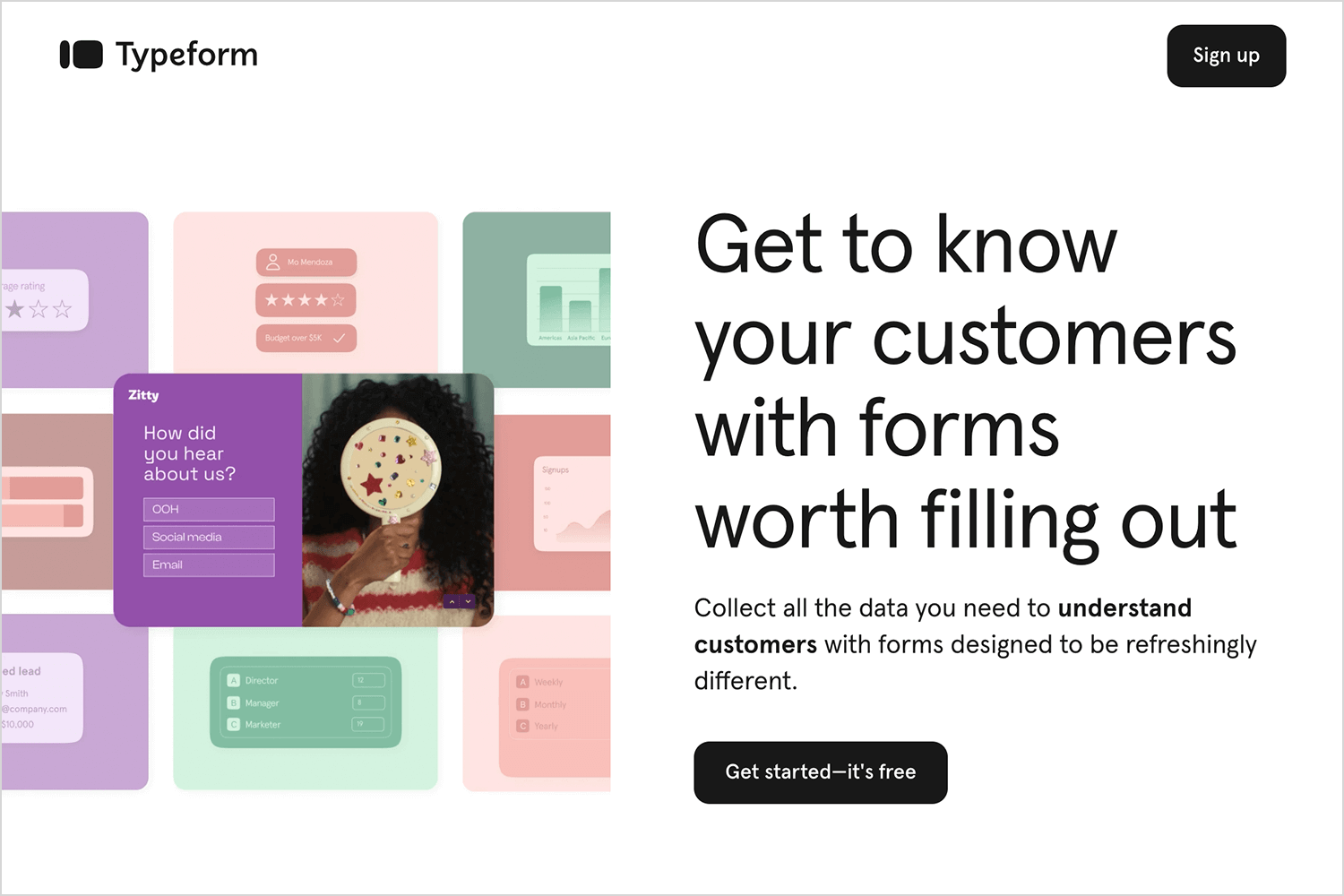
Typeform‘s website warmly welcomes visitors with UX storytelling that feels more like a friendly chat than a sales pitch. Right from the start, the site playfully acknowledges the pain of boring forms, then smoothly introduces Typeform as a welcome change.
The Financial Times came up with a novel way of presenting journalistic research into the lives of Uber drivers – an interactive visual game.
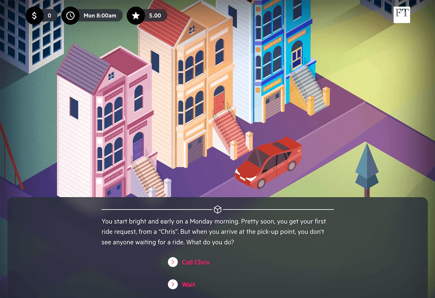
The Uber game encourages readers to think about the decisions an Uber driver needs to make in their day-to-day, and consider the difficulties of this form of employment. Sensitive, to the point and enlightening.
When you’re taking your user experience to the next level, you’ll want to include visual storytelling. It’ll take a bit of imagination, a lot of creativity and a fair deal of honesty and empathy to get it right. But the results can be spectacular. There are few more effective ways of creating a lasting emotional memory in a user’s mind. So what are you waiting for? Start working on visual storytelling for your next project now!
PROTOTYPE · COMMUNICATE · VALIDATE
ALL-IN-ONE PROTOTYPING TOOL FOR WEB AND MOBILE APPS
Related Content
 Learn how to design better e-learning platforms with user-centered UX principles, real examples, and high-fidelity prototyping tips to boost engagement and learning outcomes.13 min Read
 Infinite scroll keeps users engaged, but it’s not always the best choice. This guide breaks down when to use it, when to avoid it, and how to design it right.14 min Read
 Learn how to design web and mobile app prototypes, how to test them and what to look for in a prototyping tool in this complete guide.15 min Read
