How to design a data-driven Select
Here you will learn how to design a data-driven Select component.
Here’s how you build it:
View
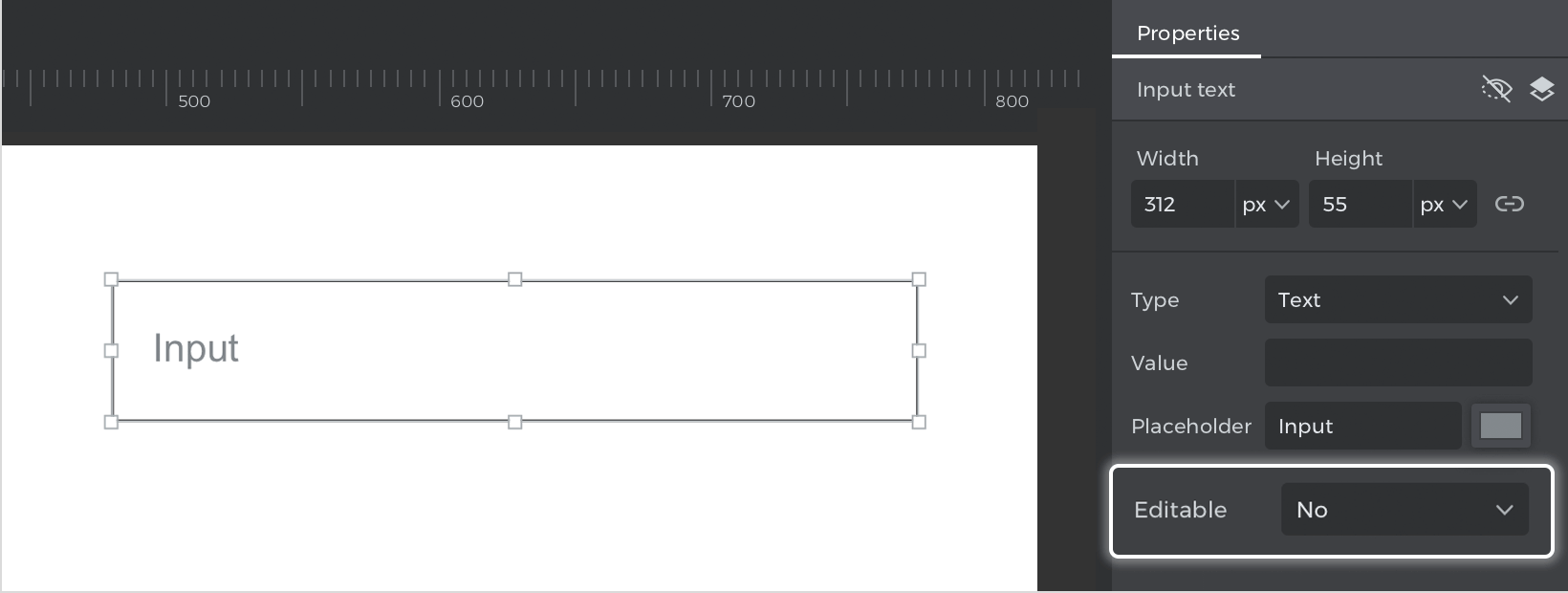
- Place an “Input text field” on the canvas, double click on it and write “Input”. Go to the Properties palette and in the “Editable” option, select “No” in the dropdown.

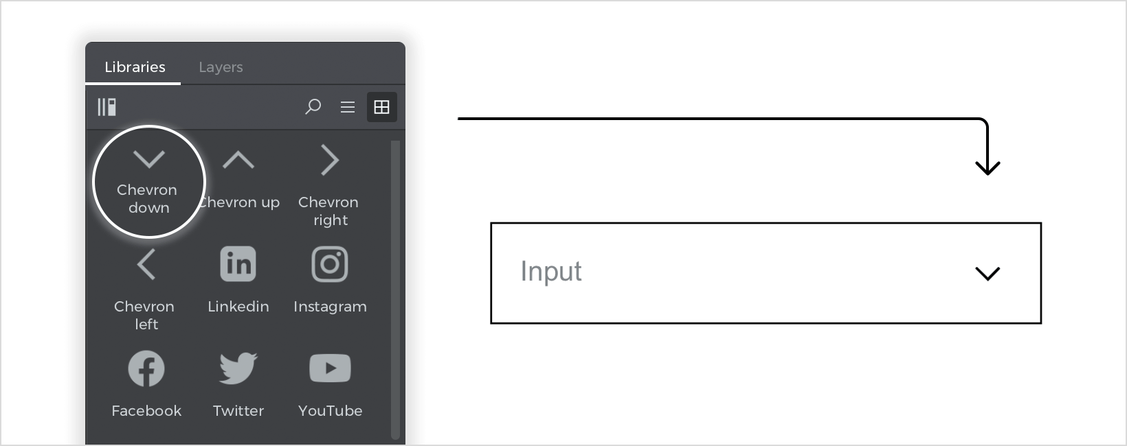
- From the “Web components” library, drag the “Chevron down” icon and place it on top of the “Input text field”.


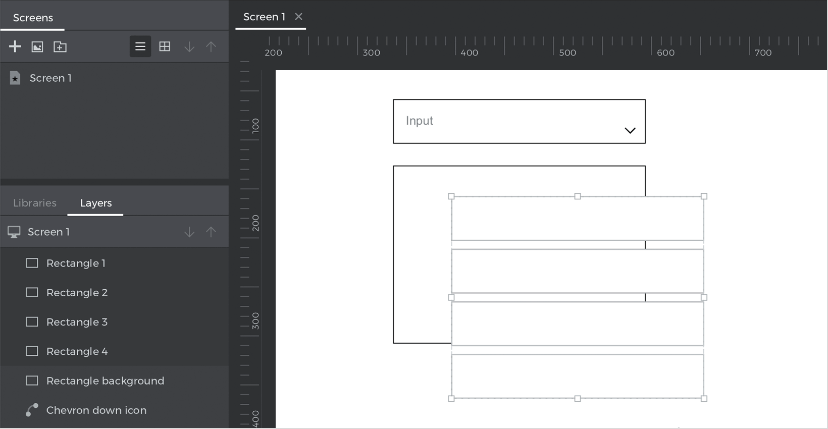
- Below the “Input text field” place a “Rectangle” that will be the background of the dropdown options. On top, place four more rectangles, and line them up, one for each option.

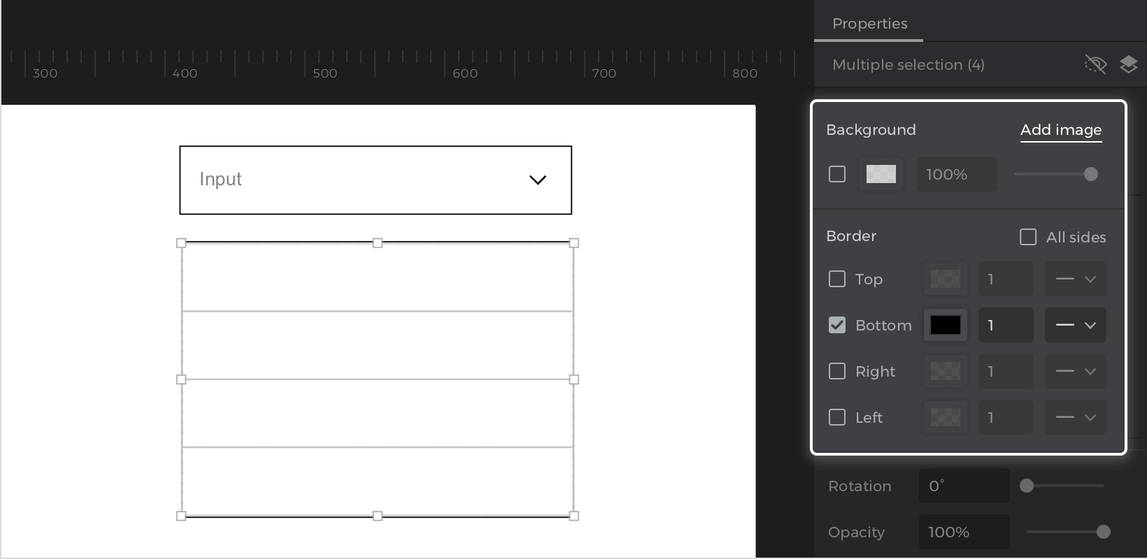
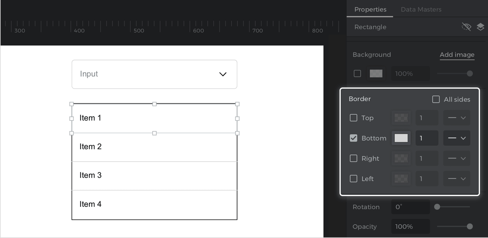
- From the Properties palette deactivate the background color of the four rectangles, and leave only the border “Bottom” active in the first three. For the fourth rectangle, turn off the borders on all sides.

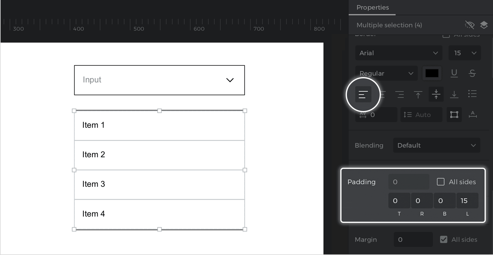
- Double click on each rectangle, and write “Item 1”, “Item 2”, “Item 3” and “Item 4”. Go to the Properties palette, give the text the left alignment and edit the left padding.

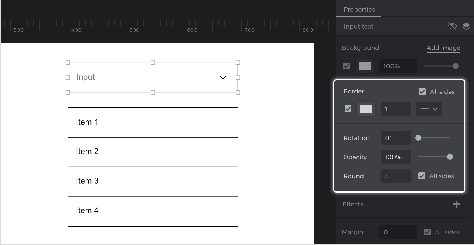
- Select the “Input text field”, go to the Properties palette and edit the “Border” color and the “Round”.

- Select the rectangles from the dropdown options, go to the Properties palette and edit the border color.

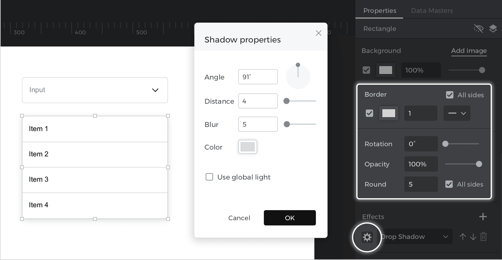
- Select the rectangle that acts as the background of the dropdown, go to the Properties palette, and edit the Round and Border color. Next, go to Effects within the same palette, and click on “+”. A drop shadow will be added by default. Click on the Settings icon to edit the shadow.
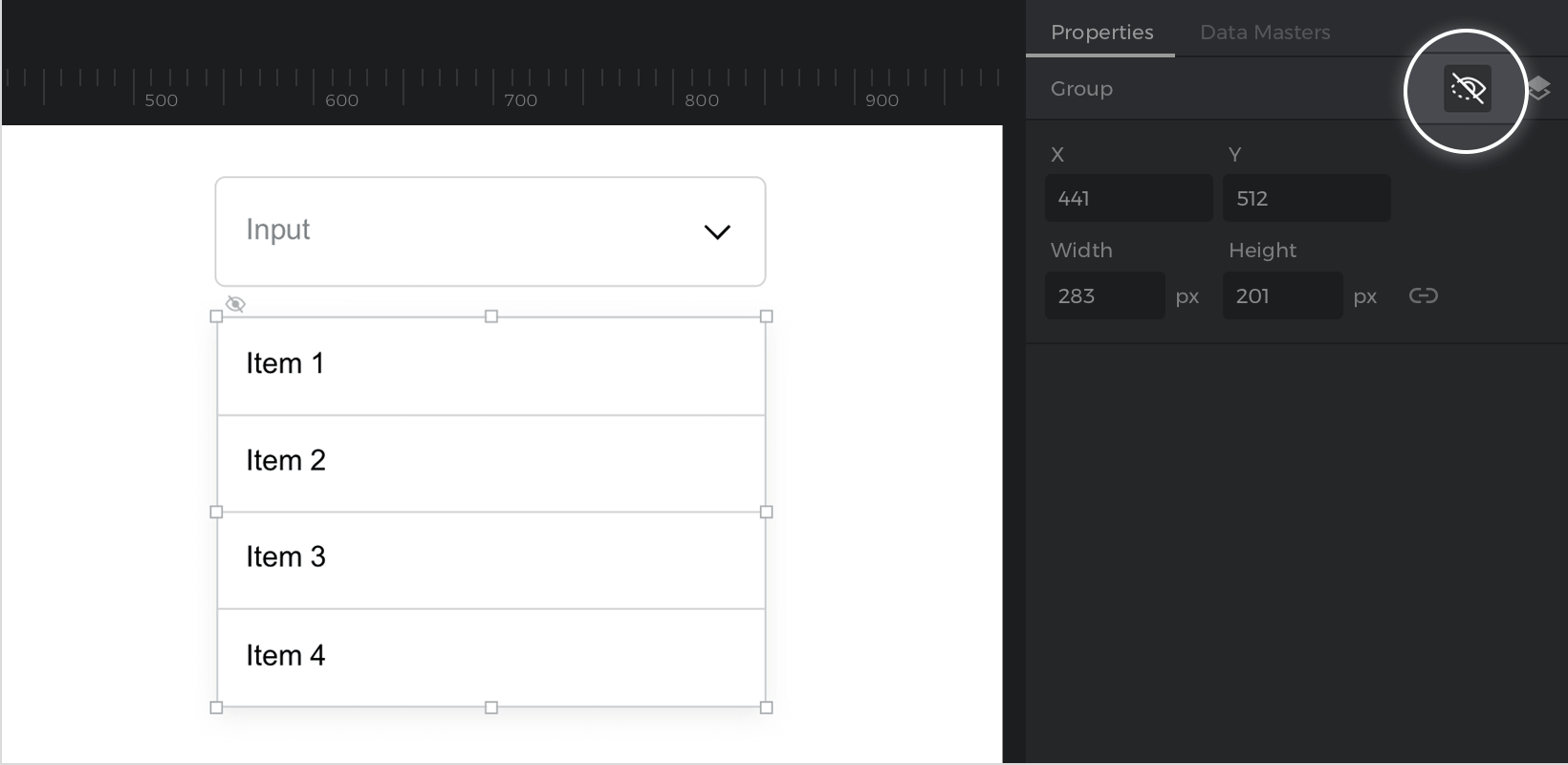
- Select the four options boxes, and the background box, right click, and click on “Group”.
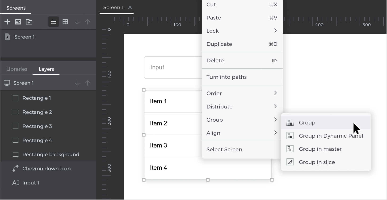
- Go to the Properties palette and click on the “Hide in simulation” icon.


Events
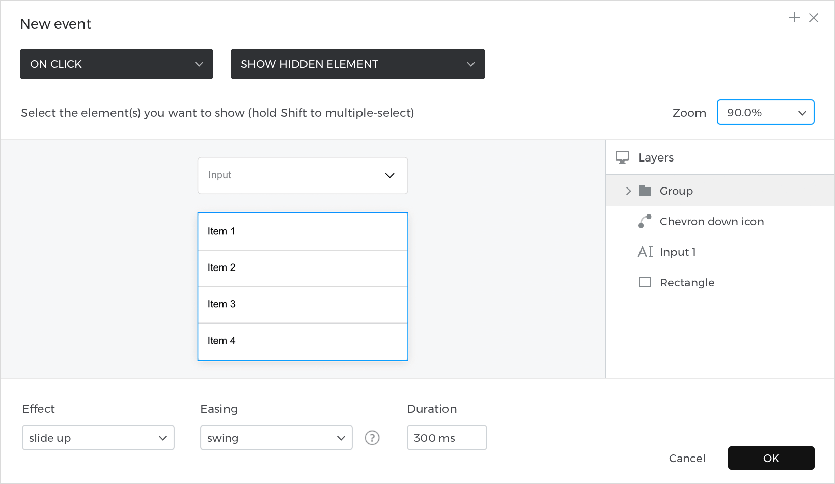
Select the “Input text field”, go to the Events palette and click on “Add event”.
- In the dialog box, click on “Choose Trigger”, hover over the “Mouse” section, and select “on Click”.
- In “Choose Action,” select “Show hidden element” and select the “Group” that includes the dropdown options.
- At the bottom, select the “Slide up” effect, with an Easing type “Swing” and a Duration of 300ms to give the dropdown a smooth animation.

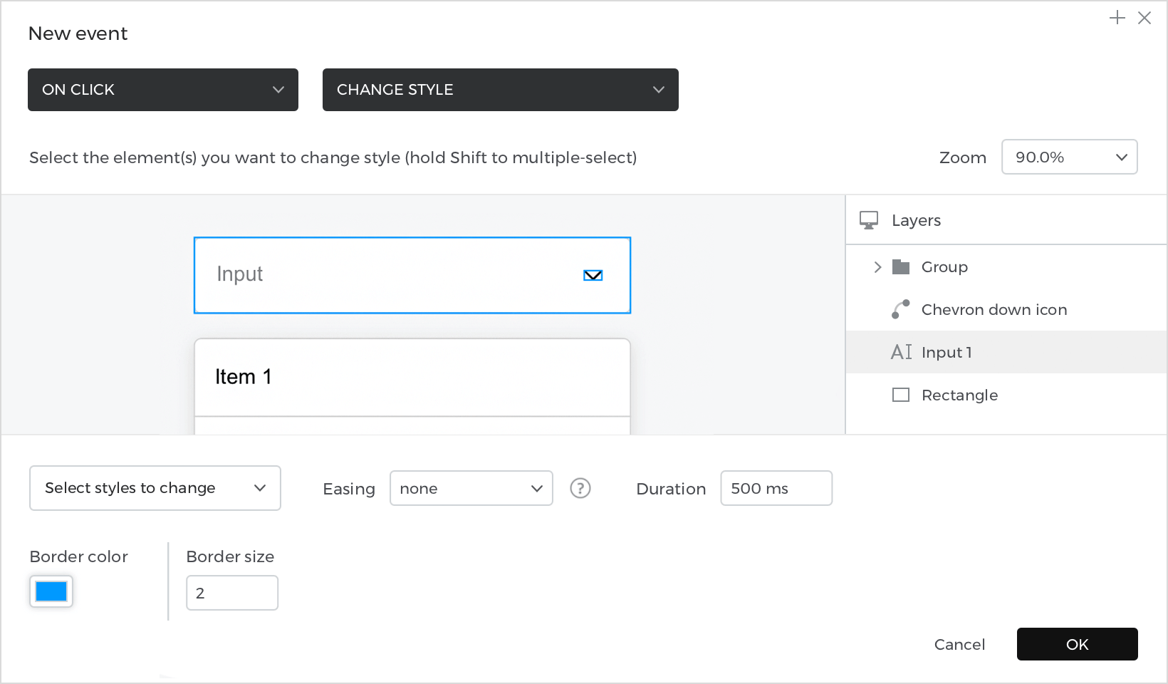
With the “Input text field” selected, go back to the Events palette, and click on the “+” to add an event.
- In the dialog box, click on “Choose Trigger”, select “on Click”.
- In “Choose Action,” select “Change style” and select the “Input text field”.
- And in the lower menu, select the border color and the thickness that the input will have when it is selected. For this example, choose a blue color for the border, and a thickness of 2px.

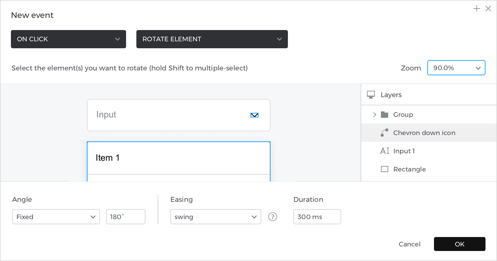
With the “Input text field” selected, go back to the Events palette, and click on “+” to add an event.
- In the dialog box, click on “Choose Trigger”, hover over the “Mouse” section, and select “on Click”.
- In “Choose Action,” select “Rotate” and select the “Chevron down” icon.
- In the lower part, edit the Angle so that it rotates 180º, and select an Easing type “Swing”, with a Speed of 300ms to give the icon a smooth animation effect.

In the Events palette, switch to “WITH previous” mode between each of the events, so they all happen at the same time.
Select the rectangle with the text “Item 1”, go to the Events palette and click on “Add event”.
- In the dialog box, click on “Choose Trigger”, hover over the “Mouse” section, and select “on Click”.
- In “Choose Action,” select “Set value to an element” and select the “Input text field”.
- Select the radio button with the “Calculated” option, and click on “Add expression”.
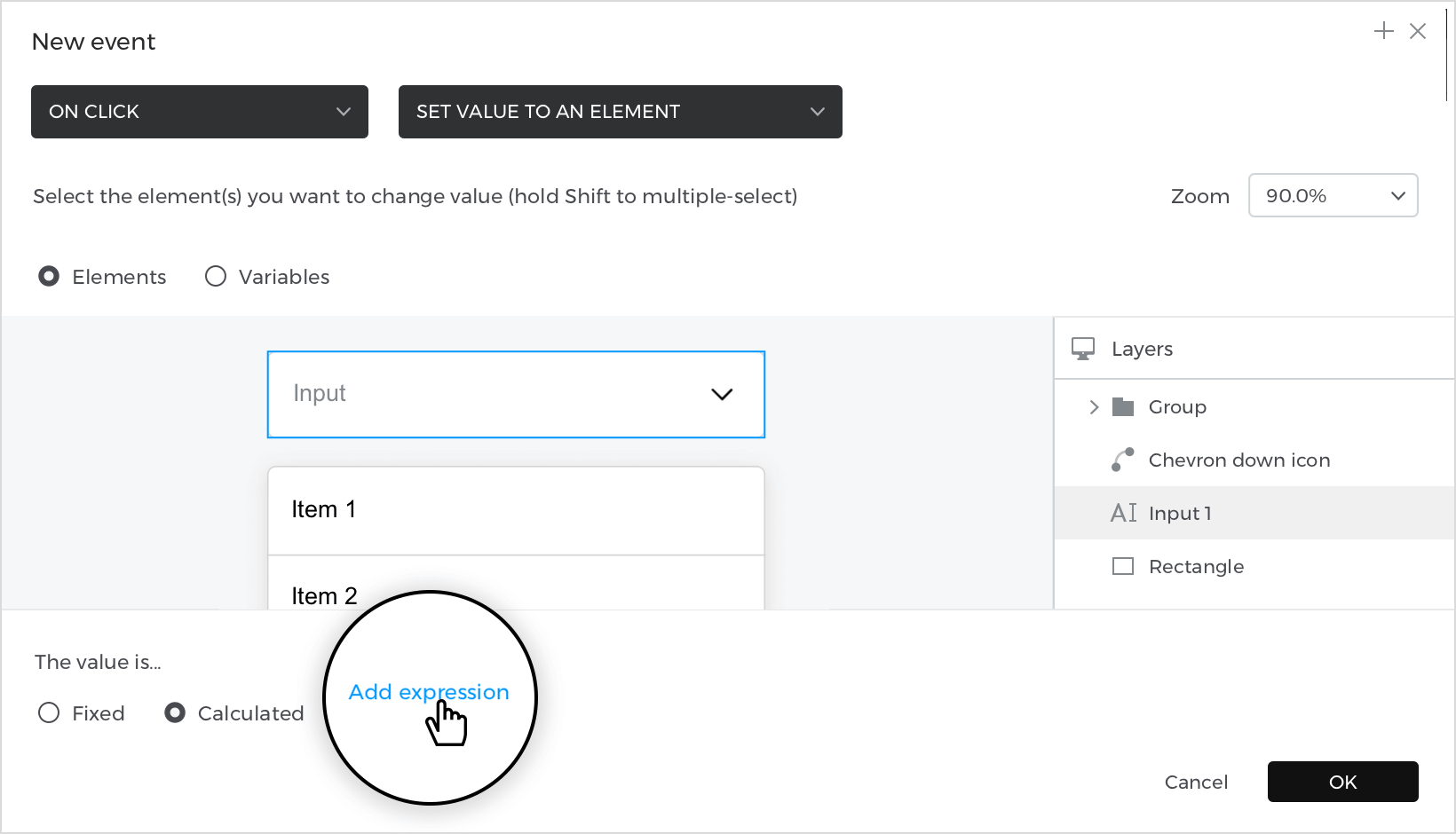

In the Expression builder, drag the “Item 1” rectangle to the first field, so selecting the first option will update the “Input text field” with the text that the rectangle contains. Click “Ok” and “Ok” again to finish creating the event.
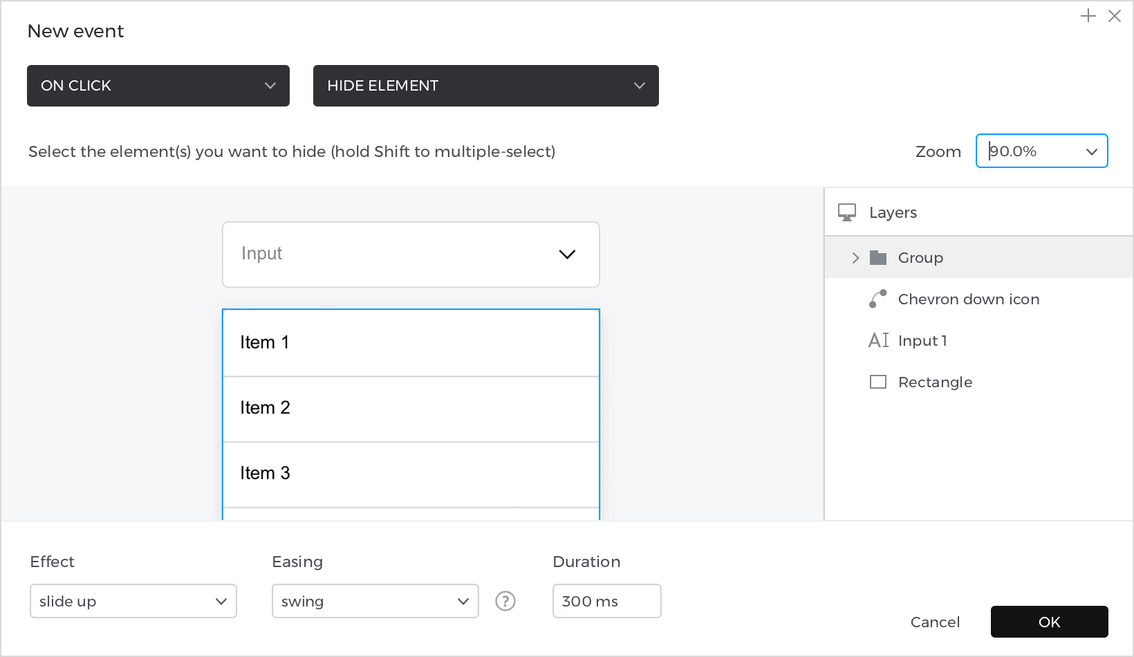
With the “Item 1” rectangle selected, go back to the Events palette, and click on “+” to add an event.
- In the dialog box, click on “Choose Trigger”, hover over the “Mouse” section, and select “on Click”.
- In “Choose Action,” select “Hide element” and select the “Group” that includes the dropdown options.
- At the bottom, select the “Slide up” effect, with an Easing type “Swing” and a Duration of 300ms. Clicking on one of the options will close the dropdown with a smooth animation. Click “Ok” to finish creating the event.

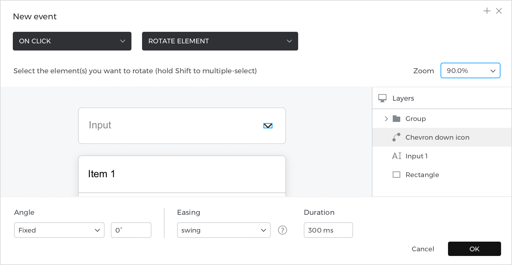
With the “Item 1” rectangle selected, go back to the Events palette, and click on “+” to add an event.
- In the dialog box, click on “Choose Trigger”, hover over the “Mouse” section, and select “on Click”.
- In “Choose Action,” select “Rotate” and select the “Chevron down” icon.
- In the lower part, edit the Angle so that it rotates 0º, and select an Easing type “Swing”, with a Speed of 300ms to give the icon a smooth animation effect. Click “Ok” to finish creating the event.

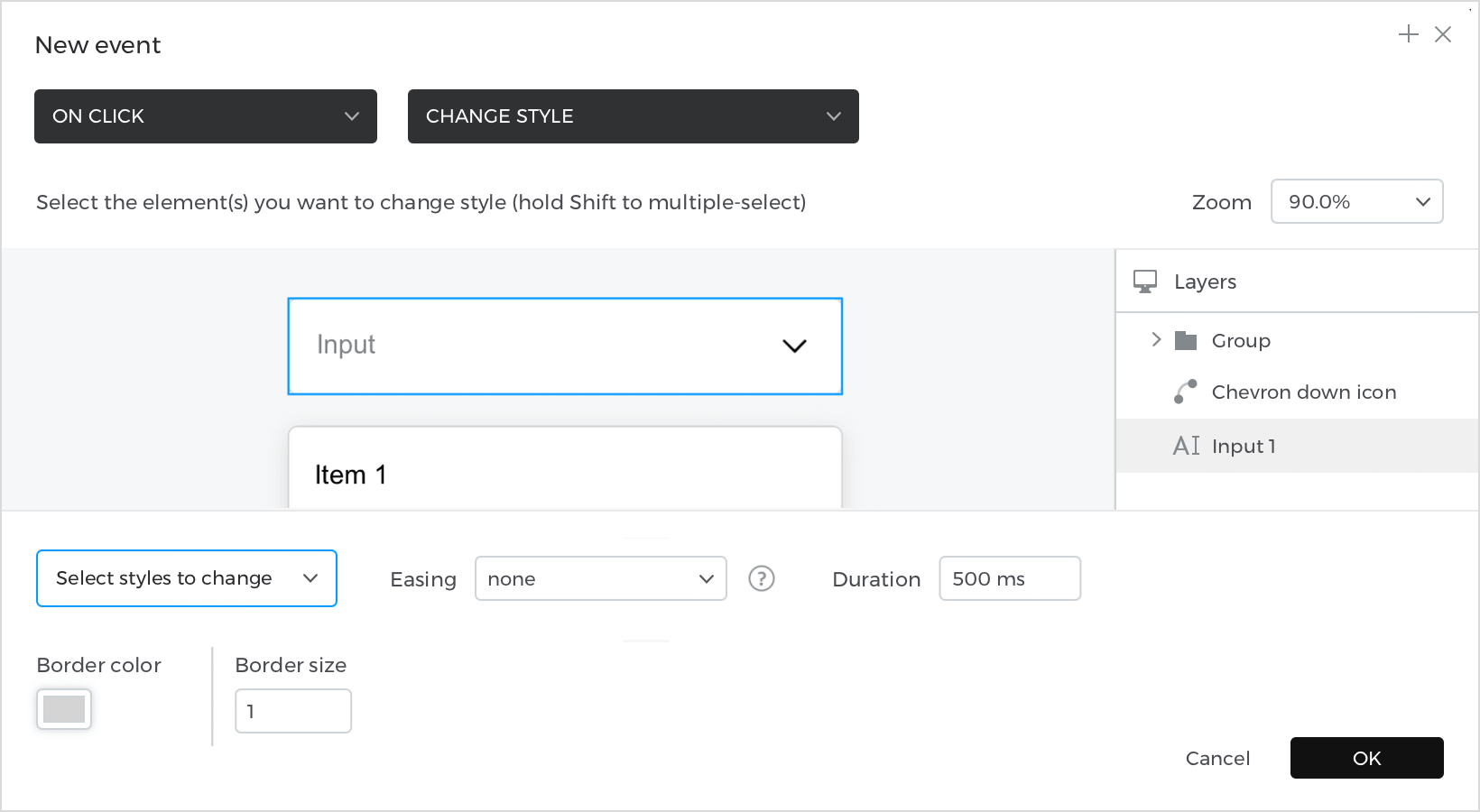
With the “Item 1” rectangle selected, go back to the Events palette, and click on “+” to add an event.
- In the dialog box, click on “Choose Trigger”, hover over the “Mouse” section, and select “on Click”.
- In “Choose Action,” select “Change style” and select the “Input text field”.
- At the bottom, leave the default border color, and the default border size (1). Click “Ok” to finish creating the event.

In the Events palette, switch to “WITH previous” mode between each of the events, so they all happen at the same time.
From the Events palette, click on “Copy all events”, select the rectangle with the text “Item 2”, and click on the “Paste all events” button.
Edit the target of the “Set value to an element” event. Go to the event expression, and in the builder drag the “Item 2” rectangle to the first field. Click “Ok” and “Ok” again to modify the event. The rest of the actions remain the same.

Repeat the action for each of the remaining dropdown options.
Simulate your prototype.