The User Interface module
Get to know the User Interface module, where you will build the visual and interactive components of prototypes.
Toolbar

The toolbar contains quick editing options for the selected screen UI element. Find the most common and frequently-used tools and commands in the toolbar.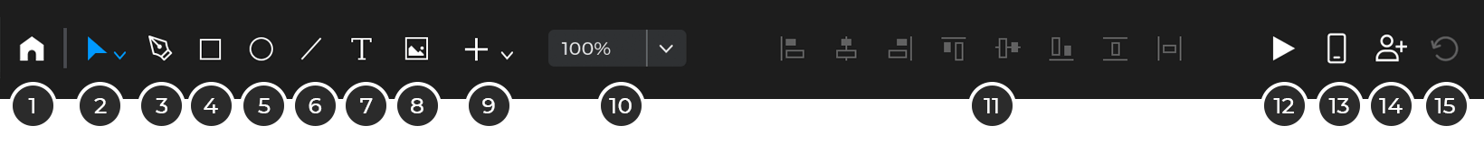
- Home – Click to go back to your home dashboard.
- Selection tools:
- Selection tool: use this tool to select elements in the canvas. Double-clicking will select inside groups or containers.
- Direct selection tool: A selection tool that ignores groups and containers so you can select elements directly.
- Delete tool: This tool deletes any element that you click on with it.
- Copy style tool: You can copy all the style properties such as colors, borders, etc. from one element to another using this tool. Click first on the element with the styles you want to copy and then the element that you want to apply those styles to.
- Copy events tool: You can copy all the events from one element to another using this tool. Click first on the element with the events you want to copy and then the element that you want to apply those styles to.
- Crop tool: Select an image and then, after selecting this tool, you’ll be able to crop it / add a mask to it.
- Pen Tool (keyboard shortcut P): after selecting this tool, click on the canvas to create an anchor point. Click again to create a line or click and drag to create a curve. Keep clicking to create a shape.
- New Rectangle (keyboard shortcut R): after selecting this tool, click and drag in the canvas to create a new Rectangle. Hold the ‘shift’ key to create a square.
- New Ellipse (E): after selecting this tool, click and drag in the canvas to create a new Ellipse. Hold the ‘shift’ key to create a circle.
- New Line (L): after selecting this tool, click and drag in the canvas to create a new Ellipse. Hold the ‘shift’ key to restrict the angle of the line.
- New Text (T): after selecting this tool, click and drag in the canvas to create a new Text. The text element will be activated so you can start typing right away.
- New Image (I): clicking this tool will display a file explorer to select an image file. After selecting a file, you can choose where to place it in the canvas. Justinmind supports most of the image formats and even SVG files.
- Select the Image element on the Canvas, go to the “Edit” main-menu option. Select “Image” and then “Select file…” from the contextual menu and select an image file.
- Select the Image element, click on the preview of the image in the Properties palette and select an image file.
- Drag an image file directly from your file system to the Canvas (no need to have an Image element on the Canvas).
After placing an image on the Canvas, you will be prompted to choose from the following options:
- Include image in prototype – click to embed this image in the prototype’s file.
- Link to image file – this will create a link to the image file that you have in your computer. If you edit that image with another design tool, the updates will be applied to the prototype automatically.
- If you right-click on an image you’ll see an Image submenu with additional operations:
- Select file… – change the image file of the image element.
- Edit image file… – opens the image with the default image edition application. If you change anything from that image and save it, the changes will apply to the image in the prototype automatically.
- Open file location… – opens the folder containing the image file if the image is linked to a file.
- Crop image tool – activates the crop image tool. Allows to create masks on images.
- Flip horizontal – invert the image over the X axis.
- Flip vertical – invert the image over the Y axis.
- Set original size – restore the image to its original size.
- Embed in prototype – embed the image in the prototype if the image was linked to an image file.
- Clear – remove the image file displayed. The image placeholder (that appears by default after placing an Image widget on the Canvas) will replace the image file until you select another.
- Create a separate copy – duplicate the image.
A couple of things to take into consideration when working with images. If you have a linked image from a network drive or an external device, and you lose the connection, or if you delete the image file from your file system, Justinmind won’t be able to refresh the image, and the image will show as its last update. A warning symbol in the top left-hand corner of the image will alert you to a broken link. Once the connection is restored, or the image has been put back into its original folder, the icon will disappear and the image will be updated.When an image is added to Justinmind, it won’t lose quality, even when resized. Retina images will maintain retina quality on a retina display.
- More Tools:
- Button (B): It works as a single element. By adding an event to the button, it will affect the entire component. In both layers and properties it appears with the category of Button, it becomes easily identifiable from other components. Buttons can include text and their background and border appearance can be modified.
- Hotspot (H): after selecting this tool, click and drag in the canvas to create a new Hotspot. A hotspot is like a transparent rectangle and it’s a way to add events to areas of images.
- Table: The Table element creates a grid or table that can contain any other elements such as text boxes, paragraphs and images. When dragged to the Canvas, the Table element has two rows and two columns by default, though these can be modified in the Properties palette.
- Interactive input fields: A collection of tools to create different types of input fields. These input fields are interactive by themselves, without a need to add any interactions. Input Text Field (F): text box that allows the user to enter a value during simulation.Input Text Fields can be one of six text types: Text, Text Area, Password, Number, Email and URL. Select: a drop-down widget that lets the user select one value from a list of values in simulation.You can edit the values of the Select List element in the Properties palette, by clicking the “Edit values” option. To set one of its values as default, double-click on the desired value from within the element on the Canvas. To select one of its values during simulation, simply click once on the element and select a value from the drop-down. Date: allow the user to select a date and/or time in the simulation. List: displays a list of values. Only one value can be selected at a time.You can edit the values of the Select List element in the Properties palette, by clicking the “Edit values” option. To set the default selected value, double-click on the desired value from within the element on the Canvas. To select a value from the List Box widget during simulation, click on the desired value from within the element. Multi-select List: displays a list of values. More than one value can be selected at a time.You can edit the values of this element in the Properties palette, by clicking the “Edit values” option. To set the default value(s), double-click on the desired value(s) from within the element on the Canvas. To select/de-select a value during simulation, simply click on the value(s). Remember that you can select as many values as you like. File Upload: allows the user to select a file from his computer. It is displayed by an input text field with a Browse button on the right-hand side. This input won’t upload the actual file to the server, it will just display the file browser and save the name of the file to be used in other parts of the simulation. Check: Checkboxes are clickable buttons that allow you to select more than one option. Radio: The radio buttons are clickable buttons, when selecting one, the others are deselected. In order for them to work together, they must always go within a group.Check List: similar to the radio list but with check boxes instead of radio buttons. Radio List: a group of radio buttons. Only one value can be selected at a time.
- Lines and shapes: A basic collection of tools to draw basic shapes. Rectangle (R): click and drag to draw a rectangle in the canvas. Hold the shift key to draw a square. Double clicking on the rectangle will allow you to add text inside it. Ellipse (E): click and drag to draw an ellipse in the canvas. Hold the shift key to draw a circle. Double clicking on the circle will allow you to add text inside it. Line (L): click on the canvas to define the starting point of the line and then a second time to define the end of the line. You can change any end points by selecting them and dragging around the canvas. You can also change the end points in the Properties palette to arrow points. Triangle: click and drag to draw a triangle in the canvas. Double clicking on the circle will allow you to add text inside it. Arrow: click on the canvas to define the starting point of the arrow and then a second time to define the end of the arrow. You can change any end points by selecting them and dragging around the canvas. You can also change the end points in the Properties palette to arrow points. Callout: click and drag to draw a callout on the canvas. Double clicking on the circle will allow you to add text inside it.
- Dynamic content: A collection of tools to different types of dynamic elements such as dynamic panels or data grids/lists. Dynamic Panel (D): use this tool to create Dynamic Panels. A Dynamic Panel allows to show different content in the same page using events. Data List: use this tool to create Data Lists. Data Lists are a way to show tables where the rows can be linked to logic through events. Data Grid: use this tool to create Data Grids. Data Lists are a way to show lists of cards in a grid where the content of the cards can be linked to logic through events.
- Other elements: A collection of tools to different types of elements such as tables and embedded HTML. Text Table: after selecting this tool, click and drag in the canvas to create a new 3×3 Text Table. A few things about Text Table elements. iFrame: it creates a placeholder for HTML code. You can type any HTML code in the Properties panel and will be rendered in the area defined by this element. Website: it creates a placeholder where an entire website can be displayed. The URL of the website to be displayed is defined in the Properties palette. Some websites have enhanced security properties that prevent them to be displayed this way. Document / Video: use this element to display any document in an area of the canvas. HTML folder: use this element to embed an entire HTML folder in your prototype.
- Zoom options: a collection of additional options related with zoom.
- Align tools: a collection of tools to align a selection of several elements in the canvas or a single element relative to the canvas.
- View on device: click this option to simulate the current state of the prototype in a mobile device.
- Simulate: click this option to launch the simulation of the current prototype.
- Share: upload the current state of the prototype to your online account in order to share the simulation with reviewers and developers.
- Get all changes: Update the project with all the changes made by the rest of the team members.
Modules selector

This drop down allows to change between the four modules in Justinmind: User Interface, Comments, Scenarios and Requirements. Each module can hold information about different aspects of the application you’re designing. User Interface is used to design the screens and interactions of the prototype. Comments stores and manages all the conversations and feedback you might be having with your stakeholders. Scenarios is a generalistic diagraming tool that can be used to design user flows or site maps. And finally, Requirements is a complete requirements management tool and the point of integration with JIRA and Azure DevOps.
The Workspace
Here’s an overview of each palette within the User Interface module:
- Screens palette – the Screens palette lists all the screens in the prototype.
- Templates palette – the Templates palette lists all the templates included in the prototype. Learn more about prototyping with templates.
- Widget libraries palette – the Widgets palette contains pre-built widgets to create a prototype’s content. Simply drag and drop them to the Canvas, or click on a widget and then click on the position in the Canvas where you want to place it.
- Masters palette – the Masters palette lists all the Masters included in the prototype. Learn more about prototyping with Masters.
- Screens on the Canvas – find tabs for each screen within the prototype at the top of the Canvas. These are useful for jumping between screens quickly. The selected tab is active on the Canvas.
- Canvas – design prototype’s screens, templates and masters by dragging widgets onto the Canvas. It displays the active screen, template or master.
- Properties palette – edit the properties of the selected UI element (e.g. name, color, border, font, position) in the Properties palette.
- Events palette – add functionality to UI elements and screens. Learn more about creating events in Justinmind prototypes.
- CSS palette – copy the styles of UI elements (default or customized styles), including width, height, font family, size, weight and color to other design tools or programs in the CSS palette. You cannot modify any content from the CSS palette. To edit properties, revisit the Properties palette (7).
- Layers palette – the Outline palette displays all UI elements in the selected screen.
- Data Masters palette – find a list of a prototype’s Data Masters here. Learn more about working with Data Masters and data-driven prototyping.
- Variables palette – find a list of a prototype’s Variables here. Learn more about working with Variables.
- Requirements palette – view and add requirements in a prototype. Learn more about working with Requirements.
- Comments palette – view and add the comments in a prototype. Learn more about Comments in Justinmind.
Customizing the workspace
You can customize the workspace by: showing, hiding, moving and repositioning palettes. You can reorder palettes within a group of palettes, move a palette to another group or just make them float by dragging them to any place in the screen that doesn’t have palettes.
Any changes in the workspace will remain intact the next time you open Justinmind. To reset the workspace, choose the “Reset workspace” from the “Palettes” main menu option.
The Screens palette
The Screens palette lists all the screens in a prototype.
Add, delete and manage screens in the Screens palette.
- Add a new screen to the prototype
- Add a new screen from an image file
- Create a folder to organize your screens
- View the screens as a list of names
- View the screens as a list of screenshots
- Move screen one position down in the screen hierarchy
- Move screen one position up in the screen hierarchy
Right click on a screen to manage an individual screen’s options:
- Edit some properties of the screen such as the name or template. Additional options are available in the Properties palette.
- Set the current screen as the Home screen of the prototype. That is used as the starting point for the shared simulations and for calculating the connected screens.
- Duplicate the selected screen.
- Delete the selected screen.
- Categorize the screen. Choose from the following: Completed, To change, Discarded, None.
- Create a comment linked to the whole screen.
- Create a requirement linked to the whole screen.
- Create an image file (PNG) with the contents of the screen.
Screens will display one of three icons:
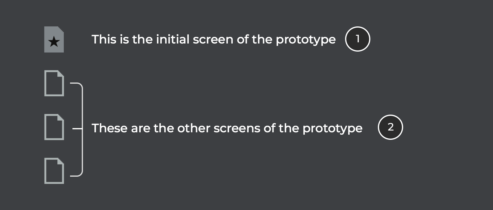
- Initial screen or Home screen. This is the first screen in the prototype, and will load initially when viewing a shared prototype or on a device.
- Screens linked to the Initial screen.
The Widget Library Palette
The Libraries palette allows to add and create custom collections of elements to be used in the current prototype or any other prototype.
To add and manage your Widget libraries, go to the Libraries palette. From the top left-hand corner, click the ‘More libraries’ text to be taken to the “Configure Libraries” dialog. This dialog contains all your available libraries, including the ones you’ve created. From this dialog, you can add Widget libraries to and remove Widget libraries from Justinmind’s editor.
Learn more about managing your Widget libraries.
The plus sign on the palette allows to create a new library. Please refer to the appropiate sections in the user guide to learn how to create your own widget libraries. In this same palette you can search for specific widgets and configure the way the list of widgets are displayed in the palette.
The Canvas
Design your prototype’s screens, templates and masters by adding elements onto the Canvas. It displays the active screen, template or master.

Zoom in and out of the Canvas typing the zoom level in Justinmind’s toolbar, the shortcuts CTRL + (CMD + in Mac) and – or pinching on the trackpad. You can also use the options available next to the zoom indicator in the toolbar, such as the zoom tool or different pre-defined zoom levels.
Adjust the prototype design to the pixel and arrange and align widgets with the following view options. Each can be activated/deactivated in the View menu:
- Rulers: it allows to create guides that can be used to align elements in the Canvas. You can create or delete guides by right clicking on the rulers.
- Guides: lines that go all the way from side to side and up and down that are used to align elements in the Canvas. To create a guide, right click anywhere within the horizontal or vertical rulers and select to create a guide. You can then drag the guide to the desired position on the Canvas. To delete a guide, right click on it and select “Remove Guide”.
The guides created in a Screen belong to that screen but the guides created on a Template show up in all the screens that are using that template. - Grid: a grid to align elements on the Canvas. When the grid is activated, a set of vertical and horizontal dots are displayed on the Canvas background. The grid isn’t displayed during simulation. Select the “Snap to grid” option from the “View” option in the main menu, to enable UI elements automatically align with the nearest grid line.
- Snap to geometry: snap elements into position in relation to surrounding elements. These green highlights appear when hovering over a UI element or dragging an element vertically/horizontally. Blue vertical/horizontal lines appear on the edge of nearby elements. Hold the “Alt” key while dragging the widget to avoid snapping.
- Smart Guides: guides that show an element’s size and positioning on the Canvas in relation with the sorrounding elements.
The Properties palette
The Properties palette provides all the tools necessary to change any style property for the selected element plus some specific configuration properties for that element.
The top section of the palette shows the type of element that is selected at that moment. Next to it, there are two icons to configure two properties: Hidden and Always on top. The ‘Hidden’ icon configures the selected element to be visible or not when the simulation is launched. The ‘Always on Top’ icon controls if the selected element will show up always on top of the rest of the elements in the simulation.
Here’s an overview each sub-section of the Properties palette. To start modifying a UI element, select it on the Canvas and go to the Properties palette.
Position
- X/Y: define the X and/or Y position of the element on the Canvas with the spinners provided. You can use decimals of a pixel if you need to.
- Pin icon: check this option to display additional positioning options to design responsive prototypes. See more in the “Pin position options” section below.
Pin position options:
If the pin position icon is enabled, two drop downs will show up next to the X and Y position input fields. Each drop down allows to define the different pin options for each coordinate independently.
Size
- Width: define the width of the element. Next to the input there’s a drop down to select if the width is defined as a number of pixels or a percentage of the width of the container where the element is in.
- Height: define the height of the element. Next to the input there’s a drop down to select if the height is defined as a number of pixels or a percentage of the width of the container where the element is in.
- Keep proportions icon: click this icon to force that every time the height or width are changed they keep the current proportions.
Text
Text UI elements have the following text properties:
- Typeface: select a typeface from the drop-down. Typefaces are loaded from the ones installed in your computer.
- Font style: select the font style from the drop-down. The styles available will be the ones defined by the typeface.
- Size: select a font size (in points) from the drop-down
- Color: – change the font color from the drop-down
- Underline and Strikethrough icons: additional decoration options for the text.
- Horizontal alignment: define the horizontal alignment of the text: left, centered or right.
- Vertical alignment: define the vertical alignment of the text: top, center or bottom.
- Bullet points: add bullet points to the text. A bullet will be added to the text each time there is a break line character.
- Line: adjust height of the lines of text (in pixels) with the spinners provided
- Fit text icons: use this controls to define if the size of the text box will be defined by the text content or manually.
Blending
Blend Modes allow you to define how you want two layers to blend together. This involves taking the pixels from each layer and applying calculations to them. This allows you to adjust aspects of an image, like the background color. Or, create interesting overlays and textures.
- Multiply: Looks at the color information in each channel and multiplies the base color by the blend color. The result color is always a darker color. Multiplying any color with black produces black. Multiplying any color with white leaves the color unchanged. When you’re painting with a color other than black or white, successive strokes with a painting tool produce progressively darker colors. The effect is similar to drawing on the image with multiple marking pens.
- Screen: Looks at each channel’s color information and multiplies the inverse of the blend and base colors. The result color is always a lighter color. Screening with black leaves the color unchanged. Screening with white produces white. The effect is similar to projecting multiple photographic slides on top of each other.
- Overlay: Multiplies or screens the colors, depending on the base color. Patterns or colors overlay the existing pixels while preserving the highlights and shadows of the base color. The base color is not replaced, but mixed with the blend color to reflect the lightness or darkness of the original color.
- Darken: Looks at the color information in each channel and selects the base or blend color—whichever is darker—as the result color. Pixels lighter than the blend color are replaced, and pixels darker than the blend color do not change.
- Lighten: Looks at the color information in each channel and selects the base or blend color—whichever is lighter—as the result color. Pixels darker than the blend color are replaced, and pixels lighter than the blend color do not change.
- Color Dodge: Looks at the color information in each channel and brightens the base color to reflect the blend color by decreasing contrast between the two. Blending with black produces no change.
- Color Burn: Looks at the color information in each channel and darkens the base color to reflect the blend color by increasing the contrast between the two. Blending with white produces no change.
- Difference: Looks at the color information in each channel and subtracts either the blend color from the base color or the base color from the blend color, depending on which has the greater brightness value. Blending with white inverts the base color values; blending with black produces no change.
- Exclusion: Creates an effect similar to but lower in contrast than the Difference mode. Blending with white inverts the base color values. Blending with black produces no change.
- Hue: Creates a result color with the luminance and saturation of the base color and the hue of the blend color.
- Saturation:Creates a result color with the luminance and hue of the base color and the saturation of the blend color. Painting with this mode in an area with no (0) saturation (gray) causes no change.
- Color: Creates a result color with the luminance of the base color and the hue and saturation of the blend color. This preserves the gray levels in the image and is useful for coloring monochrome images and for tinting color images.
- Luminosity:
Creates a result color with the hue and saturation of the base color and the luminance of the blend color. This mode creates the inverse effect of Color mode.
Background
- Checkbox: use this check box to define if the element has or has not a background.
- Color: click to change the background color with the color picker dialog that shows up. You can select a color or gradient and combine them with background images.
- Transparency: define the transparency of the element with the spinners provided or entering a %.
- Add Image: use this option to select and configure a background image for the selected element.
Border
- Checkbox: use this check box to define if the element has or has not a border.
- Border color: select the color of the element’s border.
- Border width: define the width of the borders with the spinners provided.
- Border type: select the line type from: none, solid, dotted or dashed.
Other options
- Rotation: indicate the number of degrees of rotation of the selected element.
- Opacity: define the transparency of the entire selected element.
- Round: defines the level of roundness of the corners of the element. They can also be defined independently.
Effects
-
- By clicking on the “+” the effects are enabled. Each effect has its own properties that can be accessed by clicking on the nut. You can also change the position and remove them by clicking the icons on the right.
- Drop Shadow: Adds a shadow that falls behind the contents on the layer.
- Inner Shadow: Adds a shadow that falls just inside the edges of the layer’s content, giving the layer a recessed appearance.
- Blur: Blurring an element gives it a nice look, enhances it by providing a shallow depth of field which is pleasing to the eye.
- Brightness: The amount of white or black mixed in with the color. It’s also calculated as a percentage value between 0% and 100%.
- Contrast: When increasing contrast, you make the darks darker and the brights brighter. This increases the difference or distance between them.
- Grayscale: The grayscale function converts the input element to grayscale. The value of amount defines the proportion of the conversion.
- Hue: You can modify the full spectrum colors found on the color wheel: red, orange, yellow, blue, green, and violet.
- Invert: The action Invert makes the colors on the selected element become their opposites on the color scale.
- Saturate: Saturation makes colors more vivid, is the strength of a surface colour, its degree of visual difference from neutral grey.
- Sepia: A tone added to a black and white element in the darkroom to “warm” up the tones (though since it is still a monochromatic image it is still considered black and white).
The Layers palette
You can select, organize and control the elements of the canvas using the Layers palette.
- “Eye” icon: toggle to show or hide an element on the Canvas to make it easier to select something below it. This property doesn’t hide the element in the simulation. Use the option in the Properties panel for that instead.
- Element groups: – toggle to expand or collapse a group contents or the elements within a container.
- Move element buttons: define the order of the elements in the canvas using this arrows. You can also use drag and drop within this palette instead.
The Data Masters palette
This palette lists the Data Masters in the current prototype. Data Masters are a centralized way to define data that emulates a Data Base. You can learn how to use Data Masters here. The following are the details of the Data Masters palette:

- New Data Master: use this option to create a new Data Master. When this icon is clicked, the following dialog will show up:
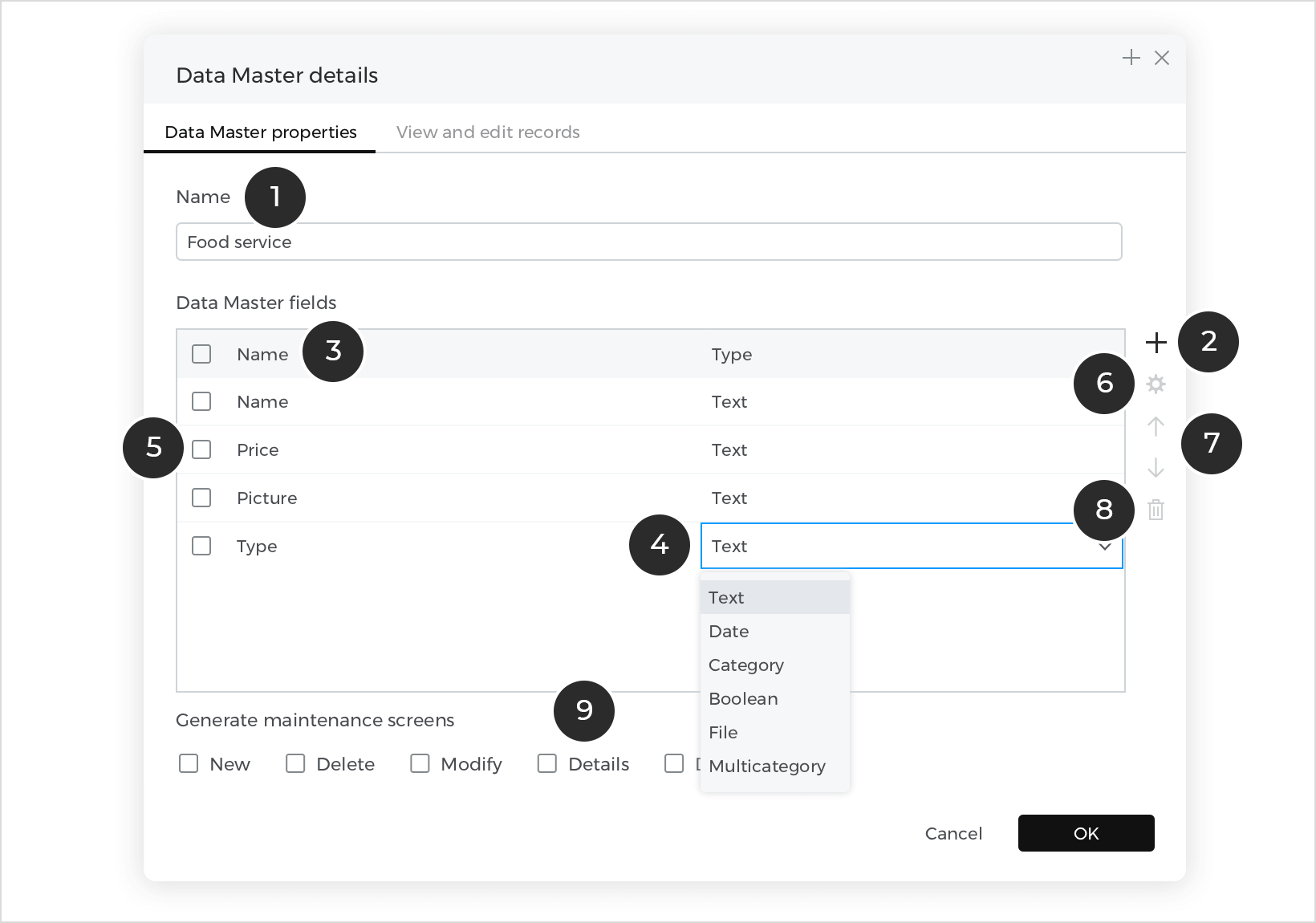

- Name the Data Master
- Add fields to the Data Master
- Name the fields
- Select the field type
- Select a specific field
- Modify field properties
- Move field positions
- Delete a field
The ‘View and Edit records’ tab in the Data Master contains these operations:
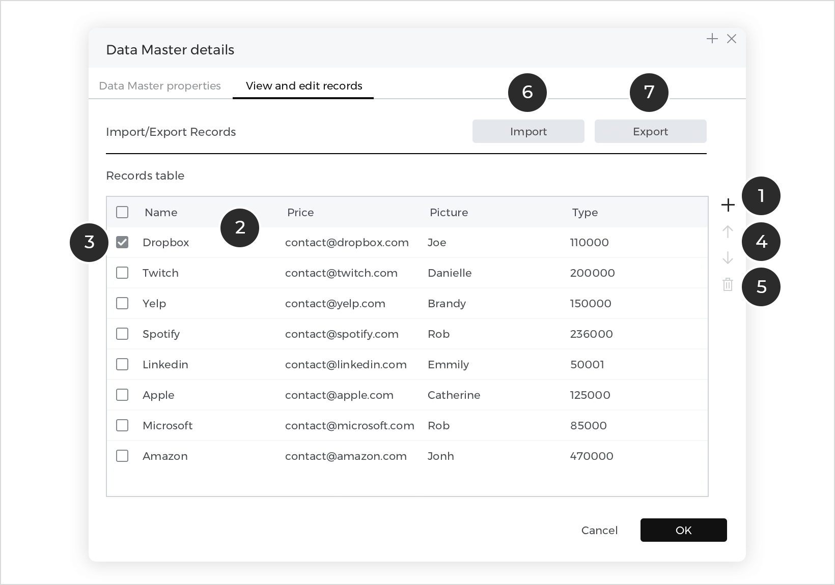

- Add new records to the Data Master
- View the records in the Data Master
- Select a specific record
- Move record positioning
- Delete a selected record
- Import records from a .csv file.
- Export records from the Data Master
- Create Data Master from CSV file: use this option to import a CSV file and create a Data Master from its contents.
- Data Master: Data Masters are listed with their names and their attributes as sub elements. Dragging the Data Master to the canvas will automatically create an input form.
- Data Master Attribute: the attributes of the Data Masters are listed with their names. Dragging an attribute to the canvas will create an input field and a label.


Data Master categories
Data Master fields can be the following types:

Text – select a field with this type and click the ‘gear’ icon to see further customizable properties:

Date – select a field with this type and click the ‘gear’ icon to see further customizable properties:

Category – select a field with this type and click the ‘gear’ icon to see further customizable properties:
Click the ‘+’ icon to add new items to the category.
Select from the added categories in the ‘View and Edit records’ tab.
True/False – select the value in the ‘View and Edit records’ tab.
File upload (image) – upload or remove an image in the ‘View and Edit records’ tab.
Multi-category – select a field with this type and click the ‘gear’ icon to see further customizable properties:
Simulating prototypes
Click on the “Play” icon on the top right section of the mail toolbar to show the simulation window, which will display the current screen on the Canvas.
To change the simulation settings, select “File – Simulate – Settings” from the main menu. The following dialog will appear:
- Screen content (for web prototypes): specify if the prototype will expand to the browser’s width, or be restricted to its designed width during simulation
- Scale: define how prototype is to be simulated:Fit to screen size – fit the prototype to the selected device’s screen resolution
or
Custom – choose a custom scale % - Include top bar: include top bar in simulation mode. The top bar includes options related to comments and allows you to navigate between different screens.
- Highlight interactive elements: makes the interactive elements in the simulation blink if the user clicks on something that is not interactive.
- Include scenarios: include the list of scenarios in the simulation so the reviewers can see them.
- Include requirements: include the list of requirements in the prototype.