UI widget libraries
In addition to basic elements in the Toolbar, there are thousands of other pre-made assets you can add to Justinmind for free. You can also create your own custom shareable libraries to define consistent brand design systems.
Justinmind pre-made assets
Pre-installed libraries
The Justinmind team has created dozens of interactive widget libraries you can include in your prototypes. It’s easy to add them to your Justinmind interface:
- Look over to the Libraries palette. You may find a few libraries already listed here depending on which device you’re prototyping for.
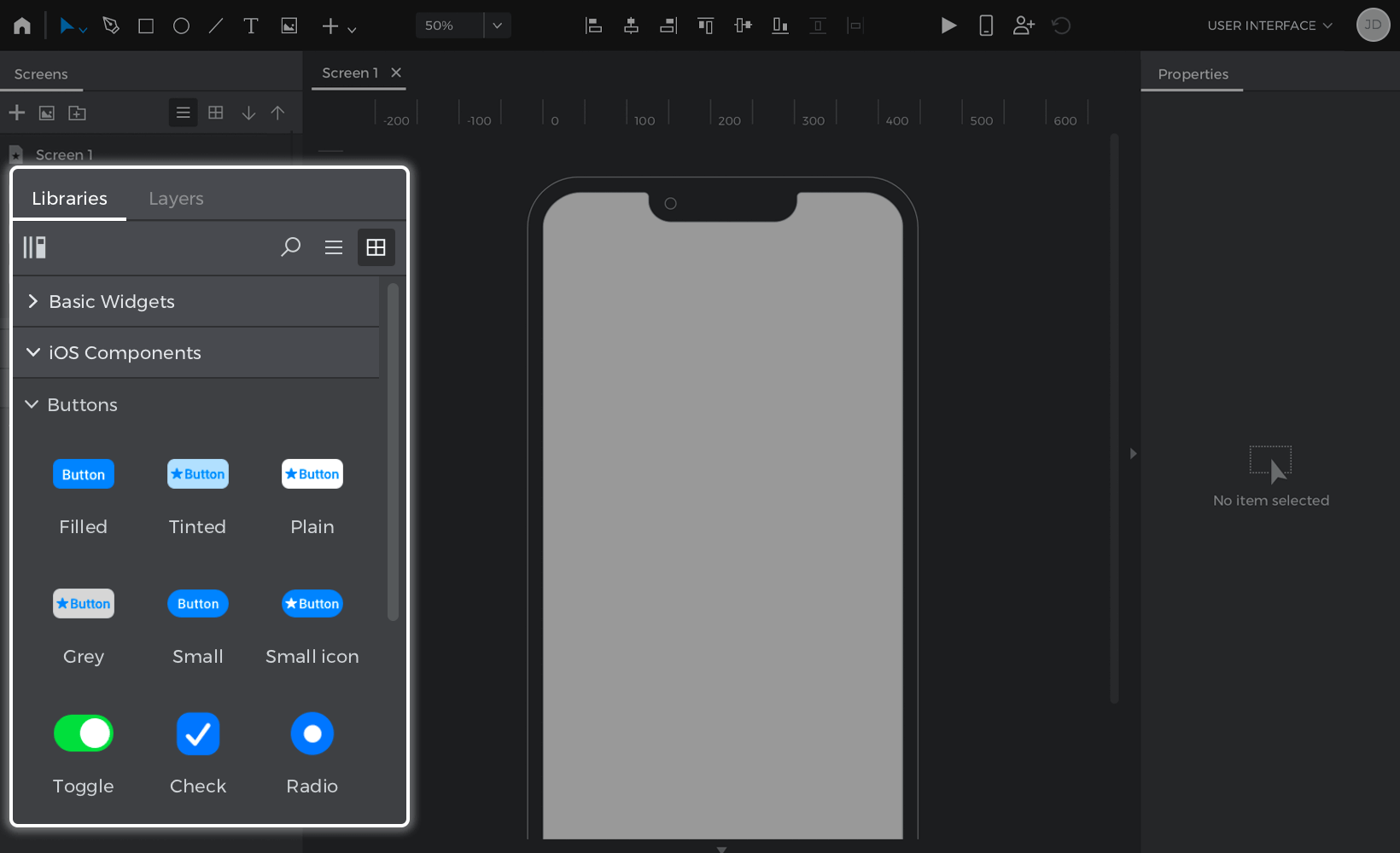
- Click on the ‘More libraries’ text link, which will open a pop-up list of libraries, like iOS icons, Diagrams, and Web Components. Tick the check boxes of the libraries you’d like to add and click “OK”. They’ll be imported into the Libraries palette.
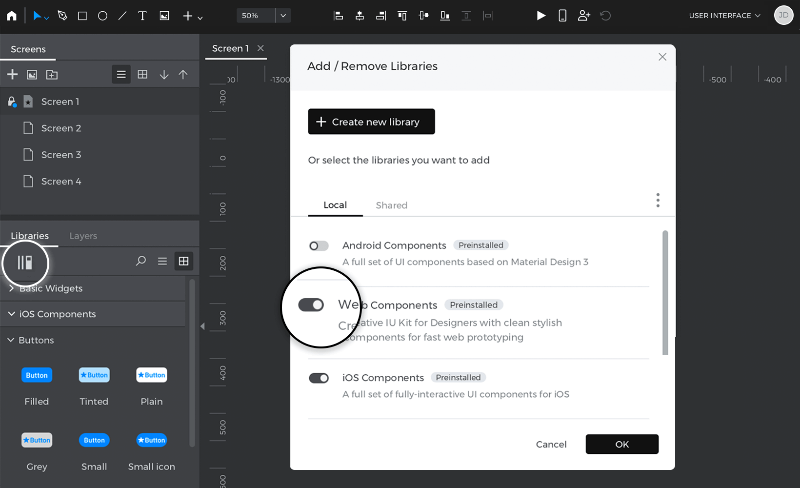

You can now drag and drop elements from those libraries into your prototypes. Untick the check boxes in the pop-up to remove libraries from the palette.


Downloadable libraries
There are even more libraries you can import into Justinmind for free:
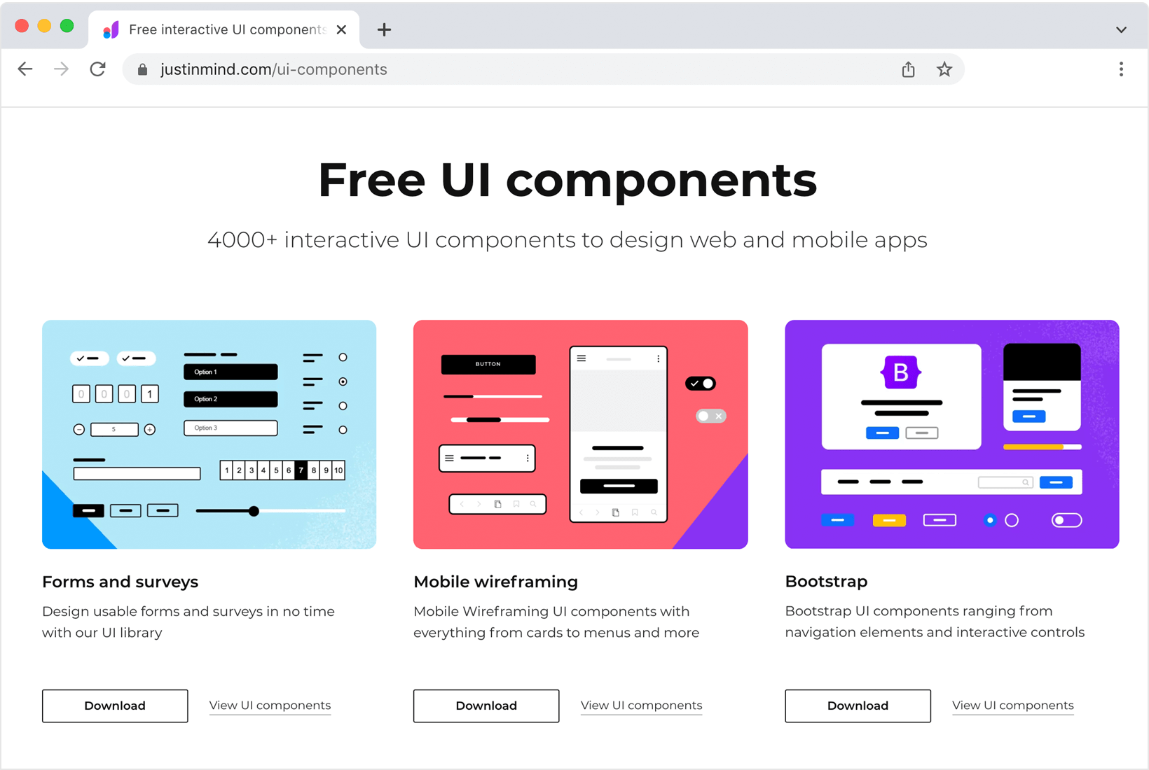
- Click on the ‘More libraries’ text link and tap the ‘Download more widget libraries’ button in the pop-up, which will open a web browser loaded to a list of UI kits.
- Download a library you’d like to use.

- Back in the ‘More libraries’ pop-up, click the ‘Import library’ button. Select the library file (.jpl) you downloaded to import from the file browser.
- Tick the library’s check box to add it to the Libraries palette.

Custom libraries and design systems
Build custom element libraries and share them with your teammates to create a single source of truth for your designs. Combined with Templates and Masters, you can easily develop and maintain unified branding with custom shared libraries.
Create a custom library
- Look to the Libraries palette and click the ‘+’ button to create a new widget library. Give it a title and description and click ‘OK’. You’ll see your new library in the Libraries palette.
- Libraries have four different categories that you can define: Colors, Text Styles, Components and Assets. The sections below explain how to add and use the content in those categories.
Adding and using colors in a library
- In order to add a set of colors to a library, that library has to be in ‘Edit mode’. You get into ‘Edit mode’ right away just after creating a library but you can also enable that mode by clicking on the gear icon in a library and selecting ‘Edit library’.
- There are two ways to add colors to a library. One is to click on the ‘+’ icon next to the word ‘Colors’. A color picker will show up and you can use it to select the color you want and to give it a name.
- You can also add colors to a library by dragging an element from the canvas onto the ‘Colors’ section. The colors being used by that element will be automatically added to the list.
- Once you have colors in the ‘Colors’ section, you can use them with the elements in the canvas. There are two ways to assign a color from the library to an element in the canvas. One is to drag the color on top of the element. A pop up will show up to select what part of the element you want to color. The other way is to click on any color picker in the ‘Properties’ palette. In the color picker that shows up, you’ll see the list of all the colors in the libraries that you’re using listed at the end of the dialog. They are the ones with a small white rectangle.
- Once you have used a color in the library with a component in the canvas, that elements gets linked to that color. So if at any point you change that color in the library (by double clicking on it or right clicking and choosing ‘Edit’), all the elements in the prototype that were using that color, will change automatically.
Adding and using text styles in a library
- In order to add a set of text styles to a library, that library has to be in ‘Edit mode’. You get into ‘Edit mode’ right away just after creating a library but you can also enable that mode by clicking on the gear icon in a library and selecting ‘Edit library’.
- There are two ways to add text styles to a library. One is to click on the ‘+’ icon next to the word ‘Text Styles’. A dialog will show up and you can use it to define the style text you want and to give it a name.
- You can also add text styles to a library by dragging an element with text from the canvas onto the ‘Text Styles’ section. The text style being used by that element will be automatically added to the list.
- Once you have text styles in the ‘Text Style’ section, you can use them with the elements with text in the canvas. There are two ways to assign a text style from the library to an element in the canvas. One is to drag the text style on top of the element. The other way is to click on the drop down that says ‘No text style’ in the ‘Properties’ palette. That drop down will list all the text styles in the libraries that you’re using.
- Once you have used a text style in the library with a component in the canvas, that elements gets linked to that text style. So if at any point you change that text style in the library (by double clicking on it or right clicking and choosing ‘Edit’), all the elements in the prototype that were using that text style, will change automatically.
Adding and using components in a library
- Design an element or group of elements on the Canvas. You can also add interactions like Mouse Over and Swipe effects.
- To add an element to a library, drag it from the Canvas to the ‘Components’ section in the library in the Libraries palette. You can also right-click on an element, go to ‘Add to Widget Library’, and select the library.
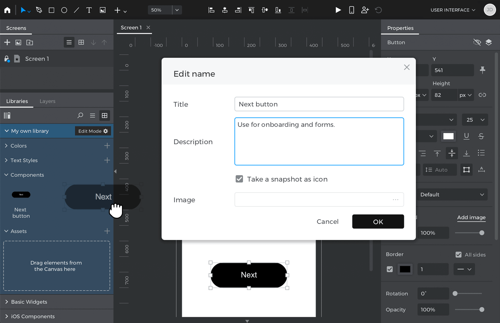

Next, write in a name and description for the element and click ‘OK’. - You can now drag and drop it from the library onto the Canvas to use in your prototypes.

Adding and using graphical assets in a library
- Graphical assets or ‘Assets’ are image files that can be used in the prototype as images or background images. In order to add graphical assets to a library, that library has to be in ‘Edit mode’. You get into ‘Edit mode’ right away just after creating a library but you can also enable that mode by clicking on the gear icon in a library and selecting ‘Edit library’.
- There are two ways to add a graphical asset to a library. One is to click on the ‘+’ icon next to the word ‘Assets’. A file dialog will show up and you can use it to select an image file from your computer.
- You can also add assets to a library by dragging an image, a path or several paths to the ‘Assets’ section.
- Once you have assets in the ‘Assets’ section, you can use them with the elements in the canvas. You can drag an asset on the canvas and it will create an image in the prototype using that asset. If you drag the asset on top of another image, the image will get replaced by the one dragged. If you drag it on top of another type of element, then the asset will be used as background image for that element.
- Once you have used an asset in the library with the prototype, that asset gets linked to everywhere it has been used. So if at any point you change that asset in the library (by double clicking on it or right clicking and choosing ‘Edit’), all the places in the prototype where the asset was being used will change automatically.
Organizing the information in your library
You can organize the elements within the different sections of a library in groups.
- Load the library in the palette, click the ‘gear’ icon and select ‘Edit library’.
- Click on the gear again and select ‘New widget group’.
- A dialog will show up to select what category you want to add the group to and what’s the name of the new group.
- The new group will show up in the selected section. Drag elements within that section to the group to add them to the group.
Edit an already existing library
- Click on the ‘gear’ button next to the library name in the Libraries palette and select ‘Edit library’.
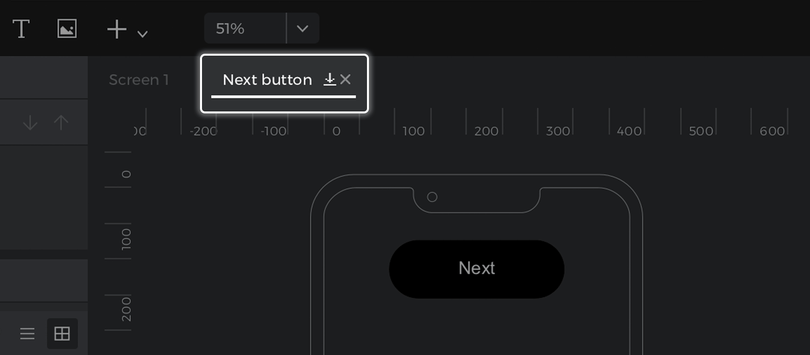
- Right-click on an element you’d like to edit and select ‘Edit details’ to change its name and description or ‘Edit contents’ to change its appearance and content. You’ll see the element open in a new Canvas tab, where you can make changes.
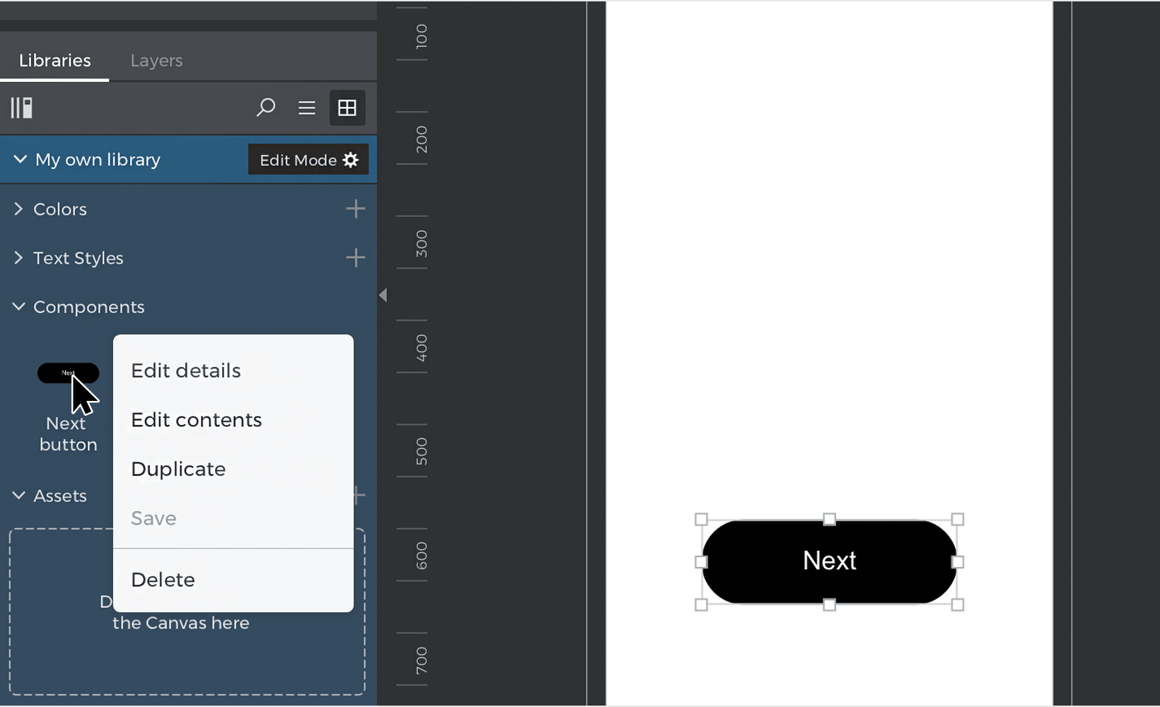

- Click the ‘save’ button on the element Canvas tab to save your changes to the library.


You can open all elements to edit by selecting ‘Edit all widgets’ from the ‘gear’ button pop-up. Make edits individually or go to the Edit menu and select ‘Replace styles’ to edit properties of each element in bulk.
Click ‘Save all widgets’ from the ‘gear’ button pop-up to save your changes to all widgets.
Share a custom library
You can share a custom library with your teammates in just two clicks:
Click the ‘gear’ button next to your library’s name in the Libraries palette and tap ‘Share’.

Your teammates can now add your library to use in their prototypes in the ‘More libraries’ pop-up.
Remove other’s access to your library by clicking the ‘gear’ button and selecting ‘Unshare’.
Commit library changes
Tap on the ‘gear’ button and select ‘Commit’ in the pop-up to upload your library’s changes. Teammates can click ‘Update’ in the ‘gear’ button pop-up for the library to download those updates.

Generate a Design System with one click
Libraries can not only be used as a great way to create consistent designs fast but also as a great tool of communication with developers. Offering developers a way to visualize all the information defined in a library, can help to create consistency and accuracy in the UI of the software projects of that organization. Justinmind offers a way to generate and customize a preview of your library in one click.
- Load the library you want in the Libraries palette.
- Click on the ‘gear’ icon next to the name of the library and select ‘Generate Design System’.
- A new prototype file will be created with all the information in the library (colors descriptions, Text styles defined, the components with their descriptions and the list of assets).
- Since it’s a Justinmind file, you can change anything in it as you’d do with any other prototype or design. You can also publish it and share it with developers or get a link and make it public in a website.