
Navigation is at the heart of great UX. Tree navigation was once a firm favorite but has been replaced by modern alternatives. Here are our top 3
Navigation is one of the most important elements in user experience design. Good navigation design is what allows users to open your app, find their way around and achieve what they want to achieve.
Create new products. Enjoy unlimited projects.

Ideally, your navigation should be straightforward and as easy to understand as possible. If you have poor navigation, your users will get lost in the wilderness of your information architecture and tap out. That’s the last thing you want.
There are many ways to approach navigation and each solution has its own merits and faults.
One common approach is tree navigation, which most people might remember from using Windows, using layers in Photoshop or wading their way through large hierarchies of files.
Then there are other approaches like mega menus, accordions and slide menus.
With more modern approaches to navigation changing today’s UX landscape, especially with the rise of mobile devices, the once ubiquitous tree navigation is slowly falling out of favor as designers create new and improved patterns for navigating user experiences.
In this post, Justinmind will cover the tree navigation basics and give you 3 modern alternatives you can use when creating awesome navigation patterns for your users.
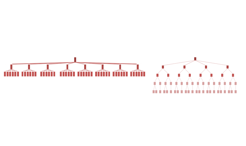
First up, let’s get into what tree navigation is. Tree navigation is a navigation pattern that allows for access to a hierarchical structure.
If you’re big into the outdoors, you’ll be pleased to know that the structure of the tree navigation is broken down into trees, branches, and leaves. However, that’s where nature ends and the computer science terminology begins.
In a tree navigational structure or view, you will have at the top the root node, which can also be referred to as a parent. The lines which connect the elements are the branches and children of the parents, which have no children themselves, are the leaves.
To make life easier, just visualize going through a folder system on your computer. If you’ve ever had to navigate through a maze of folders and documents then you may be familiar with tree navigation. Here’s what it looks like:

Normally, tree navigation displays vertically and there are plus and minus icons to indicate the opening and closing of the folders within the tree.
When it comes to information architecture, there are various ways that you can present content to your users.
Back in the day, it seemed as though tree navigation had a monopoly on navigation but as different patterns are created and popularized, there is more balance to the application of tree navigation in user experience and information architecture design.
Ensuring that information is organized properly and in an order that makes sense to people will lead to good UX. Confusing navigation is never a good thing for your users. Designers invest a lot of time into ensuring a good navigation even at the wireframe stage of design.
Tree navigation is useful if you want to organize information into a deep hierarchy and still want to achieve a good user experience but it’s not going to be easy. There are just better ways of doing things today.
If you use a deep hierarchy in your UX design, try to ensure there are alternative navigation options (or even a good search function) to lead directly to lower levels of the navigation flow. Why? It’s counter-intuitive because we don’t think in hierarchical structures but more in terms of similarity.
The main issue with tree navigation is that it requires a lot from the user. If you have a deep hierarchy like the one above, your user may get lost, distracted, bored or simply give up because there’s a lot of work involved getting to where they want to go.
Plus on a mobile device, it isn’t easy to click through a tree view. The icons are small and our fingers are big. Because of this limitation in the UX, tree navigation is better displayed on a desktop computer.
If you have many options in your tree navigation, the user has to spend time scanning and looking for what they want in the categories given.
This means they might have to guess where they’re going, especially if there are a lot of categories to choose from.
Thankfully, designers can apply Hick’s Law to remedy this by grouping categories more intuitively.
Here are a few other problems with using tree navigation in your designs:
- Navigating trees requires multiple interactions to go from the root to the leaf.
- Nodes are usually small and require a lot of mouse-click precision within a tree navigation. This problem is compounded on mobile devices.
- The further into a tree you go, the more difficult it is to see where you came from as the leaves can obscure the broader context of the taxonomy.
Create new products. Enjoy unlimited projects.
OK, so tree navigation isn’t entirely redundant, it’s simply less present. There is still use for it. It’s still found on Windows. We use it in Justinmind’s prototyping tool for our Outline palette. You’ll see it in Photoshop when you create multiple layers.
It isn’t that tree navigation is a bad pattern. It’s that it was very, very popular for a long time and now there are emerging patterns which work better for different contexts. Let’s take a look at some of those other patterns now and how you can create your own using Justinmind.
To be as efficient as we can, start first by downloading and installing Justinmind. We have a free trial, don’t worry.
An accordion is a design pattern which when clicked expands to reveal information.
Let’s say you have a side panel which has various navigation options within it. One of these might be ‘Inbox’. When clicked, Inbox drops down to reveal other navigation possibilities such as ‘New’, ‘Sent’, ‘Trash’. This is progressive disclosure in action.
Progressive disclosure used in an accordion navigation pattern reduces errors and makes applications easier to learn, according to Nielsen Norman Group. Because you’re showing fewer options there is less chance for your user to become overwhelmed.
They also save space which goes a long way in boosting the usability, especially on mobile devices.
To make your own accordion menu in Justinmind, start a new prototype.
After you’ve created your prototype, you’ll need to combine our dynamic panels with rich Events. By using dynamic panels and ‘On click’ events, your user will be able to easily expand and retract the accordion menu.
A comprehensive overview of designing your own accordion.
Mega menus are quite prolific. They’re great for navigation, if done well. Usually, a mega menu will be made up of large panels which include groupings of navigation options. They’re drop-down, so users hover over a section to reveal the menu.
Since mega menus are big there is a lot of space to fill. This means content can be grouped into sensible categories for easy scanning.
As there is often a lot of space to use in a mega menu, imagery can further improve the usability of the menu and make it easier for users to understand.
Start by creating a new prototype in Justinmind’s website prototyping tool. Since a mega menu is large and takes up a lot of space, this sort of menu is best used on a desktop so start with a web prototype – you can choose your own dimensions.
Then you’ll need to use dynamic panels. Add one to the canvas. Inside of this panel, add another panel. Now you have the menu.
To make it interactive, you will need to add a series of simple Events. These events will be used so that when the user hovers their mouse over the main menu item, the mega menu will appear.
For a more detailed explanation of how to create the perfect mega menu for your prototypes, head over to our support section.
Create new products. Enjoy unlimited projects.
A slide menu also called a hamburger menu because of its icon’s resemblance to a Big Mac, is a useful way to display multiple navigational options without compromising on the retail estate.
The slide menu is a feature found in many applications and websites on mobile devices but it’s common to see it on websites, too.
Because this menu hides many navigational options, there is a discussion about the efficacy of this menu. However, in spite of that, it’s still a go-to for many designers out there.
When using a hamburger menu, try and avoid putting any important links within it for fear they may go unnoticed.
In Justinmind, create a new prototype. Then design the UI as you want it. Be sure to get a good look at all the widgets on offer to ensure that you’re making something that has a great user experience.
Combine our UI widgets with our powerful dynamic panels. This is where you can put all the content for the slide menu. It’ll sit just outside of the view of the main screen of your device. Add power interactions to create the slide movement and a hamburger icon so people know what to click.
Some hamburger menus have the text ‘menu’ written near them to make it clear that the icon is in fact clickable and a menu.
For a full rundown of the slide menu, this tutorial will help.
When it comes to good UX, tree navigation might not be your number one choice. But, it does have its place. Tree navigation is good for users who know exactly what they want and where to find it. But there are alternatives that can help your user get their faster and in a more pleasurable way – the perfect recipe for exceptional UX.
PROTOTYPE · COMMUNICATE · VALIDATE
ALL-IN-ONE PROTOTYPING TOOL FOR WEB AND MOBILE APPS
Related Content
 A fun look at different data table designs, from basic lists to smart, interactive ones, based on how complex the data is and what users need.18 min Read
 Single page design v multi-page design – everything you need to help you choose the right design for your site’s content18 min Read
 Website backgrounds can be a powerful tool in creating an experience. But what kind of experience can you convey and how? We got the full run-through for you!14 min Read


