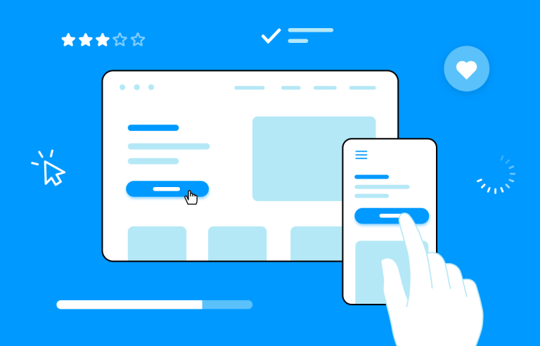
Interaction design allows users to communicate with your product via the interface. Learn more about how they benefit your users!
In today’s digital world, where competition is fierce and attention spans are short, the user experience (UX) is more important than ever. A good UX design can turn a product or service into a beloved brand, while a poor one can quickly drive customers away. Interaction design plays a crucial role in creating such interfaces, focusing on how users interact with digital products and services.
This comprehensive guide will delve into the key principles and best practices of interaction design, providing you with the tools and knowledge to create exceptional user experiences. From understanding user needs to conducting usability testing and ensuring accessibility, we will cover all aspects of the design process.
Time to bring out your interactive prototyping tool and give this a read. Get ready to create a product your users can understand, enjoy, and love with interaction design!
- What is interaction design?
- Core principles of interaction design
- Design process in interaction design
- Elements of interaction design
- Interaction patterns and examples
- Types of interaction
- Feedback in interaction design
- Visual and interaction hierarchy
- Interaction design for mobile
- Interaction design for accessibility
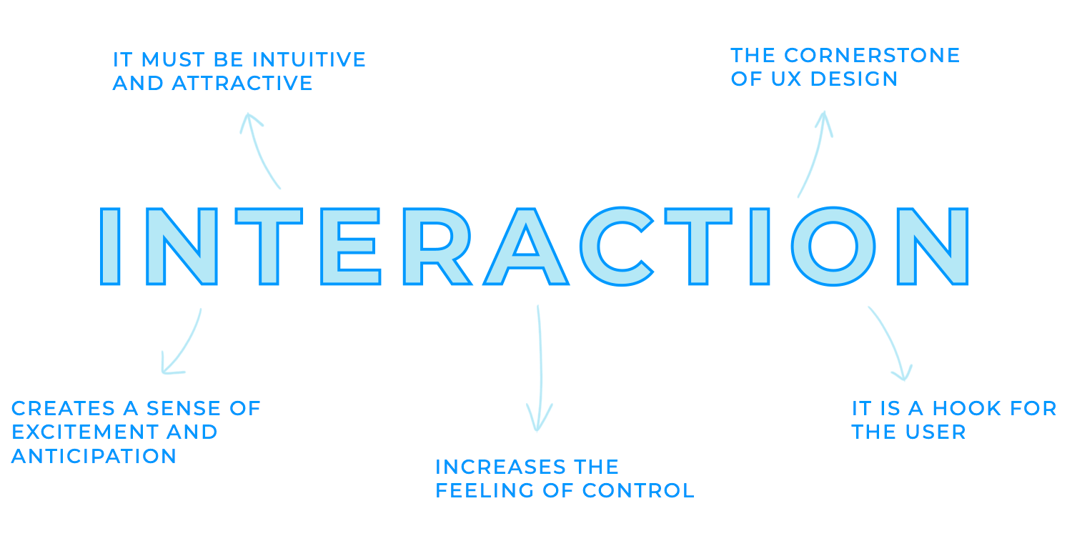
Put in simple terms, user interaction design is the art and science of creating digital experiences that are intuitive, engaging, and delightful. It’s about designing intuitive interactions that create a sense of excitement and anticipation and that make users feel empowered and in control.
While UX design focuses on the overall user experience, interaction design delves deeper into the specifics of how users interact with digital products. It’s the heartbeat that brings a UX design to life.
Whether it’s a playful animation, personalized recommendations, or a sense of accomplishment, well-implemented interaction design can create a sense of excitement and anticipation that keeps users coming back for more.
Interaction design is that added touch of magic that transforms a product into a delightful and memorable experience. It’s about crafting interactions that feel intuitive, engaging, and satisfying.
It helps define the user’s path through a product or service and ensures that the user can easily navigate from one screen or feature to another. The user ends up feeling more in control than when using a static website because it’s like a dialogue between the user and the website or app.
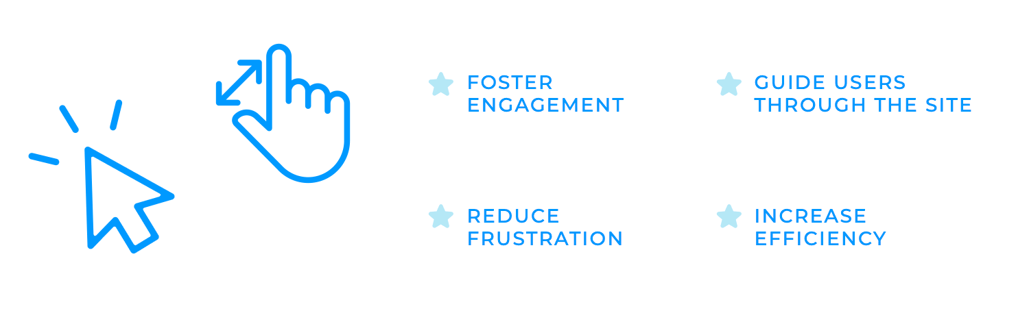
Interaction design plays a vital role in the success of digital products. Imagine a captivating story that keeps you on the edge of your seat, eager to know what happens next. This is the power of engaging interactions. When a product is designed to be fun, exciting, and rewarding, it is more likely that it will foster more engagement with users.
A well-designed product guides users through the website with no hiccups, which makes it easy for users to accomplish their tasks. Interaction design reduces frustration and increases efficiency and, in turn, product satisfaction. This means that more likely than not, users will keep coming back for more!
Interaction design is an art built upon a set of fundamental principles. These principles guide designers in creating intuitive, efficient, and satisfying interactions that delight users.
The first interaction design principle is consistency. Imagine navigating a website or app where buttons change colors randomly, icons have different meanings in different contexts, and the layout shifts unexpectedly. This inconsistency would be incredibly confusing and frustrating for users.
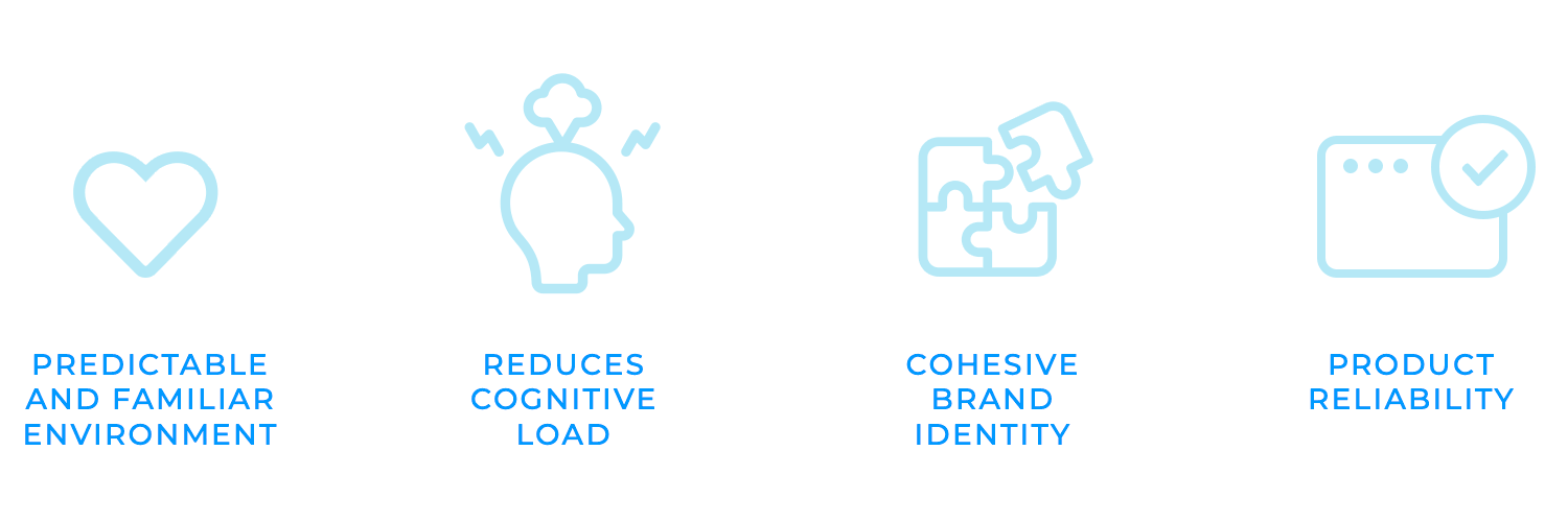
Maintaining uniformity across all elements helps designers create a predictable and familiar environment. Users can quickly learn how to interact with the product, reducing cognitive load and improving overall usability. Consistent design elements also contribute to a cohesive and professional brand identity, reinforcing the product’s value and trustworthiness.
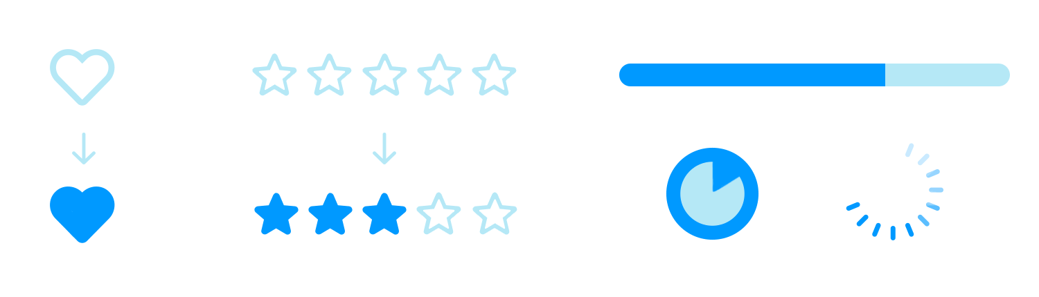
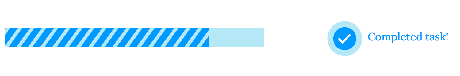
Feedback, the second interaction principle, is like the reassuring pat on the back when you’ve done something right, and the gentle nudge when you’ve made a mistake.
When you perform an action, clear and timely feedback is essential for creating a positive user experience. It confirms that your input has been received and processed, preventing confusion and frustration. For example, when a button changes color as you hover over it, the feedback happens when the color changes to indicate that pressing the button will lead to the desired outcome. Filling in the stars to leave a review on a product or service is another form of feedback.

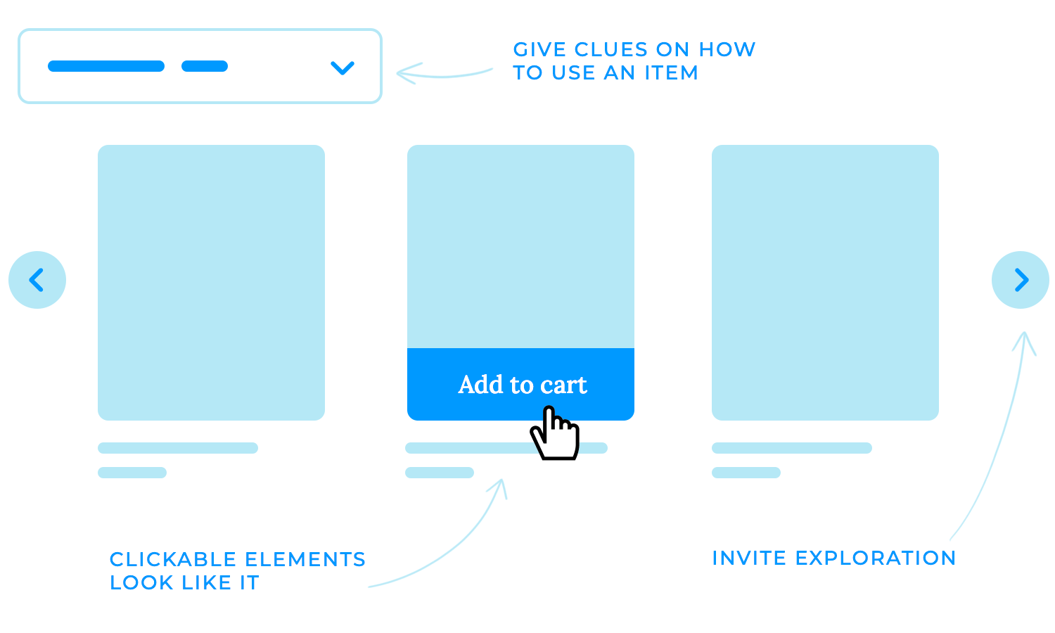
Affordances are like invisible guides, leading users through the interface. This interaction design principle is based on subtle cues that suggest how an element can be used, making it easier for users to understand and interact with it.
In a well-designed website, buttons look clickable, sliders appear adjustable, and drop-down menus invite you to explore. It’s like having a knowledgeable friend who whispers the right instructions in your ear, making your journey through the digital world a seamless and enjoyable one.
Just as a well-written poem evokes emotions with minimal words, a well-designed interface communicates effectively with minimal complexity.
Simplicity is probably one of the most important interaction design principles to keep in mind while working. It is the key to a great user experience. Focusing on essential elements and avoiding clutter helps create intuitive, efficient, and visually appealing interfaces. Clear and concise language ensures that users can easily understand how to interact with elements, while adherence to established design patterns provides a familiar and predictable experience.
This makes it easier for users to accomplish their goals while making interfaces more accessible for those with disabilities.
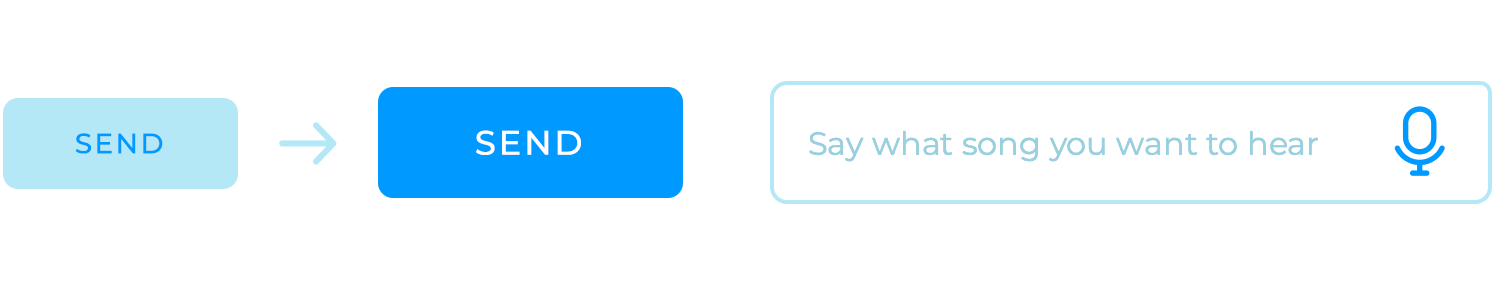
Mapping in interaction design refers to the logical relationship between controls and their effects. It’s like creating a clear and understandable cause-and-effect relationship that helps users understand how their actions will impact the system. Associating visual elements with their corresponding actions or values, helps users understand the system and navigate it effortlessly.
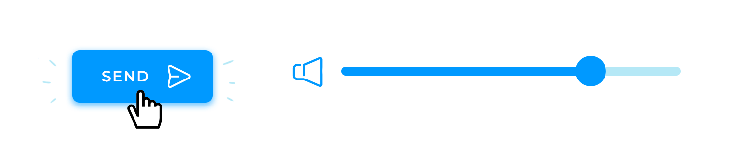
For example, a button labeled “Send” should immediately convey to the user that clicking it will send the form data. Similarly, a slider that controls volume should have a visual indicator that clearly shows the current volume level, making it easy for users to adjust the sound to their preference.
Menus and options should also be organized logically, with items grouped and labeled based on their functions. This helps users quickly find the desired option without any confusion.
Visibility is another one of the most crucial interaction design principles. When users can quickly locate the elements they need, they are more likely to accomplish their goals and feel satisfied with the interaction.
For example, buttons, links, and other interactive elements should be clearly visible and distinguishable from the background. Additionally, using consistent placement and labeling can help users anticipate where to find certain controls, making the interface more intuitive.
To create truly user-centered products, it’s essential to delve deep into the minds of your users. User research is the key to understanding their goals, pain points, and expectations.
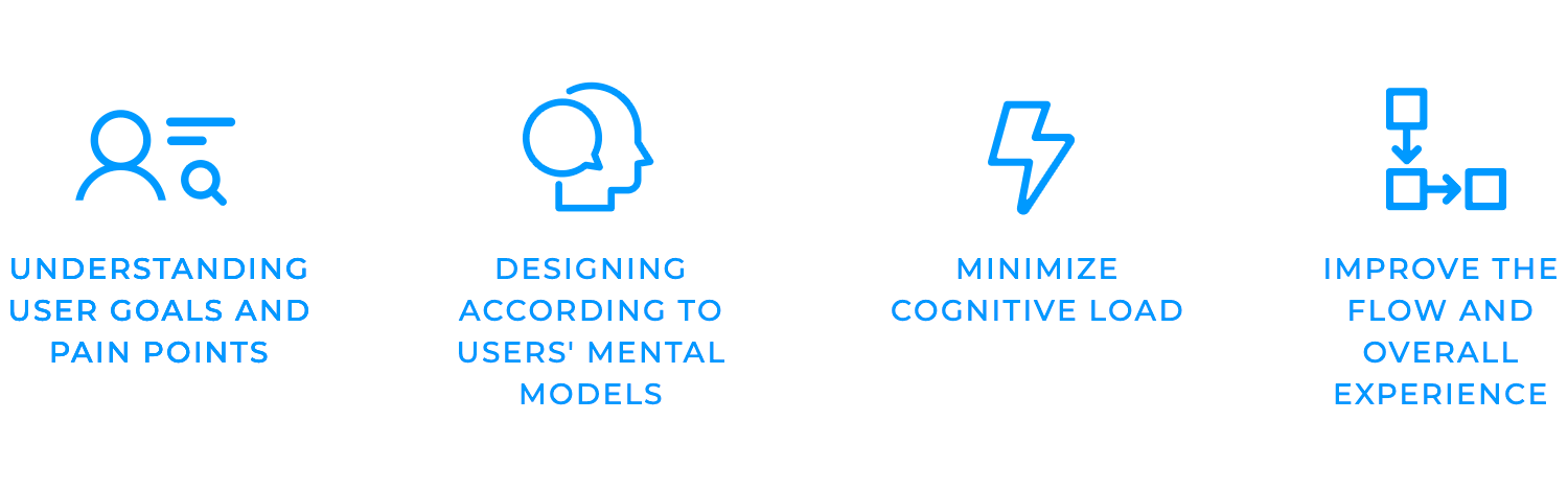
Research is needed to gain valuable insights that empower your decision-making process needs research. This usually includes conducting interviews, surveys, observations, and usability tests.
One benefit of research and discovery is minimizing cognitive load, which is the mental effort required to interact with a system. Minimizing this enables your users to accomplish their tasks and reduce undesired feelings of frustration.
This can be achieved by simplifying tasks, using clear language, and providing helpful feedback. Research can also improve flow, or in other words, the state of being completely absorbed in an activity.
Once you have a solid understanding of your users through research, it’s time to start conceptualizing the design. Defining key interactions involves identifying the essential actions that users will need to perform to achieve their goals.
One way of doing this is establishing patterns that help create a consistent and predictable user experience. Interaction patterns are the building blocks of your user interface. They dictate how users interact with familiar design elements, such as buttons, menus, and forms to make it easier for users to navigate your interface and understand how to interact with it.

Using a wireframe tool to visualize the layout, hierarchy, and flow of information is highly recommended. Creating low-fidelity representations of your interface can help iterate on different ideas and get a sense of how the final product will look and feel.
High-fidelity prototypes are detailed representations of your interaction design that closely resemble the final product. They help you test interactions, gather user feedback, and identify potential usability issues before investing in development.
Another benefit of prototyping would be usability testing, which involves observing the users as they interact with your prototype and collecting their feedback. These tests, more often than not, gain valuable insights into how users perceive your interaction design and identify areas for improvement.
Gathering feedback from users is essential for refining your interaction design and ensuring that it meets their needs. You can identify areas where your design may be confusing or inefficient by listening to their comments, observations, and behaviors.
Iterating on interaction design consists of making changes based on the feedback you receive. This process allows you to continuously improve your design and create a truly user-centered product.
The moment of truth has arrived! After countless hours of research, brainstorming, and design iterations, it’s time to bring your vision to life. Once your interaction design has been iterated upon and finalized, you can start integrating your carefully crafted patterns into the final product.
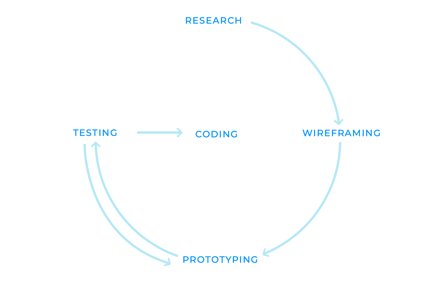
This means it’s coding time! At this point, developers translate your design concepts into functional code, ensuring that the interactions work as intended and align with the overall user experience.
Attention to detail is crucial during this phase. Even a minor inconsistency or bug can disrupt the user’s flow and negatively impact their satisfaction. Thorough testing is essential to identify and address any issues before the product is released.
Microinteractions are the often-overlooked yet powerful elements that can elevate a product’s user experience. Unlike major features or complex workflows, they focus on small, subtle interactions that occur within the larger context of an application. These seemingly insignificant moments can have a profound impact on how users perceive and interact with a product.
Examples of microinteractions in interaction design include the gentle vibration you feel when you like a post, or a toggle button on your smartphone. Other examples include the helpful tooltips that appear when you hover over an element, the subtle animations that indicate the progress of a loading process, or the satisfying sound that confirms a completed action. These may seem trivial but are crucial in making a product feel more responsive, engaging, and enjoyable.
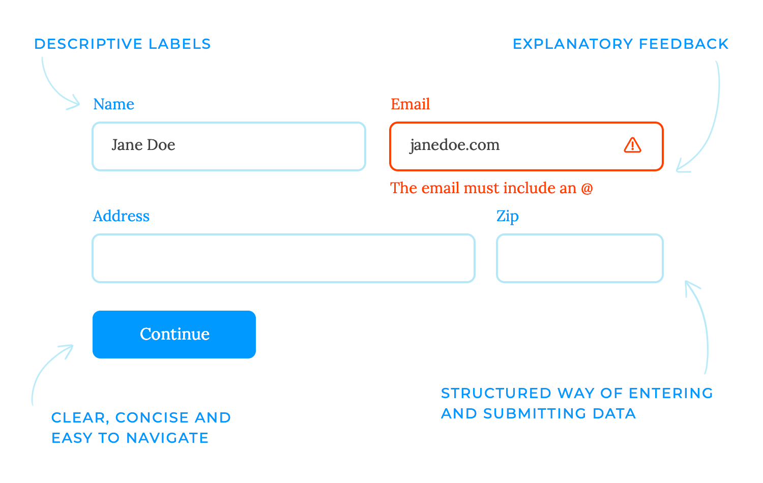
When designing user inputs, it’s crucial to prioritize clarity, accessibility, and ease of use. Inputs should be clear and understandable, avoiding ambiguous labels or confusing instructions. This is essential for creating an inclusive experience.
Finally, inputs should be easy to use and require minimal effort from the user, avoiding overly complex or cumbersome input methods. Remember, everything makes more sense when you get straight to the point!
Feedback mechanisms are the essential signposts that guide users through the digital landscape. They provide vital information about the results of their actions, ensuring that users understand the system’s response and feel in control of the interaction.
Confirmation messages, hover states, animations for completed actions, and other visual or auditory cues are all examples of feedback mechanisms. These elements help users stay informed and engaged, reducing confusion and frustration.
Carefully designing feedback mechanisms helps empower users as they navigate the system, knowing that their actions are being acknowledged and understood.
Navigation systems in interaction design provide the structure and organization that helps users find their way around a product or application.
Menus, breadcrumbs, and search functionalities are common examples of navigation systems. Menus offer a hierarchical structure, allowing users to explore different sections of the application.
Breadcrumbs provide a clear path back to previous pages, helping users understand their current location within the system. Search functionalities allow users to quickly find specific content or features.
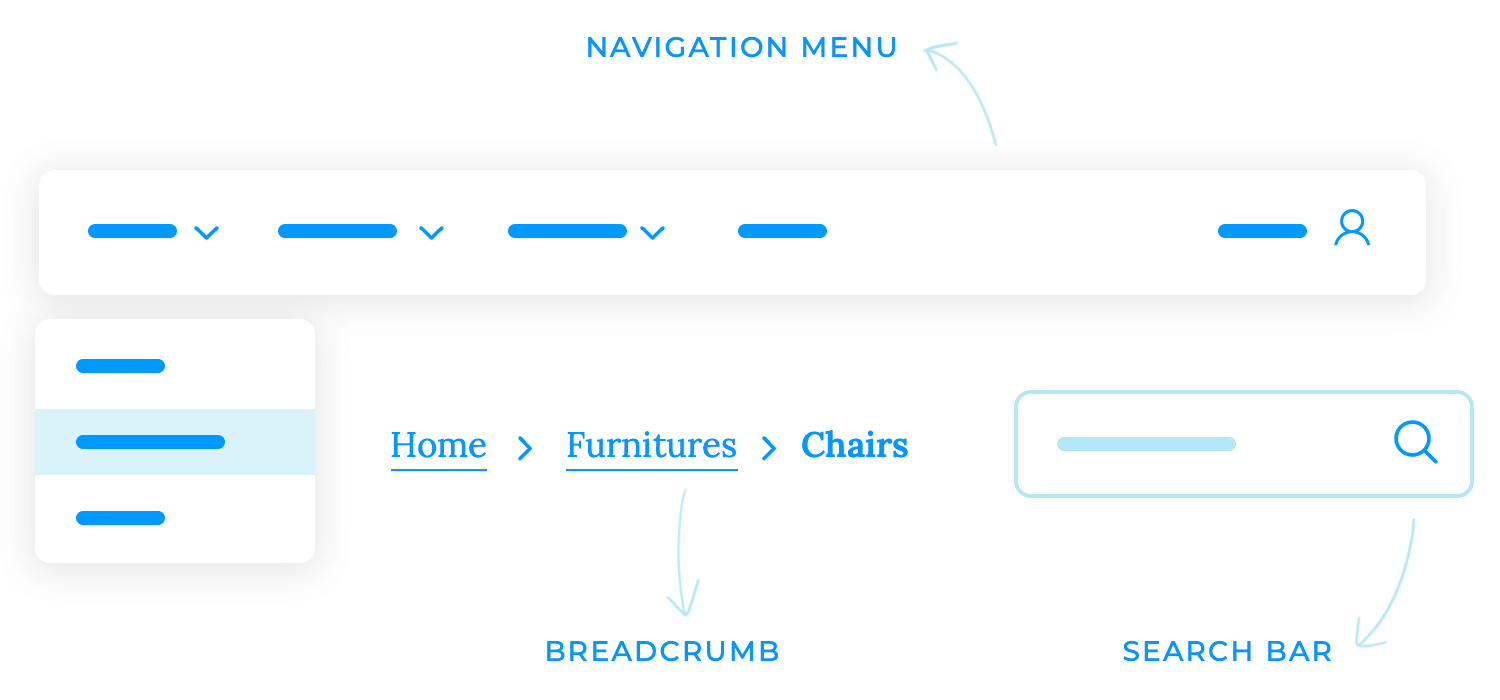
The system’s navigation design should be intuitive and easy to use. It should be clear and consistent, using familiar patterns and terminology that users can easily understand. The information should also be grouped logically and presented clearly and concisely.
Animations and transitions are the polish and garnish to a user interface. They can help to create a sense of flow and continuity between screens or actions, making the user experience more engaging and enjoyable.
For example, a subtle animation can indicate that a loading process is complete, providing visual feedback and reducing perceived wait times. Similarly, a smooth transition between screens can create a more immersive experience.
However, it’s important to use animations and transitions sparingly and purposefully. Excessive use can be distracting and even detrimental to the user experience. Animations should be used to enhance the functionality or aesthetics of the interface, not simply for show.
Affordances and signifiers are the visual cues that guide users through the digital landscape. They are the subtle signals that suggest how an element can be interacted with, making the interface more intuitive and easier to navigate.
Affordances are the perceived properties of an object that suggest how it can be used. For example, a button that appears clickable is an affordance, as it suggests that it can be pressed to trigger an action.
Signifiers are additional cues that provide more information about an element’s function. A tooltip that explains the button’s function is a signifier, providing users with additional context and guidance.

With these, users can quickly grasp how to interact with elements, reducing confusion and frustration and, in turn, helping users navigate the interface with confidence and ease.
Navigational UI patterns are the underlying structure that supports a user’s interaction with a digital product. They provide a framework for organizing content, guiding users through the information architecture, and facilitating efficient task completion.
Global navigation, tab bars, breadcrumbs, and side menus are just a few examples of commonly used navigational patterns. Each pattern has its own strengths and weaknesses, and the optimal choice depends on the specific needs of the product and its target audience.
Global navigation, for instance, is well-suited for large-scale websites with complex information structures. It provides a centralized point of access to all major sections of the site. Tab bars, on the other hand, are particularly effective for mobile apps where screen real estate is limited. They allow users to quickly switch between different primary views or functions.
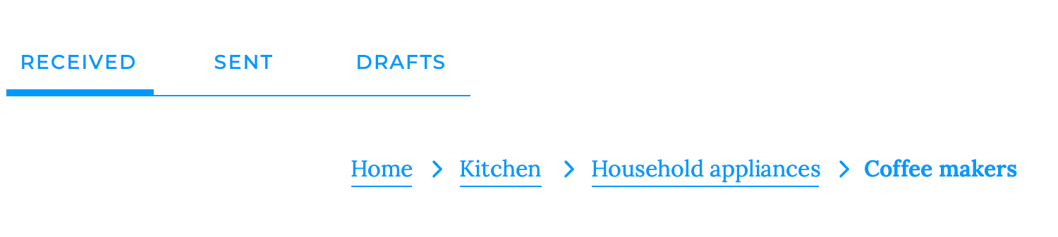
Breadcrumbs offer a clear visual representation of the user’s current position within the site’s hierarchy. They help users understand their context and navigate back to previous pages. Side menus, while often used for secondary navigation, can also be a valuable tool for organizing complex information structures or providing access to frequently used features.
Feedback patterns are essential for establishing trust and transparency between users and digital products. By providing clear and timely information about the status of their actions, users can feel more confident and in control.
Success and failure messages, for example, are crucial for confirming the completion of tasks or informing users of errors. They help to prevent misunderstandings and reduce frustration. Loading indicators and progress bars provide visual cues that help users understand the duration of processes and avoid the perception of inactivity.
Effective feedback patterns should be designed with clarity, timeliness, and relevance in mind. Messages should be easy to understand and avoid technical jargon. They should appear promptly after an action is initiated to avoid confusion. Additionally, feedback should be tailored to the user’s current context to ensure it is relevant and helpful.
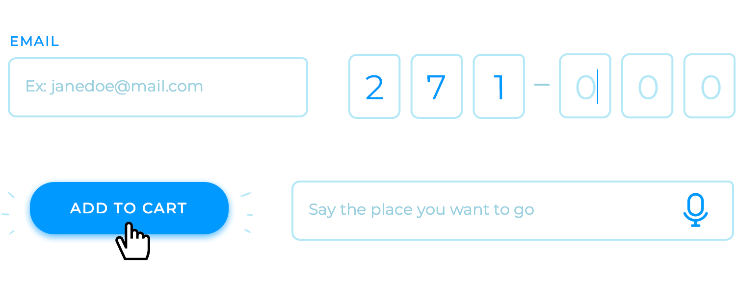
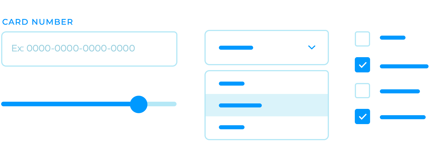
Input control patterns are the fundamental tools that enable users to interact with digital products. They provide the means for users to enter, select, or adjust data, shaping the way they engage with the interface.
Text fields, dropdowns, checkboxes, and sliders are some of the more commonly used input control patterns. Each pattern has its own strengths and weaknesses, and the optimal choice depends on the specific context and the type of data being collected.
Effective input control patterns should be designed with clarity, accessibility, validation, and usability in mind. Labels and placeholders should clearly indicate the expected input, and the controls should be accessible to users with disabilities. Additionally, input controls should validate user input to ensure data accuracy and prevent errors.
Interactive UI components are the lifeblood of modern digital products. They go beyond simple text and images to create dynamic and engaging experiences that captivate users.
UI cards, accordions, modals, and popovers are just a few examples of interactive UI components. Each component has its own unique purpose and can be used to enhance the user experience in different ways. Cards offer a visually appealing and efficient way to present information, while accordions allow users to expand and collapse content as needed.
Modals provide a way to interrupt the user’s flow and present important information or actions, while popovers offer contextual information or options without disrupting the main content.
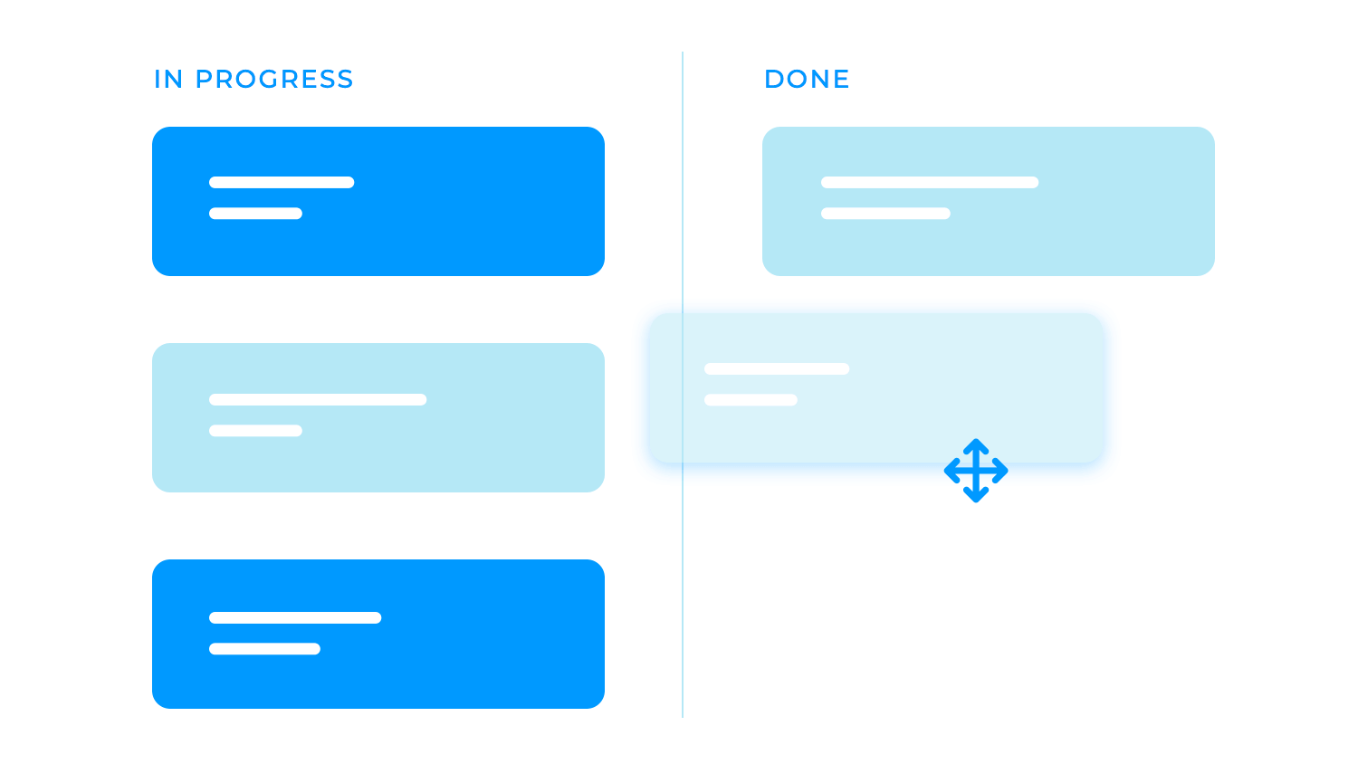
Direct manipulation is a powerful tool in the designer’s toolkit, allowing users to interact with digital content in a way that feels almost tangible. By simulating the physical world, direct manipulation can make complex tasks seem more simple and intuitive.
Take, for example, dragging and dropping files between folders, or resizing images with a simple click and drag. These actions are so familiar to us because they mirror the way we interact with physical objects in our daily lives. This familiarity makes direct manipulation a highly effective and intuitive approach to user interface design.
Form-based interactions are the workhorses of many digital applications, providing a structured way for users to input and submit data. From simple contact forms to complex registration processes, forms are a ubiquitous part of the modern web experience.
While forms may seem straightforward, designing effective forms requires careful consideration. A well-designed form should be clear, concise, and easy to navigate. It should also be visually appealing and provide clear feedback to users.
Gesture-based interactions have revolutionized the way we interact with mobile devices. By leveraging the capabilities of touchscreens, these interactions offer a more intuitive and engaging experience compared to traditional input methods like keyboards and mice.
Swiping, pinching, and zooming are just a few examples of the many gestures that can be used to control applications. These gestures feel natural and intuitive, as they mimic the way we interact with physical objects in the real world.
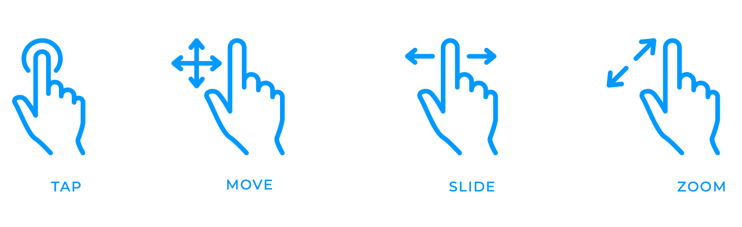
Gesture-based interactions are particularly effective for tasks like navigating through content, zooming in on images, or controlling media players. They allow users to interact with content more fluidly and dynamically, by using your fingers, for example, to move or slide the image or file, making the experience more enjoyable and immersive.
Haptic feedback is a powerful tool for engaging not only our visual and auditory senses — but also our sense of touch. Designers can create a more immersive and satisfying experience when incorporating tactile responses into user interactions.
Vibrations, pressure, and other physical sensations can be used to provide feedback on actions, such as confirming a selection or indicating an error. This can help users understand the system’s response without relying solely on visual or auditory cues.
Haptic feedback can also make interactions feel more tangible and satisfying. For example, the gentle vibration you feel when you press a button on your smartphone can create a sense of physical connection with the device.
In interaction design, voice-based interactions have the potential to revolutionize the way we interact with technology, thanks to the rise of virtual assistants like Alexa and Siri.
This technology allows users to interact with devices and applications using natural language, providing a hands-free and convenient way to get things done.
Designing for voice-based interactions requires careful consideration of factors such as:
- Natural language understanding: The system must be able to accurately understand and interpret user commands.
- Speech synthesis: The system must be able to generate human-like speech responses.
- Context awareness: The system must be able to understand the context of the conversation and respond appropriately.
Immediate feedback is a crucial element in building a positive and engaging user experience. It’s like a digital handshake, acknowledging the user’s input and reassuring them that their actions have been registered and understood.
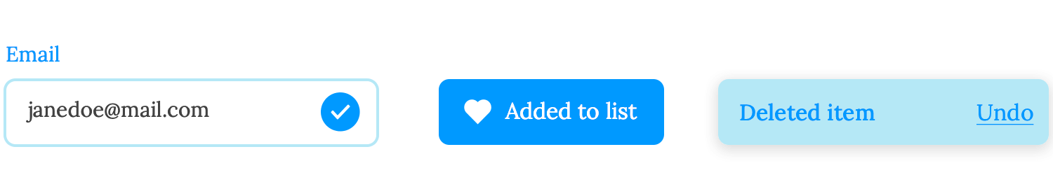
When users receive instant confirmation, they feel more connected to the system and have a greater sense of agency. This can lead to a more enjoyable and satisfying interaction, as users feel like they are actively participating in the process rather than passively waiting for a response.
In essence, immediate feedback is a small but significant detail that can make a big difference in how users perceive a product or application. It’s a subtle yet powerful way to build trust, improve usability, and create a more positive overall experience.
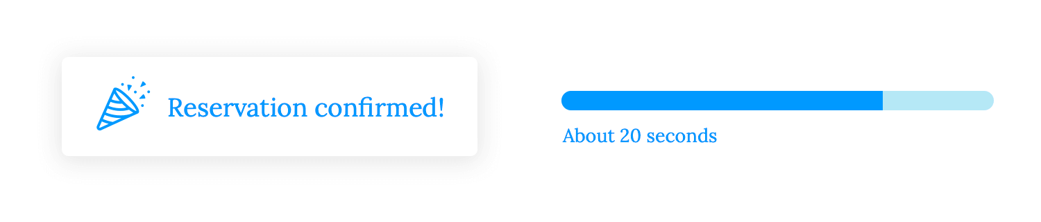
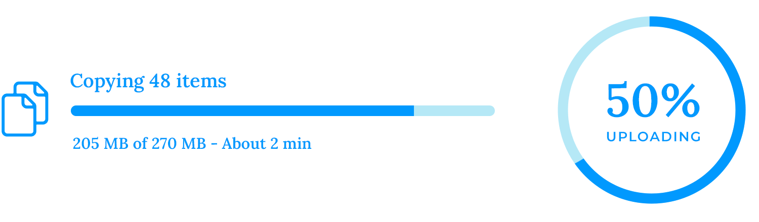
Delayed feedback is like a patient friend, letting users know that the system is working diligently behind the scenes. When actions take time to complete, loading indicators or progress bars can serve as reassuring visual cues, bridging the gap between the user’s input and the system’s output.
These indicators provide a sense of transparency, offering users a glimpse into the system’s processes. By understanding that the system is actively working on their request, users are less likely to feel frustrated or confused. This reduces the risk of users abandoning tasks prematurely, leading to a more positive and satisfying user experience.
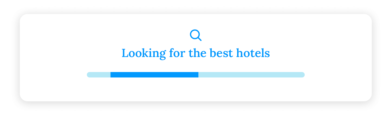
Moreover, loading indicators can help to manage expectations. If users know that a particular action takes time, they are less likely to become impatient. This can contribute to a more relaxed and enjoyable interaction with the system.
System status updates are like friendly reminders, keeping users informed about the system’s progress. Messages like “Saving…” or “Processing…” provide a glimpse into the behind-the-scenes workings of the application, helping users understand the expected wait time and reducing anxiety.
For example, imagine you’re uploading a large file to a cloud storage service. Without system status updates, you might be left wondering if the upload is still in progress or if it has stalled. However, with clear and informative messages, you can track the progress of the upload and anticipate when it will be complete. This helps to reduce uncertainty and frustration, making the overall experience more enjoyable.
Additionally, system status updates can help to build trust between the user and the application. When users feel informed and in control, they are more likely to have a positive perception of the product.
Establishing priorities is the cornerstone of effective user interface design. It involves carefully considering which elements should be most prominent and visually appealing to guide user attention.
For instance, larger CTA buttons can be used to emphasize important calls to action, making them stand out from the rest of the interface. Bold headlines can be used to draw attention to critical information or headings, providing a clear visual hierarchy.
Progressive disclosure is a clever design technique that helps to avoid overwhelming users with too much information at once. It’s like unwrapping a gift slowly, revealing the contents piece by piece.
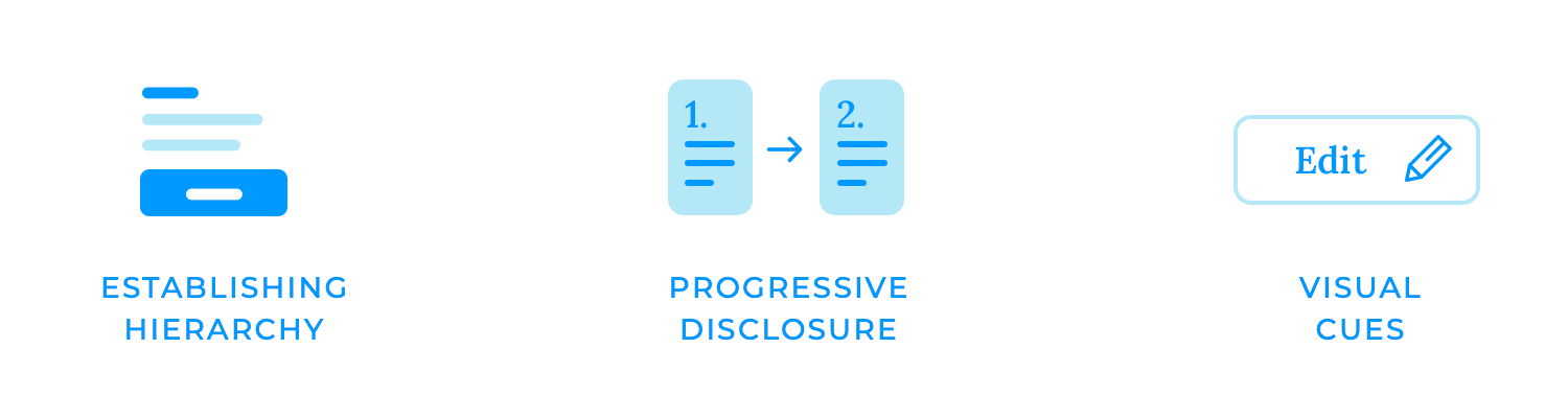
Revealing information or actions can gradually make the interface feel less overwhelming and more manageable. This can be achieved through techniques like expandable sections, modal windows, or tooltips. When users aren’t bombarded with too much information at once, they can focus on the task at hand and make better decisions.
For example, an expandable section might initially show a summary of information, with the option to click on a button to reveal more details.
Visual cues are the silent guides that lead users through the digital landscape. By using colors, icons, and animations, designers can make clickable or interactive elements stand out and encourage user interaction.
Colors can be a powerful tool for indicating clickable elements. For example, a button might change color when hovered over, signaling to the user that it is interactive. Icons can also be used to visually represent actions or features, making them more easily recognizable.
Finally, animations can add a touch of dynamism to the interface, drawing attention to interactive elements and making them more engaging.
Touch-based interaction is the cornerstone of mobile user interfaces. Unlike traditional desktop computers, mobile devices rely heavily on touchscreens for input. To create effective mobile experiences, designers must optimize UI elements to accommodate the unique characteristics of fingers.
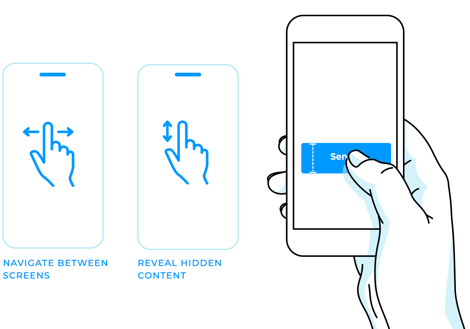
One of the most important considerations is button size. Since fingers are relatively large compared to screen sizes, buttons should be designed to be easily tappable. Larger buttons reduce the likelihood of accidental taps and improve accuracy.
Additionally, swipe gestures are a natural and intuitive way for users to interact with mobile interfaces. For example, swiping left or right might be used to navigate between screens while swiping up or down could reveal hidden content.
Gestural navigation, as mentioned previously, refers to pinching and zooming, for example, that allow us to effortlessly adjust the scale of content, whether it’s an image, a map, or a webpage.
Tap and hold gestures can reveal additional options or context menus, providing quick access to hidden features, and swiping up or down is a familiar and intuitive way to navigate through content, making it easy to explore and discover new information.
Mobile devices come in a wide range of shapes and sizes, from small smartphones to larger tablets. To ensure a consistent and optimal user experience across all devices, designers must create responsive and adaptive designs. This means that the interface should automatically adjust to fit different screen sizes and orientations, regardless of the device they are using.
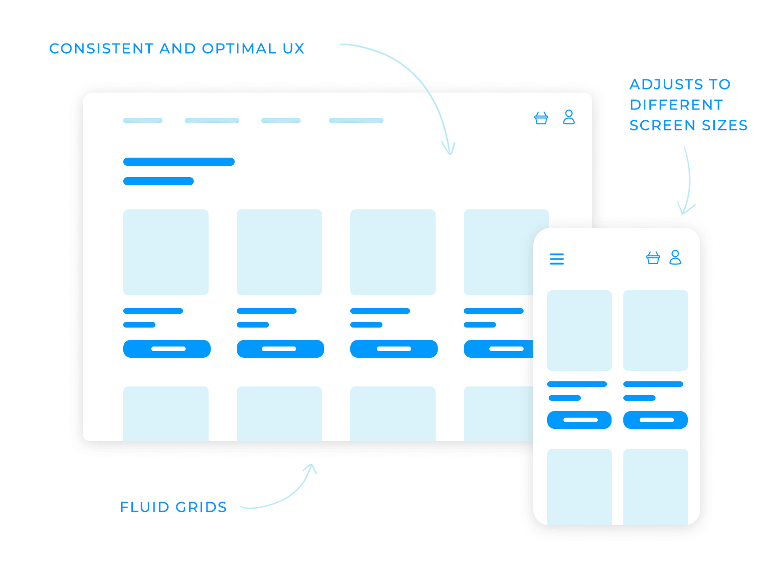
Responsive design involves using flexible layouts and fluid grids that adapt to the screen size. This allows the content to be displayed effectively on different devices without requiring significant changes to the design. Adaptive design takes a more targeted approach, tailoring the interface to specific screen sizes or device types. This can involve creating different layouts or hiding certain elements on smaller screens to improve usability.
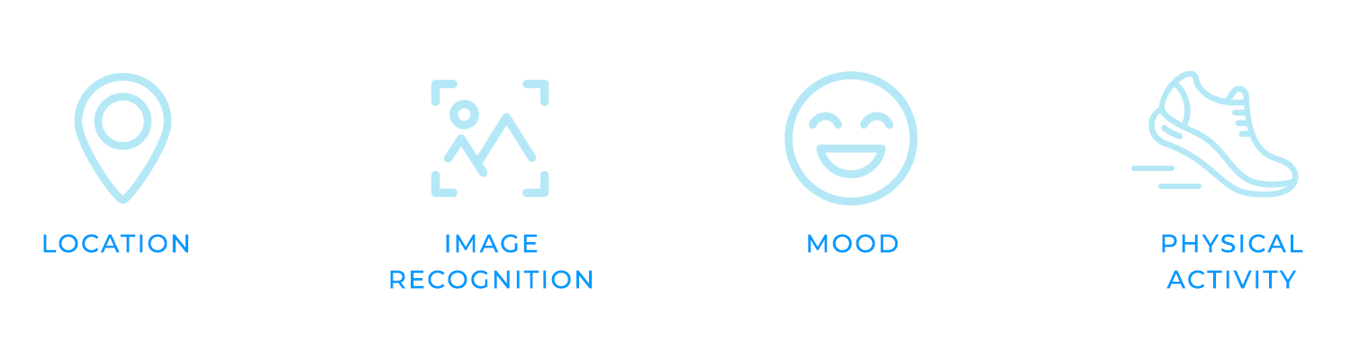
Context-aware interactions like GPS and cameras, designers can create applications that are more personalized and relevant to the user’s situation.
Lets take a weather app as an example. It can use GPS to determine the user’s location and provide accurate weather forecasts tailored to their specific area. A camera app can use image recognition to detect the scene being photographed and suggest appropriate filters or editing options.
Context-aware interactions can also be used to create more immersive and engaging experiences. For example, a gaming app might use GPS to create a location-based augmented reality experience, or a music app might suggest songs based on the user’s current mood or activity.
Keyboard navigation is a crucial aspect of accessibility, ensuring that interfaces can be used by individuals who cannot use a mouse or touchscreen. By providing clear keyboard focus indicators and ensuring that all interactive elements can be accessed using keyboard shortcuts, designers can make their interfaces more inclusive and usable for a wider range of users.
Keyboard focus indicators help users understand which element is currently selected and can be interacted with using the keyboard. This can be achieved through visual cues, such as a highlighted border or a different color, or through auditory cues, such as a sound when an element is focused.
Additionally, it’s important to ensure that all interactive elements, such as buttons, links, and input fields, can be accessed using keyboard shortcuts. This allows users to quickly navigate through the interface and perform actions without relying on a mouse or touchscreen.

Screen reader support is essential for ensuring that interfaces are accessible to users who are blind or have low vision. By providing clear and concise text labels for all UI elements, using appropriate headings and structure, and avoiding the use of images without alternative text, designers can make their interfaces more inclusive and usable for a wider range of users.
Clear and concise text labels help screen reader users understand the purpose and function of each UI element. For example, a button might have a label like “Submit” or “Save,” while a text field might have a label like “Name” or “Email.”
Appropriate headings and structure help screen reader users navigate through the content and understand the hierarchy of information. For example, using headings can help to create a clear structure and make it easier for screen reader users to find the information they need.
Alternative text is essential for images and other non-text content. It provides a textual description of the image, allowing screen reader users to understand its content and purpose. Without alternative text, images may be inaccessible to screen reader users.
Larger touch targets make it easier for users with limited fine motor skills to tap on elements. This can be particularly important for users with conditions like arthritis or tremors. By increasing the size of buttons, links, and other interactive elements, designers can reduce the likelihood of accidental taps and improve the overall user experience.
In addition to larger touch targets, designers should also consider alternative input methods. Gestures and voice commands can provide alternative ways for users to interact with the interface, making it more accessible for those who may have difficulty using traditional touch input. For example, users with limited hand strength might find it easier to use voice commands to navigate through the interface.
Color contrast and alternative text are other two essential elements to ensure that interfaces are accessible to users with visual impairments.
Color contrast refers to the difference in brightness or luminance between text and its background. For users with low vision, it can be difficult to read text if the contrast is too low. An adequate color contrast between text and background really makes a difference to those with visual impairments.
Alternative text is essential for images and other non-text content. It provides a textual description of the image, allowing screen reader users to understand its content and purpose. Without alternative text, images may be inaccessible to screen reader users.
Ultimately, interaction design is the secret sauce that transforms digital experiences from ordinary to extraordinary. It’s proof that by understanding user needs, conducting rigorous testing, ensuring accessibility, and crafting visually appealing interfaces, designers can create products that bring joy and create a connection with the user.
So, the next time you interact with a digital product that feels like it was made just for you, remember the art and science behind it: interaction design!