The perfect web design portfolio is all about presenting yourself in the best light. Check out these guidelines, examples and practical templates!
How do designers go about creating their web design portfolio? What are the crucial details you can’t overlook? Some designers out there have created truly unique and unforgettable portfolios that win awards and gigs. It’s no secret that a powerful portfolio can change everything.
So, let’s take a look at some of the basics of what portfolios have to include and why these details matter. We also have some wonderfully inspiring web design portfolio examples as well as some practical portfolio templates that can help you get started.
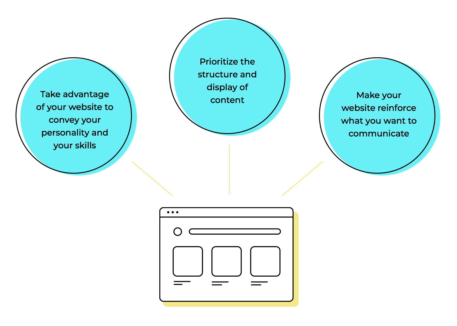
Creating your own web design portfolio is all about transmitting who you are and the skills you bring to the table. This refers to your design skills but also any other skills you think can be valuable, like good communication skills or an understanding of psychology.
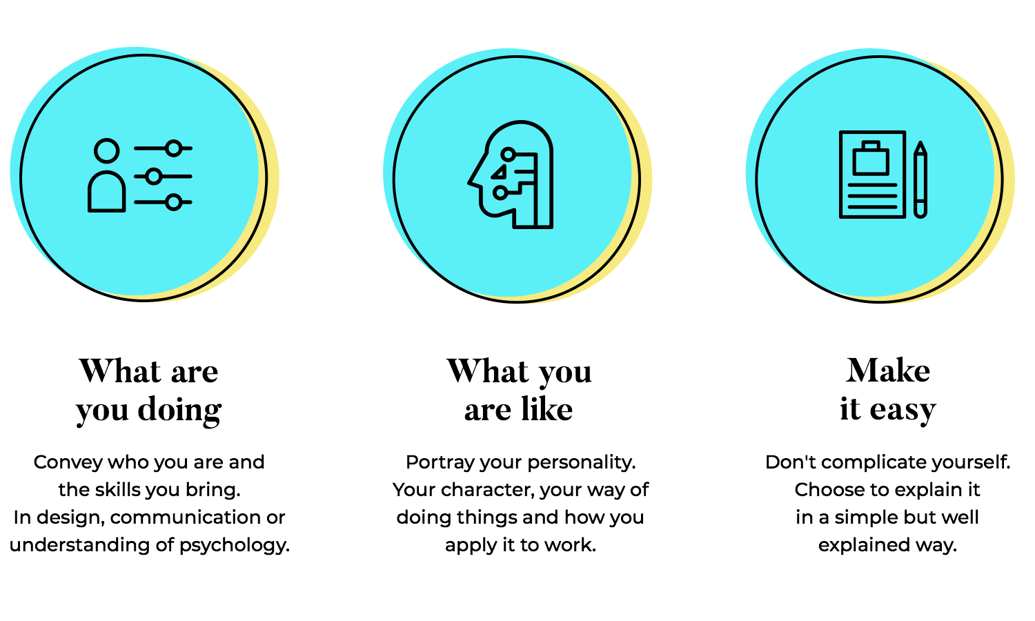
It’s also a great opportunity to portray your personality, like a small glimpse into who you are as a person. Are you formal or casual? Do you prefer to take things seriously or prefer light humor? Are you a team person?
The struggle is how to portray all of this in a single portfolio, without making it a conceptual mess. Luckily, the portfolio itself doesn’t have to be highly complex. It can be a small website that only has a few pages, not venturing into lots of content or categories and low/high level pages.
Let’s take it from the top. The concept of a web design portfolio is all about showcasing your best work. This means that you want to look at past projects and choose only the best, the ones you’re most proud of.
If you’re struggling with how to choose the best, try to think of their value to you and to the client. Did that project change the game for the client? Did it represent a milestone for that company? What about you? Did it teach you something? Did it present you with a tough challenge that you managed to overcome?
The true value of a project can be a bit abstract. That’s why you want to have an objective view of the projects individually. Sometimes, showcasing a difficult problem that you solved can have a huge value to the employer – web design is, in a certain way, an exercise in problem-solving. Other times, you want to make it all about the hard results that the project rendered, without focusing too much on what it meant for you.
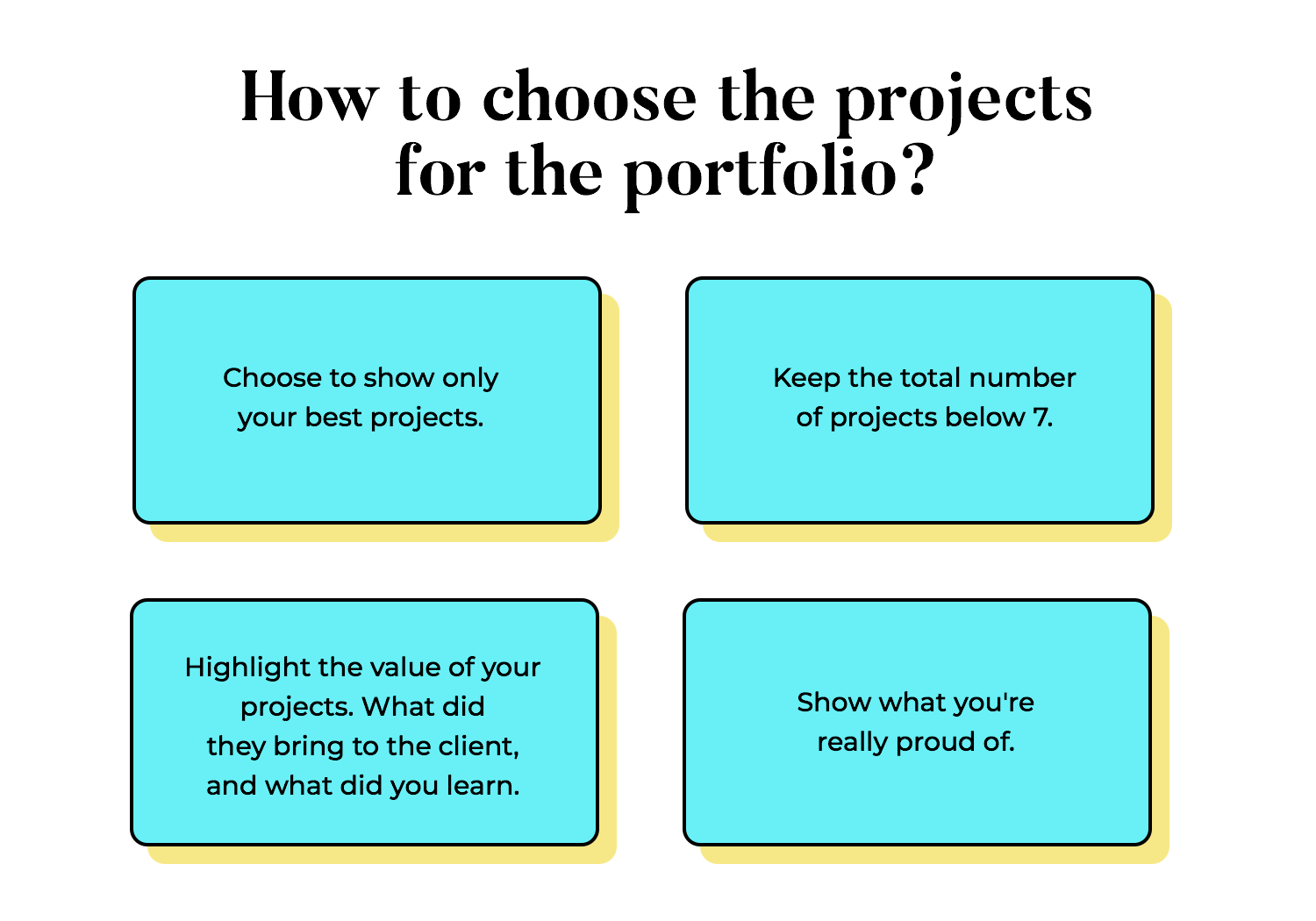
In the end, this is a highly subjective topic. You want to think about how you see these past projects and what they meant. There isn’t one right answer that will suit everybody. Ultimately, you want to take the things you’re proud of and present them in the best possible light.
The ideal web design portfolio is one that has a healthy balance between the visuals and the text. Why text, you may ask? If this is all about web design, why not focus on the powerful visuals and let that speak for itself?
There are many factors to consider here. The first, and perhaps, most important of which is that design, in general, isn’t just about pretty visuals. Truly good design is about problem-solving, understanding the context of a problem, and using design to solve it.
This process can often be lost on those who simply enjoy a beautiful color palette or focus on an intricate illustration. There’s a huge amount of work invested in those visuals, which aren’t obvious to an outsider.
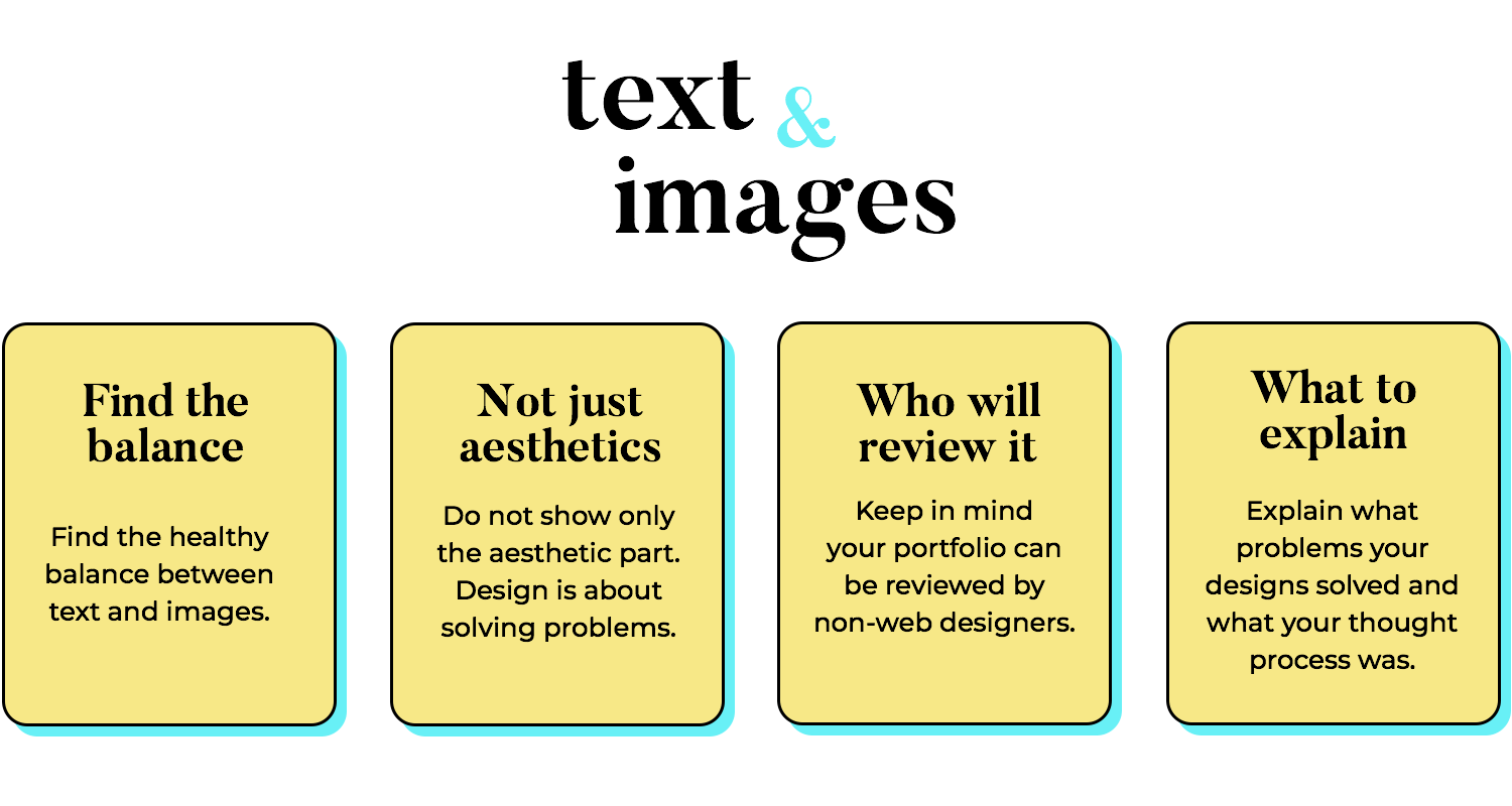
You want to present your work with some context. Why was this a good project? Why do you love it? How difficult was it for you? What was your thinking process? These are pieces of information that show readers how you approach project definitions, how you deal with challenges.
The second factor at play is the reader himself. It’s possible that the person reading your portfolio is a web designer who will appreciate all the effort that went into those creations. However, it’s much more likely that it will be a recruiter, a marketing manager, a CEO, or even someone from human resources. The bottom line here is that if the reader has no design experience, all the extra work you invested will be lost on them.
Since we’re talking about web design portfolios, how important is the design of the portfolio website? We’d say: very. The website itself can be a great opportunity to convey your skill and your personality. Designers are highly skilled at communicating without words, which is why this can come easy to most experienced people in the industry.
Every little detail counts. The layout, the loading speed – it all matters. Create a space where visitors can fully immerse themselves in your work. We live in a world of instant gratification, so make sure your site loads faster than a cheetah. And let’s face it, most people browse on their phones. Your portfolio needs to look as good on a tiny screen as it does on a desktop.
But a pretty website isn’t enough. You need to turn those visitors into clients. That’s where a killer call to action comes in. Make it clear how people can work with you, and give them a reason to choose you over the competition. Offer something extra – a freebie, maybe – to sweeten the deal. Remember, every element of your portfolio should work together to create a seamless experience that not only showcases your talent but also gets you hired.
We’ve summarized the above points and added a couple to walk you through the process of creating your portfolio from start to finish. We’ll cover everything from choosing the right audience to the importance of strong CTAs, all the while showcasing your best work in a compelling way.
- Define your target audience: Figure out who you want to work with and make your portfolio speak their language. Consider their preferences, industry, and design taste.
- Curate your best work: Show off your range with projects that highlight your skills and problem-solving smarts.
- Build a strong foundation: Pick a platform that works for you and your skills, then create a clean, easy-to-navigate space with a consistent look and feel.
- Craft compelling project descriptions: Tell a compelling story about each project. What was the goal, what were the hurdles, and how did your design magic solve it all? Don’t forget to brag a little about your role in the success.
- Showcase your design process: Show off your design thinking process with wireframes, mood boards, and other behind-the-scenes stuff. Let people see how you tackle problems and come up with awesome solutions.
- Optimize for search engines: Boost your online visibility by using keywords that people actually search for and optimizing your images and page descriptions
- Create a strong CTA: Make it easy for people to get in touch by including your contact info and a simple contact form. And while you’re at it, invite them to join your email list or follow you on social media for more design goodness.
There are all sorts of portfolio websites out there. Some are edgy and loud, using flashing colors and bold fonts. Others are unique because they work like a game, making the reader interact with the design in order to see the projects on display. There are also simple portfolios that opt for a minimalist approach, letting the reader focus entirely on the content itself and not the design of the website.
All of these are great. There’s a huge margin here to capture who you are, to reflect part of you with the look and feel of the portfolio itself. All we can say is that you want to prioritize the content structure and display, making it as easy to find and read as possible.
We listed a few of the templates we thought were the most intriguing, creative and memorable:
This homepage offers a great visual hierarchy and can work as a wonderful homepage to a web design portfolio. Made with smooth lines and a modern feel, designers can simply create more pages in order to display their previous work, connecting it all to this homepage.
The structure itself can be adapted to just about any type of portfolio, even if the template was created with a featured image in mind.
The split-screen UI pattern is wildly popular in web design. It creates a visual impact that still guarantees a good usability, which makes it a great option for a web design portfolio homepage. Each side of the screen is made to hold content, making it a great opportunity to showcase your strong points together.
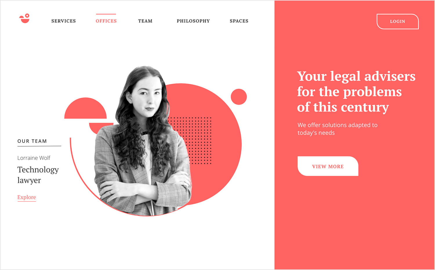
Alternatively, you can simply introduce yourself and use the right side to land a sales pitch – something that captures who you are or what you do.
This template is a wonderful option for freelance web designers, offering a wonderful structure for the homepage of a portfolio. Despite being created for a travel website, designers will find that the content structure can easily be adapted to showcase previous work, display testimonials and lay down the services offered.
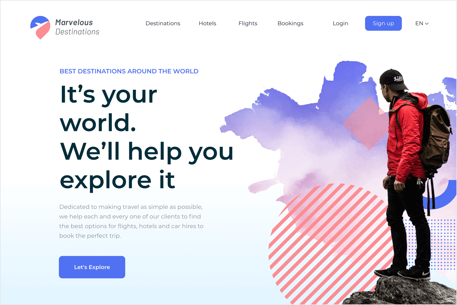
Below the header area, we have a grid structure that can display previous work, working as a central station where the reader can find all the case studies and visuals. Below the grid, there’s a testimonial section where you can display clients, managers, or co-workers’ quotes, transmitting their experience with you.
The homepage offers basic but practical navigation, with a top menu and a footer where you can link up all your platforms such as Dribbble, Twitter, Linkedin, and so on.
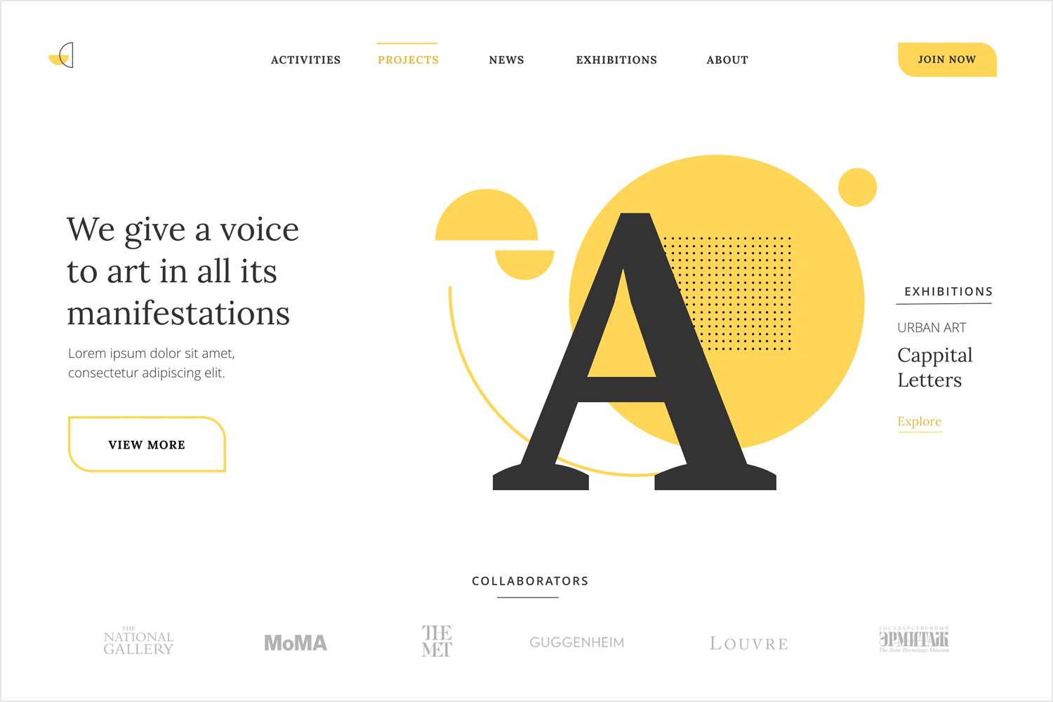
This template brings us the header area of a classic homepage. The style is simple and highly adaptable, with written content to the left and a vector illustration to the right. The navigation follows a menu at the top of the screen, with a call-to-action to the right. From here, you can take the portfolio design in any direction you want: flashy interactions and animations, intricate custom illustrations and so on.
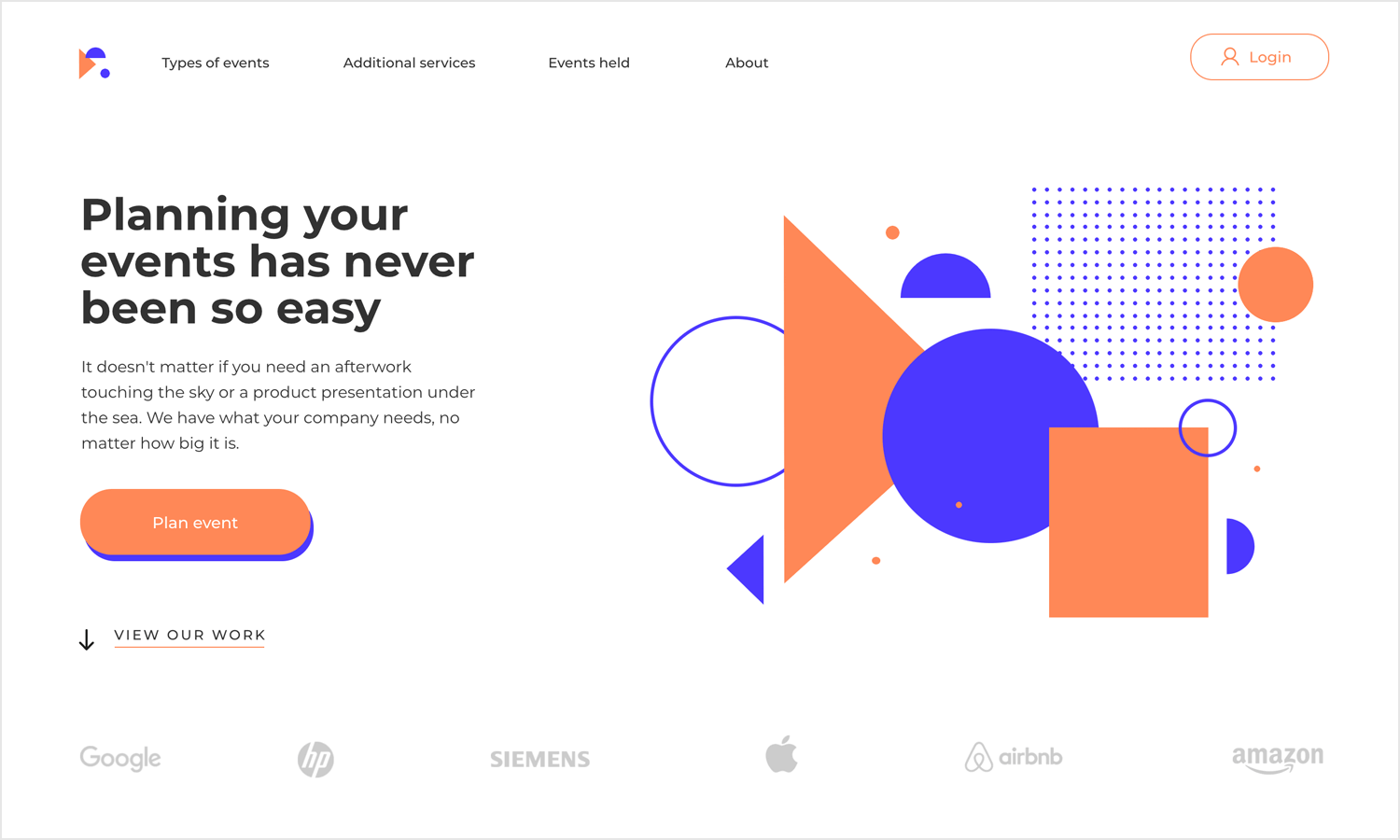
We like that despite the template itself being limited to part of the homepage, it’s very applicable to web design portfolios. Simply create the other pages where you’ll be displaying your visuals and your case studies, using the template to get the homepage out of the way.
Another wonderfully practical homepage template where you can display your visual skills, with a clean look and casual vibe. This is a great starting point for a web design portfolio homepage. The navigation at the top of the screen is perfect for the crucial parts of your web design portfolio, making it a simple task to find the right content.
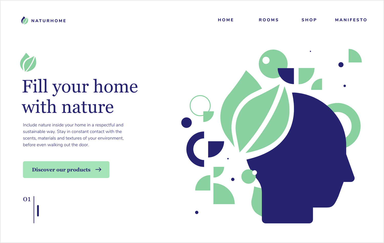
We like the numbered featured content at the bottom, which can be easily expanded to showcase your services or your design process.
We love the vibe of the Lounge Lizard website. It perfectly captures the spirit of the agency, making it a young, vibrant and fun experience for readers and potential clients. The case studies are wonderfully presented also, breaking down the context surrounding the project as well as the design process that was implemented. It’s true that there’s a large number of case studies, but given that this is a portfolio for an entire agency as opposed to a single designer, it works.
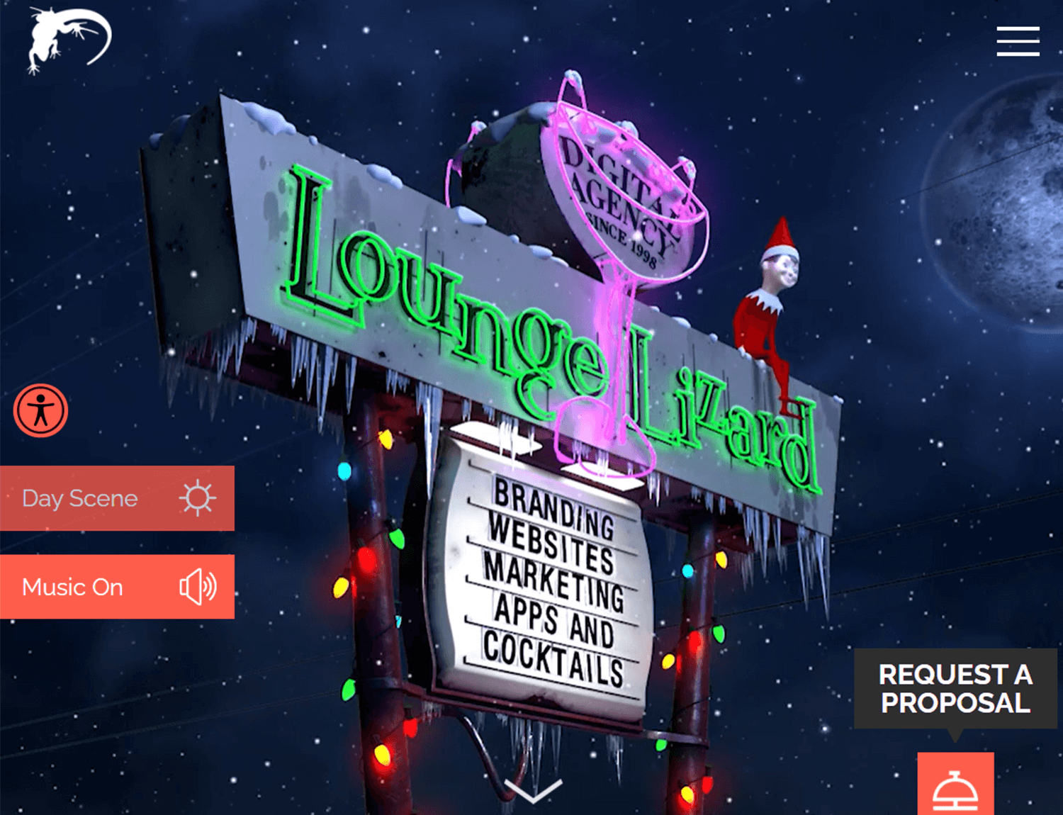
Granted, this website isn’t strictly a portfolio in the pure sense of the word. It’s a website that showcases the previous work and presents the services rendered by a design agency – but it’s close enough. The website itself brings us a bold use of animation, with eye-catching visuals and microinteractions that offer great usability.
MN STUDIO’s portfolio is a dynamic showcase of founder Mark Noble’s expertise in motion design and web development. The studio’s focus on projects that incorporate animation and movement is evident throughout the website, with potential clients immediately drawn into this visual-centric approach.
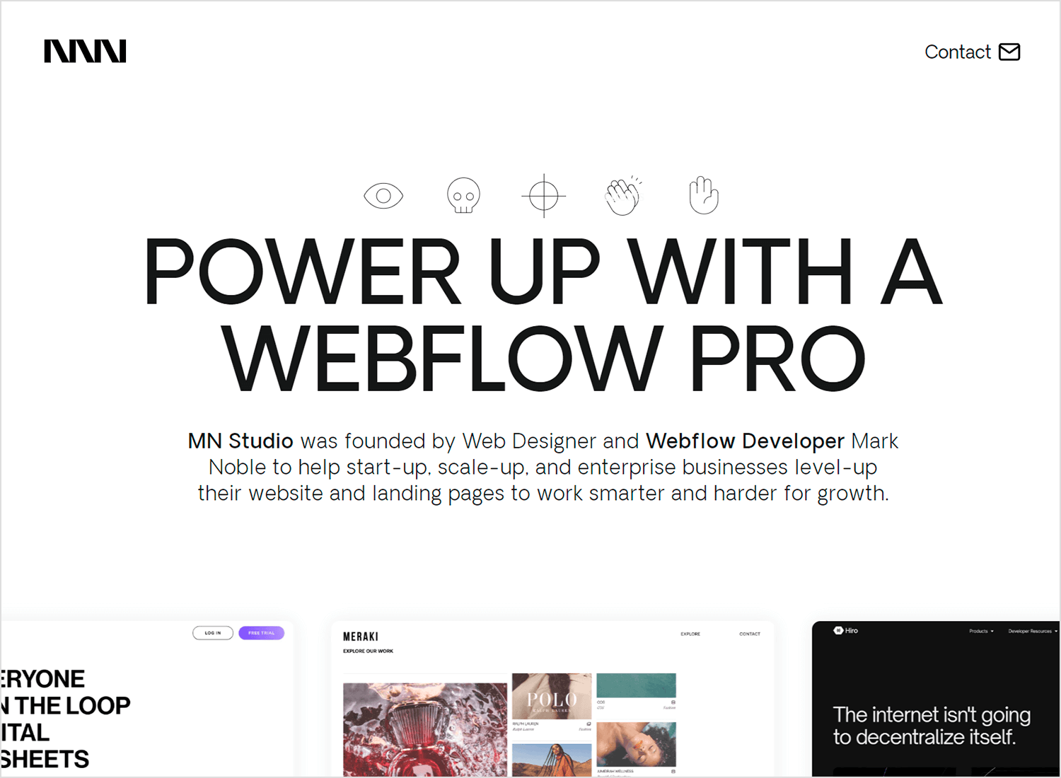
Interactive elements are at the core of the portfolio experience. As visitors scroll and hover, past projects glide across the screen, inviting exploration. This engaging format effectively highlights the agency’s skillset. Every page is imbued with motion, from subtly sliding text to popping imagery and interactive features. By immersing viewers in the content, the website maximizes opportunities to showcase MN STUDIO’s capabilities and build a compelling case for their services.
John Henry Muller created a truly unique web design portfolio. His focus wasn’t so much on the case studies of previous work, but transmitting who he is and what he’s about. As a reader, we get his history of work, learning the path he took and why he did it. It’s a true lesson in communicating personality through website design, both in the UI itself and the content he included in it (especially his mom’s testimonial).
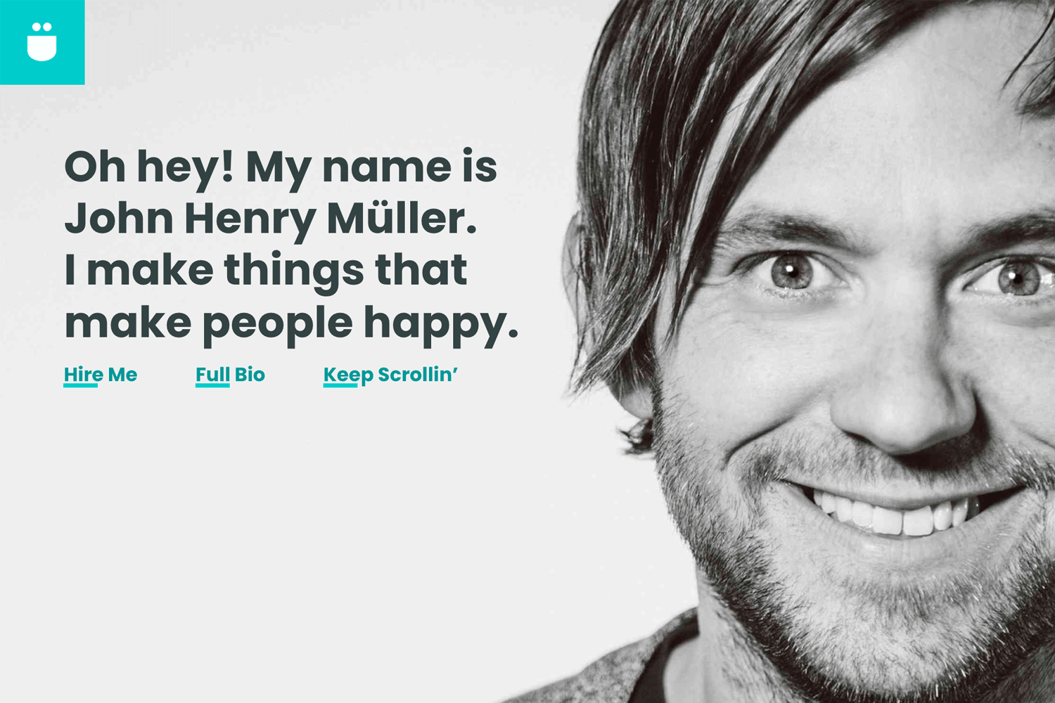
We love how personal his portfolio is. In the end, that’s what it’s all about. None of us here at Justinmind have met John, but we like him already. That in itself is a major success when it comes to creating a web portfolio.
Jarrod Drysdale created a web design portfolio that is highly reactive and concise. For us, one of the greatest things about this portfolio is that Jarrod achieved a wonderful balance between strong visuals and relatable copy.
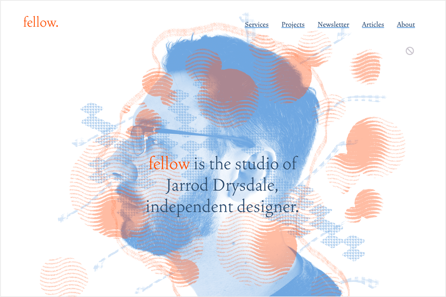
From the visuals side, we find that the reactive images and shapes make the entire experience super dynamic. Even more impressive is that this reactive design doesn’t overwhelm the reader, which can happen sometimes with visuals that respond and relocate according to cursor movement. In this sense, Jarrod actually showed a lot of restraint – which absolutely paid off.
From the copy side, we find that Jarrod used few words but they were all the right ones. It’s a brief kind of copy that also transmits personality. It doesn’t feel like a formal read, making Jarrod seem like a real person who is carrying a conversation. It’s easy, enjoyable. His past projects are presented without case studies, opting for a line or two describing the project.
Barcelona-based Ramon Gilabert created a wonderful web design portfolio. It’s calm, friendly and casual. Using clean lines and plenty of empty space, Ramon shows off some true skills when it comes to visual hierarchy and information architecture. The use of white space, clear typography, and logical content hierarchy ensures a seamless user experience, while the interactive elements like social media links are strategically placed for easy access.
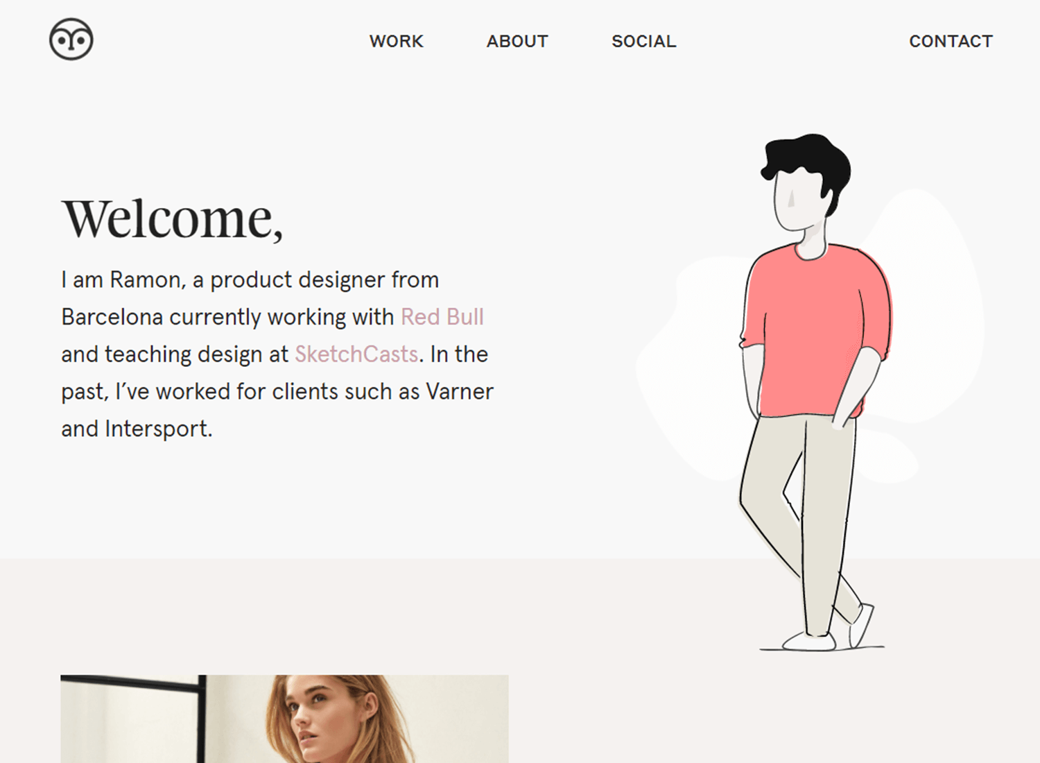
The design reflects Ramon’s professional identity, combining simplicity with a personal, approachable tone that enhances emotional connection. Overall, it successfully balances aesthetic appeal with functionality, making it easy for users to engage and connect with Ramon.
Empathy, a pre-designed framework by Ty Hughey, offers a strong foundation for crafting compelling agency or studio portfolios. Its consistent structure and mobile-first approach enable the creation of visually striking and professional websites.
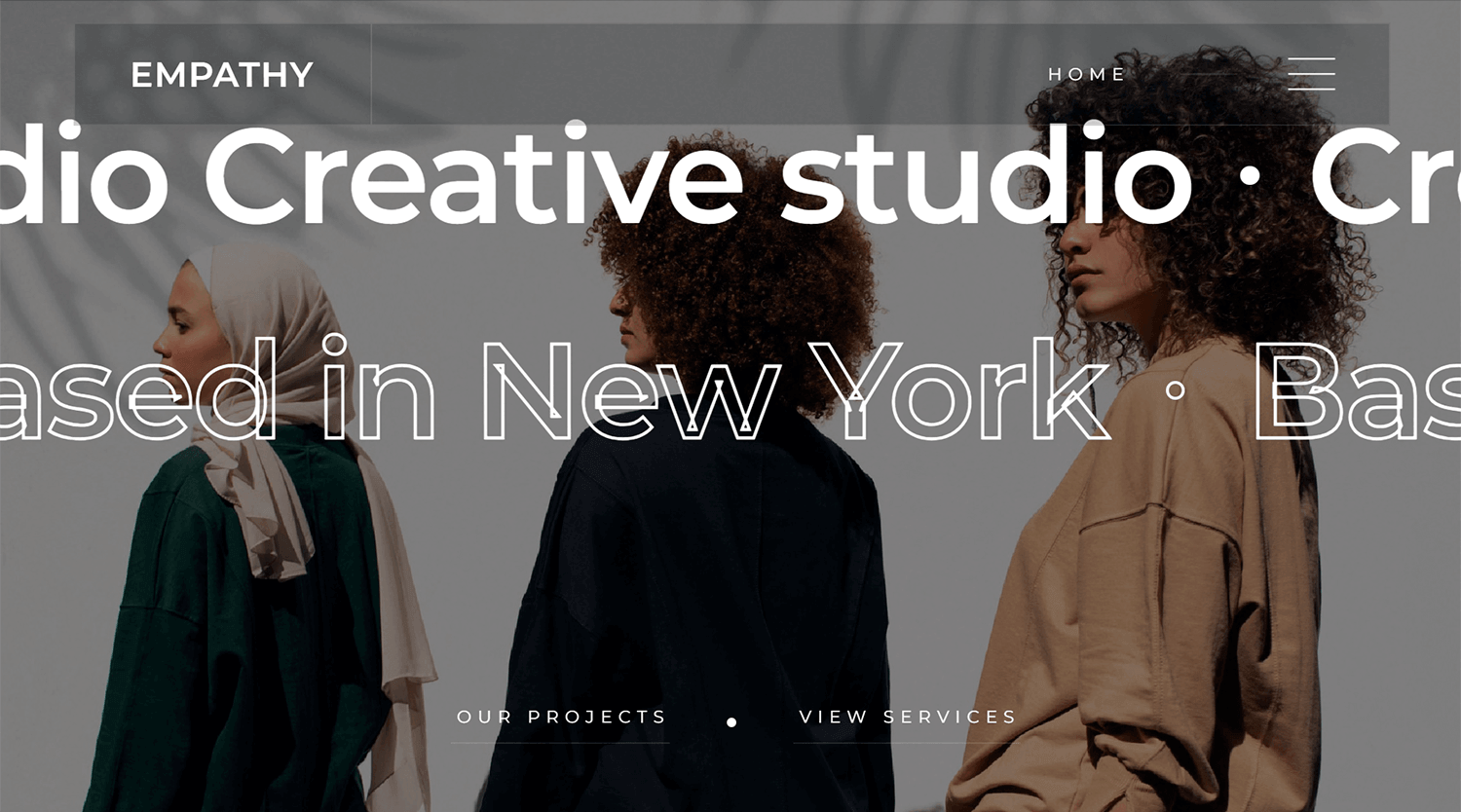
The template’s design emphasizes showcasing high-quality visuals. Each image can be paired with descriptive text and a title, providing opportunities to highlight project details and engage potential clients.
With dedicated sections for projects and services, Empathy can be readily adapted to showcase individual portfolios, allowing for a high degree of customization.
Andrew Mogire‘s portfolio exhibits a strong commitment to minimalism and visual clarity. The initial pages effectively introduce the designer and their skill set, establishing a consistent aesthetic. The black background with white text creates a sophisticated and focused atmosphere.
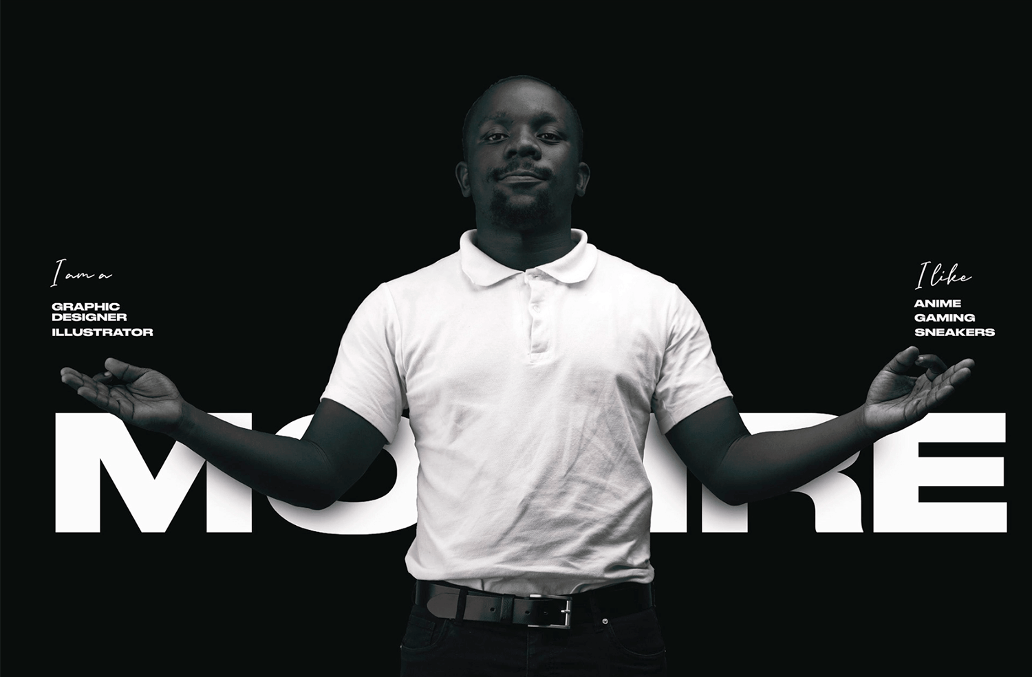
While the first few pages offer a solid foundation, the portfolio’s true strength likely lies in the subsequent pages. The minimalist design is maintained, but without the stark black background, allowing the focus to shift entirely to the showcased work. This approach suggests a designer who is confident in their abilities and seeks to let their work speak for itself.
This website is a portfolio for a digital designer named Roman Osypenko. It provides an overview of his skills and experience in various areas of design, including branding, UX/UI design, interaction design, web development, and 3D modeling.
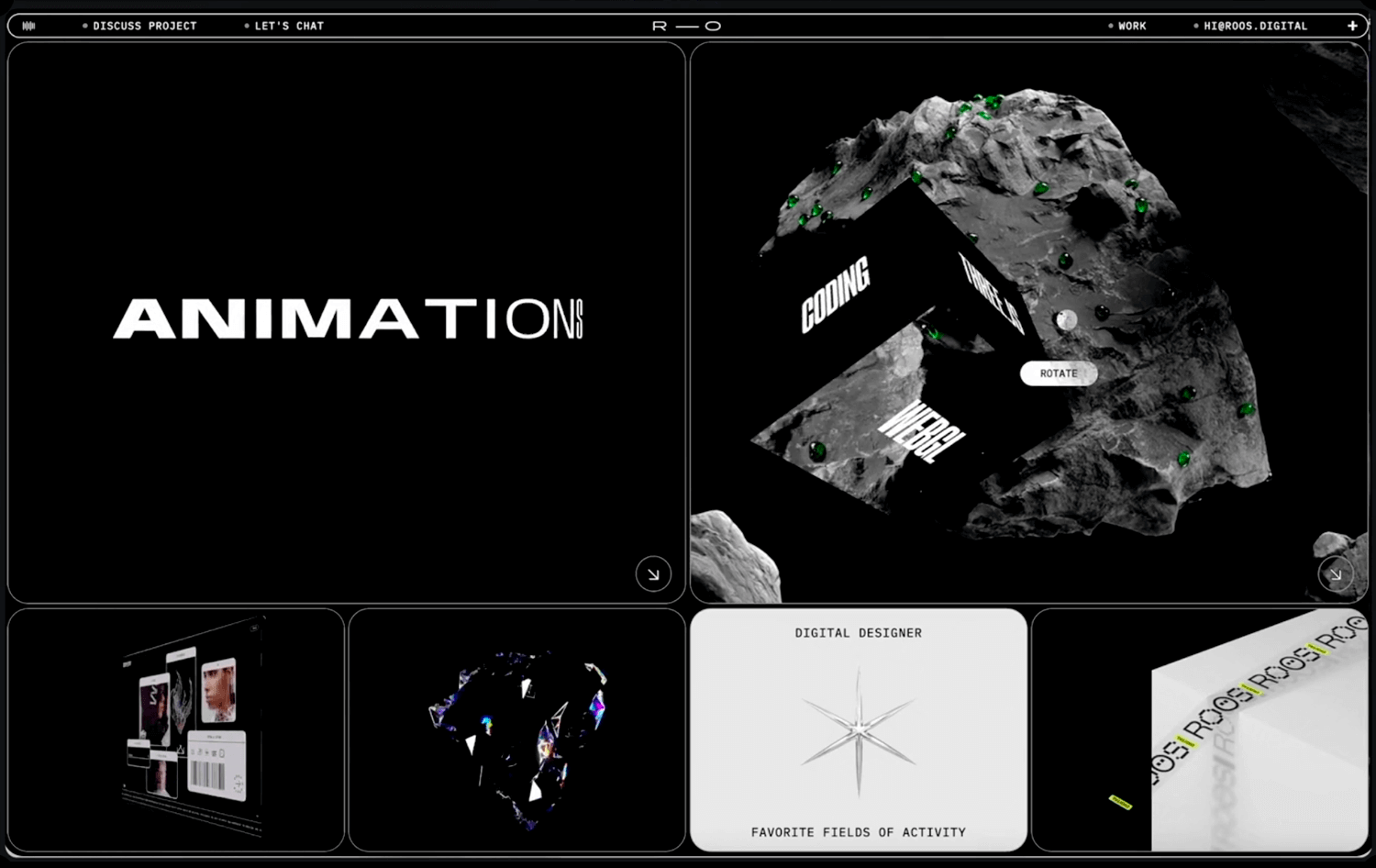
Visitors can learn more about Roman’s work by viewing his portfolio and case studies. They can also contact him to discuss potential collaborations or freelance projects. Overall, the website effectively showcases Roman’s talent and expertise as a multidisciplinary designer.
Antoine Belot’s portfolio exhibits a strong commitment to minimalism and visual clarity. The consistent use of a clean, sans-serif typeface and a predominantly white color palette creates a professional and modern aesthetic. The layout is well-structured, with a clear hierarchy of information that enhances readability.
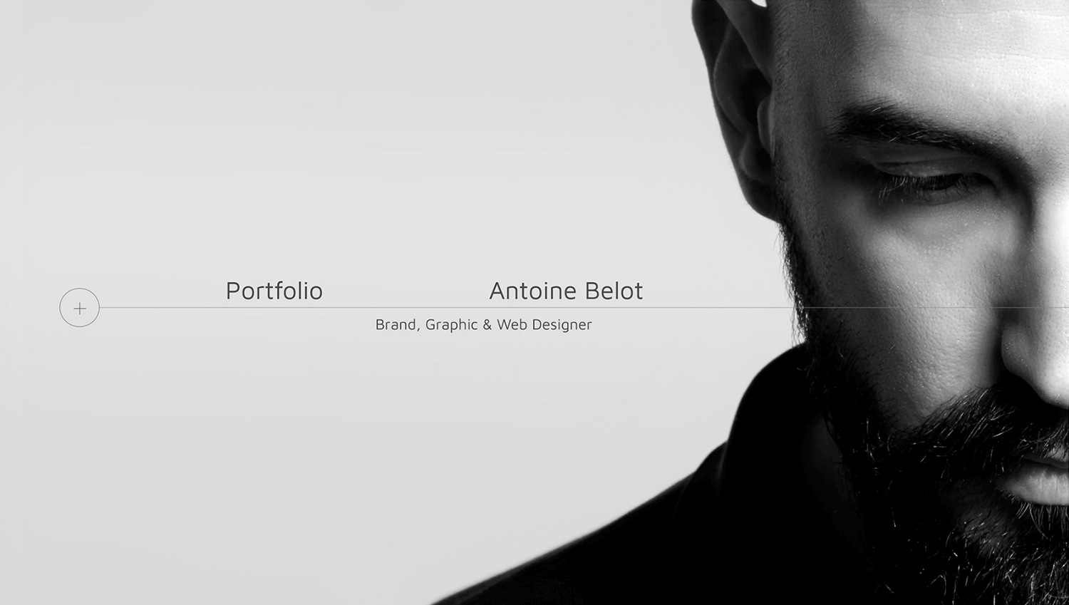
The designer demonstrates a strong understanding of visual communication, effectively conveying information through the strategic use of typography, color, and spacing. While the minimalist approach maintains a consistent look and feel, there’s an opportunity to introduce more visual interest and personality through the use of imagery and interactive elements.
Vektora Studio‘s website has a clean, modern aesthetic that’s both visually appealing and user-friendly. The design is straightforward and effective, with a good balance of white space and content. While it’s not groundbreaking, it’s definitely a solid example of contemporary web design.
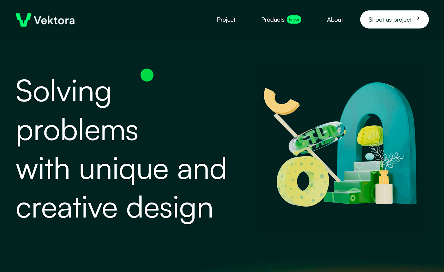
The color palette is professional and understated, and the typography is clear and readable. Overall, it’s a well-put-together site that effectively communicates the company’s brand.
Colin Moy‘s online portfolio is a dynamic showcase of his design prowess. The website itself serves as a living example of his work, inviting viewers to explore its intricacies. Moy’s portfolio makes a striking first impression with a playful visual element: eyes replacing letters in his name. This interactive detail not only captures attention but also functions as a unique toggle for dark mode, accompanied by an engaging animation.
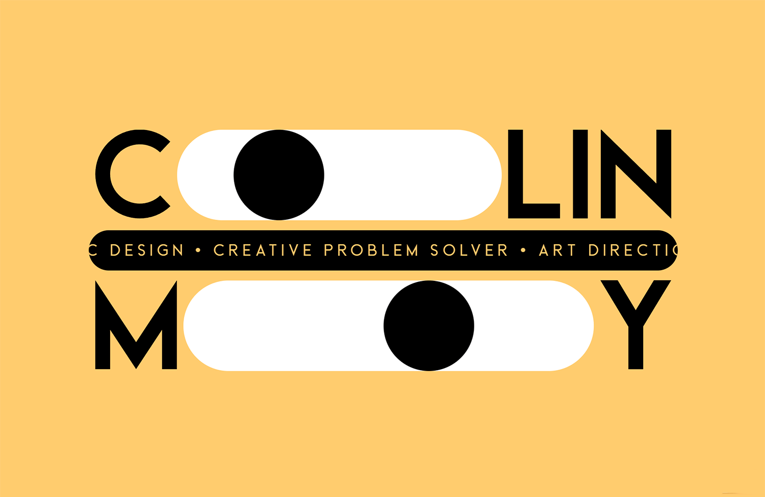
The motif continues throughout the site, transforming letters into clickable sections that reveal additional content. This innovative approach effectively guides visitors through the portfolio, encouraging exploration and interaction.
Tamirlan Azisov‘s portfolio exhibits a strong commitment to minimalism and visual impact. The consistent use of a dark background and bold typography creates a striking and memorable aesthetic. The designer effectively leverages whitespace to enhance the focus on key elements, such as the designer’s name and project showcases.
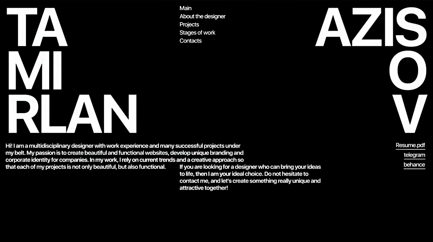
The portfolio demonstrates a clear understanding of visual hierarchy, with information presented in a logical and easy-to-follow manner. The consistent use of a minimalist approach maintains a cohesive brand identity throughout the website. However, incorporating subtle visual elements or varying the typography could add further depth and interest to the overall design.
Paul Lapkin‘s portfolio is a clean, modern showcase of his design prowess. The website effectively balances minimalism with visual impact, creating a professional and engaging user experience. The use of white space and a restrained color palette allows the focus to remain on the quality of the design work. The portfolio effectively conveys Lapkin’s expertise in digital design, particularly in the areas of Framer and web development.
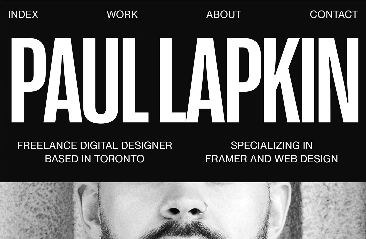
The overall aesthetic aligns well with his stated passion for typography and grids, demonstrating a strong understanding of design principles. While the minimalist approach is consistent, incorporating subtle interactive elements or animations could potentially enhance user engagement. Overall, the portfolio is a strong representation of Lapkin’s design capabilities and serves as an effective platform to showcase his work.
Cuberto‘s portfolio prioritizes clarity and professionalism. The minimalist design effectively creates a focused user experience, allowing visitors to quickly grasp the company’s core offerings. While the use of whitespace and a restrained color palette is commendable, the design could benefit from additional visual interest to enhance engagement.
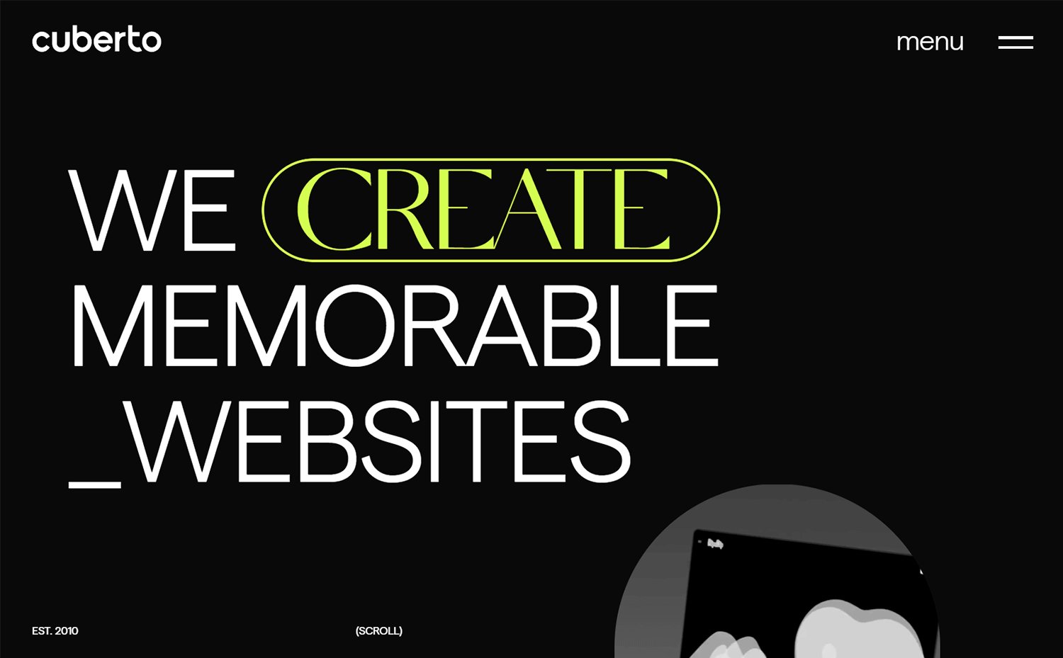
The portfolio effectively conveys Cuberto’s expertise in digital product design, although a more robust showcase of past projects would further solidify their reputation. The current design provides a solid foundation for the brand, but incorporating subtle visual elements and a more comprehensive project portfolio could elevate the overall impact.
Milli Creative Agency delivers a distinctive digital experience. Their portfolio is a dynamic composition of overlapping rectangles, each containing unique content. The agency’s personality shines through with playful text placements and unexpected content juxtapositions.
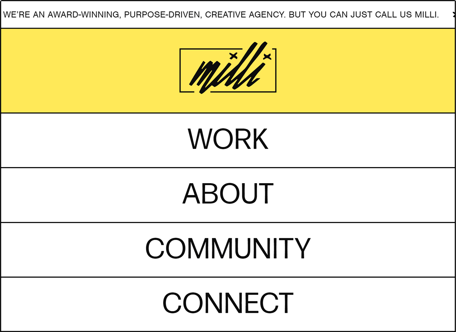
The portfolio’s interactive elements elevate the user experience. Key sections like Work, Connect, About, and Community are emphasized with a vibrant yellow highlight and enlarged text upon hover, inviting visitors to explore deeper. This innovative approach effectively showcases Milli’s creative flair and encourages engagement.
Ali Saeed, a Kuwait-based designer, specializes in crafting digital solutions for startups and corporations. His portfolio effectively showcases his expertise in web design, branding, and presentation development through a clean and interactive layout.
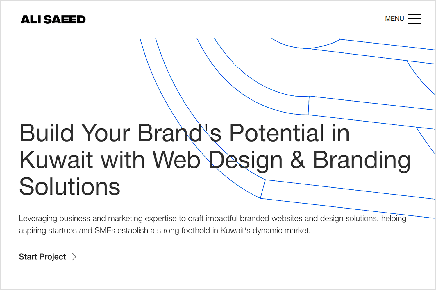
The homepage presents a curated collection of case studies and insights, side-by-side. Saeed’s design ingenuity is evident in the subtle yet captivating animations applied to each project preview. As users hover over these interactive elements, gradients shift, colors change, and subtle movements draw attention, encouraging exploration and deeper engagement with his work.
Eve Kayser‘s portfolio presents a visually striking introduction with a distinctive color palette and gradient accents. A dynamic navigation feature guides visitors through the “About Me” section, unveiling details in a progressive manner.
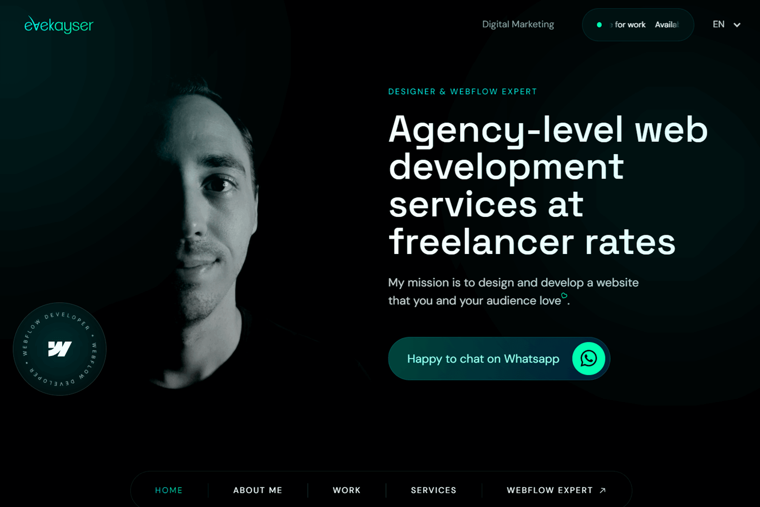
The “Work” section showcases a vibrant array of projects for a diverse clientele, maintaining a cohesive aesthetic with the portfolio’s overall color scheme. This strategic approach effectively highlights Kayser’s design versatility while preserving a strong visual identity.
Karlis Kah‘s portfolio immediately establishes his focus on interactive, animated, and motion design. The homepage presents a striking contrast between a minimalist white “KAH” and an embossed 3D counterpart, creating a visually engaging introduction.
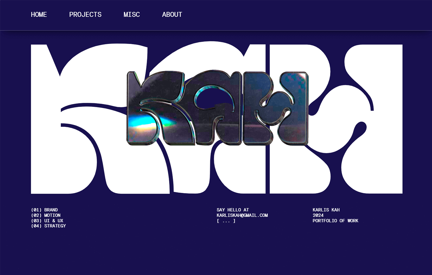
The portfolio seamlessly transitions to a concise “About Me” section before showcasing a standout collection of projects. Each project is represented by a square animation that expands on hover, offering a dynamic preview without overwhelming the overall design. This visual language is echoed in the “Misc” section, where a mood board of colorful squares further reinforces Kah’s design aesthetic.
Adrien Gervaix‘s portfolio effectively employs minimalist design principles. By prioritizing clean lines, ample white space, and a strong focus on content, the portfolio achieves a modern and professional aesthetic. This minimalist approach enhances user experience by making the website easy to navigate and visually appealing.
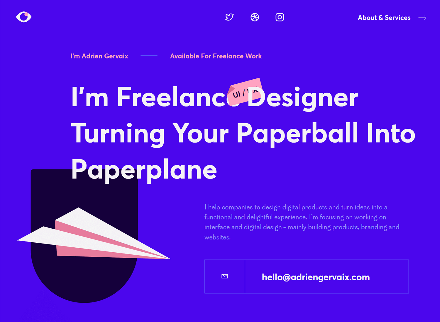
Gervaix demonstrates a solid understanding of UX/UI best practices. The portfolio’s clear information hierarchy, intuitive navigation, and appropriate use of white space contribute to a positive user experience. The emphasis on showcasing the design process suggests a user-centered approach, which is a cornerstone of effective UX design.
Ivette Felix Uy, a Brooklyn-based product designer, presents a focused portfolio on her landing page. By spotlighting six key projects, she effectively showcases her specialized skill set. The clean, cream-colored backdrop accentuates the vibrant visuals in her case studies.
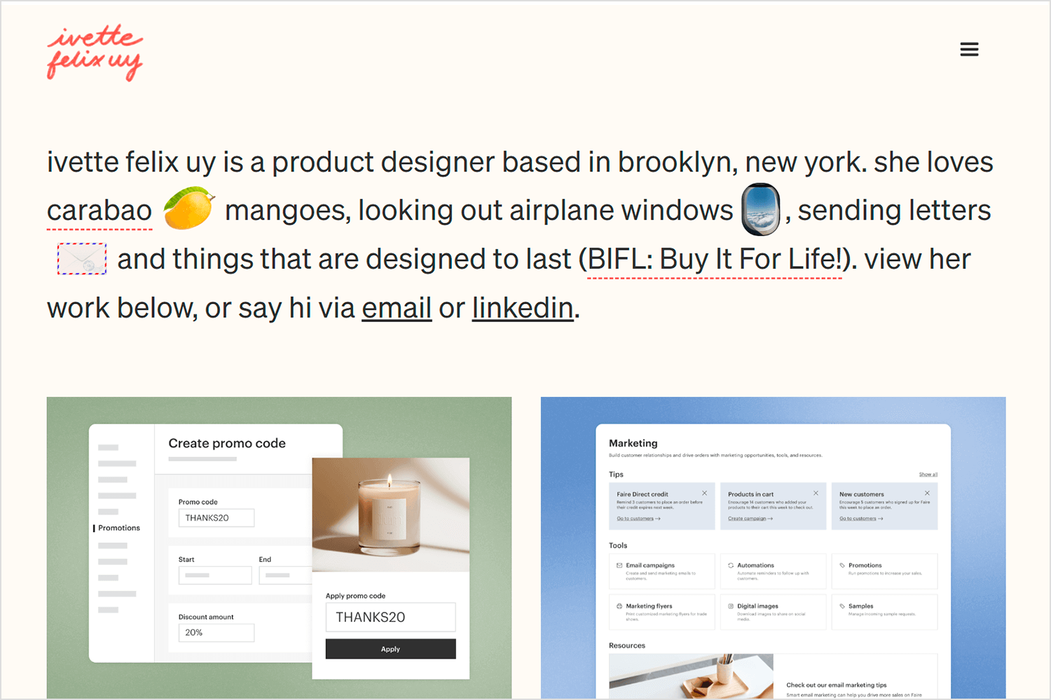
This format caters to both casual visitors and those seeking in-depth information. A quick scroll provides a clear overview of Uy’s offerings, while dedicated viewers can delve deeper into each project.
Finding the perfect platform to showcase your web design portfolio can be overwhelming. This section highlights ten popular web design portfolio sites to help you decide where to display your creative work. From beginner-friendly options to advanced platforms for seasoned designers, we’ve got you covered. Let’s find the ideal home for your digital masterpiece!
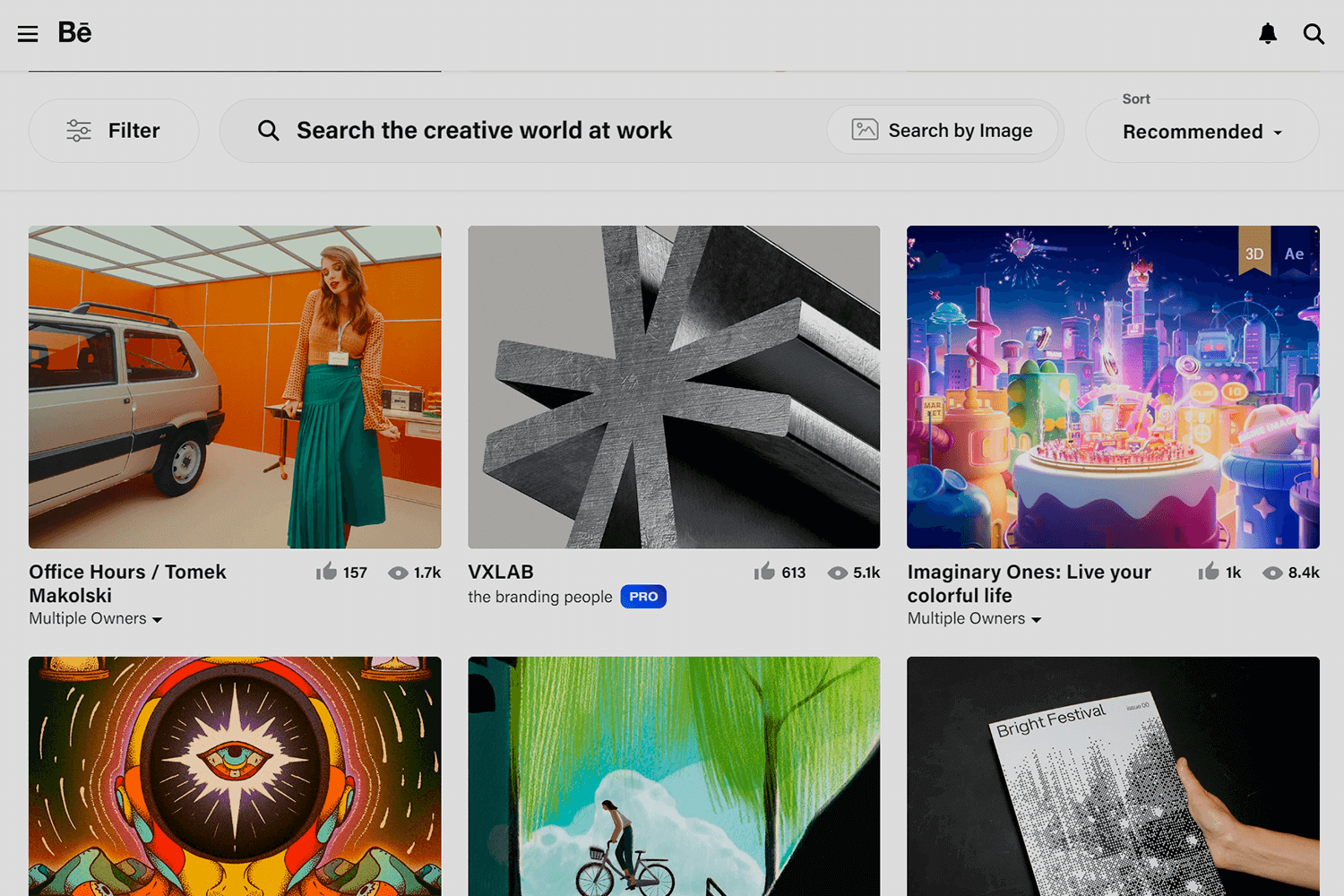
Behance is a popular platform for creatives to showcase their work. With a vast community, it offers diverse categories to highlight your projects. It’s a great place to discover inspiration and connect with potential clients.
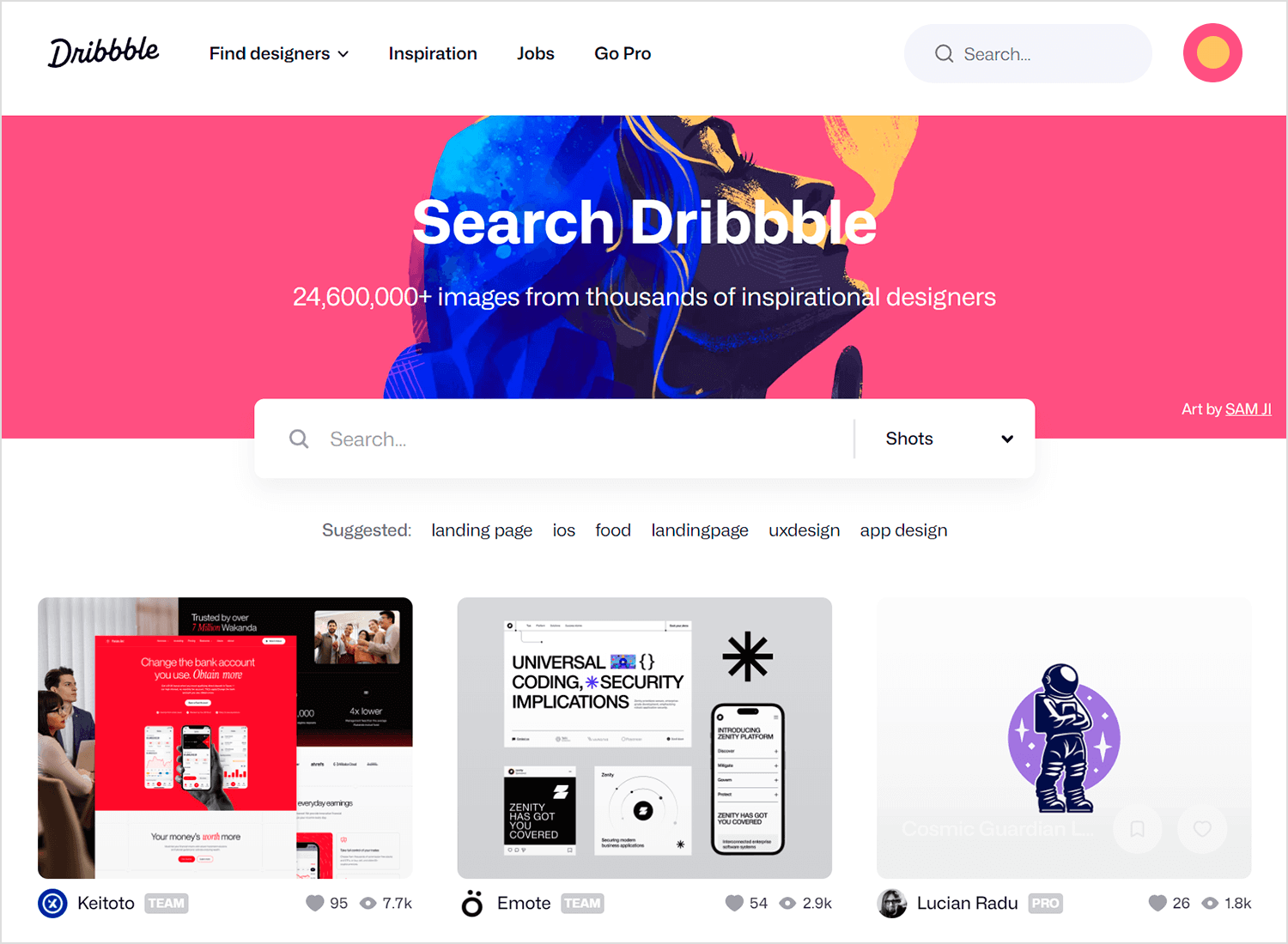
Primarily focused on design, Dribbble is a go-to platform for UI/UX designers and graphic artists. Its emphasis on visual appeal makes it ideal for showcasing your design process and final products
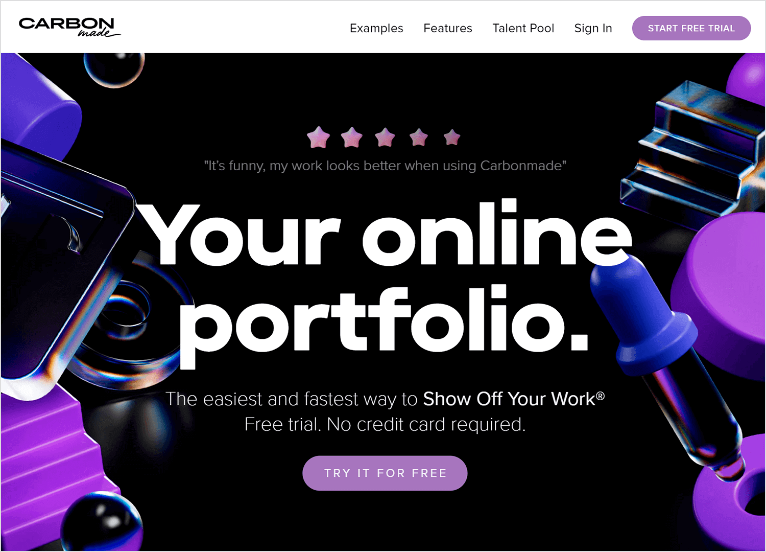
Known for its sleek and minimalist templates, Carbonmade is perfect for creating professional-looking portfolios. It offers a clean interface and customization options to highlight your work effectively.
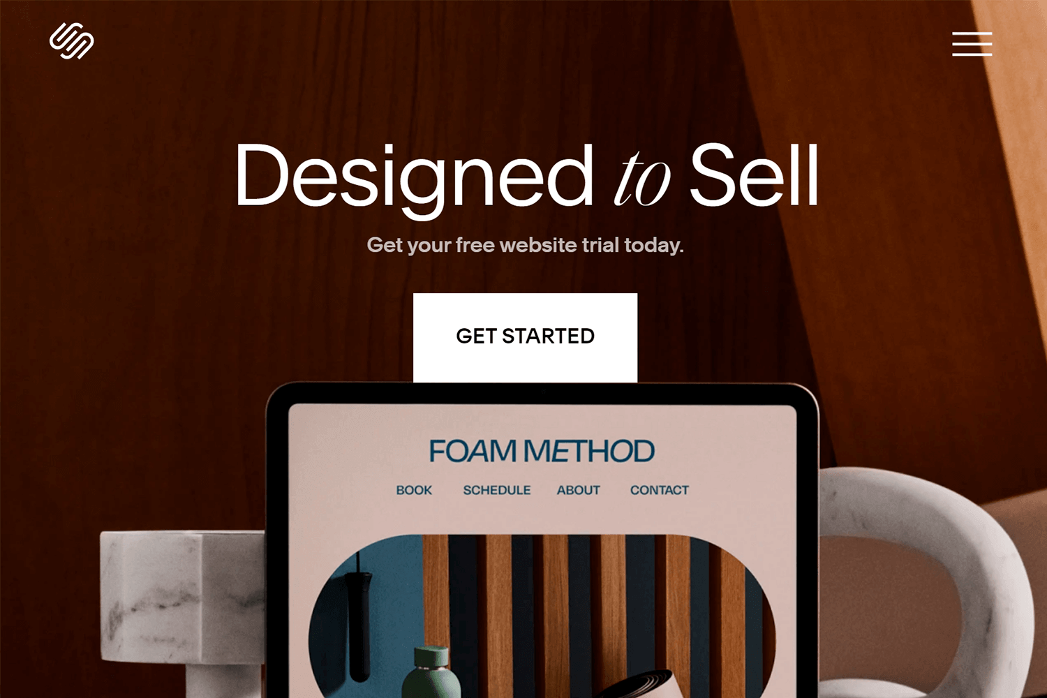
While primarily a website builder, Squarespace also excels at creating stunning portfolios. Its wide range of templates and design flexibility allows you to craft a unique online presence.
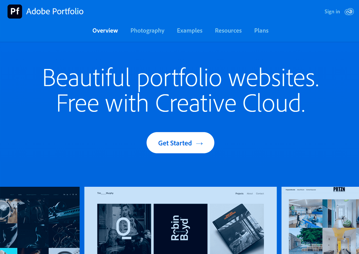
A free option for Adobe Creative Cloud users, Adobe Portfolio provides pre-designed templates optimized for showcasing your creative work. It’s a quick and easy way to create a professional portfolio.
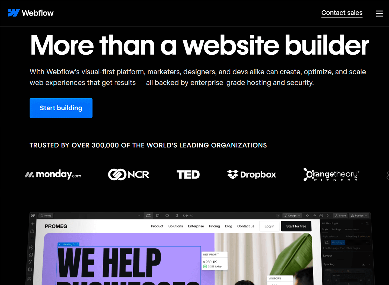
Webflow is a powerful platform for creating custom, interactive websites without coding. It’s ideal for building sophisticated portfolios that showcase your work in a unique and engaging way. With its drag-and-drop interface and flexible design tools, you can create stunning visuals and complex interactions to impress potential clients.
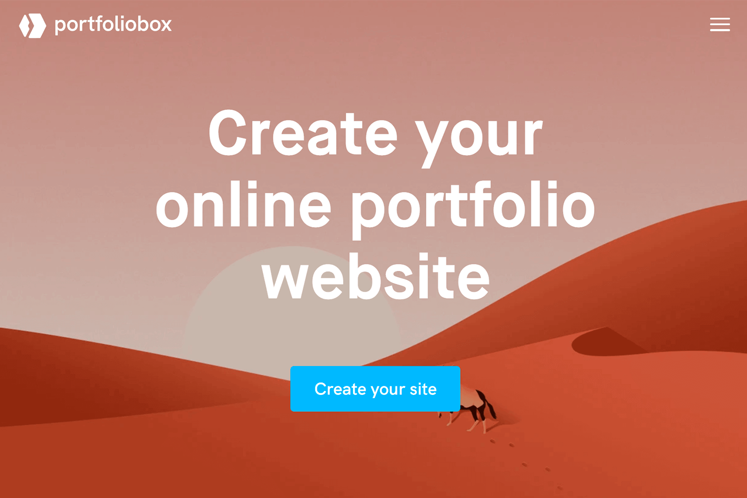
Dedicated to creating online portfolios, Portfoliobox offers user-friendly tools and customization options. It’s a good choice for those who want to focus solely on showcasing their work without the complexities of a full website.
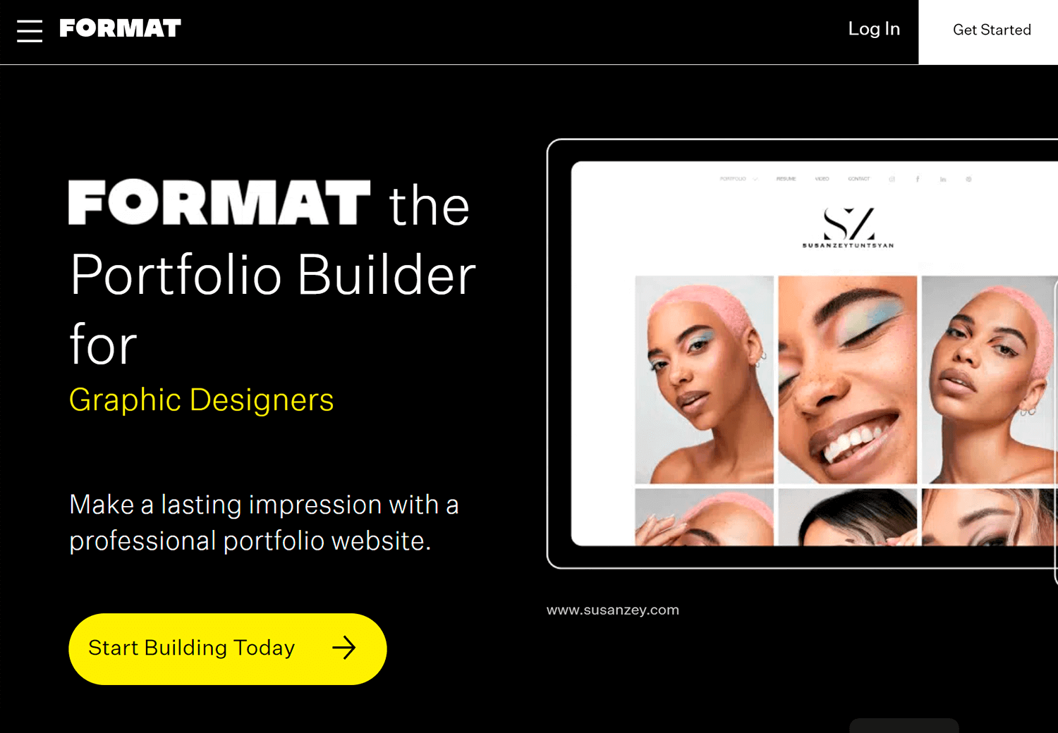
Format emphasizes simplicity and speed. It allows you to create visually appealing portfolios with minimal effort. If you prefer a clean and straightforward design, Format is worth considering.
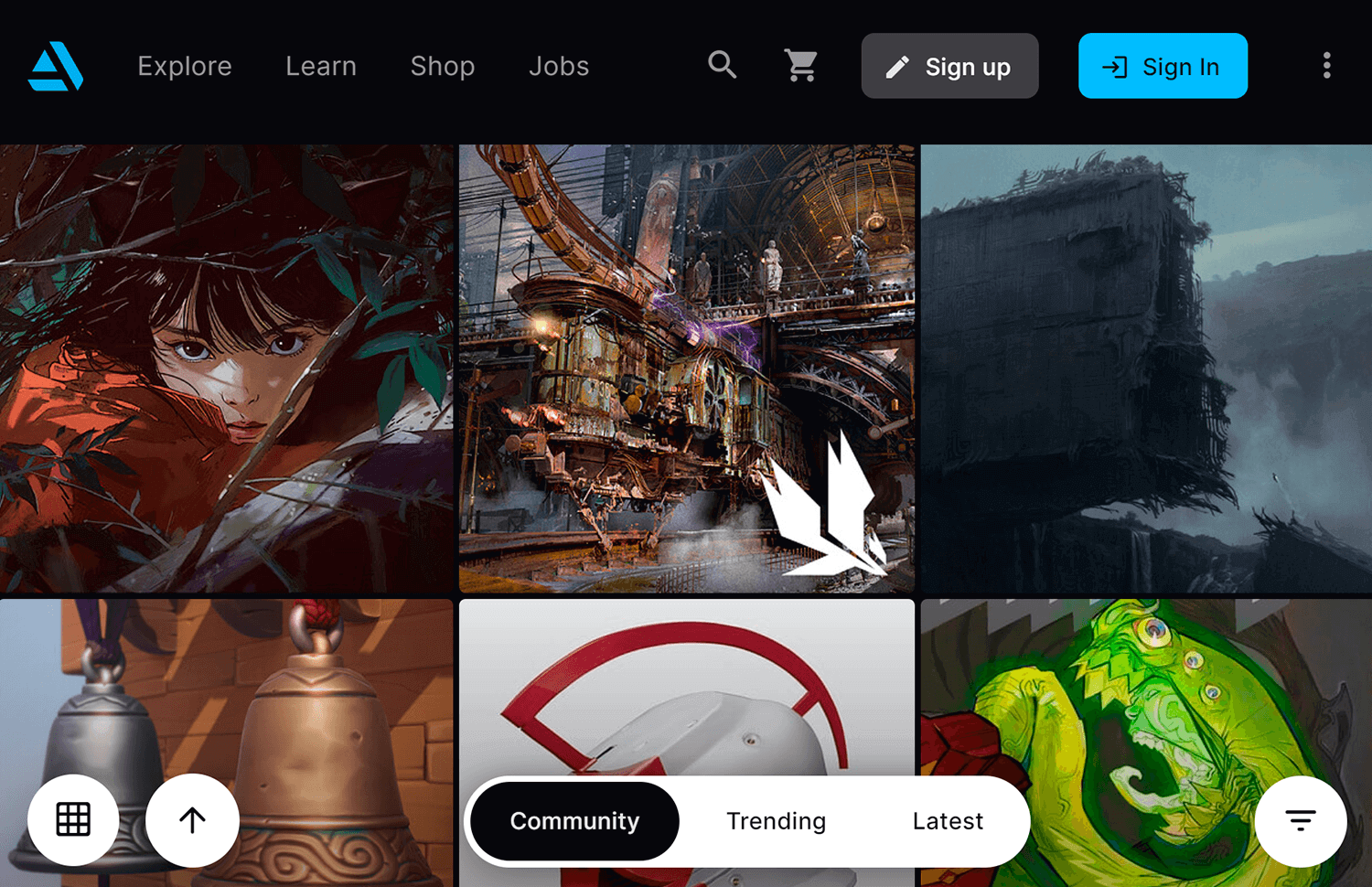
Crafted for artists and designers in the gaming, film, and animation industries, ArtStation is a platform to highlight your 3D models, illustrations, and concept art.
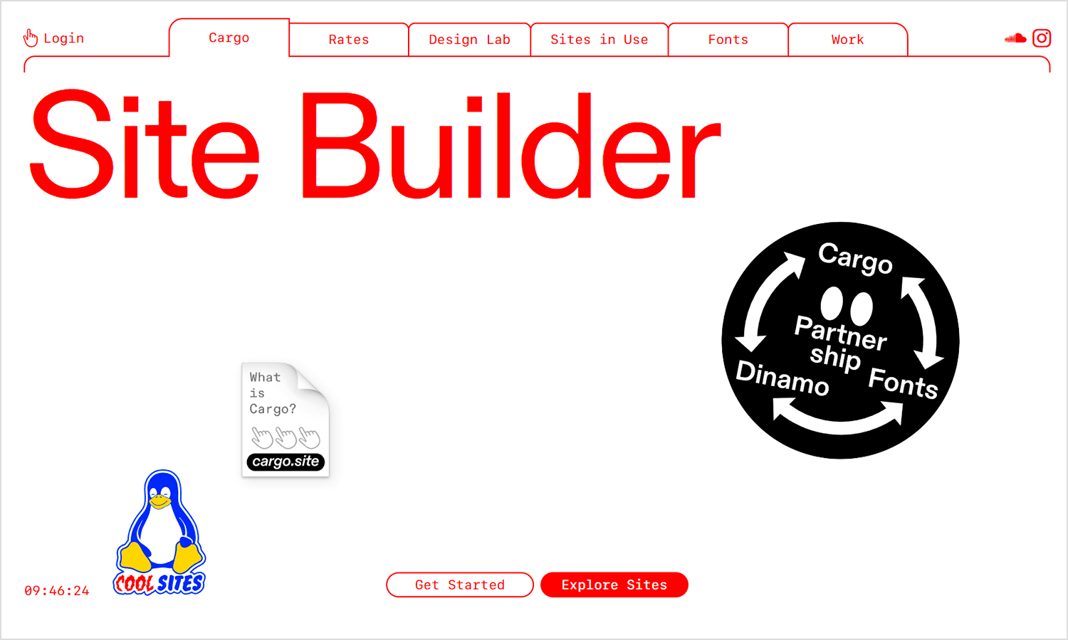
Cargo offers a unique approach to portfolio building. It emphasizes clean design and flexibility, allowing you to create custom layouts and experiences for your visitors. It’s a popular choice among designers and photographers who want to showcase their work in a creative and interactive way.
It’s not easy to tell people how to create their portfolios. So much of it depends on personality, taste and personal experience. Each designer has their own story to tell, their own accomplishments to share. At the end of the day, a good portfolio is the one that truly transmits who you are.
PROTOTYPE · COMMUNICATE · VALIDATE
ALL-IN-ONE PROTOTYPING TOOL FOR WEB AND MOBILE APPS
Related Content
 A fun look at different data table designs, from basic lists to smart, interactive ones, based on how complex the data is and what users need.18 min Read
 Single page design v multi-page design – everything you need to help you choose the right design for your site’s content18 min Read
 Website backgrounds can be a powerful tool in creating an experience. But what kind of experience can you convey and how? We got the full run-through for you!14 min Read

