Card UI design is an important technique for modern website and mobile app UIs. Read on for some card UI design inspiration!
Nowadays, we can safely say that cards have become a design staple across websites and mobile app UIs. And there are good reasons for it. Card UI designs are simple, intuitive and aesthetically pleasing. Just like Justinmind’s UI design tool, they’re also a powerful tool to create responsive websites.
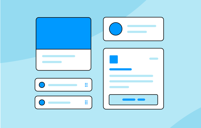
Create interactive card UI components for web and apps

In this post, we’ll look at what cards are used for and why they’re so popular. We’ve also thrown in some tips on how to create the perfect card. Read on to discover how card UI designs can make life easier for you and your users!
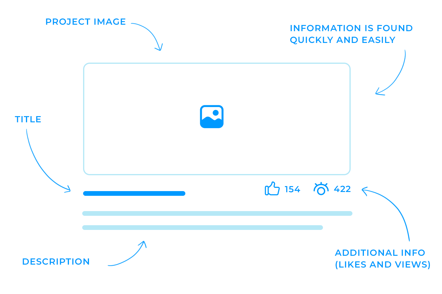
A card UI component is a design element used to present content in a clear and visually appealing way. Imagine each card as a small container that holds bits of information, making it easier for users to scan and understand content quickly. The idea behind using cards is to avoid overwhelming users with long blocks of text and instead, break information down into manageable, bite-sized pieces.
Even if someone isn’t familiar with the term “card” in design, they intuitively know how to interact with them because they resemble physical cards we encounter in everyday life, like business cards or baseball cards. These physical cards have always been a handy way to store and share small chunks of information, and the same concept applies in digital design.
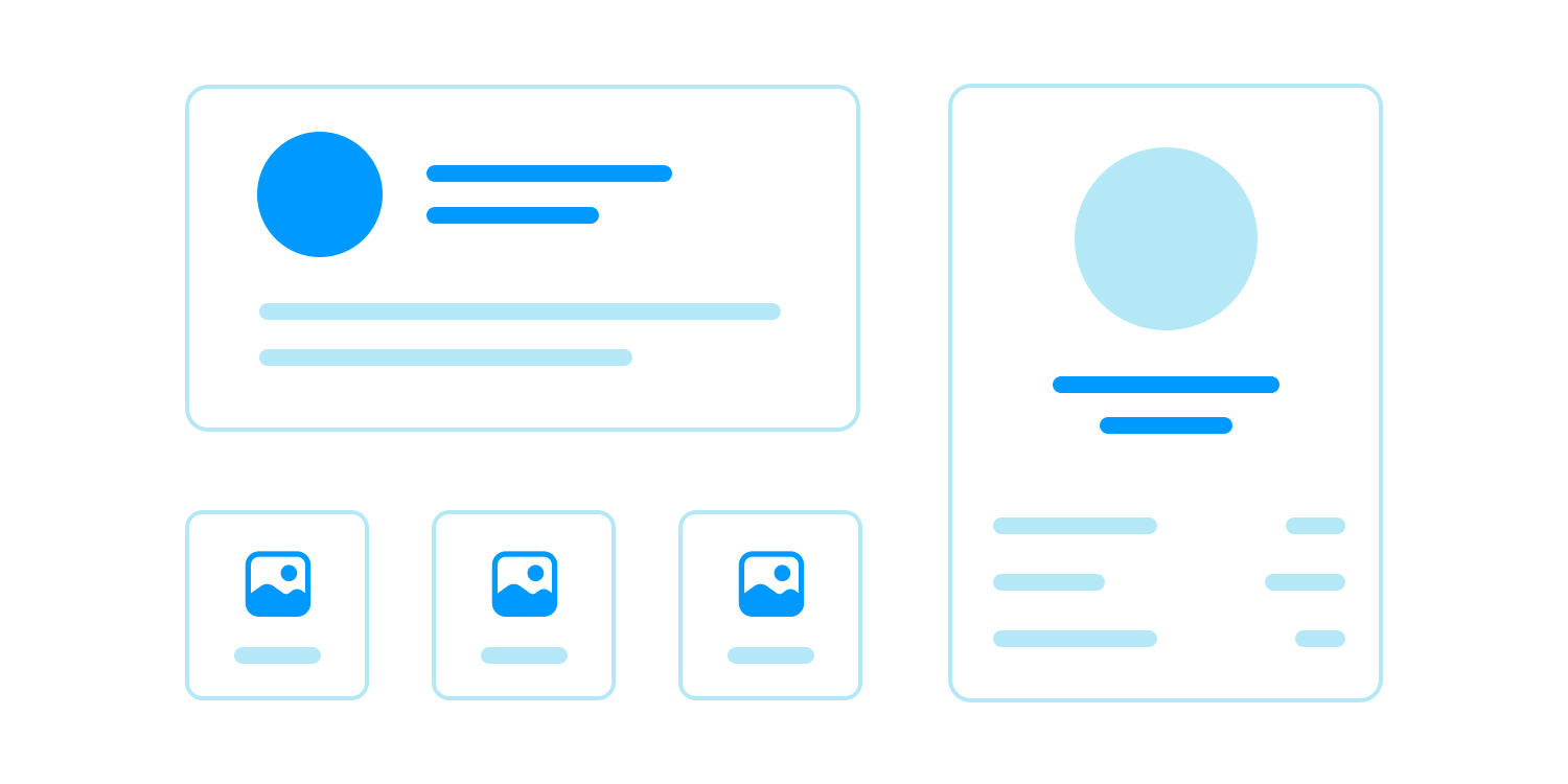
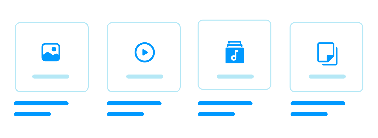
In UI design, cards typically have clear boundaries with square or rounded edges and come in various shapes and sizes. They usually feature a simple layout: a background, an image, and a few sections or “containers” that hold different elements. These elements, or “items,” might include an image, a button to take action (like a “Buy Now” button), and a title or subtitle to describe what the card is about.
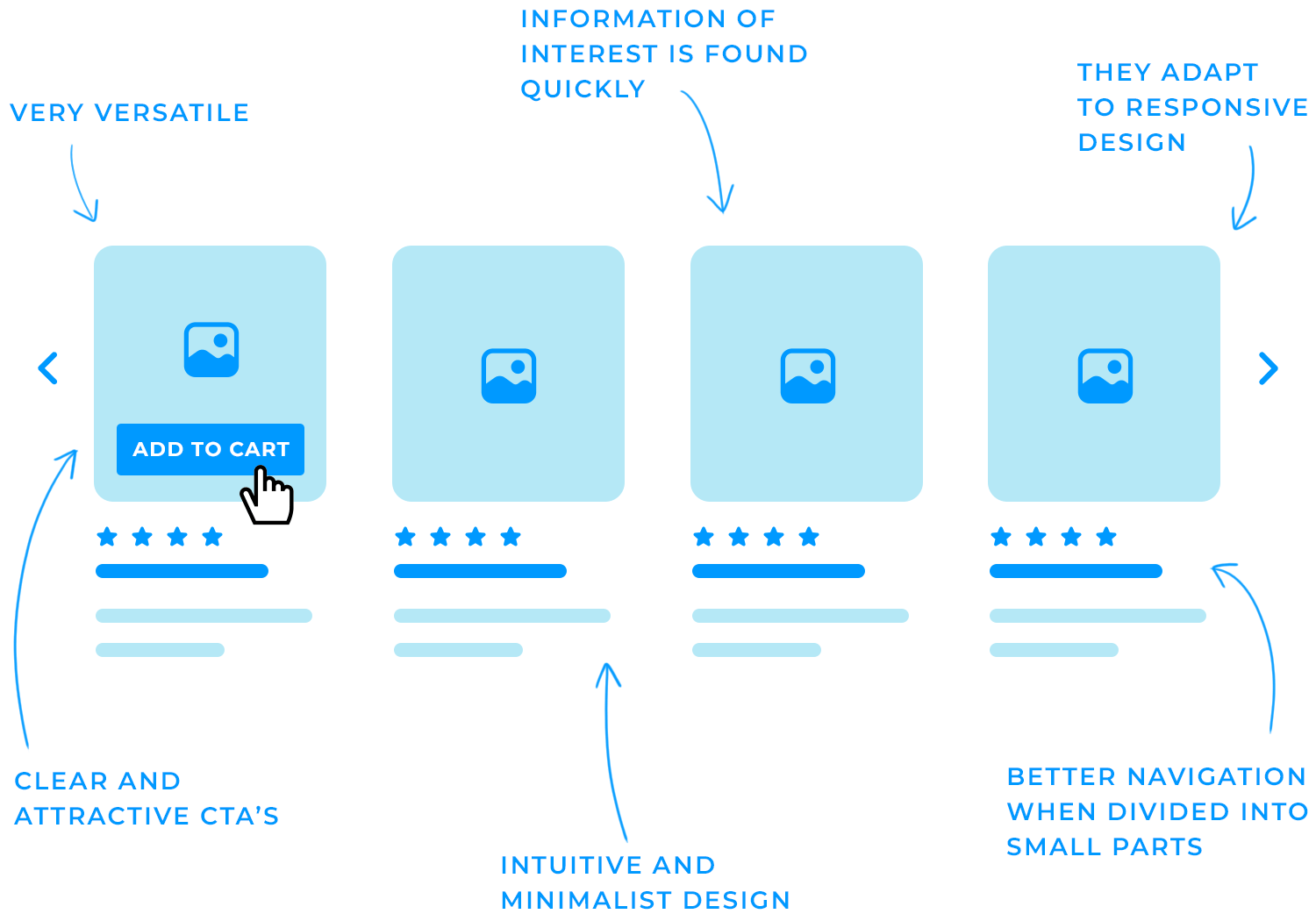
Cards have become incredibly popular in modern web and app navigation design for several reasons:
- Improved navigation: cards break down content into small, scannable pieces, making it easier for users to find what they’re looking for. This is especially helpful on content-heavy websites or apps, where users might otherwise feel overwhelmed.
- Intuitive design: card UI designs are minimalist by nature, which makes them user-friendly. They present content in a way that’s easy to understand at a glance, reducing cognitive load and enhancing user experience (UX). Learn more about minimalist design principles.
- Scannability: one of the key advantages of card UI designs is their ability to present small snippets of information, letting users quickly skim through and identify what matters most to them. This makes cards ideal for organizing and highlighting diverse content.
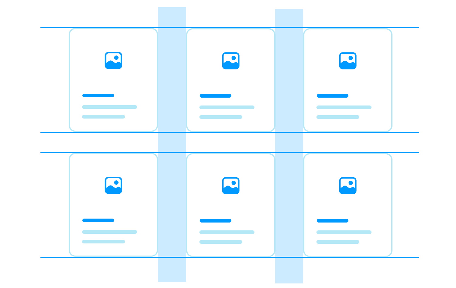
- Responsiveness: cards are highly adaptable to different screen sizes, whether on a desktop, tablet, or mobile device. Their ability to scale and rearrange makes sure a consistent and user-friendly experience across all devices, while also keeping a clear visual hierarchy.
- Versatility: cards can be used to display a wide range of content, from images and videos to galleries and text. This flexibility makes them suitable for various types of websites and apps, including ecommerce, social media, and news platforms.
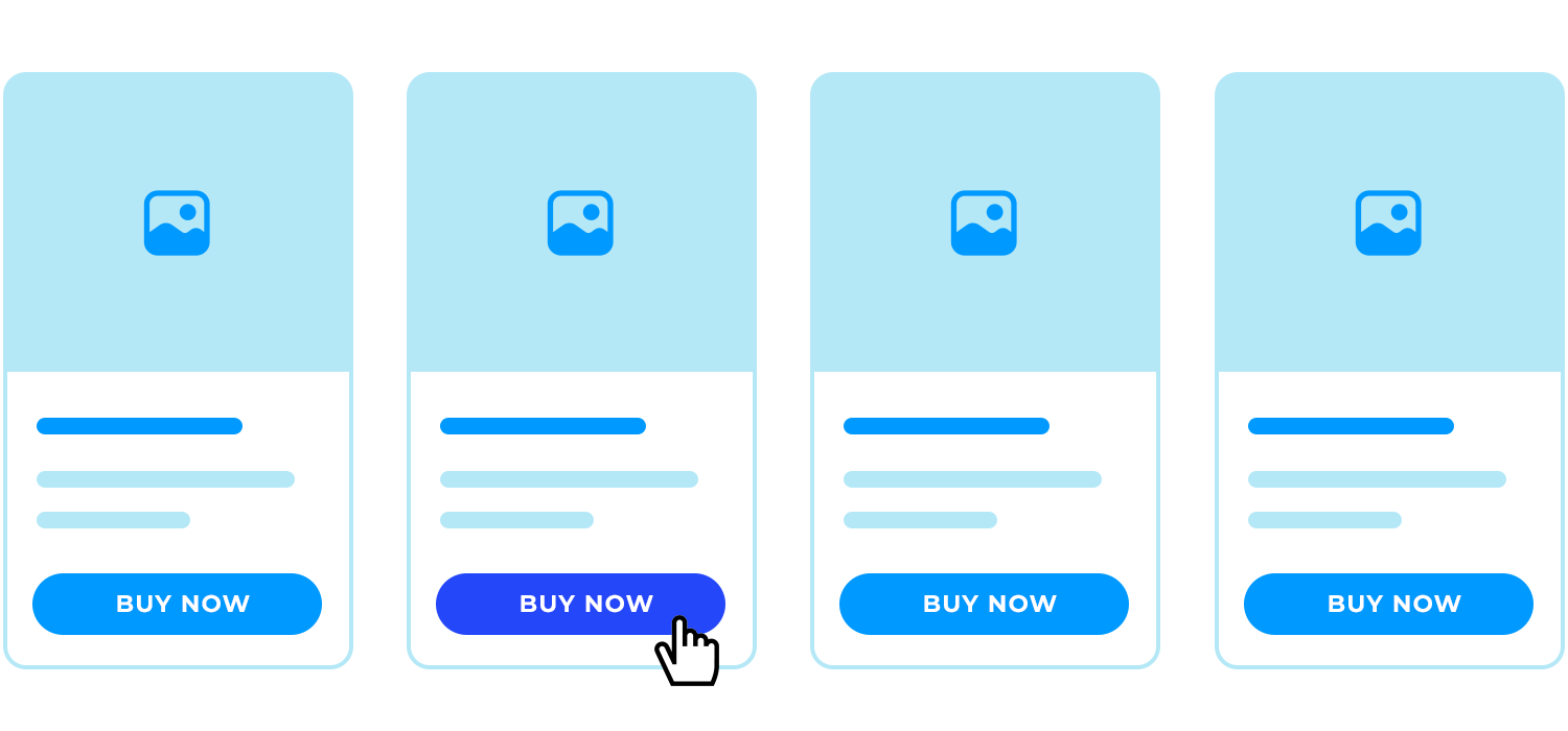
- Effective CTAs: cards are also great for drawing attention to specific actions. Whether it’s encouraging users to click a “Buy Now” button or share content on social media, cards make these actions clear and inviting, which is crucial for engagement.
To wrap things up, cards are a versatile design tool that help make content easy to navigate and interact with, which is why they’ve become so popular in modern web and app design. If you’re looking to get started with card UI design, you can explore our collection of free UI kits to find inspiration and resources.
Card UI designs can make your website or app much easier and more enjoyable to use, but they’re not always the best fit for every situation. Here’s when using a card UI design works really well.
Cards are great when you need to show a variety of information. For example, if you’re designing game-related content or a landing page or blog with posts on different topics, cards can help keep everything organized. Each card can focus on one piece of content, making it easier for users to browse through without getting overwhelmed.
But, if all your content is very similar, like a list of products with similar features, a simple list might work better than cards. If you’re interested, you can learn more about prototyping mobile UI patterns for real users.
Card UI designs are also ideal for interactive content, such as videos, images, and other media. Wrapping this type of content in a card makes it easier for users to engage with and navigate through the media. For example, a card can showcase a video thumbnail with a play button, making it clear and inviting for users to click and view.
Cards as well are great for content that’s designed to be shared on social media. By including clear and accessible call-to-action (CTA) buttons within the card, you can encourage users to share or engage with the content, boosting its reach organically.
Incorporating CTAs within cards is another strong use case. Whether you want users to share a story, sign up for a newsletter, or make a purchase, cards can help highlight these actions in a clear and compelling way. For example, on an e-commerce website, using a card to feature a product along with a “Buy Now” button makes it easy for users to take immediate action.
Cards are particularly effective in creating a clear visual hierarchy and improving navigation on your site or app. By breaking down content into smaller, more digestible chunks, cards can guide users through the information smoothly, helping them find what they’re looking for with ease.
One of the great things about card UI designs is how easily they adapt to different devices. Cards can quickly adjust or rearrange to fit any screen size, making them perfect for responsive web design. Whether your users are on a desktop, tablet, or mobile phone, card UI components help keep everything looking consistent and easy to use.
When you understand these scenarios, you can easily decide if a card UI design is the right choice for your project, making sure it improves the user experience effectively.
Now that we’ve talked about why card UI designs are so popular, let’s look at how you can create card UIs that really work. There are plenty of ways to design cards, but some key principles can help make sure your cards are both easy to use and nice to look at. Here are some tips to keep in mind.
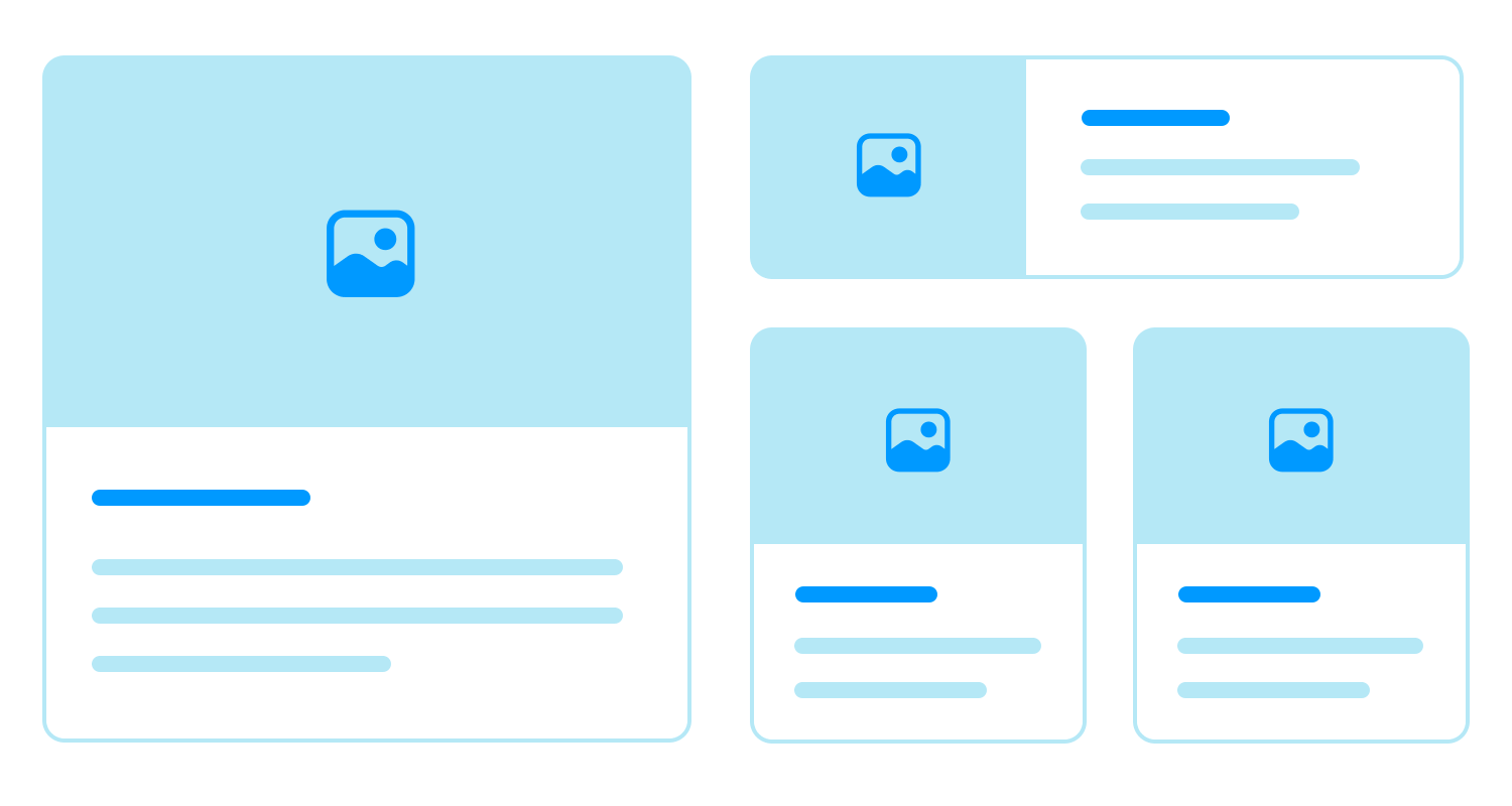
Each card should focus on just one idea, topic, or product. This keeps things simple and helps users quickly understand what the card is about. Instead of cramming too much info into one card, break it up into smaller, more manageable pieces.
It’s important to have a clear order for the information on each card. Start with the most important details, like the title or main message, and then add the supporting info. A well-organized card makes it easy for users to find what they need without feeling overwhelmed.
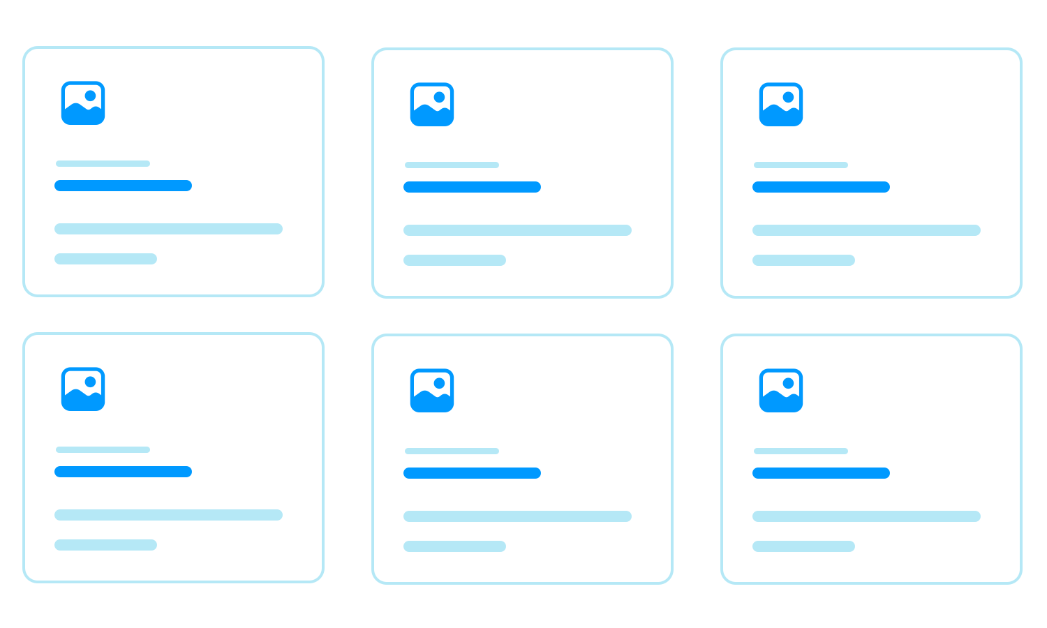
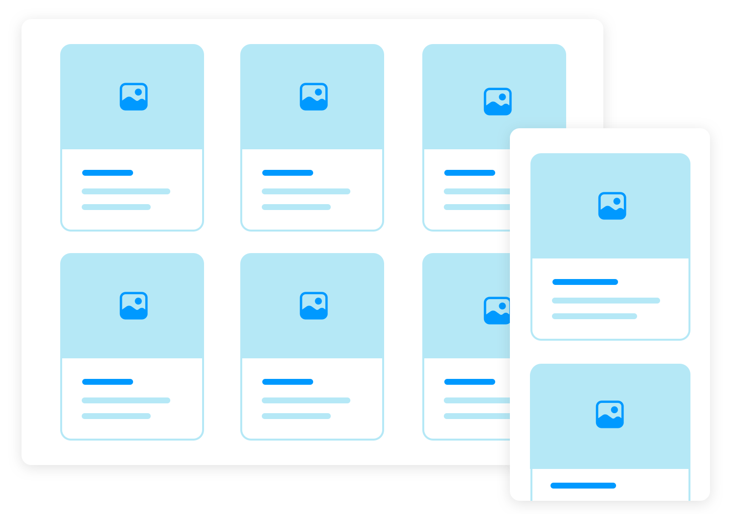
A grid system helps keep your cards neatly arranged and consistent. It makes sure the spacing, margins, and alignment are the same across all your cards. This not only makes your design look better but also makes it easier for users to navigate.
Giving your cards enough space to breathe is key to a clean and readable design. Make sure the cards are aligned properly so everything looks tidy and professional. Good spacing and alignment make your UI more pleasant to use.
If your cards are meant to be clicked or tapped, they should look and feel interactive. Adding small effects like a change in shadow or a slight animation when you hover over a card can make it clear that the card is clickable, which makes the user experience smoother.
To make things easier for users, make the entire card clickable instead of just a link inside it. This way, users can click anywhere on the card to take action, which is more intuitive and user-friendly.

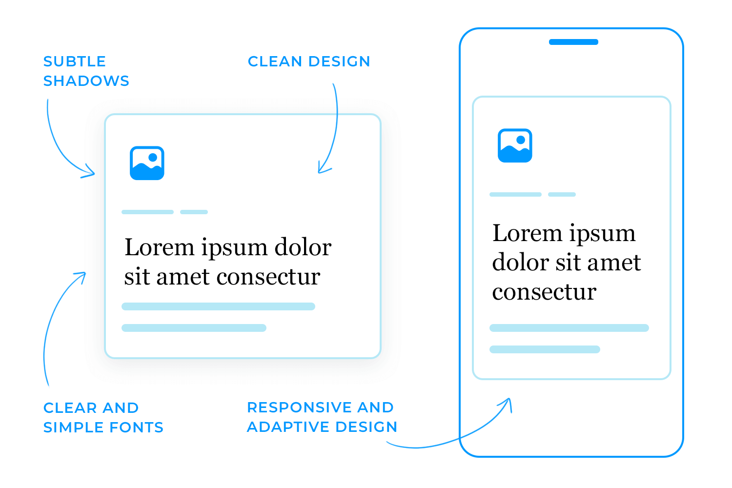
A little bit of shadowing can make your cards look more three-dimensional and stand out from the background. This subtle effect adds depth to your design without being too flashy.
The fonts you use on your cards should be clear and simple. Avoid fancy fonts that are hard to read. The goal is to make sure users can quickly read and understand the text on your cards.
Your cards should look good and work well on any device, whether it’s a desktop, tablet, or phone. Make sure the cards can adjust and rearrange themselves easily, like moving from three cards per row on a desktop to one card per row on a mobile phone. This ensures a smooth experience for all users, no matter what device they’re using.
While it’s important to follow these basic principles, you can also have fun with your design. Try out different layouts and styles to make your card UI stand out. You could experiment with modern styles like neumorphism or skeuomorphism, but always make sure your design choices keep the user experience in mind.
Lastly, and most importantly, you should always plan how you’re going to tackle the issue of responsiveness. Plan your card UI design’s responsiveness by making sure it can easily scale down to smaller resolutions, like shifting from a row of three cards to two. If you want to explore card design within a more trendy style, why not check out our posts on neumorphic design or skeuomorphic design?
Create interactive card UI components for web and apps
This e-learning platform makes great use of a card UI to organize courses in a clean and user-friendly way. Each course is presented in a large card with important details like the course title, date, subject, and relevant tags (such as “Design” or “AI”). Users can easily filter through courses by their status – Current, Pending, or Completed – and click “View more” to get further details.

The right-hand side includes a schedule that highlights upcoming events, making it simple for users to stay on top of their learning schedule. The card UI design keeps everything well-spaced and easy to scan, making sure users can quickly find the courses they need. This layout works perfectly for educational platforms, giving users an easy and smooth way to access their courses and stay on top of their schedules.
This app uses a smart card UI design that’s perfect for mobile shopping. Each product gets its own card, featuring an image, price, and short description, so everything you need is right there at a glance. Whether you’re looking at books, tech gadgets, or fashion items, the layout makes it easy to scroll through and compare.

The design is simple and organized, allowing users to quickly browse products. You can even tap the heart icon to save items for later, making it easy to keep track of favorites. Overall, this card UI keeps everything clear and user-friendly, making mobile shopping a smooth and enjoyable experience.
Next, let’s take a look at how this streaming platform, the card UI design does all the heavy lifting, making it super easy for users to browse and start watching their favorite shows. Each show is highlighted in its own card with eye-catching images and key info like the title and genre. The best part? You can jump right into a show, by clicking “Watch now” button right on the card.

The interface keeps things simple and user-friendly, allowing users to manage their watchlist with just a tap on the “+” button to add or remove shows. Off to the side, there’s a section for “Acclaimed” shows, where viewers can get quick recommendations along with ratings, and a “Best Artist” feature that spotlights top stars. The card layout keeps everything neatly organized, letting users quickly scan through the options and find something to watch in no time.
Here, each card showcases headphones in a clean and simple way, making it super easy to browse through the options. You’ve got crisp images, product names, and prices all laid out clearly, so you can check out every product with no hassle.

The navigation in this headphones store app is straightforward too, with a filter bar at the top that lets you narrow down your search by categories. This card design cuts through the clutter, giving users just what they need to make quick shopping choices without feeling overwhelmed.
Now, shifting gears, this hotel booking site uses a super simple card UI to make finding a great deal easy. Each hotel is neatly displayed in its own card, with a stunning image, key details like the price per night, location, and star rating right there for you to see. Plus, the “View more” button lets you dive deeper into the details without any issue.

The site makes it easy to search, letting you filter by destination, check-in and check-out dates, and guest numbers. The clean card layout ensures everything you need to know is right in front of you, making it a breeze to compare your options and make a choice.
This card design is perfect for a hotel booking site, keeping everything simple, organized, and super user-friendly so you can book your stay without any hassle.
If you’re a fan of space, you’ll love how this portal organizes content. This space news portal uses card UI to make it super easy for readers to find the latest space stories. Each article is displayed in its own card with a big, eye-catching image and a short description.

And here’s a cool touch, the cards also show the estimated reading time, so you know exactly how much time you’ll need. It’s a great example of a simple and clean design that helps you scroll through the news without feeling overwhelmed.
Here’s an example of eye-catching and simple card UI design, making this travel booking site super easy to browse dream destinations. Each destination gets its own big, beautiful card, complete with a stunning photo, the price, and user ratings, so you can quickly see all the important details.

The cards are spaced out nicely, giving you a quick snapshot of each place, whether you’re thinking about relaxing in the Maldives or exploring the Sahara Desert. Little touches like star ratings and location markers add extra info without making the design feel cluttered.
This magazine app uses card UI to bring the digital reading experience to life. Each article is wrapped in its own visually appealing card, with a big, attention-grabbing image and a headline that hooks you in immediately. The categories are all neatly laid out, making it feel like you’re flipping through a well-organized, modern magazine.

What makes it really pop? The “Featured” tags that instantly highlight trending articles you won’t want to miss. It’s almost like the app is curating the best reads just for you. With everything so clean and easy to navigate, you can dive right into the stories that matter, without feeling overwhelmed. It’s a design that makes browsing not just easy, but enjoyable.
Another great example of an amazing card UI design is this shoe shopping app The card design does all the work, showing off the shoes with big pictures and clear prices. If you like what you see, just tap the “+” button to add it to your cart making it super easy.

Below, the “Offers” section has smaller cards you can swipe through to check out more options without crowding the screen. This card layout keeps everything simple and makes shopping feel fast and easy. It’s a great way to show how card UI makes browsing and buying smooth.
In this case, shopping for products has never been easier because of how simple card UI design is in this e-commerce app. Each item is displayed in its own neat card, showing the product image, name, and price clearly. You can browse through different categories like shampoo, conditioner, and packs, all organized for easy access.

The best part? You can add a product to your cart with a single tap on the “+” button, quick and fuss-free. The clean layout makes everything feel organized, so you can focus on what you want without distractions.
Now let’s check how this wellness app nails it with its card UI. Right away, you’re greeted with options like Yoga and AcroYoga, each displayed in its own neat little card with vibrant images. It’s super easy to scroll through and find the session that suits your vibe for the day.

No confusion as everything you need is right there, visually laid out for you. You can just tap and get started with your wellness journey. This design really shows how card UIs can make browsing through an app feel intuitive and smooth, without any effort at all.
Now, let’s talk about how this travel app uses card UI to make exploring new adventures super easy. Each activity, whether it’s surfing or hiking, is organized into its own card, giving you a clear and quick view of what’s available. The cards are visually appealing, with bold images that grab your attention right away.

At the top, you’ve got some categories making it easy to switch between different activities. The UI card design helps keep everything simple and easy to scan. Plus, with details like friends’ likes right there on the card, it adds a personal touch to your experience.
Need a meeting room fast? This app’s card UI makes it easy. Each card highlights key details like room size, seating capacity, and special features, all in one place. With a “Book now” button right on the card, you can lock in your spot in no time.

Any post talking about card UI design wouldn’t be complete without the project management software known as Trello.
Trello’s entire user interface is based on card design alone. Trello presents the user with a Kanban style dashboard that allows users to write their tasks onto cards that they can then sort into the following categories: To Do, Doing and Done.
Trello is a great example of using card UI design in a unique way. Normally cards and lists don’t go together, but Trello manages to achieve it. Instead of being a list of cards, each card has a list of tasks in various phases of operation, which are freely movable in that they can be dragged and dropped to any other kanban category on the dashboard. In this way, the user can create their own lists using the cards.

Lastly, the Trello website has a section that works as a guide on how you can use the software across a variety of different sectors. The way the information is laid out is fun and intuitive. Each card has the right amount of copy – the name of the area of management, along with fun vector images that complement the copy.
Design hosting website Dribbble is a great example of how to use cards to create an intuitive and visually stimulating UI design. Their homepage presents the user with a dazzling array of cards showcasing some of their designers’ most popular work.
The site also has the typical navigational menu options on the header, followed by different breadcrumbs that lead to the various content categories on their site. Clicking on these will take you to more relevant cards. All the cards are all organized into categories based on the tags the author used, in much the same way as many social media sites.
Each card on the Dribbble website has an interesting method of interaction that’s similar to the Justinmind Examples page. As you hover your mouse over each card, a container that was previously invisible pops up with the name of the work and the date it was created. There are also two CTA buttons prompting you to “save” or “like” the design.

Finally, clicking on the design itself takes you through to a larger image of the UI design, where you can see the author’s summary, as well as comments that people left, social media buttons and an option to copy the link. Two arrow buttons then come up on the side, letting you browse the rest of the cards to the left and the right without having to press the back button.
The designers of the Dribbble website made sure that only the necessary information was displayed on each card, leaving the images to shine for themselves, as they are the most important part.
British news channel Sky News uses a card UI design to display all its latest stories and content. The top of the website includes the typical breadcrumb options of most news sites to help the user to navigate to trending news topics, but the main visual display of the site is focused on the cards.
Sky News’ website layout is a great example of how a myriad of breaking and trending news stories can be presented using a card UI design. All the cards are symmetrically centered in rows of three on the screen, with the main article being three times the size of all other cards for a sense of hierarchy.
The fact that there are cards displaying both text based and video based news stories helps to further illustrate how card UI design can be used to display a rich variety of media on the same page easily. As you scroll over each story, the images expand, encouraging you to click and dive deeper into the story, and news videos start playing silently.

Sky News’ website also demonstrates the ability of a card UI design layout to scale down perfectly to smaller resolutions. On tablet, the homepage shifts from three cards to two card rows. On cell phone resolutions, that number is reduced to one, but instead, each card takes on a slimmer, more rectangular shape, meaning more can fit vertically on the screen.
When it comes to handling payment details, a card UI design is a real lifesaver. This example shows how well-designed cards can make managing financial transactions super easy and secure. This payment platform uses cards to organize important details like payment amounts, dates, and even specific categories (like accommodation or cleaning fees).
Each card clearly breaks down the information, making it simple for users to track and understand their payments. There’s a space to enter details, see amounts owed, and even review payment lines in one neat place. Plus, it’s designed with intuitive buttons to guide users smoothly through the process without feeling overwhelmed.

This type of card UI design is perfect for payment systems because it keeps things clean and organized, helping users manage their financial info quickly and securely.
This productivity dashboard is another great example of how card UI can keep things organized and easy to follow. Each card focuses on different areas of productivity, from tracking your weekly progress to checking total hours worked, upcoming webinars, and even your schedule for the month.
The cards are nicely spaced out and give you quick bits of important info. For example, the “Weekly progress” card shows how close you are to finishing your tasks, and the “Total Hours” card gives a clear picture of how much time you’ve spent. The webinars section also uses cards to show upcoming events, making it super easy to spot the ones you’re interested in.

This card UI design is perfect for productivity tools, giving users all the details they need at a glance without overwhelming them. Everything is neatly organized, helping users stay on top of their tasks, time, and activities in a clear and simple way.
Keeping things simple and stylish for a NFT marketplace website is easy with this card UI design. Each NFT is shown in its own card, packed with all the important info like price, who owns it, and the artist behind it. The buttons are right there to make taking actions something easy and quick.

The cards also show rarity levels, giving you a heads-up on how unique the NFT is, while the bold artwork really stands out. Everything is laid out clearly, so it’s easy to scroll through and find what catches your eye. Plus, with filters at the bottom, you can sort through NFTs by what’s popular or other options in just a click.
This card UI makes the whole process of browsing and buying NFTs super smooth and user-friendly.
Filters at the top help you narrow down options based on your preferences, whether it’s Wi-Fi or soundproofing you need. It’s all laid out simply, so booking your meeting space is smooth and hassle-free.
Let’s change now to this messaging platform, the card UI design keeps everything super organized and easy to use. Each section sits neatly in its own card, making it simple to find what you need.

For example, you’ve got the contact card where you can see the profile, quick actions for calls or messages, and the chat card showing ongoing conversations. There’s also a dedicated card for shared files and even one for upgrading to the pro plan, all clearly spaced out so nothing feels cluttered.
The card layout helps users navigate through different tasks quickly and efficiently, whether they’re chatting, uploading files, or managing contacts. It’s a clean, no-fuss design that makes managing communication smooth and intuitive.
In this example, we can see how effective card UI can be for managing different tasks in one place. Each section is neatly displayed in its own card, giving users an easy way to handle complex data without feeling overwhelmed.

Teamup website design helps users quickly get the info they need, whether it’s checking candidate details or tracking company hiring progress. It’s simple, clear, and makes managing HR tasks much smoother.
Here’s a dashboard that makes exploring features feel exciting. Each card stands out with bold colors, like the glowing green “Fine Details” card, practically inviting you to click on it. The dark background makes everything pop, making it easy to know where your attention should go.
The design feels super interactive, especially with that little hover effect on the “Fine Details” card – it adds a fun, playful touch. You can quickly explore different options without feeling overwhelmed.

Overall, it’s a really cool and simple way to dive into different features while keeping things engaging and easy to navigate.
To wrap up our website card UI examples, let’s look at this travel booking dashboard that does a great job using card UI to keep all your travel details in one place. Each card gives you important info or even a handy map of places you’ve been or plan to visit.

The card for flight check-in is especially useful, showing upcoming trips and letting you check in with just a click. There’s also a card for special promotions, helping you easily spot discounts on your next adventure. And don’t forget the boarding pass card, it’s all laid out neatly, ready for you when it’s time to travel.
This card UI keeps the whole process stress-free, letting you manage everything from booking to boarding without any hassle. It’s a simple, organized way to handle your trip planning, all in one easy-to-navigate dashboard.
Card UI designs are meant to be a highly visual design approach that encourage interaction from the user, and Pinterest uses that to its advantage. The social media site makes use of its encyclopedic nature by using cards (Pins) to display information that not only is descriptive of the category that they represent, but also highly visually appealing.
Each card on the UI represents a “Pin” within an information category that the user can collect on their “board”. They might be pins for hobbies such as fashion, cooking, gardening or art. The result is a visually appealing collage of all your hobbies and saved information in one place, in a way that’s both appealing to the user, as well as to their profile visitors.
On the main screen of their app, you’re free to browse whatever takes your fancy, with cards on display that are based on your previous searches. There’s also a search bar if you’re looking for something more specific that you haven’t browsed for before. This combination of card UI design and a search bar is the perfect combination to ensure great UX, possibly owing to the popularity of the app.

Pinterest displays cards of various sizes in rows of two that you can vertically scroll through (infinite scrolling is used). Under each card is an overflow menu icon that, on tapping, presents further options: you can download the image, hide it or report it. Tapping on the card itself takes you into the actual Pin, such as an infographic about suitable teas for the different moods you find yourself in.
Further interaction is then possible, as you can share or save the Pin to your board, in addition to seeing similar Pins in the “more like this” section. You can also visit that user’s profile, website or follow their boards on Pinterest.
What better use of a card UI design is there than an app store? Google Play, with over a million apps available for Android users, has found a natural and logistically flawless way to display all of the apps available in their store – cards.
Each app is a card, with the app icon being the largest item you see, followed by the name of the app as a subtitle and then the third item, with the app’s rating. The cards are organized into various sections such as “recommended for you”, “suggested for you” and “just updated”. While most mobile card UI designs deploy vertical scrolling, Google Play favors horizontal. And the funny thing is, when done right, horizontal card scrolling on a mobile device actually works.

The cards are just small enough to have multiple rows of three visible on the screen, each row belonging to a different category. What we like about this card UI design is that Google Play has organized them in such a way that small snippets of card that hasn’t been scrolled into view are visible, encouraging the user to swipe further.
Create interactive card UI components for web and apps
Skyscanner is another interesting example of a UI design based almost exclusively on cards. Their app makes use of a card UI design to help the user find their perfect holiday in the most interesting and exciting way possible.
When you first open up the app, you’re presented with a calendar where you can choose the dates you want to travel. Interestingly, a horizontal list of cards appears at the bottom advertising special dates, such as public holidays, with fun animations to depict the holiday. This is an innovative trick to help users plan their calendar. In this way, they use cards as suggestions.

Hitting the explore icon on the footer allows you to discover your next destination via categories such as “Your perfect trip” and “weekend breaks”. Here, Skyscanner presents each destination on a card with a photo of the place, along with a caption, such as “Solo Travel” and “kid free”, offering a personalized experience.
The Skyscanner app is a great example of how to use a card UI design to increase the intuitiveness of your mobile app while creating a fun and personalized user journey.
If you’re looking for a cheap ecommerce app and an alternative to Amazon, then you might try AliExpress (although, be warned – some stuff takes ages to arrive!). Their mobile app lets you carry a catalogue of over 100 million products with competitive prices around in your pocket.
But that’s not the best part. What caught our attention was how they designed their mobile app – with a complete card UI design! As soon as you open up the app, they present you with a variety of “deals” and “featured” categories, all of which are simple UI cards.

Under the deals sections, each card displays a clear image of the product on sale. Directly under that is the percentage of price reduction applied to that item against a red background and beneath that, the current price. This is a clear example of how to make the most of the space on a card to appeal to the user’s attention with business goals in mind.
Let’s talk about this mental health app that’s all about how you feel. The card UI here makes it super simple to check in with yourself and explore activities based on your mood. You just tap on how you’re feeling, and the app instantly shows you activities to match.

The cards below give you easy suggestions, like talking to a friend or trying a relaxing meditation. The design is clean and friendly, making everything feel calm and easy to use, so you can focus on feeling better without any stress.
What comes next is a sleek and simple kayaking gear app. The card UI makes it easy to browse and shop. Each item has its own card showing the price, an image, and an “Add to Cart” button, making it quick to add items to your cart.

You can easily switch between categories like life jackets, ropes, and paddles at the top. The dark background makes everything stand out, giving the whole shopping experience a clean and easy flow.
And now, wrapping up our mobile UI card examples, we’ve got this vibrant savings app. The colorful card UI here makes managing savings feel effortless and fun. Whether you’re putting money aside for a trip, a down payment, or something like a new sofa, each card shows your progress with a handy bar.

The bright colors, fun emojis, and profile pictures keep things personal, making it easy to see who’s contributing to each goal. It’s a smooth, user-friendly way to stay on top of your financial goals, all while keeping it visually appealing.
Create interactive card UI components for web and apps
Now that you’ve seen some great examples of card UI design for websites and mobile apps, let’s talk about how you can bring your own card designs to life using Justinmind. Whether you’re new to prototyping or a seasoned designer, Justinmind makes it easy to create, test, and refine your card UI designs.
With Justinmind, you can start by choosing from a variety of design templates and UI kits that include pre-designed cards, so you don’t have to start from scratch. These resources can save you time and give you a solid foundation to build on. Simply drag and drop the card elements onto your canvas, and you’re ready to customize them to fit your project’s needs.
One of the best things about using Justinmind for prototyping cards is how easy it is to tweak and test your designs. You can quickly adjust the size, shape, and layout of your cards to see what works best. Want to experiment with different fonts or add interactive elements like buttons and links? It’s all possible with just a few clicks.
Another great feature is the ability to make your cards interactive. You can add hover effects, animations, and transitions to bring your card UI to life. This helps you see exactly how users will interact with your design, making it easier to refine the user experience before you move to development.

If you’re designing for multiple devices, Justinmind also makes it simple to create responsive card designs. You can set up different views for desktop, tablet, and mobile, ensuring your cards look great and work smoothly on any screen size.
To get started, check out our support page where you’ll find step-by-step guides and tutorials on how to prototype card UI designs with Justinmind. Whether you’re looking to create something basic or want to explore more advanced features, we’ve got you covered.
Prototyping your card UI with Justinmind not only helps you visualize your design but also lets you test and iterate until you’ve nailed the perfect user experience. Give it a try, and see how easy it is to turn your ideas into interactive prototypes.
Knowing how to create a good card UI design means knowing how to create an intuitive browsing experience for your users. Great card UI design is like functional eye candy when done right.
In short, card UI design is one of those important skills where, once mastered, allows you to solve a wide array of UI design problems. And what’s more, cards don’t look like they’re going anywhere fast – they’re literally on the cards for the future!
PROTOTYPE · COMMUNICATE · VALIDATE
ALL-IN-ONE PROTOTYPING TOOL FOR WEB AND MOBILE APPS
Related Content
 Satisfy your client and give them their money's worth with this effective logo design checklist8 min Read
 Find the best free and paid SVG editors available online and desktop, including Mac, Windows and Linux.24 min Read
