
Fonts for apps play a major role in your users’ experience. Here, we’ve rounded up the best ones you should use for your next mobile app UI design
Without a doubt, fonts are one of the most critical elements of UX . It can make or break the UI design. If your users are unable to read your content, you can say goodbye to them immediately. That’s why even a rudimentary understanding of typography means you can determine for yourself the best fonts for apps.
Design hi-fi prototypes for apps with any font you want

Legibility is everything and choosing the right font will have a big impact on the overall user experience of your mobile apps. In this post, we’ll look at how to choose fonts for app design. We’ve also thrown in a list of the best free and paid ones around!
Fonts are like the clothes words wear; each one serves a different purpose or intention. Just like wearing a scarf in summer is impractical, certain fonts work better in specific situations. By creating a symbiosis between your UI design and fonts, you ensure coherent user experiences.

Following on from our outfit analogy, let’s imagine you wear a Hawaiian shirt to a funeral. Seem appropriate? Similarly, Comic Sans wouldn’t be on the menu of a Michelin-starred restaurant.. In this way, many of us already understand the feeling that fonts can elicit. It’s this feeling that can help determine which are the best fonts for apps.
However, we’re not just talking about whether or not a font “goes with something”. Just because a font looks good doesn’t always mean that its appearance translates into other important areas: legibility, readability and usability.
Mobile is the dominant screen today so UX designers should ideally design with responsive typography in mind. Responsive typography has geometric and scalable outlines. Remember, fonts are there to be read, not for pretty decoration.
If you have a font that displays large on an ordinary computer screen but doesn’t scale down properly when viewed on mobile, then your website or app wireframe is going to have terrible usability, even if you’ve chosen the best font in the world.

To really push the boat out, think about fluid typography. It’s like responsive typography’s more attractive cousin. Basically, fluid typography resizes fonts to match any screen, not just at certain breakpoints as with responsive typography.
Before we think about the best fonts for app designs, it’s important to make the distinction between two different styles. These styles are serif and sans-serif.
The Oxford Dictionary believes the word serif originated from the 19th-century Dutch word “schreef”, meaning line or dash. With respect to fonts, a serif is a small line attached to the end of a stroke in a letter. Think of names like Times New Roman or Clarendon that everyone knows about.
Conversely, a sans-serif – also known as Grotesque – is a font without serifs, hence “sans”. These fonts include familiar typefaces such as Helvetica, Proxima Nova and Open Sans. Many modern fonts for apps are sans-serif because they increase readability and can scale much more easily. They also tend to clash least with most UI designs.

The first thing you should do is disregard most fonts. It sounds drastic, but many fonts for apps that you can find on the internet aren’t widely used in mobile app design. However, every so often, a font will pop up and get used by everybody, like Gotham. Ubiquity isn’t something to shun when it comes to fonts, particularly if that font does the job well.
You can likely count on both hands the number of fonts that frequently appear in mobile app design. The reason these same fonts keep recurring in UI design is that they perform exceptionally well. They’ve been thoroughly tested and proven effective. They’re readable, legible, and widely recognized. We’re looking at you, Proxima Nova!
For more specialized needs, like numeric displays, consider exploring the best number fonts to enhance your app’s design. To ensure optimal readability in your app’s typography, it’s essential to follow best UX practices for line spacing. Plus, getting the hang of visual hierarchy can really boost your app’s user experience by making it easier for users to find their way around.

When picking out fonts for apps, these questions should help you distinguish a good font against a bad one:
- How many weights does the font have?
- Is readability good owing to the x-height?
- Does this font scale well on multiple devices?
- Is it accessible?
- What’s the contrast ratio?
If a font has a wide selection of weight, a large x-height, and scales effectively, it will likely perform well in most UI layouts, context permitting. Remember to keep in mind the general rules of usability and UI design principles when choosing a font.
Whichever fonts you do decide on, limit yourself to using just one or two at a time. Sometimes just using one font at various weights can be just as effective as using multiple fonts.
In the Justinmind UI design tool, you can use default and Google Fonts in your designs. They’re easily integrated into the tool. If you’re stuck between a few font choices then a great solution to this age-old problem is to simply prototype and test until you have the most appropriate solution. Some designers even go so far as to create a paper UI sketching of the design, already noting the fonts they feel would fit in.
Prototyping fonts can put you on the right track before making any commitments that might affect the UI design later on. As you work your way from a low-fidelity to a high-fidelity prototype, your style will never escape from your control.

If you want to expand your search for inspiration, feel free to check out this post on UI design examples. In there, you’ll find both mobile and web designs that push the boundaries of UI design! You can also explore other, more specific types of designs. Check them out:
With that said, below you’ll find a collection of the best free and paid fonts selected by our design team to get you started!
Design hi-fi prototypes for apps with any font you want
There’s very little you can do to go wrong with San Francisco when choosing the fonts for apps made for iOS. Consistent and legible, this sans-serif offers up a friendly voice, and one that’s instantly recognizable to iPhone users.

Designed by Mark Simonson as the modern world’s slightly toned-down answer to Helvetica, Proxima Nova draws from both Futura and Akzidenz Grotesk.

Many popular apps use this font, including Netflix and Spotify.
Lato is the Polish word for summer, as it was designed in that season in 2010 by Lukasz Dziedzic.
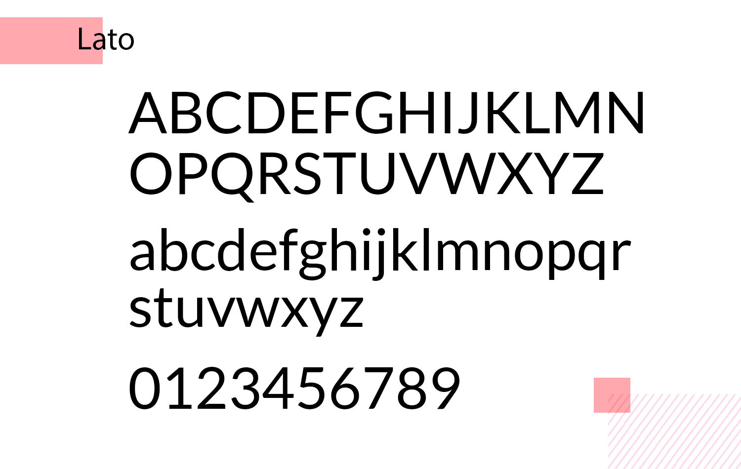
This slender font family supports over 100 latin-based languages and even Greek! Its sheer versatility alone makes it worthy of consideration.
Nexa is a typeface that’s straight up simple, while being cutting-edge at the same time.

With 32 font styles and weights, this is one free font for apps that you can rely on in any situation.
Another popular font for apps from the sans-serif humanist genre, Open Sans is the second most widely used typeface on Google fonts!

Based on Droid Sans, it works wonders in various types of Android app UI design.
Created by Julieta Ulanovsky, Montserrat takes its name from the historical neighborhood in Buenos Aires.

Julieta took inspiration in clear, urban typography that she saw in her native Argentinian town.
Need to design an app with mostly large text and many headings? Then Playfair Display could be what you’re after, as it was originally intended as a display typeface.

Avoid using it in large paragraphs of text or in long passages in your UI designs.
Roboto was interestingly chosen by Google as the main font for its mobile operating system on Android phones, making it a popular choice for app UI design.

This neo-grotesque font is the perfect choice for any Android app as it was designed directly in Google’s laboratories!
This interesting specimen was designed by Paul D. Hunt for Adobe.

Taking inspiration from fonts such as Franklin, News and Lightline Gothic, Source Sans offers a large x-height and works wonders when using multiple styles variations, especially Italics.
Similar to Playfair, Nunito is a well-rounded font for apps that was designed with the goal of being used as a display font.

Nunito is quite prolific and you can see it used widely across many mobile apps, as well as across the web.
A modern geometric sans-serif typeface, Poppins is known for its friendly and approachable feel.
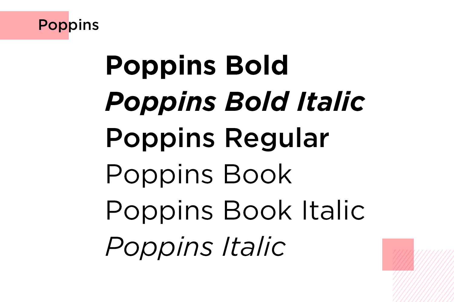
As you can see, it offers excellent legibility and works well for both body text and headlines.
A versatile sans-serif typeface with elegant thin lines and distinctive letterforms. Raleway exudes sophistication and is a popular choice for titles, logos, and branding.

This font is a minimalist sans-serif typeface designed for screen readability. Muli is clean and uncluttered, making it ideal for body text and user interfaces.

Work Sans is a sleek and versatile sans-serif typeface, perfect for both digital and print media. With its clean lines and modern aesthetic, it ensures readability across different sizes and devices.

Whether you’re designing user interfaces or crafting content, Work Sans delivers a professional and polished look.
Cabin is a charming humanist sans-serif font that brings a touch of warmth to your designs. Its rounded corners and friendly appearance make it perfect for a wide range of projects, from body text to headlines.

Combining modern flair with classic appeal, Cabin adds personality and readability to any application.
Design hi-fi prototypes for apps with any font you want
Legendary Helvetica, designed and developed by Max Miedinger of Switzerland was originally intended for use as a realist print font.

Known to have influenced other modern fonts, such as Proxima Nova, there’s very little you can do from a design point of view to go wrong with Helvetica as a font for app UI design.
- Pricing: from $43
Our designers are adamant that no list of fonts for apps would be complete without Brandon Grotesque.

This structured sans-serif draws on elements from the 1920s and 1930s, while fitting seamlessly into modern typography and enhancing legibility with a stylish edge.
- Pricing: from $40
From humble, urban beginnings, Gotham was inspired not by the fictional City in DC Comics, but by New York City.

Taking inspiration from architecture and signage in the city during the mid-20th century, Gotham is a versatile font for app UI design that offers the user a clear and legible experience without even knowing they’re having one.
- Pricing: requires yearly subscription of $299 to access all fonts.
Aeonik is the perfect font for app UIs that require business-like strictness and rigidity, while at the same time, providing a solid reading experience.
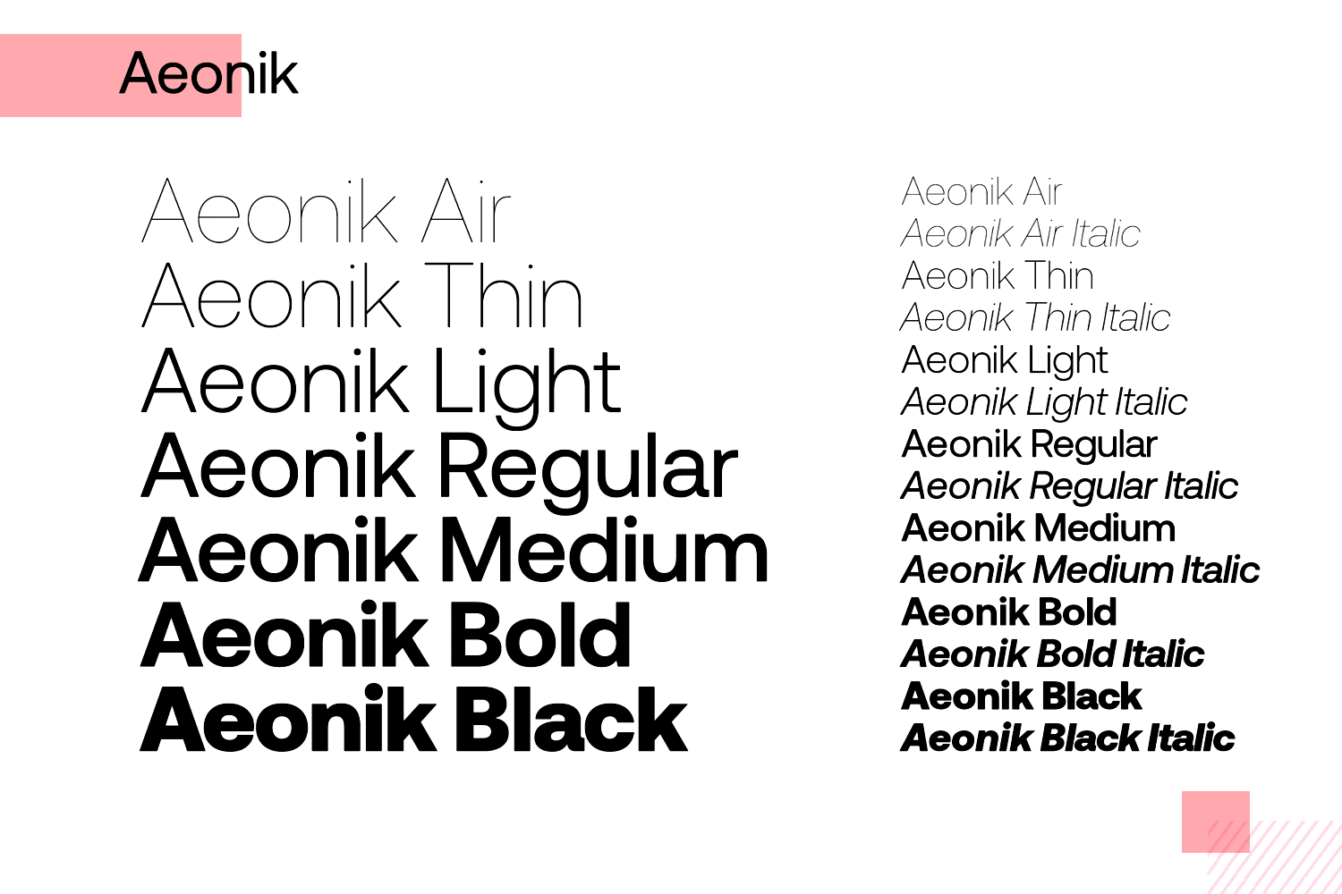
Aeonik comes in seven different weights and is applicable to most latin-script languages.
- Pricing: from $50
SangBleu is a complete typeface with over 45 different styles and five different collections, suitable for both latin and cyrillic alphabets.

SangBleu offers a futuristic slant on the typical sans-serif style across mobile app UI design today.
- Pricing: from $52, $412 for all weights and styles
Designed by Erik Spiekermann who is famous for having slated Helvetica as “boring and bland”, he sought to create its perfect arch-nemesis, FF Meta.

Originally intended for use in German Post Offices, FF Meta has grown to be widely loved by designers worldwide.
- Pricing: from $55
FF Din is used as an acronym for the German Institute of Standardization.

It’s slender design gives it an unassuming, inoffensive, yet stylish render for great UI design.
- Pricing: from $55
When naming this font family, it was clear that Adrian Frutiger had high aspirations for Avenir Next, with Avenir being French for “future”.

When working on this font, Adrian had “human nature in mind” as he worked to create something that enveloped a more organic interpretation of 1920s geometric print.
Pricing: from $108
Design hi-fi prototypes for apps with any font you want
If you’re looking for old-school serif font for apps, you could do much worse than Sabon.

Taking inspiration from Garamond, Jan Tschichold sought to create a font that would have a harmonizing effect on the reader.
- Pricing: $43
Freight Text is a humanist sans-serif designed for optimal readability, making it ideal for long passages and extended paragraphs.

It’s also quite versatile with five different weights to make different combinations possible throughout your app wireframe.
- Pricing: from $46
GT America is one of the best fonts for apps, combining American gothic and European grotesque styles.

It offers a range of weights and widths, making it perfect for various design needs, from branding to editorial design.
- Pricing: from $65
Maison Neue is a clean, modern font for apps with geometric influences.

Its elegant simplicity and high legibility make it one of the best fonts for mobile apps and digital interfaces.
- Price: $50 per weight
Founders Grotesk is a distinctive and adaptable font for app design, blending historical influences with modern aesthetics.
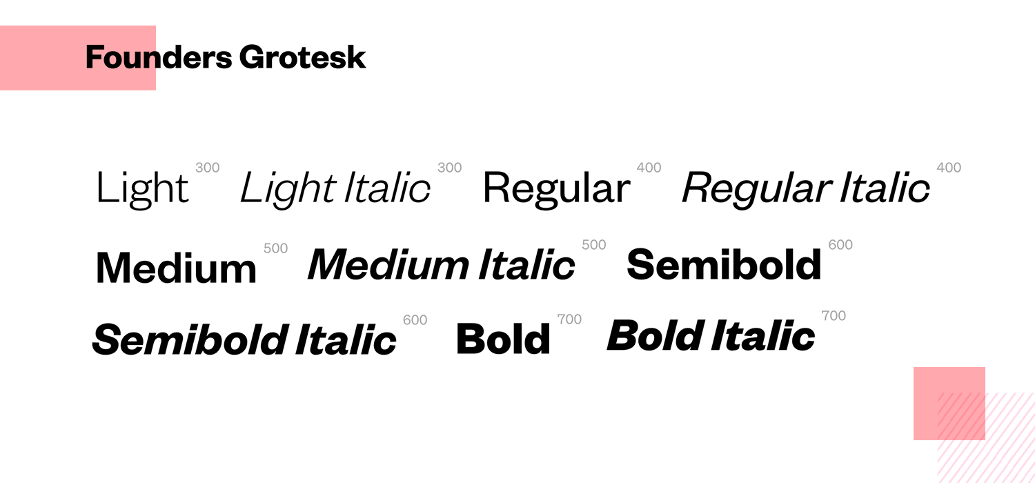
Its unique character makes it ideal for branding, editorial, and web design.
- Price: $50 per weight
If you’re aiming for sophistication, Noe Display is the ideal font for your app design.
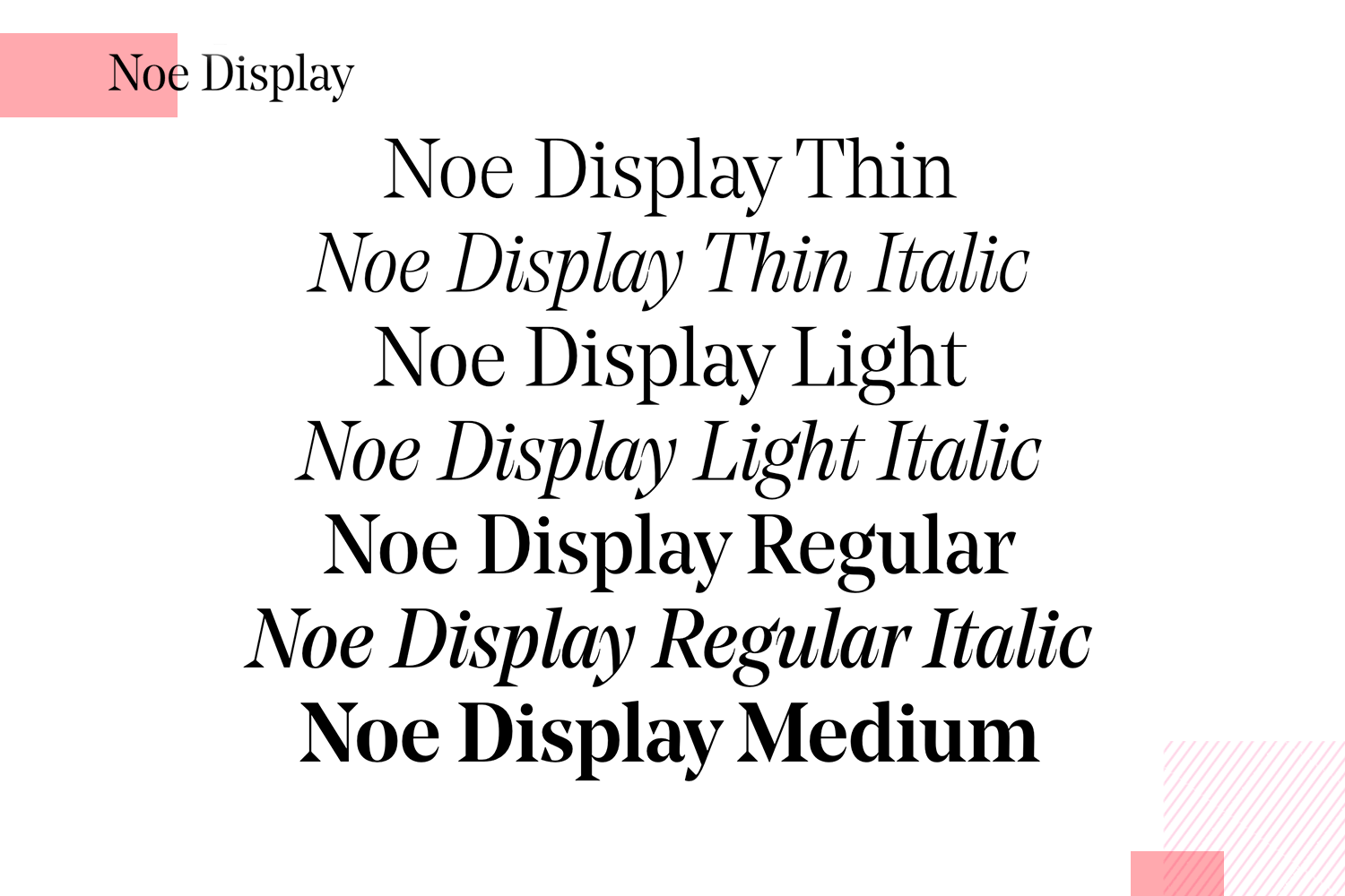
This serif typeface, with its sharp contrast and elegant curves, adds a touch of luxury to any mobile app.
- Price: $50 per weight
Aperçu is a contemporary grotesque font for apps, known for its balanced proportions and clean lines.

It’s versatile enough for both digital and print, making it a favorite for app design and branding.
- Price: $75 per weight
Need a minimalist design? Replica is the ideal font for mobile apps.

With its modern sans-serif style, it is perfect for corporate identities, user interfaces, and editorial projects.
- Price: $39 per weight
For a neutral, unobtrusive appearance, Graphik is a geometric sans-serif font for apps.

It offers a wide range of weights and supports numerous languages, making it an excellent choice for global brands and mobile app design.
- Price: $50 per weight
If you prefer a friendly and approachable font for app design, Supria Sans would be a perfect font for app design.

Its open forms and generous spacing enhance readability, making it ideal for branding, packaging, and digital content.
- Price: From $49 per weight
Seeking a modern font for mobile apps? Clan Pro, with its distinctive character and extensive language support, is suitable for both text and display purposes, making it a versatile choice for app design.

- Price: $60 per weight
For a unique and friendly appearance, Circular is the best font for app design.

This geometric sans-serif font, with its rounded letterforms, is versatile and readable, making it ideal for branding, web design, and editorial layouts.
- Price: $75 per weight
When you ask for the best fonts for apps, you’ll get a lot of different opinions. The truth is, the ideal font depends on factors such as your audience, the cultural context, the devices they’re using, and what your app aims to do.
So, there might not be a one-size-fits-all “best” font for apps. It’s more about finding the right fit for your specific needs. And honestly, that’s what good UI/UX design is all about, isn’t it?