
Great typography is about more than just which font you like best. Find out how line spacing can make or break your content.
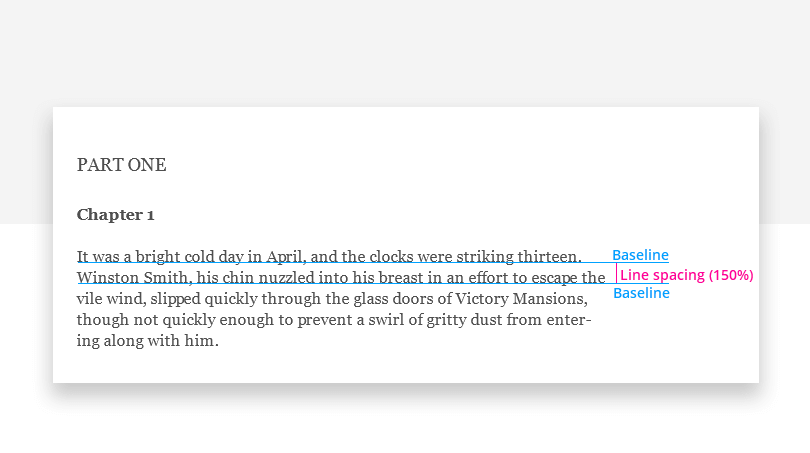
In the world of typography, line spacing is the term used to define the vertical space between two lines of text. Specifically, it’s the exact distance between two adjacent baselines. While it might not appear at the top of every UX designer’s list of priorities, it’s actually a really important aspect of user experience design because it has a huge impact on the readability of text in an app or website.
Start designing new products today. Unlimited projects!

Get it right and no one apart from typographers and UX designers will notice. Get it wrong and your users will immediately notice that there’s something wrong with your text, even if they can’t put their finger on what it is.
Line spacing theory dates back to the earliest days of manual typesetting on printing presses. Its technical name, leading, actually refers to thin strips of lead metal which were used to separate the lines of text. So it’s ‘leading’ to rhyme with ‘bedding’, rather than ‘beading’.
When typewriters appeared later, line spacing went through a process of standardization. Because they had fixed line-height (usually 12pt per line), typewriters were mechanically incapable of offering line space options. The only way of increasing line spacing on a typewriter was to add an extra carriage return after and insert a whole empty line, doubling the line spacing. And because double-spaced lines leave more room for comments and notes, double-spacing caught on in academic, legal, and industrial contexts where text can be pretty heavy. So it’s thanks to typewriters that double-spacing lives on today in the age of the computer.
Some modern design applications like Photoshop still use the term leading, while in HTML and CSS, the attribute is called line-height. Leading, line spacing, and line-height all refer to the same thing.
Start designing new products today. Unlimited projects!
The importance of line spacing for UX design comes from the power it has to render a block of text more or less readable.
Line spacing is commonly measured as a percentage of font size. Conventional wisdom is that line spacing of 130%-150% is ideal for readability. In fact, anything from about 120% up to 200% is acceptable, but 140% tends to be the most quoted sweet spot. You should experiment to see what looks best with your text.
There are two main risks when it comes to line spacing: too little, and too much. Most serious is having too little space between the lines. Setting line spacing at 100% means that letters on adjacent lines can touch, because there’s no additional space between the lines. This makes for poor readability and atrocious accessibility. It should be avoided at all costs. Setting spacing much below 100% will render it completely unreadable. This is a good thing to check when you validate your high-fidelity prototype.
Less serious is having too much line space. The problems tend to kick in around 250%, as the reader’s eye might find it more difficult to pass to the next line without getting confused.
- Aim for about 140%-180% for optimal readability and accessibility. Any smaller and the text will be cramped and difficult to read. Go much larger and the eye can get lost.
- Limit line length to 70-80 characters. Longer lines of text can confuse the eye, particularly when reading text on a screen. If you must use longer lines, increase the line spacing to help protect readability.
- Font size should be minimum 16pt. This long-standing rule of thumb still applies. Most of the time. In apps for bigger displays like TVs, you will need to go to about 32pt.
- Small fonts need more spacing. Line spacing as a % should actually increase with smaller font sizes. This is because smaller fonts are already more difficult to read, and need more space around them for the eye to easily follow.
- Experiment with tighter spacing on pull quotes or other short texts. If typography is mostly about how we present language in text form for optimal readability, it’s also partly about beautiful avant-garde design. If you want to play with less line space, stick to pull quotes and similar shorter text areas.
- Check your line spacing when you change font or font size. Different fonts have different maximum heights (x-heights) even when they’re the same size in points. So you need to be sure that when you change font, you check to see how your line spacing feels in readability terms.
If you’re working with CSS, you can always express Line-height as a percentage value. In other tools like Photoshop, you may need to do some basic arithmetic to find the optimum line spacing. E.g. if our font is 18pt, and we’re aiming for line spacing of 150%, simply multiply the font size by 1.5 and you have the correct line spacing value: 27pt.
For a more advanced way to calculate optimal line spacing and font size, check out the Golden Ratio Typography Calculator. It’s a super-useful and very clever tool that can help you tune font size and line spacing for the width of the content area.
Start designing new products today. Unlimited projects!
Take a look at these three paragraphs. Which one do you find easier to read?
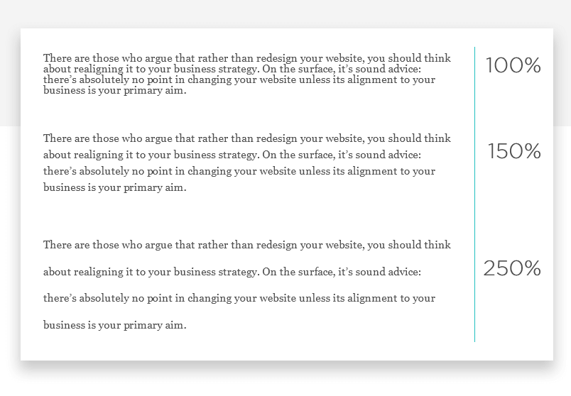
In the 100% paragraph, you can see that letters on adjacent lines come dangerously close to touching each other. The reason this is problematic is that people with some visual impairment will find it much more difficult to read. At 150%, it feels like the space is nicely balanced and the text is readable. Meanwhile, the paragraph with 250% spacing seems to be taking things too far – the line spacing is so exaggerated that reading the text feels unnatural.
Line spacing is an important part of typography and the usability and readability of your site or app. By applying these simple rules, you can reduce user tiredness, boost clarity and improve your content’s accessibility rating. So now you know how, there’s no excuse!
PROTOTYPE · COMMUNICATE · VALIDATE
ALL-IN-ONE PROTOTYPING TOOL FOR WEB AND MOBILE APPS
Related Content
 Learn how to design better e-learning platforms with user-centered UX principles, real examples, and high-fidelity prototyping tips to boost engagement and learning outcomes.13 min Read
 Infinite scroll keeps users engaged, but it’s not always the best choice. This guide breaks down when to use it, when to avoid it, and how to design it right.14 min Read
 Learn how to design web and mobile app prototypes, how to test them and what to look for in a prototyping tool in this complete guide.15 min Read


