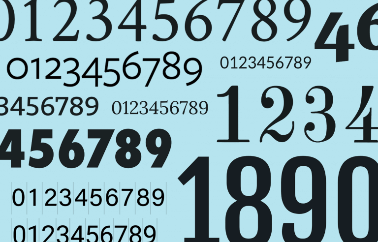
Everything you’ve ever wanted to know about number fonts including where to get the absolute best ones!
When it comes to choosing the perfect typeface, there’s a multitude of fonts available to designers. Whether you’re aiming for complete legibility or simply want to add personality and flair to a design, it’s no easy task to find a font that ticks all your boxes.
Design hi-fi prototypes for apps with any font you want
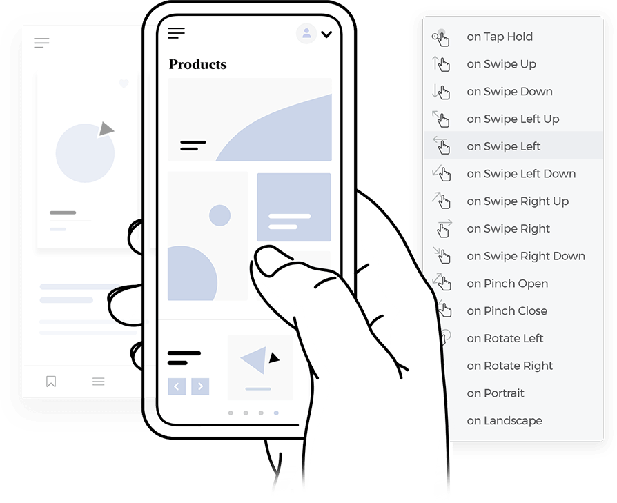
But there’s another conundrum that UI designers have to grapple with: displaying numbers.
There are many reasons you might want to display numbers. From data visualizations and statistics to pricing and contact information, numbers play an important role in the way we understand data and the world around us.
With that in mind, which number fonts are great for displaying numbers and where can you get your hands on some free ones? Once you get the right font for your design, it’s just a matter of opening your favorite prototyping tool and get to creating!
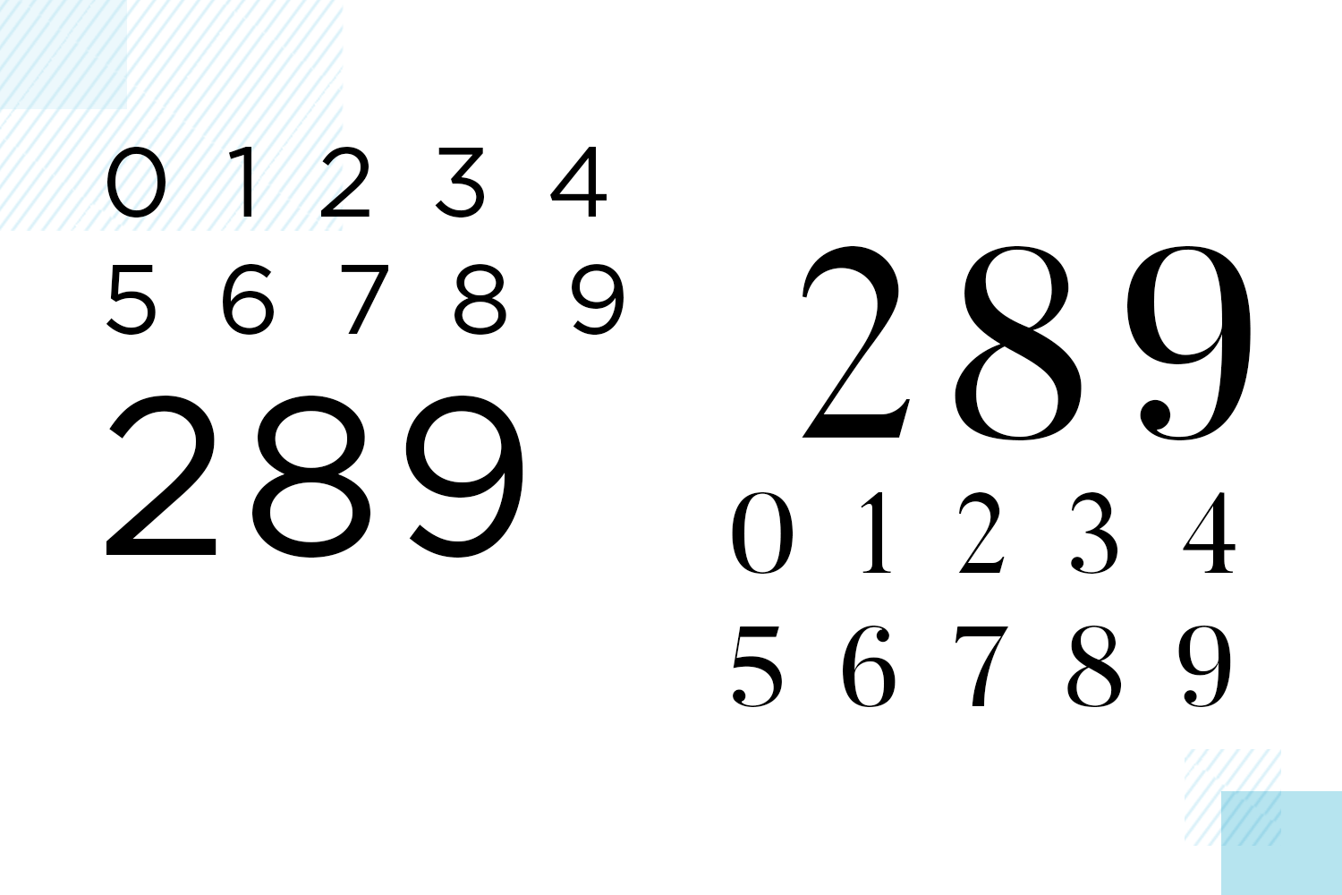
Usually, a well-made, comprehensive font will include numbers and other symbols in its design. You do have the occasional creative font that is mainly focused on numbers, but those are few when compared to most common fonts, that include both numbers and letters.
There are some fonts which are less extensive and have fewer supported languages – these tend to be the free ones.
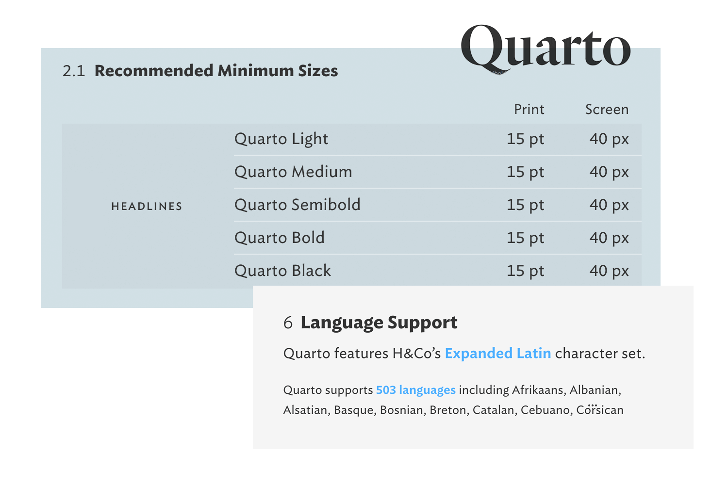
When it comes to getting your hands on a font, it’s worth checking how many symbols, letters and numbers it includes. We’ve seen instances of fonts with random characters missing. Keeping an eye on the languages supported is important too, especially for large companies that intend to make global products and prototypes that stretch for miles.
There are some typefaces which only have the standard alphabet, for example. If you’re buying a font from an established foundry, such as Hoefler and Co, check the features section – it’ll give you all the information you need.
It’s also worth making sure that the font will work well on a mobile device, so you can maintain your design across the board. Check out our post on the best fonts for apps for more information.
We mentioned in the intro that designers can have a tough time with numbers. Why? The reason is that numerals have different conventions than letters.
Numerals have more curves and some numerals have ample white space to contend with. Take the letter O. Depending on the font used, some people may have difficulty discerning the letter from the number zero.
To deal with this peculiarity, designers can change the stroke of the number to give emphasis or take away attention from the number.
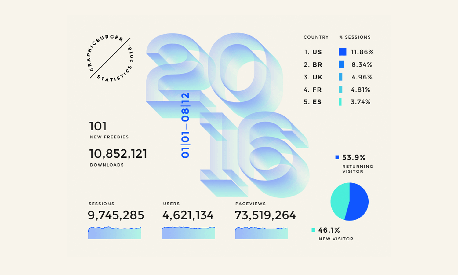
By Raul Taciu.
When it comes to infographic design, headlines and lists, you’ll need to use numbers to convey the information in a clear and understandable way. That means choosing the right font and displaying the numbers in the right way.
If you’ve ever spent much time looking at numbers or fonts, you’ll come to learn there are subtle differences in the way numbers can be displayed.
First is lining numerals. Lining numerals is somewhat self-explanatory. It is when the numbers of a typeface sit on the baseline and are aligned with the cap height.
Text figures is when the numbers are typeset with varying heights, as seen in the comparison below:
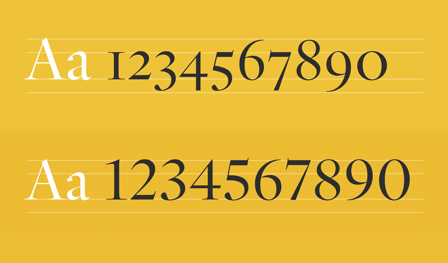
Text figures are useful when you have numbers in a large block of text. Their purpose is not to distract the reader, and they help the visual rhythm of the text by blending in instead of sticking out.
Then we come to proportional spacing, an alternative to tabular spacing. Proportional spacing is where the numbers are close together, helping reduce empty space in a document.
Just like letters, numbers are proportional. They vary in width according to their shape. A number 1 is much thinner than the number 0, for example.
Proportional spacing blends letters and numerals together more effectively. This variation wouldn’t work well when it comes to displaying numbers in a table because of the varying widths that result from proportional spacing.
Tabular figures mean the characters or numbers in the font occupy the same amount of horizontal space, also known as monospaced figures.
Tabular figures are useful when you have to display:
- Sums
- Price lists
- Stock listings
- Code
Here we can clearly see the difference between proportional figures and tabular figures:
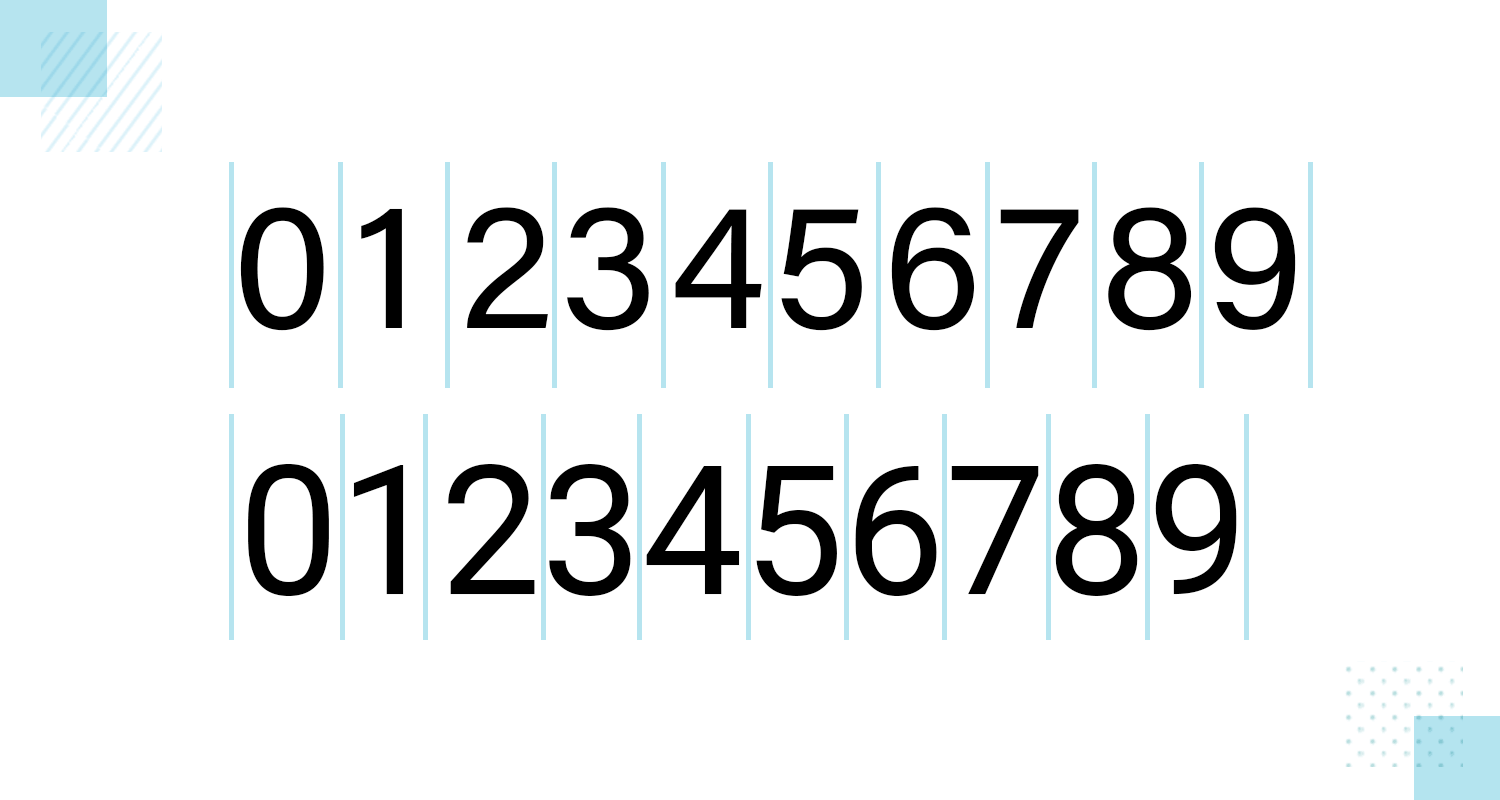
Typewriters commonly use monospaced fonts as well as text editors—monospaced fonts are also used when writing code. With tabular figures, the numbers are built on a fixed width to ensure that columns of data align correctly.
Design hi-fi prototypes for apps with any font you want

Let’s take a look at some great number fonts that can have a real impact on your design. All of these are free and offered by Google, making them perfect to use in combination with your website prototyping tool. Check out our post for more details on Google Fonts.
Poppins is a geometric sans-serif font family that is highly versatile. Its uniform letterform width and rounded shapes make it suitable for both small and large numbers. It offers excellent readability and a clean, modern aesthetic, making it a great choice for web and print design.
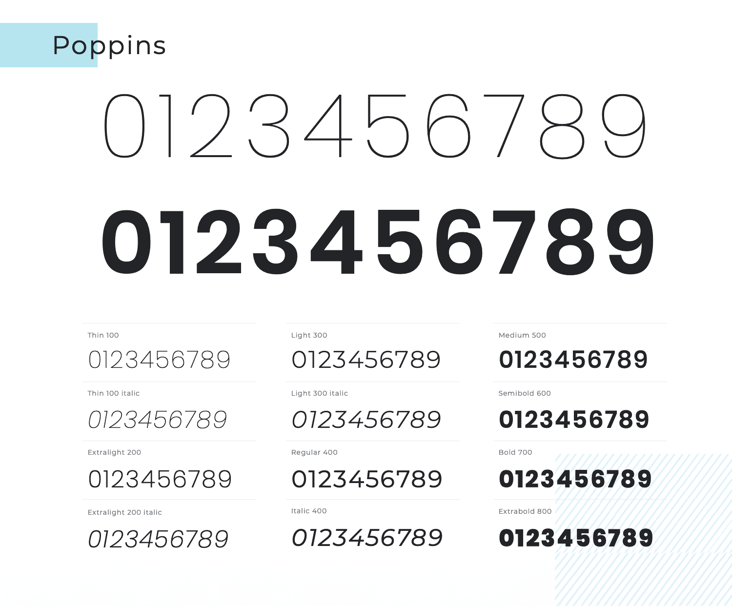
The font’s balanced proportions and simplicity allow it to blend seamlessly into a variety of design contexts, from user interfaces to editorial layouts. Additionally, Poppins comes in a wide range of weights, providing designers with ample flexibility to create visually engaging and harmonious typographic hierarchies.
Montserrat is another popular geometric sans-serif font. Inspired by urban typography from the early 20th century, it offers a modern and stylish look. Its bold weights are particularly effective for making numbers stand out in your designs, while its lighter weights can be used for a more subtle approach.
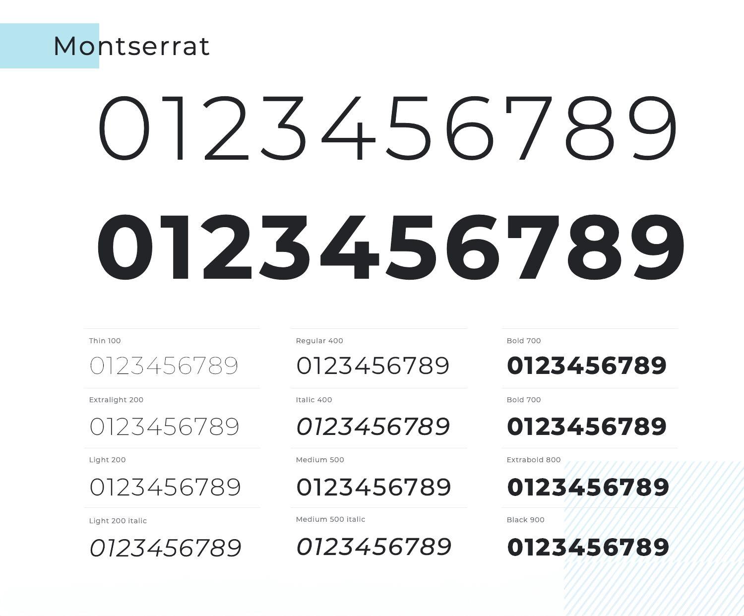
Montserrat’s extensive character set and multiple styles make it perfect for both display and body text, ensuring versatility across various design projects. The font’s clean lines and contemporary feel bring a touch of elegance to both digital and print media, making it, in our humble opinion, one of the best fonts for numbers.
Bungee is a display font designed for vibrant and eye-catching headlines and signage. Its bold and playful design makes it one of the best fonts for numbers that need to grab attention. Whether used in large headings or small labels, Bungee ensures your numbers are easily noticed.
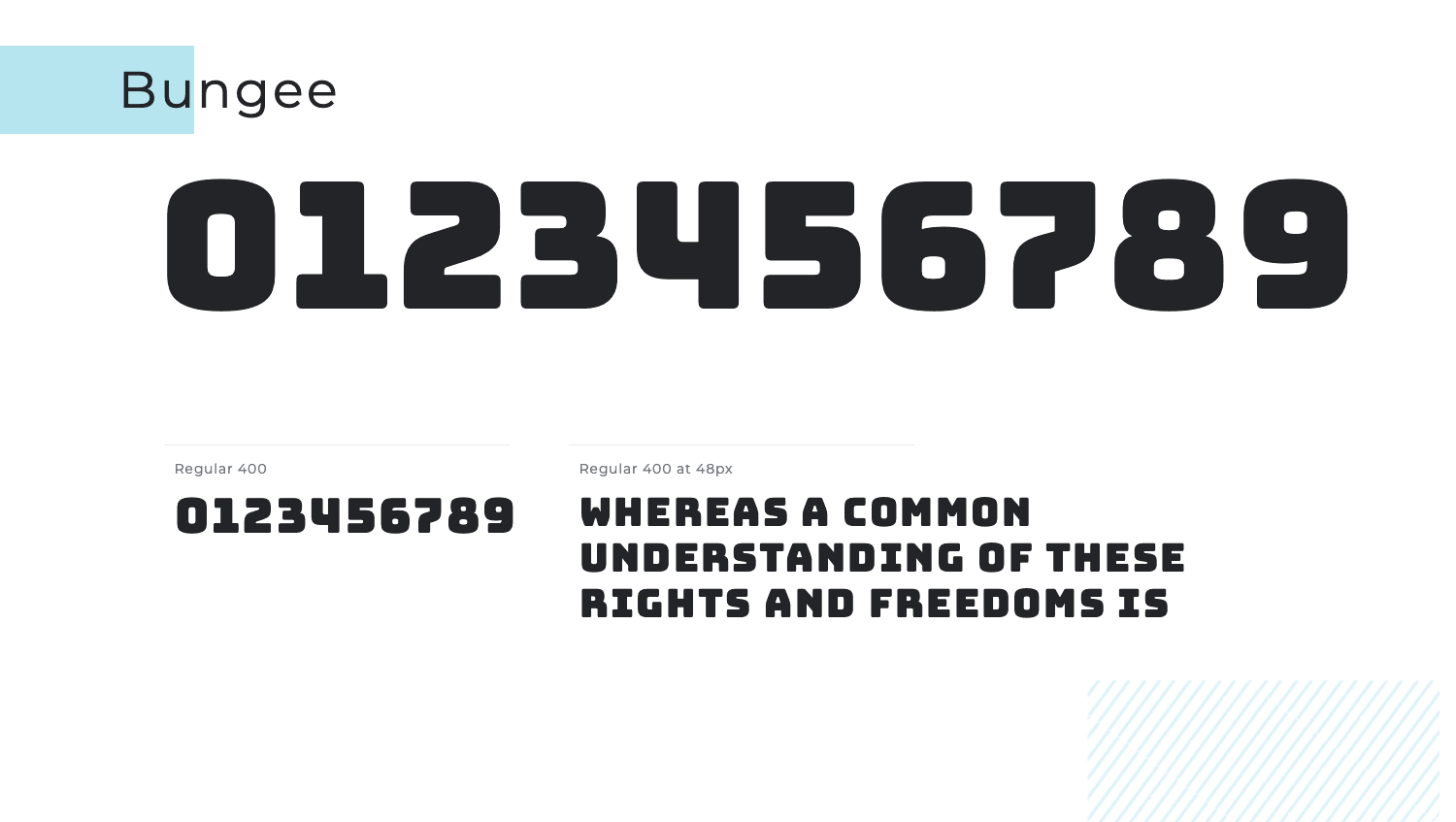
The font’s unique style and energetic feel add a sense of fun and dynamism to any project. Additionally, Bungee’s strong presence and striking appearance make it ideal for designs that aim to make a memorable impact.
Rubik is a slightly rounded sans-serif font family with a warm and friendly feel. It maintains readability across different sizes and is especially effective for user interfaces and digital applications. The smooth curves and consistent weight distribution make numbers easy to read and visually appealing.
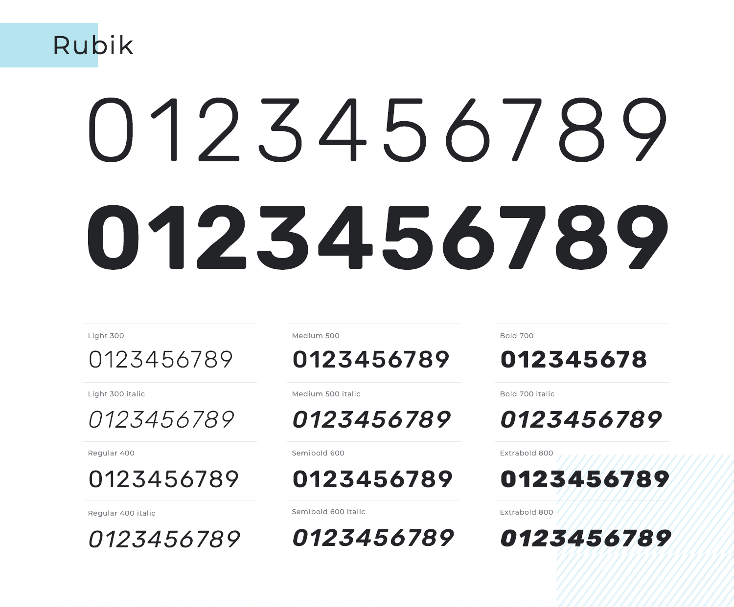
Its versatility allows it to seamlessly integrate into both modern and playful designs, enhancing the overall user experience. Another reason why we have Rubik as one of the best fonts for numbers is its wide range of weights and styles provides designers with the flexibility to create dynamic and engaging typographic compositions.
Archivo is a grotesque sans-serif typeface family designed for high performance in both print and digital environments. It is excellent for display and long texts, combining well with other fonts for clear and impactful designs. Its wide character set and multiple weights ensure versatility in displaying numbers prominently.
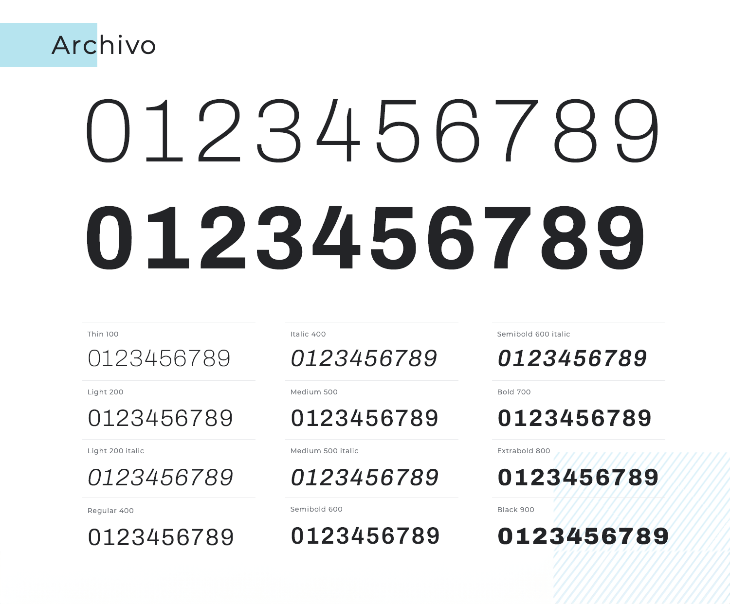
The number font’s robust structure and clean lines make it a reliable choice for conveying information with clarity and precision. Additionally, Archivo’s balanced proportions and modern aesthetic contribute to a polished and professional look in any project.
This Google Font is all about simplicity and elegance. Crimson Text rings of other classic fonts that we’re used to seeing all around the internet, and sticks with classic shapes and clean lines. It has an old-style sense to it, and would do well for both serious and casual numbers and products.
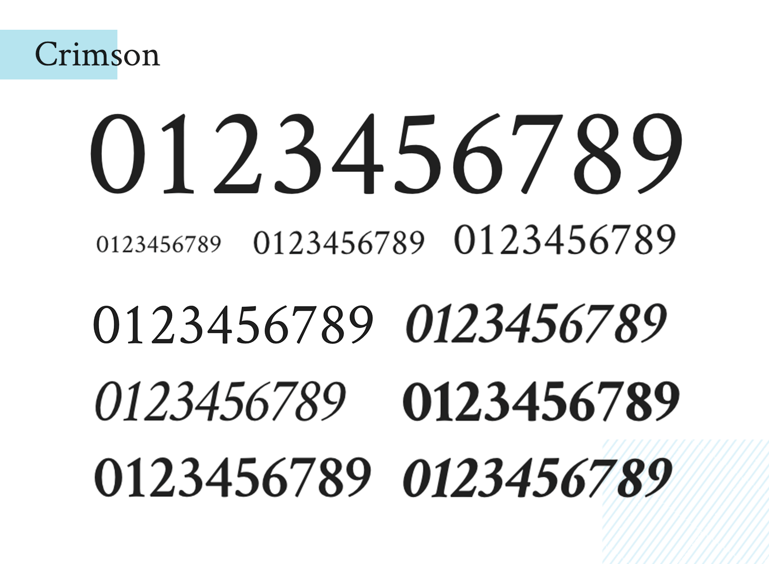
The readability of Crimson Text is great, working for both large and small sizes. This gives you ample margin to stick with this font throughout the entire product, without having to worry about the readability of it all.
Lato was first brought to us by Łukasz Dziedzic in 2010, and it’s enjoyed lots of popularity since. It was meant to be simple and elegant, while still showing some unique traits when displayed in larger sizes.
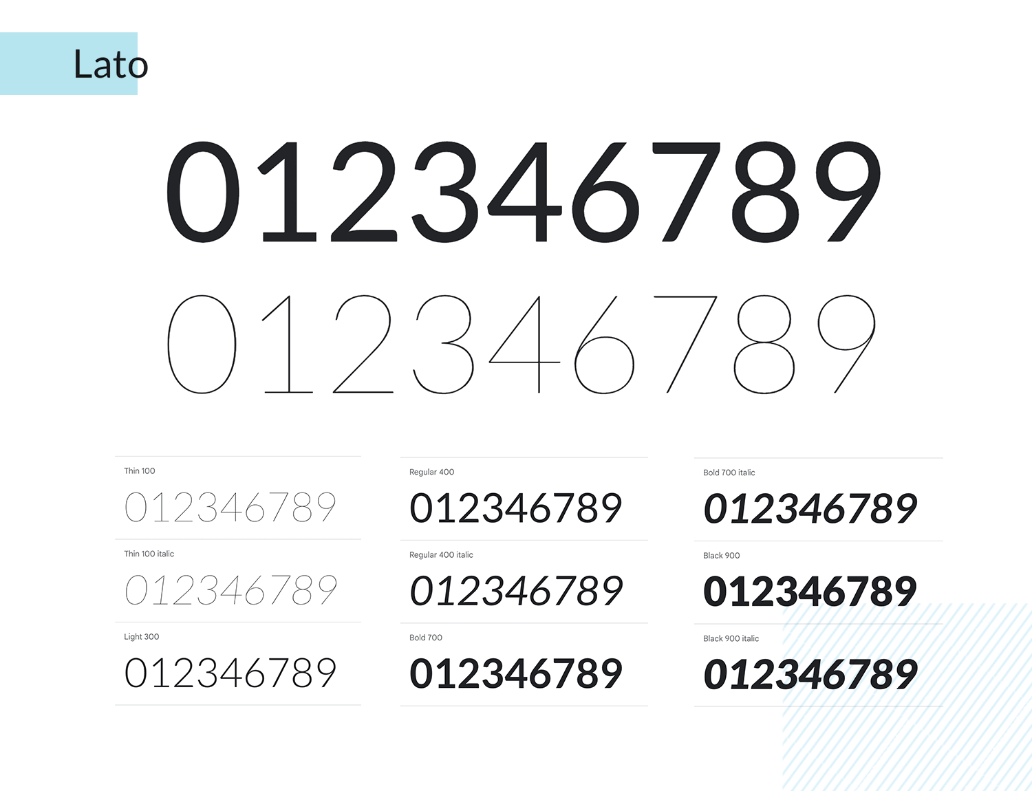
One of the main reasons we love Lato so much is that it’s got personality, but its simplicity allows for all but unlimited practicality. The font is casual but elegant, full of life but also discreet. This basically means you can get away with using Lato to display just about any number and any content in any size!
Roboto Condensed is another highly practical number font. It consists of mostly geometric forms, but still enjoys open curves that make it feel casual as opposed to formal. This font also allows numbers to keep their natural widths, which makes for a natural reading experience.
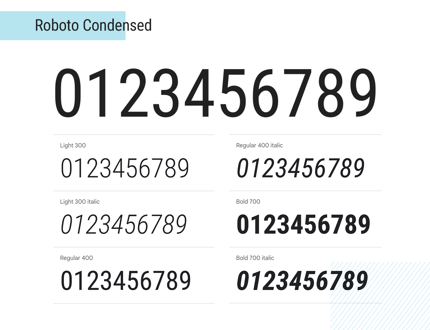
Roboto Condensed also delivers awesome readability. In fact, the font works well and makes the most of the space it has, making it a wonderful option for small sized numbers. Other great uses for this font include long pieces of content, forms, or displaying prices. Very handy!
Varela Round is a great example of a round typeface that still manages to deliver a good experience to users – even in small size. Its rounded shapes allow for a friendly and casual feel.
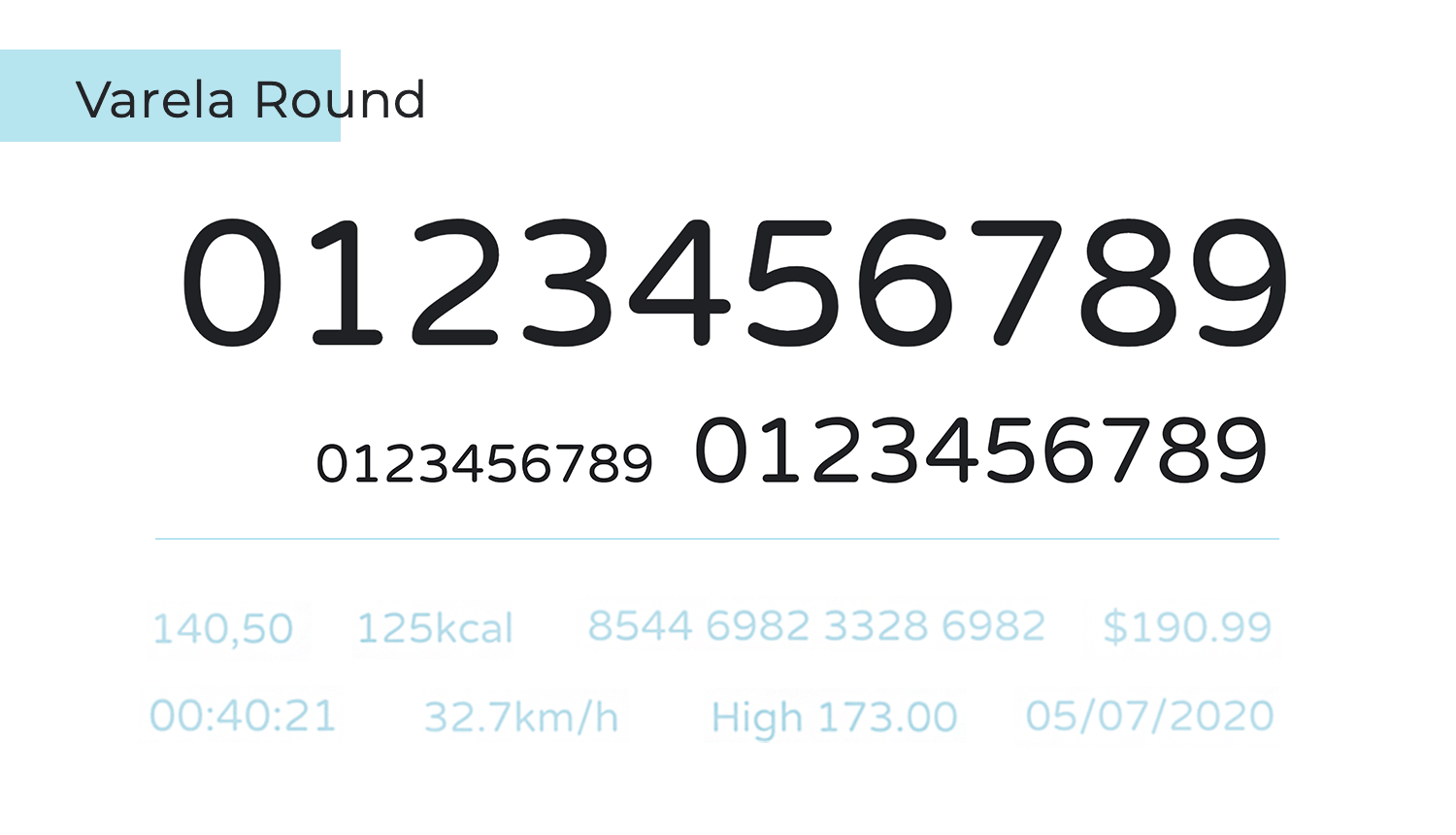
The one thing with Varela Round is that while it makes for great readability in small font size, it may not deliver a wow-factor in a bigger size. This means its use for an important figure or number you want to place in evidence in the design is rather limited, as you may wish to go for a font that has a bigger visual impact.
Bitter is a serif typeface that shows a lot of personality. It’s slightly thicker than most other regular fonts, but that only adds to its charm! Precisely because of its thickness, this font does wonders when it comes to displaying numbers in very small sizes.
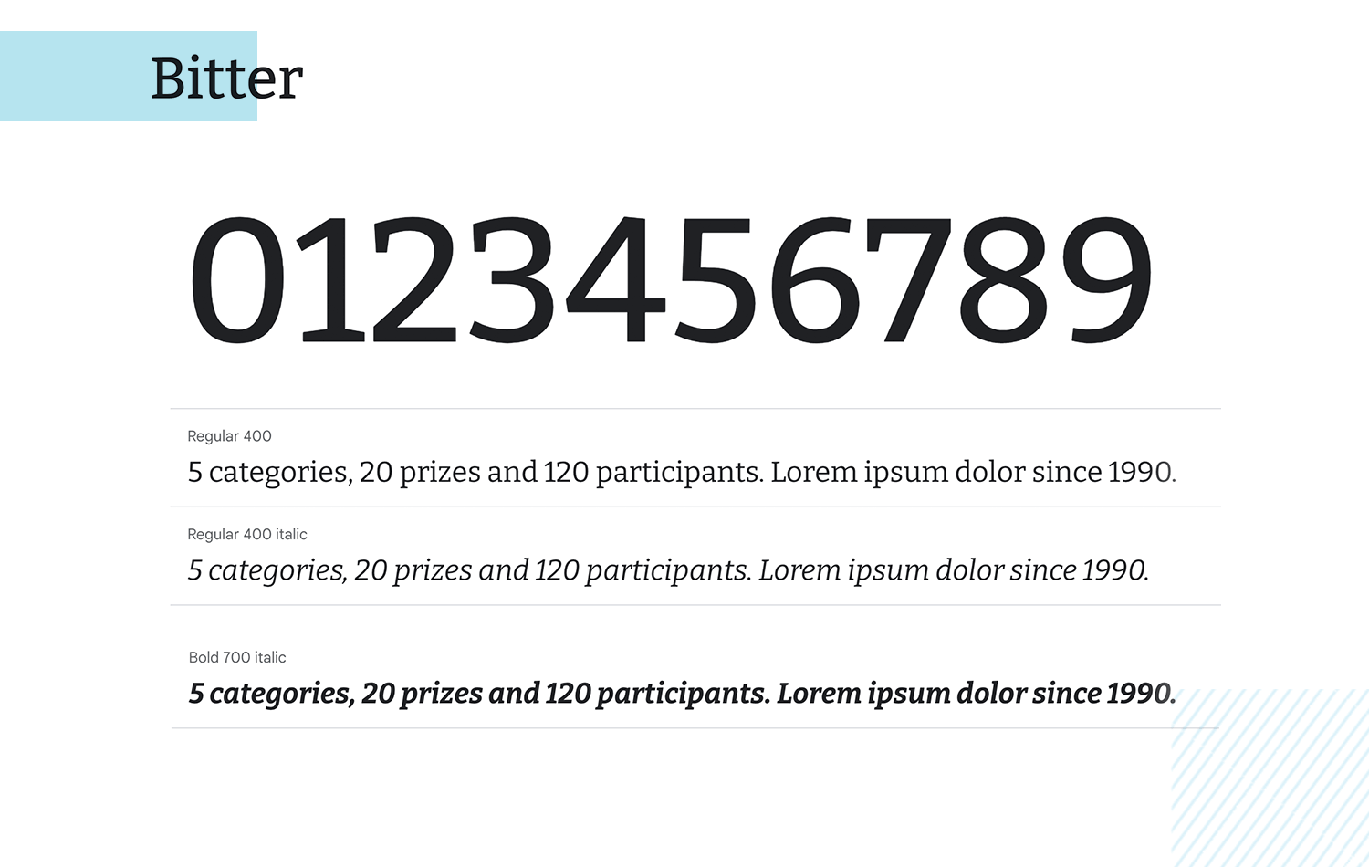
The added thickness improves the readability, and has the potential to add a lot of color to any design. Consider this font when displaying numbers within a paragraph, with an overall small size. Your users will appreciate it!
Fjalla One is another number font that is all about personality. It makes for a simple font that still delivers a unique experience. The fact that it’s thick allows for great readability in small sizes, while its rounded curves allows for visual impact in larger sizes.
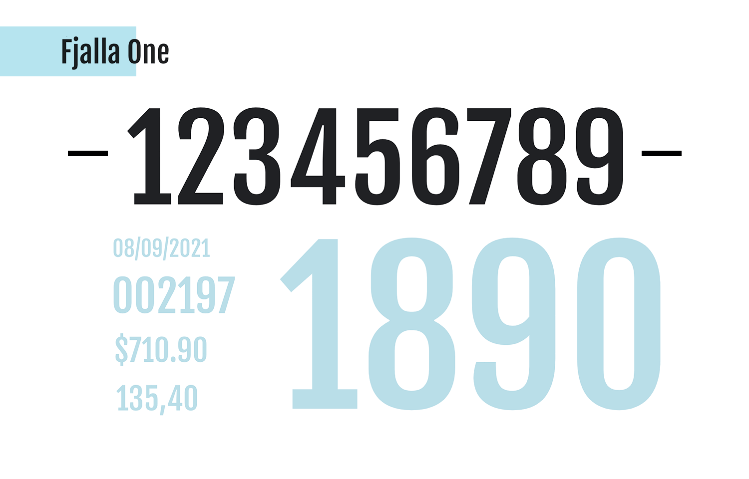
It makes for a very practical font you can apply to both numbers that come accompanied by other content, or to bigger numbers that take the center stage. We think that Fjalla One is one of the best fonts for numbers because it makes for convenient and thoughtful design, that minds both the visual and the usability of it all.
Oswald is a classic font that also enjoys quite a bit of popularity. The sans-serif typeface was made and updated constantly to perfectly suit the screens of any device out there, minding the usability.
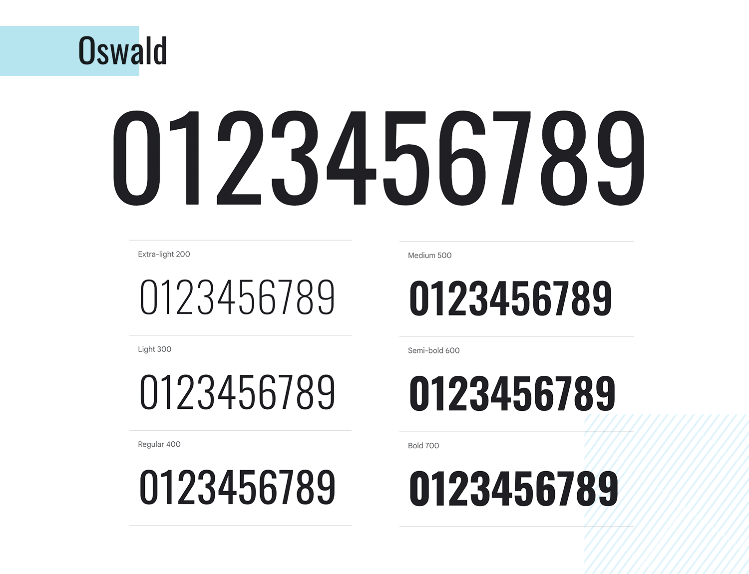
The number font is massively practical, as its family comes with many options as to the weight of the body, from 200px all the way to 700px! Oswald is a good option for both small numbers that blend in with the rest of the design, or attention-grabbing numbers that stand out from the page.
Nanum Gothic is a special typeface. It was originally made for korean but it also supports latin letters – and it works wonderfully as a number font!
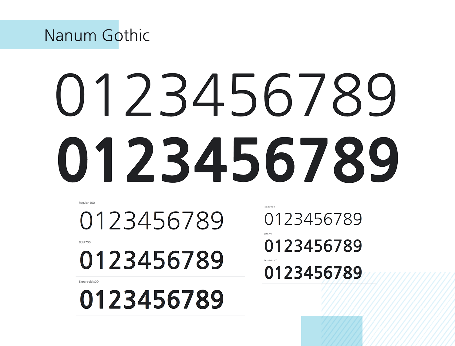
This font delivers some great readability, especially when it comes to offering users numbers that come in a small size, surrounded by other content like text. It doesn’t do so well when it comes to numbers that are to be highlighted or displayed in larger size on the screen, though.
DM Serif makes for a truly powerful typeface. Made with high contrast, it’s perfect if you want to highlight a number or make the number the main component of the screen. It’s got both a delicate and energetic feel, which makes it perfect for titles and headers
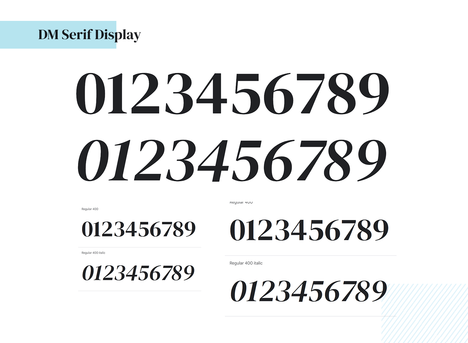
On the other hand, that impact DM Serif has can also be very dominant. This means that the DM Serif is better for limited use in the same page, in order to respect visual hierarchy. The good news is that it has a sister font that follows similar lines, but it’s perfect for small sizes and content-heavy pages: DM Serif Text.
Lora is a serif number font that is all about balance and readability. It’s got classic shapes that are both simple and beautiful, making it a great option for a font you can apply to just about any number out there. It suits both formal, serious and more casual, friendly interfaces.
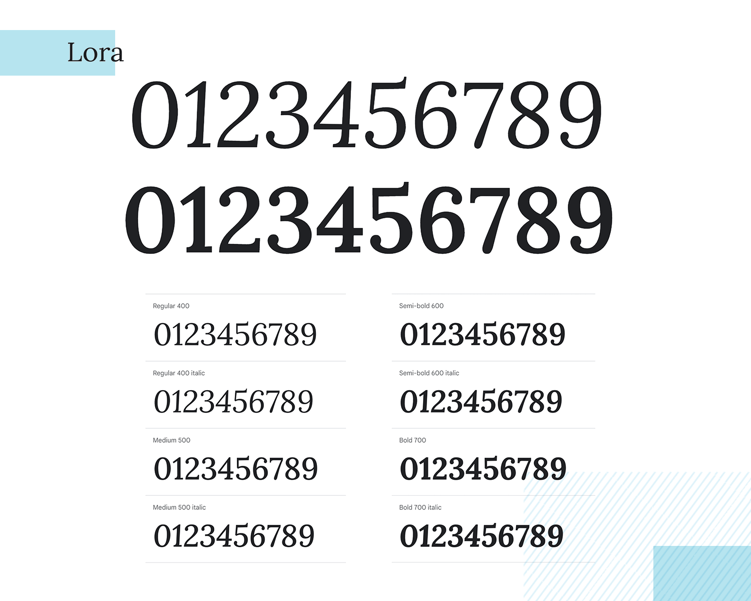
Another great characteristic about Lora is that it makes for a great reading experience, regardless of the size you display the number in. The cherry on top is that it comes with many options regarding weight, going from regular 400 all the way to 700 bold.
Design hi-fi prototypes for apps with any font you want

JetBrains Mono brings with it an air of digital typography which makes it a great number font for reading for small figures. Created by typeface and former digital designer, Phillip Nurulin, it’s aimed at developers and to be easy on the eyes when cranking out line after line of code.
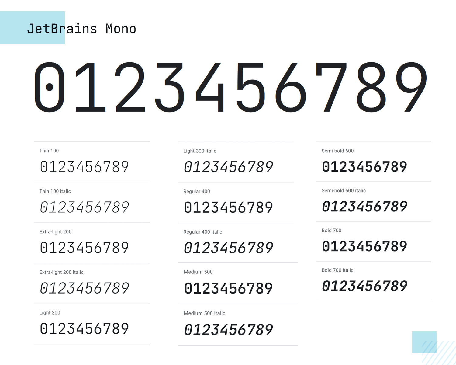
The digitized look makes it perfect for tech or SaaS websites or apps. As a font, it pairs well with the more understated Opens Sans, with Montserrat, Lato and of course, Roboto.
Open Sans is quite a common, humanist typeface designed with upright stress on the numbers and instilling an overall neutral appearance. It’s optimized for a range of different screen resolutions, as well as print and is quite versatile when it comes to the different functions you can use it for, in addition to being a highly readable number font.
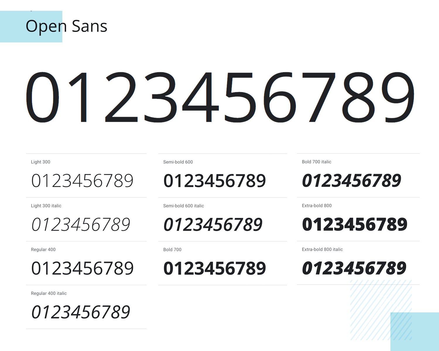
On top of that, there’s an incredibly large variety of weights available for this font, and it also goes well with Roboto, Lato and Montserrat if you want to use a secondary font.
Raleway is an elegant font and is great for use in blocks of text or titles. Giving off an aesthetic finish, you can go with either old-style numerals sitting above or below the baseline, or lining numerals for headlines and titles.
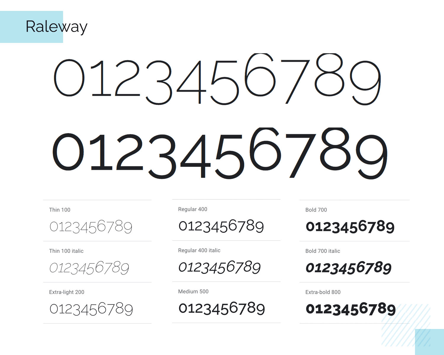
The great thing about Raleway is that it also comes with alternative geometric sans-serif fonts, as opposed to the typical neo-grotesque style. This ensures that it’s always a highly legible number font when choosing it to display figures.
Noto Sans is part of the extensive Noto font family designed by Google, aimed at covering every symbol in the Unicode standard. The numbers in Noto Sans are clean and highly legible, making it a versatile choice for both digital and print applications.
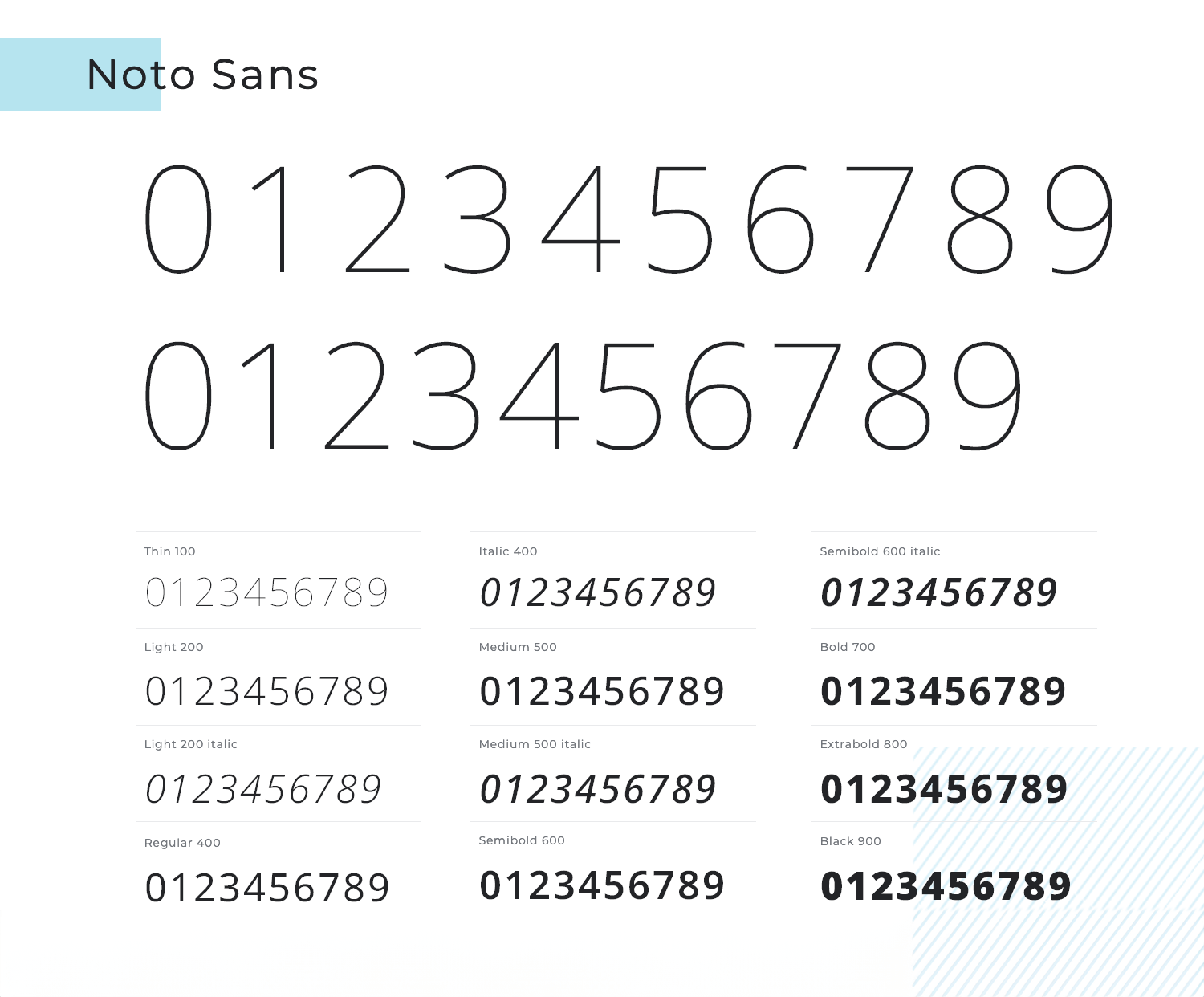
This font is particularly useful for projects that require support for multiple languages and scripts, ensuring consistent and readable numbers across diverse content.
Roboto Mono is basically the monospaced version of the Roboto typeface and comes optimized for high readability on a range of different device sizes, making it an excellent choice for responsive website design.
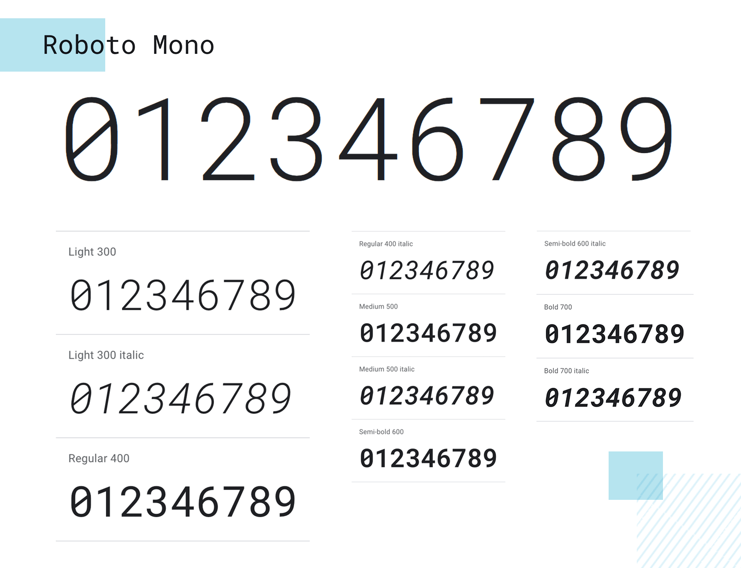
Using a tabular number font like Roboto Mono means figures are perfectly contrasted. Numbers also work well when mixed with text and don’t confuse the reader. For example, the 1 and ‘i’ are easy to tell apart, as are the 0 and the o. Roboto Mono also pairs exceptionally well with Roboto Slab, of course, as well as Open Sans, Lato and Montserrat.
Roboto Slab is a great way of introducing a dose of benign, friendly and open curves to your UI design. It comes with a mechanical backbone, yet its forms are tellingly geometric.
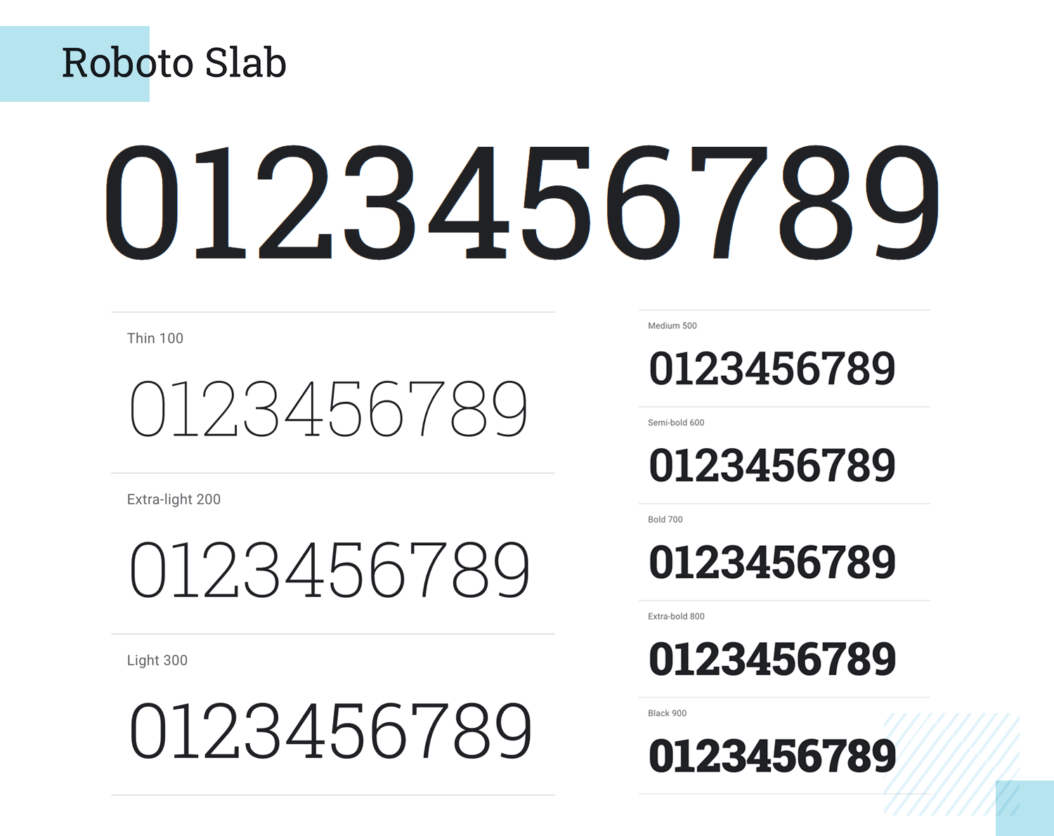
But while Roboto Slab is Grotesk in form, as a number font it doesn’t impose its strict style on all figures, letting them settle in naturally without altering their width, using proportional spacing, leading to a more natural reading rhythm that’s more akin to typical humanist and sans serif fonts.
You can pair Roboto Slab quite well with Roboto Mono, Montserrat and Open Sans.
Cormorant Garamont is a throwback to the led typeface era and is great for use in specialized cases, such as for titles or in headlines. This is because, in our opinion, it appears to be more aesthetic than focused on practical use, with numerals resting above and below the baseline, along with beautiful strokes on the 3, the 6 and the 9.
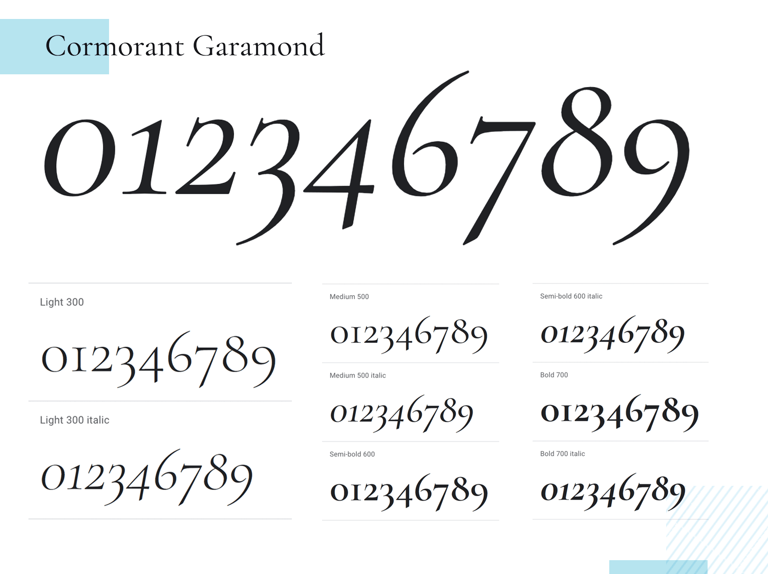
For this reason, as a number font, it goes perfectly when paired with more functional fonts like Montserrat and Lato, but you can also mix it up with other display fonts like Playfair below, but with numbers, this will probably be unlikely.
Design hi-fi prototypes for apps with any font you want

If you’re looking for a deeply aesthetic and traditional number font, you could do a lot worse than experiment with Playfair Display. This font was originally inspired by the replacement of quills by fountain pens.
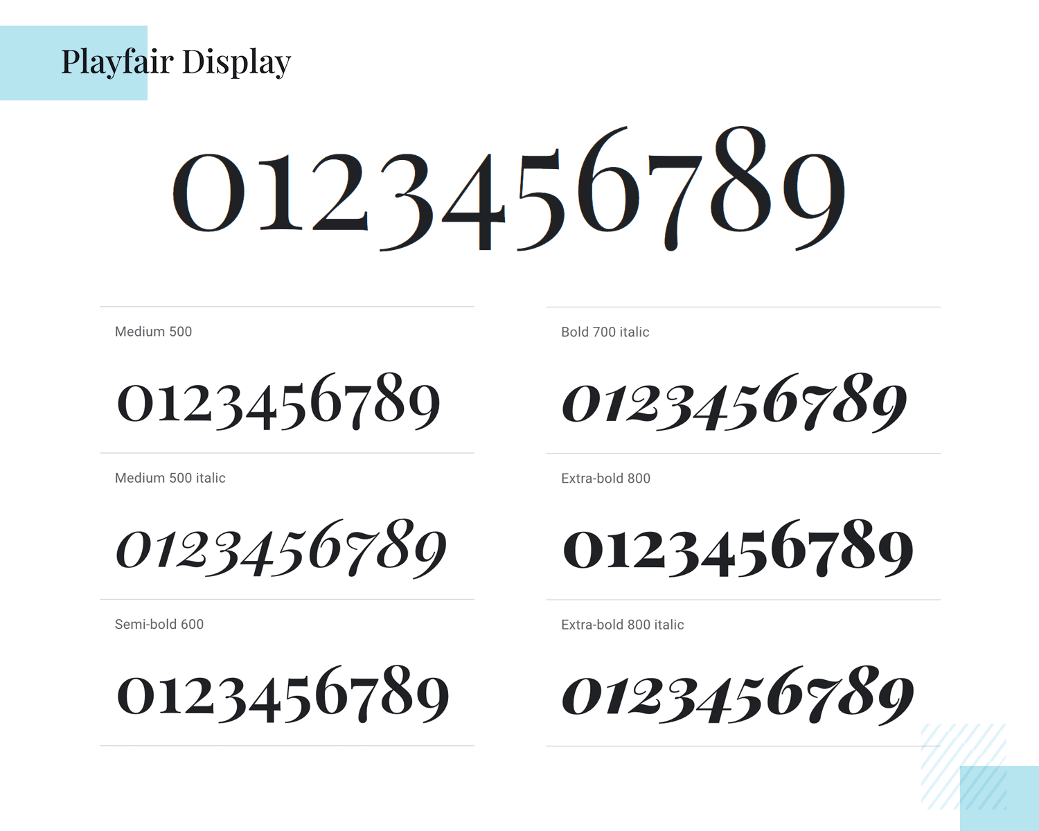
It’s great for cases where form trumps function for decorative purposes, such as encrusted numerals. When used for these purposes, you can pair it with more functional fonts like Raleway, Montserrat and Open Sans.
Shippori Mincho is more of a classical-style serif, originally intended for long-form text setting in novels.
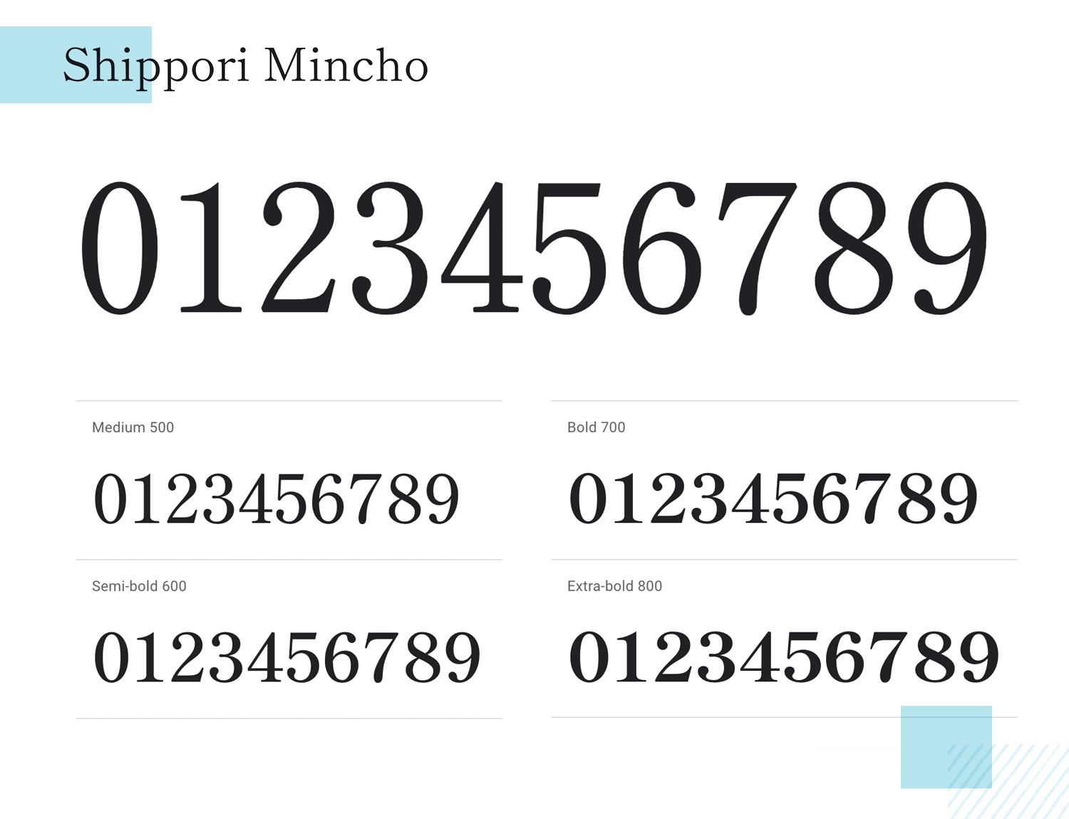
Due to its intended nature, this makes it one of the best number fonts displaying figures that have a high degree of legibility at a small size. It goes well with Roboto, Open Sans, Montserrat and Lato.
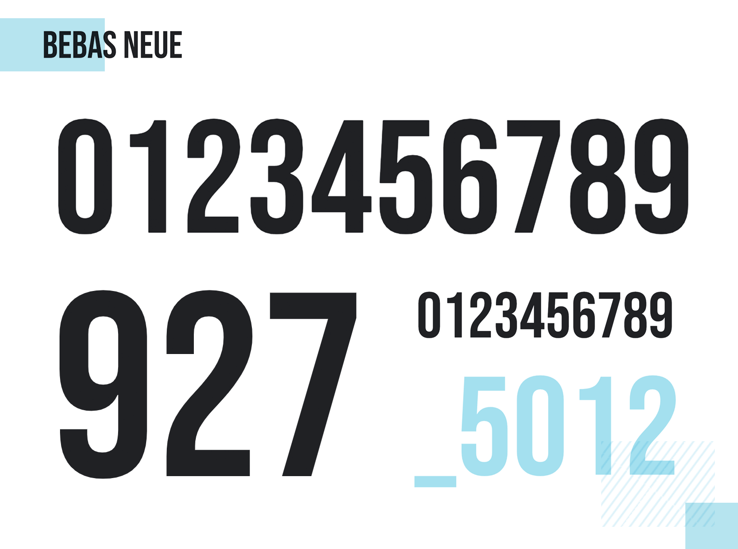
When it comes to making numbers stand out, few fonts do it better than Bebas Neue. Yet it’s also a wonderful choice for small numbers as well. It’s just versatile – end of story!
Proxima Nova bridges the gap between typefaces like Futura and Akzidenz Grotesk. Its clean, modern aesthetic makes it perfect for both web and print design, ensuring great readability across different sizes.
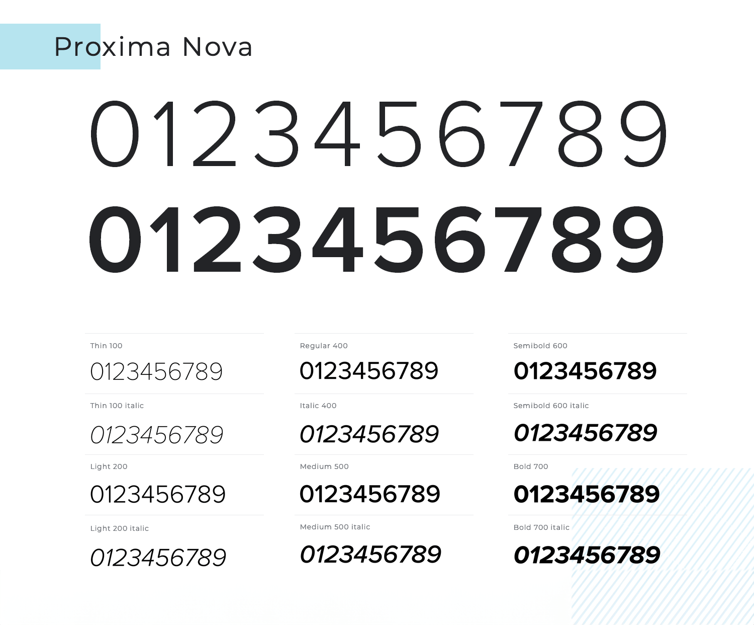
The number fonts in Proxima Nova are clear and balanced, making them suitable for various applications, from headlines to detailed data displays.
- Price: Starting from $22 for a single style
Gotham is a highly versatile sans serif typeface that offers great readability and a strong, modern feel. The numbers in Gotham are clean and precise, making them ideal for both digital interfaces and print media.
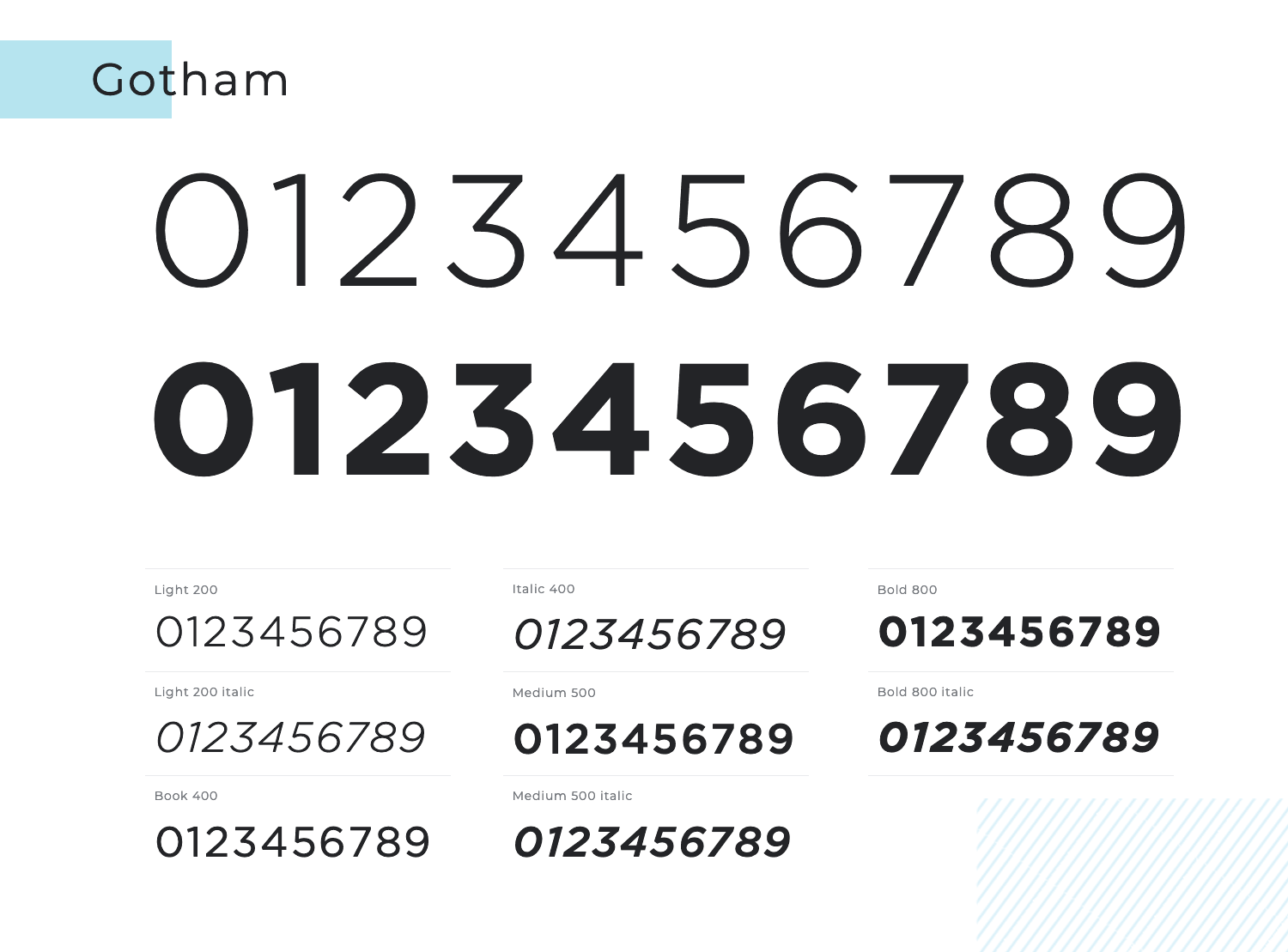
Whether you need to display large headlines or small, intricate details, Gotham ensures your numbers are always clear and legible.
- Price: Starting from $17,49 for a single style
Avenir combines the best aspects of geometric and humanist sans serif designs. Its numbers are designed to be highly legible and aesthetically pleasing, making them suitable for a wide range of applications.
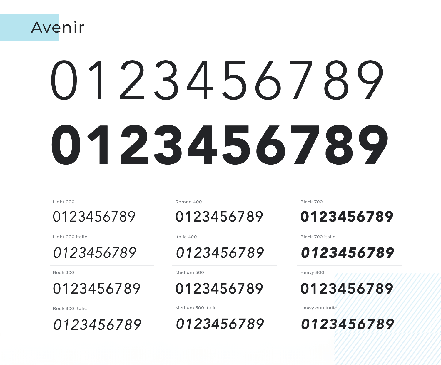
From digital interfaces to print layouts, Avenir’s numbers provide a clean, professional look.
- Price: Starting from $42,99
Museo Sans is known for its geometric precision and readability. The numbers in Museo Sans are distinct and easy to read, making them perfect for data visualization, UI design, and print.
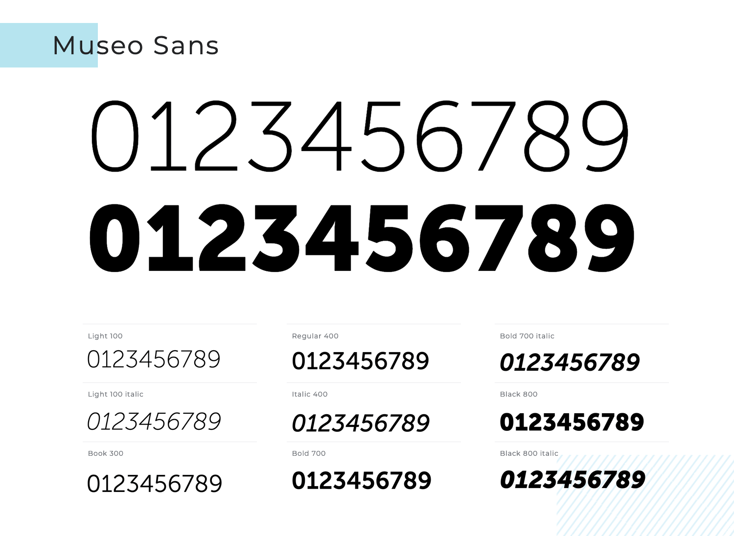
The font’s versatility and modern aesthetic ensure that your numbers will always stand out beautifully.
- Price: Starting from $16.50 for a single style
DIN Next takes the classic DIN typeface and updates it for modern use. Its numbers are designed to be highly legible, with a clean and professional appearance.
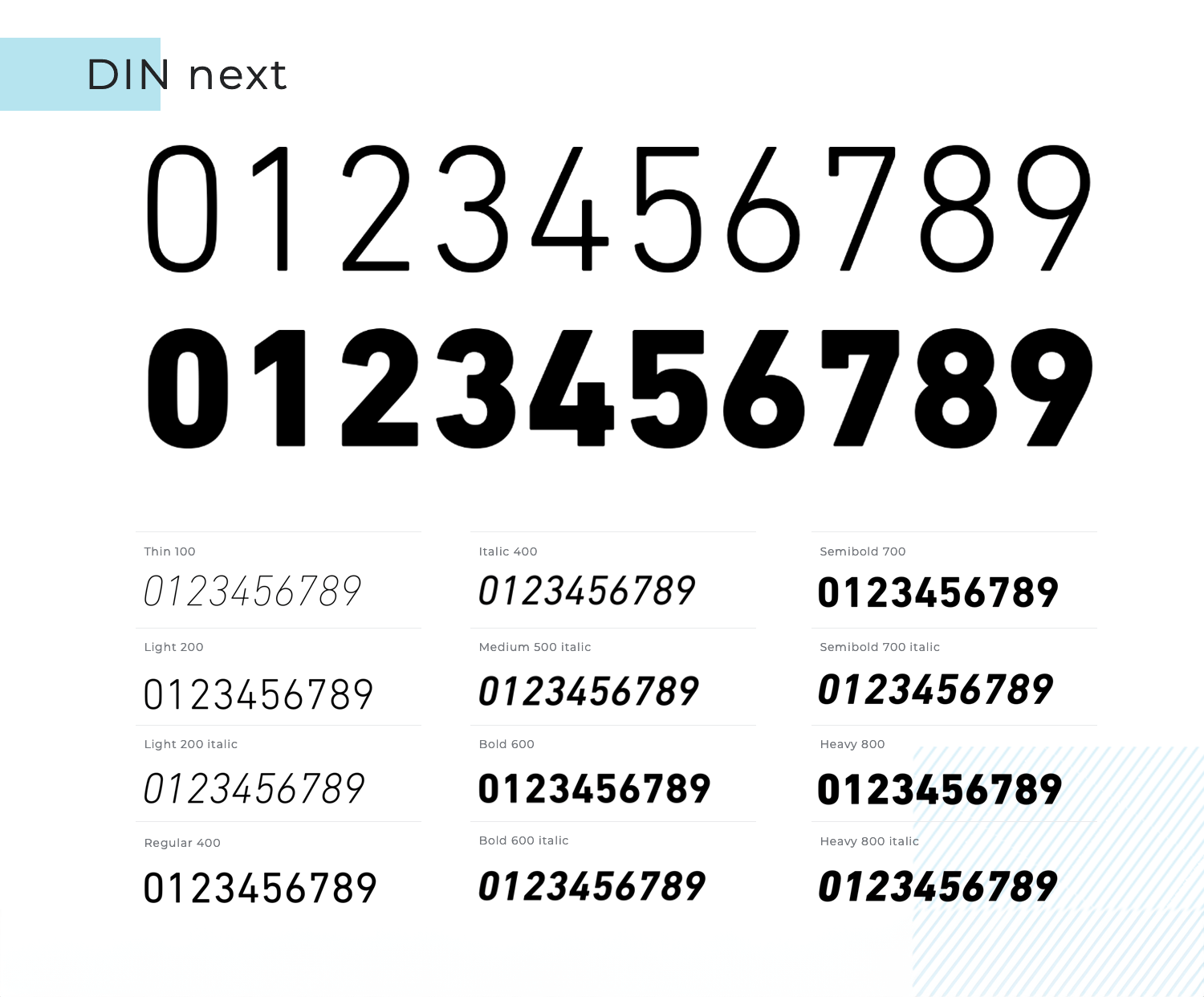
Perfect for technical documents, user interfaces, and branding, DIN Next ensures your numbers are always clear and impactful.
- Price: Starting from $56.99 for a single style
FF Din is all about smooth curves and well-balanced verticals. The font is a member of a massive font family, bringing us many – and we mean many – alternatives when it comes to body weight, italics and bolds.
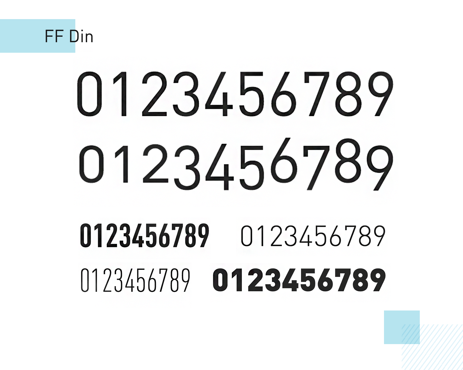
We love that this font makes for easy reading of numbers, while also giving us ample margin to customize the font according to the style of the product. Some aspects in which you can customize the number fonts include choosing between tabular or proportional widths, classic or slashed zeros, default lining or old style – right down to how to display proportions.
- Price: Starting from €59
Didone Room is a number font that doesn’t deal in letters. Made specifically for displaying beautiful and eye-grabbing numbers, it makes for the perfect font to highlight any figure you wish.
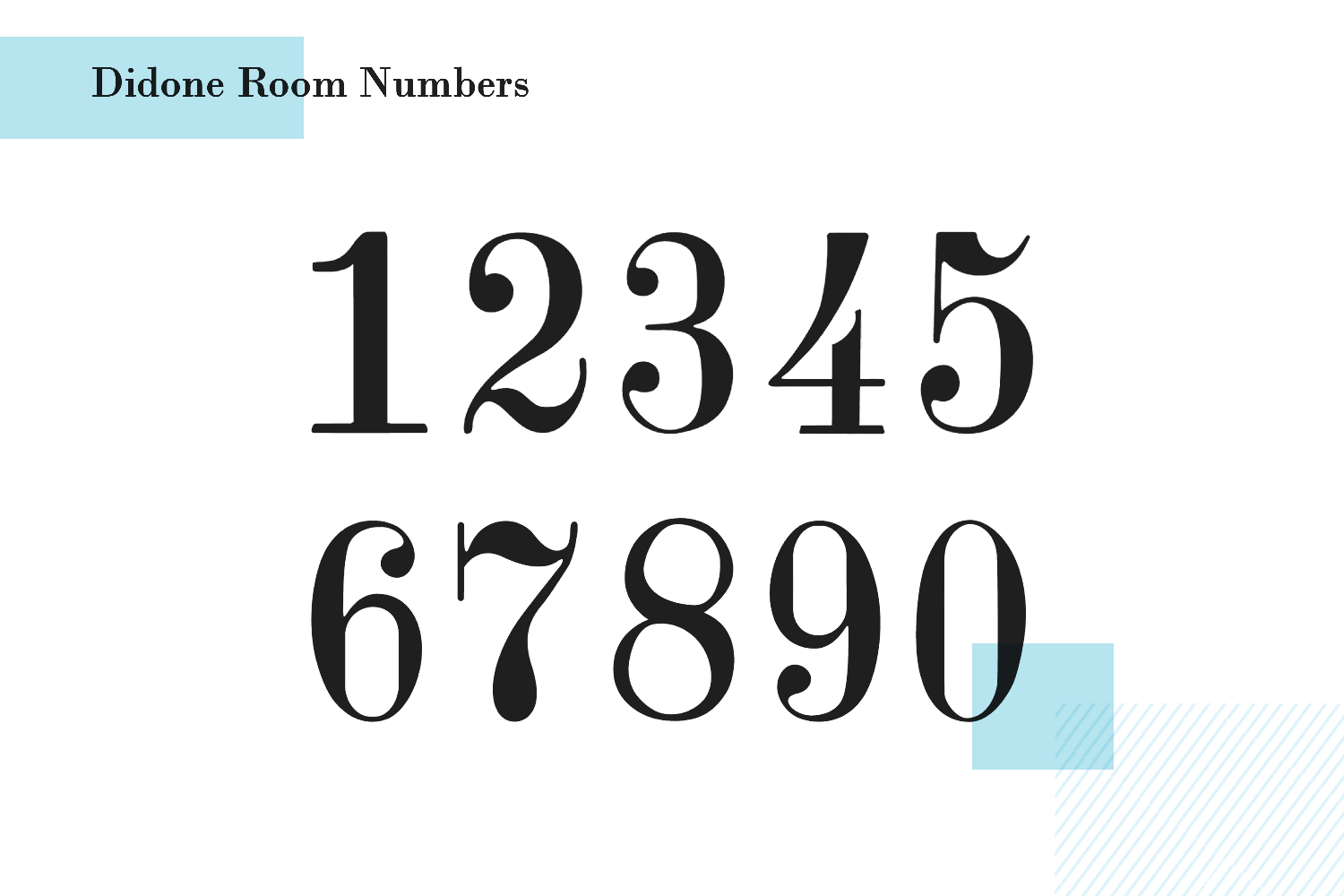
The number font was made with big and powerful numbers in mind, so this isn’t a font to use when displaying many figures at once. Cool side note: the designer behind it was inspired by the numbers on a hotel room door!
- Price: Subscription to Envato Elements
BoldPrice is another number font that doesn’t offer letters. It’s made for that wow-factor, putting creativity first. The regular weight is simply black numbers while the bold version resembles a wood effect!
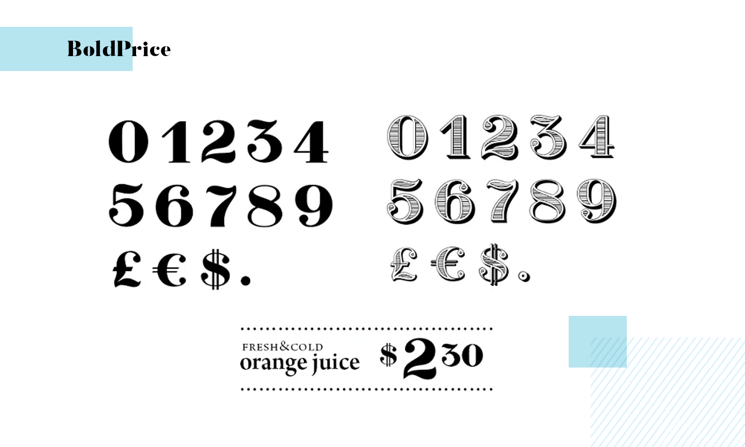
It’s a great option if you’re going for a casual, friendly design that is all about personality. It’s better suited for stand-alone numbers, such as price listings.
- Price: Starting from $12.10 for the web version
Klinic Slab is a serif font that enjoys a contemporary feel to it, making it a wonderful way to add flare to your product. When it comes to Klinic as a number font, we love that this font allows you to customize it to your liking.
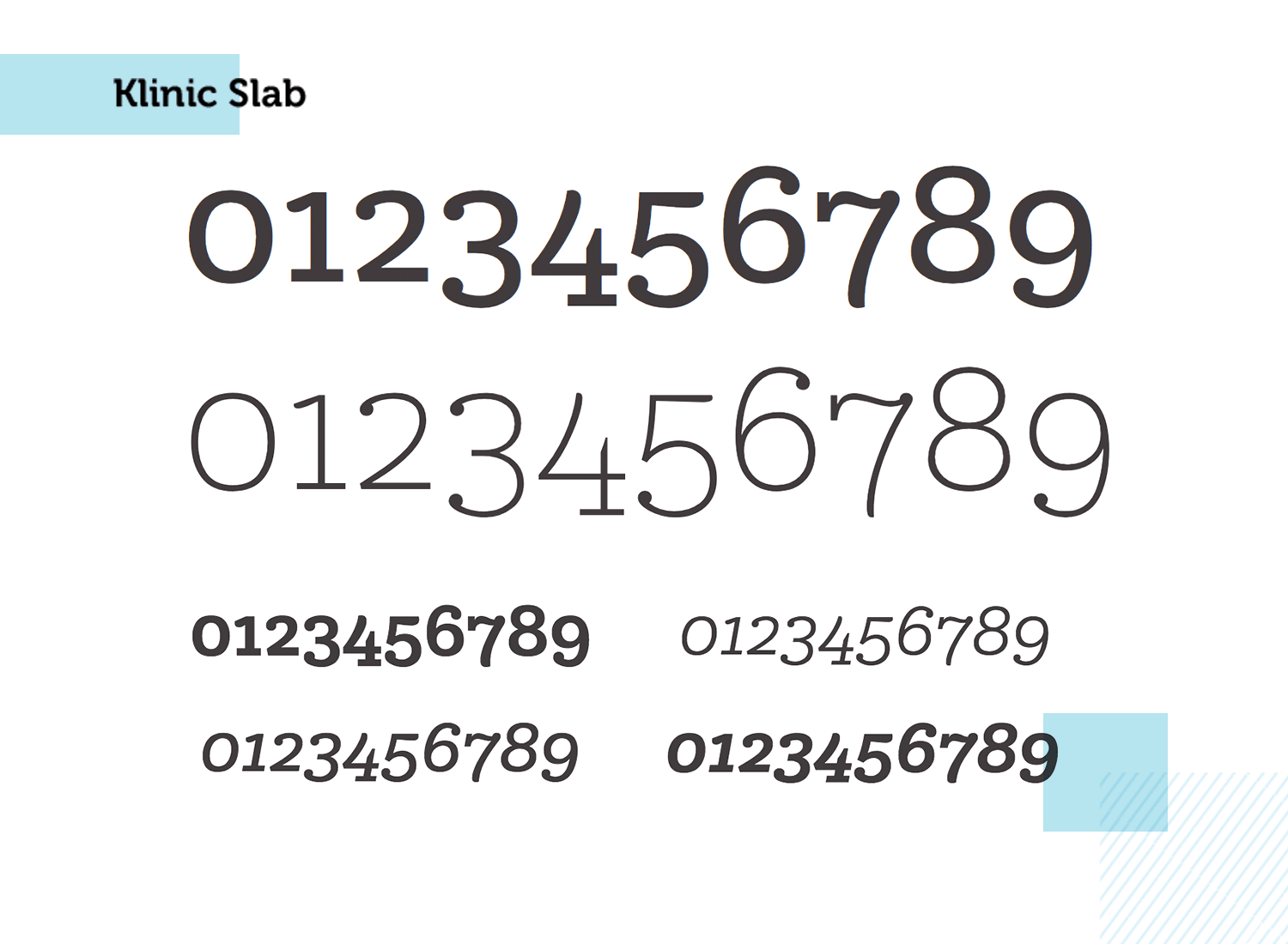
For example, designers can choose between classic lining and no lining of the numbers. This opens the door to forgo the lining in stand-alone numbers for more personality, or classic lining for numbers that come accompanied by more content or for displaying several figures at once.
- Price: Starting from $45 for commercial use
What’s there to say about such a classic when it comes to typefaces? We all know and love Helvetica, a font that has enjoyed massive popularity since first being brought into the digital world back in the early 80s.
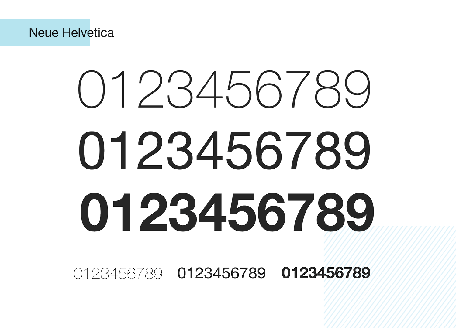
Neue Helvetica keeps all the great things about the classic Helvetica, while adding a flare of contemporary style to the product. It’s an elegant and casual sans serif font that can be used for just about any number out there!
- Price: €39 for a single style
Design and prototype web and mobile apps with Justinmind for Free. Unlimited projects!

Brandon Grotesque is a number font for those crucial numbers you want to highlight in your design. The font is full of personality, making for a sans serif font that does wonders for headers and highlights!
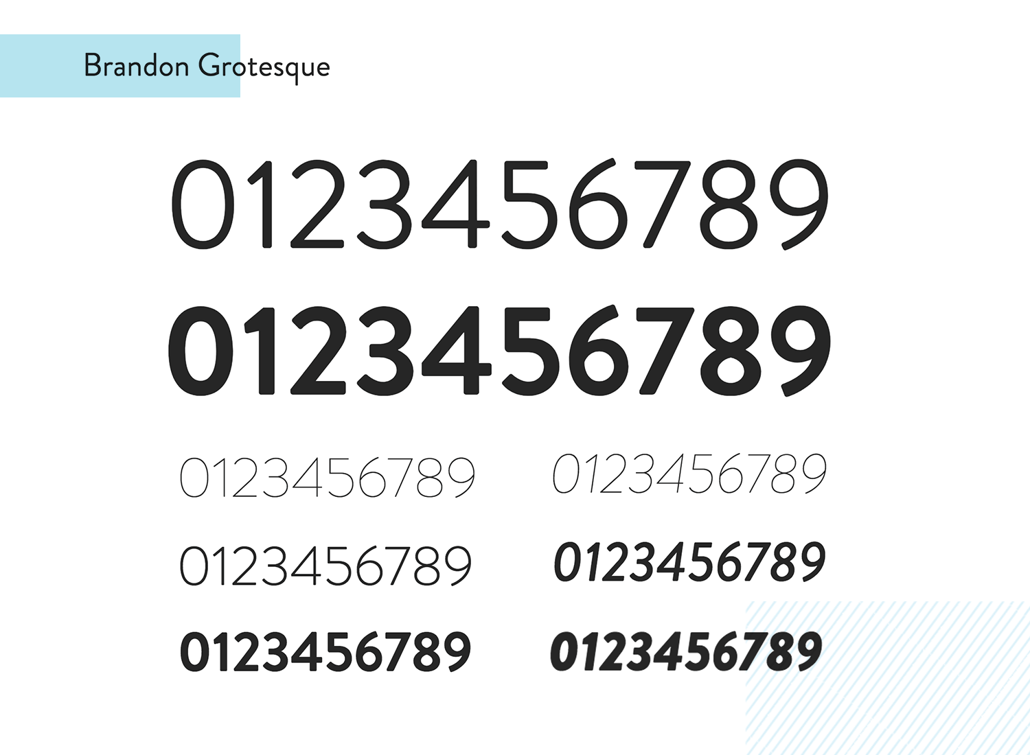
The font itself comes with 12 styles, making it versatile and adaptable to suit your style. With that said, this font shines bright for a big and dominating display of numbers! For small displays that come with other important content, perhaps this isn’t the one for you.
- Price: €37.99 for a single style
Optima is an old-school font, brought to us at first way back in 1958 by Hermann Zapf. Today, it’s still a wonderful font for products that want a vintage feel, or just seek to keep it elegant and timeless.
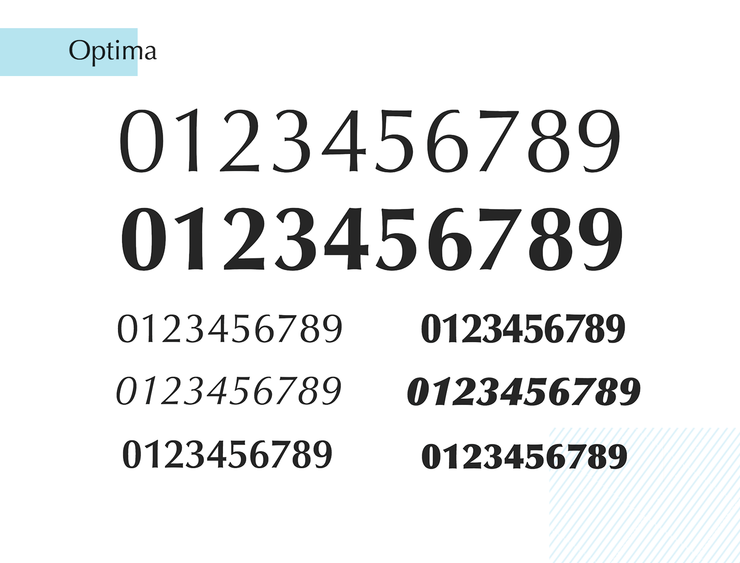
This sans serif font can make a big impact in large displays, but maintains its readability in smaller displays too – especially when we account for the 12 styles this font enjoys. It’s both stylish and practical!
- Price: €39 for a single format
Futura PT makes for a sober and rather serious font. It’s simplicity and clean lines make for good readability, especially when it comes to displaying many numbers in a small size. This number font is perfect for more serious products, such as banking apps.
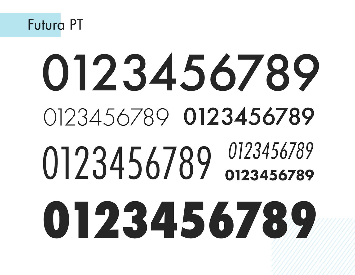
Another cool thing about this number font is that while it does very well in small sizes, it also adds value in larger displays. Its design can add an elegant feel to any product, without any concerns over usability.
- Price: €27.99 for a single style
GT America merges the best features of American and Swiss design, resulting in a versatile typeface that is both classic and modern. The numbers in GT America are meticulously designed to ensure clarity and readability across various sizes and contexts.
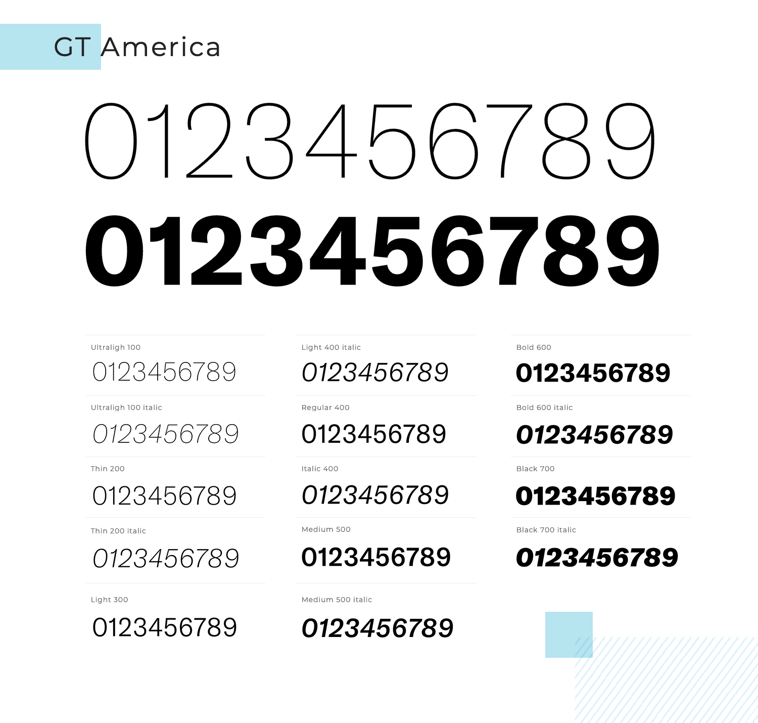
Whether used in print or on digital platforms, this font delivers a professional and polished appearance. We think it makes for a wonderful and simplistic font!
- Price: Starting from $75 for a single style
Graphik is a highly adaptable geometric sans-serif font that excels in a variety of design contexts. Its numbers are clear and balanced, making them ideal for both digital and print use.
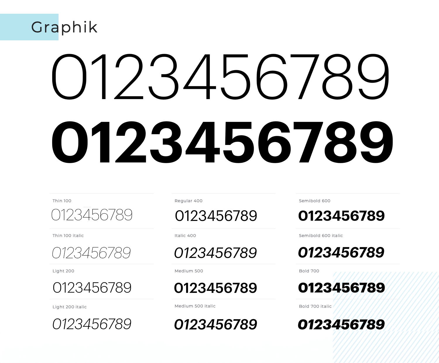
The font’s versatility allows it to work seamlessly in both minimalistic and complex designs, ensuring that your numbers are always easy to read and visually appealing.
- Price: Starting from $50 for a single style
Avenir Next Pro was developed as an alternative to Futura and works marvels as a sans serif number font. Overall, there are 32 fonts in this typeface and it makes for excellent legibility across pretty much every size screen available.
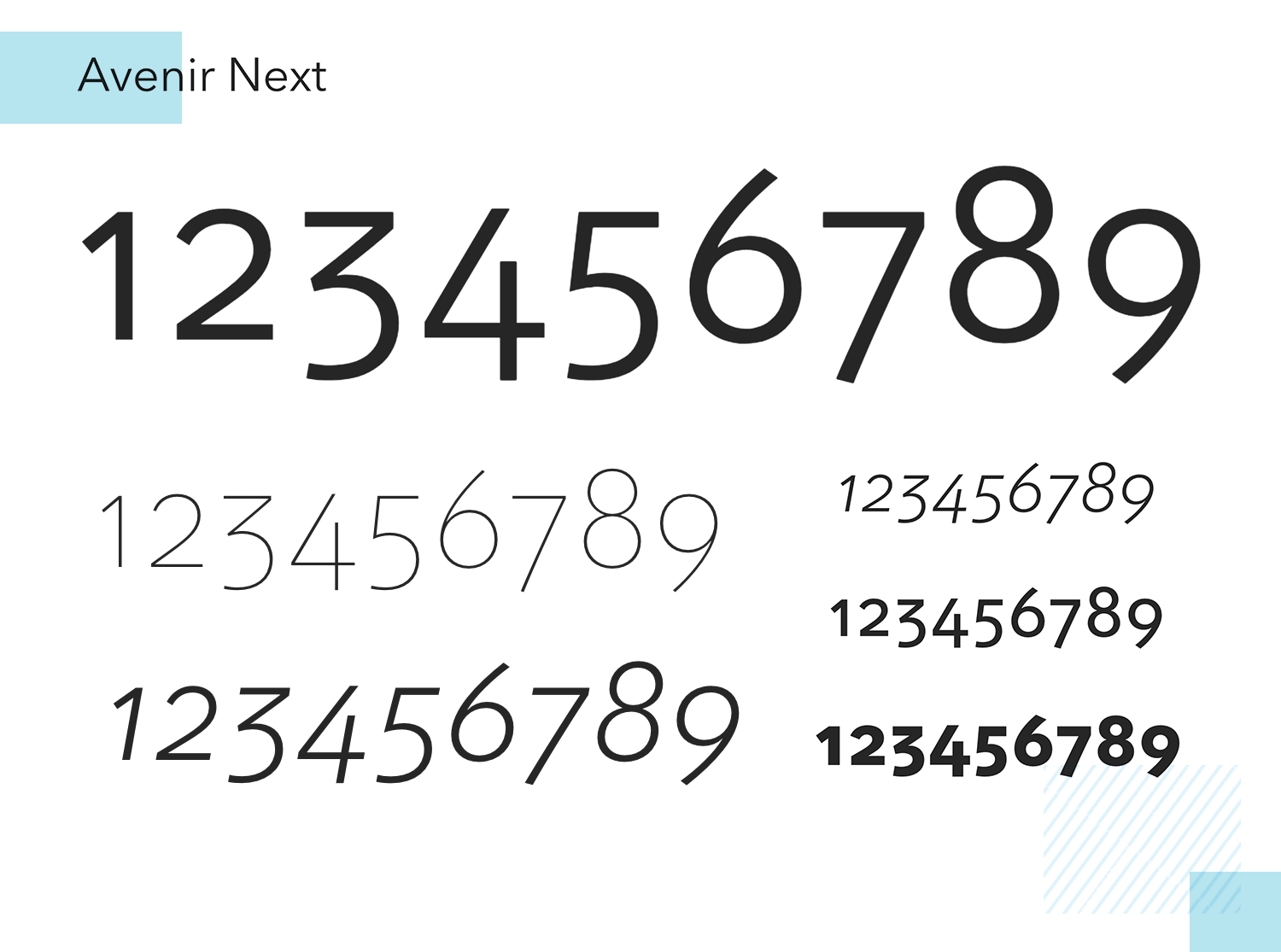
The numbers you’ll find in Avenir Next Pro use proportional spacing and is designed for both serious and casual situations alike. The best thing is that you can pair it off well with most serif fonts.
FF Mark is a geometric sans serif font that received a lot of its input from the original FF Meta font that was intended to be the polar-opposite contender to Helvetica. As a modern interpretation of the German classical sans serif, it’s similar to Meta in a lot of ways.
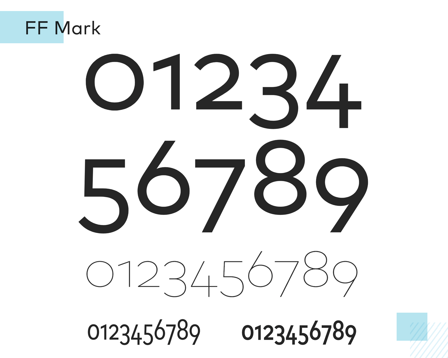
With lined, tabular numbers that are full of personality for a sans serif, you can rely on FF Mark for clear, stand-out numbers that work well in headlines and provide optimum legibility.
Gilroy is another geometric sans serif that works exceptionally well as a number font. It’s perfect when used in graphic design, titles and headings, as the numbers are built for tabular displays.
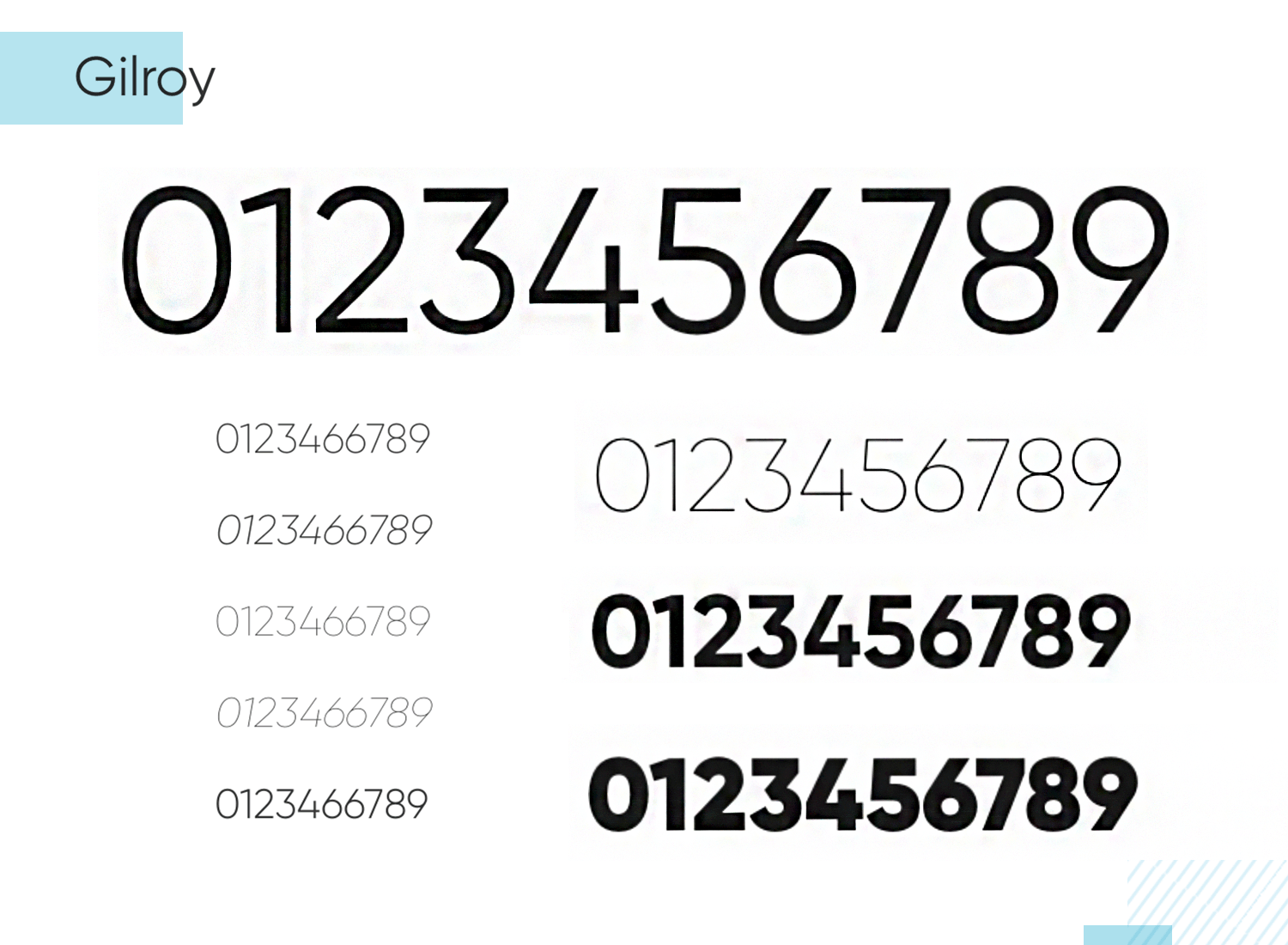
Sharp and punchy, Gilroy numbers are tremendous for when you need to add a bit of perk to corporate web designs.
Sure, everyone’s heard of Helvetica. Some love it, some hate it, but there’s certainly no denying its success or sheer ubiquity throughout the decades. Emerging in the early 60s out of Switzerland, Helvetica is perhaps one of the most widely-used sans serif fonts.
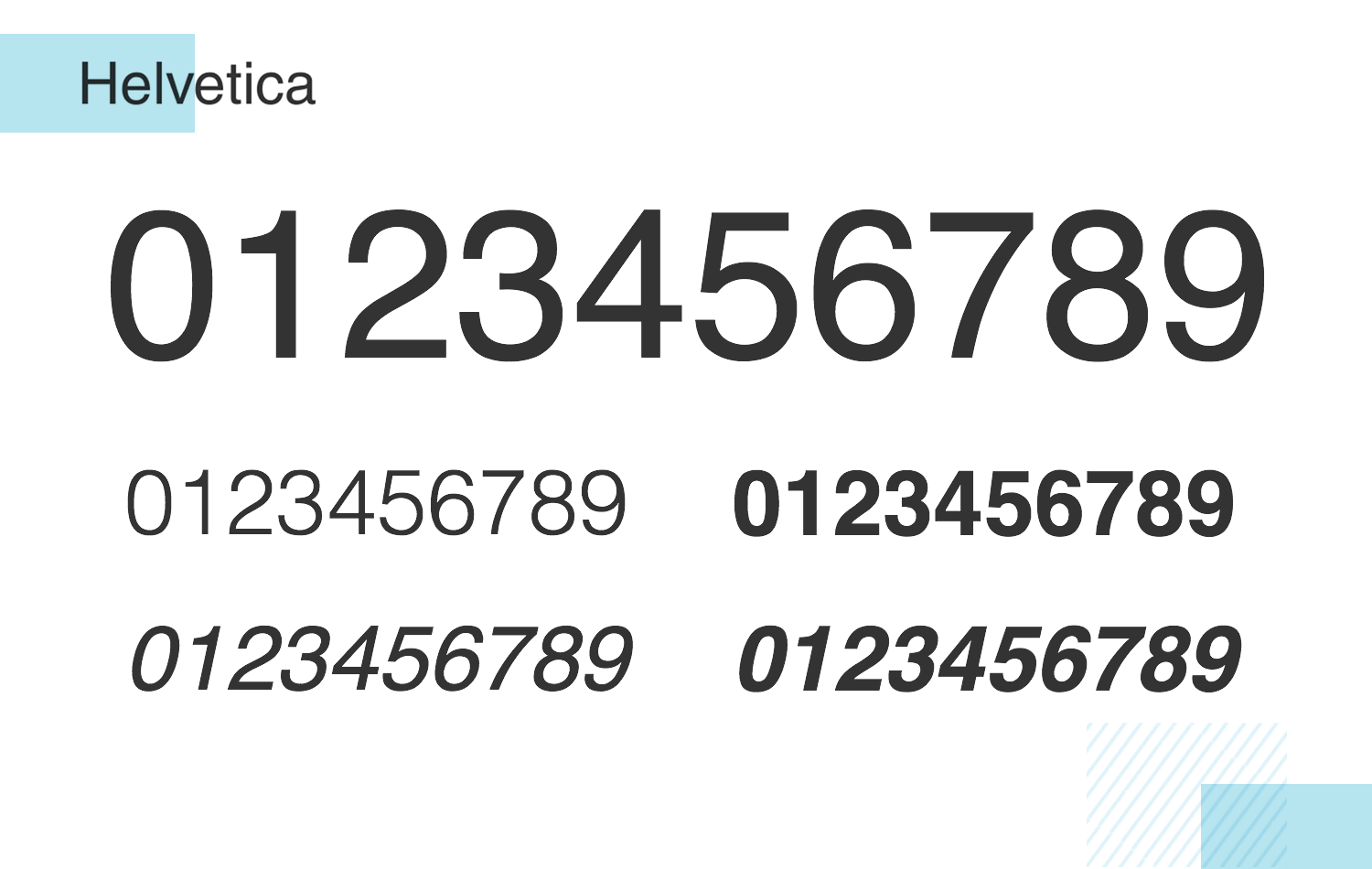
However, we may underestimate its use as a number font as well. What most people think of when they think of numbers may well be the typical Helvetica numbers, simply due to their display throughout the years. It’s something people are used to seeing, as a tabular, in-line number font, it produces excellent readability.
Univers, in much the same way as other functional sans serifs like Helvetica, has its roots in Aksidenz Grotesk. However, although it’s a less well-known alternative to Helvetica, that doesn’t mean it’s any less effective, especially to those on a tight budget.
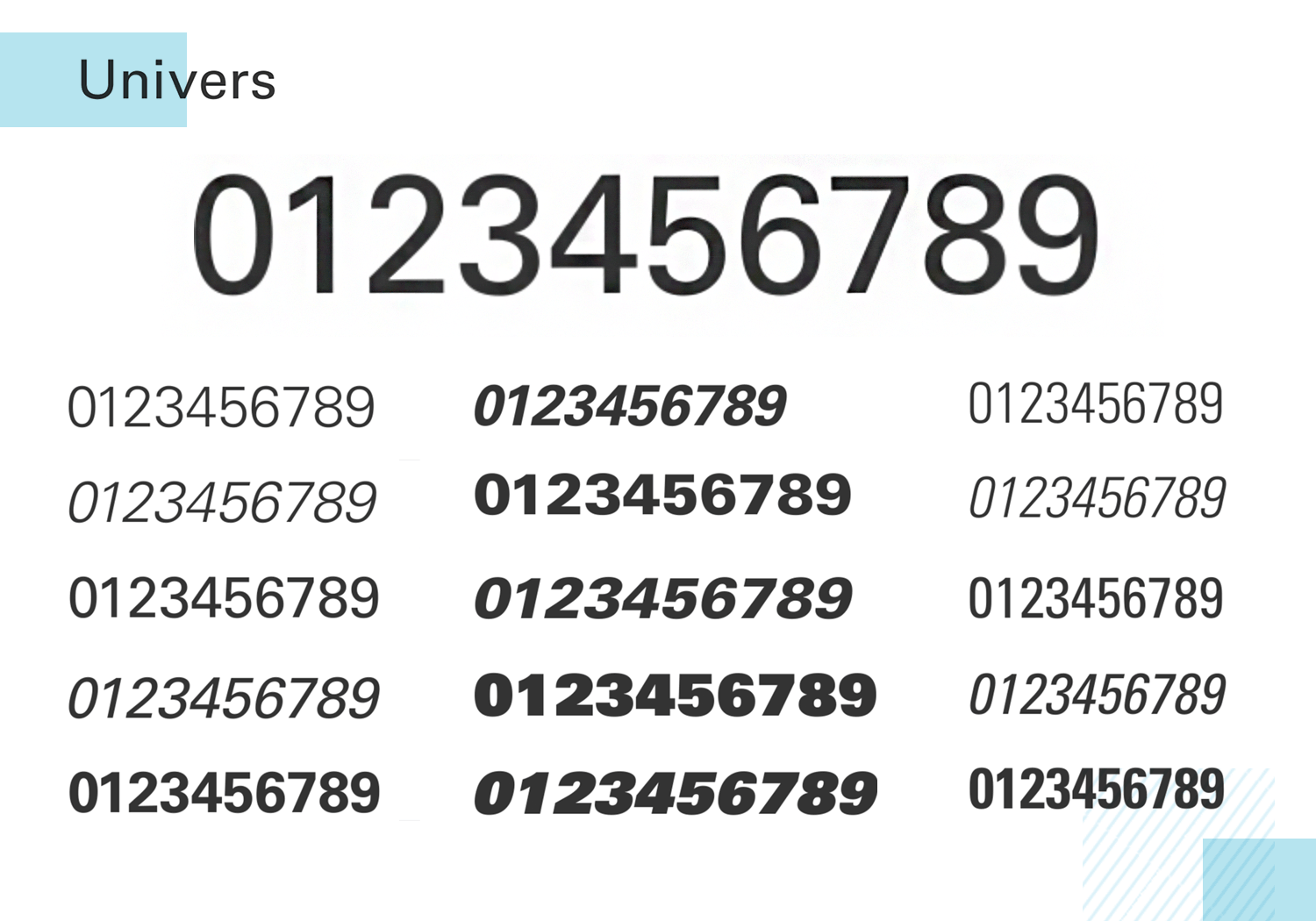
Univers, when used as a number font, consists of monospaced numbers that are bolder and slightly more angular than Helvetica, with more shallow curves. Perhaps the starkest marker of this difference is in the number 1. For these reasons, Univers makes for the perfect display number font to show your figures in sharp relief.
Trade Gothic is an interesting alternative to use as a number font if you’re in search of a clean, angular design that gives your figures a sharp, neat and tidy appearance.
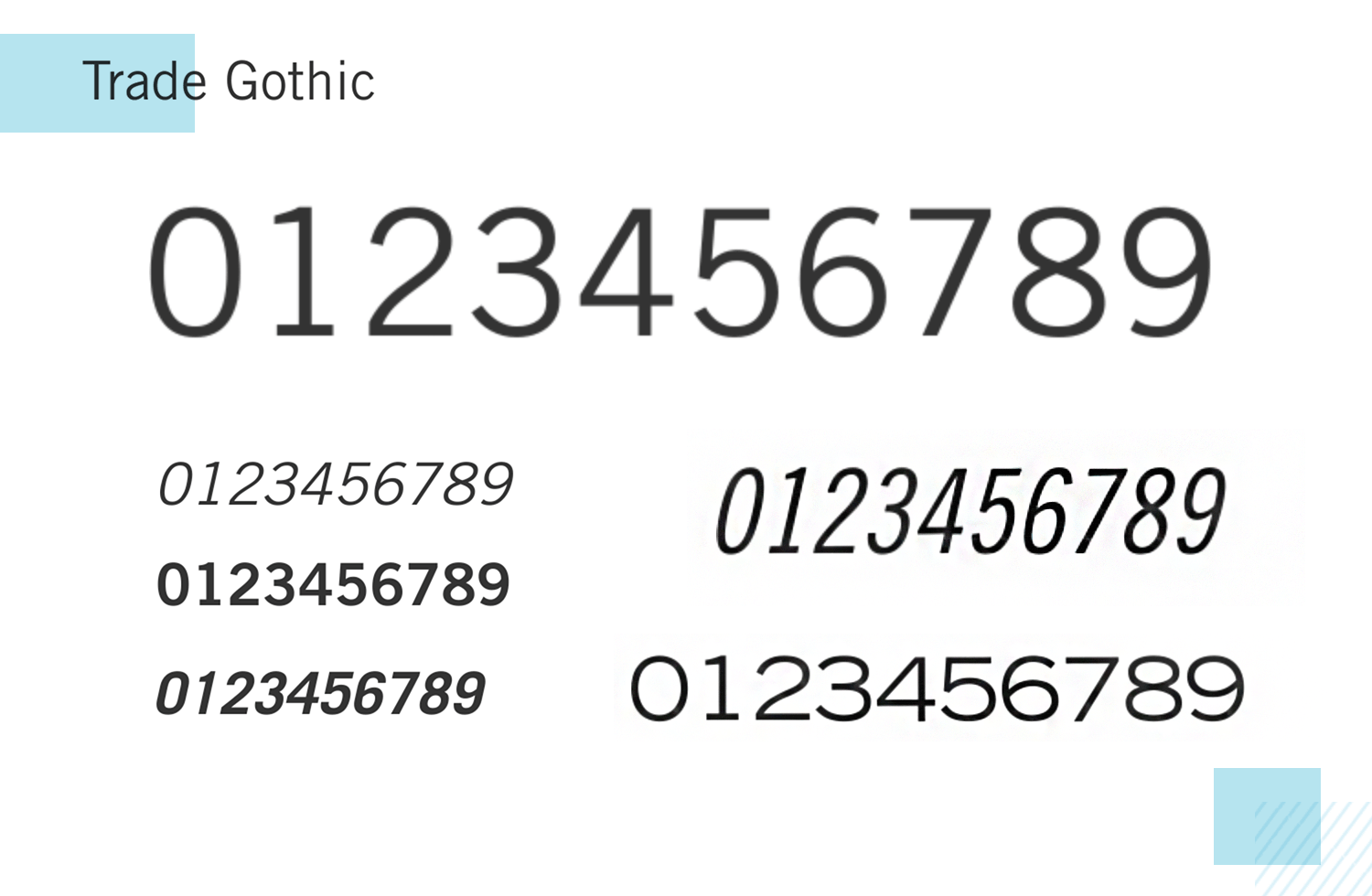
This monospaced number font works well with Roman textual fonts and is perfect for use as a display text and well-suited to advertising, publicity, marketing and multimedia.
Veneer offers a strikingly bold font to display your numbers, with upright stress being placed on all of its neat, monospaced, lined numbers.
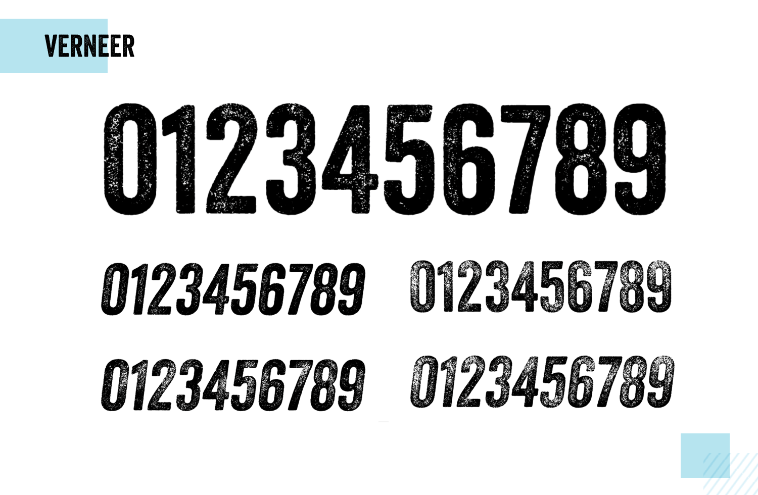
What really stands out to us is that, even though numbers are displayed in tabular format, they all appear to be symmetrically aligned due to the shallow curves and near upright stress. For example, the 1 has more complimentary space than the other numerals to compensate for lack of width, yet this is barely noticeable. That’s what we want in a tabular display.
If you’re after a more casual serif number font, then you could do worse than try Recoleta. Its smooth, bubbly and soft serifs of the 70s are echoed in its numerals, yet it’s not too intense or overcooked like other, similar display fonts.
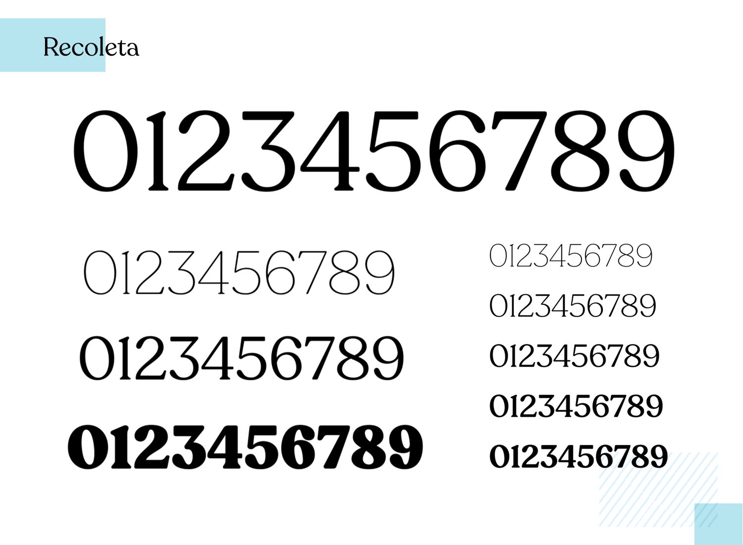
Recoleta is the perfect option for a serif font that uses monospacing, lined displays that add a bit of casual flair to a UI design.
Sofia Pro is a perfectly geometric serif font that strives to achieve a sense of modernism, harmony and roundness in its text, glyphs and numerals.
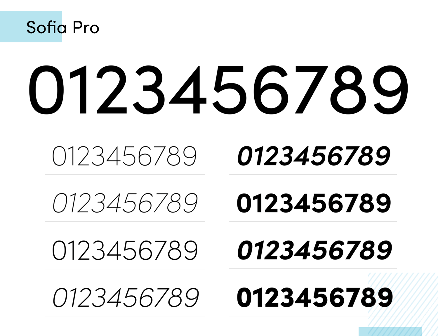
It also has the quirk of ligatures with text combinations such as ‘fi’ and ‘ff’, making it an interesting choice if you want to combine numbers with text. When it comes to usage, we would be inclined to recommend this number font for corporate uses to add an element of class and prestige.
ITC Avant Garde Gothic was intended to be an attention-grabbing font and bases itself on Avant Garde’s Magazine. It was used in the 2011 Eurovision Song Contest and also in the credits for Back To The Future.
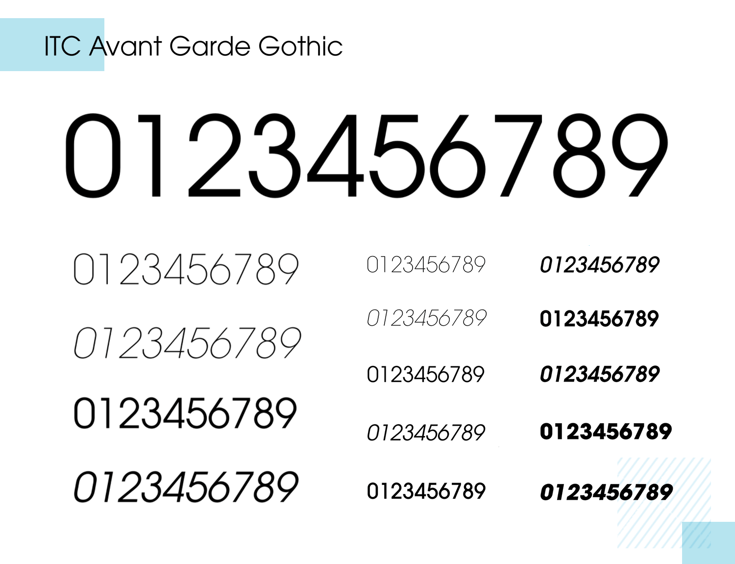
ITC Avant Garde Gothic has monospaced numerals with equal width for each number. It’s a perfect number font for display purposes, titles, headers, graphic design and infographics to really grab the attention of the user.
Numbers are an essential part of any good font. Typographers who care about building strong fonts will undoubtedly design the numbers just as well as the letters.
Getting your hands on some free fonts means scouring the wilderness of the internet – there are a few here that will get you started. Use them wisely and, remember, always respect your type. If you enjoy a more generous budget, it might be worth investing in some of the truly unique paid number fonts on this list!
PROTOTYPE · COMMUNICATE · VALIDATE
ALL-IN-ONE PROTOTYPING TOOL FOR WEB AND MOBILE APPS
Related Content
 A fun look at different data table designs, from basic lists to smart, interactive ones, based on how complex the data is and what users need.18 min Read
 Single page design v multi-page design – everything you need to help you choose the right design for your site’s content18 min Read
 Website backgrounds can be a powerful tool in creating an experience. But what kind of experience can you convey and how? We got the full run-through for you!14 min Read
