
Breadcrumbs are instantly recognizable - but what makes a good breadcrumb scheme? Check out these examples and see what unites them.
Most users are familiar with breadcrumb website navigation, even if they can’t determine what it is. The fact is, many of the biggest online retailer platforms out today make use of breadcrumbs in their UI design – it’s particularly handy if you’ve got a big website with plenty of content.
But what does a good breadcrumb design look like? Is there a recipe for success when it comes to prototyping them, regardless of the type of website?
Start prototyping breadcrumbs today with Justinmind.

Here, we cover the three types of breadcrumbs, location-based, attribute based, and path based, as well as the benefits of using breadcrumbs for your website navigation and we even throw in some breadcrumb examples that we absolutely adore. But first, let’s go over the basics tenets for how to design them in your prototyping tool. Let’s get to it!
Most of us will recognize the small series of links that can be often found in small size, on the top left corner of big platforms such as Amazon. They are usually small due to their secondary nature, and are provided to users in a horizontal line. Even though breadcrumbs get their name from the famous Hansel and Gretel tale, this origin can often mislead designers as to what breadcrumbs really are.
Breadcrumbs can very well trace the last few steps of the user, much like the children in the tale – but they can also serve other ends.
Consistency and familiarity are super important for a great user experience, especially when someone visits a website for the first time. Those first few moments are make-or-break; users quickly decide whether to stick around or move on. It’s all about that first impression, that initial hello.
When users encounter something new, the learning curve is key. Consistent elements can really help smooth things out and make the experience easier and more welcoming. This is where breadcrumbs shine, offering clear orientation so users instantly know where they are on the site, preventing them from feeling lost or confused.
Most users instantly recognize familiar patterns and elements—which is awesome because it means they don’t have to learn something completely new just to get around. This familiarity provides a sense of comfort and ease, like seeing a friendly face. This directly leads to reduced frustration and an improved user experience as users feel more in control of their navigation.
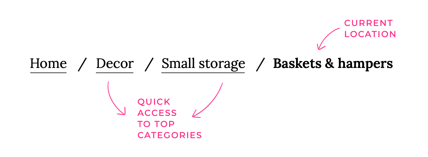
This is a classic reason why many designers include breadcrumbs in their navigation design. It helps users understand their current location within the website – which is particularly helpful in enhancing the website navigation of big websites such as e-commerce platforms.
Plus, consistent elements also give users context about where they are within the website’s overall structure. This context is especially helpful for users who land on a specific page from a search engine, like a product page. They really benefit from understanding not just where they’ve landed, but also the bigger picture of the information architecture and where else they could explore.
This contributes to enhanced site navigation by creating a visual hierarchy that clearly represents the website’s structure. It also offers context as to what level the user is in, and where they can go from there. This is particularly helpful when users land on a product page of a t-shirt, for example, and wish to explore the category of t-shirts as a whole.
This helps users not just feel more comfortable, improving usability, but it also works as a shortcut – which is always a plus. They allow users to jump to larger categories and higher level pages in a single click. One of the big wins about this tactic is that by using breadcrumbs we create shortcuts that take up very little screen space.
From an SEO perspective, breadcrumbs are like little gifts that keep on giving! They’re not just for users; search engines love them too. They boost your site in a few key ways:
First off, they help with improved search engine rankings. Think of it like this: breadcrumbs give search engines a clear map of your website. They show how all the different pages connect and what the overall topic of your site is. This helps search engines understand your content better, which can lead to higher rankings in search results – like getting a gold star from Google!
Secondly, breadcrumbs enhance internal linking. They create a nice, organized network of links within your site. This is super important for improving crawlability and indexing. Search engine crawlers (those little bots that explore the web) follow links to find new stuff.
Breadcrumbs make it easy for them to wander through your whole site, making sure all your important pages get discovered and indexed. It’s like leaving a trail of breadcrumbs (ironically!) for the search engine bots.

And finally, breadcrumbs can help you get rich snippets in search results. These are like supercharged search results that show extra information beyond the usual title and description. When you set up your breadcrumbs correctly (using something called schema markup), search engines can show a breadcrumb trail right there in the search results.
This makes your listing look way more appealing and gives people a better idea of what your page is about before they even click. This increased visibility and clarity can lead to more clicks, which is a big win for your SEO. So, breadcrumbs are a win-win: happy users and happy search engines!
These are the most common type and show the user’s location within the website’s hierarchy. Location-based breadcrumbs are like the helpful signs that guide you through its exhibits! They show you exactly where you are within the museum’s layout, helping you understand how each room connects to the bigger picture.
For example, you might see a sign that reads “Entrance > Ancient Greece > Greek Mythology > Myths of the Gods.” This clear path lets you easily retrace your steps and confidently explore other areas of the museum.

For an e-commerce website this would be something like: Home > Products > Electronics > TVs > Smart TVs. This type of breadcrumb website navigation is best for websites with a well-defined hierarchical structure.
Curiously enough, path-based breadcrumb website navigation is the only type of this navigation scheme that does what Hansel and Gretel wanted in their tale. With this kind of navigation, we don’t consider levels or any type of category but rather the actual steps users have taken.
That means the navigation scheme is fluid, showing each user their own path. However, this kind of breadcrumb website navigation is the source of much debate in the design industry. The issue mainly arises from the fact that using path-based navigation can have very limited benefits.

For example, users may be confused when they see two different navigation schemes after arriving at the same page twice using different paths. Another issue is that this scheme would mainly mimic the browser’s “Back” button, offering little added value.
On top of all that, there’s the separate issue that users landing directly on any page from a Google search won’t have breadcrumbs at all.
It can be slightly difficult to tell the difference between location and attribute-based breadcrumb navigation. The key difference is that while location-based breadcrumbs will show only levels of pages within the product, attribute-based will show categories that are increasingly broader.
These are often used on e-commerce websites and show the attributes of the current product. They’re like product filters. For example: Home > Women’s > Shoes > Heels > Red Heels. This type is helpful for narrowing down product searches and showing users the specific characteristics of the product they’re viewing.

Big names of e-commerce use this kind of navigation scheme such as Amazon and Best Buy, and it’s not tough to see why. It makes exploring products that much easier!
Start prototyping breadcrumbs today with Justinmind.
When it comes to breadcrumbs, less is definitely more! We want to make them super easy to understand at a glance. So, use clear and concise language – think simple, everyday words that everyone can get. Avoid any technical jargon or industry-specific terms unless you’re absolutely sure your audience will understand them.
And remember to keep the number of steps to a minimum. Breadcrumbs are meant to show the main path, not every single turn you took along the way. Focus on the key steps in the website’s hierarchy to keep things clean and uncluttered.
Imagine walking down a path where the signs suddenly changed style every few steps – confusing, right? The same goes for breadcrumbs! Maintaining consistent formatting, typography, and color schemes is key. This helps users instantly recognize and understand them. Stick to a consistent font, size, and color palette that matches your overall website design.
And don’t forget the separators! Whether you prefer “>”, “/”, or another symbol, use the same one throughout your site to create a predictable and easily scannable path.
We want those breadcrumbs to be super easy to scan and understand, so visual hierarchy is our friend! Also, as a secondary navigation scheme, it’s only logical that your breadcrumb navigation shouldn’t take up too much screen space or take away from the navigation bar. In other words: it should never be the focal point. You want it to be small, but visible.
Most users are used to having breadcrumbs under the main navigation bar. Although, if you keep reading, you’ll see which big player has opted to place their breadcrumbs above their website footer!
In short: You want the breadcrumbs to have a supporting role in the page design, with the primary navigation in the starring role. Make it discreet, but easy to spot.
You also want to mind the small details, such as choice of font and the space you allow between the links. You want to leave enough space between the links, so that users can easily perceive them as being several parts of the same element.
The separator element is also important, even if it is straightforward. Among the symbols that are most commonly used we can find slashes (/), arrows, and the greater than symbol. Out of those, the only thing worth noting is that the greater than symbol “>” implies hierarchy.
Be mindful that if you’re using path-based breadcrumb navigation, for example, using this symbol can be misleading to users. Seeing an “About > Home”, for instance, is possible for users who get to the About page straight from Google.
We want everyone to be able to use our website, so accessibility is super important. Make sure your breadcrumbs are accessible to screen readers and other assistive technologies. This means using appropriate HTML markup (like <nav> and lists) and adding ARIA attributes. These little bits of code provide crucial context for screen readers, allowing users with visual impairments to navigate your site effectively using the breadcrumbs.
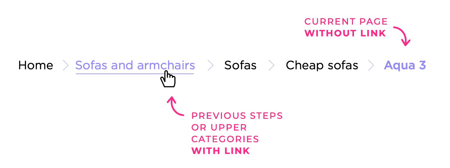
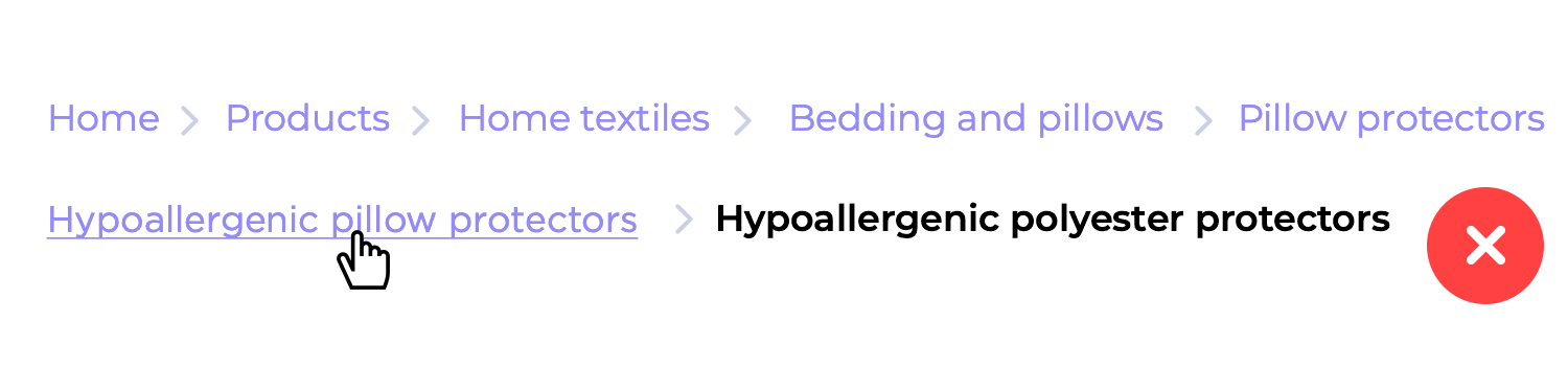
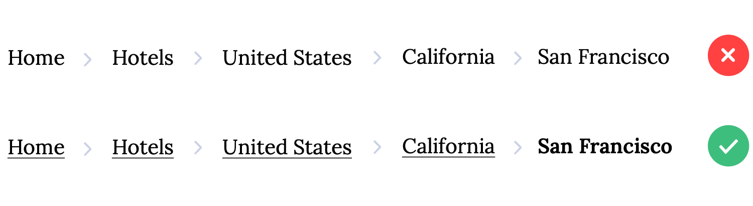
This may not be obvious to beginners. As we mentioned previously, one of the strongest benefits of using breadcrumb website navigation is that it helps users understand where they are within the entire website. Think of the breadcrumbs as a type of map around the product – including the current page is like adding a “you’re here” mark. It helps users grasp the context between the breadcrumbs.
With that said, it’d be a mistake to make that last breadcrumb a link. Users will only see it when they are already on that page, making it redundant to have a link there. This implies that you need to include a visual distinction between the clickable breadcrumbs and the last static one.
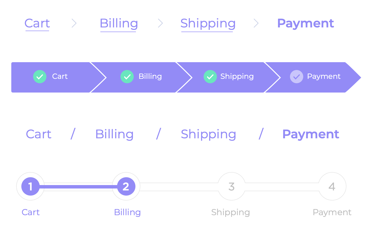
Smart design can very well kill two birds with one stone – having one feature accomplish two goals can be a great way to push usability levels up while avoiding clutter and confusion. When we use breadcrumb website navigation to represent a process that has more than one step, they have the same function as a progress bar.
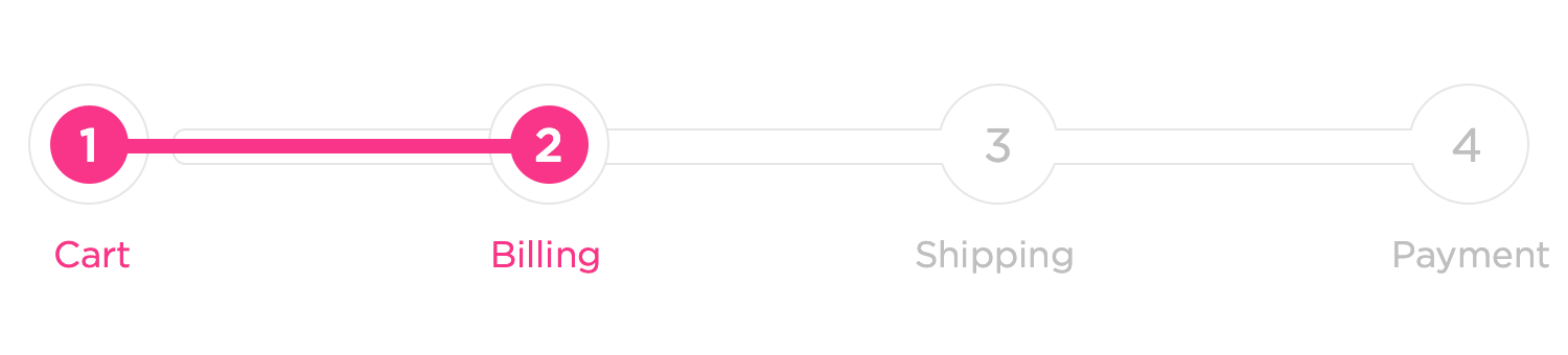
While they may not be a progress bar in the classic sense of the term, these breadcrumbs will work as a progress indicator that will help users see the light at the end of the tunnel.
Great breadcrumb website navigation isn’t just about showing a path; it’s about anticipating where the user wants to go and helping them get there efficiently. That means we need to really consider the user’s intent. Tailor the breadcrumb navigation to their specific needs and goals. Think about what brought them to this page in the first place.
For example, if a user arrives on a product page after performing a search, it can be incredibly helpful to include the search query within the breadcrumb trail. Imagine someone searching for “blue running shoe size 10.” A breadcrumb like “Home > Shoes > Running Shoes > Blue Running Shoes > Blue Running Shoes Size 10” provides immediate confirmation that they’re in the right place and makes it easy to refine their search or explore related products.
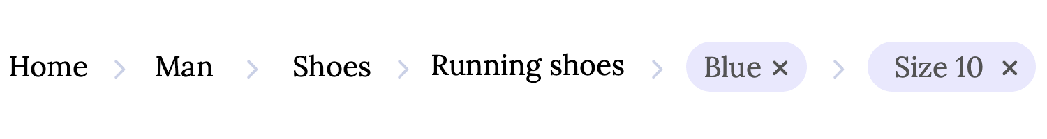
This level of detail is especially useful on e-commerce sites with complex product filtering. It helps users understand exactly how they arrived at a specific product and makes it easier for them to navigate back up the product hierarchy or to refine their search.
Like any other design element, breadcrumb navigation should be subjected to rigorous testing. Conduct user testing to gather feedback on the effectiveness of your implementation. Watch how users interact with the breadcrumbs: Do they use them as intended? Are they easy to find and understand? Are there any points of confusion? User testing can uncover usability issues that you might not have anticipated.
And the work doesn’t stop after launch. Continuously monitor user behavior using analytics tools. Track metrics like click-through rates on breadcrumbs, bounce rates from pages with breadcrumbs, and overall navigation patterns. This data will provide valuable insights into how users are actually using the breadcrumbs and whether they are contributing to a positive user experience. Based on the feedback and data you collect, make adjustments as needed.
Breadcrumb navigation is not a “set it and forget it” feature; it should be continuously refined to ensure it’s meeting the ever evolving needs of your users.
Think of breadcrumbs as a subtle guide, not a dominant feature. Excessive use of breadcrumbs can overwhelm users, especially on pages with already complex layouts. If you find yourself creating long, winding breadcrumb trails that span multiple lines or take up significant screen real estate, it’s a sign that you might be overdoing it.
Remember, the goal is to provide helpful context, not to create visual clutter. A good rule of thumb is to keep the breadcrumb trail concise and focused on the key hierarchical levels. If the path becomes excessively long, it’s likely a sign that your site’s information architecture could benefit from some streamlining.
Also, while this kind of navigation scheme can be very helpful to users, it’s not meant to act as an entire navigation solution for the product. It’s supposed to be an added bonus – a convenience feature. Trying to make your breadcrumb website navigation the primary means of moving around the product is problematic, to say the least.
That’s why, before implementing breadcrumbs, carefully evaluate your primary navigation. If it adequately serves the user’s navigational needs, consider whether breadcrumbs are truly adding value or simply adding visual clutter and overall confusion. It’s often better to focus on optimizing the primary navigation for clarity and ease of use rather than adding a secondary navigation element that might not be needed.
Again, with breadcrumbs not being a one-size-fits-all kind of component, they aren’t automatically suited for all websites out there. Mainly, websites that don’t have too much hierarchy on their pages or lack large volumes of content.
That is because breadcrumbs tend to work better within a complex structure that has a clear hierarchy. Not only would they add little value to a website that enjoys a total of 4 pages, but they would likely confuse users. In general, it’s best to tie breadcrumbs with big numbers of pages and content.
Even with the best intentions, breadcrumbs can sometimes go wrong. Here are some common slip-ups to watch out for: Messy formatting, like inconsistent fonts, colors, or spacing, can really confuse people and make your site look a bit sloppy. Keep things consistent for a clean and professional look.
Using unclear labels is another easy mistake to make. If the text is vague or misleading, it defeats the whole purpose of having breadcrumbs! Make sure the labels are super clear and accurately describe where they lead. Nobody wants to wade through a super long breadcrumb trail, especially on their phone. If your breadcrumbs are stretching on and on, it might be time to simplify your site’s structure.
And finally, don’t forget to highlight where the user currently is! If the current page doesn’t stand out visually, it’s hard for people to quickly see where they are on the site. A little visual cue, like bolding the current page, makes a big difference.
Start prototyping breadcrumbs today with Justinmind.
Now that we’ve gone over the basics, let’s take a look at some places that make the most of their secondary scheme. Check out these awesome breadcrumb examples!
This breadcrumb from Justinmind’s furniture web shop template is a great example of simple, helpful navigation. It clearly shows the path: Home > Collection > Cart, making it easy for shoppers to see where they are in the shop and quickly jump back to previous sections. The little house icon for “Home” is a nice touch, too!

This breadcrumb from Justinmind’s makeup shop template is a great example of keeping things simple and user-friendly. It clearly maps out the user’s path: Home > Products > Product Page, so shoppers always know where they are and can easily hop back to the main “Products” area or the homepage. It’s clean, simple, and does exactly what it needs to do!

This breadcrumb from Justinmind’s online florist template is like a little trail leading you through the shop! It clearly shows the path: Home > Shop > Aurora. It’s a simple and easy-to-follow way to help you find your way around the florist’s website.

This breadcrumb from Justinmind’s hotel booking template is a great reminder of how you got to this page! It shows you started at Home, then went to the Search Results, and finally landed on the Island Palace Hotel. This is super helpful if you want to go back to the search results to compare prices or look at other hotels. It’s a simple way to keep track of your search journey.

This breadcrumb from Justinmind’s car rental template is like a helpful guide that shows you exactly where you are in your car search. It clearly lays out the path: “Renting for individuals > Audi > AUDI A3 Sportback.” This is super handy when you’re checking out different makes and models because it lets you easily jump back to the “Audi” category or the main “Renting for individuals” section. It’s all about making your car browsing experience smooth and easy!

That’s right – we are one of the breadcrumbs examples on this list. And we don’t even mean our main website pages, but rather our learning center. This is a platform that users can go to find all sorts of tutorials ranging from how to set up their profile to how to create a fluid grid.

The fact of the matter is that these tutorials represent a lot of content. That’s pages and pages of dense information that can be rather specific – and confusing to people who are just getting started.
That’s why our breadcrumb works with the vertical bar, like some other breadcrumb examples on this list. The breadcrumb offers context, and the bar takes users to any content they like – while conveying the hierarchy of the content as a whole.
Start prototyping breadcrumbs today with Justinmind.
NASA has all sorts of content on their website. From live streams of press conferences regarding brand new images of Jupiter’s red spot, to hundreds of articles on the Moon, the Earth, Science and their missions.

It makes perfect sense that NASA would add some form of secondary links to help users move around and find what they are looking for. It also establishes a hierarchy of content. Great information architecture, and a great breadcrumb example!
When we think of websites that hold a lot of content, big retail platforms come to mind. Walmart exemplifies that idea, as their website holds thousands and thousands of individual products.

Each one of those products comes with its own product page as well as the corresponding categories and subcategories. What makes Walmart a prime breadcrumb example is that they have so many products that users benefit from a reminder of their path.
Much like Walmart, ASOS also has incredibly large volumes of content that are organized into categories – making it a great breadcrumb example. Sticking to the classic move by e-commerce brands, ASOS chooses to also place their breadcrumb on the top left of the screen.

We appreciate that even though they’ve included the current page the user is in to the extreme right of the breadcrumbs – that last link is a different color. This will tell users that the last “link” is their current location and not a clickable link at all.
It’s always advisable to not have a link that adds no value or would be pointless, such as this link would be. It’s nice that they included it anyway, as it works as a snapshot. It immediately tells users where they are within the grand scheme of the platform – much like a “you are here” red dot in a shopping mall map. A great breadcrumb example!
Start prototyping breadcrumbs today with Justinmind.
We like that this breadcrumb example doesn’t have anything to do with retail and everything to do with education. EdX made its breadcrumb scheme slightly more visible than others by contrasting the font of the links with the background, following the same palette as the expandable menu above.

In our example, we can appreciate that the name of the course we are looking at regards American Political Institutions, such as Congress. It is offered by Harvard, within a larger program of which the course on institutions is a part of. In the breadcrumbs, the last link leads to this bigger program and not the individual course.
This accounting and consultancy firm is a great breadcrumb example, because it shows that when it comes to complex content, users need all the context we can give them. Grant Thorton’s website is all about complex content, with topics like international taxation and asset management. That’s why we really appreciate the breadcrumbs. It gives users a sense not just of where they are, but how the content fits within the website.

This breadcrumb from HP shows you exactly where you are. It’s super clear, which is great, but it’s also pretty long because it uses the whole product name.
While it definitely tells you everything, a shorter version like HOME > LAPTOPS > ENVY x360 15″ might be a bit easier on the eyes, especially on phones or smaller screens. It’s all about finding the right balance between clarity and conciseness!

This Hertz breadcrumb example shows you exactly where you are on their website! You started at ‘Special Offers’, then clicked on ‘Featured Offers’, and now you’re seeing the ‘Seize Weekend Moments’ page. It’s like a helpful map so you can easily go back to the main Special Offers page or the Hertz homepage if you want to explore other deals!

Yes, this breadcrumb example is everyone’s favorite search engine, Google. And we don’t mean their support pages, either. When users search for something, they may very well be offered breadcrumbs of the listed results.
It is true that since users aren’t on the website when they see the search result, these breadcrumbs don’t do much to help them move around the website. However, it is true that by offering breadcrumbs, we give users an understanding of the general content of the website.

In the example above, we can appreciate that while Dribbble’s breadcrumbs include “tags”, the Search Engine Journal includes “SEO”. Upon first glance, we tell users that one platform has tags with what they are looking for, while the other platform has content on that topic within a category called “SEO”.
That’s quite a way to give users an idea of how that website is organized, and how it easy or difficult it would be to find the right content there.
Remember when we hinted at a peculiar breadcrumb example in our list? This is the one. While most of the platforms on this list have their breadcrumbs near the primary links, tech-giant Apple goes the opposite way. Their breadcrumbs are all the way at the bottom, right above the footer.
It’s an interesting choice when it comes to the location, as most users won’t get to the bottom of the page even if they are looking for a specific page within the website.

However, location aside, it’s still a solid breadcrumb design example. That is because it’s discreet in a way that fits in with the rest of the website and it’s an interesting contrast with the links in the footer.
It’s not often that we can point to government-owned platforms with praise for the design. In this case, the State of Oregon got their breadcrumb navigation right by the use of clear visuals and great visual hierarchy. The website keeps things simple but it checks all the right boxes!

Regardless of how you feel about BP, there’s no denying that their use of breadcrumb navigation works. The website itself is all about negative space, strategic use of color and great layout. The website makes great use of space, with the breadcrumb navigation fitting in perfectly. We love that BP was careful to create a visual distinction between the last breadcrumb and the others, helping users see what they can click on or not.

Another great use of breadcrumb navigation. Lonely Planet uses a black color and symbols between breadcrumbs that imply a hierarchy among the pages. It’s a classic use of breadcrumb navigation. However, the one improvement we suggest would be to differentiate between the current page and the rest of the path.

Here, we can see a more interactive type of breadcrumb navigation on Adidas’ website. Each breadcrumb responds to the mouse, changing states. This adds a level of interactivity to the general design, as well as making for a creative and memorable breadcrumb navigation scheme!

IKEA takes a more controlled approach to breadcrumbs. The individual breadcrumbs have a more discreet use of color, using very small symbols that showcase the hierarchy of the products. Much like Amazon, IKEA uses the breadcrumb navigation to encourage users to go back to bigger categories and explore new item options.

Breadcrumbs can be a small detail that ends up having a big impact on the usability of your website. It’s true that they’re not the main focus of users nor do they make or break your design like primary links – but they do matter. It’s why all these breadcrumb examples exist in the first place.
Great UX is all about minding the small details to make sure users have an easy and enjoyable time on your website. You can get creative with your breadcrumbs or keep it neat and classic like many of the breadcrumb examples on this list. Either way, your users will appreciate their presence, making them a great addition to your product!