
Drop down list design can make or break the user experience of your website or app. Find out how to make the best of them in this guide!
Everyone likes easy and efficient forms, settings and surveys, right? After all, they are just a means to an end. It’s safe to bet that most people don’t do them for fun (well maybe UXers) so the idea is to make them as painless as possible.
Design drop down lists for web and mobile apps with Justinmind.

Among many other important UI elements that kind help make a user’s life easier, drop down lists shine among the brightest. Why? Because they automate the process – users choose an answer from a collapsible list and voilà – the field is filled!
However, like with many things in life, drop down lists should be used in moderation and in the opportune scenario. When designing a web form or survey with a UI design tool like Justinmind, you’ll want to know how to ensure the best usability possible. Don’t worry – we’ve got it covered in this post!
So what exactly is a drop down list? To answer that, it’s important we make the distinction between a drop down list and a dropdown menu!

Drop down menus are concerned with navigating a website or app. They often provide the user with navigational options when they hover their mouse over a menu element.
On the other hand, a drop down list is more concerned with letting users choose option settings or input data, via a collapsible list. They are usually denoted by a field with a placeholder, followed by a downwards pointing arrow, however this doesn’t always have to be the case.
You probably use drop down lists to adjust the settings on your computer, or when you’re choosing the address to send that Amazon parcel to. Or perhaps it’s something a little more complex, like choosing your budget range on a web application form for a consultancy service.
The main reason for drop down lists at all in UI design, is that they’re supposed to make life easier for the user. However, like anything, if you don’t apply them properly, they can backfire.
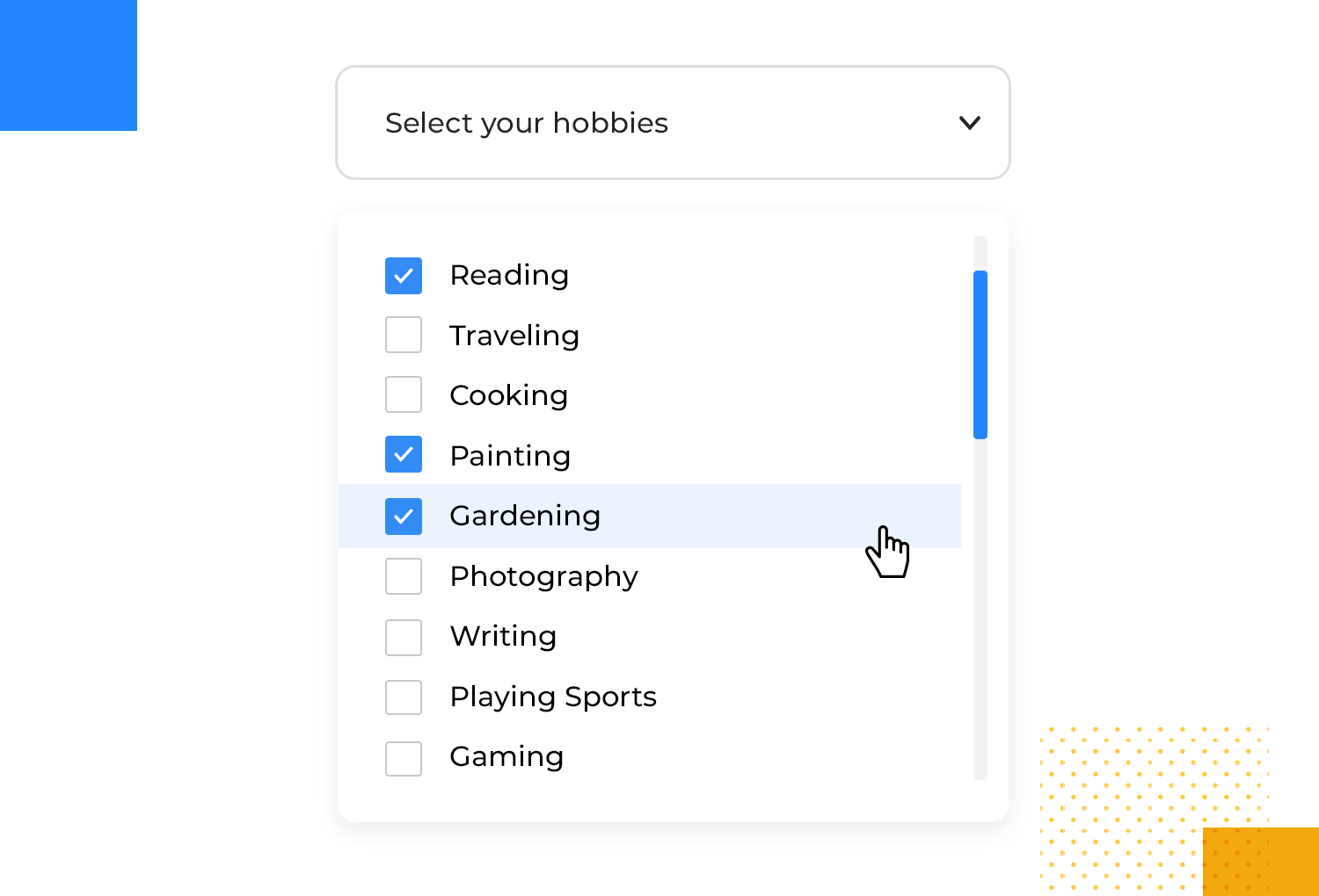
Let’s explore the world of multi-select drop down lists – they’re a fantastic tool for creating user-friendly websites and apps and for gathering more comprehensive information. Think of them as giving users more choices and control compared to those standard, single-choice drop downs.
When you need people to pick more than one option, multi-select drop downs are the perfect solution. Imagine a job application where candidates can highlight all their relevant skills, like “Python,” “JavaScript,” and “Data Analysis,” or a fun hobby survey where participants can select “Reading,” “Hiking,” and “Photography” as their interests.
The point here is empowering users to express themselves fully and accurately, while also providing you with richer, more detailed data.
These are absolute lifesavers when it comes to finding precisely what you’re looking for. On e-commerce websites, shoppers can effortlessly filter products by multiple criteria simultaneously, such as brand, size, and color.
Job boards can make life easier for job seekers by letting them filter jobs based on their skills and the industries they’re interested in. This helps people find the right jobs faster, which saves them time and frustration.
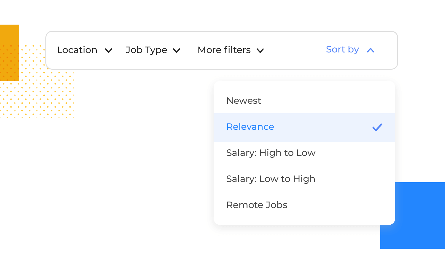
Want even finer control over your search results? Multi-select dropdowns give users the power to narrow things down by multiple criteria at once.
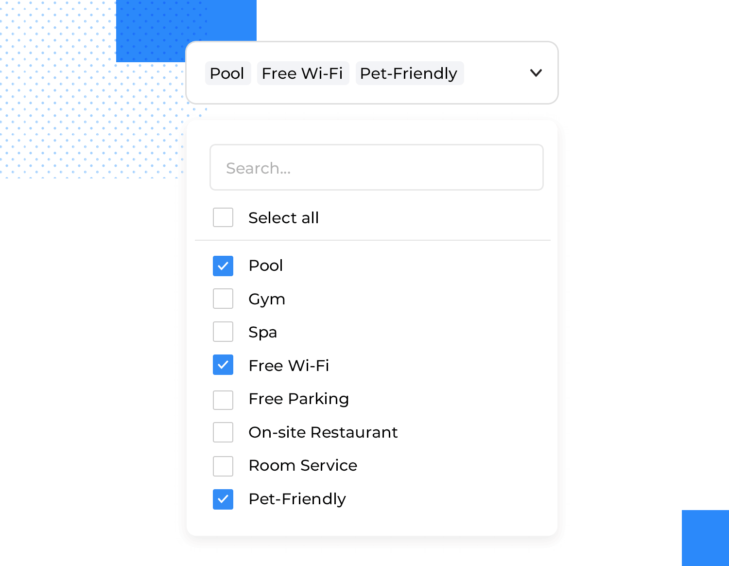
For example, someone searching for a hotel might use a multi-select dropdown to filter results by price range, desired amenities (like a pool or gym), and guest ratings, helping them find exactly what they’re looking for.
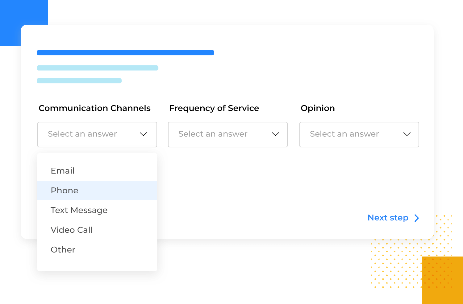
When a single answer just isn’t enough to capture the full spectrum of responses, multi-select dropdowns are invaluable for surveys and feedback forms. For instance, a survey question about preferred communication channels might allow respondents to select “Email,” “Phone,” and “Text Message” if they use all three.
This flexibility helps you gather comprehensive feedback and gain a more complete understanding of user preferences.
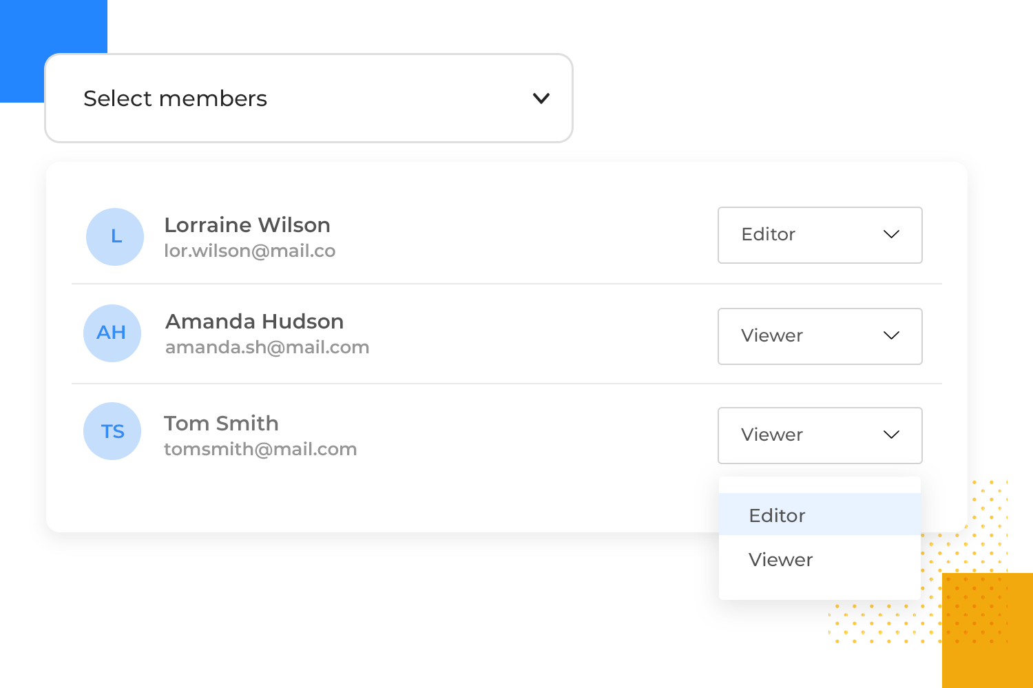
Multi-select drop down lists offer a streamlined and efficient solution for behind-the-scenes tasks like managing user permissions and assigning roles. Selecting multiple departments or user groups helps administrators easily grant access to specific resources or functionalities.
This simplifies the often complex process of managing user access, ensuring that only authorized individuals have access to sensitive information. It also saves time and reduces administrative overhead.
Let’s dive into the world of drop down list design for websites – those handy lists that help users interact with online content. There are several types, each with its own strengths:
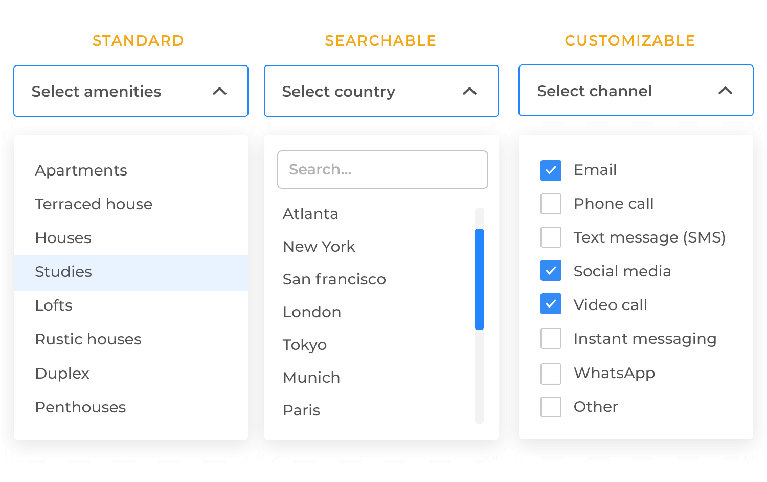
These are your everyday, go-to dropdowns, perfect for simple form fields. Think of selecting a country from a list, choosing a date, or picking a size. They’re clean, concise, and familiar to most users, making them a reliable choice for straightforward selections. They’re best suited for shorter lists where the options are easily scannable.
When you have a really long list of options, scrolling through it can be a real pain. That’s where searchable dropdowns come in. They include a search bar right within the drop down list, allowing users to quickly filter by typing in keywords.
This is incredibly useful for things like selecting a state from a list of all 50 US states, choosing a specific product from a large catalog, or finding a particular contact from a long list. It saves users time and frustration by making navigation much more efficient.
Sometimes, the predefined options in a standard drop down list just don’t quite cut it. That’s where customizable dropdowns shine. They allow for user-added inputs, like an “Other” option where users can type in their own response.
They can also handle dynamic content, meaning the options within the drop down list can change based on user input or other factors. This makes them incredibly flexible and adaptable to a wide range of situations.
Design drop down lists for web and mobile apps with Justinmind.
It’s time to get into some best practices for designing effective and user-friendly drop down lists. These tips will help ensure your dropdowns are intuitive and easy to use.
Where you place your dropdown is crucial. The best practice is to position the drop down list as close as possible to the element that triggers it (like a button or text link). This creates a clear visual connection for the user, making it obvious what action caused the list to appear. Consistency is also key.
Using consistent alignment (e.g., always aligning the dropdown to the left edge of the trigger) makes the interaction predictable and reduces cognitive load for the user. They’ll know exactly where to expect the list to appear every time.
To make dropdowns easy to use, the button or text you click should clearly tell you what’s inside the list. For example, instead of just an arrow, you could see labels like ‘Choose a Country,’ ‘Sort By,’ or ‘Filter Options.’ This helps you know exactly what to expect when you click.
Also, most people understand that a downward-pointing arrow icon means there’s a hidden list. To make it even easier to use, the arrow icon should change slightly when you hover over it with your mouse or use the keyboard to select it. This lets you know that you can click it to see the list.
Imagine a drop down list as a helpful little assistant. You want it to be easy to use and understand, right? That’s why clear spacing between options is key. It’s like giving each item its own breathing room, making it easier to spot the one you need. And if the list is long, think of a scrollbar as a helpful elevator, smoothly taking you to the option you’re looking for without overwhelming you.
But a good assistant is also helpful to everyone. Make sure the list works smoothly with the keyboard for users who prefer that, and that screen readers can easily understand it too. Keep the design consistent with the rest of the website, and you’ll have a drop down list that’s beautiful and a pleasure to use!
Let’s switch our focus to designing drop down lists specifically for mobile apps, where screen real estate is limited and touch interaction is paramount. Here are some key best practices to keep in mind:
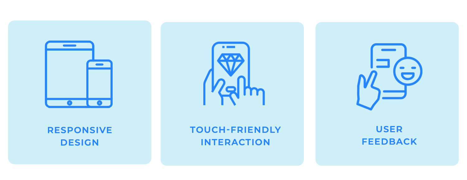
In the mobile world, phones and tablets come in all sorts of sizes, and we hold them in different ways! That’s why your drop down lists need to be responsive. They should look great and work smoothly no matter what size screen someone is using or how they’re holding their device.
Make sure your dropdowns are easy to read and use on both tiny phone screens and larger tablets.
Think of your phone as a touchscreen canvas. When you design drop down lists for mobile, make sure the areas you tap are big enough to hit easily with your finger. Nobody wants to accidentally select the wrong option because the target is too small!
Leave plenty of space between each item in the list. This prevents those frustrating moments where you are meant to tap one thing but end up selecting another. Remember to consider how big people’s fingers actually are when you’re deciding how much space to use.
Providing clear feedback to user actions is crucial in mobile interfaces. For drop down lists, this means providing both visual and tactile feedback when a user interacts with the list. Visual feedback can include subtle animations when a button is tapped or an option is selected.
That combined with a gentle vibration gives users that satisfying confirmation that their input has been registered. Yay!
These enhancements can significantly boost the usability of drop down lists on mobile devices, especially when dealing with complex or lengthy lists.
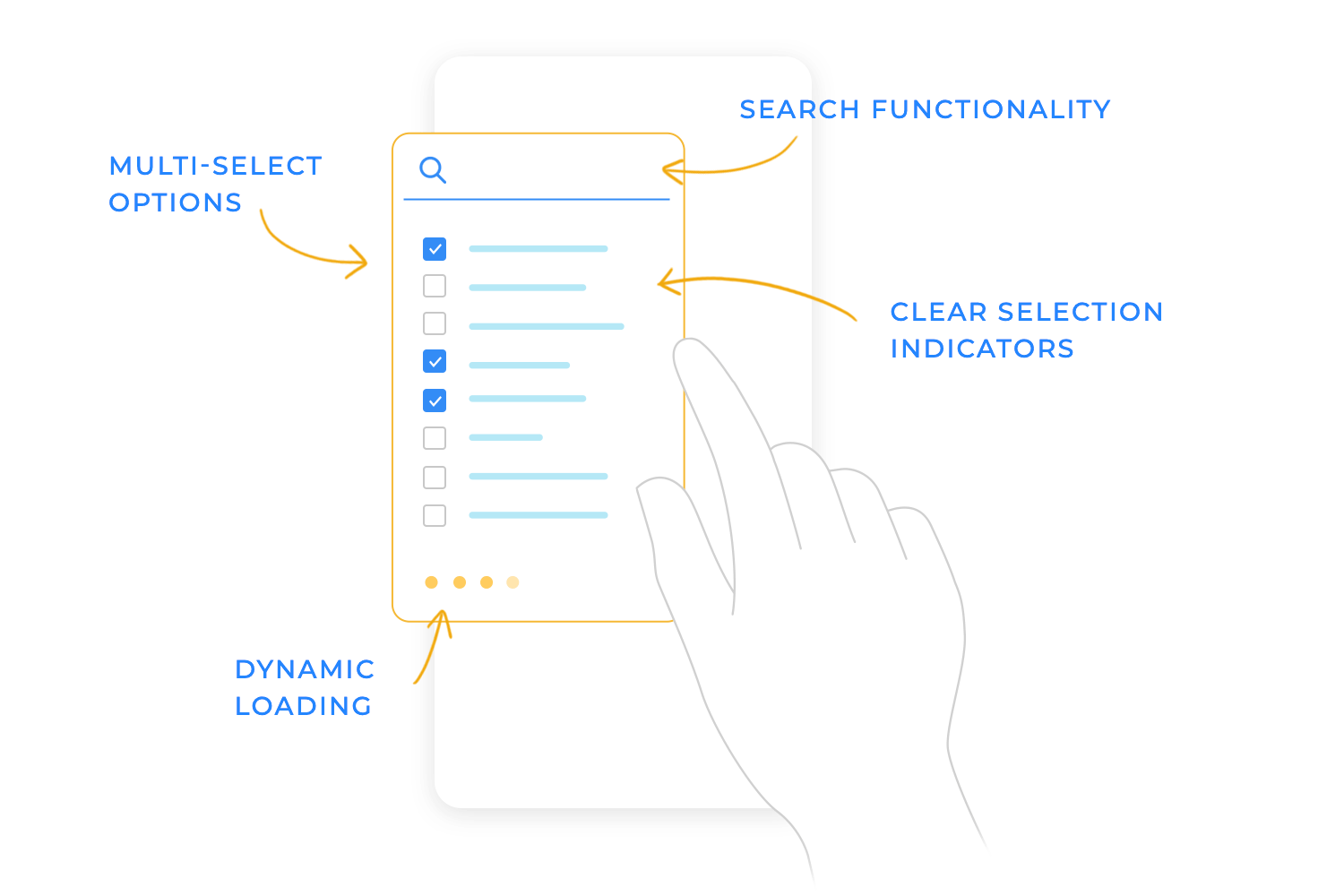
Scrolling through a long list of options on your phone can feel like forever! To make it easier, some drop down lists have a built-in search bar. This lets you quickly type in what you’re looking for, like the name of a country or a product.
The list then magically shrinks, showing only the options that match your search. It’s like having a super-powered filter that helps you find what you need in seconds whether it’s choosing a specific item from a large product catalog, or finding a contact from a lengthy phone book.
Sometimes, users need to select more than one option from a drop down list. On mobile, the best way to handle this is by using checkboxes or tags. Checkboxes provide a clear and familiar way for users to select multiple items, while tags can be a more visually appealing option, especially when dealing with categories or keywords.
Both methods provide clear visual feedback about which items have been selected, making the multi-select process intuitive and straightforward. Avoid confusing situations where your users are not sure which items they’ve actually chosen. Clear visual feedback makes the whole process much easier and more enjoyable for them, not to mention it builds trust!
Imagine a huge drop down list with hundreds or even thousands of items. If we try to load all of them at once, it can really slow things down, making the app feel sluggish and unresponsive. Nobody wants to wait for a spinning wheel!
That’s where “dynamic loading” comes in. Think of it like this: instead of showing you the entire list at once, we only show you a small chunk of it initially – just enough to fill the screen. As you scroll down and get close to the bottom of that visible chunk, we automatically load the next set of options. This happens seamlessly in the background, so you don’t even notice a delay.
It’s like loading pages in a book as you read them, rather than trying to read the whole book at once!
This approach has some big advantages:
- Faster initial load time: The list appears much quicker because we’re not loading everything at the start.
- Smoother scrolling: The app stays responsive because it’s not trying to handle a massive amount of data at once.
- Better performance on all devices: This is especially helpful for phones or older computers with less processing power.
When someone clicks on an option in a drop down list, it’s really important to give them a clear signal that their choice has been registered. We don’t want them wondering if anything happened! Think of it like pressing a button – you expect something to happen to confirm your action.
Two of the best ways to do this are with checkmarks and background color changes. A little checkmark popping up next to the chosen option is like a friendly “Got it!”—simple and universally understood. Another great option is to change the background color of the selected item, making it instantly stand out and clearly showing the user what they’ve picked.
For even better clarity, we can combine both! A checkmark and a background color change make it absolutely clear which option has been selected. It’s like saying “Yes, you chose this one!” in two different ways, which helps avoid any possible confusion. This is especially helpful in situations where quick selection and confirmation are important.
Design drop down lists for web and mobile apps with Justinmind.
We’ll also show you some alternatives so that you don’t end up overdoing the drop down list. And don’t worry – it often happens to some of the most well-known brands and organizations!
It’s by no means a newbie mistake, in fact, we could even almost consider it as a fine art – knowing how to use the drop down list element with respect, knowing when to use it and how to use it with finesse.
Toggle buttons are an excellent way to prevent overuse of drop down lists, as they can help display two settings options at a time. Imagine the following scenario where you want the user to select light or dark mode for the UI. A drop down list might not make quite so much sense.

We could also take into account that, for the light and dark scenario, a toggle button would literally be like flipping a light switch on or off, and therefore could be more intuitive.
Now let’ s say that you want the user to choose whether they are “Male”, “Female” or would “Prefer not to specify”. You could use a drop down list element for this. But would it be the best option here? It could be if you have limited screen real estate.

However, space permitting, it might make more sense for the user to use radio buttons where the user can select one button so the others are automatically disabled. They can’t both be “Female” and “Prefer not to specify”. That would just be weird!
While drop down lists might seem like a simple solution at first glance, they quickly become cumbersome and inefficient when used for dates and times.
Imagine having to navigate three separate dropdowns just to select a date: one for the day, one for the month, and another for the year. This becomes especially tedious when dealing with a wide range of years, forcing users to scroll through countless options. Similarly, using dropdowns for time (hours, minutes, and AM/PM) can also lead to a frustrating user experience. It’s simply not the most effective way to handle temporal data.
This is where dedicated date and time pickers come into play. These specialized UI elements are designed specifically for handling date and time input, offering a much more intuitive and efficient experience for users. They provide optimized interfaces that streamline the selection process and minimize user effort. Instead of forcing users to navigate multiple dropdowns, date and time pickers offer purpose-built controls that make selecting dates and times a breeze.
Among date and time pickers, calendar-based pickers are particularly effective for selecting dates, especially when the user needs to visualize the date within a calendar context. Think of scheduling an appointment, booking a flight, or setting a reminder. Calendar pickers allow users to quickly navigate between months and years, easily selecting a specific day with a simple click or tap.
For dates that are frequently recalled or fall within a limited range, such as birthdates, allowing direct text input with automatic formatting and validation can be highly efficient. This allows users to quickly type the date in a familiar format without the need to navigate a calendar interface, offering a convenient alternative for specific use cases.
Alternatively, if you need the user to specify a number of options that apply to them, such as whether they are married, single, with children or living with parents or solo, you might decide it’s better to use checkboxes.

For this kind of multi-select answer it may be preferable, space permitting, that the user can scan all the options at a glance.
Now let’s get to the famous conundrum – and many companies and organizations make this mistake – getting time and date pickers right. In most cases date pickers that come in the form of a calendar element actually make more sense than scrolling through the months and days.
The optimum solution might be to provide a drop down option for the year, then use the calendar option for the month and the day.

Nonetheless, when it comes to something like the birth date, users generally have the relevant keystrokes for these types of dates well-wired into their finger muscle memory. In this case, it may be just better to let the user type the day, month and year.
In other cases, it might be better to provide a search bar if what they’re searching for is relatively straightforward. When it’s easier for the user to type something, it might be better to let them just type it- it’ll save them clicking a drop down element and scrolling through a long list, having to read all the options.

However, if it’s something that’s likely to require data validation, then it may well be better to use a drop down list design. That way you’re ensuring the integrity of the data that the user is always going to be entering.
Steppers are a great substitute for when the user just needs to set a page zoom percentage, screen brightness or to enter in an order quantity number. Drop down list fields in those scenarios might be unnecessarily wide and take up more screen space.

In the cases mentioned above, steppers can also be more intuitive – a plus and a minus button indicates merely increasing or decreasing a value.
Design drop down lists for web and mobile apps with Justinmind.
The drop down lists designed by Justinmind show off a bunch of different styles and ways to choose things. You’ve got simple ones with just text, some with checkboxes to pick multiple options, a cool expandable section for when you have a long list with descriptions, and even some with color swatches and little “chips” to show what you’ve selected. It’s a great example of how to make dropdowns look good and work well in different situations!

This set of dropdown lists looks really clean and organized, with icons adding a nice touch! The “Department” one uses icons to show what each department does, and the “Select Country” dropdown has cute little flags. The “Ingredients” dropdown lets you check off as many as you want, and the “Select employee” one shows pictures of the people. The “Select a color” dropdown uses actual color swatches, which is super helpful! It’s all very easy to understand and makes choosing things a breeze.

These dropdown list designs from Justinmind are pretty slick with their dark theme. They use cool visual tricks like icons for departments and countries, checkboxes for picking lots of ingredients, little profile pics for employees, and actual color swatches for colors. It makes it super obvious what everything is and way easier to pick the right thing. Plus, the dark background gives them a modern vibe.

This Amazon dropdown list lets you quickly pick the size of the item you’re looking at. It’s super simple: just click the dropdown, and a list of sizes (like X-Small, Small, Medium, etc.) pops up. Choose the size you want, and the page updates to show you that specific size. It’s a handy way to make sure you’re getting the right fit!

Expedia uses drop down lists all over their site to make booking travel a breeze. You’ll find them when searching for flights (for choosing departure and arrival airports, number of travelers, and cabin class), hotels (for selecting check-in and check-out dates, number of guests, and room types), and car rentals (for specifying pick-up and drop-off locations and car types). These dropdowns help you quickly narrow down your options and find exactly what you’re looking for, making the booking process smooth and efficient.

When setting up your profile on LinkedIn, you’ll see drop down lists for things like your education, what industry you work in, and what skills you have—making it super quick to pick from a list of options. And when you’re searching for jobs? Dropdowns help you narrow things down by experience level, what kind of job you want, and where you want to work, so you can find exactly what you’re looking for without any fuss. Basically, they make everything smoother and help you find the right stuff faster.

Indeed uses drop down lists to make your job search smoother and more efficient. When you’re searching for jobs, you’ll often see dropdowns to specify things like location, job type (full-time, part-time, contract), experience level (entry-level, mid-senior level), and salary range. These dropdowns help you quickly narrow down the massive number of job postings to find the ones that are the best fit for you. They save you time and make it much easier to find relevant opportunities.

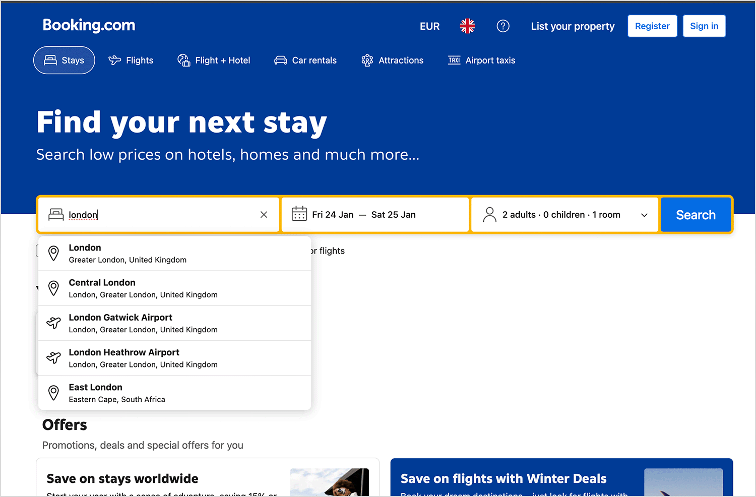
Booking.com relies heavily on drop down lists to simplify the process of finding and reserving accommodations. When searching for a place to stay, you’ll encounter dropdowns for key details like check-in and check-out dates, the number of guests, and the number of rooms needed. These dropdowns allow you to quickly specify your travel needs and filter through the vast selection of hotels, apartments, and other properties available on the site, helping you find the perfect place for your trip.
World-renowned online retailer, House of Fraser are a great example of how a clothing ecommerce can utilize drop down list design for maximum usability benefits.
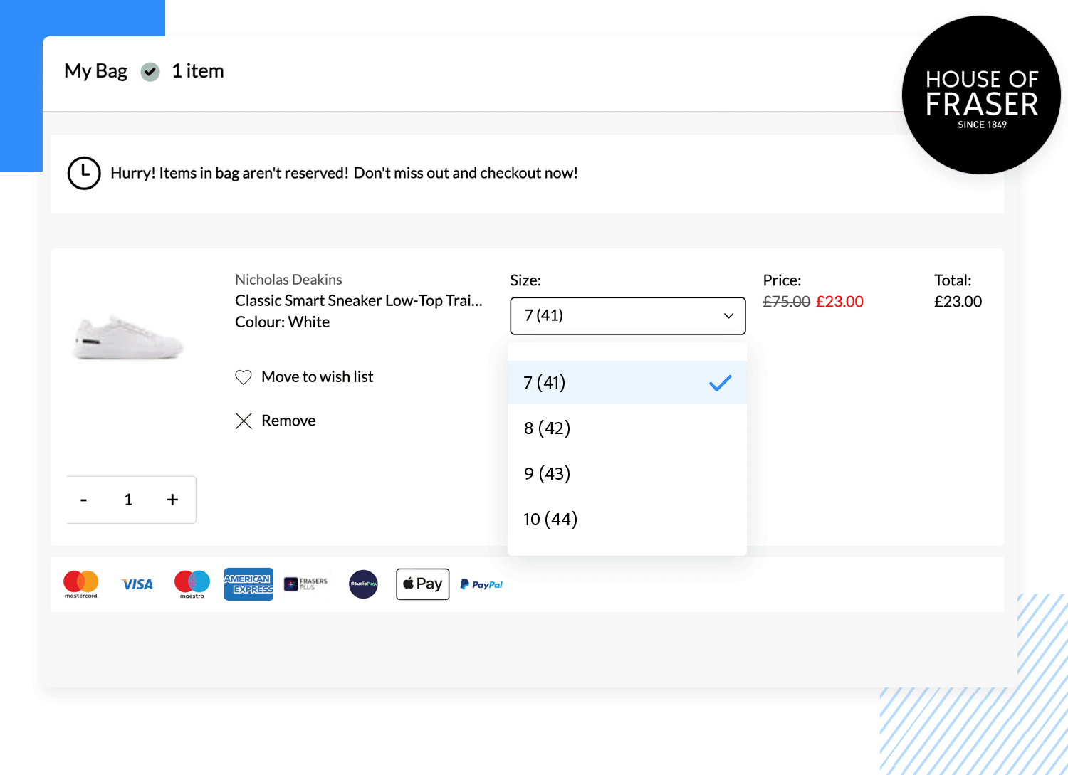
They use a drop down list in the right place – to let users choose the size of shoes and clothing. They use steppers to help them indicate the quantity. Using a drop down list for the shoe sizes is appropriate – listing the different sizes available would take up a lot of screen real estate and would look messy and be hard for the user to scan.
Typing sizes out might be inappropriate too, as the customer or user might be prone to typing errors, making their order incomplete or void. Their way the user can simply select from a collapsible list from the sizes that are available and written in the appropriate size format.
Design drop down lists for web and mobile apps with Justinmind.
The birth month dropdown on Gmail’s signup page is designed with a clean and simple style that feels familiar and easy to use, just like other Google products. It uses a standard drop down list with clear labels and a concise list of months, making it super easy to find and select the right one. This design choice puts usability first, ensuring a smooth and effortless signup experience.

UX passion is another example of a website that understands the correct application of drop down list design.
For questions that can be automated and prevent the user from typing unnecessarily, they have provided two drop down lists of answers to two questions: for the user’s proposed budget and for their start date.

Instead of the users typing in impossible start dates (like in five minutes) they instead have to choose from a list of possible start dates. And when it comes to budgets, the customers have to pick from predefined quantities like in the example above, making the data easier to categorize and sort through and automate after the user has submitted their information.
Smart planning, but we wouldn’t expect less from a domain called UX Passion!
Tinder‘s language selection dropdown is designed to be clear and accessible, presenting a whole world of languages in a friendly, organized format—because finding “the one” shouldn’t get lost in translation! The use of clear labels and a straightforward layout makes it easy to quickly find and select your preferred language, so you can focus on sparking connections, not deciphering dictionaries.

Active Campaign has a phone number input field comes with a handy dropdown that’s like a mini world tour for your digits! It presents a neatly organized list of countries, each with its corresponding flag and country code (that little + number that goes before your phone number). This makes it super easy to select the right country code and prevent putting in the number of some random person living on the other side of the planet!

These dropdowns by Orman Clark have a really cool, modern vibe with their dark background. They’re super easy to use, with clear labels and helpful little icons. I like how they use checkboxes when you need to pick more than one thing, and the flag icons for countries are a nice touch. They just look good and make picking stuff a breeze!

This dropdown by Juliette Lagache is all about letting you choose which columns you want to see in a table of data. It’s super simple: just check the boxes next to things like “Status,” “Platforms,” “Budget,” and so on. This way, you can easily customize what info is shown and focus on what’s important to you. It’s clean, straightforward, and makes it a breeze to tweak your view.

This settings panel for managing session lifetimes by Pixsellz includes a drop down list within the “Maximum Lifetime” section. This dropdown allows users to select the time unit for the maximum session duration. In the example shown, the default unit is “Days,” but it likely offers other options like “Hours,” “Minutes,” or “Weeks” to provide flexibility in setting session limits.
This neat little drop down list by Dash presents you with three choices: “Components,” “Pages,” and “Templates.” The “Components” option looks like it can expand to show more stuff, thanks to that up/down arrow. So, clicking on “Components” would probably open up a list of different components you can choose from. It’s a clean and simple design with a dark background and easy-to-read text.

This drop down list by George pops up when you hit the “Schedule” button. It gives you some quick scheduling options like “Monday at 10am,” “Tonight at 8pm,” “Tomorrow at 9am,” and “Next week Monday.” If none of those work, there’s also a “Custom Time & Date” option so you can get super specific. Each of the quick options has a little number next to it, maybe showing its place in line or something. It’s all very clean and easy to read.

Kevin designed this drop down list accessed by clicking the “Filter” icon. It presents four filtering options, each represented by a distinct icon and label: “Date” (calendar icon), “Tag” (tag icon), “Status” (document icon with bars), and “Amount” (dollar sign icon). This layout makes it easy for users to quickly identify and select the type of filter they want to apply to the data. The design is clean and uses a light color palette.

This Category Card drop down list we found gives you a quick overview of how things are going with 34 different controls. It breaks them down into easy-to-understand categories like “Passing” (15), “Failing” (3), “Need changes” (2), “In review” (3), “In progress” (3), and “Pending” (8). Each category has its own little colored square, so you can quickly see the overall picture. It’s a handy way to check on the status of everything at a glance.

In short, drop down lists work when it comes to increasing screen real estate to work with and also help automate certain processes for users, to make filling out forms and surveys, along with changing settings, much more efficient.
However, this is not always the case and just because you identify an opportunity to use a drop down list in UI design doesn’t mean you should. Always bear the user in mind when thinking about what would be easier. If it’s easier for the user to type something – give them that option!
Lastly, always test your drop down list designs on your users to make sure that they are providing the best experience possible. If not, consider some of the alternative UI elements listed in this post.