Liquid layouts and breakpoints
You can change the position or even changing the contents of a screen dynamicalle, when the screen widens or narrows in the browser. This is called defining breakpoints. A breakpoint is the “point” at which a website’s content and design will adapt in a certain way in order to provide the best possible user experience. On top of that, you can create a liquid layout to resize the objects on a page in accordance with changes made to the page size or orientation.
Liquid layout events
You can use events to define breakpoints and create liquid layouts. These events can link to another screen with a different layout, show a Dynamic Panel that has a different layout, or move elements on the screen.
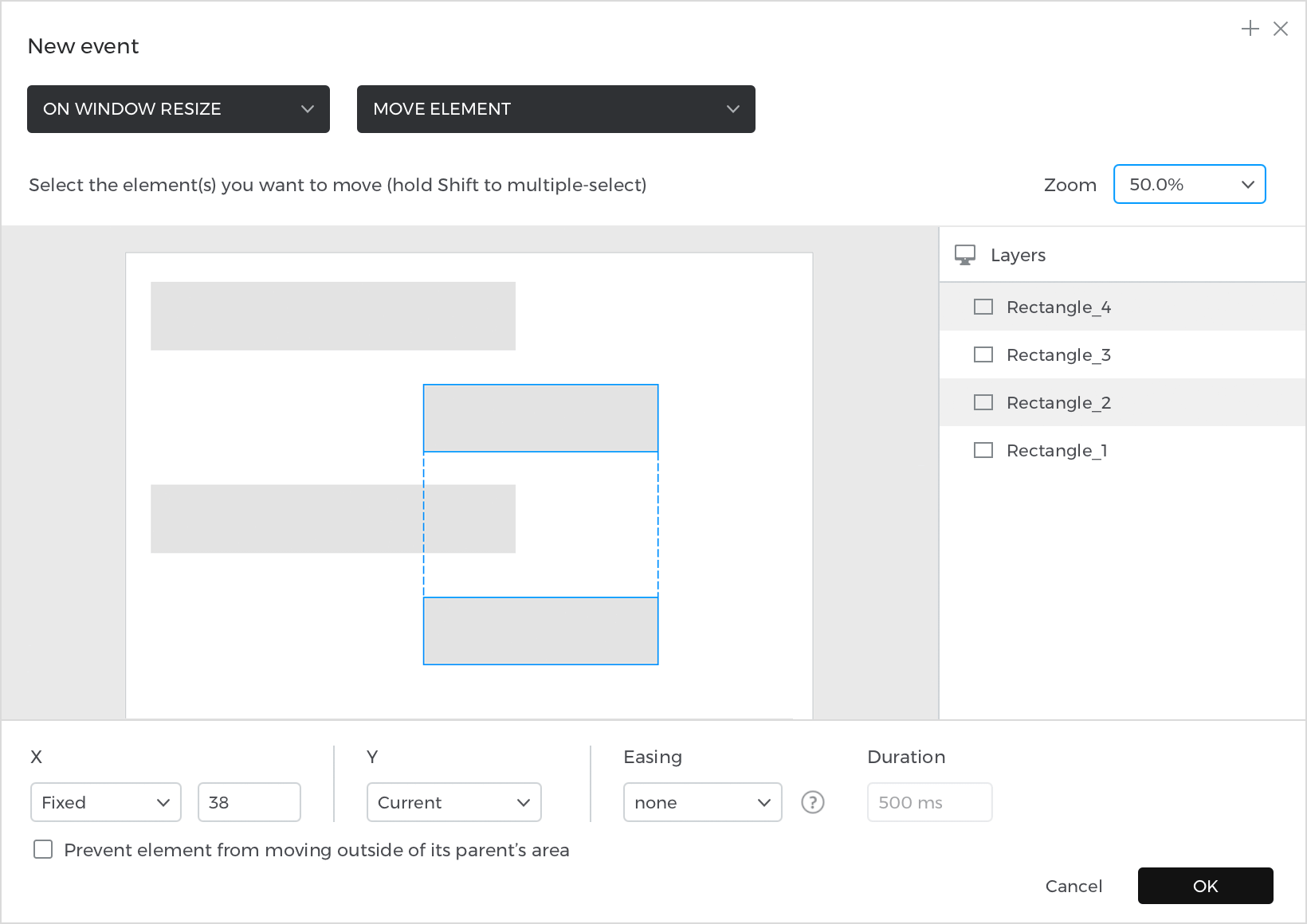
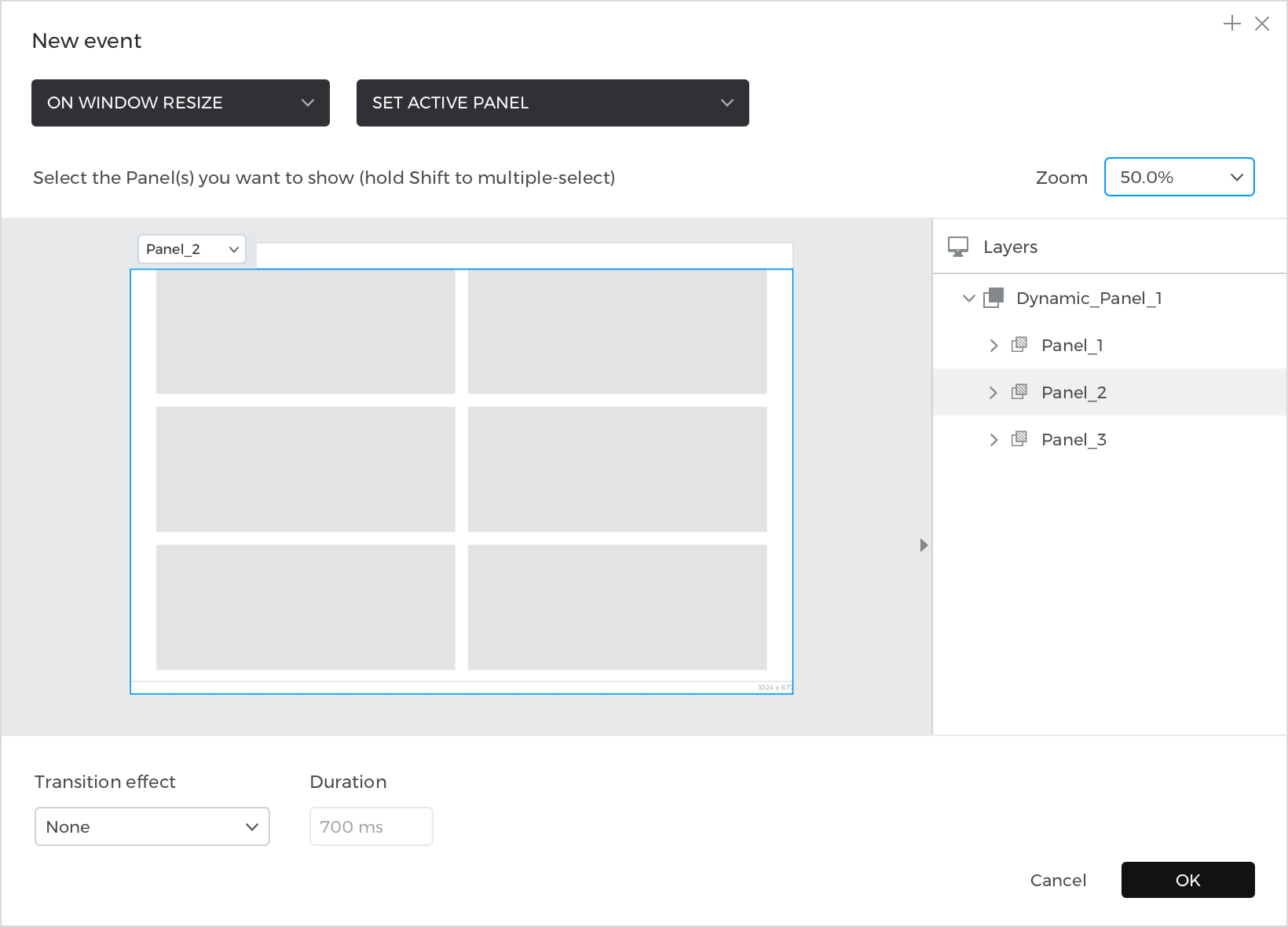
When creating the breakpoint event, start with the “On Window Resize” trigger. The “On Window Resize” trigger will detect when the simulation window has been resized. Then, for the resulting action, choose a “Navigate”, “Move”, or “Set Active Panel” action.
The “Link To” action will link to another screen with a different layout.
The “Move” action will move an element to another area on the screen to make it more visible.

The result of the “Move” action will look like this:
The “Set Active Panel” action will show another Dynamic Panel which has a different layout.

The result of the “Set Active Panel” action will look like this:
Liquid layout conditions
After creating the event, you will need to define a condition so that the event will only trigger when the simulation window is a certain size. This condition will detect the simulation window width, and will compare that to a window size that you define. That defined window size is the breakpoint, which is when the contents of the layout start to get cut off, or when elements start to intersect when resizing the window.
Here’s how to create that condition:
- Look to the Events palette, where you have just created an event. Click on the “Add condition” text and then the Conditional Expression builder will appear.
- Click on the “Constants” tab. Drag the ‘Window Width’ icon into the open space in the expression. The ‘Window Width’ constant will automatically detect the simulation window’s width.
- Click on the “Functions” tab and look at the “Comparators” section. Here, you’ll find the comparators you can use to define the condition. You’ll likely want to choose a ‘Greater Than’ (‘>’) or ‘Less’ Than (‘<’) comparator. ‘Greater Than or Equal To’ (‘≥’) and ‘Less Than or Equal To’ (‘≤’) will also work well here.
- After dragging one of those comparators next to the ‘Window Width’ icon, an open space will appear.
- Double click in that open space and type a value. This will be the simulation window’s width that must be met to trigger the event. Common widths are 1000 (web), 900 (tablet) and 600 (mobile). Depending on your layout, you might want to adjust these numbers to be larger or smaller.
- Note: Note:for a tablet layout, you will need to add another part to the condition using the “And” (‘&’) logic function.
- Click OK to finish building the condition.
Once you’ve created the condition for this event, you’ll need to create another event that will switch back to the default layout when the window width condition is no longer met. This will be another “On Window Resize” + “Link To”/”Set Active Panel”/”Move” event.
