
How important are lists in UI design? How much do they affect usability and what’s the best way to design them? Find out in this guide on list UI design!
From the Tablets of Stone engraved with the Ten Commandments, to the Rosetta Stone’s three versions of the Decree of Memphis, lists have always been around. And from stone to modern UIs, it’s safe to say that this technique of summarizing information has come a long way!
Design and prototype List UIs with Justinmind

Why do we create lists? Because they’re a natural way to optimize scannability and summarize content. Lists are a way to remember, to summarize and a way to get things done. And in UI design it’s no different.
Many web and mobile app UIs make use of lists to help their users achieve a variety of daily tasks. Lists, therefore, play a crucial role in UI design. That’s why investing time and effort into this aspect of UI design has many payoffs in terms of usability.
In this guide, we’ll show you exactly what those payoffs are and run you through how to create the best list UI designs to fit your purpose. We’ve also listed (see what we did there?) some great examples to inspire your next designs!
Everyone knows what a list is, you might say. True enough. But when it comes to great UX, it’s the fine detail that counts. Lists are supposed to be a solution to reading comprehension, and the rival of grid UI designs.

Getting list UI design right is crucial for achieving the optimal UX for your app or website. This is because lists make up a large part of many apps and website UI designs. The way they’re designed can have a huge impact on the usability of your product. Most apps or websites contain large selections of data. Designers have to organize this information so that it’s logically and intuitively ordered. That way, users can easily find what they’re looking for in the UI.
Creating the optimal solution for your list UI design means first understanding the core elements that make up a list UI design. The anatomy of a list, which is a classic UI pattern, generally consists of one column of horizontal line content in rows. However, lists can take various forms depending on the design needs, including different text arrangements or even grids of images. Let’s explore some common types of list UI designs.
A single-line list, like the name suggests, has just one line per item. Single-line lists can be very effective in that they provide optimal scannability.
Two-line lists provide a primary and secondary text. These are helpful when you need to go into a little bit more detail about the line item itself.

Three-line list designs allow for both a primary text and secondary text paragraph of two lines. For most list designs, Material Design doesn’t recommend surpassing three lines.
Image list UI designs usually take the form of a grid of images that share a similar pattern or set of attributes. The images can have a uniform aspect ratio or they can be a variety of different sizes. The latter is called a “quilted image list” and it is used to display hierarchy among list items.
Since lists play a crucial role in UI design, it’s important to understand the key principles for making them effective.
Design and prototype List UIs with Justinmind
To start with, you need to decide what type of list is the best fit for your list UI design. Here you need to think about how much information you should convey to your user at first glance and what order it should be in. Why is that important? Because lists are meant to summarize details to optimize scanning.
You also need to know what type of activity your users are trying to achieve. Do they want to memorize a series of items or mark certain tasks as done? This will dictate the type of list you’ll create, in addition to the type of interaction design and visual design your list UI design will incorporate.

Depending on what your users need to get from your list UI design, the content can take various forms. Basically, list items are grouped into three main categories by order of importance as: supporting visuals, primary text and metadata.
As the name suggests, supporting visuals draw attention to the list item, helping to convey basic information about the item to your users.
They say a picture is worth a thousand words, and lists should be easy to scan. That’s why it often makes sense to use a thumbnail or an icon as supporting visuals in a list UI design.
Primary text is the main text element in a list item. It should represent the most important piece of information for your users. After this comes secondary text which usually takes the form of a subtitle and offers a slight elaboration on the primary text.
Metadata conveys any type of second-tier information about the list item. Examples of this might be the price of a product in an eCommerce app or website, star ratings on a travel app, or simply the item’s order on the list.
Before we move into the specifics of web and mobile list UI design principles, let’s take a moment to consider some general principles and how they can help organize information in list format.
Pogo-sticking is a term used to describe when a user has to jump back and forth between different pages or sections to find the information they need. Imagine you’re trying to find the right item on an online store, but the categories and lists aren’t clear.
You keep clicking on different products, then hitting the back button over and over again because nothing seems to match what you’re looking for. That’s pogo-sticking, and it can be frustrating.

This happens when the structure of a list isn’t clear. Instead of guiding users smoothly to what they need, a poorly designed list can cause them to waste time clicking around, trying to figure out where the right information is. In short, it makes the user experience more complicated and annoying.
To avoid this, you should make sure your lists are well-organized and easy to navigate. Clear categories, good labels, and a logical flow will help users find what they’re looking for quickly and easily, reducing the chances of pogo-sticking.
The general goal of a UXer is to provide the most simple user experience possible and that is helped by reducing cognitive load. Keeping your list limited to the essentials makes your UI design more intuitive and naturally reduces interaction costs.
By creating a situation where your users are required to pogo-stick around your list UI design, you’re automatically bumping up the interaction cost tenfold. Spending adequate time planning your list UI design can help you avoid this and make sure your users get the information they need at first glance.
Now that we’ve covered the overarching principles, let’s explore how these can be tailored for web and mobile platforms, each with its unique set of challenges.
When it comes to list UI design for websites, designers usually have more options to play around with. This is due to the higher screen resolution, providing more screen real estate.

Here are some points to keep in mind when creating your list UI design for a website:
- Extra space: Take advantage of the extra screen real estate to create white space. This will help isolate and draw attention to important elements.
- Consider using card or image lists: These work exceptionally well with website UIs and are very responsive.
- Three-line lists: These work well on a web UI, offering enough space for essential information without overwhelming the user.
- Filters: Use a sidebar filter if possible. Show the applied filters in a separate section of the UI if not using a sidebar filter. Make sure the back arrow removes filters.
When it comes to mobile list UI design, things can get a little trickier. Due to there being less screen real estate to manipulate, it’s easy to create a cramped feel and lose that minimalist touch.

Here are some points to consider when designing lists for mobile UIs:
- Less space: Consider using more single-line and two-line expandable and collapsible lists. Icons such as checkboxes and the draggable hand icon work well with touchscreen UIs.
- Hierarchy through color and font: Use color and font variations to display hierarchy and minimize UI design clutter.
- Indented separators: List items will be closer together, so use indented separators for a less cluttered but easily comparable list of items.
- Filtering and sorting: Slide-over on screen filtering provides a partial overlay on top of the search results to help keep the user aware of what they’re filtering. Fullscreen filtering creates a more focused filtering experience. Search filtering works well, but so do categories. Sorting tends to work better with limited UI space as no filter controls need to be displayed.
Before we think about the type of list UI design to include in our website prototype or mobile app wireframe, we should first take a moment to consider some general principles and how they can help organize information in list format.
The first, and perhaps most important set of principles regarding list UI designs are the visuals. A list with a good visual design is scannable, informative and easy on the eyes. Here are a few ways you can make that happen in your list UI design:
Nielsen Norman group maintains that the left part of the screen receives the most attention in cultures that read from left to right. Therefore, you should always ensure that the most important information is aligned to the left of the screen.
Deciding on which element of the list item gets this visual priority will help you draw your users’ eyes to the most important parts of the list first.
Once you’ve ranked the order in which information should be displayed, you can use font as a way to guide your users’ attention to important elements.
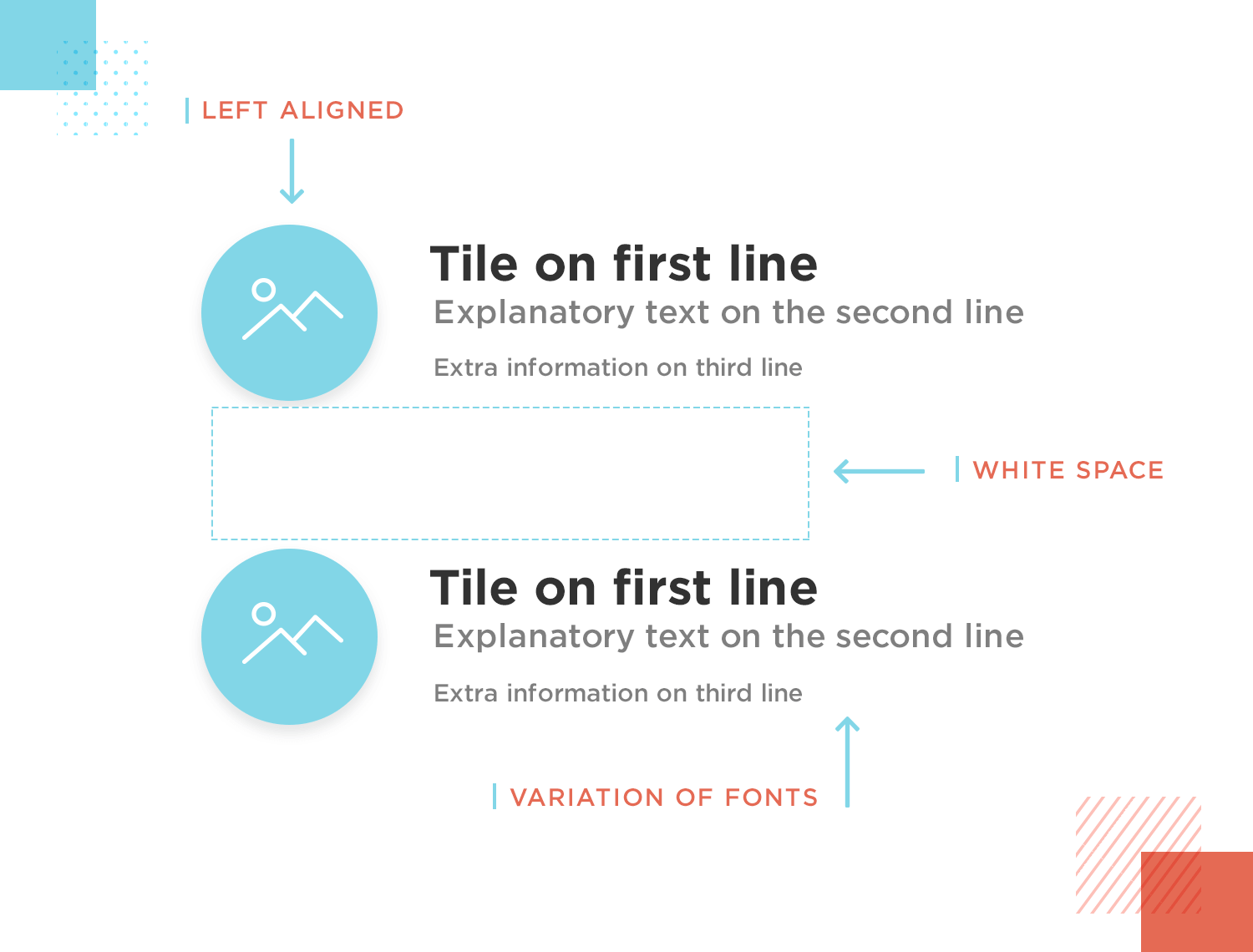
You can place varying emphasis on the different key attributes of each item. You can achieve this by using different font sizes and weights for each element in the list item, creating a clear hierarchy in the UI design.
One way to make an element within an item stand out in a list UI design is to simply leave it alone – literally. White space is one of the best ways to isolate the important elements in a list item. Doing this draws the user’s attention more easily.
A list, at the end of the day, doesn’t have to be fancy – it’s all about narrowing down choice for your users. And sometimes, less is more!
When it comes to improving the scannability of your list UI design, consistency is king. A good list UI design has to have a consistent design all the way through. Otherwise, it doesn’t really serve its function as a list and doesn’t help the user to scan through all the information which is precisely what it’s meant to do.
Dividers are great for helping distinguish each item in your list UI design. A great example of a divider is a separator line. There are two types of separator line: full-bleed and indented.

Full bleed separator lines span the full width of the screen and separate each list item into different sections on the screen.
The indented variety doesn’t span the full width of the screen. Rather than separating the items into different sections, they merely allow the items to be grouped together but distinguished as being different from each other.
Color can be a powerful tool to enhance the scannability of your list UI design. Using a consistent color scheme can help you differentiate individual elements and improve the readability of the list.

The only rule to keep in mind is that less is more. Use too many colors and this trick could backfire, with no visible contrast. We recommend choosing two main colors and instead alternating between different shades and hues.
Interaction is a great way to render your list UI design as intuitive as possible. Applying icons that allow your users to interact with your list, in addition to sorting and filtering options can give your whole website or app a powerful boost in UX.
What better way to make a long list interactive than filtering and sorting? Let’s start with filtering. If you wish to incorporate filters in a list UI design for a website, you have two options:
- Displaying the filters in their original location
- Having a separate applied filters section.
According to research by UXPlanet, both approaches are effective.
The first option works well because when a user deselects a filter, they often look for filters in the same place where they originally selected them. This option is best used when paired with sidebar navigation.

The second option is also a great idea. It lets your users know where they are in the filtering process and allows them to easily go back and switch off the filters.
Use a back arrow to remove filters. Users tend to understand filtered sections as being like separate pages, rather than a string of events that happens on the same page. Sending them to a different page is a great way to convert users into haters!
When creating a filter for a mobile list UI design, things can get a little more complicated. However, there are a few options available:
- Slide-over on screen filtering: creates an overlay that covers some of the search results but reminds the user where they are in the filtering process.
- Fullscreen filtering: uses an entire screen to select filter options, meaning that the search results are fully visible.
- Search filtering: lets your users manually pull up an item from a list and acts as a safety net to prevent pogo-sticking if all else fails.
- Sorting: items alphabetically or by date helps a user find what they need faster and doesn’t require all the busy onscreen options that filtering does.
A popular technique for rendering lists more scannable are the expanding and collapsing list actions. These allow users to expand certain items to reveal more detail and subsequently collapse the item again to get an overview of the list.
You can make each item look expandable or collapsible by using the ▲/▼ icons. However, when doing this, you’ll want to take special care that the relationship between items on the list and their subcategories is always clear.
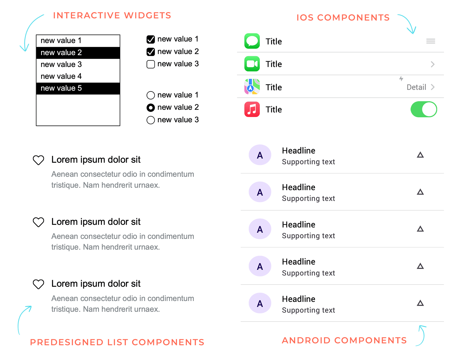
Icons are a great way of adding interaction to your list UI design. Here are some icons that let you do this:
- Checkboxes: let your users mark tasks as done or items acquired
- The draggable hand icon: demonstrates that your users can re-shuffle items within a list
- Toggle UIs: let your users choose between two choices that change the list options such as pricing
- Radio buttons: let your users select one option from a list, blocking out the others
Check out our post on the choice between the radio button vs checkbox, the never-ending debate.
Swiping is another interaction you can add and is often used in Material Design applications, such as Gmail, for archiving information. You can also use swiping if you’re designing an image or card UI design for a mobile UI. Swiping can allow users to swipe through various groups, either horizontally or vertically.
Design and prototype List UIs with Justinmind
The e-learning website template list UI design by Justinmind has a clean layout, which, combined with clear headings and concise descriptions, makes it easy for learners to check out available courses and find the ones that align with their interests.

Additionally, features such as search functionality and a calendar ensure that learners can be more efficient when managing their lives. If you’re looking for a visually pleasing list UI for learners to explore and engage with educational content, this one is for you!
Anyone who enjoys binge-watching would love the TV shows tracker mobile app list UI design created by Justinmind. This list transforms your favorite TV series into a personalized watchlist that’s simple to access and to keep track of, thanks to its elegant and modern UI.
Planning the next viewing session is effortless, with progress bars and episode information buttons showing exactly where users left off. Whether they’re in the mood for a light-hearted comedy or a binge-worthy drama, the trusty search bar helps them find their favorite shows with ease. If you’re working on a similar project, this app is ideal!
The UI design of the list in the restaurant landing page UI design by Justinmind is exemplary in its simplicity and effectiveness. The two-line format ensures that the most relevant information, including the day of the week and the opening event featured for that day, is immediately visible to the user. Not to mention the use of clear and concise language, which allows for faster and better reading comprehension.

Additionally, users can scan and find the information they need more easily thanks to the strategic use of white space. This list UI design helps users quickly and easily understand the restaurant’s daily specials, making it a valuable component of the overall landing page experience.
Your smartphone becomes a personal DJ with Justinmind’s music player mobile app list UI design, an auditory nirvana. This list UI design converts your music library into a curated collection that is simple to browse and enjoy.

Album covers provide a visual component that enhances the pleasure of listening to your favorite music. This is the a great music app example created to transform your users’ party playlists into legendary soundtracks and an everyday commute into a concert.
Support ticket administration is made simple with Justinmind’s elegant and effective Bootstrap helpdesk list UI design. Users can sift through a sea of tickets and find the most urgent problems right away.

While the search and sorting options enable customers to take charge of their support workflow, color coding, and status indications add a visual aspect that makes the list even more appealing. This Bootstrap helpdesk list UI design is a game-changer that will optimise your workflow and boost your general productivity. We love it, and we think you would too!
Meeting planning is made simple with the help of Justinmind’s workspace booking template. It’s enjoyable to browse and choose the ideal location for upcoming meetings because the room photos and iconography give the workstation a unique touch.

This template also includes account information in list form, ensuring users can manage their information like past reservations efficiently and without any hiccups. It’s the best meeting organizer UI list available, keeping your users on track and productive!
The financial dashboard on the Justinmind home banking website list UI design brings those numbers to life. Red and green are used to identify financial movement. And ample white spacing keeps the information separated for an easier read.

When it comes to managing your finances, you want all that information to be as clear as day. This example by Justinmind pulls that off and so much more!
This customized dashboard provided by Justinmind’s secondhand app offers a list UI design that keeps your users always close at hand thanks.

Using arrows and icons adds a touch of skeumorphism which makes it that much easier for users to identify what they are looking for in the app. Users can manage their purchases, shipments, and more through this interface. Definitely one of our faves!
Travel Xplore was a design project to create a list UI design to showcase various travel destinations. While destinations could have been displayed using image lists or cards, the vertical list proved to be an effective choice.

The designer made good use of the indented separator line and established a clear visual hierarchy for all elements, including thumbnails, ratings and buttons in the UI design.
Patch is a list UI design created for listing bank deposits. Many web list UI designs often appear overloaded, as designers try to maximize the extra screen space available at higher resolutions.

But lists like this one keep things nice and simple for the user with a two-line list that naturally draws attention to the most important elements on the screen. UI designs like this are also much more responsive.
Speaking of responsive: check out this quick tutorial on how to design a responsive website prototype in 10 minutes.
Next up is a cryptocurrency stock website list UI design – Satoshi View. Most cryptoanalysis, financial or stock market websites have UIs that literally resemble a headache-inducing soup of icons, figures, and loud clashing colors. Not this one!

This list UI design proves that whatever a website’s content, there’s always a visually appealing solution out of which a user friendly interface can be created. In this case, we’re faced with a list of cryptocurrencies followed by information such as “market cap” and “current price”. Yet it somehow doesn’t seem like so much information.
This web UI list design is a shining example of how great list design can render even complex lists as readable.
What better example of a list than a bookkeeping web app? After all, from P/L and financial position statements, to lists of invoices, it’s safe to assume that there are a lot of lists involved in finance, right? And while that might all seem a bit boring, this web list UI design actually makes the accounts look like an interesting activity!

All the list items are contained on separate rectangular cards, clearly grouped into sections, such as “previous invoices” and “activity income”. What we particularly like is how they tackled the filters – with a few buttons in the top right corner that indicate the current filters selected, that ensure the user always knows what filters have been applied.
Imagine a contact list that’s as clear and refreshing as a crisp morning. That’s the Dialin contracts manager. It’s a masterclass in simplicity, using a clean list design to give you the lowdown on your contacts.

Need to know someone’s role or status? No problem. It’s color-coded for lightning-fast scanning. And when you want to dive deeper, just hover for more details without the clutter. It’s like having a personal assistant who keeps your contacts organized and always at your fingertips.
Design and prototype List UIs with Justinmind
Forget boring spreadsheets. EmployIn Invoice Manager brings a touch of sleekness to your finances. Its dark theme isn’t just eye-candy; it’s a functional masterpiece. Key invoice details pop like stars against a night sky, making it easy to spot names, numbers, due dates, and totals.

The best part? Essential financial information is front and center, providing a clear snapshot of your invoicing activity. Think of it as your own virtual financial advisor.
Following that, we have the Property Management Notification Center, offering a clear and organized list design that helps users quickly scan important updates.

Each notification is distinct, with icons and color coding to differentiate messages like maintenance updates, rent payments, and lease renewals.
The design is straightforward, making it easy to stay on top of everything with a quick glance.
Picture a task manager that’s as clear and effective as a well-organized military operation. That’s exactly what the New Document Task Manager delivers. With its column-based layout, you have a bird’s-eye view of your workflow, instantly seeing what’s in the pipeline, what’s in progress, and what’s ready for final touches.

Each task is presented on a dedicated card, providing essential details like due dates and status symbols at a single glance. This list design is like having a visual command center for your projects, keeping everything organized and under control.
Ever felt overwhelmed by project tasks? This Project Management Dashboard simplifies everything with a clean and user-friendly list design. Everything is organized into simple sections, so you can find what you need without any fuss.

The UI is intuitive, using soft colors, icons, and clear labels that make it easy to see where each task stands. It’s designed to help you stay on top of your projects without getting bogged down – just clear, organized lists that keep you moving forward.
Managing sales just got easier with this Sales Admin dashboard, which features a clean and well-organized list design. It clearly lists your transactions, showing what’s completed and what’s pending, so you can keep track without any confusion.

The dashboard also displays important numbers like income and expenses, all in a layout that’s easy to read. The colors and text are simple and consistent, ensuring everything is easily visible at a glance.
This list UI design is like having a personal assistant for your chats. 7Chat Messaging is easy on the eyes with its clean design, and it intelligently organizes your messages.

You can quickly see who’s online and easily find conversations based on what you’re working on. Plus, it’s simple to use, so you can focus on the chat, not figuring out the app.
Here we have another great example of a property list design. The Leel Property Search Dashboard makes it effortless to browse and compare properties. It neatly lists each option with all the key details you need, like price, yield, and specs.

Plus, it’s paired with an interactive map so you can see exactly where each property is located. The clean layout and simple filters mean you can quickly find what you’re looking for.
Here’s a great example of list design from the Ukrainian Creative Powers Showcase. This layout really pops with its bold text and clean, minimalist style. Each creative team is laid out in a grid with big, easy-to-read names and key details like their focus and team size. It’s a simple and effective way to browse through different agencies while keeping things visually interesting.

Imagine this: You’ve got a bunch of different subscriptions, right? This UI list design for service subscriptions makes it simple to track everything in one place. It neatly displays whether a service is active, its type, and the cost. Plus, intuitive icons and dropdown menus let you explore details without adding clutter.

Next is a great example of a single line web list UI design. We’ve chosen this ecommerce product dashboard which lists a group of e-courses that the user can select.

On each line, only the essentials are conveyed, such as the course name, the type of course, how many places are available and the price. This example demonstrates that, by keeping things simple, you can display many more items on screen than if you decided to go into more detail.
Side note: looking for something new? Discover our guides to trendy takes on UI design skeuomorphic design and neumorphic design.
Design and prototype List UIs with Justinmind
This wish list page was a project done for a ticket wallet app. On this page the user can accumulate a list of tickets they want to buy in the future.

We really like the simple pastel design of this UI, in addition to the single-line list. The designer made great use of the limited mobile UI space available and included some nice visuals, along with all the information needed at a glance, such as ticket prices and amounts saved up.
They also provided an option to expand or collapse certain items in the list with a “view more” button. Learn more about button states for a more complete overview.
This category listing page shows a nice grid arrangement of cards with icons as an alternative to the vertical list.

The icons and descriptions provide a more visually appealing – not to mention scannable – list UI design. It’s also a clever way of letting the user apply their own filters immediately, by letting them choose the category they want. This method eliminates having to provide filter controls.
Here’s another wish list design to inspire you. We chose this UI design because it’s a great example of how you can make image lists work on a mobile UI.

The designer in this case denotes each category clearly with large bold font, followed by groupings of images for that category, all related to clothing items within that category. We also like the clear hierarchy created with the use of different aspect ratios for the images.
This holiday itinerary app is a great example of how to use a two-line list with full-bleed separator lines to create a list UI design that’s easy to scan.
To counter the lack of space caused by using a two-line format, the designer chose to go with full-bleed separator lines – and it worked!

The use of icons on the left of each line draws the eye in to the activity, with the primary text being the name of each activity itself, followed by the secondary text which contains the practical details.
The fact that the content is centered on each line helps prevent that cluttered, claustrophobic feel we mentioned earlier.
A list about lists wouldn’t be complete without the traditional to-do list! This example of a todo list shows how simplicity and minimalism can help get the job done.

The designer made great use of a uniform color scheme to differentiate clickable and non-clickable elements. They also used white space wisely to guide the eye to important elements, such as the current task, then the time each task is to be completed at.
For those who struggle to keep their tasks organized, this UI list design has you covered with this sleek, dark-themed design. It’s all about helping you stay focused, with each project and its tasks laid out clearly.

The color-coded circles make it easy to see what’s done and what still needs attention. No clutter, no distractions, just a simple, effective way to manage your to-do list and keep things moving.
This UI list nails the basics with a clean and easy-to-navigate design. Each option, whether it’s account settings or notifications, is paired with a simple icon that makes everything clear at a glance.

The soft, calming colors give it a welcoming feel, making it pleasant to use. Whether you’re changing your password or exploring other settings, everything’s laid out intuitively, so you can get things done without any fuss.
Here it is another great example of how a well-designed list can make things easier. The tabs at the top clearly separate buying and selling options, and the key details are presented in a simple way that’s easy to follow. The map adds a nice visual touch, making the whole experience more user-friendly and functional.

This task manager UI design makes staying on top of your tasks feel effortless. The layout is super user-friendly, letting you quickly create new tasks, set dates, and keep track of everything you need to do. Each task is clearly listed with all the important details like when it starts and ends, and there’s even a progress bar to show how close you are to finishing.

It’s all about keeping things simple and organized, so you can focus on getting things done without any hassle.
This Watering Program App makes it convenient to manage your garden’s watering schedule with its simple list design. Each zone is laid out clearly, so you can quickly see what’s set to water, when, and for how long. Adjusting settings is simple, with everything you need right there in the list. It’s a straightforward way to keep your garden happy.

If you’re after a list design that’s bright and user-friendly, the UI list design of this Business Tool App has it all. It neatly arranges everything you need (surveys, newsletters, and customer feedback) into sections that are easy to navigate.

The colorful and inviting layout makes it a great experience to browse through different options. Everything is designed to be clear and accessible, making sure you can find what you need quickly while enjoying the process.
We love this list design from a Content Browsing App because of its clean and modern design that makes exploring articles so easy. Things are displayed in a way that’s simple to scroll through, helping you find something interesting in no time.

Each article is paired with a clear title and an eye-catching image, making it really inviting to click and read. This minimal design that keeps focused on the content is a total yes.
Here’s a list design of another task management that really stands out. It uses bold colors and strong typography to make sure your tasks grab your attention. Each task is displayed in vibrant, easy-to-read blocks, making it simple to see what’s on your agenda.

The layout is both striking and functional, with large text and clear labels ensuring nothing gets overlooked. It’s a refreshing take on task management that keeps things lively while helping you stay organized.
Design and prototype List UIs with Justinmind
Did you know that with the Justinmind UI design tool you can prototype a variety of different list designs using data masters? Best of all, you can make them interactive and add any kind of filter you want. Take a look at the following examples:
Let’s start with data lists. These are incredibly versatile and form the backbone of many list designs. Imagine you’re setting up a contact list. You’d design by creating a data master, where you add fields such as “name”, “address”, and “phone number”. This lets you structure your data in a way that’s easily displayed and managed.
Now, to make your lists even more user-centric you can incorporate column headers. These aren’t just for show but also let users sort and filter the list based on different criteria. For example, you can set up your list so that users can sort contacts by country or phone number with just a click. It’s a great way to add depth and interactivity to your lists. To learn more about this process, check out our tutorial on Filtering a Data List through a column header.

But why stop at basic lists? Justinmind offers a range of widgets that can take your list design to the next level:
- Multiselect lists: Allows users to choose multiple items at once – perfect for preference settings or bulk actions.
- Checkgroups: Lets users select multiple options from a list, giving them more flexibility in their choices.
- Radio groups: Provides a way for users to make a single selection from a set of options, ensuring clarity in decision-making.
These widgets are fully customizable, too. You can adjust them to fit the exact look and feel of your design, ensuring consistency across your project. This flexibility means you can create lists that not only look good but also provide a seamless user experience.
What really sets Justinmind apart is its focus on interaction. Lists in Justinmind aren’t just static elements on a page – they’re dynamic components that users can engage with. Whether through sorting, filtering, or selecting, the interaction options available let you build lists that are truly user-focused. If you’re interested in learning how to add sorting functionality to your data lists, this tutorial about how to sort a data list will guide you through the process.
These capabilities are especially powerful when designing complex interfaces where the user’s ability to quickly find and act on information is key.
If you’re going to include a list in your UI design, which is very probable, you need to think it through carefully. Lists can be a make-or-break when it comes to UI design. They can render your UI design as usable or unusable.
Lists, by definition, should be easy to read and scan. The amount of lines each item in your list should have largely depends on the purpose of your UI design, but you should always keep it to the minimum possible. Each element in a list item should be relevant and follow a clear hierarchy. Try to encourage intuitive interaction where possible.
We hope this guide has given you some food for thought for your next list UI design. Happy listing! Looking for design something more data-heavy? Try your hand at dashboard design.
PROTOTYPE · COMMUNICATE · VALIDATE
ALL-IN-ONE PROTOTYPING TOOL FOR WEB AND MOBILE APPS
Related Content
 What’s the difference between flat design and Material design? In fact, where did they even come from and which one should you be using? In this post we’ll explore the raison d’être of these major design styles, as well as the pros and cons of each.10 min Read
 Discover 40 of the best web design blogs on the internet. Find a diverse range of inspirational material, resources and boost your creativity!10 min Read
 Satisfy your client and give them their money's worth with this effective logo design checklist8 min Read

