
It’s flat design vs. Material Design in a match to discover which interface design favors usability and encourages better user experiences!
Flat design vs. Material Design – what’s best? We take a dive into Material Design as well as another design trend that’s swept over the UX design community in recent years: flat design. Known for their minimalist approach and stark UX design similarities, these design systems have us asking: what factors influence the UI design choice between them?
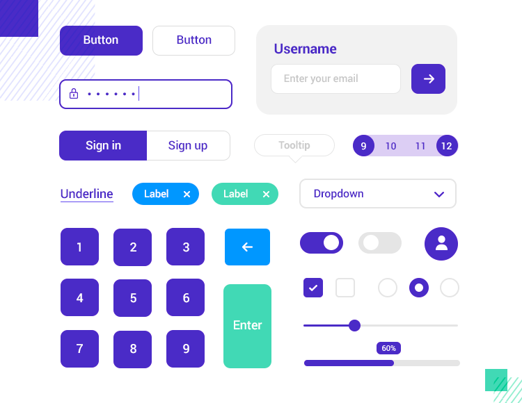
Start prototyping new mobile apps today! Unlimited projects.

Let’s throw our five cents into the flat design vs. Material Design debate and discover just what the difference is.
Think of flat design as the opposite of skeuomorphic design, which uses 3D iconography that mimics real-life objects. In many respects, flat design was a direct reaction to skeuomorphic design.
The scope was that bringing things back down to the 2D would increase usability and improve a UI’s aesthetics, as well as reduce design time. This all proved to be true. It had the further knock-on effect of reducing the load time of apps and websites.

Apple’s evolution from skeuomorphic to flat
Sure, skeuomorphic design served its purpose, which we’ll go into more detail on below, but we could say that flat design more truly embodies the digital landscape. Why? Because people no longer need metaphors and realism to understand how to use technology. Minimalism and flat design go hand-in-hand and so a lot of flat designs look intentionally sparse.
However, for those who don’t wish to use flat design, there does exist a midpoint between Skeuomorphic design and the former: neumorphic design.
Neumorphism assumes many of the minimalist influences of flat design while adding slightly more depth to the iconography by using color and by blending them in with the background. Having said that, the differences between neumorphic and flat design are very subtle. It’s not something you’d be able to appreciate at the UI sketching phase of design.
- Uncluttered, distraction-free design
- High readability with clear typography
- Easily adjusted for responsive design
- Faster to load in browsers and apps
When it comes to typography in mobile designs, check out our post on the best fonts for apps.
Start prototyping new mobile apps today! Unlimited projects.
- Lack of depth makes elements looks less clickable
- Creative design and standing out is harder
- No design guidelines like other design systems
A ubiquitous presence across all Android devices, Material Design is the birth child of Google, borne out of the intent to create a coherent, practical and accessible visual language. The aim is to design web and mobile experiences that are based on and take full advantage of tactile screens, taking inspiration from paper and ink.
Paper and ink? Yes, that’s right. Google initially bestowed it the name of Quantum Paper, later changing it to Material Design. The design principles attempt to translate the physical properties of paper to the screen using the z-axis. The background acts as a sheet of paper and the UI’s elements and behavior mimics paper’s ability to cut and re-size, shuffled and bound together.

Material Design’s elements mimic paper in space
Unlike flat design, materials such as paper cast shadows, creating a sense of depth to UI elements. They can also change shape and be manipulated in myriad ways by the user.
In many respects, Material Design aims to encapsulate the best of both worlds from flat design and Skeuomorphic design. Like flat design, Material Design also aims to use bold colors and 2D iconography, but with the aim of deploying a graphic and intentional UI that takes inspiration from print-based design.

Material Design uses the z-axis to create shadowing and depth
- Unified and simplistic interface
- Principles and goals provide consistency for designers
- Z-axis creates depth
- Intuitive to use
- Uses motion to show users what is happening on screen
- Elements such as floating action buttons can be superfluous
- Designs only valid for Android devices
- Heavily associated with Google with less room for branding
- UIs designed without motion often lack intuitiveness
Start prototyping new mobile apps today! Unlimited projects.
Perhaps the best way to observe the difference between design languages is to look at their relationship with skeuomorphic design. Flat design intends to put as much distance as possible between itself and skeuomorphic design, so that it disappears completely from the rear view mirror. Completely flat.
On the other hand, Material Design doesn’t completely reject its distant cousin. It somewhat tries to imitate the physical world but in a much flatter, subtler way by use of the z-axis. This can help demonstrate element hierarchy, clickability, and can also be a cue for interaction. However, the metaphor here is in the natural movement of paper – you won’t see any trash cans or polaroid cameras!

From left to right: Material Design vs. flat design UI
Conversely, flat design doesn’t employ any shadowing and doesn’t make use of the z-axis, keeping everything firmly rooted in the second dimension. This helps add further simplicity to the design and can vastly reduce page loading times, albeit sacrificing usability if buttons don’t look clickable.
Flat design tends to use limited but bold colors for fewer distractions, while the simplicity of the UI element design encourages efficiency and functionality.
Material Design also strives towards simplicity but attempts it from a different angle: basic interactions with real world elements (like paper). This is in stark contrast with flat design which doesn’t attempt to imitate anything from the real world.
Flat design takes inspiration from design movements like Bauhaus. One important tenet of Bauhaus is that function follows form. That’s why flat design is stripped back, with no frills.
Material Design, on the other hand, takes a lot of its influence form print design and nature.
As flat design was mainly a reactionary movement that aimed to reject skeuomorphic design, it remains exactly that. It started off as a design trend; there was no organization designing it, like was the case with Material Design. As a result, there are less rules and guidelines to stick to when designing flat UIs. For some designers this can be liberating, for others, the lack of direction can be a hindrance.
Flat design icons are beautifully simple and minimalist
However, one thing is for certain: flat design UIs are certainly faster to design than Material Design ones. Why? Because of their pure simplicity. Conversely, Material Design requires a bit more detail, especially with the addition of subtle depth to the UI elements. And being a design system pertaining to google, it also requires a somewhat stricter adherence to its guidelines.
Start prototyping new mobile apps today! Unlimited projects.
The style that started the inspiration for a flatter digital world. Apple was the first practitioner of skeuomorphic design, a design system intended to assist users with the transition from analog to digital. To help them with this digital upheaval, the icons of Apple’s device UIs were three-dimensional. They represented physical items from reality to help their users understand the concept of what different icons were for.
Well-known examples of this include the floppy disk icon which has become second-nature knowledge to most people as being a feature to save work or progress. Similarly, the icon of a trash can has become synonymous with deleting and recycling files on the computer.
However, the world now finds itself with much less need to imitate the real world, as most of its population have become used to using web and mobile apps on a daily basis. They no longer require such detailed iconography to find a UI intuitive.

From more detail to less: the evolution of Apple’s iconography
Furthermore, skeuomorphism turned out to be more work in terms of design and often led to more cluttered UIs. To further compound issues, it also led to longer loading times for web pages and apps. For these reasons, and as we mentioned above, skeuomorphic design prompted a strong reaction from the design community to change things up a bit: enter flat design – Skeuomorphic design’s antithesis.
However, that’s not to say that Skeuomorphic design is dead, either! It can still potentially have benefits like when it comes to designing technology for older generations who didn’t have the privilege of becoming digital natives.
Designers could also find an unprecedented use for Skeuomorphic design when it comes to the development of VR applications, as 3D interfaces start to make sense again when it comes to helping users navigate a virtual world.
Fluent Design is also worthy of a mention due to its similarity to Google’s Material Design. Microsoft’s design system comes with a very standardized set of guidelines, much in the same way as Material Design. Microsoft’s main goal with Fluent Design was to create “simple elements, systematic processes, and coherent products to be synonymous with Microsoft design.”

Microsoft’s Fluent Design user interfaces
They intended Fluent Design to be deployed across a range of software products and OS, such as Windows, web apps – even Android and iOS. You can even notice Fluent Design UIs across different Microsoft products, including Xbox.
In similar fashion to Material Design, Microsoft wanted Fluent Design to be based somewhat on natural physics, with UI elements being based on the following main principles:
- Scale
- Material
- Depth
- Light
- Motion
The benefits of using the Fluent Design system are obvious – if you want to design applications for use on Windows desktop or handheld devices, or indeed across any range of Microsoft product, it’s a wise decision to use Fluent!
It’s clear that both flat and Material design systems have their own merits and faults. It’s also apparent that their principles and goals cross over slightly. But for Justinmind’s design team, the fleeting nature of flat design may signify it isn’t here to last but the well-defined guidelines of Material design give it a solid foundation that can be built upon and improved.
PROTOTYPE · COMMUNICATE · VALIDATE
ALL-IN-ONE PROTOTYPING TOOL FOR WEB AND MOBILE APPS
Related Content
 A fun look at different data table designs, from basic lists to smart, interactive ones, based on how complex the data is and what users need.18 min Read
 Single page design v multi-page design – everything you need to help you choose the right design for your site’s content18 min Read
 Website backgrounds can be a powerful tool in creating an experience. But what kind of experience can you convey and how? We got the full run-through for you!14 min Read


