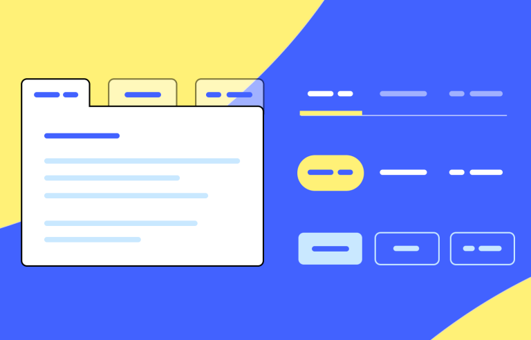
In-page tabs that modularize content are a popular UI design pattern, and rightly so. They’re an intuitive way to present lots of information on-screen, whilst allowing you to save on real estate and avoid overwhelming the user. Tick, tick and tick!
Prototype your web apps with fully-interactive tab navigation.

But contrary to popular belief, tab design isn’t always easy. As we’ve learned from UX guru Jakob Nielsen, tabs are often poorly designed and can build up interaction cost.
So in today’s post, we’re lending a helping hand. If you’re getting started with tabs, or just need a refresher, this post is for you. We’ll be discussing everything from functionality and logic to visualization and consistency, plus some great DIY tab tips. Read on and get educated!
Imagine you’re flipping through a magazine. Each page is like a tab, and you can quickly switch between them to find the article you’re interested in. That’s essentially what a tab UI component does. It’s a handy tool that organizes information into different sections, making it easy for users to navigate and find what they need.
Think of those tabs as doors leading to different rooms. Each room contains unique content, and when you click on a tab, the door opens, revealing the content inside. This makes it simple to explore various topics or tasks without getting overwhelmed.
Tabs can be customized with text, icons, or a combination of both, helping users quickly identify the content they’re looking for. And if there are too many tabs to fit on the screen, they can often be scrolled horizontally, ensuring that all options are easily accessible.
Additionally, tabs can have different states, like being active (selected) or inactive (not selected). This visual feedback helps users understand which tab they’re currently viewing and which ones are available for exploration.
Tabs are a versatile and efficient way to organize information and improve user experience. They are particularly useful when you have a large amount of content that can be naturally divided into different categories or topics. This allows users to easily find the information they are looking for and navigate between different sections of content without getting overwhelmed.
Here are some specific examples of how tabs can be used to organize information:
Clear content groupings: Tabs are a powerful tool for organizing and presenting lengthy content. By breaking down information into digestible chunks, they reduce cognitive load and make content easier to scan. However, it’s essential to use tabs judiciously.
Limited tab count: Too many tabs can create usability challenges. When there are more tabs than can fit in the tab bar, a carousel-like mechanism may be necessary. This can make hidden tabs less discoverable, increasing interaction cost as users need to access secondary controls. Therefore, limiting the number of tabs is generally advisable.
Prioritize content: The default tab often receives more attention from users. To ensure a successful user experience, prioritize critical content in the default tab and place less important information in nondefault tabs. This helps prevent users from overlooking valuable content.
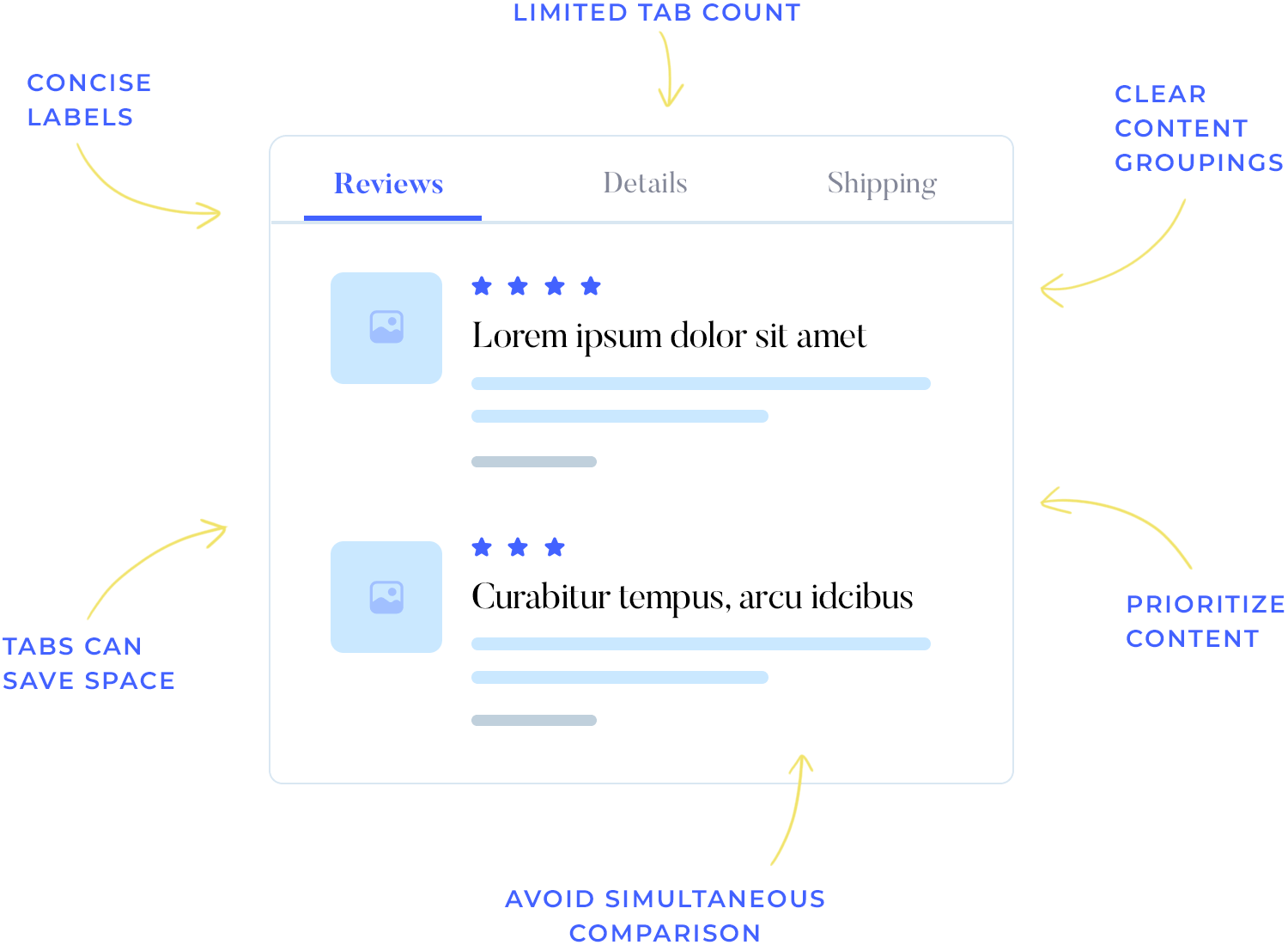
Concise labels: Concise tab labels are crucial. Short, descriptive labels conserve space and make it easier for users to quickly identify the relevant content.
Avoid simultaneous comparison: Tabs are best suited for content that doesn’t require simultaneous comparison. If users need to reference information from multiple tabs at once, a single-page layout might be more effective. Switching between tabs repeatedly can increase cognitive load and hinder usability.
Finally, tabs can save space, especially on smaller screens. This is because in-page tabs can be used to display multiple sections of content within a single window, rather than requiring users to open separate windows for each section. This can make it easier for users to access all the information they need without having to clutter their screen with multiple windows.
Let’s explore some creative and strategic tips to elevate your tab design game and create memorable user interactions.
Full disclosure: this post discusses in-page and module tabs, not navigation tabs. The goal of in-page tabs is to allow the user to alternate between sibling views on the same screen. In-page tabs should not be used to navigate to different areas of a website or app, and definitely shouldn’t be used to replace navigation patterns like breadcrumbs.
As Jakob Nielsen points out, being able to switch between different groups of content within the same context is the reason we even have in-page tabs. So stick to the rules!
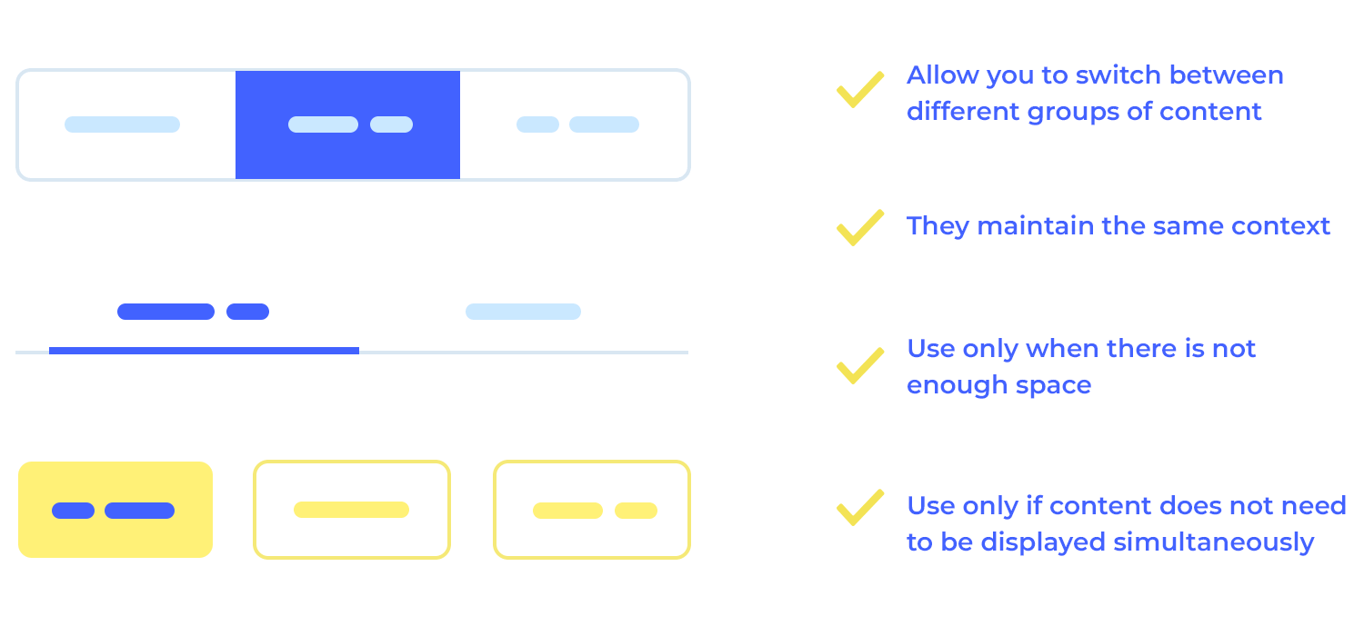
Do it yourself: in-page tabs only make sense if the user doesn’t need to see content from multiple tabs simultaneously. Use user personas and user stories to help you visualize what user need you’re going to address and how to present the appropriate solution in your site or app.
To effectively highlight the selected tab and guide users through your interface, consider using a combination of visual cues. A classic approach involves matching the background color of the selected tab with the displayed content panel, ensuring a clear contrast with unselected tabs. However, modern designers often opt for simpler techniques like adding a horizontal line beneath the selected tab or changing its font style to bold or a darker color.
For added emphasis, you can also increase the size of the selected tab or assign it a unique icon indicator.
Movement through a site or app should follow a logical order that visitors are familiar with. In the same way, your tabs should be arranged in an order that makes sense for your users.
The default tab (usually the furthest-left tab) is the first tab the user will see when the land on a page, so it should contain the most important/frequently-read information. The followings tabs should be arranged in order of importance or logic: The first tab you’ll see explains what the product is, the second who might use it, the third why you should buy it, and so on.
Do it yourself: during usability testing, use heat maps to track where users are spending the most time on your site or app. Not only will heat maps help you gather feedback on which areas of your site need to be improved, you’ll also gain a better understanding of where users usually click for specific bits of information.
For websites and straightforward apps, a single row of tabs is generally the most effective approach. Stacking tabs within a single control can create confusion and hinder usability.
When tabs are stacked, the selection indicator may appear between multiple labels, making it unclear which tab is currently active. This ambiguity can lead to user frustration and errors.
Stacking tabs can also disrupt spatial memory. As users navigate through the tabs, they rely on their mental map to remember which ones they’ve already visited. Stacking can disrupt this mental map, making it difficult for users to keep track of their progress.
While all-caps text might seem attention-grabbing, it can actually hinder readability. Research suggests that while all caps can improve glanceability at small font sizes, it’s not a wise design tactic to use broadly.
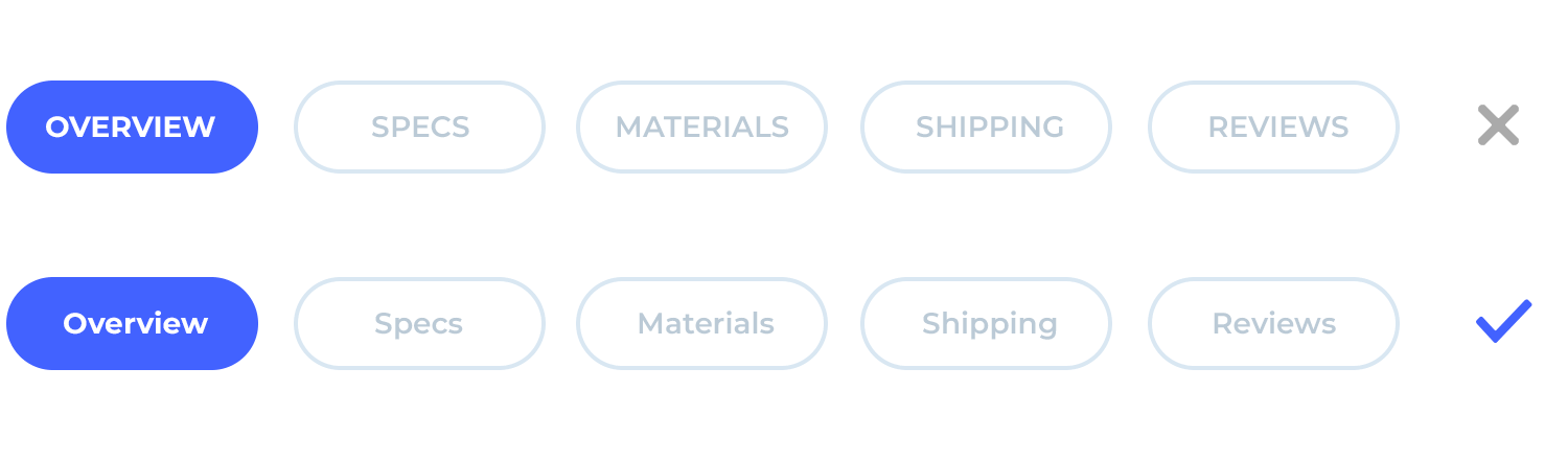
Most of the text we encounter in our daily lives is mixed case, so our brains are more accustomed to scanning and reading it. Switching to all caps can disrupt this natural reading flow, making it harder for users to quickly understand your content.
Choose a consistent capitalization style (sentence- or title-case) and stick to it. This will create a more cohesive experience for your users.
Do it yourself: use a website wireframe tool with ample font and label options to try out. Justinmind’s Text widget contains a Single/Multiline control which may come in handy.
Keeping the elements in your UI design consistent is always a good idea. As UX Researcher Euphemia Wong tells us, consistency is important in GUI control design because it eliminates confusion and reduces the learning curve.
When it comes to UI design patterns, it’s important to make it quick and easy for users to find their way around. In order to prioritize consistency in tab design, make sure that your tabs all look and behave in the same way.
Do it yourself: use Justinmind’s templates and masters to reapply styles and spread global changes across your prototype’s screens and UI elements. Save yourself some time, and ensure 100% consistency throughout your design.
Tabs are a great way to display lots of information in the same section of a site or app prototype. The downside to this is that you need to be careful about how you chunk your content. Poorly chunked content may lead to interaction cost, and cognitive load, putting a particular burden on the short-term memory.

For instance, if you display too much content in one tab, you’ll have users jumping back and forth between tabs trying to memorize information. Display mismatched content across tabs and users won’t be able to predict what they’ll find and may even mistake each tab as a new section of navigation.
Do it yourself: keep content concise and parallel in nature wherever possible. Card sorting is a great way to test your information architecture and interface controls.
Prototype your web apps with fully-interactive tab navigation.
In this section, we will explore some outstanding examples of tab UI components from various websites and applications. These examples showcase best practices in tab design. Take a look and get inspired!
The tab component in JustinMind’s Online Bookstore web template provides a clear and organized way to present information about a book. It is divided into two main sections: “INFO” and “COMMENTS.”

Overall, the tab component effectively presents essential details about the book in a visually appealing and informative manner. It allows users to quickly access information about the book’s content, authorship, and physical attributes.
The strategically placed tabs of Justinmind’s Furniture Webshop template help users navigate through the product easily. The labels “Details,” “Reviews,” and “Shipping and Returns” serve as your personal tour guides.

With their visually appealing appearance and intuitive functionality, these well-designed tabs make exploring product information a delightful journey, ensuring you make an informed and confident decision, which is what tabs practically ask you to do!
Justinmind’s Online Florist website template brings the feeling of stepping into a lush, floral wonderland to your fingertips. The beautifully designed tabs at the top of the page – labeled “Home,” “Weddings,” “Events,” “Bouquets,” and “Christmas” – invite you to explore a world of vibrant blooms.

With just a click, you can immerse yourself in a curated collection of stunning floral designs, each crafted with care and passion. Let nature’s beauty unfold before you as you navigate this enchanting online florist experience.
Embark on a cosmic adventure with Justinmind’s Mars Explorer website template. The captivating tabs – labeled “Why Mars,” “Space Station,” “Moon,” and “Mars” – invite you to delve into the mysteries of our neighboring planet.

With these well-designed tabs as your guides, you’ll be equipped with the knowledge and excitement to follow humanity’s quest to conquer the Red Planet.
The HR management web app template by Justinmind makes it super easy to find answers to your most burning questions. You’ll see tabs labeled “Getting Started,” “Save the Skin,” “Customization,” and “Pricing” right below the main heading. Each tab is like a shortcut to specific information, so you can quickly find what you’re looking for.

The tabs are designed to be eye-catching and easy to understand, making it a breeze to navigate through the FAQ section. With this helpful feature, you’ll be able to find the answers you need in no time and get started using the webapp with confidence.
Prototype your web apps with fully-interactive tab navigation.
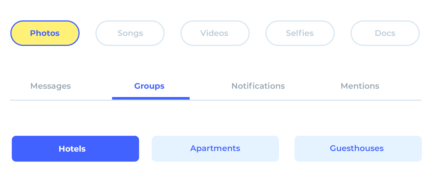
Hotel booking has never been easier with this tab design. With just a click, you can discover the hotel’s unique features, services, room options, guest reviews, and policies. Our user-friendly tabs – labeled “Description,” “Services,” “Rooms,” “Comments,” and “Policy” – guide you through the information you need.

These visually appealing tabs are designed to be easy on the eyes and intuitive to navigate, so you can effortlessly plan your stay and discover the perfect hotel for your next getaway.
Apple‘s website is a UX designer’s playground, and their tabs are a shining example of what’s possible. They always love proving that less is, in fact, often more. The clean layout, subtle color palette, and glossy finish create a premium experience that’s hard to resist. As a UX designer, take inspiration from Apple’s approach.

Remember that simplicity is your secret weapon. A cluttered interface can be a UX nightmare. Pay attention to the smallest details, from the spacing between elements to the choice of typography. And don’t underestimate the power of color!
Sephora‘s tabs are a digital invitation to explore their community. Sleek, uncluttered, and well-integrated into the website’s aesthetic, they’re a striking example of what tabs should look and work like. Sephora’s tabs enhance the user experience by strategically placing content and using clear labeling.

They’re like well-trained guides, gently leading customers towards their desired products or information. The tabs contribute to the site’s overall sophistication, creating a premium feel that aligns with Sephora’s luxurious brand image.
Airbnb‘s user-friendly search page features a row of in-page tabs that make finding your ideal accommodation a simple process. These tabs, labeled with terms like “Countryside,” “Beachfront,” and “Castles,” allow you to quickly filter your search results based on your specific preferences.

Whether you’re seeking a tranquil retreat in nature, a luxurious beachfront escape, or a historic castle experience, Airbnb’s tabs provide a convenient and efficient way to narrow down your options and discover the perfect place to stay.
Great Jones is a cookware brand founded in 2018. The main navigation is placed at the top, with gorgeous tabs inciting visitors to learn more about the company and explore their products. The colors used on the tabs are beautiful – deep shades of pink, green, and yellow serve as an appealing introduction to the site.

They also stand as harbingers of what Great Jones items are like. The company is known for its colorful products and their beauty stands out against a beige background. As soon as you start to scroll down any page, the tabs disappear and the menu sections show up in the header. As soon as the transformation occurs, the menu becomes sticky, allowing users to easily go to any section of the site.
Prototype your web apps with fully-interactive tab navigation.
So you’ve got your tab design down pat, now it’s time to make those tabs interactive. Follow the steps below to guide you through the process.
- Create a dynamic panel: Drag and drop a Dynamic Panel onto your canvas.
- Add panels: Create a panel for each tab (e.g., “Tab 1”, “Tab 2”, “Tab 3”).
- Design content: In each panel, design the content that will be displayed when that tab is active.
- Create tab labels: Add text elements or images to represent each tab.
- Create interactions: Select the tab label, and add an “on click” event so that when you click on it, the corresponding panel is selected.

Feeling confident? It’s time to put everything you’ve learned into practice. Download Justinmind and get started with tab design right away. You’ll enjoy a 15-day free trial, so don’t delay!
Our UI kits offer a curated collection of pre-designed tab components that can be easily integrated into your projects. Check them out below and get started on your tab design project!
Justinmind’s Web Wireframing UI Kit is an invaluable tool for anyone seeking to create exceptional websites. By leveraging its pre-built elements, such as awesome tab designs, drag-and-drop functionality, and collaboration features, you can efficiently design wireframes that effectively communicate your vision to stakeholders and developers. Start wireframing today and lay the groundwork for a successful website project.

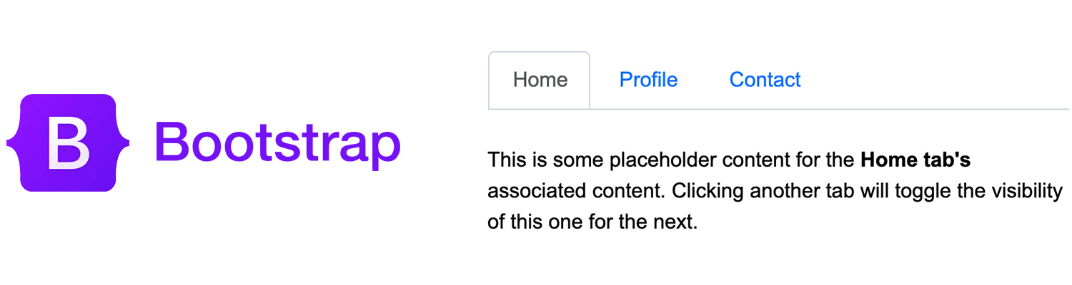
JustinMind’s Bootstrap UI Kit offers you an intuitive tab design that is functional and hits the mark on the best practices described above. The horizontal arrangement of the tabs, combined with clear and informative labels, makes it easy for users to identify and select the desired content. The visual highlight of the active tab provides a clear indication of the current focus, ensuring a smooth sailing user experience.
JustinMind’s Material UI Kit offers a versatile set of tab components that adhere to Google’s Material Design guidelines. These tabs can be arranged horizontally or vertically, and they support scrollable functionality for longer lists. You can easily add icons to your tabs for visual clarity and customize their styles to match your brand. Additionally, the tabs are designed with accessibility in mind, ensuring they can be used by users with disabilities.

JustinMind’s Angular UI Kit offers a range of tab components specifically designed for Angular developers. These tabs adhere to the best practices and design principles, which provide the tabs with a modern and consistent look and feel. You can customize their appearance and behavior to match your brand and design preferences, and they even support scrollable functionality for longer lists!

JustinMind’s Vuetify UI Kit ensures your Vue.js applications look nice, have good usability, and are consistent with clear guidelines. The tab design provides an intuitive way to organize and present content, enhancing the user experience. With features such as customization options, scrollable functionality, and icon integration, Vuetify tabs can help you design a digital product that stands out for all the right reasons.

Our PrimeFaces UI Kit offers a versatile set of tabs designed to streamline your design process. These ready-to-use tabs are easy to integrate into your JSF applications, providing a wide range of customization options and adhering to design best practices. With our comprehensive collection, you can create any kind of digital product and save countless hours when designing your JavaServer Faces project.

PROTOTYPE · COMMUNICATE · VALIDATE
ALL-IN-ONE PROTOTYPING TOOL FOR WEB AND MOBILE APPS
Related Content
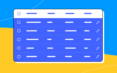 A fun look at different data table designs, from basic lists to smart, interactive ones, based on how complex the data is and what users need.18 min Read
 Single page design v multi-page design – everything you need to help you choose the right design for your site’s content18 min Read
 Website backgrounds can be a powerful tool in creating an experience. But what kind of experience can you convey and how? We got the full run-through for you!14 min Read


