Bootstrap UI kit: design responsive website prototypes

Designing a website with Bootstrap is quick, easy and cost-effective. Prototype eye-grabbing websites with Justinmind’s Bootstrap UI kit.
Looking to get straight into designing with a flexible, easy-to-use UI kit with our prototyping tool? Then look no further than Justinmind’s Bootstrap UI kit.
Bootstrap is among the most popular open source web design frameworks in the world. Formerly known as the Twitter blueprint, this front-end framework has become the go-to choice for many web designers and developers.
The pinnacle of Bootstrap is simple design and intuitive UX. In this post, we’ll examine the many benefits of designing a website with the aesthetically appealing library, as well as provide an example of how to design a website with the Justinmind Bootstrap UI kit.
Bootstrap was born in 2011 and is the result of a group of designers and developers getting together at Twitter. Jacob Thornton and Mark Otto, who were at the forefront, helped to develop what they would later call the “Twitter Blueprint”.

The idea of this was that the company would use the framework as a point of reference across all their internal tools. As Mark Otto stated, this allowed them to “document and share common design patterns and assets within the company”.
During a hack week, as developers from across the company contributed to the blueprint, they soon realized the potential for the product to help web designers and developers across the world, and in 2011 they made the framework available as an open sourced project.
First of all, as a framework, Bootstrap is highly adaptive in that it allows for endless possibilities when it comes to design. On top of that, the Bootstrap UI kit allows for responsive and scalable development, which is tantamount to modern website design, along with making developer hand off a walk in the park.
Let’s first of all talk about the grid system layout. Grids are what enable designers to improve their products because they create hierarchy, aligning different elements and creating a more thoughtful and consistent design.
Many designers find themselves in Bootstrap web design and with good reason: it’s easier to create responsive designs and adopt a mobile-first approach. Responsive design means that it is flexible and can adapt to any screen size, and mobile-first means that you start designing for the smaller resolutions first.
The reason for this is primarily down to Bootstrap’s efficient grid system, which creates a fluidity and makes it easy to customize. Also, it lends itself perfectly to interactive design because it not only helps to define the structure of the page, but also the way in which components adapt to breakpoints for different resolutions.

Each component and element in our Bootstrap UI kit has been designed with their grid system in mind, meaning that you can quickly put together an eye-catching web page in no time and be safe in the knowledge that whatever design you create will be scalable.
A further plus to using Justinmind’s Bootstrap UI kit is that when it comes time for the handoff, developers will find themselves in a very familiar environment. Most developers work quite extensively with Bootstrap framework due the sheer simplicity of its CSS ui framework.
CSS stands for cascading style sheet. It’s a language that is used to describe how a document written in a markup language is presented, the most common markup used being HTML. CSS basically shows how different HTML Bootstrap elements will be displayed, either on screen or on paper.
In terms of development, Bootstrap requires only the most basic working knowledge of CSS, HTML and Javascript, as many pre-compiled components such as navigation bars, progress bars, drop down menus, alerts, badges, labels, etc already exist.

Designers can take advantage of creating a Bootstrap website prototype in Justinmind using the Bootstrap UI kit and exporting the final design in the form of CSS. The CSS code for each and every component and element you use from the Bootstrap UI kit will be accounted for, making life easier for the developer, thus saving time and money.
Our Bootstrap UI kit comes with all the components and widgets you need to start prototyping your content-focused website. Everything has been organized into categories, so finding what you need to work with is a piece of cake.

The first category of the Bootstrap UI kit, includes all the most popular Bootstrap texts. This Texts section of the Bootstrap UI kit consists of all the different text groups you might need such as page and example headers and header subtexts, as well as general headers ranging from H1 through H6 and a body section.
Other categories include, Badges and feedback, modals, and heros where you’ll find all the panel elements and alerts as well as all the Bootstrap cards and badges you could need. Popovers are handy for displaying content on Mouse Over, while tooltips are good for displaying smaller quantities of content.
Cards and grids, the cards come in various recommended layouts and also include a pricing and features card, as well as different grid options to work on.
In the Navigation category you’ll find a carousel fixed with three slides and built-in interaction to navigate between them. In this section you’ll also find selection of navigation menus, including pagination, breadcrumb, tabs, in addition to grouped radio and checkbox buttons, a nested buttons menu.
The Dropdowns and Tables and lists categories will allow you to choose from a selection of dropdown menus ranging from basic menus with icons to dropend, and light and dark options, as well as to easily find components to best represent and organize data in groups or hierarchies.
You’ll also find some helpful pre-assembled navbars equipped with a dropdown buttons and a search bar, in addition to an external one with a hamburger menu that is programmed to collapse the content it contains. A vertical and horizontal scrollspy is also available in this category.
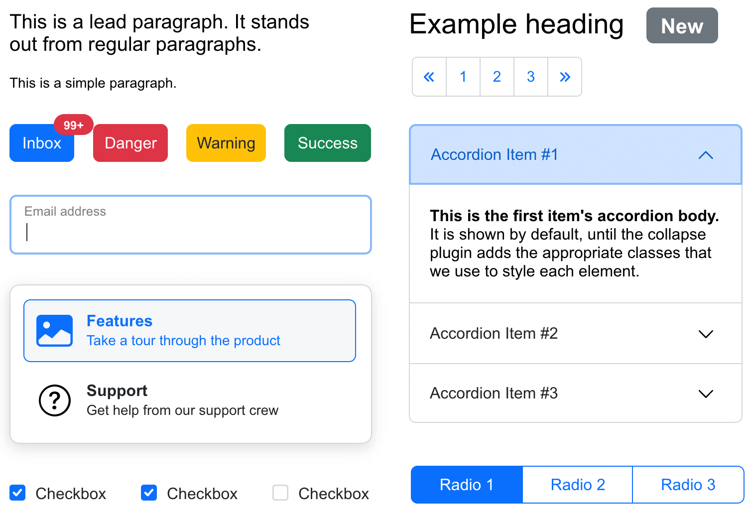
You can find every type of button you could need for your webpage, and they’re fully customizable with pre-designed samples such as warning, danger, success, info and link buttons.
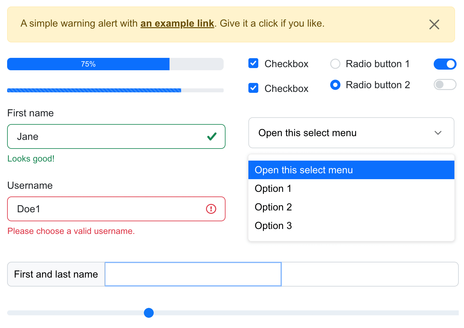
This category of the Bootstrap UI kit gives you a range of input fields,multiple input field, including labeled inputs suited to different tasks. There’s also a textbox, check boxes, radio buttons, and a select menu.
Like most of the elements and components in the Bootstrap UI kit, all the basic interactions are already added to speed up the prototyping process. Bootstrap elements such as sliders are movable and you’ll find you can already type in text fields when simulating your prototype.
In this post we’ll show you what you can do with our Bootstrap UI kit and how to design a website prototype with the library. In order to get started, follow the four steps below and begin prototyping with Bootstrap:
1: Download the Justinmind prototyping tool
2: Download the Bootstrap UI kit from our Free UI components page
3: Import the UI kit into Justinmind in the libraries palette.
4: Create a new Bootstrap web prototype.
Designing a Bootstrap website with our UI kit in Justinmind is quick and easy. Let’s imagine we want to design a website about culture in our city. Our website should have a simple layout with a homepage that advertises all the features of the site.
By simple layout we mean that the content of our site will be organized in a clear and intuitive way, so that the user can quickly and easily find the information that is relevant to them.
When considering the layout of content on our site, we’ve decided that ordering it into sections is what the doctor called for. There should be a section to buy tickets to events, as well as a section for reading featured literary posts and interviews, and also a Subscription section for people interested in the premium access to events.
So let’s start with the top of the page. We’ll choose a simple Navbar component and drag it to the canvas to edit the text; in this case we’ll include the following four options: Home, Tickets, Reading and Subscriptions. These will showcase the main features of our site.
The Navbar provides a dropdown menu feature whose text options can be edited or expanded. The cool thing about this feature is that the interaction is already built-in to the component, saving you time adding it in. In this dropdown menu we’ll add some options to redirect the user to the different pages of the website. Conveniently, the search bar that is featured in this component also has the text input interaction, like other text fields in the library.

Now let’s add our navbar to the templates section so that it remains fixed in place for all pages. For all intents and purposes we’ll name it “Navbar”. Fixing the navbar to the a-axis and choosing pin to top for the y-axis will enable it to remain at the top of the page as the user scrolls.
Next, we’ll add in a breadcrumb menu above the text to let the user navigate more easily between the content. Conveniently, the breadcrumbs already have an “on Mouse Over” interaction built in to them which highlights the text, meaning we just have to add the appropriate interactions to link them to the other pages.
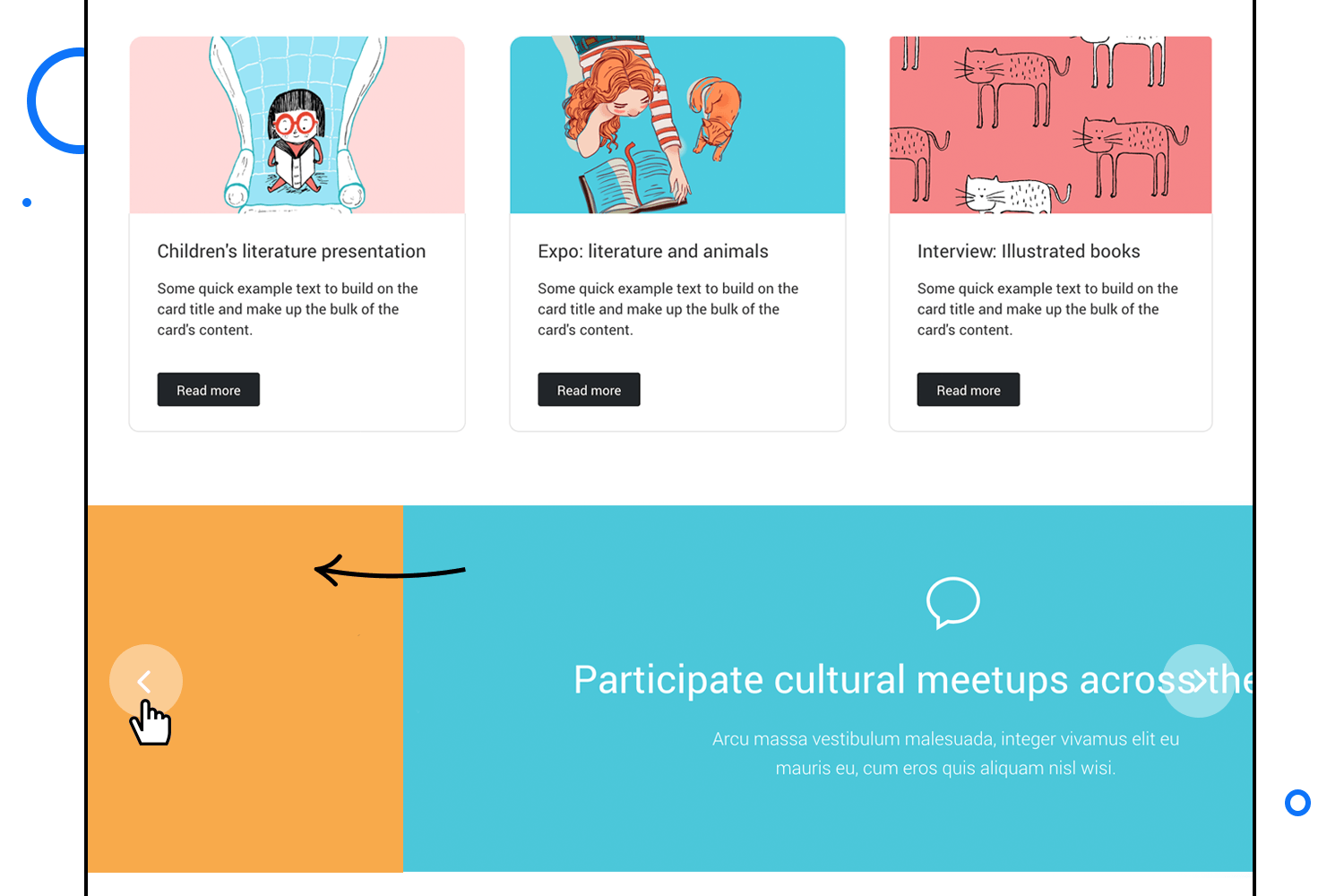
The next part of our homepage will be populated with Bootstrap cards to succinctly showcase some of the interesting new content on our site. In this example we’ll use the primary Bootstrap cards that consist of an image, a paragraph and a button. To add our chosen image to the card, we simply select the Rectangle and go to the Background section under Properties. Here we can find a dropdown menu with different options for resizing our image, and select the one that best fits ours.

The buttons also have that practical built-in on Mouse Over interaction, allowing us to focus on the button’s design and the subsequent page it links to. In this case, we’ve just altered the text and the color of the button.
Finally, the lower part of our homepage will feature a carousel component demonstrating the different events around the city that our site will be promoting. The component comes with three slide labels (of which more can be added) that also have interactive controls to switch between slides. Here we’ve given each one a catchy title and changed the icons and the color. Each slide will link to a different page on our website.
Next, we’ll create a page for managing new subscriptions. We’ll first add a left-aligned hero unit with image. On this page we’ll also compose a sign up form using basic input fields and renaming them to Name and Last name; we’ll use a floating label input field for the username and another basic one for the email field. In the latter you can add a second floating label input to the left to begin with “@” à la Twitter. Then we’ll place a simple dropdown menu allowing our users to select the type of subscription they want.
Once we have entered the title of our sign up form we’ll add a popover that provides the user with extra information (denoted with an “i”) triggered by a Mouse>on Click. Below that, we’ll provide a checkbox to include the premium plan in their subscription – you’ll notice that the checkbox already has the checking interaction added.
The second part of this page will be the payment details where we’ll offer the user the option to select how they want to pay: by Visa, Mastercard or Paypal.

For this, we’ll drag a radio group to the canvas and line them up (and duplicate in the same group either radio button for a third one). A few more text fields, dropdowns for credit card expiration and a dark button at the bottom and we’re good to go with the second page.
After our subscriptions page is finished, we’ll go back to the homepage screen and add an event to the subscription button in the main menu to link to the subscription page – voilà! We’ve already created a simple Bootstrap prototype for our cultural website!

Fashion magazine Vogue’s website was built using Bootstrap. It’s a great example of how much detail can be fitted onto the screen using the Bootstrap’s responsive layout system.
Using bootstrap web design, Vogue manages to cram a lot of information onto its homepage, without it looking crowded. The designers clearly put a lot of thought into the site’s navigation design, giving its content a clear hierarchical form.
The most striking feature of this website is the large hero image that leads into a featured news story, followed by smaller images below that also link to further articles. Their aim seems to be to create a homepage that grabs the user’s attention while using the minimum amount of text – something which Bootstrap helps to achieve.
There is also a clear hierarchy throughout the website which is evident through the logical use of breadcrumbs on each page, in addition to the main ones on the website’s header.

Maximilian is a historical brand of Italian sparkling wine managed by Cantina di Soave. Its website is the perfect example of a product reinforcing its brand identity through web design, and it illustrates the degree of power and flexibility that the bootstrap library bestows on its designers.
The website has been crafted making sure that all Bootstrap elements are properly spaced out but perfectly aligned, and the user can scroll down, triggering the parallax effect. If you hover over the culinary suggestions, depending on which direction you move the mouse, the ingredients move in counter phase, creating a very realistic three-dimensional animation.
All of these effects scale down perfectly on smaller devices, while still maintaining that minimalist, spacious feel. The hamburger menu turns translucent in the mobile version of the website so that the rest of the content under it is still visible.
Each “Find More” button is clearly visible under each product, opening into a card containing further detailed information about them. The designers of this website clearly made content layout one of their prime strategies.

Pop Art Studio is a web development and design service from Serbia and has made a pretty good job of its own website – using Bootstrap.
On entering the site, the first thing that jumps out is the bold yellow color that contrasts with the otherwise minimalist design, along with the dynamic hero image – one of the most notable effects of the site. The designers take advantage of the 12 column grid layout to showcase the company’s full design potential.
Great button design is another feature of this website. Hovering over any button on the website, the user will see an arrow sliding past, as if shot by a bow. These minor interactions create a more immersive experience for the user. Call to actions are clearly visible, displaying the most important information first, such as the “portfolio” and the “order” buttons.
It is also a great example of how effective Bootstrap design can be as a mobile first developer language. The details of this website scale down perfectly to smaller mobile and tablet screens, with the breadcrumbs compressed into a hamburger menu on the smaller resolutions.
As you can see, prototyping your website using Justinmind’s Bootstrap UI kit is a great idea if you want to design an attractive, modern-looking, responsive website that provides an easy transition from design to development and offers your users an intuitive experience.