
What is a website heatmap and how can it help you? Read on to learn all about this easy and powerful method of user testing!
Techy, scientific, complicated. Those might be the words that spring to mind when you think about website heatmaps. However, that’s not the case. Yes, they use an advanced type of software and are scientific in nature, but they’re relatively easy to set up and analyze!
Website heatmaps are prolific in the UX industry because they’re a great way of improving website usability and boosting conversion rates. In this post, we’ll look at how they work, how you can set them up and the best tools to get the job done!
So what exactly is a website heatmap? You could think of it as an automated graphical visualization that makes it easier to view and understand large amounts of data, without drilling down into the raw numbers yourself. It’s always done online, making it a type of remote user testing.

Website heatmaps tell you what part of your webpage your users are focusing on the most. They generally use a color scheme, ranging from warm colors, like red, orange and yellow, to colors like green and blue at the cooler end of the spectrum. The warmer areas denote the places users are focusing on more.
As a result, website heatmaps are an incredibly useful source of information to gauge the following factors: attention, engagement and interactions.
Website heatmaps can tell you where your users’ attention is going when they visit your website. They can provide you with an indication as to the content your users find most interesting. They can also point out bad things, like the areas they get stuck on or find confusing, such as navigation menus or forms. For example, maybe there are too many buttons close to the CTA which distracts them from it and is therefore decreasing potential conversions.
That’s why it’s so important to validate these types of designs constantly to make sure they’re intuitive. You can check out our post on how to validate form prototypes for a broader view.
Just as website heatmaps can tell you where your users are focusing all of their attention, they can also tell you what elements or aspects of the page users are engaging with the most.
Take content as an example. Heatmaps can tell you up to what point users are disengaging with your content, getting bored and not reading anymore. It can also show you where they’re getting stuck and where they might be experiencing frustration.
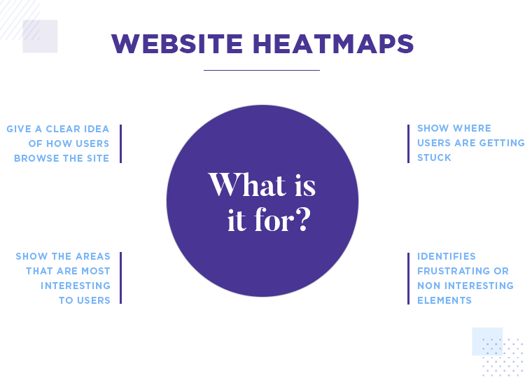
Another interesting benefit that website heatmaps bring is that they can also give you a very lucid idea of how your users are actually interacting with your website. You can see what buttons they’re clicking and how they generally tend to be navigating through your website. You can also see how far down each page they’re getting.
For all of the reasons above, website heatmaps generate heaps of useful data in a way that’s visually quick and easy to visually digest. That can help us to take a step back, reflect and identify patterns that the masses (we hope) who visit your site follow.
These patterns might be that your users land on your homepage and read the first half, but don’t scroll down much further below the fold before clicking on a menu option. For this reason they might not be clicking on that’s below the fold, therefore reducing your conversion rates.
One of the things you could do in the above case is either make the content and design of the homepage more captivating to make it more “scrollable”. On the other hand, might decide to move the CTA up above the fold. Or you may just go for a combination of both.

In this sense, website heatmaps arm you with plenty of qualitative data that helps you start addressing the hows and whys of your website’s conversion and current level of usability.
Website heatmaps allow you to obtain qualitative data about the usability of your website and how well it appeals to users. This data provides you with insights and gives you opportunities to improve conversion rates and potentially boost sales.
For a great example of how qualitative data can boost the usability of your designs, check out our post about data-backed design at NASA!
In this sense, it is particularly helpful for ecommerce websites who want to know where on the page the user’s attention is going. Equally important – it can show if the navigation or information architecture (IA) is affecting the user flow when it comes to actually buying a product.
Website heatmaps can tell you if users are following every step for buying a product or abandoning it midway due to a confusing form, poor button design or menu option. They can also tell you if the content on a page is really engaging or not, it can even give you hints as to the quality of the content.

Imagine that users are spending a particularly long time focusing on a certain paragraph or sentence. You might then find that your content has a really low readability rating on the Flesch-Kincaid readability scale. This may prompt you to revise your product descriptions.
All these insights point to how much your website can benefit from this form of user testing. However, unlike other forms of user testing, such as card sorting, website heatmap testing can only be performed on an up-and running site.
The other benefit that website heatmaps offer is that they simplify numeric data, meaning you don’t have to go trailblazing through all that numeric data – the tool does it for you, taking an aggregation of data from many different users. It represents their actions as if they were one collective user, with the exception of confetti maps, which we go into more detail about below.
It’s this automatic data compilation that makes heatmapping such a useful technique. You save time on making sense of data and compiling your own statistics and graphical representations!

An added benefit of website heatmaps is that they marry well with other user testing methods, such as AB testing and card sorting.
Firstly, imagine you that after a card sorting session, you decide your IA needs an overhaul, so you update the sitemap. To test whether or not the new IA works better than the previous version and affirm the results of the card sorting session, you create a website heatmap.
The heatmaps will be able to show if the changes helped boost conversion, engagement and helped your users navigate more easily through your site. But only, of course, if you compare it with a heatmap of the old version. That’s where AB testing comes in! Thankfully, many user testing tools on the market have both website heatmap and AB testing features.
This is where we get to the interesting part. There are several different types of website heatmap, meaning many ways to go about testing your site. Fear not – this just means you can get creative about interpreting the results!
You might decide that one certain type of website heatmap is right for your website or you might decide that you want to use multiple different types. Whatever you decide to do, it all depends on the kind of website you’re testing, the kind of information you need and the kind of results you’re after.
Here are the main types of website heatmap testing:
Mouseflow heatmaps measure where the user’s mouse wanders on your webpage during a session. Why is this information useful? Because many users point their mouse towards areas of interest on a web page. This is also true for written content.

For example, a user might point their mouse at paragraphs, sentences or words that they find particularly interesting. Or it can be that the mouse lingers around these parts because they’re worded awkwardly or is confusing. Either way, it’s usually easy to draw a conclusion from the context.
The only things you have to watch out for with this type of heatmap, are pesky mouse parkers. These are users who tend to leave the mouse literally parked on one part of a page while they read, giving no real indication of which part they find interesting.
Another problem is that you don’t even know that they’re actually reading at all. One way around this problem is to make sure you segment your users, filtering out the ones that spend more than a certain amount of time (usually 10 minutes) on the page, as they’re the ones who likely leave their mouse parked on your page but aren’t actually reading it.
A clickmap can aggregate the data from many users’ clicks and represent those results in the form of a colored heatmap, the warmer colors indicating the elements that were clicked on the most.

Clickmaps are therefore a really helpful demonstration of which buttons and elements are grabbing users’ attention the most. They can also give you some insights into how well their mental models fit in with the IA of your website and if they are clicking on unclickable elements.
Click percentage maps are a type of website heatmap that are extremely useful for quantifying the actions of your users. These types of heatmap display the click results as percentages over the elements users clicked most on the page.
They’re different from clickmaps in that they don’t rely on the color spectrum to show the click density. Rather, they provide numerical representations like the percentages we mentioned above. In this type of website heatmap, you’re most likely to see these percentages over buttons, links, menu options, CTAs and other clickable elements that include clickable images.
Scrollmaps, similar to mouseflow heatmaps and clickmaps, also use a warm-to-cold color scheme. However, scrollmaps display the colors in horizontal lines across the screen, usually starting with red from the top, since that’s the most viewed part of web pages in general. The horizontal colors then start getting colder as they move down the screen and below the fold.

According to Nielsen Norman Group, scrollmaps can be a great example of how to analyze users’ attention above and below the fold. They can help you see if content is performing well enough to keep users scrolling down, or if false floors are causing a problem and users simply aren’t seeing the bottom at all.
Confetti maps are special because they don’t just show the density of clicks. Instead, they show it like it is, that is, how many users clicked and where exactly they clicked. As a result, you can see all the mouse clicks on the page in the form of dots.
Most tools offering the confetti heatmap as a feature often also feature a method of seeing which clicks came from which sources. For example, depending on how long you waited to aggregate the results, you’ll see a number of multicolored dots strewn about the screen (hence the name confetti).
Each of these dots will represent where each user clicked with their mouse, and each color will represent the source where that user came from, with the colors being represented on a legend key close by. For instance, some users might come directly from Google, whereas others may have been referred from another source and landed on your page via a backlink.
Eye tracking heatmaps fall nothing short of awesome because they show where your users are looking and what they’re looking at most on the page. Another plus is that they represent the results in the same format as the traditional clickmaps and mouseflow heatmaps. That is, they use a color scale varying from warm to cold, with the warmer colors representing where users looked the most.
The only problem, of course, with eye tracking heatmaps is that they require a special type of software that’s more expensive than most other types of heatmap.
The software to track people’s eye movements across your web page often works through the use of the user’s web cam, for remote testing. However, for face-to-face testing, users can also use a type eye tracking glasses which pick up on the direction of the user’s gaze.
This type of website heatmap can provide you with useful insights about both the information, content and visual hierarchy of your web page. It can also help you see how much the images on your web page are serving as eye candy for your users.
There are lots of uses website heatmaps have and the benefits you can get out of them are nearly endless. Furthermore, there are certain times, budget and schedule permitting, where it you may want to use it over other user testing methods.
Let’s say you want to make improvements or updates to your existing website. If you’re designing a new website, heatmaps won’t make sense as you won’t have any data to go on. Website heatmaps are all about making data-informed re-designs, iterations and improvements to an already-existing design.
Website heatmaps are a great solution if you want to check how well your website is doing in terms of usability. Additionally, if you have low conversion rates and sales but high traffic and want to understand why, then creating a website heatmap might be the answer to your performance woes.
If you’ve decided it’s the right method, then you need to have a sit-down with your colleagues and decide, first of all, what needs improving. Then decide what exactly it is you need to test and why. It’s always better to have a concrete goal in mind so that you don’t waste time and money and the results you have mean something and serve to help you make actual changes.
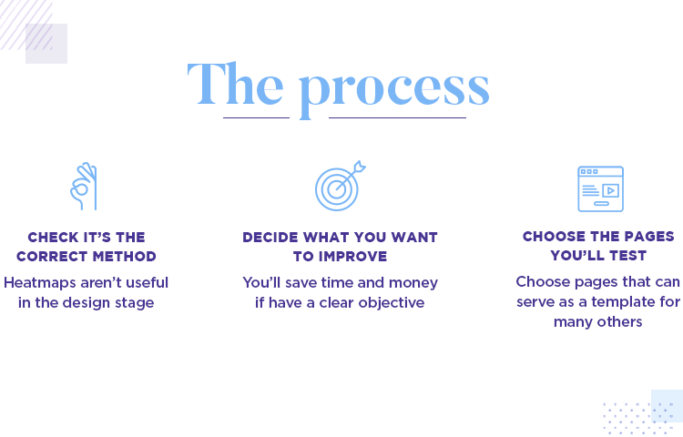
Most of the time, a website heatmap is created for each page, so it’s important to ascertain which pages of your website you want to test.
Imagine you want to principally test the homepage and a handful of others. Why? Because maybe some pages aren’t quite as important to conversion. But also because, based on the insights you discovered from similar pages, it might not be worth repeating the same test for many pages.
Take your typical ecommerce website as an example. A site like this might have thousands of pages that have the same UI layout, it’s just the actual content that changes. Incidences like these might include product listings. In this case, it might be wise to choose a tool where you can create a template of the page to be tested, and then just test one. And then apply those insights, where possible to the rest of the pages.
An example might be where you want to check what part of the description customers are checking, and whether or not they’re clicking on clickable elements, in addition to how well any call to actions, like BUY or ADD TO CART are working.
Make sure to choose a tool that’s able to test dynamic web pages. What do we mean by dynamic? Dynamic pages are those where you have moving elements on the page. An example of this might be a sliding menu that covers part of the screen when selected, then becomes invisible again when deselected.
Another example might include a dropdown menu. Unless the tool is also able to measure these dynamic elements (which is important because most modern websites have dynamic elements), then the results won’t be all that useful.

Next, you’ll want to make sure you’re using a tool that allows you to create responsive heatmaps. Afterall, if they’re not responsive, they’re not going to provide you with a whole truckload of useful data if both mobile and desktop versions of heatmap data are aggregated into one model. What you need is a tool that will segment the users viewing your site on the mobile versions and the desktop version and aggregate those results separately.
Once you have your tool selected, all that’s left to do is to is to install the tracking code for your tool on your website. If your website uses wordpress, many tools provide plugins that you can easily install for this purpose.
If you want to learn more about the practical side of responsive design, check out this tutorial on how to make a responsive website prototype. It only takes 10 minutes!
Once you’re all set, it’s just a matter of waiting for a certain period of time for the data to accumulate, which will vary greatly depending on the amount of traffic your website currently has. For some, a day of data collecting might be enough, whereas for others you might want to wait a couple of weeks.
The next (and obvious) step is to analyze all those results. The beauty of website heatmaps lies in the fact that they make it pretty easy to come up with fast conclusions. They make it easy to identify patterns easily due to the intuitive way the data is represented with color tone and density.
Most website heatmap tools have a contrast button that allows you to adjust the color overlay to stand out even more. You then need to check the overall amounts of warm layers. Lots of warmth in certain areas signify “hotspots”.
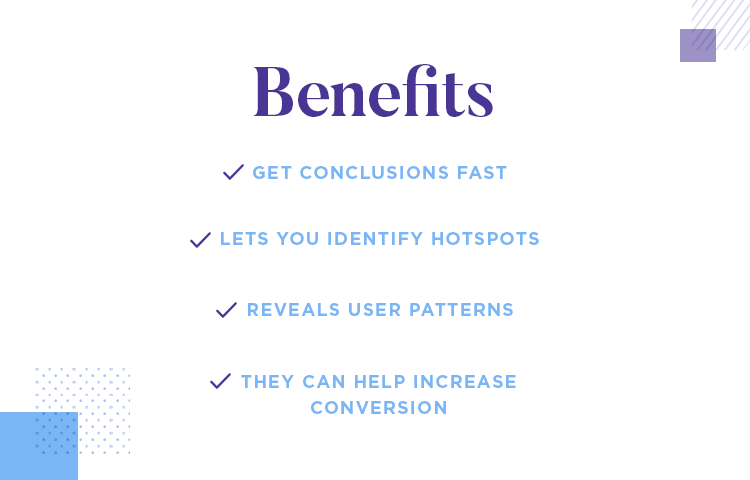
Hotspots are areas that receive the most attention, interaction and engagement. If there are hotspots in areas that are less important, you might want to consider making changes to the layout of the page to boost the website’s conversion rates.
Likewise, if you discover that many users have been clicking on unclickable elements, it might be time to consider ways in which you can make them look less clickable. However, one thing UX designer Talia Wolf does is use it as an opportunity to learn more about what the users’ intentions when clicking static elements. It might be that you need to reconsider the navigation of your site or you might even decide that it’s better to make those elements clickable.
Lucky Orange has all the features you’d expect from a top-of-the-range website heatmap tool, from color heatmaps, scrollmaps and clickmaps. However, that’s not all. They also boast some unique features that not many other tools on the market have.
Such features include being able to see people using your website in real time. They also include form analytics that tell you which fields people fill in and at which fields they generally tend to abandon the form at. Each field even comes with an “abandonment percentage.

If these features aren’t enough, you also have the option of setting up an automatic poll to gather feedback and a chat and live co-browse system to let you help lost customers.
If you’re after more than just great usability, and want to provide excellent customer service, then lucky orange is the website heatmap tool for you.
- Pricing: ranges from $10 to $100 per month, depending on the plan you use.
Crazy Egg is another well-known website heatmap tool on the market. Crazy Egg lets you see detailed reports about what exactly users were doing on your page and even filter the traffic reports and heatmaps by date.

Another handy feature that crazy egg’s website heatmaps have is the ability to be able to adjust the contrast of the color overlay, to make the results even clearer. The types of heatmaps they provide include everything from the typical mouseflow map and scroll reports, to confetti reports and click percentage maps. You can also see individual session recordings from users.
One of the best things however, is that you can easily combine the results along with their AB testing tool. They also have prolific integrations, like Hotjar below, being integrated with the Justinmind mockup tool and having plugins for sites like WordPress and Shopify.
- Pricing: ranges from $24 per month to $249. View their heatmap demos!
Hotjar have definitely earned their stripes on the website heatmap tool market. Many of their high profile customers include UNbounce, Nintendo, Microsoft, Skyskanner and more.
Apart form having a an impressive customer base, hotjar also have a great list of features. Not only do they bestow you with the ability to visualize your uses’ behavior with heatmap tracking, you’ll also have the ability to tag recording to organize your insights correctly.

For example, you can add tags such as “abandoned due to long wait time”, or “clicked on unclickable element”. On top of that, the software is a piece of lemon pie to set up and allows you to easily share your results and heatmap recordings.
Pricing: ranges from about $100 per month to $658 depending on how many pageviews you have (minimum being 20,000). They also have a 15-day trial version
FullStory are called thus because they say they tell the story of the user on your website. They also make quite the claim by stating their website heatmap tool captures more data about user interactions than any of the others on the market.
But apart from that, and apart from having all the basic website heatmaps features, the tool also has some special abilities that make it unique.

For instance, the tool has a special feature that even tracks the analytics of the webpage that you do heatmap testing on. For example, with their analytics you can analyze slow page load times and see the average load time, along with other statistics such as how many users visited the page.
- Pricing: available upon request
PTengine is a website heatmap tool that promises to get you all the real time data about your user testing sessions. That means you can see what users are doing as soon as they enter your website.
In addition to all the staple heatmap testing features, such as mouse clicks and scrollmaps, it also gives you access to features such as multi-domain monitoring. This is great for if you have more than one website because it means that you can monitor more than one of your domains from the same account.
Another feature that makes them stand out is their auto event tracking feature that lets you monitor outbound links, file downloads and even mails sent from your website.

Lastly, it’s a brilliant tool for if you want to do more than just improve the usability of your site. They go the extra mile by offering you great customer service, responding quickly to any queries.
Pricing: ranges from about $130 to $446 per month. There’s also a free version which gives you one heatmap and 3,000 views
With all the great tools available to us these days, getting a website heatmap of your site is easy-peasy. Just install a line of code and that’s it, in most cases.
For a reasonable price, most tools let you monitor crucial KPIs such as attention, engagement and interaction to identify the habits and thought processes of your users.
Website heatmaps often play a vital role in a website’s continual improvement in terms of boosted conversion rates, great usability and an enhanced UX.