
Learn how white space design can help shape the content on your website and make it stand out with 20 inspiring examples
Could you exist without space? Would any separate entity exist without it? Believe it or not, our bodies are made up of 99.9999999% space. It’s a vital part of life, but in a world full of physical and virtual content, we often forget about the important role of space. In web design, we refer to it as “white space”.
White space, less commonly known as negative space, is crucial to a website’s UI layout. A cluttered UI is the web equivalent of white noise: nothing stands out. Without white space design, brilliant artwork goes unnoticed, all elements are smothered and graphic design drowns in a puddle of itself.
Start prototyping apps today. Enjoy unlimited projects!

In this post, we look at 20 inspiring examples of how to manipulate white space to make the important content on your website stand out the way it should do. We’ll also run through some best practices on how to get the most out of, well – nothingness – in your prototyping tool!
Apart from affording UIs a higher degree of sophistication and prestige, white space design also has user-based benefits. It helps by providing a digestible amount of content to the user up front, it causes you to prioritize which content to show first and how much emphasis to place on it.
White space design also improves the readability and scannability of your website, according to NNG, in addition to improving reading comprehension by 20% according to a study done at Wichita State University. How? White space design renders your content easy on the user’s eyes by eradicating extraneous details and breaking information up into easily digestible chunks. In other words, it reduces the amount of cognitive load placed on the user, which in turn reduces the bounce rate.

Whatever way you spin it, the sheer amount of benefits white space design brings makes it a worthwhile technique to consider. Afterall, isn’t it easy to just leave space unfilled? The answer is that, like everything in web design, without practice, it’s going to be difficult. That’s why we’ve included some best practices below to keep you at the top of your white space design game.
Don’t forget to first wireframe your website design in order to decide on the optimum use of white space in your design. Our free wireframe tool can help you get started. Using a website wireframe will help you nail down your white space design and determine the correct quantity of spacing and padding around each element. It gives you a medium to try out different spacing before you move through more increasing fidelities of the website design.
You can also check out our list of awesome wireframe examples for some serious design inspiration.
Use white space design to help guide your users’ eyes. You can do this by organizing your page’s content into no more than 15 points on the page (any more than that should ideally go on another page). Now you just need to set an order of priority for those 15 points. For example, point number one might be the logo, number two might be the navigation bar, number three might be a hero image, number four a text paragraph and so on.
Next, when positioning this content, you need to decide on where your macro white space will be. In other words, where you place each piece of content or group of elements on the screen. Macro white space is the space surrounding each element or group of elements. Micro white space, on the other hand, is the space surrounding different elements in a group or the spacing between paragraphs, lines and letters in a text.
Start prototyping apps today. Enjoy unlimited projects!
The Gestalt principle of proximity maintains that users associate closely-related elements to have similar attributes. To apply this principle well, you’ll need to make sure that you group related elements close together.
Consider form design as an example. For example, you might want to group personal details such as name and address together in one group, separated by a bit more space and followed by another group of fields under credit card details.
Ensure paragraph column widths and margins aren’t too wide. This means including ample amounts of lateral space on both sides of your UI. This helps improve the readability of your paragraphs and makes the text more easy on the eyes. To reduce margin size, try including one idea per paragraph.
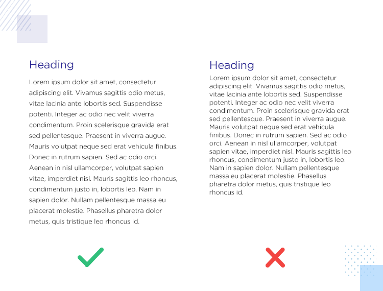
You should also take care with your line spacing. You don’t want to have each line on top of the other, but at the same time, you don’t want too much space between the lines either. The sweet spot to aim for when it comes to line spacing is between 130-150% of font size.
Use white space to demonstrate the visual hierarchy between elements on your page. Consider trimming or increasing aspects like padding and margin to place more or less emphasis on certain elements. Make sure to position important elements like CTAs in a place where they particularly stand out.
Looking to learn about other types of web design? Check out our post on dashboard design.
You need to strike a balance between white space and content when you get to the prototyping stage. Just as you want to avoid cluttering the page, you also want to avoid a spartan effect on your website UI. This can reduce the user’s comprehension because all the elements and any text will seem disconnected, making the page harder to scan.
Start prototyping apps today. Enjoy unlimited projects!
Bold imagery combined with bold copy make Bear Creek Distillery stand out from other producers of spirits.

The sparsity in the design allows Bear Creek to highlight what they do best: distil. By using as few distractions as possible, that idea is powerfully conveyed to visitors of the website.
Squarespace uses very few UI elements on their homepage but, in spite of these limitations, the user has everything they need to understand what Squarespace is all about.

The macro white space is carefully thought-out to capture the user’s attention at the top left hand corner. Their gaze is then drawn down an immaculate example of a web page and then across to the text column on the right which gives more context.
The white CTA button to “get started” on the navigation menu bar stands out clearly against its black background.
Who knew there was a punctuation mark to convey irony? Or a SarcMark? Progressive Punctuation is an online showcase of unused punctuation marks that could drastically improve our online communication.

Their smart use of negative space is necessary in order to convey the message of each of the non-standard punctuation marks.
Can anyone really write about white space design without mentioning Apple? While they’re not pioneers of white space, Apple sure do know how to confidently and properly use it in order to garner attention, sales and impact.

Apple’s products are an art in and of themselves and by using white space, the visitor only has one focus at any given time. No distractions here.
Start prototyping apps today. Enjoy unlimited projects!
Tinker lets you build your own custom watch, choosing from a range of colors, styles and finishes.

To highlight the custom nature of their offering, Tinker uses a large, striking image of their finest product range. This image purposely occupies most of the screen to leave an impression on the user and combines with a CTA to “shop now”.
In contrast, the rest of the page is delightfully simple, with a logo, mere search bar and an almost-hidden navigation menu tidily arranged in each upper corner of the UI.
The Pisacco Chronicle is an online magazine that focuses on food, cinema and art. A few of our favorite things.
Interestingly, Pisacco uses a polaroid-style slide show of the different feature pieces with colorful photography. The unorthodox position of the title and navigation links is made all the more curious because there are so few competing elements on the page. Had there been more text then this convention may not have worked as well.

Without any needless distractions and a limited color palette, Pisacco Chronicle manages to grab the user’s attention for the right reasons. Great use of the proximity principle is also at play, with similar menu and navigation grouped closely together, then separated dramatically from other navigation options with an ocean of space.
Another distillery, this time for non-alcoholic drinks. A rather new concept can be difficult for people to get their head around; using white space design, Seedlip expresses their USP clearly and concisely with one simple line of copy.
More is less with this design and the beautiful photography is given center stage as the user scrolls down the page to discover more about these non-alcoholic spirits.

To reinforce the idea of quality and sophistication, all the user sees when they first enter this page is the baroque-style logo copy which highlights the luxury nature of the Seedlip and intentional white space. Cheers!
Penguin are known for their book covers. Bold colors with bold text. Pocket Penguins continues this theme perfectly, and in a similar vein to Seedlip, the users’ focus is immediately on the books which the company is known for.

The colors stand out strongly against the background to show-off Pocket Penguin’s vibrant and charming brand personality.
Fraemohs Homes deliver attractive-looking Scandinavian-designed kitset houses that customers can order on the website and construct themselves. Not too unlike ordering flat-packed furniture from IKEA.

With such a modern construction concept, it’s only fitting their website reflects that modern industry – and it does. Their masterful deployment of white space design draws the user straight in to their mission statement. They follow that up with a striking black CTA button to view their list of homes available.
They also make use of white space design to guide the user’s eye down the page in a Z pattern of scattered images and text to provide the user with a sense of discovery.
Start prototyping apps today. Enjoy unlimited projects!
Not your typical design portfolio, Juliana Cavalcanti makes the best use possible of white space design on her website. The fact her design efforts are mainly geared towards the hospitality industry are reflected in the luxurious yet minimalist choice of text and imagery – but even more so in the careful white space layout.

Images of high-end interior design materials are playfully arranged in the macro white space. They’re arranged together and layered in perfect juxtaposition with neat, not-too-flowery sans serif. There’s an abundance of unfilled white space, so the subtle effects of these elements and their arrangements inspire a sense of relief and relaxation.
Minimalist apparel company Museum of Peace and Quiet looks to promote peace of mind and tranquility through their clothing range. They also take an interesting and unique approach to white space design on their website.
The content on their homepage makes intentional and drastic, sporadic use of space and a grid system comprising imagery and text. A massive hero image decorates the page to the right, but most interestingly of all, the upper left quadrant of the screen, which is where users theoretically start reading and scanning, is left completely blank – nothing but white space.

As the user’s eye takes in the space, feeling a sense of clear-headedness and relaxation, the eyes are drawn to a simple, three line paragraph of their mission statement. This is minimalist and white space design at its best. However, it’s not quite clear if their consistently out of stock products are a continuation of this minimalist idea!
Shipping company, BMS United, have a strikingly unique approach to their web design for their industry. Within the first second of landing on their website, the user might be forgiven for thinking they’ve landed on someone’s design portfolio.

However, with the hero images that adorn the homepage of containers and offices, it soon becomes clear that isn’t the case. They provide the user with a collage of imagery overlapped with a large brutalist font that stands out against a pale blue background.
Each image and letter is carefully enveloped in pale, micro blue space so that, instead of creating a jarring effect, it provides intrigue and makes the user want to discover more about their unique story.
Parisian creative agency, Blackballoon, has a website whose navigation is not entirely intuitive. Nevertheless, it does get its white space design right.
They use a collage comprising irregular sized cutouts of photography that are dynamic and constantly in flux with fancy transitions. Each one is arranged in a Z pattern so that the left, right and center of the screen is covered with something vibrant, yet allows breathing room with plenty of white space.

The photographs reveal the story of the work they did for previous clients, such as Land Rover and Chanel. While Blackballoon’s white space design certainly makes it easy on the eyes, the general intuitiveness, not to mention the navigation could be improved for the user’s sake. Many images link to the same page, but give the impression of linking to something different, which is a big no-no in UX design.
An important lesson from these guys is: experiment with white space, but don’t change the position of links and don’t include multiple links to the same page!
Sasaki is a design agency providing a suite of solutions including architecture and interior design.
They communicate to the user who visits their homepage that they know a thing or two about the power of good design. They do this with the carefully thought-out layout which utilizes white space to draw attention to and emphasise the colorful logo. The immediately leaves an imprint on the mind as it stands out in stark relief against an otherwise white background.

Occasional splashes of color draw the user’s eye to various parts of the page that feature interesting information. Short paragraphs of text which describe the company’s services and what they’re about are neatly divided using narrow-column paragraphs to provide quick and easy scanning with easily digestible text.
Start prototyping apps today. Enjoy unlimited projects!
Oral healthcare company, Quip, focuses on providing a user-centric approach to the design of their products but also their website.
The Quip website uses crisp imagery against a minimalist background. They make great use of passive white space around their menu options. They also demonstrate clever use of the Gestalt principle of proximity by grouping related elements together throughout the homepage, such as similar menu options and reviews.

To showcase their products, they made sure to center their images and text paragraphs, leaving plenty of lateral margin space, making the text easy to scan for the user. Their text to imagery display follows an attractive Z pattern to keep the user engaged with the content.
Karel de Stoute’s website tells the story of restaurateurs Thomas, Lien, their team and of their kitchen in Belgium.
However, their website does more than simply tell a story of how they got started. It captivates the user from the start as soon as they land on the homepage and it does this with some clever white space design.

By using an array of overlapping text and imagery against a smooth pastel space, the logo, navigation menu and hero image has plenty of breathing room. It makes the user feel at ease, which is how they want their customers to feel in the kitchen.
While it might look simple, it’s elegance conveys that the design team thought very carefully and deliberately about the arrangement of elements within the space of the homepage.
Wealth management company, Wealthsimple, aims to help customers from a non-financial background invest in a simple, hassle-free way, providing both technology and human support to help.
They place an emphasis on the simplicity their products and services can bring to the lives of their users by utilizing plenty of white space in their website design. Readable content follows an F pattern from left to right.

Encouraging H1 and H2 texts adorn the left of the screen, while a bright CTA to “Start investing” stands out in stark contrast against a white background. Meanwhile, captivating, dynamic imagery sits cosily tucked away to the right of the screen, making it noticeable but not distracting.
Interior design consultancy, Avery Cox Design, aims to showcase its design acumen with its minimalist, luxurious white space web design.
A bright and colorful hero image featuring a living room interior contrasts nicely with the surrounding white space. The dividing macro space has been well-thought-out, with the various sections of content on the homepage given adequate room to breathe.

Below the hero image is Avery’s mission statement, and further below that are two slim columns of text, rather than one long one, describing the services the agency offers, followed by an image gallery to showcase Avery’s portfolio.
This example is a little different to the rest that are on this list in that Heights is not actually a live website but a Squarespace template.
We’ve included it on this list because it’s a great example of how whitespace doesn’t just need to be white. The first thing the user’s eyes are drawn to is the center as they land on the homepage with a captivating hero image.

Each of the elements are separated and given breathing room, such as the logo, the menu, the catch phrase and CTA. The designer made great use of the Gestalt principle of proximity here, dividing the navigation menu into groups of similar options.
Woven Magazine takes an interesting approach to their white space design. For example, at the top of the page, the first thing the user sees on the left is their menu. In the middle rests the logo and to the right – a search bar and cart.

Each of the three types of elements are separated with considerable but equally-proportioned white space, followed by a large hero image that occupies the rest of the screen. Scrolling further down their homepage, the user’s eyes are guided easily by the cleverly spaced-out navigational options.
White space is a real element in web design. The lack of content is as important as the presence of content on your website. Think of white space as Yin and Yang. You can’t have one without the other.
For the content on your website to really shine, you need to follow the best practices of white space design. Not all websites in all industries will be the same, however, and you must always read between the lines when it comes to each case. Which content is the most important, and which can you keep for another page? What order should it be shown in? Where on the screen is it most likely to garner attention?
Most importantly of all: can it breathe?
PROTOTYPE · COMMUNICATE · VALIDATE
ALL-IN-ONE PROTOTYPING TOOL FOR WEB AND MOBILE APPS
Related Content
 A fun look at different data table designs, from basic lists to smart, interactive ones, based on how complex the data is and what users need.18 min Read
 Single page design v multi-page design – everything you need to help you choose the right design for your site’s content18 min Read
 Website backgrounds can be a powerful tool in creating an experience. But what kind of experience can you convey and how? We got the full run-through for you!14 min Read


