Prototype Atlassian apps with the Atlaskit UI kit

G’day mate! It pays to know how to design great project management software. Why? Because it’s everywhere nowadays, with new tools popping up like whack-a-mole every week. However, if there’s one that rules the roost, it has to be the Ozzie Atlassian!
With millions of users who lean on its products each day for collaboration, software development and project management, you may find yourself needing to design an interface for one of Atlassian’s products.
That’s where Justinmind’s Atlaskit UI kit comes in! Read on to learn what’s in our kit and how you can design Atlassian UIs with it.
Everyone’s heard of Atlassian and its products JIRA, Confluence and Trello, but what exactly is Atlaskit? Atlaskit is Atlassian’s design system that they deploy across all ranges of these products.

Atlaskit is a set of guidelines that helps designers and developers modify and tailor Atlassian’s products to the needs of specific companies. They come with instructions for how to design elements and UIs.
With Justinmind’s Atlaskit UI kit, you can design Atlassian prototypes quickly and easily as nearly all of the UI elements have been created for you, meaning you don’t have to do them from scratch.

In fact, many of the elements, widgets and components in our kit already have basic interactions added. This means you just have to drag and drop them onto a canvas, link them up to the relevant page or action and it’s good to pass on to the developers.
Our Atlaskit UI kit helps you save plenty of time. Whether you need to design an Agile UI for JIRA, a collaboration screen for Confluence or project management feature for Trello, you’ll find it here.
You’ll discover everything from avatars, to fully mounted components and buttons with interactions that help you get the job done quickly and efficiently.
In this category you’ll find icons that help display information related to a user at any given point in time, such as an empty avatar and one with a photo image, in addition to various status update icons such as “presence available”, “busy”, “approved/disapproved” and even the Atlaskit design system color palette.
These aren’t just buttons, they’re little time -savers! In this category, you’ll find buttons that you can use on any Atlassian UI screen, such as primary, default, disabled, danger and edit buttons.
The best thing is that they even come with minor interactions already added, such as highlighting when the mouse hovers over them. You’ll even find mounted components such as button groups and tab buttons for dashboards, in addition to issue badges, typical of JIRA software.

In the components category, you can utilize everything from badge icons, navigational breadcrumbs and tag text to inline dialog boxes, modal windows and pagination components. Furthermore – they all include basic interactions!
On top of that, you’ll also find your typical project management lozenges, such as IN PROGRESS, REMOVED, SUCCESS and the list goes on.
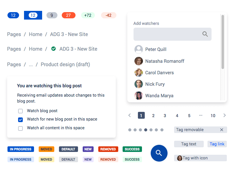
Perhaps the real icing on the cake, however, is a large repository table that comes with a scrolling effect and pagination bar with interaction already added in!
Like with any other app or software, form design in Atlassian products is crucial. For this type of UI design, it’s important to place simplicity and functionality on a pedestal.
That’s why, in the forms category of this kit, we’ve taken care of all the simple bits and pieces for you, such as the Atlassian type fields, dropdown menus and lists, date and time pickers, toggle buttons and spinners.
You’ll even find a password box with inline text and color validation, along with a simple text box area that already includes the necessary interactions, letting the user write paragraphs of text.
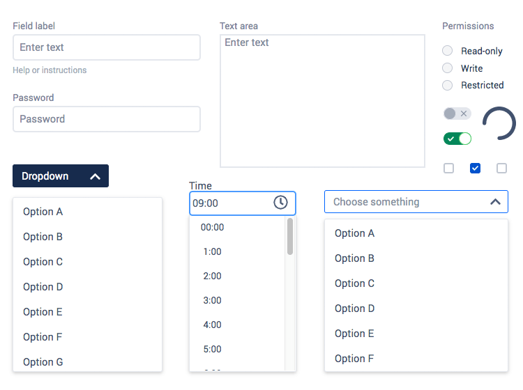
Perhaps the cherry on top though, is the data and time picker that already comes with a pre-designed pop-out calendar and scrollable hour picker that lets the user choose the date and time. On choosing the date and time, the user’s selection then appears in the field. This eliminates the busy-work of having to add in these designs and interactions yourself.
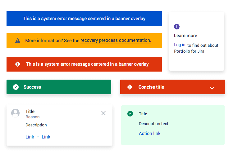
Regular messages informing the users of the status of any project or bug are fairly commonplace across Atlassian apps. That’s why we’ve dedicated a full category to helping you design messages that display helpful information to the user.
Here you’ll see colorful banners displaying informative, danger and warning overlay messages. You’ll even be able to dispose of the typical flag dropdown message component, with interaction already added to the dropdown arrow icon, customizable message and button with a highlighting feature.
To get started designing your Atlassian web app prototypes, the first thing you have to do is download our prototyping tool! Then just follow these short and simple steps below:
- Download the Atlaskit UI kit from our UI kits page
- Open Justinmind on your desktop
- Navigate to widgets on the menu bar
- Select “Add/remove libraries”
- Under “Default libraries”, scroll down till you see the Atlassian kit
- Click “Add to widgets”
- Have fun designing your screens!
To demonstrate what you can do with our Atlaskit UI kit, we’ll look at two examples of screens you can create.
For the first screen, we’ll quickly put together a project management page. All we have to do is open up a new “web prototype”. Then we’ll drag over a side menu, “hamburger icon”, a “plus” and “search icon”. This will form the basic navigation of the app.

Next, well drag and drop an “avatar entity” to denote this task as design tasks. Then we’ll bring over some text labels so that users can navigate to various places on the Atlassian app, such as backlogs, sprints and new launches.
Further right of the screen, we’ll drag over a few more of those little avatar icons to show who’s involved in the tasks. Then add in a tabs link component. This has built in interactions that highlights the options on mouse hover and highlights them when the user selects them.
For the project cards, it’s a simple case of dragging and dropping a “Flag message” component onto the “canvas” and then duplicating so that we have eight per page. All that’s left to do here is to change the text!
Lastly, below the cards we’ll add a pagination component with interaction so that our app can have ten or more pages of tasks.

For our second example, we’re going to put together a simple, no-nonsense project management screen. Firstly, we’ll drag and drop an information banner from the kit onto the canvas that informs the user what’s happening on the page (in this case it’s the apparition of the new task they’ve created).
Following that, we’ll add in a “default button” and duplicate it four times, rename and reorder them so that they appear like in the image above. Now all we have to do is add in an editable “text field”, to describe the task, and another field below for users to add in comments. We can then play around a bit more, adding in a “selection component” for users to select the department, as well as a few more elements like “label” and “tag buttons”.
Lastly, bringing over those date and time pickers we discussed above will be a nice touch as it will let the user select a time and date for, let’s say, a sprint meeting!
Now all that’s left to do is hit simulate! Click on a few elements and see how your Atlassian screens look and how the elements work!
Here are some tips for designing an Atlassian product interface with the Justinmind Atlaskit UI kit. Following these guidelines will help you design the UI in a way that matches their Atlaskit design system and helps beginners and power users alike recognize it and have the same experience.
Atlassian isn’t a product that shys away from using bold and vibrant colors, albeit with a purpose. They use color to draw the user’s attention to an important part of the UI. Now let’s talk color palettes.
The primary color palette Atlassian uses for its products are bold and bright, while the secondaries are warm colors that contrast nicely and help the bolder colors blend in. It also means that elements like project management lozenges, tags and issue badges feel more inviting. The base color scheme for these palettes consists of eight colors.
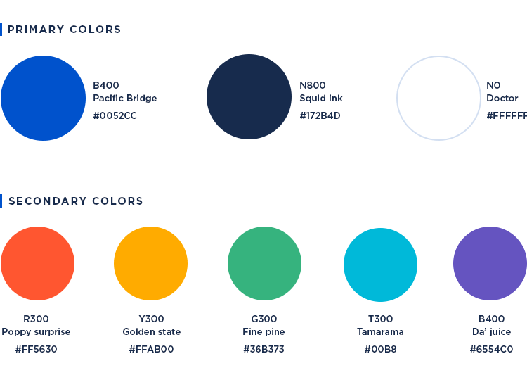
Their extended palette includes various shades of the primary and secondary palettes so you have plenty of legroom to work with when it comes to elements and illustrations. This extended palette goes up to 24 colors.
Furthermore, it’s important to notice that Atlassian are serious about using color combinations that comply with AA standard contrast ratios. You should always ensure any UI you design in Justinmind has enough color contrast between text and background, as well as between elements to support people with low vision and color blindness.
When it comes to fonts within Atlassian products, the status quo is quite a simple affair: everything in Sans-serif bar code, for which they prefer to use monospace fonts. The reason for this is to create readable copy throughout its products so the user can digest information quickly.
For Windows, you’ll be using Segoe UI, for Mac, any of the San Francisco variations or Helvetica Neue and for Chrome or Android – Roboto, Noto or Droid Sans.

Lastly, when it comes to iconography, you’ll want to make sure that you use icons that help the user understand the UI and its functions. An example of this would be the way that Atlassian uses both filled and outlined icons.
Normally when something on the UI is “switched on”, they use a filled icon to indicate it. On the contrary, an unfilled icon often means that something is “off”. The only exception to this is when the icons are on the navigation panel, in which case they should be always outlined so they contrast well with the background color of the UI.
When it comes to an icon denoting a group of sub items, you should add depth to signify that there are more detailed options behind it. Small elements such as circles should be solid to improve legibility when scaling down.
If you’re looking to tailor Atlassian UI interfaces, Justinmind helps you get it done quickly and easily, while taking the users into account. You’ll be able to put together stunning interactive Atlassian prototypes in no time that demonstrate functionality and are ready to be passed on to the developers.
Why not take the Justinmind Atlaskit UI kit for a test drive today?