Free Vuetify UI kit: tune up the way you prototype your digital products

Justinmind’s free Vuetify UI kit is now available! Check it out and see how you can tune up the way you prototype your digital products.
Justinmind’s free Vuetify UI kit offers a game-changing set of components so that you can turn your design concepts into stunning UIs with user-friendly experiences. Our Vuetify components offer sleek design components with extensive built-in interactions, and unparalleled flexibility to empower you to create outstanding user interfaces like never before.
So, what makes Vuetify stand out from the crowd? Using Vuetify ensures that you can leverage the power of Vue.js and its reactive capabilities while benefiting from Vuetify’s rich component library. The combination of these two provides a robust foundation for your web and mobile app prototypes. Moreover it is built upon the principles of Google’s Material Design!
So whether you are designing for this or any other framework, our UI kit the best option to ensure a modern and visually appealing product or brand design that engages users. Both seasoned or enthusiast designers can take advantage of this kit and start prototyping better products effortlessly.
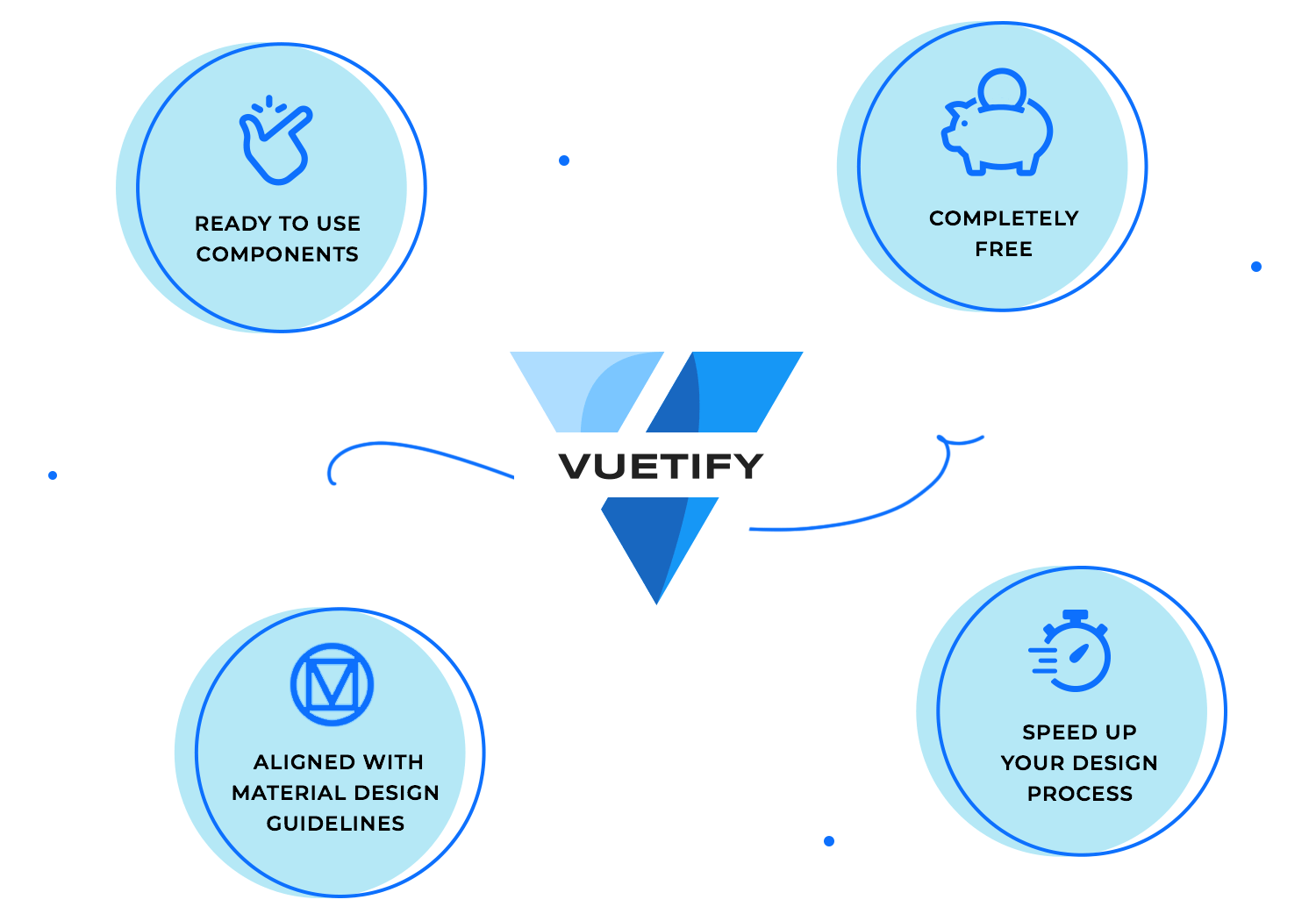
This comprehensive prebuilt library offers an extensive variety of Vuetify UI components, covering everything from buttons, forms, and navigation menus to simple and advanced data tables, toolbars, cards and lists. With over 280 UI components at your disposal, you can easily bring your web and app designs to life and create functional, beautiful digital experiences in no time.
Justinmind’s free Vuetify UI kit is made up of a collection of prebuilt UI components that are ready to use. They all have been carefully made from scratch by the pros here at Justinmind so you can take a shortcut and speed up your design process.
With plenty of drag and drop components that align with Material Design guidelines, this kit ensures your applications look nice, have good usability, are consistent and follow clear guidelines. Helping you design a digital product that stands out for all the right reasons.
Taking advantage of this UI kit or any other of the free Justinmind UI kits available for you can help you get ahead early and create a complete and scalable user experience based on the latest Vuetify style guidelines and themeing. You’ll be able to do so on time and within a budget!
Let’s see what is included.
From simple elements to multiple interactive cards and including all Vuetify’s variants, this UI kit understands the importance of customization, and gives you complete control over every aspect of the UI components, allowing you to fine-tune and tailor the components to suit your specific project requirements.
Here’s a list of the UI components:

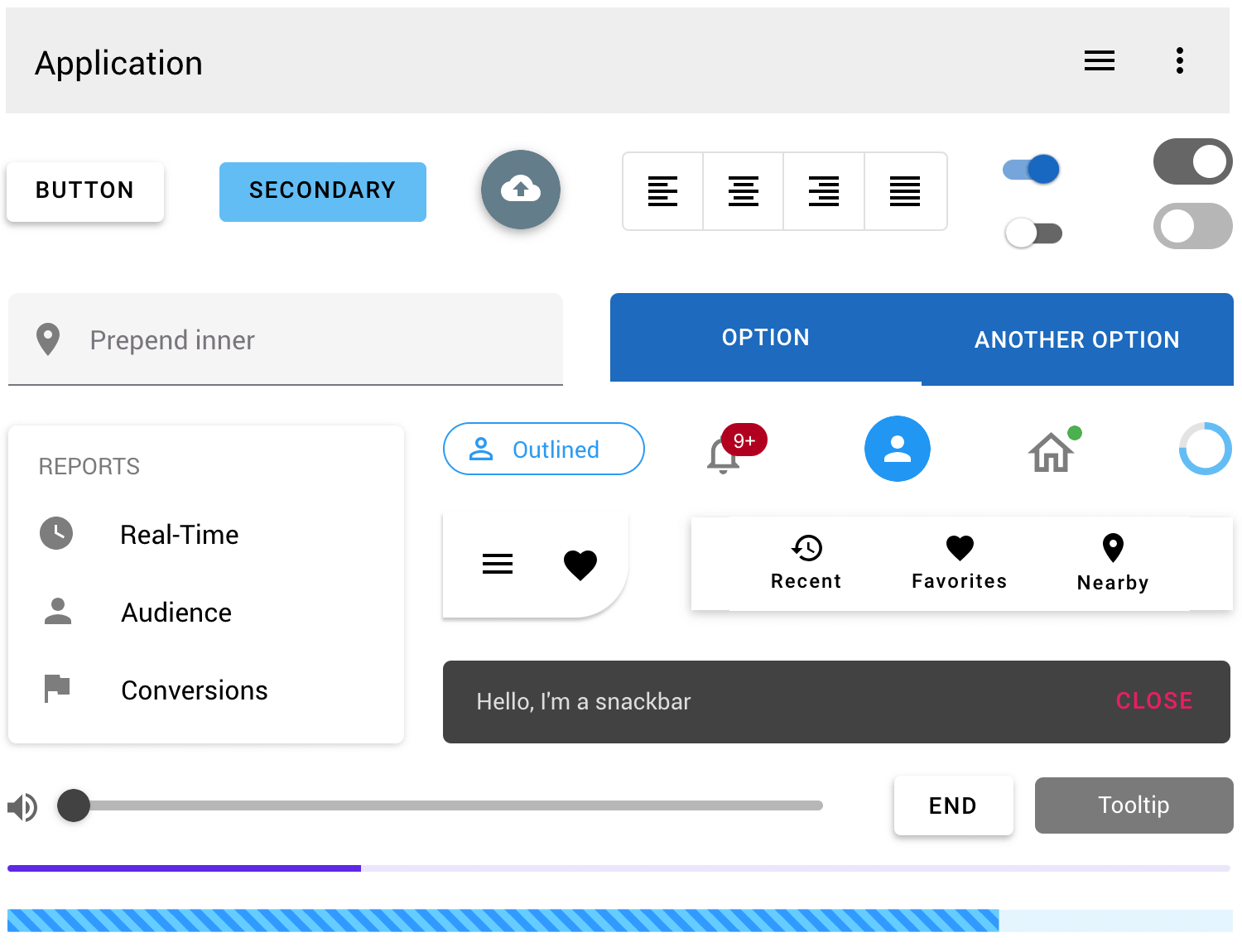
Text: here you’ll find a wide range of typography options for any type of text content.
Buttons: this category includes all the essential buttons with built in interactions in all their variants.
Button toggles: all the most commonly used toggle buttons, including multiple selection and reactive text to build an efficient workflow.
Forms: here you’ll find a wide range of input fields, that go from simple to advanced, suited for different tasks. There’s check boxes, radio buttons, and input fields with different feedback.
Selects: this category includes the most popular select menus for displaying options.
Lists: the components in this category will help you display data in different list formats including default lists, lists with grouped items or sub groups as well as with subheaders, all options come with built in interactions.
Controls: here you’ll find a range of accordion and expansion panels, in addition to different overlay components, toggle switches and rating elements.
Chips: All the chip variants you need to allow users to enter information, make selections, filter results or take actions. You’ll find components ranging from simple chip variants to filtering lists with chips.
Sliders: here you’ll find a selection of slider bars to help you display a range of values that the user can select. They are ideal for users to select a single value that usually reflects an intensity level from min to max.

Menus: this category includes the most popular menus from Vuetify, ranging from simple top, bottom and end menus to advanced, hover and popover menus, all with built-in interactions and ready to use.
Toolbars: as the hub of your site navigation to perform the most common operations fast, the toolbar is key in your design. In this category you’ll find a selection of the best ready to use toolbars that you can easily customize to your project or brand.
Navigation and App navigation: here you’ll find a selection of navigation components, including different breadcrumb and pagination options, as well as a range of navigation drawers and tabs. App navigation includes a variety of application bars designed specifically to help users move throughout apps.
Footer: the components in this category include a variety of footers, from basic and simple to multiple line footers with icons and color.
Tables: this category will help you display and organize data in groups or hierarchies. You’ll find a selection of the most commonly used table styles such as basic, dark mode, and scrolling tables to name a few.
Data display: here you’ll find components that will provide additional information about any element in your layout, be it pictures, notifications or statuses. It includes a variety of avatars, icons and badges.

Feedback: this category includes UI components that will display quick information to the user. Some of the components you can find here are tooltips, banners, snack-bars and alerts in a variety of Vuetify’s variants.
Progress bars: in this category you’ll find a complete collection of linear and circular components that are great to give users visual feedback on progress status.
Cards and grids: this category includes a set of cards and grids for displaying different types of content blocks and data. You’ll also find file and toolbar loader cards that are ready to use.
Dialogs: here you’ll find all the different dialogs available in Vuetify, so you can choose how to best add dialogs to your design. They all can be easily customized to the last detail to fit your content -from basic to large overflowed dialogs with and without scroll.
Carousels: the components in this category include a series of interactive slideshows for rotating through visual content. They are drag and drop and include all built in interactions, ready for you to customize to fit your design goals.
Timelines: the most stylish way to display information in chronological order. This category includes a variety of timeline components from simple to advanced, and in different styles, colors and layouts.
You can use our kit to explore new design ideas or to bring your digital product design to life confidently and efficiently, following design best practices and guidelines.
To get started, you must first download the Justinmind prototyping tool if you haven’t already. Follow the steps below and start designing.
- Download the free Vuetify UI kit from our UI kits page
- Justinmind will open on your desktop
- Navigate to the Libraries palette, where you should see this kit
- Browse, drag-and-drop and customize!

In case you’re seeking some inspiration or don’t know how to get started, we’re here to help. Checkout these comprehensive collections of top app and web app examples!
If using a pre-designed UI components library can save you from a few to several hours of work in a design project, then we highly recommend you save all your preferred and customized components so you can reuse it in future projects or scale it to your design team. In our learning section you can learn more about how to streamline the design process by creating your own custom library.
Doing so will save you even more time -and money, it will also ensure consistency overall so that your applications adapt seamlessly to various screen sizes and devices, guaranteeing an optimal user experience across desktops, tablets, and smartphones.
Using Justinmind’s libraries gives an unparalleled level of convenience to prototype your web and mobile designs that are not only aesthetically pleasing but also deliver a user-friendly experience. Moreover using Justinmind enables a seamless transition from design to development.
The Vuetify kit for Justinmind is a great option to design well-documented digital products and digital experiences -from concept to the final design!
PROTOTYPE · COMMUNICATE · VALIDATE
ALL-IN-ONE PROTOTYPING TOOL FOR WEB AND MOBILE APPS
Related Content
 Justinmind 10.7.5 now includes Samsung Galaxy S25 & S25+ simulators, allowing designers to create high-fidelity prototypes with accurate dimensions and real-world interactions.1 min Read
 Justinmind 10.7 is here with the iOS 18 UI library, new device frames like iPhone 16 and Pixel 9, and integrated design templates for seamless prototyping. Experience smoother workflows and intuitive design.3 min Read
 Justinmind's groundbreaking innovations in prototyping technology have earned it the prestigious Proddy Award for Best Prototyping Product of 2024.4 min Read


