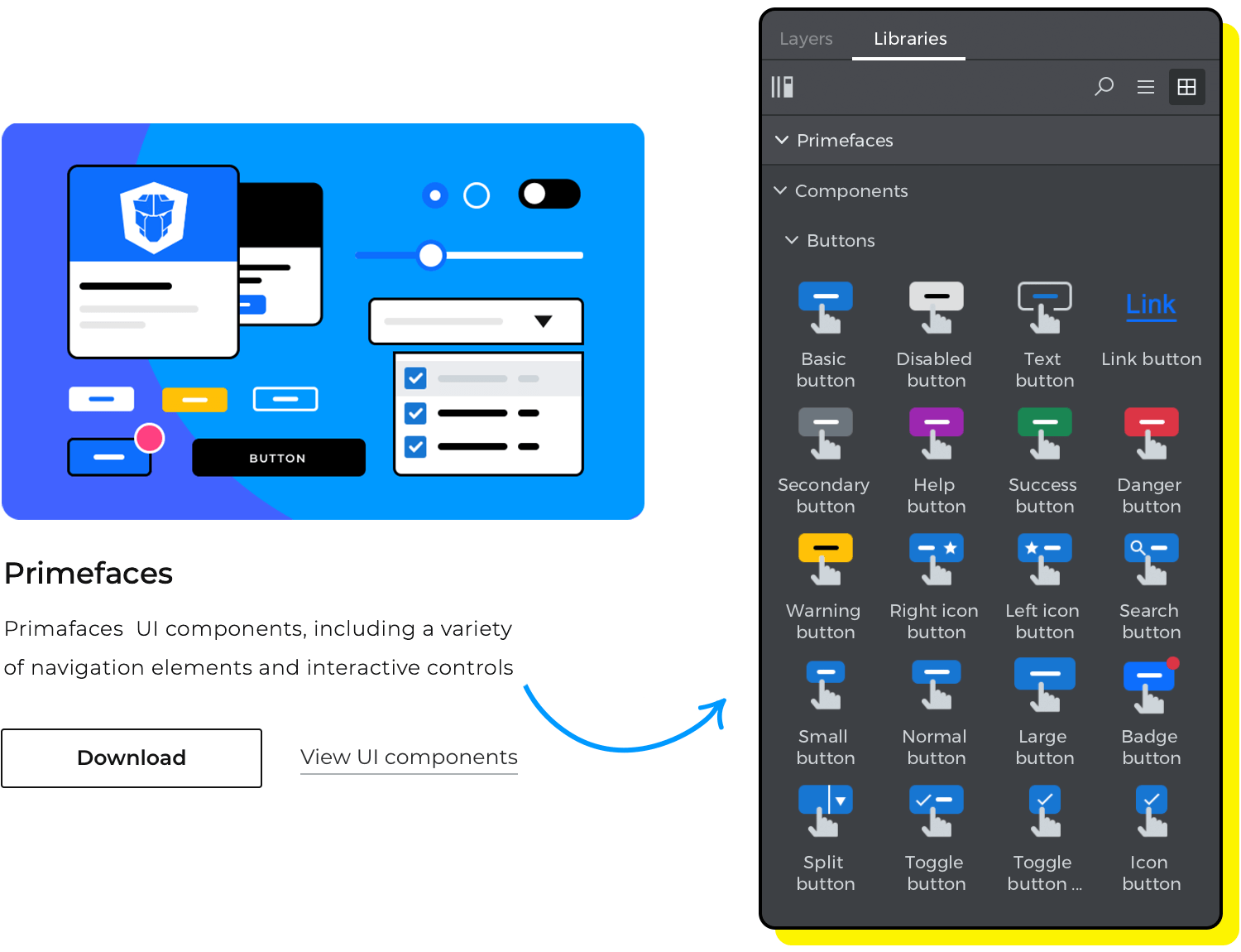
Justinmind’s free Primeface UI kit is now available! Check it out and see how you can create interactive, friendly and powerful UI and UX without the need to start from scratch.
The collection of components in this kit has been carefully crafted to significantly enhance your design process. When it comes to designing a Primefaces UI, our ready-to-use UI kit will help you get started fast. It is easy to use, offers a wide range of customization options, and follows design best practices -so you can create any kind of digital products.
This set of components includes all the most used Primefaces widgets, so you take full advantage, and save countless hours when designing a JavaServer Faces project or for any other framework really. See how to get started designing your app’s UI and UX right away!
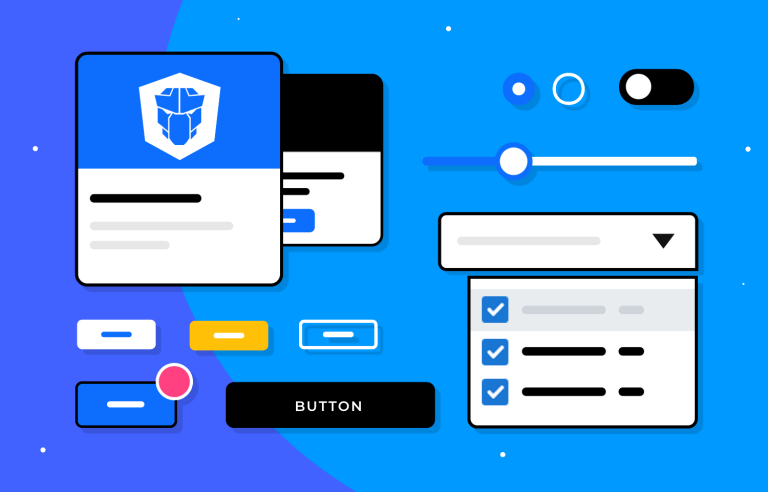
With our free PrimeFaces UI kit, designers have access to a vast collection of components such as buttons, forms, tables, selects, and navigation menus, all readily available to drag and drop, and allowing you to focus more on crafting engaging user experiences rather than spending time designing and editing components from scratch.

All the components in this library follow design best practices and Primefaces theming that you can easily customize to fit your product or brand’s look and feel. Justinmind’s components libraries are created so that you can modify the appearance, behavior, and interactions of these ready to use widgets to match the specific requirements of your app. In other words, you’ll be able to design unique and tailored interfaces while maintaining consistency with the overall design vision and Primefaces style.
You’re just a few clicks away from creating fabulous designs using Primefaces components, but before you do so, check out below the complete list of the categories included in Justinmind’s free Primefaces UI kit.
Having a beautiful and functional UI design and user experience plays a pivotal role in creating successful digital products. And an essential step for UI/UX design is creating an app wireframe and prototype that you can test and iterate on fast and easy. To help you do so, the designers at Justinmind have put together this complete pre-designed collection of components based on the latest Primefaces design guidelines and theming.

Here’s a list of the categories you can find in this library:
Text: here you’ll find all the most popular Primefaces texts. This section includes all the different text groups you might need such as general headings ranging from H1 through H6 as well as different size paragraphs and subtitles.
Buttons: here you can find a collection of pre-built buttons including Basic, secondary, search, warning disabled and help buttons in all their variants according to Primefaces styling.
Forms: our form fields, include a variety of the most used text inputs that appear in forms and dialogs. With built-in interactions, you will find fields with text indicators, error messages, input fields for numbers and to search. In addition, we have included radio and checkbox widgets.
Selects: here you’ll find a selection of interactive UI elements that allow users to specify options. This category gives you all the different select menus variants -from basic select dropdowns to more advanced options, including multiple selection, different cascade selects, tree select with filter, etc.
Lists: lists in this category range from basic lists boxes to lists with filters, template list boxes and tree lists with and without checkboxes -all with built in interactions.
Controls: in this category you’ll find all the components that allow users to make selections, filter and enter data such as date and time pickers, select buttons, toggle switches, rating icons and groups, in addition to a selection of exclusive Primefaces fieldsets .
Sliders: all the slider variants according to Primefaces styling: range slider, input field sliders, steps sliders to name a few.

Navigation: here you’ll find a selection of navigation menus and buttons, including speed dial, breadcrumb, grouped and pop-up menus, slide menus and mega menus, as always with built-in interaction ready to navigate and find your way around your app design.
Data tables: here you’ll find a collection of pre-built tables with different configurations that you can use to conveniently display data. These time-saving and user-friendly components include a tree table, table with checkbox selection, a sort table, scroll table and a spanning table.
Data display: here you’ll find a wide range of badges, chips, avatars, pills and labels in different shapes and sizes that you can use to add notifications or statuses to your UI elements.
Feedback: the components in this work perfectly to engage and communicate with the user and avoid any confusion about any element or action. You’ll find a variety of progress bars and the complete range of alert messages in Primefaces.
Cards and dialogs: the ready-to-use cards and dialogs in this category will help you present specific information in an overlay and prompt the user to take action. An example of the components you’ll find here are confirmation pop-up, overlay panels, confirmation dialogs and advanced cards to organize different content blocks.
To get started designing a better web app with our free Primefaces Ui kit you must first download the Justinmind prototyping tool if you haven’t already. Follow the steps below and start designing.
- Download the kit from our UI kits page
- Justinmind will open on your desktop
- Navigate to the Libraries palette, where you should see the Primefaces library
- Browse, select and tailor to your needs. You’ll never look back.
By following these tips, you’ll be well on your way to designing intuitive and visually appealing applications or websites using PrimeFaces elements.
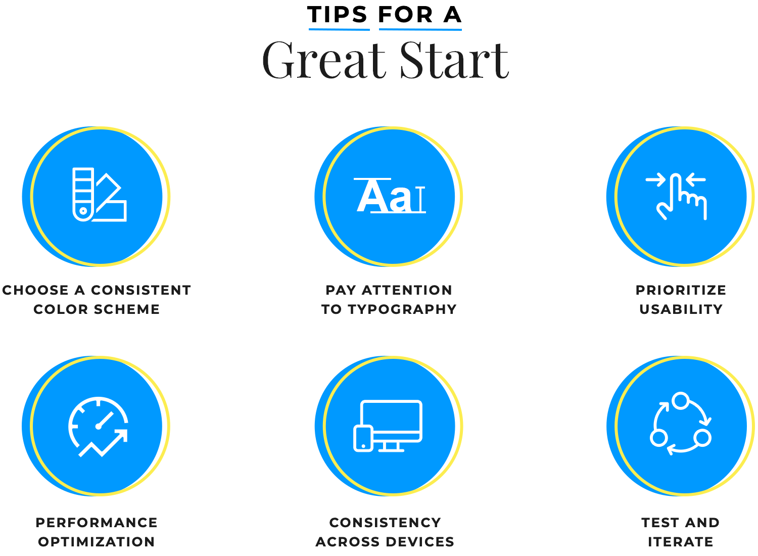
Understand the available components: PrimeFaces offers a wide range of components, including input fields, buttons, data tables, dialogs, and more. Familiarize yourself with the available components and their features to choose the ones that best suit your application’s requirements.
Follow PrimeFaces guidelines: PrimeFaces provides comprehensive documentation with examples and usage guidelines for each component. We’ve read it and our free Primefaces UI library with ready to use components is a pure joy to work with and it follows all of those guidelines and styling.
Pay attention to spacing, typography, and color schemes to ensure consistency throughout your application and across devices.
Performance optimization: PrimeFaces components are rich and feature-packed, which can impact page load times if not used efficiently. Optimize your pages by minimizing unnecessary component usage and reducing data transfer.
Test and Validate your design: Justinmind is an all in one collaboration tool that will also allow you to run user tests and iterate based on feedback for a better user experience validation. Take advantage of these features to improve the user experience and minimize time to deployment.
Once you’ve customized and made all the tweaks to your UI components to create the unique visual identity for your project, you can go on and save and publish those components in your own custom (and reusable) UI library.
Doing so will not only save you tons of time, effort and money, it will also facilitate the design and/or iteration of your projects and ensure consistency overall. Think of it as a collection of all of your product’s or brand’s identity standards readily available for you and your team to use.
Designing an app or website from scratch can be resource-intensive. By using ready-to-use UI libraries with interactive components such as this one, you can significantly reduce both the time and cost associated with UI and UX design. The saved time can be allocated to other crucial design tasks, such as user research, usability testing, and interaction design.
Get started now to improve your workflow and create seamless user experiences for your digital products.
PROTOTYPE · COMMUNICATE · VALIDATE
ALL-IN-ONE PROTOTYPING TOOL FOR WEB AND MOBILE APPS
Related Content
 Justinmind 10.7.5 now includes Samsung Galaxy S25 & S25+ simulators, allowing designers to create high-fidelity prototypes with accurate dimensions and real-world interactions.1 min Read
 Justinmind 10.7 is here with the iOS 18 UI library, new device frames like iPhone 16 and Pixel 9, and integrated design templates for seamless prototyping. Experience smoother workflows and intuitive design.3 min Read
 Justinmind's groundbreaking innovations in prototyping technology have earned it the prestigious Proddy Award for Best Prototyping Product of 2024.4 min Read


