Interactions and animations
In this section, you’ll find explanations of operations within the Events palette and Events dialog, as well as the various triggers, actions and effects you can use to make interactive prototypes.
The Events palette
All events are created, viewed, edited or deleted in the Events palette once the element has been selected on the Canvas.
The Events palette consists of:

- “Add interaction”. Click to create a new event. In the dialog that appears, in the top left-hand corner is the Event trigger and the Action drop-down menus, which are used to define events for a selected element
- Every tab groups actions by event trigger. An element can react to different triggers and inside each trigger, it can execute many actions.
- Interactions defined for the current event trigger. An interaction is a collection of actions and they can also have chains of conditions.
- Actions defined for the current interaction. Each interaction can include one or more actions
The event operations toolbar:

- Create a new event (‘+’)
- Copy all events of the selected element to the clipboard
- Replace the events by the ones that are at that moment in then clipboard. The references to the element where they were copied from will change to the one selected.
- Delete (‘X’) all events defined for the selected element
- Switch between icons and text mode
Event operations
Click on the ‘gear’ icon next to an event to perform the following operations:

- Add a new interaction(s) for this event trigger
- Copy event and its interactions to a different UI element’s event trigger
- Copy event interactions from one event to another for the same UI element
- Paste the interactions copied to the clipboard
- Delete event and its interactions
Interaction operations
Click on the ‘gear’ icon next to an interaction to perform the following operations:

- Modify the interaction’s name
- Copy this interaction
- Move the interaction
- Delete this interaction
Action operations
Click the ‘gear’ icon next to the word “Do” to perform the following operations:

- Add another action that runs after the previous one
- Modify selected action
- Copy selected action
- Paste selected action
- Order the action left or right so it runs prior to the previous or after the next action.
- Select targeted elements
- Delete selected action
Actions can be modified one by one or as a group.
The sequence of interactions in an event
By default, interactions will run in the order in which they have been created. Click the ‘arrow’ icon to reveal options to change their position in relation to other interactions.

- After previous: the events will proceed in order
- With previous: the events will proceed simultaneously
- Time after previous stated: the events will proceed after a specified time
The sequence of actions in an interaction
By default, actions will run in the order in which they have been created. Reposition actions and re-order them by dragging and dropping them into place, or shifting them left or right (see above section “Action operations”).
Their position can also be defined by clicking on the ‘arrow’ icon, which shows the following options:

- After previous: the actions will proceed in order
- With previous: the actions will proceed simultaneously
- Time after previous stated: the actions will proceed after a specified time
Events Dialog
After clicking “Add Event” the Events Dialog will appear.
- Trigger selector to define the start of the interaction
- The resulting action selector to define the result of the interaction
- The event canvas
- The attributes to be changed
Event triggers for web prototypes
Choose from the following event triggers to make interactive web prototypes:
Events triggered by user interaction with the mouse

- On Click (the user’s mouse clicks a UI element in the Canvas)
- On Mouse Down (the mouse clicks and holds an element)
- On Mouse Up (the mouse clicks an element and then releases it)
- On Double Click (the mouse double clicks an element)
- On Right Click (the mouse right clicks on an element)
- On Toggle (the mouse toggles between two states of a UI element)
- On Mouse Over (the mouse hovers over an element and the corresponding action runs until the mouse moves away from the element)
- On Mouse Enter (the mouse hovers over an element and the corresponding action runs even after the mouse moves off the element)
- On Mouse Leave (the mouse moves off an element)
- On Drag Start (the mouse starts to drag an element to another location)
- On Drag (the mouse drags an element to another location)
- On Drag Stop (when the mouse moves off an element after dragging it across the screen)
Events triggered by user interaction with the keyboard

- On Key Up (the user presses the up arrow key on their keyboard)
- On Key Down (the user presses the down arrow key on their keyboard)
Events triggered when…

- On Page Load (the current/a new screen loads)
- On Page Unload (the user leaves the current screen)
- On Window Resize (the size/resolution of the displayed screen changes)
- On Scroll (the user scrolls up, down or across the screen)
- On Variable Change (when a variable is used to control the prototype’s data)
Event triggers (gestures) for mobile prototypes
Choose from the following event triggers to make interactive mobile prototypes:
Events triggered by user interaction with the mobile device screen

- On Swipe Up (the user performs an upwards swipe gesture)
- On Swipe Down (the user performs a downwards swipe gesture)
- On Swipe Left Up (the user performs a leftwards and upwards swipe gesture)
- On Swipe Left (the user performs a leftwards swipe gesture)
- On Swipe Left Down (the user performs a leftwards and downwards swipe gesture)
- On Swipe Right Up (the user performs a rightwards and upwards swipe gesture)
- On Swipe Right (the user performs a rightwards swipe gesture)
- On Swipe Right Down (the user performs a rightwards and downwards swipe gesture)
- On Pinch Open (the user presses two fingers to the screen and moves them away from each other)
- On Pinch Close (the user presses two fingers to the screen and moves them closer together)
- On Pinch Left (the user presses two fingers to the screen and moves them to the left of the screen)
- On Pinch Right (the user presses two fingers to the screen and moves them to the right of the screen)
- On Rotate Left (the user rotates the screen anti-clockwise)
- On Rotate Right (the user rotates the screen clockwise)
- On Portrait (the user rotates the device so it is in portrait mode)
- On Landscape (the user rotates the device so it is in landscape mode)
Actions for web and mobile prototypes
Choose from the following actions to be the result of the selected trigger:
Link To

This action allows the user to navigate to another screen in the prototype or an external URL.
- Navigate to another screen, the previous screen (back button), or to an external URL
- The target page opens in a pop-up window or in a new tab
“Link To” events can have transition effects to be shown between changing screens.
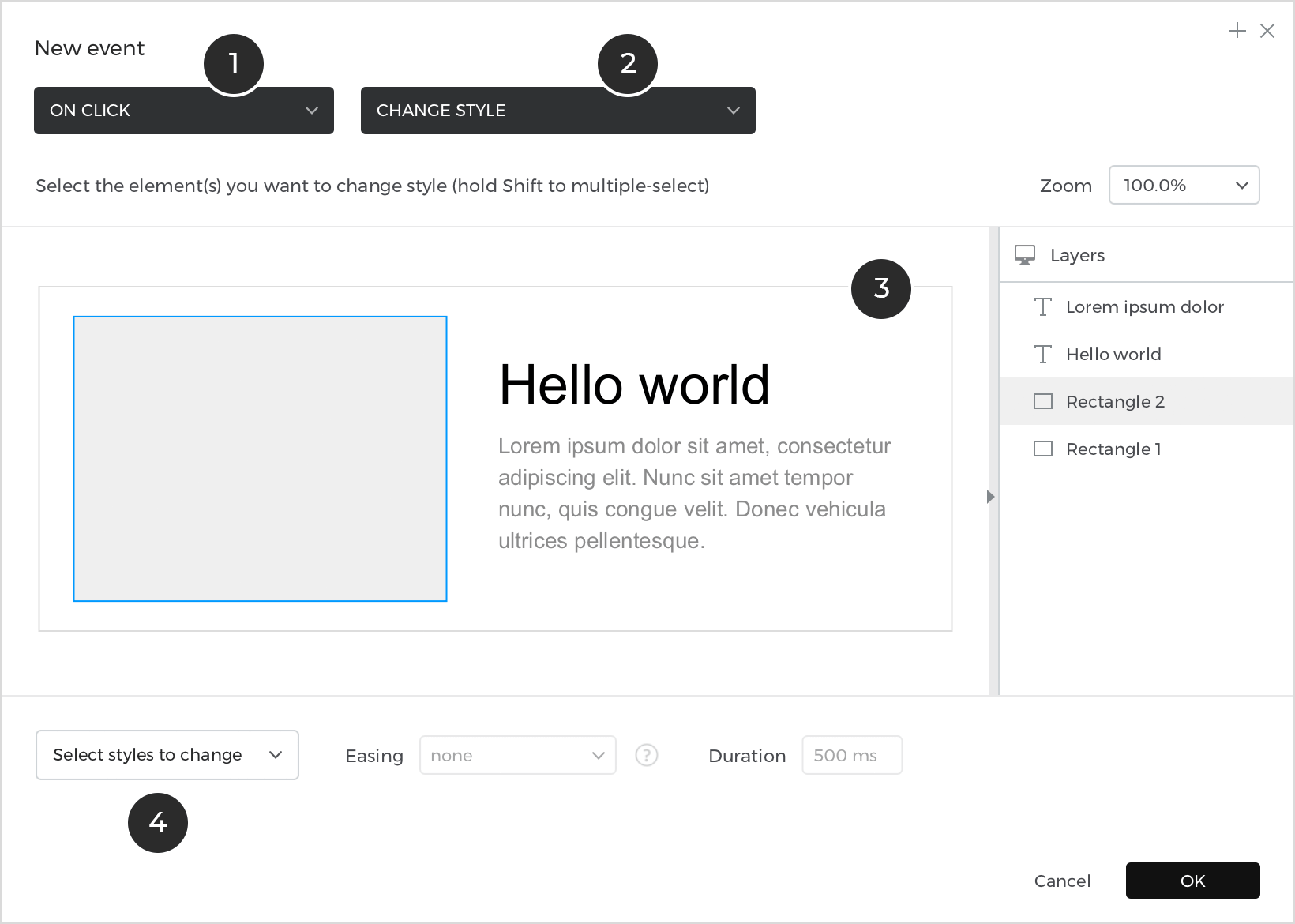
Change style
This action changes the style of a UI element. Multiple styles and formatting attributes of an element can be changed within a single Change Style action.

- The element to be modified
- The styles/attributes to be modified, and the desired modifications
Show
This action makes a previously hidden element appear.
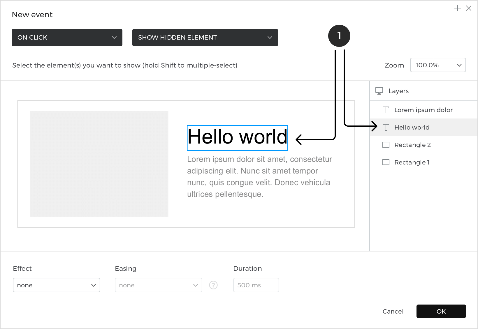
- The element(s) to be shown.
Hide
This action hides a previously visible element.

- The element(s) to be hidden.
“Show” and “Hide” actions can have effects and easing.
Set Active Panel
This action changes the active panel within a Dynamic Panel, enabling the user to interact with that panel’s content.

- The selected panel from the drop-down at the top of the dynamic panel on the Canvas.
- The selected the panel from within the dynamic panel in the Outline palette
Like “Link To” actions, “Set Active Panel” actions can also have transition effects.
Set Value
This action (sets) assigns a value to an element in the current screen or to a variable.

- Radio button to select from “Components” or “Variables”
- The widget to assign the value to
- A type of value, either Fixed or Calculated. A fixed value is entered in the input field, and a calculated value opens the Value Expression builder
UI elements that can add “Set Value” actions include:
- Basic elements containing text: Text and Paragraph elements,
- Buttons and text cells within Text Tables
- Forms and input elements e.g. Input Text Fields, List Boxes,
- Check Boxes and Radio Buttons
Select Value
This action selects a value or group of values from a selection element e.g. Select Lists (single selection elements) or Radio Lists, Check Lists and Multi-Select lists (multi selection elements). The value(s) to be selected can be defined by a fixed or calculated value.

- The single selection element to be changed
- A fixed value from the drop-down menu or the “Calculated” radio button to define a value with the Value Expression builder
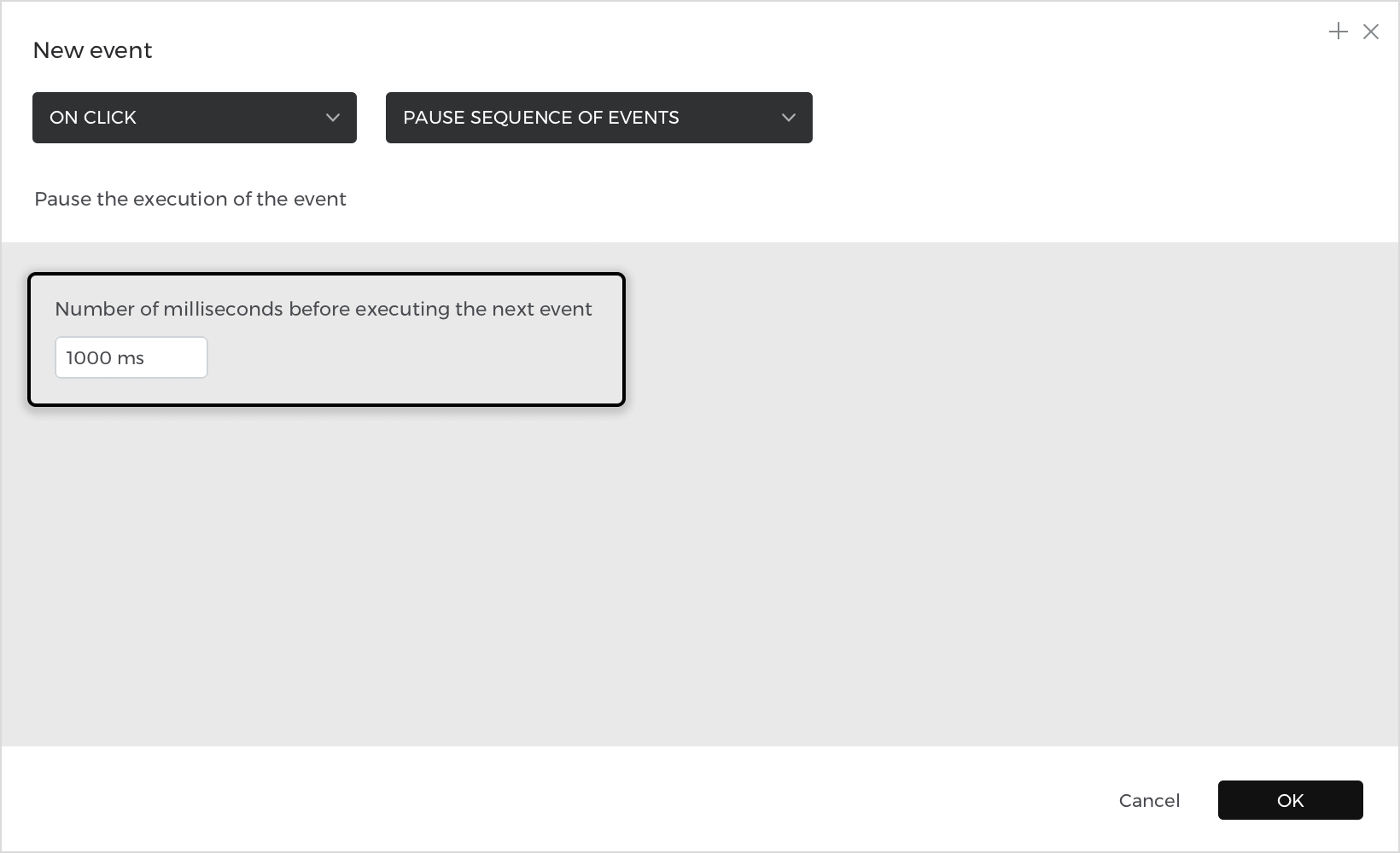
Pause
This action pauses the current event and delays pending actions defined for the same event trigger. Indicate the pause duration in milliseconds.
Move
This action repositions an element on the Canvas. Define its movement to the left (X) or up (Y)

The X (Left) coordinates:

- Current: to not modify the selected coordinate
- Fixed: to move the element a specified distance and have it remain in that position
- Offset: to move the element a specified distance and enable it to be repositioned again if the user repeats the action
- Calculated: to reposition the element as a result of the defined expression
The Y (Top) coordinates:

- Current: to not modify the selected coordinate
- Fixed: to move the element a specified distance and have it remain in that position
- Offset: to move the element a specified distance and enable it to be repositioned again if the user repeats the action
- Calculated: to reposition the element as a result of the defined expression
“Move” actions can have easing effects.
Resize
This action changes the width and height of an element.

- Current: to not modify the width or height of the element
- Fixed: to modify the width or height of the element indicating a specific amount
- Percentage: to scale the element to proportion
- Calculated: to set the width or height as a result of the defined expression
“Resize” actions can have easing effects.
Rotate
This action rotates elements such as Image, Text, and Shape elements, as well as Dynamic Panels and groups of elements.

- The element to rotate
- The angle rotation’s value (it can be fixed, offset or calculated)
Like “Move” and “Resize” actions, “Rotate” actions can also have easing effects.
Insert Into
This action inserts an element into a container element. When an element is inserted into a container, its absolute position will remain the same if the container has a free layout. If the container has a fixed layout (horizontal or vertical), the element will be positioned next to the container’s closest child.
Container widgets include Dynamic Panels and Text Table cells, Data Lists and Data Grid cells.
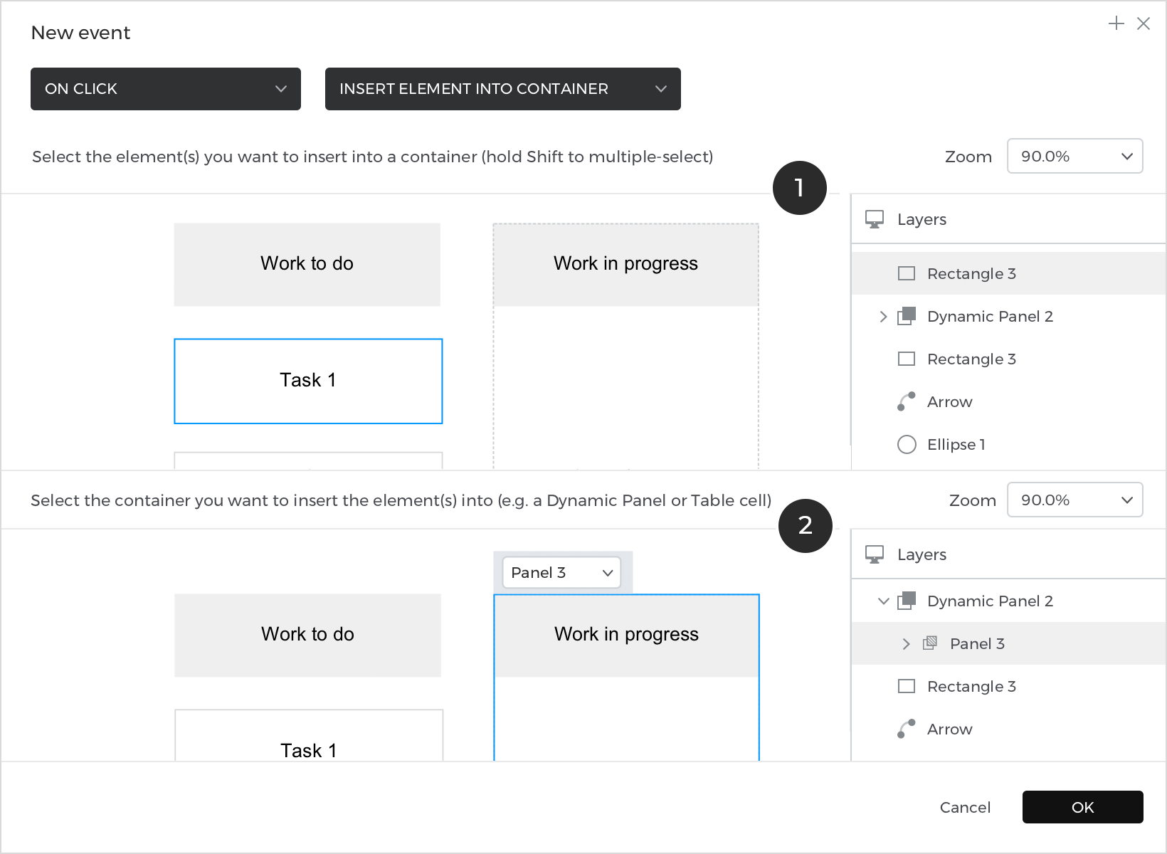
- The element to insert into another.
- The second Canvas to select the element to insert it into
Data Master Action
This action is directly related to Data Masters. A Data Master is a set of records that defines a prototype’s object and allows you to build data-driven prototypes. Learn how to use Data in Justinmind.
This action modifies a Data Master e.g. add new records to it, or modify or delete existing ones.

- Add a new record to the Data Master
- Modify the Data Master’s records
- Delete a record from the Data Master
Set Focus On

This action sets the focus on an Input Field or a selection element.
Scroll to
This action allows the user to easily navigate to an element currently out of view. When this action runs, the screen will scroll until the target element appears.

- The element to scroll to
- The direction and easing to scroll
Enable/Disable Input
This action enables or disables an input or a selection element, controlling whether or not the user can interact with it.

- The input or selection element to enable/disable
- “Enable” or “Disable” radio button
Paginate Data Grids
This action relates to Data Lists and Grids. This action navigates through the pages of a Data List or Grid.

- The data list or grid to paginate
- Paginate to First Page, Previous Page, Next Page or Last Page
Play Audio
Use to add an audio file (.wav or .mp3).

- File browser to choose a .wav or .mp3 audio file from a folder
- Tests the audio file
Effects and Easing
Certain actions can have effects and easing, which show defined movement or transitions during the action’s duration.
Effects
“Show” and “Hide” actions can have effects defined in milliseconds. These effects include:

- Blind: This makes the element move as if blinking
- Bounce: This makes the element bounce vertically or horizontally across the screen
- Clip: This makes the element float upwards
- Drop: This causes the element to drop
- Explode: This makes the element explode into several pieces
- Fade: This makes the element gradually increase in transparency and come out of view. Define the length of the effect expressed in milliseconds.
- Fold: This makes the element fold like a piece of paper
- Highlight: This highlights the background with a defined color
- Puff: This scales and fades out elements
- Pulsate: This makes the element look as if they are vibrating
- Shake: This shakes the element vertically or horizontally
- Slide: This makes the element move along in a continuous contact with the screen. Choose from Slide Up, Down, Left and Right effects
Easing
“Show”, “Hide”, “Move”, “Resize”, “Rotate” and “Scroll To” actions can all have easing effects defined in milliseconds. These effects include:

Transition effects
“Link To” and “Set Active Panel” actions can have transition effects defined in milliseconds. These effects include:

- Fade: A gradual change in the transparency level of the screen or panel.
- Flip horizontal: A rotation around the Y-axis of the screen or panel.
- Flip vertical: A rotation around the X-axis of the screen or panel.
- Flow: A conveyor belt like transition.
- Pop: A gradual change growing steadily in size and visibility of the screen or panel.
- Slide and fade: A combination of slide and fade transitions.
- Slide up: A smooth movement of the the screen or panel to the top.
- Slide down: A smooth movement of the screen or panel to the bottom.
- Slide left: A smooth movement of the screen or panel to the left.
- Slide right: A smooth movement of the the screen or panel to the right.
- Turn: A smooth movement similar to a page turn.