Forms and inputs
With Justinmind, you can prototype interactive forms to simulate user input experiences, such as registration, login, and search forms.
Creating a form
To create a form in Justinmind, you’ll need to use widgets. Look to the Toolbar located under the plus sign in the top left corner of your screen. Here, you’ll find widgets commonly used in forms, including: Input Text Fields, Checkboxes and Radio Buttons, Select Lists, and more.
You can also download our pre-made forms and import them into your Widgets palette.
Just drag a widget onto the Canvas to start creating your form.

All form and input widgets are automatically interactive during simulation – no Events needed. Just click “Simulate” and you’ll be able to interact with them.
Depending on which device you’re using in your prototype, the appearance and functionality of these widgets will differ. For example, in iPhone device prototypes, focusing in on an Input Text Field during simulation will automatically show an interactive device keyboard.
You can add additional widgets with an input style into your prototype by adding other widget libraries.

Once you’ve designed your form, you can start to add Events to create sophisticated interactions. We’ve created a few example exercises to give you an idea of a few ways to do so. Check them out below.
Autopopulate forms
In this exercise, you’ll learn how to autofill two Input Text Fields after hitting the tab key in the first Input Text Field.
Follow these steps to complete the exercise:
- Create a new prototype, for your form; use a Text, Input Text Fields, and a button from the Toolbar.
- Select the Button, and go to the Events palette.
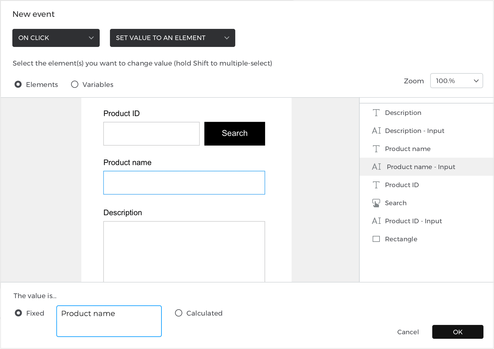
- Click “Add Event” and select the “On Click” trigger; select a “Set Value” action.
- For the target, select the second Input Text Field, and type in “Product name” for the value. Click “OK” to finish building the event.
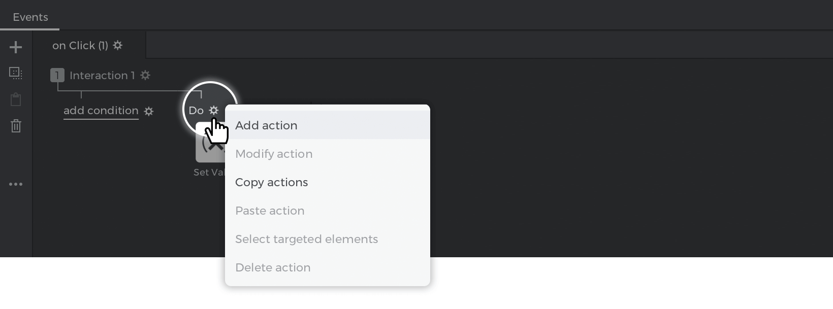
- Go to the Events palette, click on the gear icon next to the word ‘Do’ and select ‘Add action’. Create another “On Click” + “Set Value” action and select the third Input Text Field as the target, and enter something as the value set by the action.

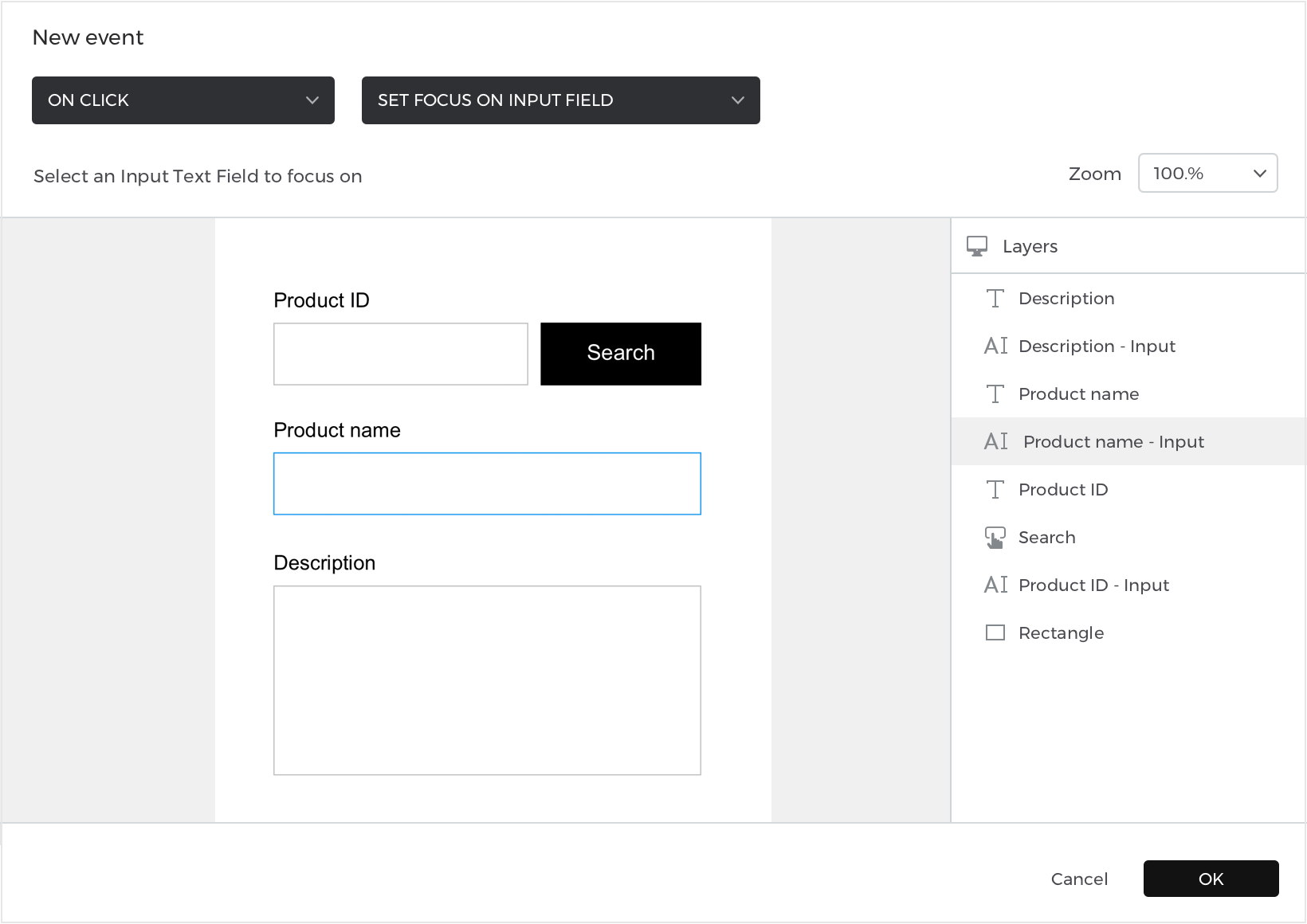
- Looking again to the Events palette, click “Add Interaction”. Leave the trigger as “On Click” and change the resulting action to “Set Focus On” and select the second Input Text Field as the target to be focused on.

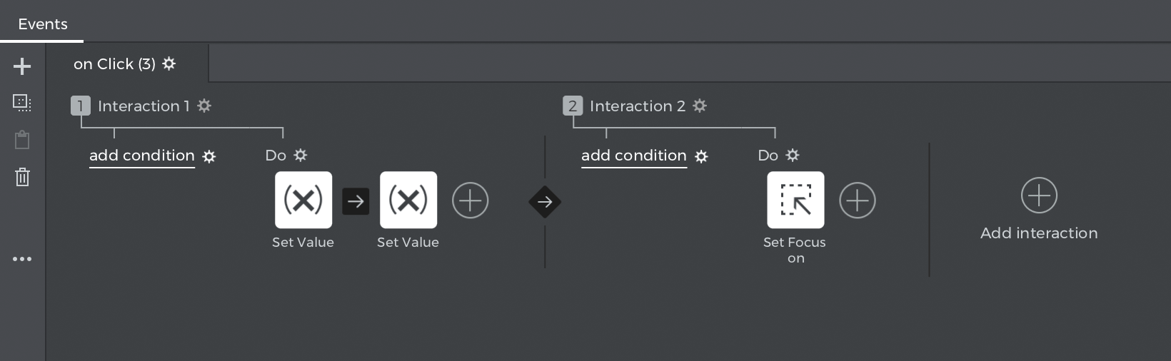


That’s it! Click “Simulate” and enter some text in the first Input Text Field. Then, hit the TAB key and you’ll focus on the second Input Text Field and see the values autofilled.
You can download the example here.
Screen flow validation
With Justinmind, you can create and simulate a multi-step form using variables and screen flow validation. In this example, you’ll learn how to create a mobile input form with multiple screens. In the last screen, the user will see a summary of all the details they have filled in.
To design a multi-step form in your prototype, follow the steps below:
Designing the screens
- Create a new prototype with two screens.
- On the first screen, drag three Texts and name them “Username”, “Email Address” and “Password”
- Drag an Input Text Field below each Text Field, there should be three in total
- Add a button in the bottom right corner of the screen that will be used to navigate to the next screen.
- Go to screen 2 and add the same Text Fields with the Input Text Fields below each text.
- Go to the Variables palette and add three variables, one for each input field.
Adding the Events
- Go to Screen 1 and create an “On Tap” + “Link To” event, and link to Screen
- Repeat Step 2 for the next two Input Text Fields.
- Go to Screen 2 and look at the Variables palette. Select a variable and drag it to the corresponding text element on the Screen. This will create an “On Page Load” + “Set Value” event, and will set the value of the Text element to the variable’s value.
- Repeat Step 3 until each Text element has been assigned its corresponding variable.
- And that’s it! Click “Simulate” and interact with your prototype. You’ll see that your answers appear in the summary on the last page.
You can download the example here.
Validating required fields
In this example, we’ll learn how to use conditions to validate an input form so all required fields are filled accurately.
Follow these steps to learn how:
Designing the form
- Create a prototype and create three Input Text Fields in the canvas (you can find the input fields in the toolbar inside the plus icon menu).
- In the Properties palette, give each Input Text Field a placeholder value of “First name”, “Email*”, and “Phone Number*”. You can define the placeholder text in the Properties palette.
Note: The Input fields that contain the ‘*’ character will require the user to input text in them in order to complete the form. Additionally, note that the email field will require a “xxx@xxx” format.
- Create Button widget at the bottom of Screen 1.
- Go to Screen 2 and create a “Success” message to inform the user that they have successfully entered their details.
Adding the Events
We’ve created a static input form. Now, we’ll add events using conditions to make our form interactive and identify which fields must be filled in to successfully navigate to the next screen.
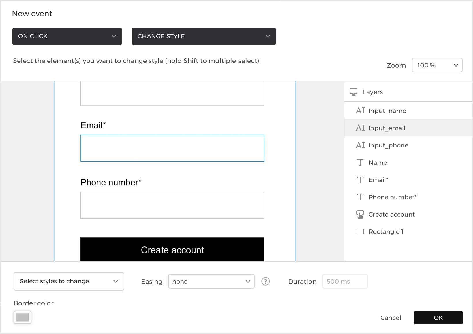
- Select the Button in Screen 1 and go to the Events palette. Add an “On Click” + “Change Style” action, selecting the “Email*” Input Text Field. Select the border and text color options from the dropdown, and set them to the current color of the Input Text Field. Then, click “OK” to exit the dialog. This will change the appearance of the Input Text Field to be its default color when the user has entered the correct information.

- Look back to the Events palette and click the “add condition” text above the event you just created. In the Conditional Expression builder, follow these steps to create the condition:
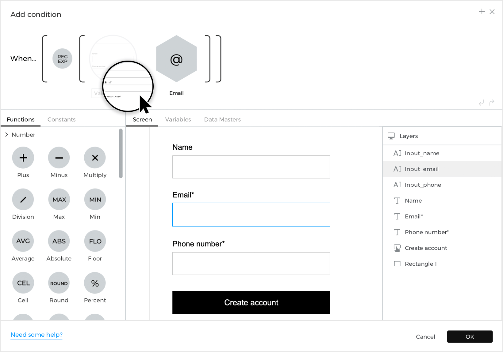

1. Drag the Regular Expression text function to the first space in the expression.
2. In the space that appears, drag the postal code Input Text Field from the dialog Canvas or from the dialog outline.
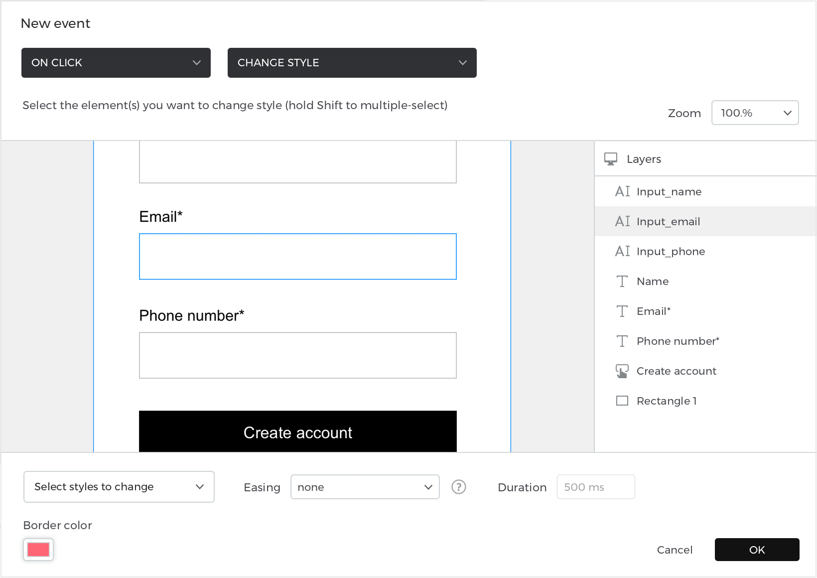
3. In the second space, drag the Postal Code constant. Click “OK” to finish building the condition. - Look to the Events you just created, and click “Else” text. Add another “On Click” + “Change Style” action, again selecting the “Postal Code*” Input Text Field and select the Border color and Text color options from the dropdown. This time, change the style of the border and the text to red. The red style will indicate to users that the Postal Code Input Text Field has not been filled correctly.
- Repeat Steps 1-3 for the other required input field (Phone number). Remember to change the components in the Expression builder and the Input Text Fields accordingly.
- Once you have events for both required fields, add one more event to the Button. Create an “On Click” + “Navigate to” event, and then select Screen 2.
- Click on the “add condition” text for this event. Add the following expression:
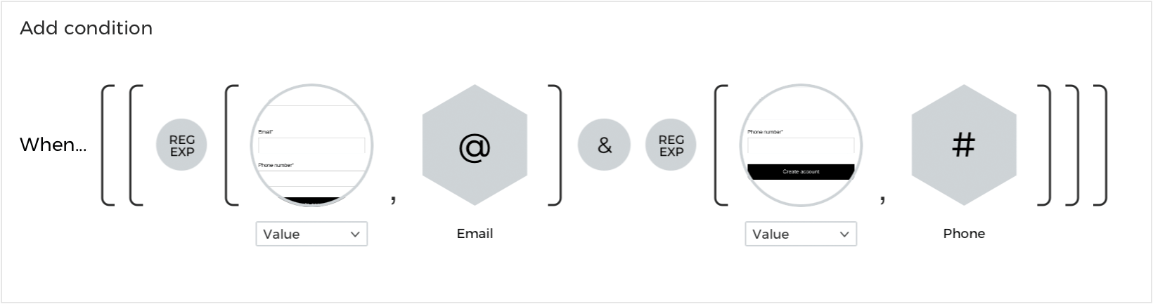
 Note: the condition must exactly match this image in order for the event to trigger correctly


And that’s it! Click “Simulate” to interact with and enjoy your input form in your prototype.