Create a basic responsive prototype
In this exercise, we’ll create a basic responsive prototype using pinned elements and percentage-based height and width.
- Create a new Web prototype. Drag two Rectangle widgets onto the Canvas, placing one at the top of the screen, and one at the bottom. These will act as the header and footers of the prototype.
- Select the header Rectangle. In the Properties palette, look to the Background section. Upload an image to the background of the Rectangle and from the dropdown, choose the ‘Cover’ option. Alternatively, you can choose a color for the Rectangle’s background instead of an image.
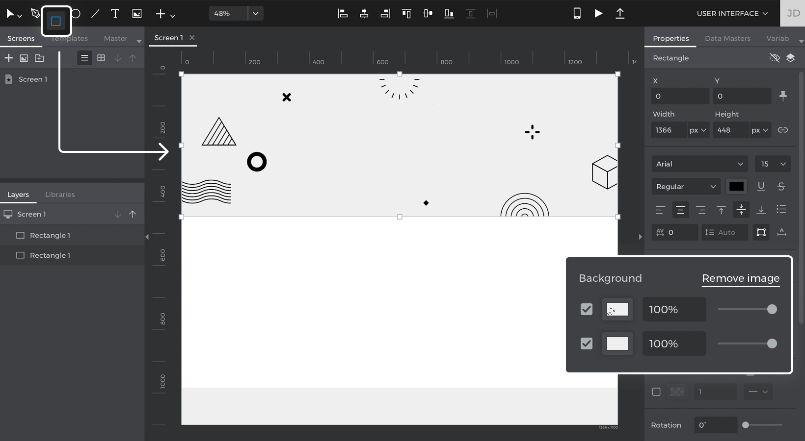
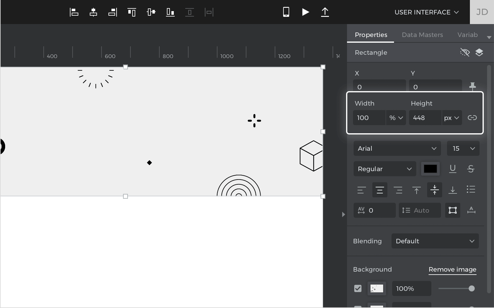
- With the Rectangle still selected, and still in the Properties palette, look to the Size section. For the width, change the ‘px’ dropdown to ‘%’, and change the Width to 100. The Rectangle will now always take up 100% of the screen’s width.

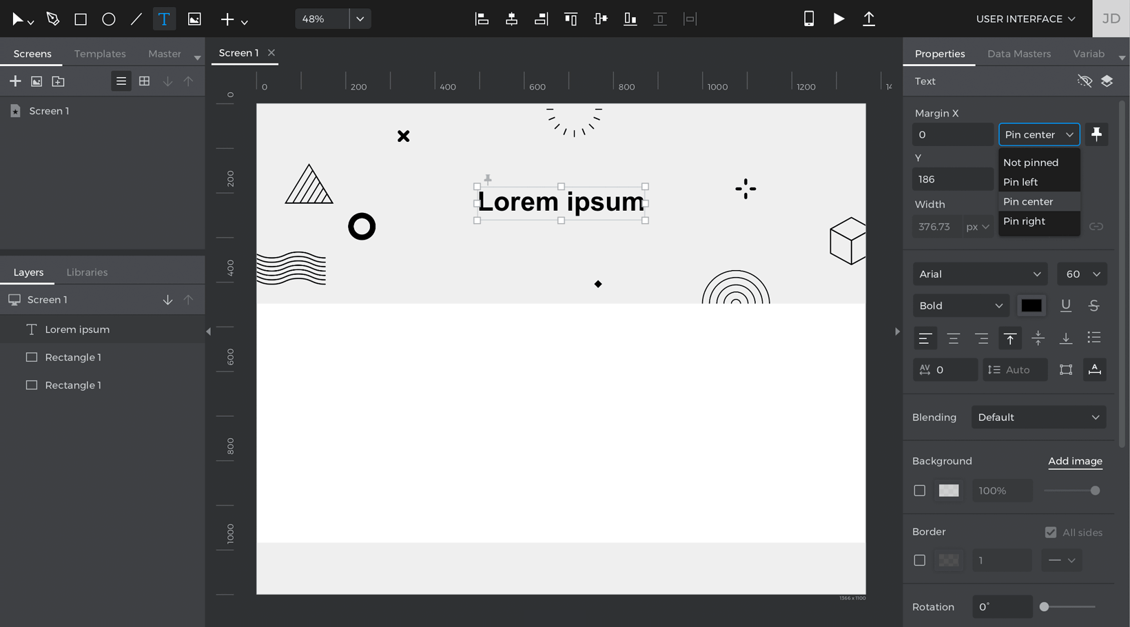
- Drag a Text widget near the top of the header Rectangle. It will serve as the title of the website prototype. In the Properties palette, look to the Position section. Tick the “Display pin position options” box.In the dropdowns that appear, change the ‘X’ parameter dropdown to “Pin to center”. Leave the ‘Y’ parameter fixed. The title Text will now always remain in the center of the screen.

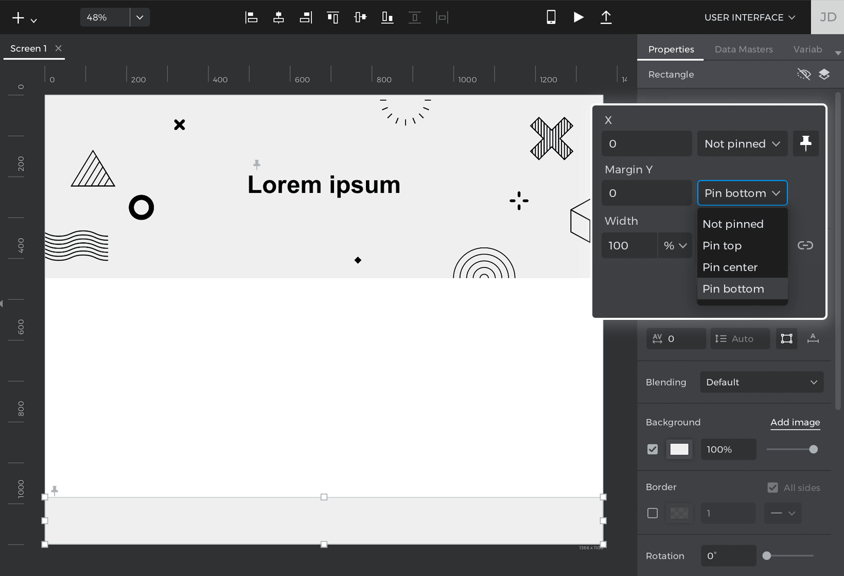
- Look to the footer Rectangle, and change its width to 100%.
- With the footer Rectangle still selected, and still in the Properties palette, look to the Position section and change the ‘Y’ parameter to “Pin to bottom”. Leave the ‘X’ parameter fixed. The footer will now always be shown at the bottom of the screen.

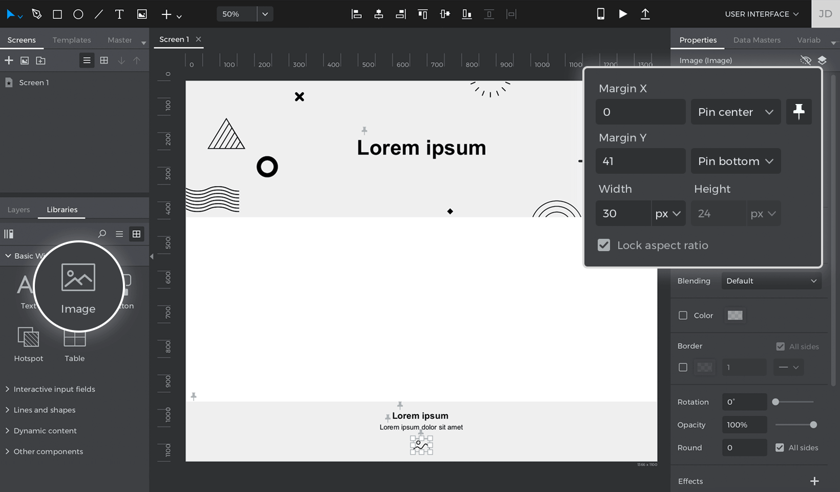
- Near the footer, drag two Text widgets and an Image widget. Change one Text widget to be pinned to center and pinned to bottom, with a 100px margin. Change the other Text widget to be pinned to center as well, and pin it to the bottom with a 72px margin.Lastly, change the Image widget to be pinned to the center and pinned to the bottom with a 41px margin.

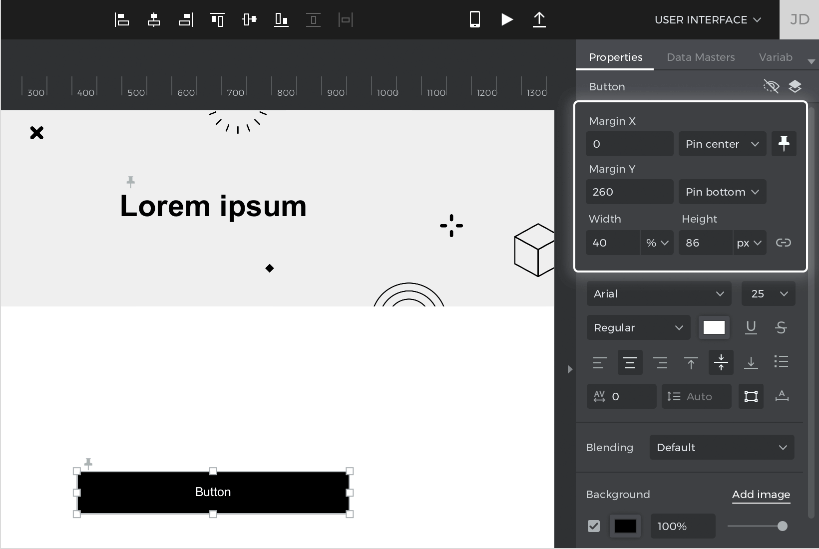
- Drag a Button widget onto the Canvas. Style it as you’d prefer and change its width to 40%. Pin it to the center, and to the bottom with a 260px margin. The Button will now always appear at the center-bottom of the screen, and will always take up 40% of the width of the screen.

- Drag one Text widget and one Rectangle widget onto the top right of the Canvas. Label the Text “Login” and the Rectangle “Sign up”. Change the Rectangle’s background to be transparent, and change its border to be rounded.
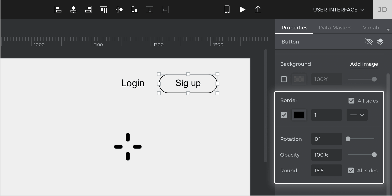

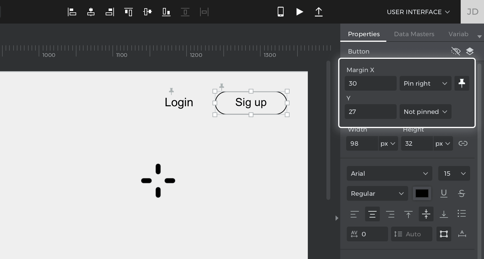
- Select the Text and pin it to the right with a 130px margin. Select the Rectangle and pin it to the right with a 30px margin.

- Drag a Dynamic Panel widget onto the Canvas. In the “Layout” section of the Properties palette, change its layout to Vertical.Then, change the “Top” padding to 40px. There will now be some spacing between the top of the panel and the contents of the panel.
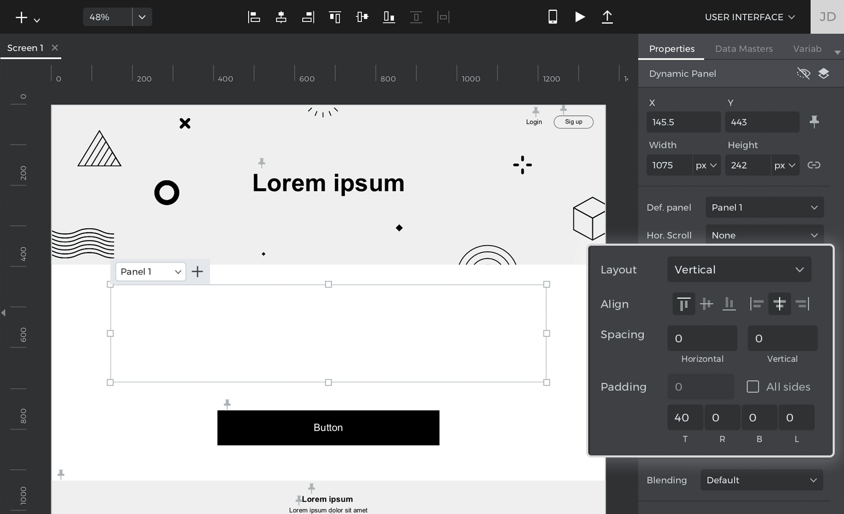

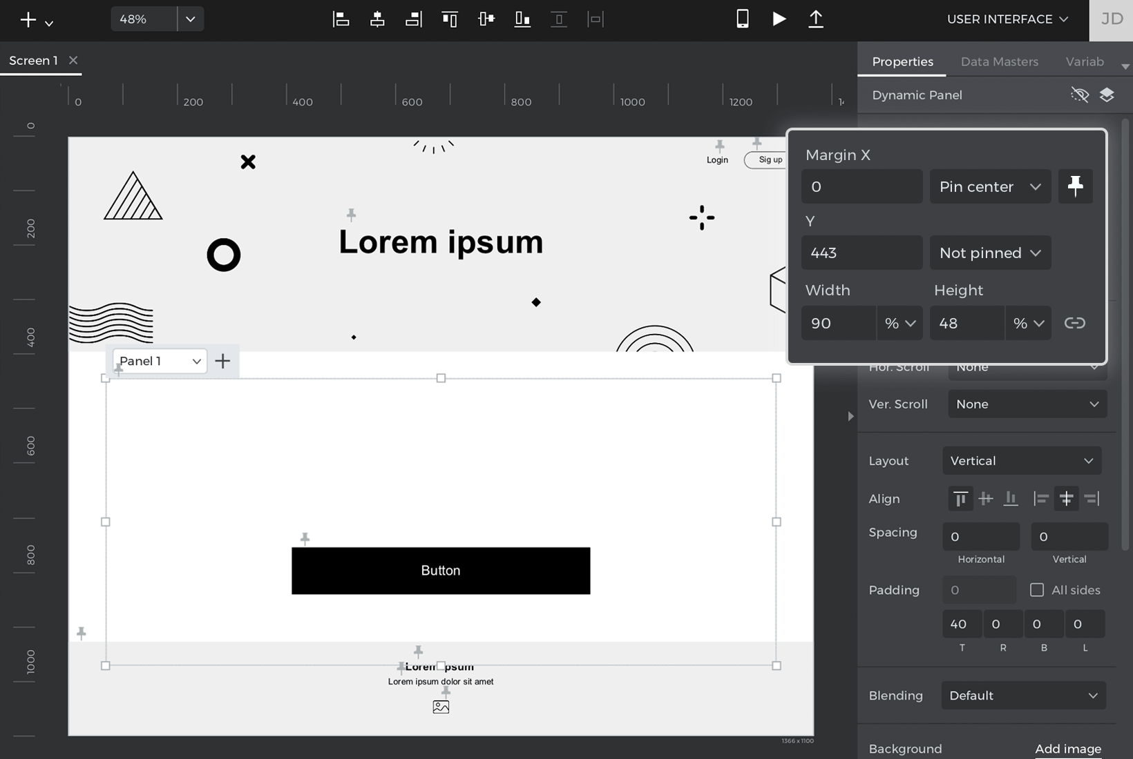
- With the panel still selected, pin it to the center, change its width to 90% and its height to 48%.

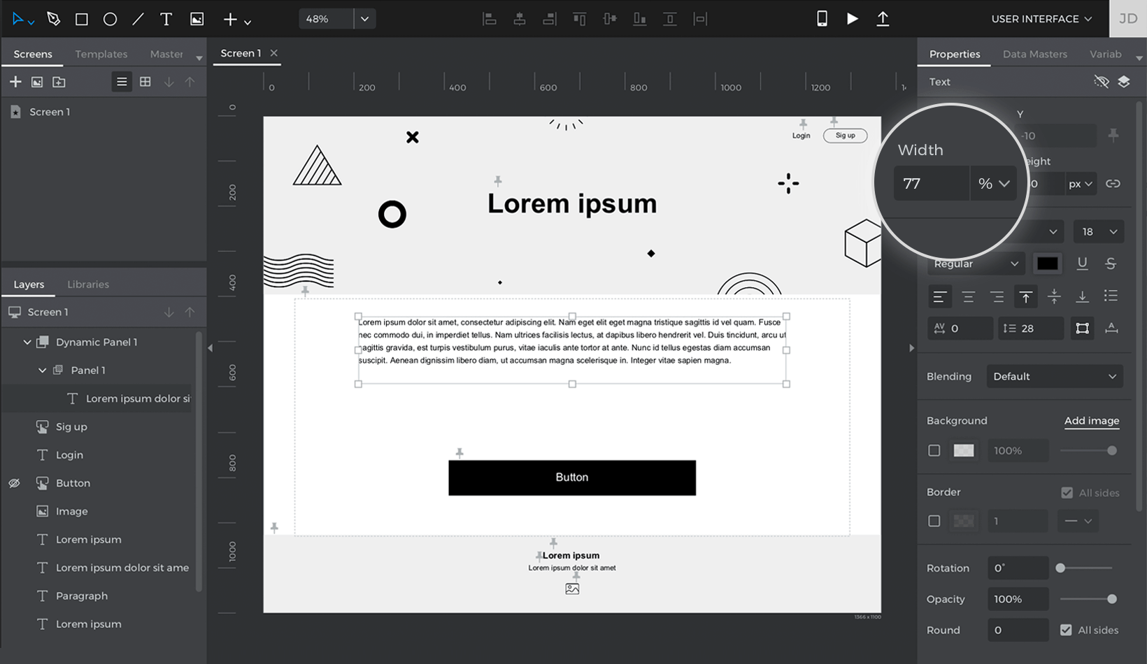
- Double click on the Panel and drag a Text widget into the panel. Change its width to 77%. The Text will now occupy 77% of the Panel’s width, and the panel itself will occupy 90% of the screen’s width.


Click “Simulate” and change the width of the simulation browser. Your prototype will automatically adjust elements to be responsive to the width of the browser.
Note: Simulation settings must be set to expand to the browser width. You can specify this in simulation settings, or in the simulation window.

You can download our example here.