Expert advice to help you create stunning UX flowcharts that help identify what users need and how to give it to them
What’s the big deal with UX flowcharts?
A UX flowchart helps you visualize the steps a user takes to complete a task or achieve a goal on your site or app (the user flow). Identifying and reflecting on how users navigate your site will help you meet their needs more efficiently.
Start new UX flowcharts today. Unlimited projects.

As with everything UX-related, the better designed your flowchart, the closer you are to building a product that users will love to use. If you’re not already designing flowcharts or flow diagrams, don’t panic.
In today’s post, we’ll cover everything you need to design the perfect UX flowchart. We’ll show you how to get started, what to include and what tools to use, as well as how to avoid potential pitfalls. So if you’re keen to stay relevant in the world of user-centered design, it’s time to learn about UX flowchart design!
A UX flowchart is a simple map that shows the steps a user takes on your website or app. It’s like a guide that helps you see how people move through your product to reach their goal.
Creating a UX flowchart is easy. First, you look at how users might start using your site. Then, you draw out each action they take, like clicking buttons or filling out forms. This helps you see where things might go wrong so you can make the experience better.
You can make flowcharts with pen and paper or use design tools.
Flowcharts can be made using simple tools like pen and paper or digital software. The key is to keep things clear and easy to follow. A well-designed UX flowchart helps you see your product through the eyes of the user, making sure their path is smooth and enjoyable.
Now that we know what a UX flowchart is, let’s see how to create one. Just like a map, a flowchart uses symbols to show each step in the user’s journey. These symbols make it easy to understand what’s happening at every point. Let’s break down some of the key elements you’ll need to design a clear UX flowchart.
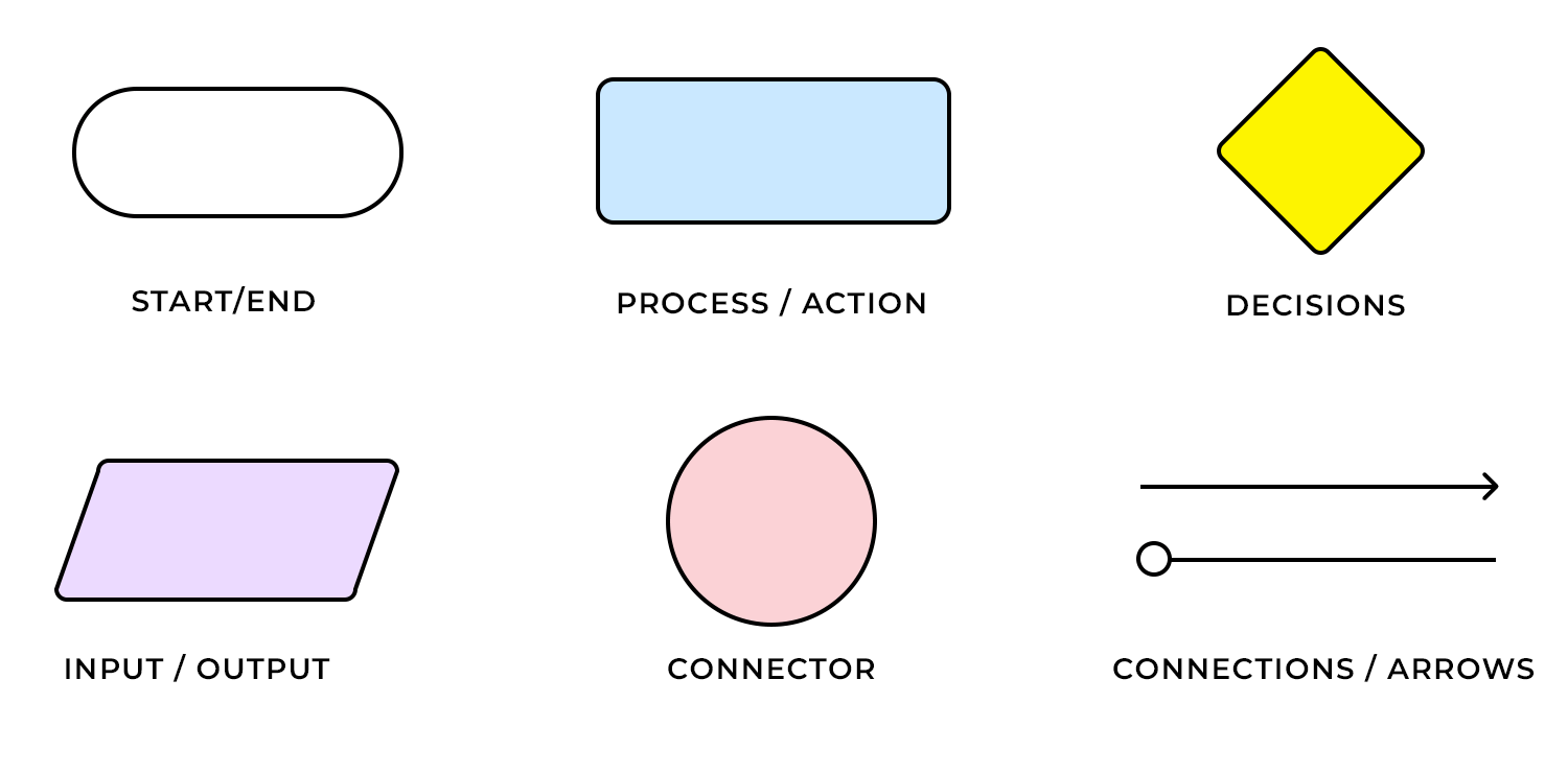
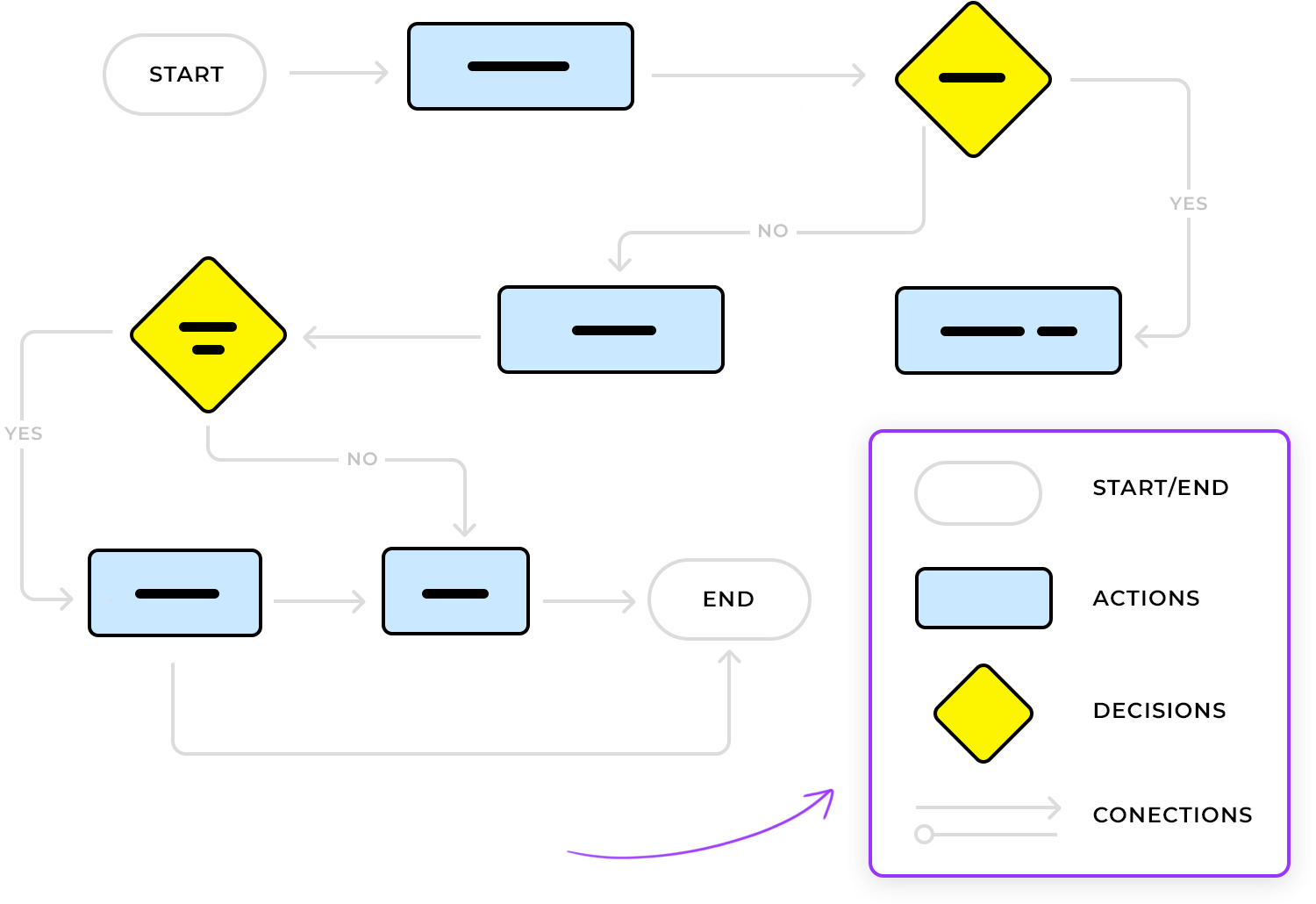
Start point: this is where the user’s journey starts. It could be when they open your app, land on your homepage, or click a link. In most flowcharts, the start point is shown as a simple oval shape. It’s like the first step on their path.
Actions: actions are what the user does, like clicking a button, filling out a form, or selecting a menu option. These are usually shown as rectangles. Each action moves the user closer to their goal.
Decision points: these symbols are like forks in the road. They represent moments where the user has to make a choice, such as “Yes” or “No,” “Accept” or “Decline.” We use diamonds to show these decision points, making it clear that the user can take different paths.
Arrows: arrows are the connectors that guide users from one step to another. They show the flow of actions and decisions, helping everyone understand how each part of the journey is linked.
End point: this is where the user’s journey wraps up. It could be completing a purchase, signing up, or simply reaching a confirmation screen. Like the start point, the end point is often shown as an oval. It signals the goal has been reached.
Use these symbols to build a clear and easy-to-follow flowchart. Remember, you want to make the user’s journey as smooth as possible, so keep your symbols simple and your chart clean.
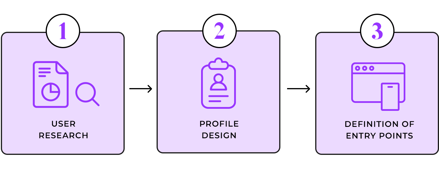
Designing an efficient UX flowchart begins with the user. Who’s going to use the system? Start by conducting user research and designing user personas, as this will help you define your target audience and their needs.
Next, think about how users will access your product. This is when entry points are introduced. An entry point is the means by which a user first arrives on a site/app, (e.g. by searching for it organically in their browser), allowing them to flow through the site towards their final destination. Take a look at the below example of a user flow and its entry point:
Note that if a product has more than one target user, it’s likely to have multiple entry points. With your entry point(s) defined, you can start exploring how users will navigate your site with a UX flowchart, following the best practices of UX design.
There are lots of ways to create your flowchart – pen and paper, using digital flowchart tools like Lucidchart, and even a wireframe tool such as Justinmind. However, one of the main benefits of creating a digital flowchart (as opposed to a paper one) is that there are loads of free UI kits and resources available online to help speed up the process. However, flowchart newbies may want to get their rough ideas out on paper before transferring them to the screen.
When building your digital flowchart, it’s important to stick to standard flowchart practices. This ensures that your design is clear and that the symbols are familiar to anyone who reads it. If you’re just starting out, it’s worth checking out Business Process Model literature to get familiar with the standard components and styles. For example, the “Start Event” component shows where the flow begins, while the “Flow” component signals the direction a user must take to reach their goal.

Justinmind’s user flows feature is a great example of sticking to these standards. It includes all the key elements, such as decisions, connectors, actions, and connections (arrows). You can even add notes and images to complement the flow. This flexibility helps you create a clear and comprehensive flowchart that meets design standards.
According to IDF, design principles help reduce the thinking process by eliminating confusion, improving the user experience.
The same principles you follow when designing an interface can and should be applied when designing a UX flowchart. Here are our top three must-apply UI design principles:
Labels are the reader’s life aid as they guide them through the user flow. The most important label is the flowchart’s title. Try to use a title that describes exactly what the user flow represents. If you’re not sure if it does, get a colleague to read it over and if they can’t tell you what the flowchart is for, you may want to do it over. Additionally, avoid Caps Lock within labels, as this has been proven to decrease readability.
The main purpose of color in a UX flowchart is to help the reader identify and group resources, as well as highlight important user actions (color coding), rather than just styling. In Justinmind’s user flows, all components are customizable. You can change measurements, text styles, and even the colors of borders and backgrounds to suit your design.
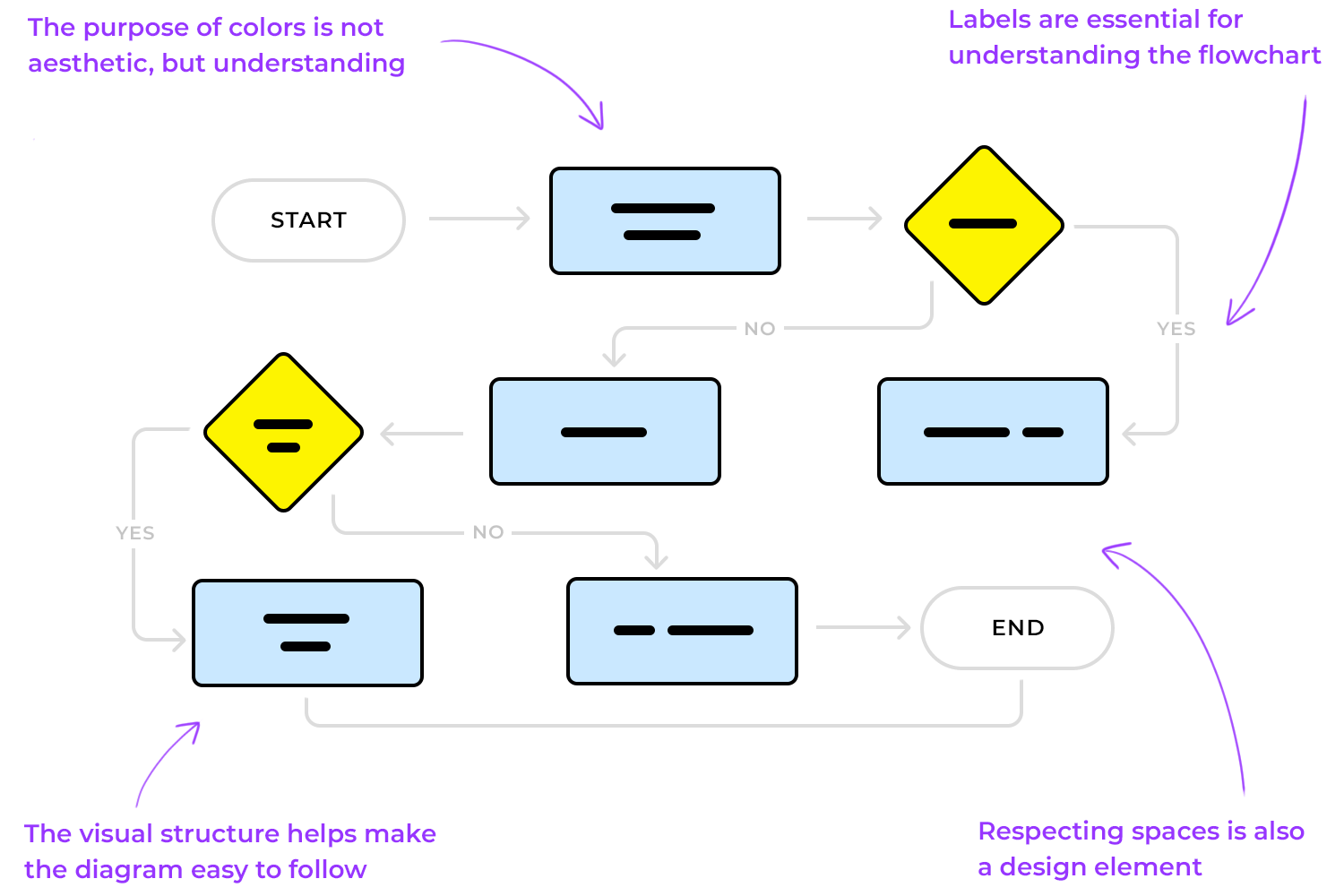
Keeping your visual structure consistent can help ensure that your UX flowchart is easy to follow and isn’t misleading. For instance, shapes and line elements should always be used as intended (according to BPM standards).
Consider the real estate in your design tool; position elements logically for an uncluttered design. Most design tools, including Justinmind’s wireframe tool, have rulers and grids to help you align elements.
Much like when building a prototype, using device skins in your flowchart adds context. A mobile device skin represents the shell of a device (the part that encases the screen).
For instance, say you were making flowcharts for an eCommerce shopping cart experience for web and mobile. If you use device skins for each device, the reader will be able to associate the chart with each flow more intuitively.
Justinmind’s prototyping tool includes an extensive range of device skins for web and mobile – including iPhone X.

As we’ve mentioned, it’s important to define flows at the beginning of the design process. When designing wireframes and prototypes, we build out each screen that our web or mobile product will contain.
However, it’s good practice to keep flowcharts to one page, according to SmartDraw. This is so that the reader can envision the flow from start to finish as easily and comfortably as possible. If the reader has to flick through multiple screens, they are more likely to get distracted and lose momentum.
Obviously, if your user flow is particularly long or complex, keeping it to a single page may not be an option. When this is the case, you may have to allow for multiple pages, or consider simplifying the flow.
One way to do this is to break it down into sub flows. As BreezeTree suggests, anytime a section of a flowchart requires more detail, create a separate flow for that sub-process and link to it.
Bringing a product to life is a matter that requires different types of professionals. UI designers, information architects, programmers and developers – everyone has a part to play in the UX game. And getting everyone on the same page is tough, as each one will need different types of information in order to reach different goals within the product development.
Think of UI designers. Their main concern is the user and how they can create something that fits the user like their favorite sweater – focusing on user’s needs, wants and preferences. But how does that help developers? Developers need to have a different overview of the product in order to understand the inner workings of the system – which touches navigation, system interactions and reactions, etc.
Using your UX flowchart as a communication tool can be a handy way to illustrate the product in a light that everyone in the team can understand and contribute to. If you want the flowchart design to be helpful to everyone in the team, you want to make sure you don’t focus on visual design details but rather how the system will act according to the user’s actions. You want to include interactions and how users will move around the product, as well as the previously mentioned points of entry and the important decision points within the design.
Your UX flowchart might be a step before user testing, but it’s a great opportunity to implement accessibility-oriented design. An accessible UX flowchart will make it possible for everyone to understand the chart, potentializing its use.
Having meaningful labels is a concept that helps with basic design perception but it also helps other people and team members to understand the key message of the UX flowchart. Aside from labels, we recommend you create a legend with all the elements used in the flowchart design. That includes any arrows and connectors that represent navigation, the meaning behind the color coding, and any other component of your UX flowchart.
UX flowcharts are super useful, but don’t forget that they’re packed with a lot of information. You’ve got points of entry and exit, user personas, actions, reactions, decision points, navigation… The flowchart brings together all these different pieces, and that can get pretty complex.
That’s why you want your flowchart to be simple and easy to follow. Clear labels, a handy legend, and consistent use of colors and shapes go a long way in helping everyone focus on the main ideas your UX flowchart is trying to show.
Make sure your UX flowchart is clear for everyone, designers, developers, product managers. Adding swimlanes can really boost visual clarity by separating different features or roles. This can be a game-changer, especially if you have multiple user personas. It helps people zero in on specific parts of the design and makes the whole chart easier to skim.
Always lay out your flowchart from left to right, top to bottom. It’s a simple tip, but it often gets overlooked when trying to sort out complex ideas. Doing this can really help smooth out the reading process, especially for Western audiences, since it presents info in a way that feels more natural.
And here’s a small but important detail: watch out for crossovers in your flowchart. Lines that overlap can easily cause confusion. Using line hops can clear things up and show the flow between screens and actions more clearly. This little tweak can make a big difference, letting your team focus on what the chart represents instead of trying to figure out its layout.
Is the path of each arrow entirely clear? Does Step 1 lead to Step 2 or Step Y? You don’t want to have any confusion among your colleagues, just like you don’t want to spend time going back to these details and explaining them to your team members. Your peers will likely understand that step 1 leads to step 2, but time will be wasted while they stare at the chart aiming to understand its flow.
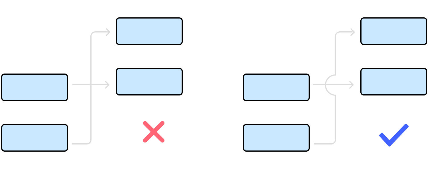
Instead, start using line hops to avoid any confusion as to the flow and links between screens and actions. The more you clarify the chart, the more the whole team can focus on what the chart represents – as opposed to focusing on understanding its representation of information.
Start new UX flowcharts today. Unlimited projects.
This flowchart UX example walks you through how to automatically send reminders to inactive users. It kicks off with a daily trigger, picking up contacts from the database. Then, it checks if the user has been active in the last 6 months.
If they have, great, the flow ends there. If not, it shoots out a quick email reminder. It’s a super handy way to keep track of user activity and give them a little nudge when needed.

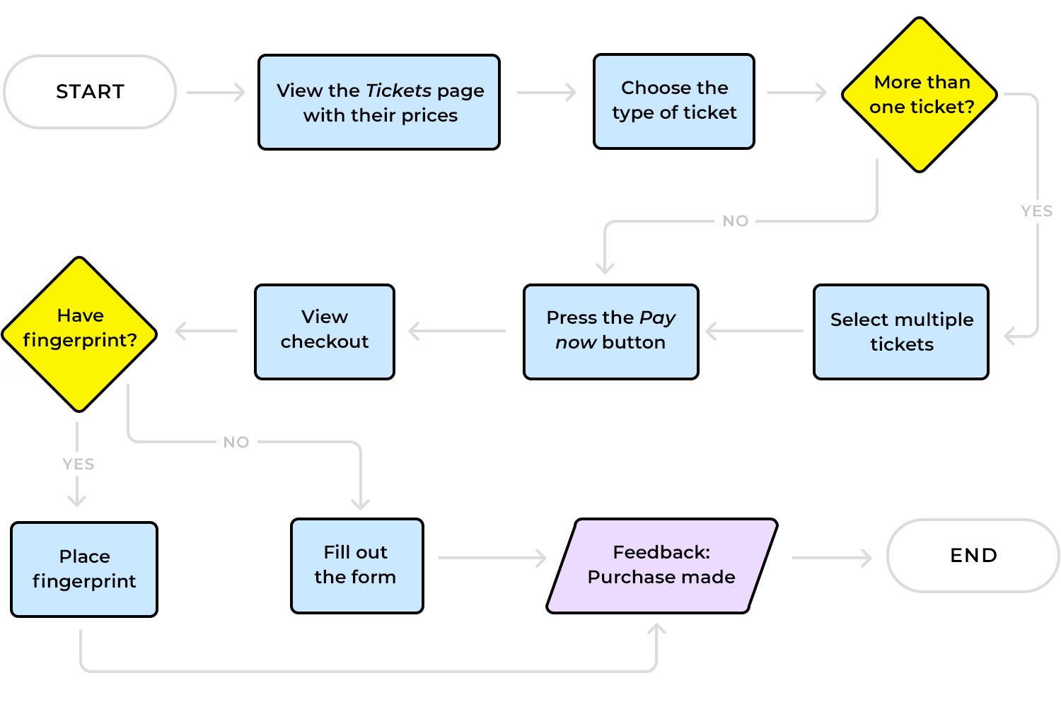
Imagine a user landing on your app or website. First, the system checks if they’ve registered before. If they haven’t, they go through the new user process, filling in their details to create an account. Their info then gets added to the database, setting them up for future logins. Now, if they are already registered, they’ll try to log in.
But what if they forget their password? No worries, the flow lets them request a new one. The final step checks if they entered the right password. If it’s correct, they’re in, If not, they can try again. It’s a simple login and registration flowchart that covers all possible scenarios for the user.

In this example, let’s say a new user comes to your site. First, the system checks if they’re already registered. If they aren’t, a registration form appears for them to fill out. Next, the account needs to be activated, and this can happen in two ways: the user gets an email to confirm their account, or an admin steps in to activate it manually.
Once either of these steps is done, the user is activated and ready to go. This email confirmation flowchart makes it easy to see how different registration paths come together.

Here we have a case handling flowchart UX that kicks off with collecting instructions and documents. Then, it checks if the client is high-profile. If they are, a background check happens next. If not, we review similar cases to find possible outcomes. After that, it’s time to document the case and get the paperwork in order.
The big question comes up: can we settle this? If yes, a message is sent to the other party, and that’s the end. If not, a lead attorney steps in, reviews everything, and prepares a brief. Simple, clear, and covers all the key steps.

Here’s how an order moves through the system. It starts when the customer places an order. Next, availability is checked and a pick ticket is generated. Then, they coordinate with the cargo agency and update stock.
In the warehouse, the order is prepped, weighed, labeled, and loaded onto trucks for shipping. After it’s shipped, the order is tracked and the invoice released. It’s a simple and clear delivery process flowchart to make sure every order is handled smoothly.

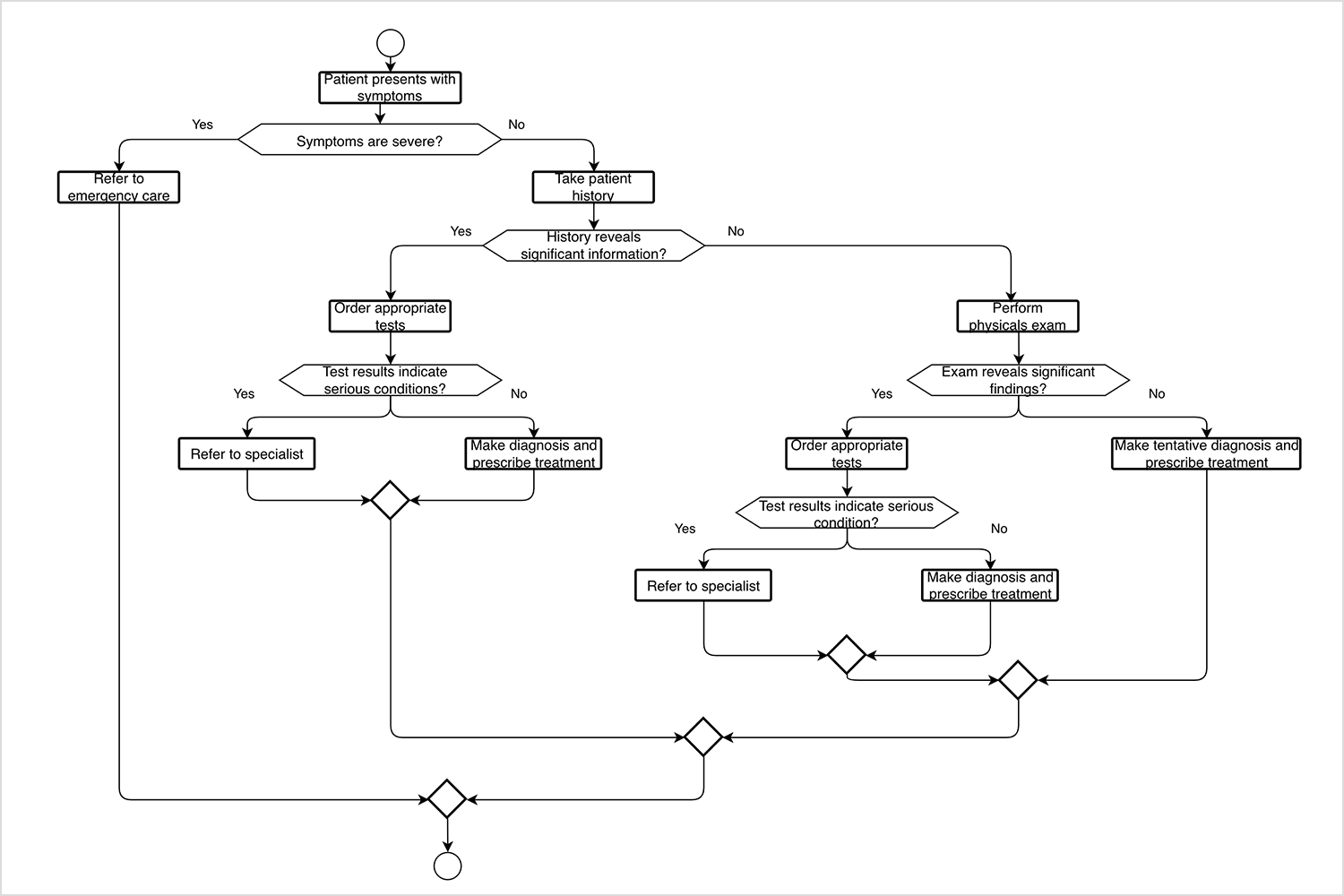
Here we have a patient diagnosis flowchart that starts when a patient presents symptoms. The first question: Are the symptoms severe? If yes, the patient is referred to emergency care. If not, the next step is to take the patient’s history.
Depending on what’s found, appropriate tests may be ordered. If the tests show a serious condition, the patient is sent to a specialist. Otherwise, a diagnosis is made, and treatment is prescribed. The process is thorough, covering different scenarios to ensure the patient gets the right care every step of the way.
This user journey flowchart shows how a user moves through an art marketplace. It all kicks off on the homepage, where they can explore artists or shop by category. When they find an artwork they like, they click on it and start the sign-up process.
First, they enter their name and email, then add their payment details. After that, they create a profile and get a welcome email. If they ever need to recover their account, they get a text with a temporary password. It’s another example of a clear and simple path for users to follow.

Let’s break down the flowchart example of this quiz platform. Users start on the homepage, choosing to log in, register, or explore the FAQs. Once logged in, they can access their quizzes or look for new ones. Admins have more options, like managing quizzes and editing user details.
Creators can jump in to create, edit, and publish their quizzes. This flowchart UX example keeps everything clear and straightforward for every type of user.

Here’s our last example with this sales flowchart that covers the customer journey, starting with the first contact. If they agree to a meeting, the sales team presents a solution. The customer then decides whether to buy or not. If yes, the order process kicks off. If not, they enter a drip campaign.

After the sale, account management handles implementation and maintains the relationship. They check in later to see if the customer will renew. If they do, great! If not, it’s back to the drip campaign. A full view of customer interactions, made simple.
Start new UX flowcharts today. Unlimited projects.
Now that we’ve got a good idea of what UX flowcharts are and how they work, let’s jump into some tools that can help you make your own. There are plenty out there, and each has its own set of features to make designing user flows easier. Here’s a list to get you started.
First up is Justinmind. It’s a versatile user flow tool that makes creating user flows a breeze. With its built-in UI kits and drag-and-drop features, you can design detailed flowcharts quickly. Plus, it has an interactive “User Flows” feature that lets you simulate the user’s journey through your app or website. This way, you get a clear picture of how everything connects.

Lucidchart is another great option. It’s a web-based tool packed with templates and flowchart symbols to help you map out user paths. The best part? It’s easy to collaborate with your team in real-time, making it perfect for joint projects.

For those who like a more flexible, digital whiteboard experience, Miro is a good pick. It’s simple to use and allows for free-form flowchart creation. You can easily add sticky notes, shapes, and connectors to build out your user flows visually.

If you’re a Sketch user, you can make use of plugins to design UX flowcharts. Although Sketch is designed for creating wireframes and mockups, with the right plugins, you can add flowchart elements to your design with ease.

FlowMapp is designed specifically for creating UX flowcharts. It has an intuitive interface that lets you build flowcharts and sitemaps easily. Its focus on UX design makes it a go-to tool for mapping out detailed user journeys.

For a free and simple tool, Draw.io is a solid option. It’s web-based and provides a variety of shapes and connectors to create detailed flowcharts. It might not have all the bells and whistles, but it gets the job done.

OmniGraffle is great for more detailed and technical flowcharts. It offers powerful features for creating complex diagrams, perfect for when you need more control over your design elements.

Figma isn’t just for UI design, it’s also a handy tool for creating UX flowcharts. With its drag-and-drop elements and plenty of community-made plugins, you can build clean and interactive user flows right within the design tool you’re already using.

Microsoft Visio is a classic for creating diagrams and flowcharts. It’s packed with templates, shapes, and symbols to help you build detailed user flows. If you’re already using Microsoft Office tools, Visio integrates seamlessly, making collaboration with your team easier.

Cacoo is another web-based tool that makes building flowcharts super easy.. It comes with a wide range of templates, and its drag-and-drop interface is perfect for creating user flows. Plus, you can collaborate with your team in real-time, adding comments and edits as you go.

Designing flows with a UX flowchart is a great way to put yourself in the user’s shoes and ensure that your product prioritizes their needs. Making a flowchart at the beginning of the design process also reduces the risk of misunderstandings about design specifications and the need for rework.
“The user flow was complex enough that, without a diagram, nobody had found the bug or been able to resolve it. This glitch wasn’t a critical one, but if the login experience had been built with a solid user flow, the bug may never have occurred. And we would have avoided a handful of disgruntled customers.” Lucidchart
Now that you’ve read our top tips on UX flowchart design, it’s time to make your own. If you’re looking for the perfect tool, we recommend trying out Justinmind’s app prototyping tool. With our drag and drop diagramming UI widgets, you’ll have created your first flowchart in no time.
PROTOTYPE · COMMUNICATE · VALIDATE
ALL-IN-ONE PROTOTYPING TOOL FOR WEB AND MOBILE APPS
Related Content
 Learn how to design better e-learning platforms with user-centered UX principles, real examples, and high-fidelity prototyping tips to boost engagement and learning outcomes.13 min Read
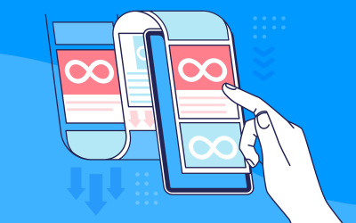
 Infinite scroll keeps users engaged, but it’s not always the best choice. This guide breaks down when to use it, when to avoid it, and how to design it right.14 min Read
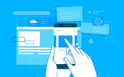 Learn how to design web and mobile app prototypes, how to test them and what to look for in a prototyping tool in this complete guide.15 min Read


