From Scandinavian minimalism to invisible principles of design: here are our favorite design philosophies to live and design by
A designer’s philosophy defines what they wish to accomplish in design, and which principles of design they will use to do so. Identifying your design philosophy is an important part of the UX design process, and directly impacts how users will respond to the end product.
Start designing new products today. Enjoy unlimited projects.
UXers define all the touchpoints and features of the web and mobile products that we use every day – so having a clear design philosophy is really important. But with so many philosophies, ideologies, and user experience trends floating around the design-o-sphere, settling on an approach isn’t always straightforward.
Luckily, the Justinmind team has handpicked our favorite design philosophies, from leading UX, web, and industrial designers, to help you make the all-important decision.
Japanese industrial designer Naoto Fukasawa questions why users should have to think about how they interact their devices – shouldn’t it be instinctive? After all, seamless user experiences are born of connected interactions between a person and an object, a user and an interface. Naoto hits the nail on the head with his philosophy on thinking and designing intuitively.
Naoto’s ‘Without a Thought’ design philosophy has it that design shouldn’t make the user work. Designers should observe users’ subconscious behavior and how they typically engage with digital products. Only then can they design solutions that users can interact with instinctively.
Designers should focus on creating experiences that accommodate users’ interactions and responses, rather than trying to create new and different experiences that users can’t relate to. After all, who has time in their day to day to be thinking about how they should use a device or website?
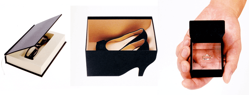
Instinctive design with Naoto Fukasawa, image credit: Design Mekka
Designers should perform usability testing to monitor and assess usage patterns (actions, responses and reactions). The feedback gathered in these tests will indicate which components of their interface need to be adjusted in order to make the user experience seamless and intuitive.
Start designing new products today. Enjoy unlimited projects.

The Scandinavian design community has a saying: ‘One should be in harmony with his or her environment, and things should be made to last rather than be replaced’.
Nordic design – that is, of Denmark, Finland, Iceland, Norway and Sweden – is known for its minimalist style. This approach to design stretches back to the early 20th century and promotes simplicity, functionality and nature. Scandinavian minimalism principles of design are characterized by clean lines and block colors. With its bold yellow and blue logo and simply-designed furniture built for durability, Ikea is a good example of how popular this design trend is.
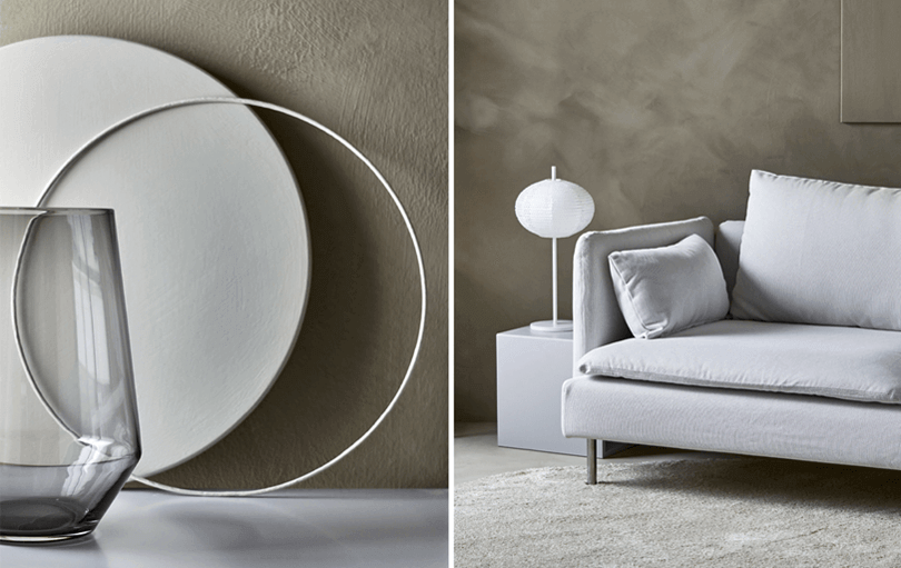
Minimalist design at Ikea, image credit: Ikea
The main purpose of Scandinavian minimalism is to create design things that improve everyday life – efficient solutions that are built to last. So what can we take away from this design philosophy? For an encumbered lifestyle, keep things simple.
In terms of principles of design, think ‘less is more’. Stick to the design principles of KISS: Keep It Simple, Stupid. Your user interface shouldn’t contain anything that doesn’t have a purpose.
Keep your UI uncluttered by kicking off your design process with a basic, low-fidelity wireframe. Only include the essential UI and navigation elements. Only build up the design with components that will bring value. If you want to keep it even simpler, just sketch out the basics in a paper prototype before making it digital.
With Justinmind’s prototyping tool, you can use our Sketching UI kit to create a static wireframe with basic elements. It’s a great way to visualize your ideas before refining your designs. You can also reflect this philosophy right from the start in your MVP.
This design philosophy is taken from FatDUX’s Web Dogma, conceived by world-renowned Informational architecture theorist, Eric Reiss. The Web Dogma is a set of guidelines for digital products that transcend ever-changing fashions and technological developments.
What does Eric mean by this? Essentially, designers shouldn’t design for themselves but for the user. Sure, web and UX designers must have enthusiasm for what they are building. But this doesn’t mean that they should take their own design assumptions as gospel.
As user experience guru Jakob Nielsen tells us, ‘designers are not users’ and they shouldn’t rely on their assumptions of what the user wants or needs. To avoid designing with bias and really improve the user experience, designers need to get to know their users.
So how do you overcome the gap between the designer and the user? Perform user testing to find out how your target users think about the product and to optimize it accordingly. Make sure you test with real users so that you can ensure that your vision matches the market reality and that you are designing solutions for your target audience.
Start designing new products today. Enjoy unlimited projects.

“My aim is to omit everything superfluous so that the essential is shown to the best possible advantage.” – Dieter Rams
Dieter Rams is a leading member of the Functionalist design movement. Long-time Industrial Designer, Dieter created his first product in 1955 for Braun. He has inspired a generation of designers with his design philosophy ‘function over form’. His designs are driven by the purpose of the object, rather than its aesthetics – seeking to achieve design purity through reduction and restraint.
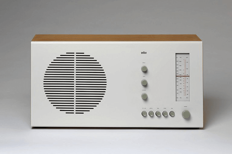
Braun product designed by Dieter Rams, image credit: Glenn Walls
In a fast-paced art world, Dieter’s design ethic is timeless, and has contributed to the birth of what we now know as the modern minimalist design movement.
To make something that people want to use, it needs to be useful. As Dieter puts it, “good design emphasizes the usefulness of a product while disregarding anything that could possibly detract from it.” No matter how pixel-perfect your interface, you need to make sure that it works.
A great way to make sure that you are designing according to Dieter’s rule of usability-over-aesthetics, is to make sure that users can get around your interface and achieve their end goal.
Try sketching out scenarios and then bringing them to life with an app wireframe tool. Then, validate them with users in order to pinpoint areas of poor usability or accessibility. This will help you unclutter your UI and focus on the real purpose of your design.
The owner of this final design doctrine is usability and research expert, Jared M. Spool. In this article, Jared talks about what contributes to good design.
With a good design, the user engages with a selection of features that allow them to reach their end goal easily. But good design isn’t only what the user sees. What about the invisible details of the design that are not on the user’s radar? The seamless interactions, the information architecture, the social media interaction, etc. These all contribute to a delightful experience.
The better the design, the more subtle it becomes and the less we pay attention to it:
“ It’s like an air conditioner in a conference room. Nobody ever interrupts our meetings to tell us how comfortable the temperature is. They don’t even notice.” – Jared M. Spool
What’s the secret to making your design invisible? The goal is to keep the user focused on the deliverable, not the process. Try simplifying your user flows. Here are some tips:
- Start by creating personas for your target audience. This will help you identify how certain users will approach your product.
- Then, sketch out your user flow and try to reduce the number of steps toward each touchpoint in your user flow. Retrace the user path, start with the user’s last action (the last thing they need to do to reach their goal) and work backwards until you reach the entry point(s).
Remember, the most invisible the process, the more natural and seamless the user experience will be.
PROTOTYPE · COMMUNICATE · VALIDATE
ALL-IN-ONE PROTOTYPING TOOL FOR WEB AND MOBILE APPS
Related Content
 Learn how to design better e-learning platforms with user-centered UX principles, real examples, and high-fidelity prototyping tips to boost engagement and learning outcomes.13 min Read
 Infinite scroll keeps users engaged, but it’s not always the best choice. This guide breaks down when to use it, when to avoid it, and how to design it right.14 min Read
 Learn how to design web and mobile app prototypes, how to test them and what to look for in a prototyping tool in this complete guide.15 min Read

