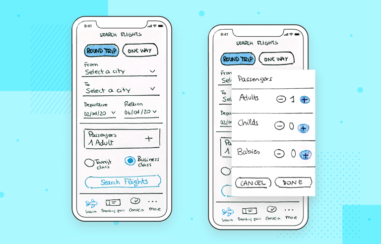
Paper prototyping is alive and well. Read on for brilliant examples, resources and how to get started
How does your handwriting compare to a decade ago? Has it worsened, improved, or is it just different? Let’s face it. Using paper is less common in the digital age. No one does their accounts in actual books anymore and most written communication is done online and through messaging apps.
Start prototyping now products today. Enjoy unlimited projects.
But what about prototyping? While it’s not as common nowadays, paper prototyping still serves a business purpose in the design world, other than making sure your sketching technique doesn’t get rusty.
This post will discuss the benefits of using a paper prototype but will also explain why it doesn’t replace the work done in your prototyping tool. In addition to that, we’ll walk you through how to make one as well as some free resources to get you started.
Paper prototyping apps and websites is a method some design teams use to begin conceptualizing a new product or feature. However, it goes a little further than that. It also helps to demonstrate the user flow and functionality that your future design will have in the very early stages of ideation. It’s a way of obtaining client and stakeholder buy-in before you start to work on your high-fidelity prototype.
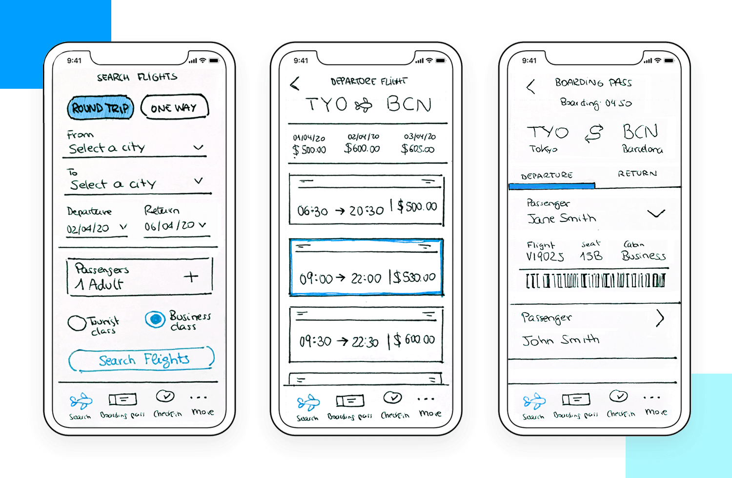
Designers like Jake Knapp have a slightly pessimistic view of paper prototyping. They reason that it’s an outdated technique whose days are numbered. However, as Jake puts it himself, it’s not entirely useless, but he also maintains that paper prototypes “should never leave the conference room”.
In other words, you should never test them on your users because they are not realistic and detailed enough. Therefore, they could never produce a realistic reaction from your users and is a waste of a tester’s time and resources. That was back in 2014. A lot has changed since then and in the field of UX design. Agile and Lean UX workflows have come a long way.
The idea of constant iteration is becoming the regular mantra of design teams the world over. So we at Justinmind would be inclined to disagree that you can’t test paper prototypes. Ideally, you should test your product throughout the design process, at all phases and fidelities. Any idea you have becomes validated all the more when you test it out on your target users. They take priority over stakeholder’s opinions. Afterall, your users determine the real success of your product.
Why take your time to draw lots of screens composed of elements and text, then immediately move on to a high fidelity prototype, when you could first run it by your users? You may find your hi-fi prototype will look quite different if you test your paper prototype than if you didn’t.
No matter what digital mediums you have available to you, there’s nothing like paper and ink to get ideas flowing. Paper prototyping is a great way of quickly weeding out the bad ideas and learning about the right design path to take with your digital prototype.
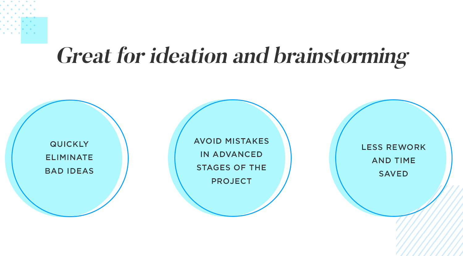
In a way, paper prototyping is to high fidelity prototyping what high fidelity prototyping is to development – less reworks, and more time saved. Sometimes, when designers build weighty Photoshop and Sketch files leading to detailed prototypes with high degrees of interaction, it can be difficult to go back and fix small errors. Paper prototypes are a faster way to avoid these errors occurring in the advanced stages of design.
Start prototyping now products today. Enjoy unlimited projects.

Some people might think of prototyping using pencil and paper as old school, but there’s something about the freedom of a blank page that sparks wild ideas. Digital tools are great for polishing things up, but when you’re brainstorming, there’s no pressure to be perfect. It’s like letting your inner five-year-old loose.
Paper prototypes aren’t just about the big ideas; they’re your design diary. You can scribble notes, draw arrows, and generally make a mess without feeling guilty. It’s like a tangible roadmap of your thought process. And hey, when you look back at it later, you’ll be amazed at how far you’ve come.
The other benefit to paper prototyping is that pretty much anyone can make rough sketches with no need to have knowledge of design tools. It’s a great way for stakeholders, clients, developers, product managers and other non-creatives to demonstrate their ideas.
That also brings us on to the next reason why paper prototyping is good: it’s a fun way to forget roles for a moment and bring the team together.
Paper prototyping can also be a great team-building activity in disguise because it inspires the team to get creative. Sketching, cutting out and coloring are a way to get people to chill out from the screens for a while. It also makes them feel like they have more of a voice in the matter and that way, everyone feels listened to.
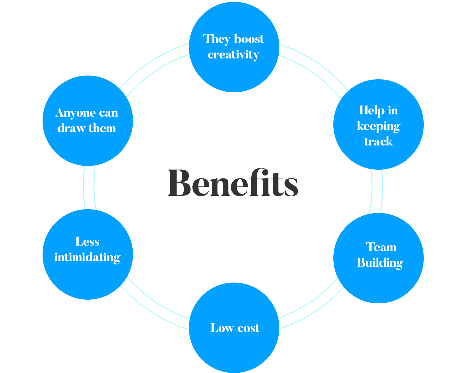
The other obvious benefit of paper prototyping is that they’re notoriously low cost. All you need to do is pay for the stationary and you’re laughing out loud. In addition to that, they can save a designer’s time by letting them quickly scribble out an idea and get it validated by stakeholders before moving on to higher-fidelity prototypes. At the end of the day, the longer a designer spends on a project, the costlier it will be.
Usually it’s easier to gain honest user feedback at the primitive paper prototyping stage. This is because they understand what you’re doing, that you’re just trying ideas out and the sky’s the limit (at least from their point of view).
So when it comes down to it, that alone is a pretty good reason. However, we could also make the point that when a user sees your prototype in more detail, they may think there’s less room for change because it looks more complete. Therefore, may be more a loathe to make suggestions or to provide feedback.
However, they’ll be more likely to voice their feedback and display their true reactions if it’s just on paper. There’s something about a paper prototype that seems less serious. And yes, that’s a good thing psychologically!
Paper prototypes bring many benefits to product design. However, they also have some drawbacks, meaning they’re still not sufficient enough to replace digital prototypes. Here’s why:
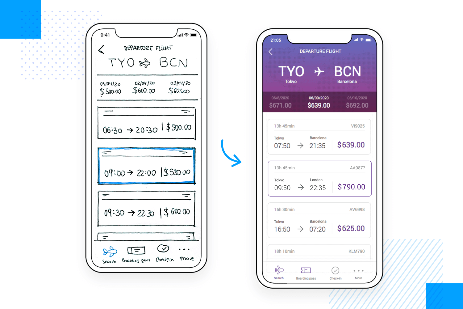
The paper prototypes lack important details such as the following:
- Microinteractions
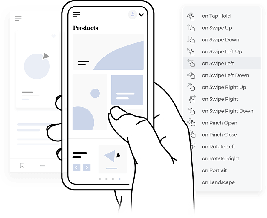
- Mobile gestures
- Interactions
- Branding
- Images and advanced graphic design
- Real content
- Data visualization
All of the above aspects can have a huge impact on your users. Therefore, it’s vitally important not to skip these and to test them out before you code your final product. Paper prototypes fall short in all these areas.
It’s also harder to implement branding (apart from drawing the logo) at this stage than at the high fidelity prototype stage. When it comes to stakeholder buy-in, as well as knowing what effect a certain range of colors used from the branding palette will affect the users in a way that positively cements the brand, this becomes an important detail.
The other problem with lack of detail and that you must also bear in mind is that you are also limited when it comes to accessibility testing.
At this stage, you won’t be able to test whether your visually impaired users or those who are hard of hearing would be able to successfully navigate through your product by themselves. It will also exclude users with impaired motor function, as they won’t be able to test gestures, mouse movements, or use screen magnification software.
The other disadvantage comes in the fact that with paper prototyping, you can forget remote testing or testing with large pools of recipients.
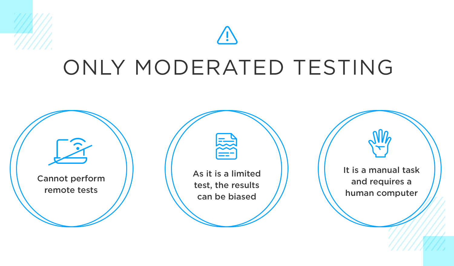
With paper prototyping, you’ll need to be testing solely with small groups, for obvious reasons. Sure, you could print off many copies and, if you have a large enough team, test groups simultaneously with different moderators. However, this can lead to chaos and can also skew the results if certain moderators deviate from the script.
Lastly, it’s only possible to do moderated testing, as paper prototypes are manual prototypes. It’s a very manual form of testing. You’ll need to have someone to act as the computer (more on that below) and it will obviously need more explaining from the moderator.
Paper prototyping also falls short when it comes to demonstrating activity. You can demonstrate the basic functionality your product will have and the basic user flow, but that’s pretty much it. Microinteractions and animations will be off limits at this stage, as will testing out hand gestures and mouse interactions.
Aside from the fact that paper prototyping can quickly get out of hand when it comes to lots of sheets of paper that you have to keep track of during testing, it’s far less environmentally friendly than its digital equivalents. And since many companies are moving towards a more paperless environment, it might be more difficult to convince them of the need for all that paper.
Okay, let’s be real: digital tools are speedy. You can whip up a prototype in no time, right? So, why bother with paper? Well, sometimes adding a physical step can slow you down. It’s like taking the scenic route when you’re already late. But hey, sometimes that detour leads to unexpected discoveries.
Start prototyping now products today. Enjoy unlimited projects.

To make a paper prototype, you’ll need to make sure you have the right materials at hand. First, you’ll need to decide on whether it’s going to be for a brainstorming session between colleagues or for a user testing session. If you’re planning to use your paper prototype for a user testing session, it will probably need to be a little bit more refined.
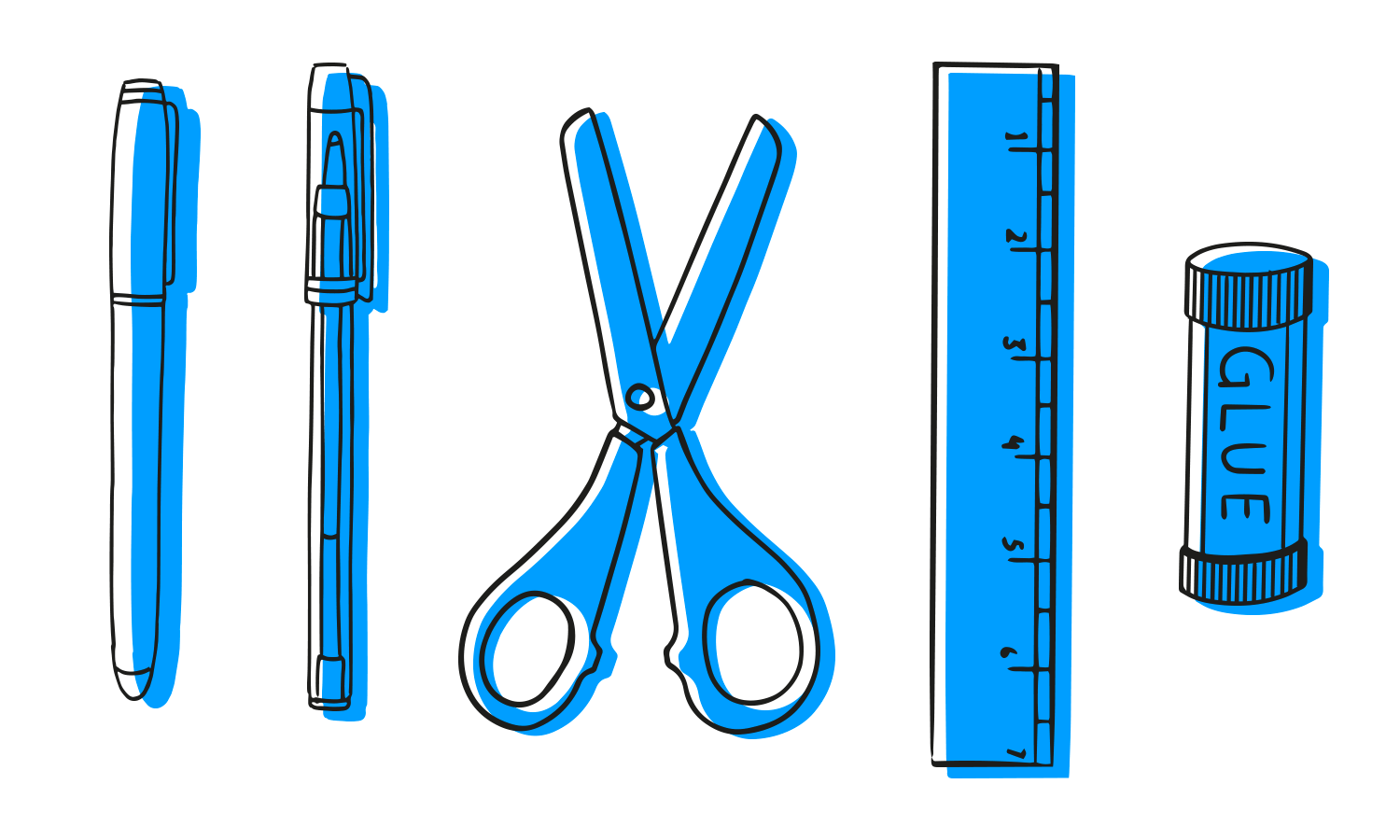
Depending on the detail your paper prototype will have, you’ll need the following:
Sorry for the Captain Obvious on this one. Any paper works, but for best results, use graph paper, dot paper or sketching paper. Below, we’ve provided a list of resources to help you source these for free.
Drawing out new screens, phone, tablet or computer outlines can start to get old and frustrating pretty fast. Instead, draw out one screen template. Then photocopy, or scan and print it out. Or, just use one of the free template outlines we’ve included below!
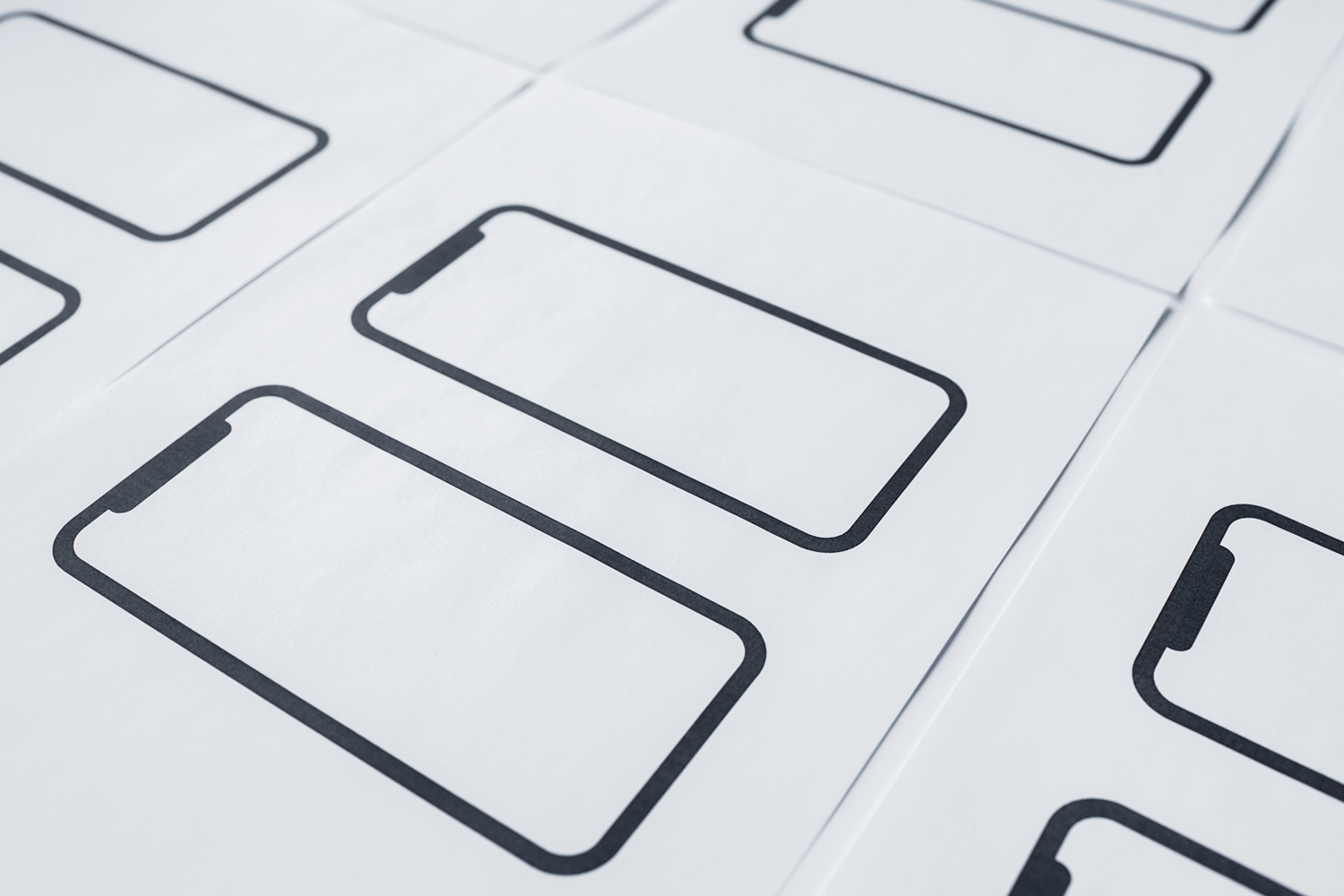
Consider the possibility of using different colors in your paper prototype. Avoid using pencils, as the lines don’t contrast as well. Pencil sketches can also end up messy. Pen or marker sketches are tidier because they encourage more deliberation and precision.
Using a ruler can help you quickly and easily draw lines, while also helping you to roughly measure line length and element spacing. While a ruler is optional, it can help speed up the process by allowing you to draw straight lines quicker.
These are also optional but extremely useful. Stencils can help you to quickly and consistently trace out commonly used icons. There are also some available that help you to draw out typical iOS and Android icons and elements. Check out our resources below for more information on that.
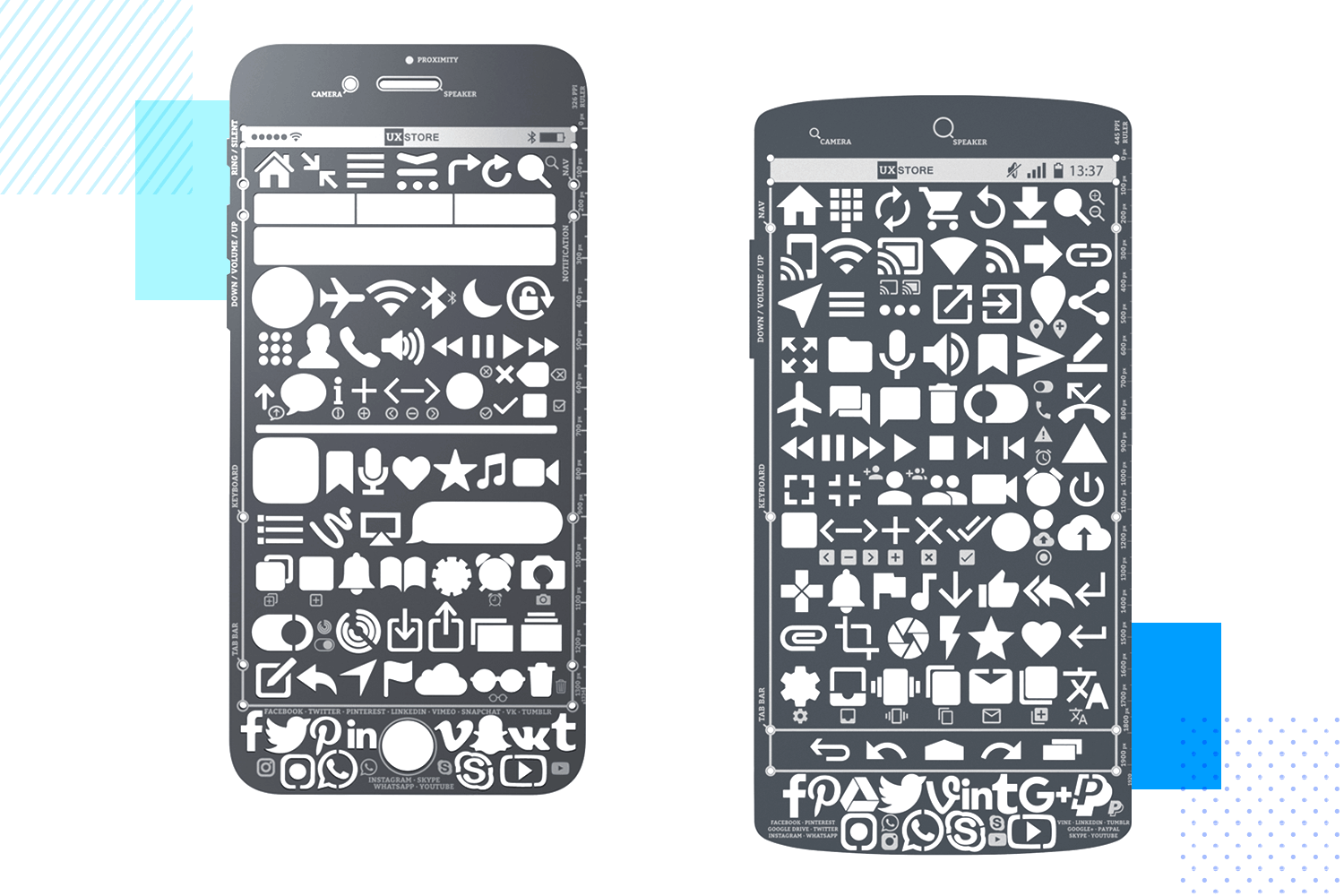
Image source: uxstore.com
Why scissors? They’re great for cut outs. Perhaps you want to overlay elements or move elements around the paper prototype’s screen. You may also need it to cut out new template screens to attach to cardboard or magnets.
Take a breather, relax the shoulders and then put pen to paper! Get a few quick doodles out of the way first.
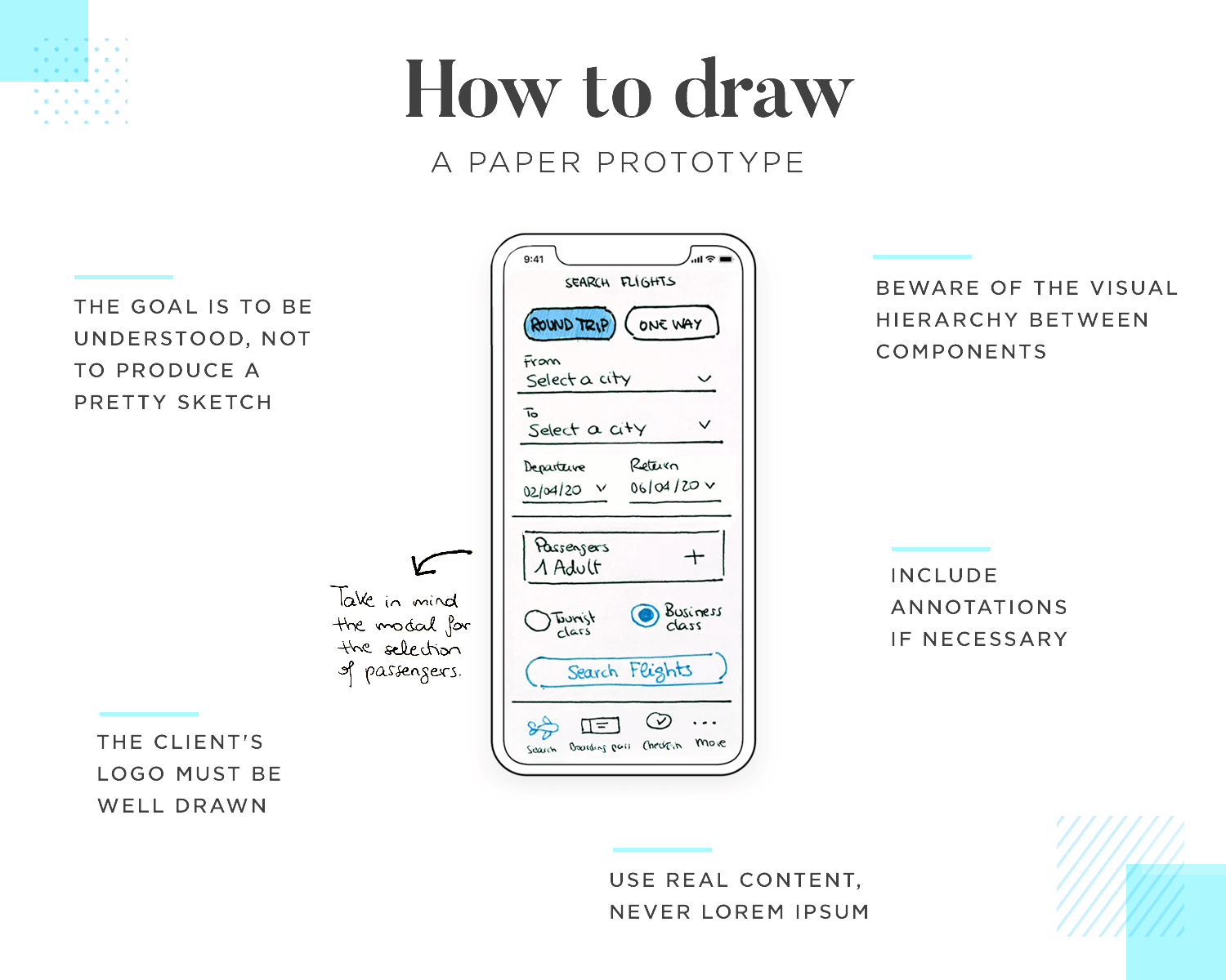
Draw your ideas out fast and don’t worry about the details. Just make sure it’s not too cluttered and that other people will be able to understand it. Remember, what you’re trying to get across to people is your idea or concept, not admiration for the lovely UI you’ve just drawn. Draw quick and deliberate lines and make circular shapes once or twice in the air before you put pen to paper.
Before drawing, take into account the size of the different texts you’ll write onto the paper prototype screen. Make sure there’s a clear difference in size between header and body texts, even button texts and inline instruction texts.
Never write in Lorem Ipsum! Everything on your paper prototype should be useful, otherwise you shouldn’t bother including it.
Start prototyping now products today. Enjoy unlimited projects.

If your paper prototype is for office use only, make sure to include technical annotations if it’s for developers or annotations for your decisions and functionality if it’s for team members or clients. If it’s for user testing, you can leave the annotations out or write them on another, duplicate screen by printing it out again.
Lastly, when it comes to the matter of buy-in, and even though we’re not really focusing on detail and branding at this stage, drawing your client’s logo well always goes the extra mile in helping convince them of your design argument.
Best of all, go in prepared. Read Caroline Schneider’s book Paper Prototyping: The Fast and Easy Way to Design and Refine User Interfaces. Caroline is a usability engineer and serial paper prototyper. In the book she talks about everything from simulating different UI elements and interactions to how to schedule testing activities.
At Justinmind, we recommend you have one person in charge of this job while someone else acts as moderator. The reason for this is that the human computer needs to be very attentive to what actions the user takes and how to interact accordingly, while the moderator needs to be concentrating very carefully on the user’s responses and behavior.
Doing these two tasks together is not impossible, but can seem easier than it is in practice. If you have the resources to be able to separate the tasks between two people, the better. For example, the moderator could set the video to record and begin the session, while the human computer is ready for the user to start interacting with the paper prototype.
Think about any elements that could move around a screen in the paper prototype and make any appropriate cutouts. Think about drag and drop actions.
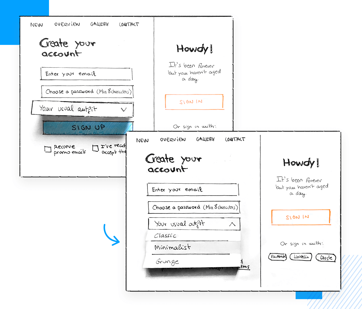
In addition to this, think about having the human computer color in any radio buttons the user selects with a pencil and using an eraser to deselect them. The human computer can also color in button state changes with a crayon, coloring pencil or marker. Anything you can do to make the experience more realistic will help as it will make the experience more meaningful for the user.
Most importantly, you should always rehearse the session vigorously with your human computer and any other moderators that are going to be present during the session. The length of time you spend preparing for the test will depend on the length of the paper prototype and how long the tasks are that you want the users to complete.
Rehearse which links lead to which screens, as well as how the human computer interacts with the user as they make their decisions. The moderator should rehearse the questions they’ll ask the user during each step and possible variations that could occur. At this point they could also consider what types of open-ended questions they could ask in order to elicit the most profound responses.
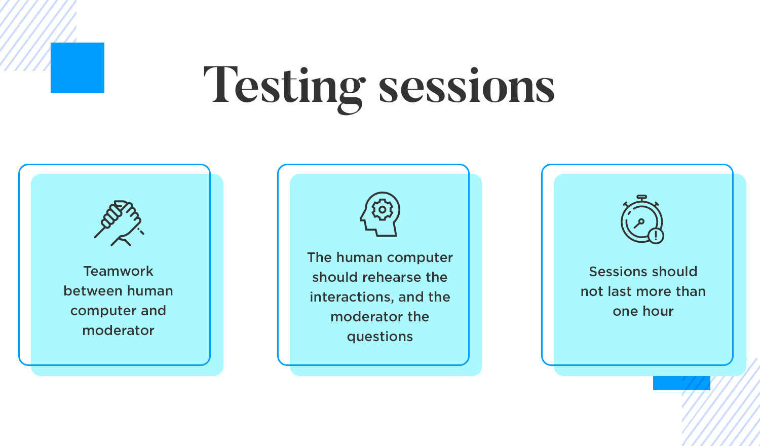
As a basic rule of thumb, we at Justinmind would advise not making the testing session so long. Don’t test out more than one or two features in a given session, and try not to have the session go over an hour. If it does, be sure to give your users a break in between sessions.
Print out or photocopy more copies of the prototype than you need. Imagine there’s a mistake made or more testees show up than you expected. It’s always handy to have a backup! As a general rule of thumb, NNG suggests only testing with five users in a group anyway.
As is the case with most user testing sessions, it always helps to offer the users some kind of incentive beforehand. It might be a free coffee, or if you’re working for a company that already exists, it might be a free coupon for a service.
When it comes to any user testing session, whether with digital testing or paper prototyping, recording the results is key. With moderated testing, having someone recording the event is crucial. Just make sure you inform the users that they’re going to be recorded and obtain their permission!
Start prototyping now products today. Enjoy unlimited projects.

Taral R Kulkarni is responsible for this iPad paper prototype example that outlines a basic social media app interface. It’s clean and minimalist, focusing on displaying content clearly and using large icons and fonts to achieve that.
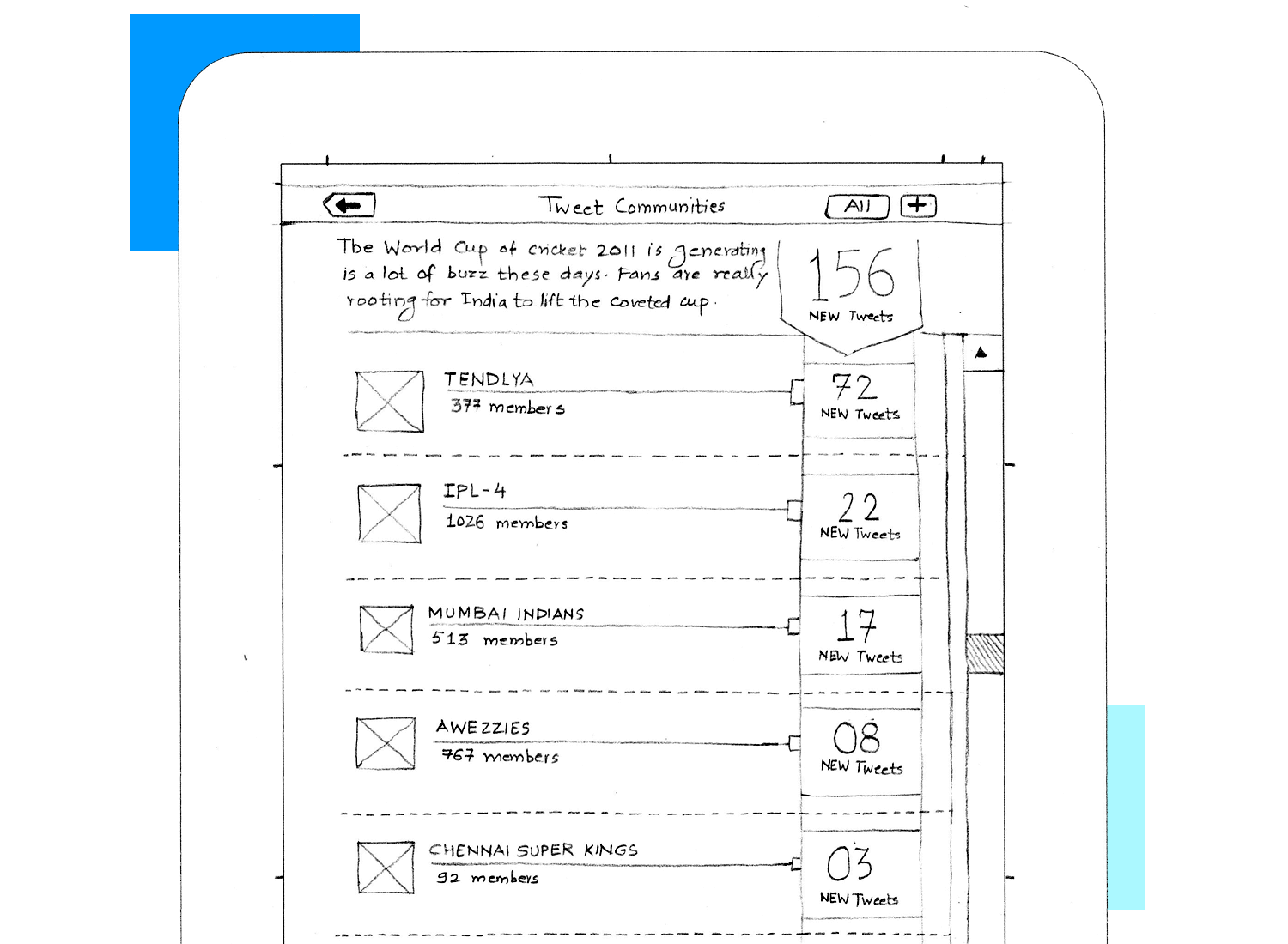
It sets the stage (which really that’s all a paper prototype does) for a potential microblogging or community-based platform. It’s a great start, but to take it further, we’d need to flesh out features, user flows, and visuals.
We love this full blown paper prototype example that demonstrates a detailed approach to outlining a task management app. It goes beyond basic features and sketches out specific functionalities like task creation with granular details, various task views, and filtering options.
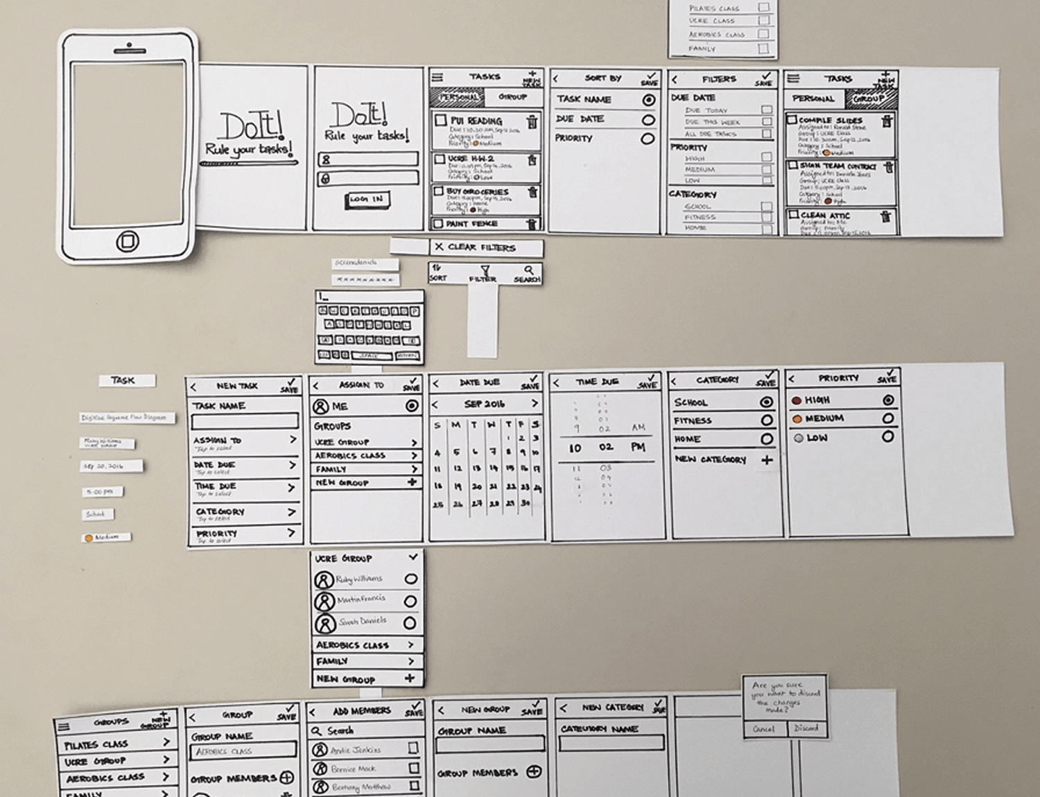
The prototype also hints at potential team collaboration features, indicating a thoughtful consideration of the app’s potential use cases. Eye catching and highly effective, this is a perfect example of what paper prototypes should look like .
Martha Eierdanz put together this paper prototype demonstrating a detailed approach to designing a mobile app interface for booking accommodations. It includes various screens and components for checking availability, selecting dates, entering guest information, and confirming bookings.
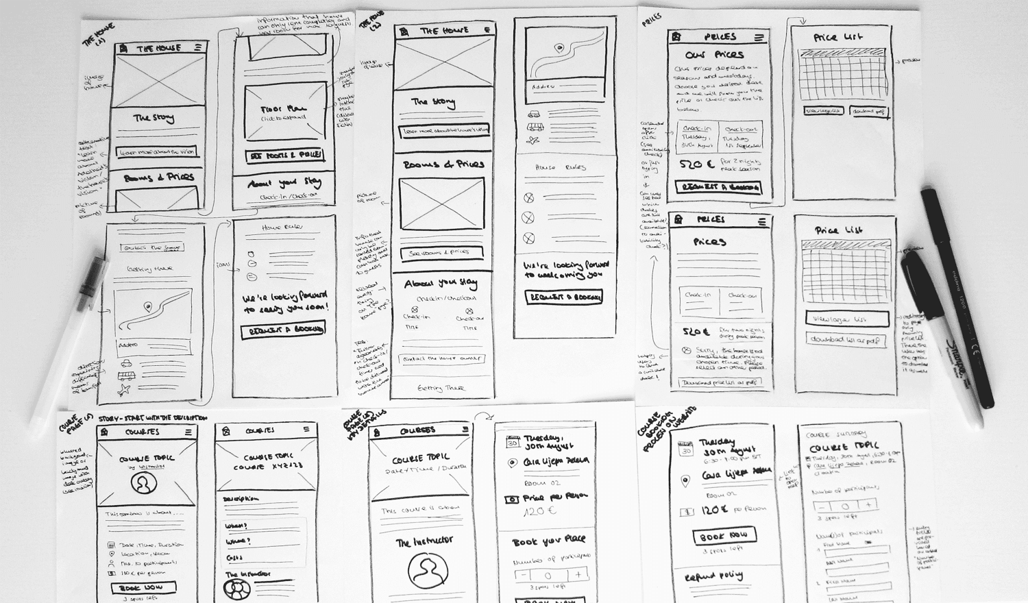
She uses physical elements like paper cutouts and a phone mockup that enhance the tactile experience and allows for easy manipulation of the prototype.
This TV show aggregator app paper prototype example focuses on a user-centric approach with features like top-rated shows, saved lists, and recommendations based on friends’ reviews.
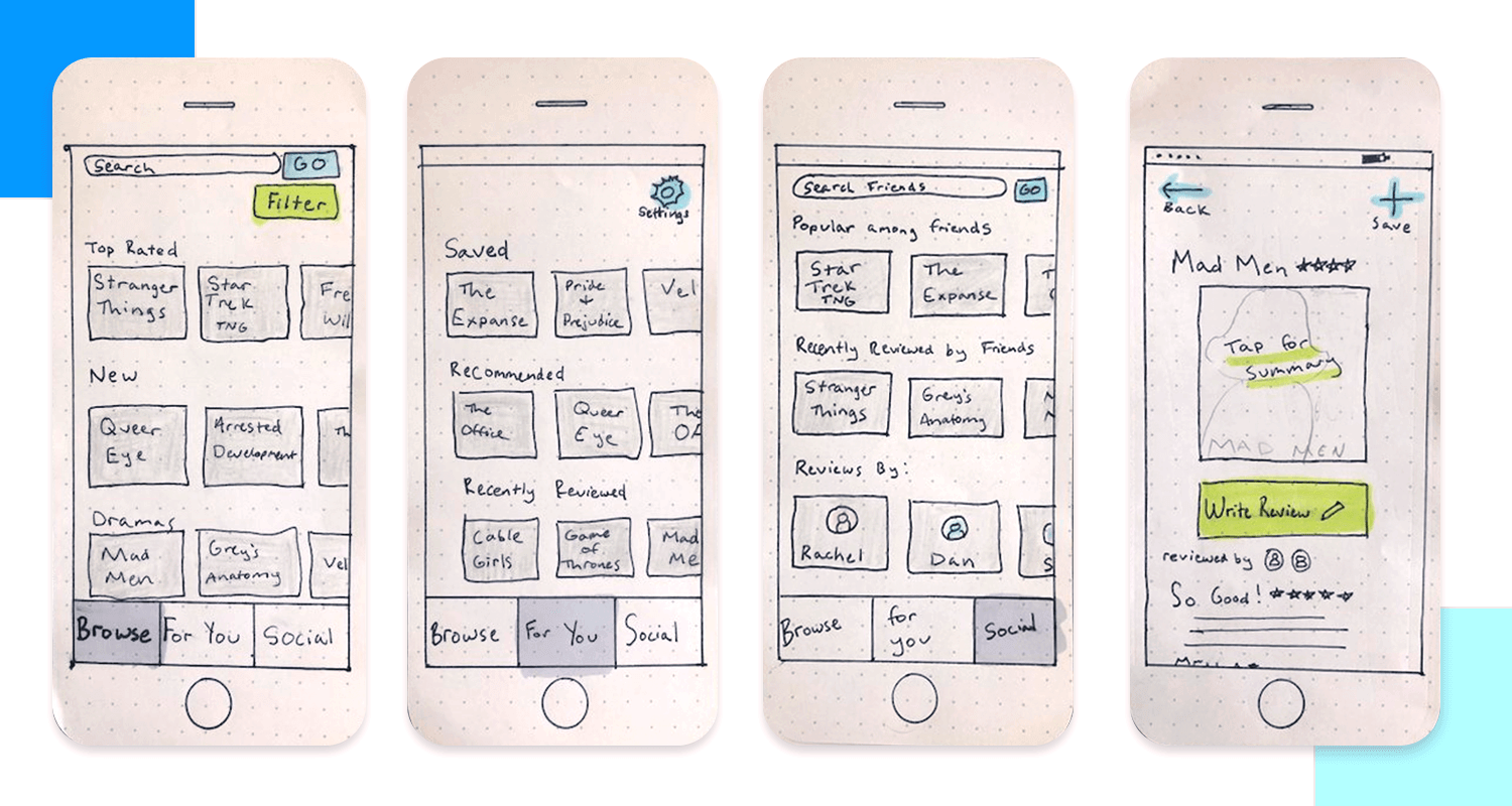
The prototype effectively visualizes the app’s core functionalities, including browsing, searching, filtering, and providing detailed show information.
This paper prototype outlines a mobile app for classified ads or product listings. It includes basic screens for browsing categories, viewing item details, posting ads, and user profiles. The design is simple, focusing on layout and functionality.
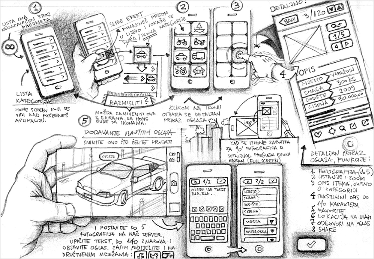
While the prototype lacks high-fidelity visuals, it effectively conveys core features and user flow. Additional features like map integration and social sharing are hinted at, suggesting potential expansion.
In this paper prototyping example for an app called DoIt, we can see how cut outs can be creatively used to put together different screens by mixing and matching elements.
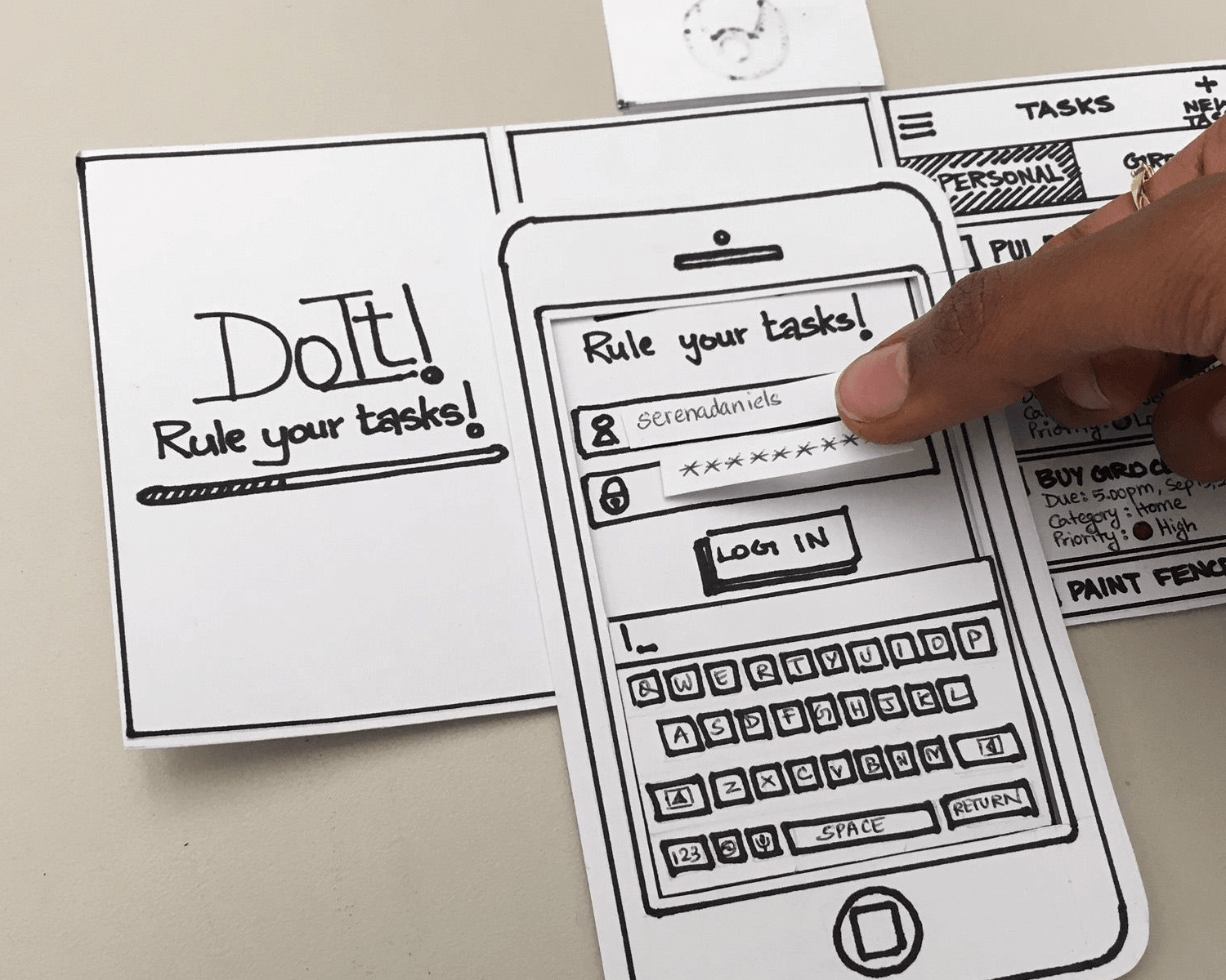
It’s also a useful way of paper prototyping forms, as the user can write in their username or password on a small rectangular cut out which can then be placed into the field by the user, the human computer, or the moderator.
What we like about this multi-channel paper prototype example is the creativity. It uses a combination of cut outs and color to make the prototype more meaningful. It also simultaneously demonstrates how a multi-channel use of the app might work with smartphone and smartwatch cut outs.
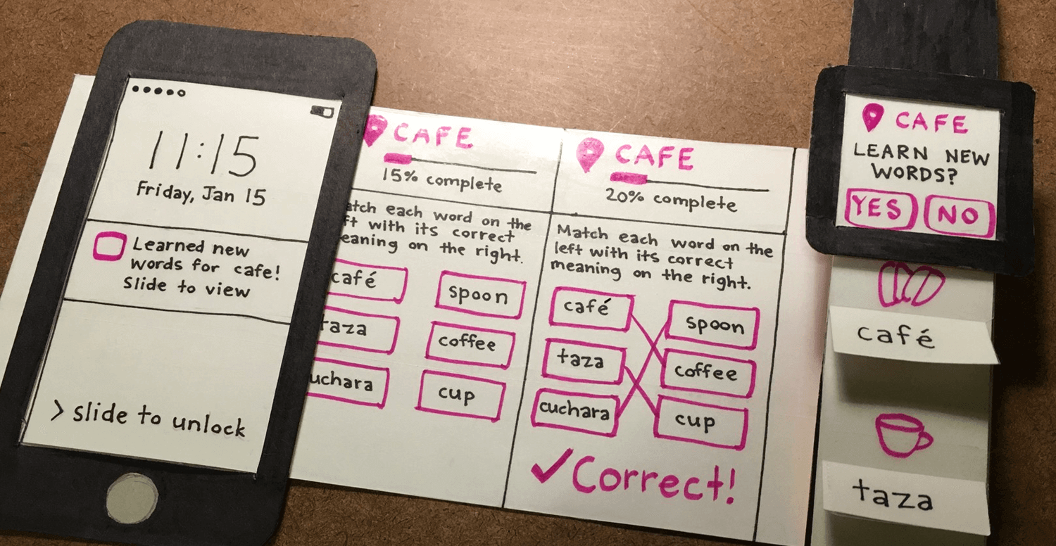
Image source: Ergomania UX
We also dig the way they use one color – pink – to differentiate between interactive elements and text.
To give you an example of a paper prototype with annotations that might typically be reserved for office use, this one from Alexander Skogberg shows how to cater to your audience.
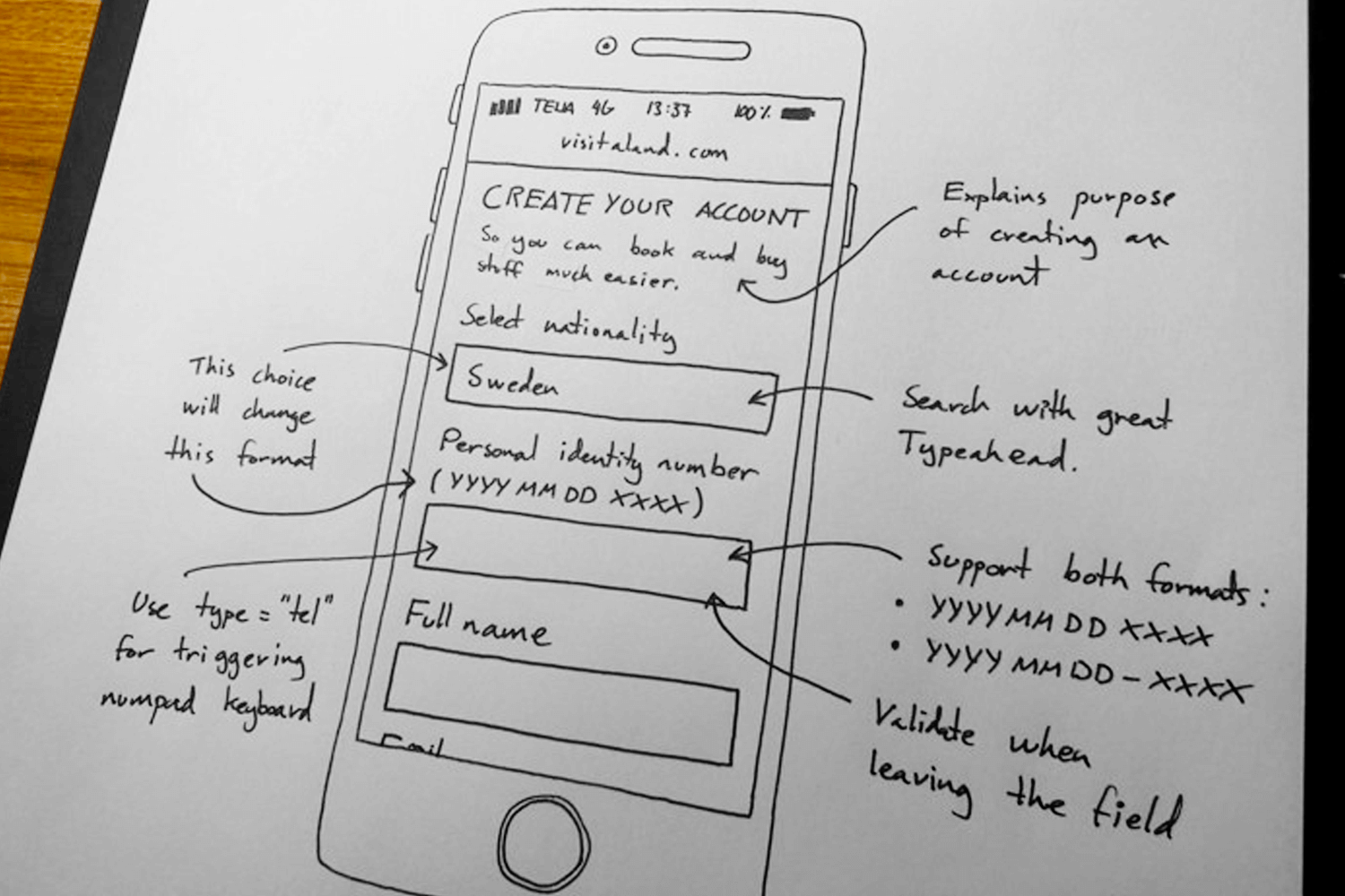
Image source: Alexander Skogberg
In this realistic and functional sketch, simple and clear technical annotations show that the idea is to convey the functionality behind the app idea to the developers early on in the design project. That way, it’s possible to know whether it’s worth turning it into a high fidelity prototype.
This screen flow paper prototype example highlights (pardon the pun) the use that a bit of color (without going over the top) can have in your prototype. In this case, the blue highlighter indicates the buttons or elements that are clickable or the flows to be tested in this prototype.
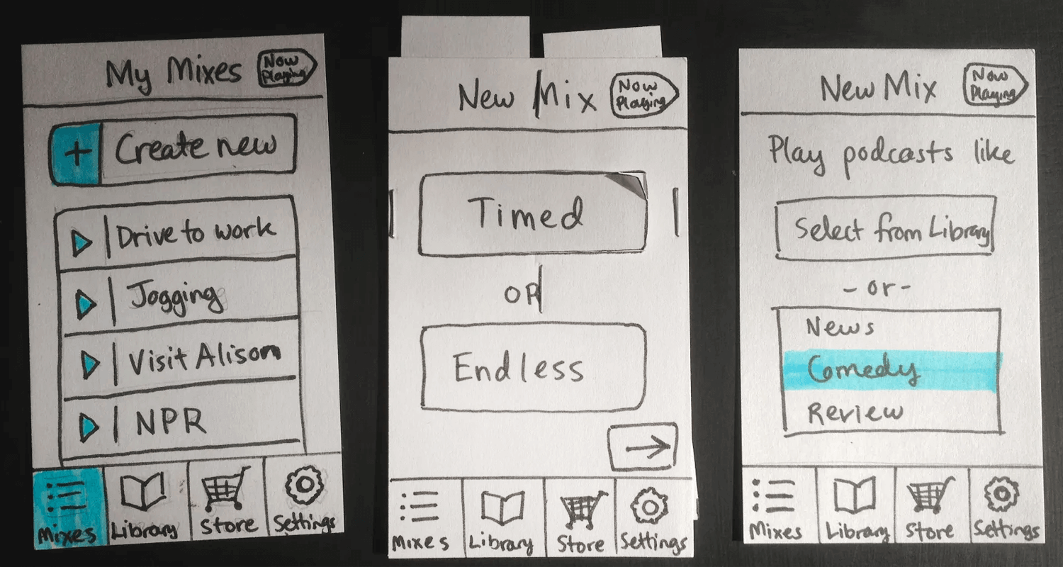
Image source: UX Pin
In the third screen, we can see that comedy has been highlighted to indicate the flow that the user selected.
This example shows just how creative you can get with your paper prototypes, as an iron iPhone mold with an empty screen is simply placed over the different UI screens sketched out on paper.
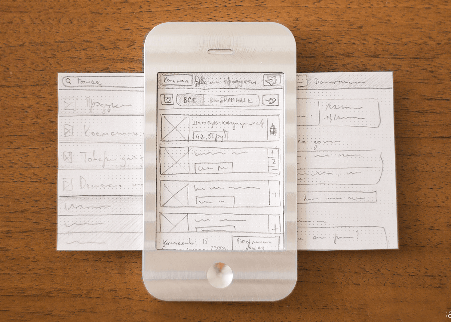
In this way, a user can navigate through a screen flow for mobile apps without having to use multiple sheets of paper for each screen. However, we’d advocate using real text here in place of the scribbles.
Start prototyping now products today. Enjoy unlimited projects.

If paper’s your thing, then Konigi is a gold mine, providing graph paper to cover everything you need for paper prototyping. Here you’ll find wireframe grid paper that’s specifically thought out for sketching website paper prototypes that will be based on the Blueprint CSS framework.
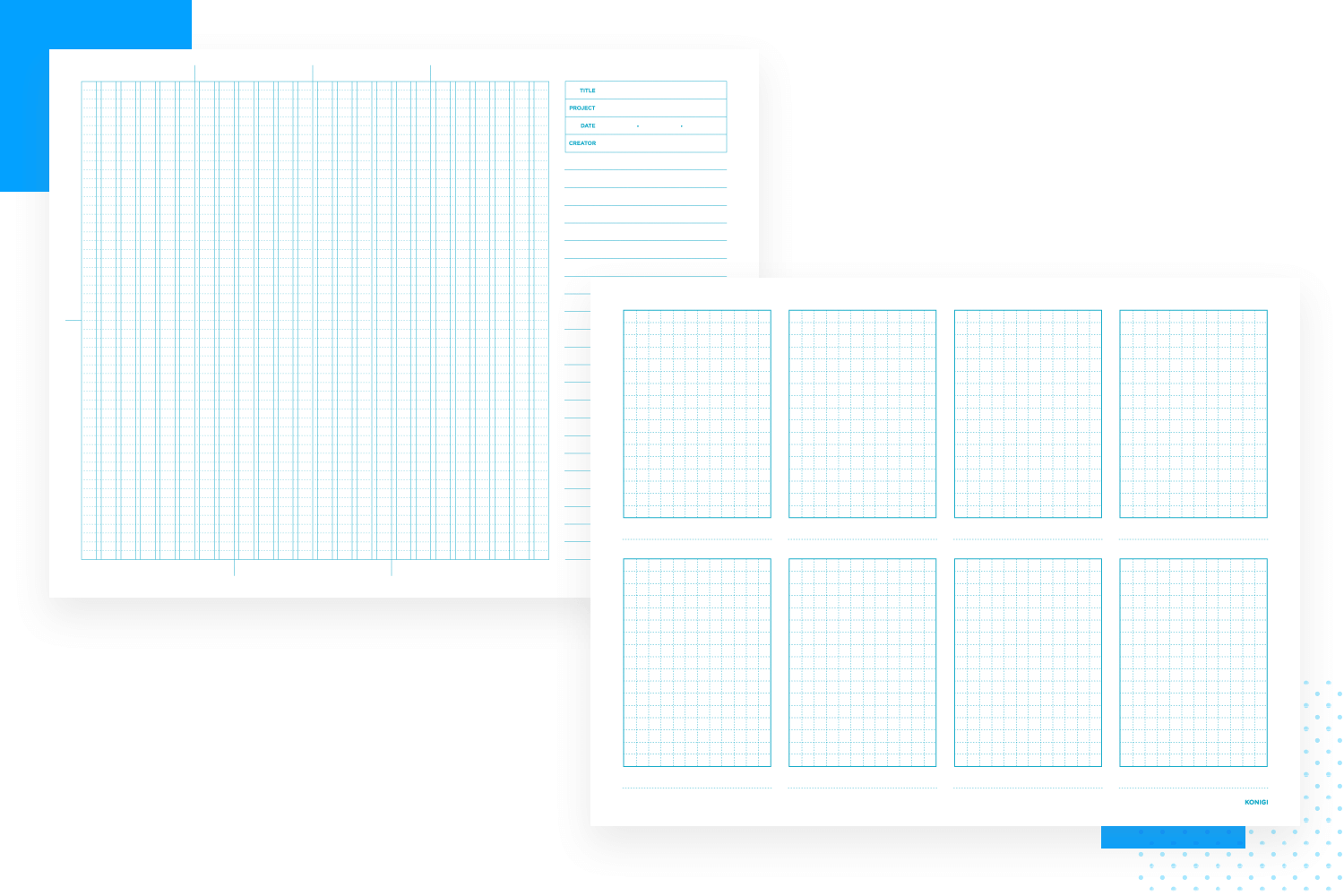
You’ll also find portrait graph paper and an 8-up sheet with 8 grid boxes that’s useful for doing fast screen sketches that can be used to display user flows. You’ll also find storyboard templates with room for annotations and simple dot grid paper.
You can download all of these resources and print them all for free.
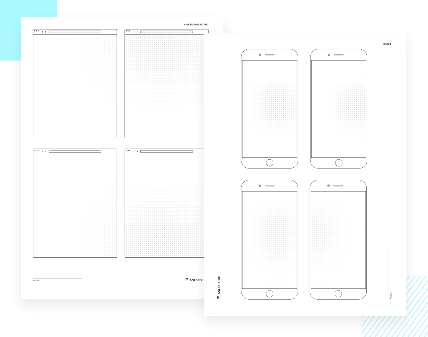
Sneakpeekit offers you flawless mobile, browser and tablet templates. They even include dot paper templates with extended screens for iPhone designs that have scrollable screens, so that you can sketch out the entire layout of the screen as it would look without scrolling. The best thing? They’re all free!
Sketch Pads from UI Stencils offers you lots of paper sketch pad resources. These include entire pads full of sheets that are complete with smartphone, browser and tablet templates that you can pull out and draw on at any time.
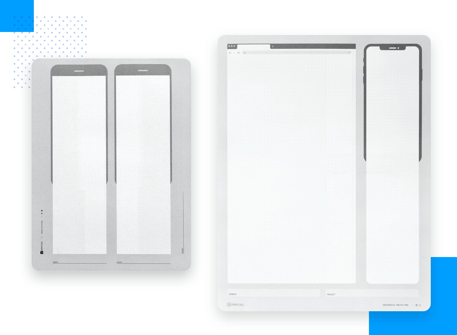
Best of all, there are also template sketch pads available that have extended screens so that you can factor in UI design based on scrolling.
These sketch pads usually range between $10-20.
UI stencils are also all about saving time and energy by allowing you to repeatedly draw perfect iOS and Android elements. You can find stencil kits for everything from the iPad to the desktop with a range of common UI icons, even gestures and interactions!
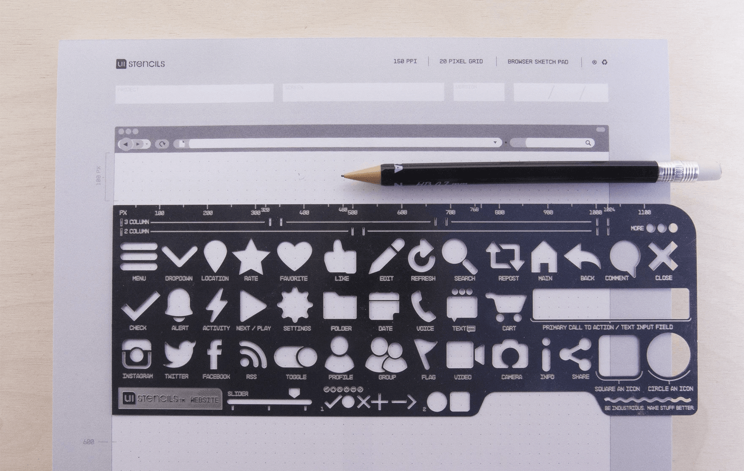
These stencils aren’t free but also won’t break the bank at about $20-30 per stencil set.
If you’d like to have more control over the device outline or are just looking for suitable graph or dot paper, then Printable Paper is the place to go.
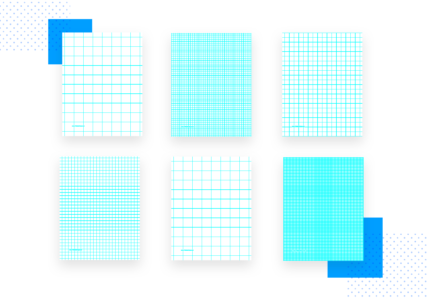
You can find graph paper with one, two or three squares per inch, dot paper with one, two or three, even four dots per inch. We could drone on ad nauseum, but the gist is, in terms of graph or dot paper, you’ll be sure to find everything you need. For free.
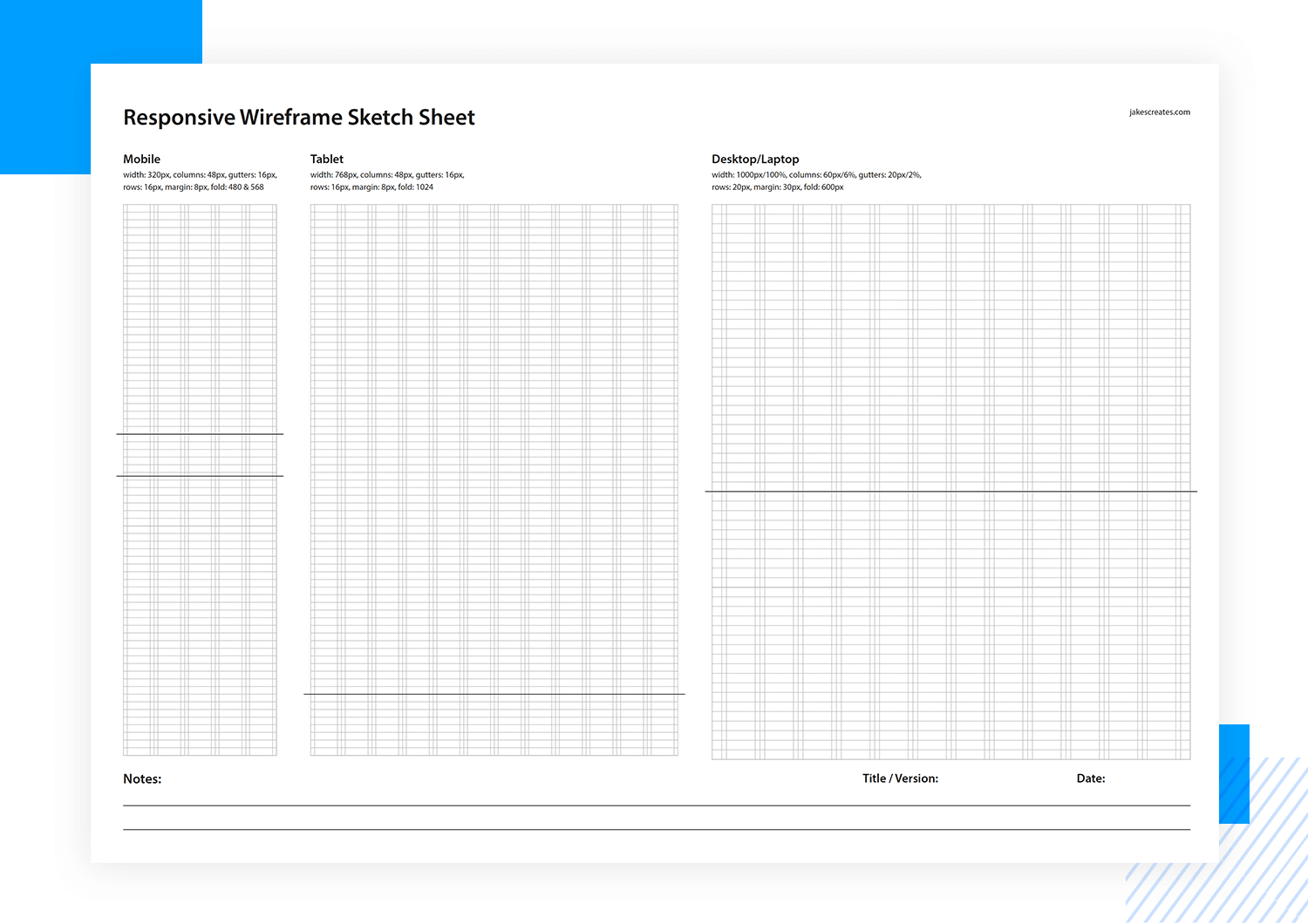
This responsive sketch sheet which David Jakes kindly offers up for free on Dribbble consists of a printable sheet with cutouts for a mobile, tablet and desktop that are vertically expanded sketching vertically and horizontally scrollable screens. There’s something handy about knowing that you have all the resolutions you need on one template!
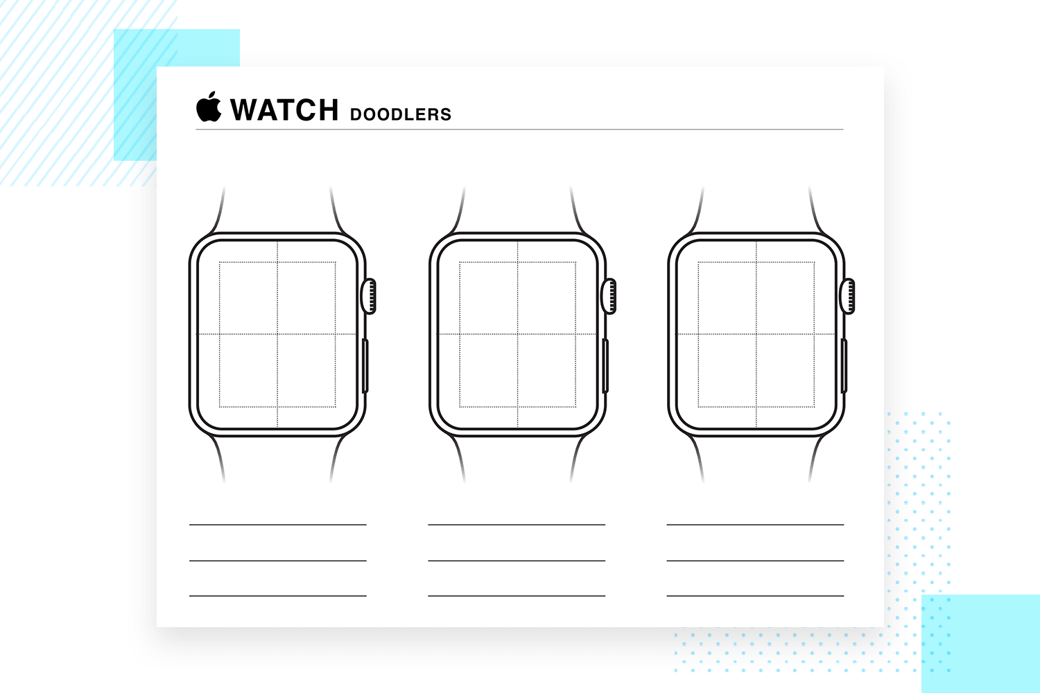
The template and resources list wouldn’t be complete without some brilliant free Apple Watch paper prototype templates. They’re free to download and print, come in a 3-up format divided into four quadrants, with blank lines at the bottom for annotations.
Sketchize specializes in offering great resources for paper prototyping. They offer everything from 2-up blank smartphone sketch templates, to extended 2-up dot paper prototyping templates so that you can draw out scrolling screens.
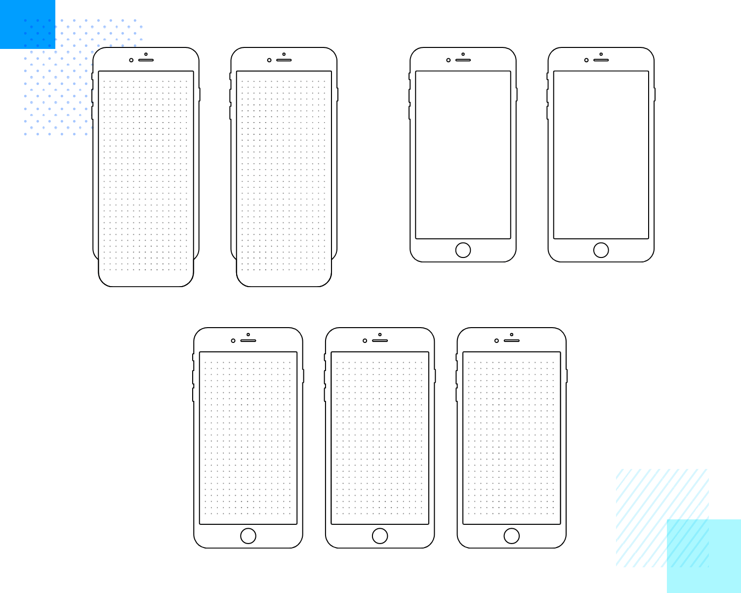
You also have 3-up mobile screens and dotted tablet screens. All the templates are free to download and print.
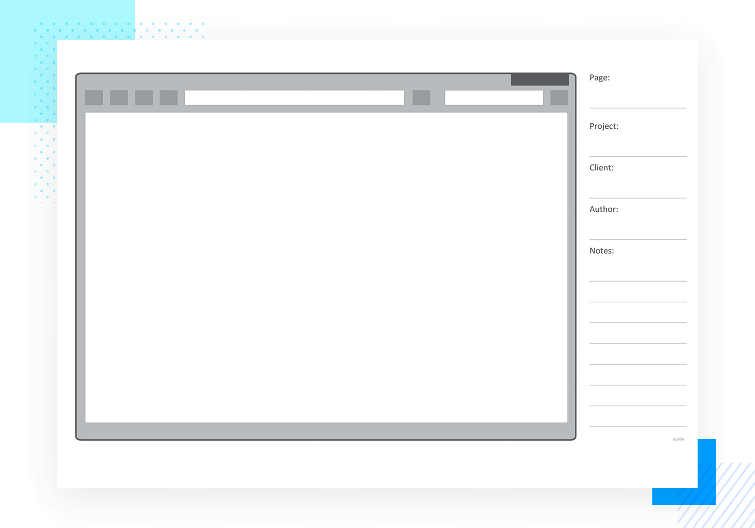
Maria Perez de Arrilucea posted a great browser website paper prototype template on flickr that’s free to download. It comes complete with an outline, along with a note section to the right for page number, project name, client author and comments.
This iPad Air template by Ben Bloodworth is free and totally worth the download if you’re planning on doing a paper prototype for iPad. The template is available in letter size and comes in scales ranging from 1:1 to 1:4. In addition to that, you can choose between a plain or dotted background, UI bars or a combination of dots and UI bars.
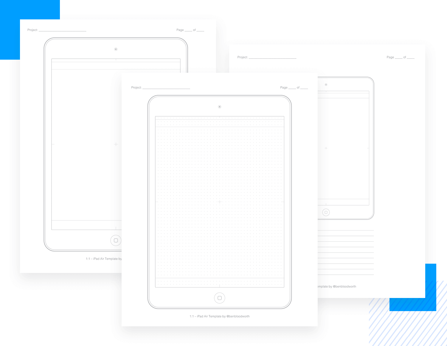
The template is also available in vertical or horizontal views.
Paper prototyping can be a useful part of the design process. But we must really emphasize the “part” it plays. It doesn’t, at the end of the day, replace digital prototypes. Instead, it can be used at the very start to guide your design direction.
When you have your paper prototyping session, be sure to include all stakeholders, i.e. the developers, product managers and even clients. Sometimes it’s easier to draw something than to explain it.
Once you have your paper prototype defined, go ahead and test it on a handful of users. The feedback you get from your paper prototype will be enough to inform the direction you’ll take with your high fidelity prototype.
PROTOTYPE · COMMUNICATE · VALIDATE
ALL-IN-ONE PROTOTYPING TOOL FOR WEB AND MOBILE APPS
Related Content
 Learn how to design better e-learning platforms with user-centered UX principles, real examples, and high-fidelity prototyping tips to boost engagement and learning outcomes.13 min Read
 Infinite scroll keeps users engaged, but it’s not always the best choice. This guide breaks down when to use it, when to avoid it, and how to design it right.14 min Read
 Learn how to design web and mobile app prototypes, how to test them and what to look for in a prototyping tool in this complete guide.15 min Read
