
Designing an iOS app prototype? Get inspired with these top tips and awesome iOS app design examples!
Designing an app for the iOS platform? Need a little inspiration? Don’t worry, you’ve come to the right place. Designing apps for iOS is similar to designing apps for other OS. However, Apple is slightly less flexible than other platforms like Android and there are a few strict guidelines set out in their Human Interaction Guidelines (HIG).
Start prototyping new iOS apps today. Unlimited projects.

In this post, we’ve rounded up the most important tips for designing iOS apps in your prototyping tool to make things a little more straightforward. We’ve also thrown in some of the best iOS app design examples to get your creative juices flowing.
Creating an iOS app is all about prioritizing user experience and functional design. iOS apps are designed to feel smooth, familiar, and visually appealing, aligning with Apple’s philosophy of simplicity and user-centricity.

iOS app design focuses on building apps that are not just aesthetically pleasing but also intuitive for users. Apple emphasizes a clean and consistent experience across all its apps, with clear layouts and smooth navigation. The goal is always to create a design that helps users engage with the app effortlessly.
iOS is one of the most widely used platforms, and its users have high expectations when it comes to the look and feel of apps. These users appreciate apps that offer a polished, user-friendly experience, and that’s a big part of what makes iOS design unique. Designing for iOS means understanding this level of expectation and delivering an app that feels right at home in the Apple ecosystem.
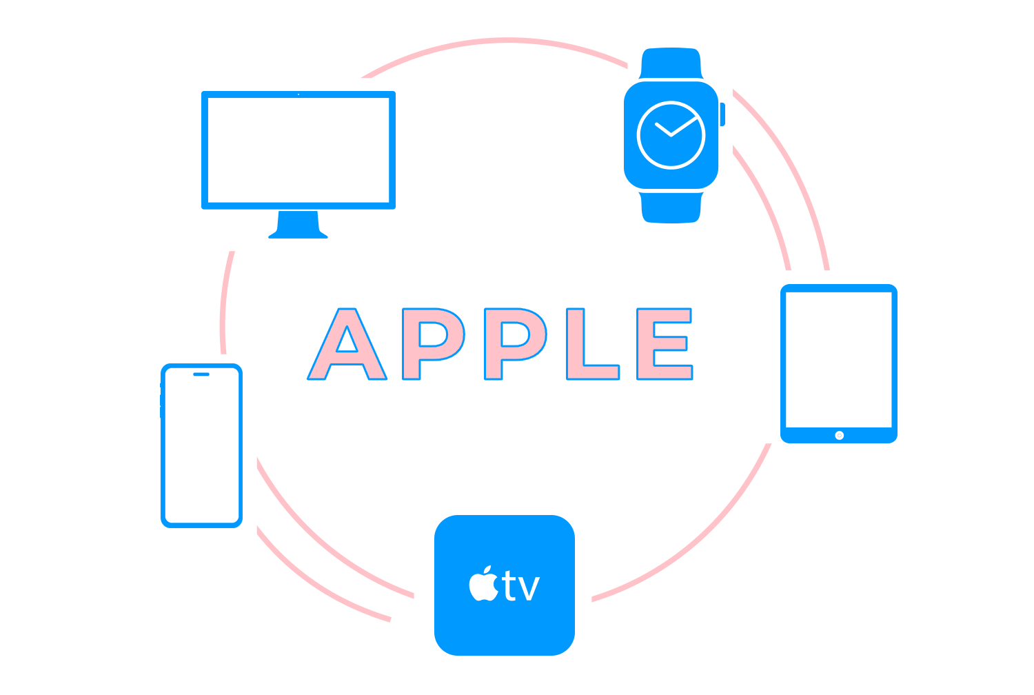
When designing for iOS, you don’t just focus on iPhones. Apple devices, including iPads, Apple Watches, and Macs, work together, providing a consistent experience across all platforms. Your iOS app must integrate smoothly into this ecosystem, enhancing the user experience across all devices.
The Human Interface Guidelines (HIG) provided by Apple give developers and designers a clear path to follow. They aren’t meant to stifle creativity but to guarantee that the app you create works in harmony with the platform’s expectations. When you stick to these guidelines, you create an app that feels intuitive and familiar to iOS users, which is key to a successful product.
Start prototyping new iOS apps today. Unlimited projects.
After understanding the fundamentals of iOS design and its importance, the next step is to focus on the key UI components that bring your app to life. These elements don’t just make the app look good, they help users navigate smoothly and interact with ease, creating that seamless experience we aim for in iOS design.

Tab bars provide primary navigation across an app’s core features. You’ve likely seen them at the bottom of many iOS apps, with icons or text representing different sections. They make it easy for users to switch between main areas without getting lost, keeping essential functions just a tap away.
Navigation bars sit at the top of the screen and help users move through hierarchical levels of the app. They usually include a back button that lets users return to the previous screen, giving them control without much effort. A well-placed navigation bar can turn a complex app structure into something simple and manageable.
When you need to show extra options or less frequently used features, side menus and modals come into play. Side menus typically slide in from the side of the screen and are useful for secondary navigation. Modals, on the other hand, temporarily take over the screen to focus the user’s attention on a specific action or information. The key is to use these components wisely so they don’t disrupt the flow.
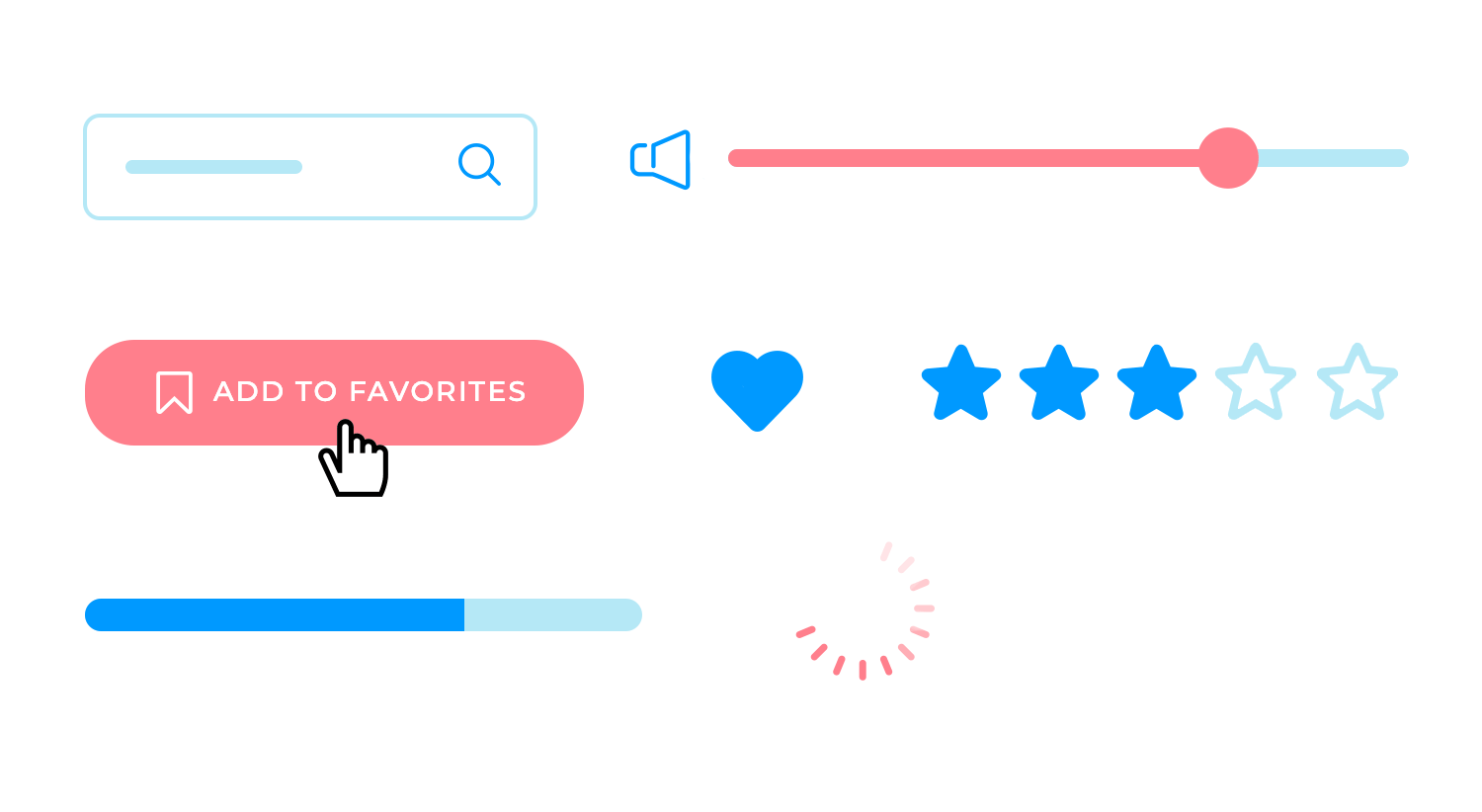
Buttons are the bread and butter of any app. Whether users need to submit a form, start a new task, or toggle a setting, buttons make those actions possible. Switches, sliders, and segmented controls offer additional ways for users to interact with content – like adjusting volume, toggling between views, or selecting options with a quick swipe.
iOS apps rely on familiar gestures like swiping, pinching, and tapping. These gestures feel natural and allow users to navigate quickly without needing to learn anything new. Swiping can move them through lists, pinching zooms in or out of images, and tapping selects or opens something. These actions are second nature to most iOS users and play a big role in the overall user experience.

The status bar at the top of the screen shows essential info like time, battery, and network strength. While it might seem like a minor detail, it keeps users informed without cluttering the screen. Toolbars usually appear at the bottom and offer quick actions related to the current screen. Together with menus, they help users find what they need without distracting from the main content.
Icons and symbols in iOS apps aren’t just decoration. They communicate meaning quickly and help users navigate without needing to read every label. Whether it’s a magnifying glass for search or a gear for settings, these symbols are simple but powerful. Keeping them clear and consistent is key to a well-designed app.
Now that we’ve covered the key components that shape your app, let’s take a closer look at the UI design principles that make iOS apps so intuitive. It’s not just about where you place buttons and icons; it’s about creating a cohesive experience where every visual and interactive element fits together naturally.
The app icon serves as the user’s first encounter with your brand. It’s more than just a logo – it’s a symbol of what your app represents. Keeping it simple and memorable is key. The icon should stand out but remain clear and uncluttered, reflecting the app’s identity in a way that’s easy to recognize at a glance.
When users open your app, the splash screen is the first thing they’ll encounter. A good splash screen loads quickly, connects visually with your brand, and gives users a smooth introduction to your app. Avoid overloading it with too many details – just a simple, branded welcome that sets the right tone is enough.
Brand consistency is essential throughout your app. Every screen, every button, and every font should feel connected to your brand. But the challenge lies in balancing consistency without making things feel repetitive. Colors, typography, and iconography all play a role in maintaining this connection across different screens, keeping the user experience seamless.
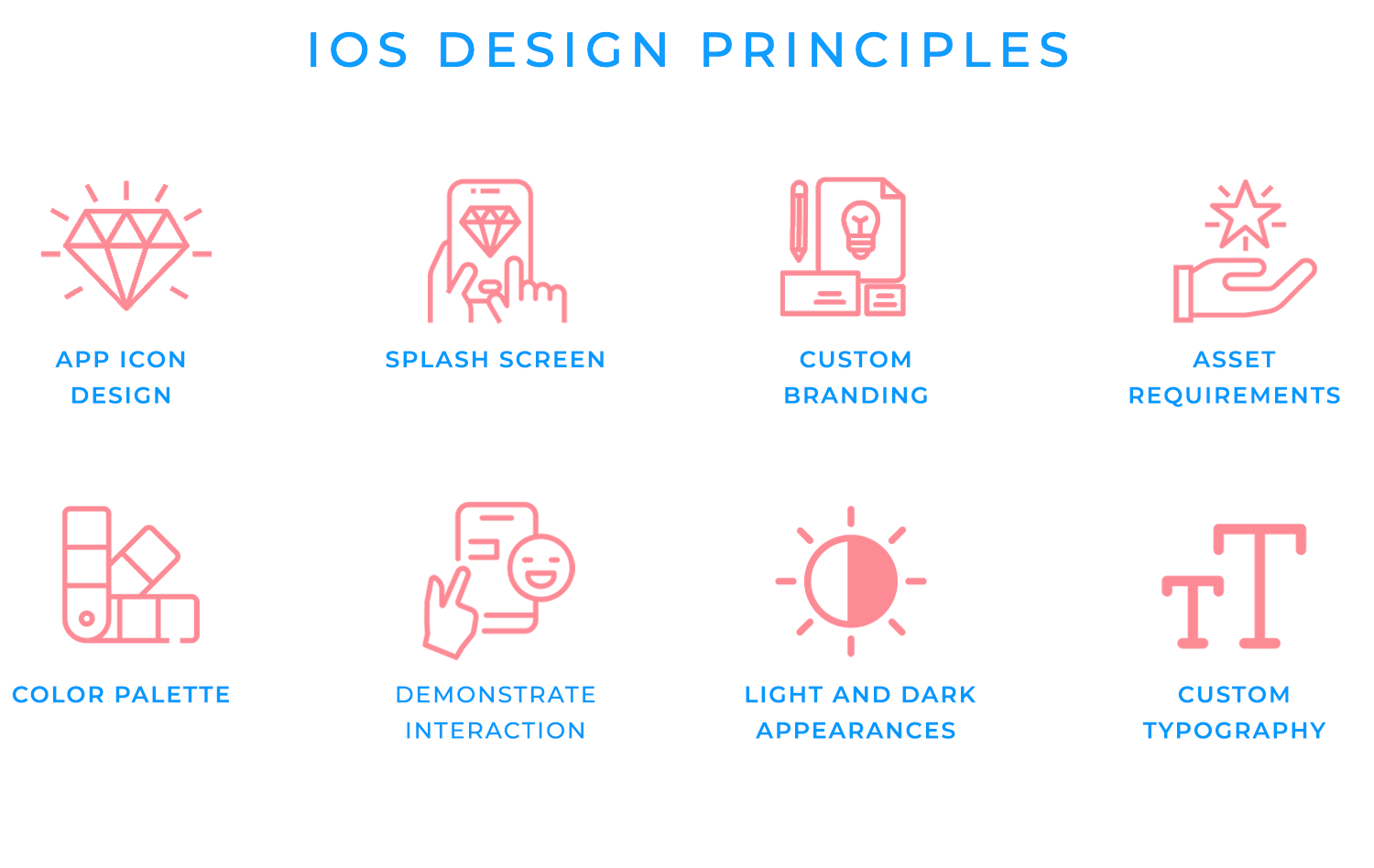
Apple devices come in all shapes and sizes, so it’s important to make sure your images, icons, and other visuals look sharp on every screen. Keeping track of different resolutions and formats might seem technical, but it’s worth the effort to keep your app looking polished and professional, no matter which device users have in hand.
Be careful in your approach to color. Your color scheme and how you deploy it will affect the user experience and usability of your iOS app design.
HIG recommends limiting your color palette to those that are in your brand logo throughout your design. Moreover, you’ll want to make sure that the colors in your palette work unanimously towards a more intuitive UI. Use the colors in your palette to consistently demonstrate various UI elements in a way that helps the user recognize the different parts of the interface.
Furthermore, with respect to warning messages, make sure to use a color like red in tandem with an icon like a triangle to make it clear when an error occurs.
Learn more about how to use color and alternatives to color to make UIs more operable for those with reduced vision in our guide to accessibility testing.
The HIG recommend using tint colors for elements with interactivity. Tint colors are those that are more saturated with white and have a lighter appearance. If you do this, the user will have a much easier time distinguishing static elements from interactive elements. You might even consider using entirely different colors for interactive vs non-interactive UI elements.
Lastly, make sure your color scheme is adaptable to both light and dark appearances. The iOS system colors are all automatically adapted for both appearances, according to their semantic color system. Using the system colors for certain icons and elements in your iOS app UI design can save you time.
Apple offers two main fonts: San Francisco and New York. These fonts are built to be flexible and readable across all devices. San Francisco works well for most of your text, while New York can give a more elegant look to titles. If you prefer using a different font, just make sure it’s easy to read, whether on a small phone screen or a larger tablet. Not sure about the best font for your users and your brand style? Check out this guide on the best fonts for mobile app design to help you decide!
For paragraph text and functional text (such as for navigation or instructions), we recommend using the San Francisco or New York typefaces as the majority of iOS app users will be accustomed to reading this font.

In addition to that, there are up to six different fonts for the San Francisco typeface, so you don’t need to worry about distinguishing text hierarchies for your user. Meanwhile, Apple’s New York serif acts as a complementary typeface for San Francisco, and is great for titles.
Apple’s HIG recommends reinforcing your brand, but you’ll need to make sure that your logo doesn’t take up too much screen real estate. This can get in the way of both content and navigation, to the detriment of the user experience.
Nonetheless, there are other ways of reinforcing your brand. The easiest and most recommended approach is simply adopting the same color scheme of your brand colors and using them for various UI elements throughout your iOS app design. You can use your brand palette for iconography such as glyphs, to highlight text and even for backgrounds or splash screens.
When it comes to the light and dark appearance of your iOS app design, always avoid creating your own appearance settings. You don’t want to create separate settings that clash with the system wide settings on the user’s device.

By doing this, you could end up creating confusion and extra work for the user. This is because they’d have to turn two sets of switches on and off to control light and dark appearance.
Next, for accessibility reasons, you’ll want to ensure the text in your iOS app design is still legible when in dark appearance. For example, if the user increases the contrast whilst in dark appearance, is there less visual contrast between the dark text and the dark background?
As long as your iOS app is in dark appearance, you’ll also want to make sure there is adequate contrast between the background and the foreground. An example of when this is necessary could be when modal sheets appear in the UI. You can do this by adhering to Apple’s HIG dynamic standard color guidelines.
Lastly, consider designing symbols for both light and dark appearance. To do this, simply design hollow glyphs with outlines for iOS light appearance and filled glyphs for iOS dark appearance.
Unless vitally necessary, try to avoid interfering with the systemwide gestures for the edge of the iOS device. This is because those gestures usually allow the user to access the Home screen, the Notification Center, the app switcher and the Control Center.

Always use standard iOS gestures to complete standard tasks. Users are accustomed to these standard gestures across a wide range of iOS products and don’t generally appreciate having to learn new gestures for achieving the same action. An example would be the left-to-right swipe to go back to a previous screen.
Start prototyping new iOS apps today. Unlimited projects.
You can also make your iOS users feel at home by using standard UI elements that are compatible with iOS haptics such as sliders, date pickers and switches. Did you know that you could get full access to all of these standard elements using Justinmind’s iOS element UI kit?
As you probably know, iOS apps, unlike android apps and those of other OS, don’t have access native navbar. Instead, the apps themselves have to ensure they cater for the user’s basic in-app navigation. The HIG recommend that you should always place this navbar at the top of your iOS app design and include a back button (← or <) accompanied by the title of the previous screen.
For example, if your user is viewing a message from a particular contact, then your navbar would have the back button, followed by “Messages”. The user would then understand that if they press the back button, they would then go back to all messages. On the right, you should include things like edit, done and other features that are necessary in that display, or else further navigation options.
It’s also a good idea to rely on tried-and-true UI patterns where possible.
iOS users are familiar with a range of gestures like swiping, pinching, and tapping. These gestures feel natural and help users move through the app without thinking twice. Swiping, for example, is great for navigating between screens or dismissing content, while pinching is perfect for zooming in on images.
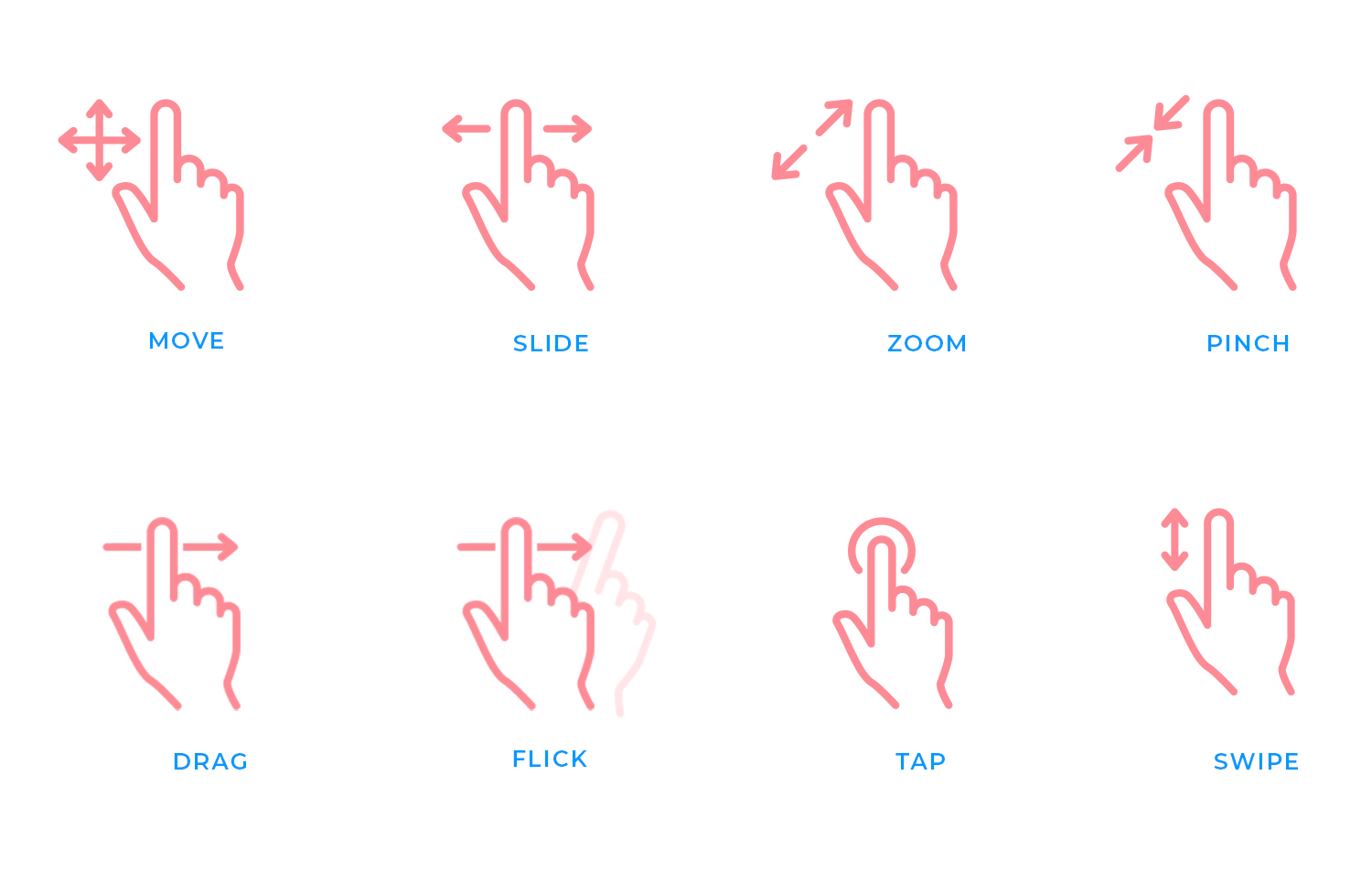
Tapping remains the most common gesture for selecting items or confirming actions. The key is to stick with these standard gestures where they make sense, ensuring users can interact with your app intuitively. Overcomplicating gestures can lead to frustration, so keep things familiar and simple.
When designing buttons and interactive elements, size really matters. Touch targets need to be large enough to accommodate finger input comfortably. If buttons or icons are too small, users might struggle to tap them accurately, especially on smaller screens. Apple recommends a minimum size of 44×44 pixels for touch targets to ensure that users can easily interact with the app without any frustration. A well-sized button isn’t just about usability – it makes the app feel more responsive and enjoyable to use.
Haptic feedback is an often-overlooked element that can add depth to the user experience. By providing subtle vibrations or tactile responses when users interact with certain elements, like pressing a button or toggling a switch, you can make the app feel more responsive and immersive. Haptics give users a physical connection to their actions, reinforcing their inputs and making interactions more satisfying.
Animations and transitions bring a sense of fluidity to your app. A smooth transition between screens or a subtle animation when an element appears can make the app feel polished and dynamic.
Common animations include fade-ins, slide transitions, and even bounce effects for certain elements. The trick is to use animations thoughtfully – they should enhance the user experience without slowing it down. For example, a slide transition works well when moving between pages, while a quick fade can make pop-up elements feel less abrupt. Keep animations smooth and quick to maintain a sense of speed and fluidity in the app.
Now let’s explore some advanced design patterns that help organize information and improve how users interact with your app. These patterns ensure that the app remains intuitive, even when dealing with more complex content or actions.
Modals and alerts come in handy when you need to deliver a message or get quick input from users without taking them away from the current screen. Modals are best for tasks that require focus, like confirming an action or filling out a brief form. They allow the user to interact without losing their place in the app. Alerts, on the other hand, are great for conveying urgent information, like errors or warnings, and should be used sparingly to avoid overwhelming the user.

When you need to display a lot of content, cards and lists are your go-to options. Cards allow you to group related information together in small, bite-sized sections, making it easy for users to scan through. They work well for things like product listings or social media posts. Lists, on the other hand, are ideal for structured data, like contacts or settings, where users expect to find information in a clear, linear order. Both views help keep things organized and user-friendly.
Search bars and filters help users quickly find what they’re looking for, especially when dealing with large amounts of content. A good search bar is easy to access and instantly responsive, while filters allow users to narrow down their search results without frustration. When designing search and filter functions, it’s important to make them flexible, users should be able to search using keywords, categories, or other criteria that fit the content in your app.
Forms are where users input important information, so making them as easy as possible is crucial. Text fields should be clearly labeled, and dropdowns should offer logical choices. Keep forms simple by breaking them into manageable sections if needed, and use clear instructions to guide users. The fewer fields, the better, only ask for what’s necessary to avoid overwhelming users.
When designing for iOS, your app isn’t just going to live on one device. It needs to look great and work seamlessly across iPhones, iPads, and everything in between. Let’s take a look at how to adapt your design for different devices.
Even though iPhones and iPads share the same software, their screen sizes and how users interact with them can be quite different. On an iPhone, users tend to stick to portrait mode, while on an iPad, switching between landscape and portrait is much more common.

Your design needs to shift naturally between these formats. For example, what might work as a simple single-column layout on an iPhone might feel cramped on an iPad. By adjusting layouts, you make sure your app fits comfortably on any screen.
One of the best ways to handle different screen sizes is to create layouts that adapt. This means building your interface so that it adjusts depending on the device being used. Whether your app is opened on a smaller iPhone or a larger iPad, the design should still feel natural. Adaptive layouts let your app flexibly respond to the screen size, keeping things looking sharp and functional.
Auto layout takes the guesswork out of making your app responsive. Instead of manually tweaking every element for different devices, Auto Layout helps you set rules so that buttons, text, and images stay where they should, no matter how the screen changes. It’s about making sure the design holds together whether the user rotates their device or switches between portrait and landscape.
With notches, home indicators, and various screen shapes, you need to make sure that important parts of your app aren’t hidden or cut off. That’s where safe areas come in. They keep your content clear of these hardware elements so that buttons, text, and other key pieces of your app are always easy to see and use. It’s the kind of detail that makes a big difference, especially when users switch between different devices.
Start prototyping new iOS apps today. Unlimited projects.
When it comes to iOS app design, having the right templates can make all the difference. In this section, you’ll find a selection of carefully crafted templates that highlight various styles and functionalities.
Each one is designed to inspire your creativity and streamline your development process. And guess what? The first ten templates are available for free download, giving you the perfect opportunity to start your next project with ease. Let’s check them out.
The Kryptonite crypto iOS app design feels like a smooth onboarding experience from the moment you open it. The sleek, black card visuals stand out immediately, hinting at a premium service, while the clean white background keeps things effortless and approachable.
The interactive elements are subtly placed, guiding you forward without needing to shout for attention. The branding is sharp and minimalist, blending seamlessly into the flow of the design. It feels like you’re stepping into something well-thought-out, with every detail in its place, ready to get started.

This iOS music app design immediately taps into personalization and smooth navigation. Designed with iOS app design principles, it makes excellent use of dark mode, which not only enhances the user interface but also saves battery life on iPhones.
The section is intuitive, and artist icons stand out, making discovery something easy. The rounded icons and the seamless transitions reflect classic iOS design aesthetics, ensuring familiarity for iPhone users. It’s a refined experience that feels like it belongs on any iOS device, from the first tap to the last.

Imagine scrolling through your favorite products with a design that feels as seamless as browsing on any iOS device. This iOS e-commerce app design effortlessly brings products to life with bold, clear visuals and an intuitive layout that’s easy to navigate.
The minimalist approach keeps the interface clean, allowing users to focus on what matters – exploring product details without distractions. Smooth transitions and familiar gestures make shopping on an iPhone or iPad feel second nature, perfectly blending functionality with iOS design principles for a fluid, enjoyable experience.

This iOS app design keeps things straightforward, helping users stay updated on their favorite shows. The bold yellow theme contrasts beautifully with the minimalist layout, making the app visually striking without being overwhelming.
The simple and intuitive design ensures that tracking viewing progress feels effortless. Every element is focused on giving users the information they need without any clutter, fitting seamlessly into the familiar iOS app design experience.
Finding the perfect meeting room has never been easier, especially when designed with iOS users in mind. This app lets you filter by preferences like soundproofing, Wi-Fi, or available projectors, with clean icons and smooth navigation reflecting Apple’s signature style.
The design isn’t just about looks, it’s about making the process seamless, from filtering to booking. The modern layout, intuitive interface, and fluid transitions help elevate the experience, fitting naturally within the iOS ecosystem and making meeting room reservations as efficient as possible.

This iOS marketplace design gives off a clean, friendly vibe, making it easy to find and explore different categories like fashion and electronics. The color palette is soft yet lively, ensuring items like sneakers and cameras pop without overwhelming the eyes. Each listing shows just what you need – image, price, and a simple description.
The smooth navigation bar and icons guide users naturally, creating an experience that feels less like browsing and more like discovering. The design keeps things easy, while still offering an intuitive, enjoyable journey through the app.

The Magazine apps on iOS come with unique design challenges, but this one keeps things simple while standing out. Instead of overwhelming users with options, it opts for a clean, minimalist look. The bright accent colors against black-and-white images bring attention where needed. Swipe gestures allow readers to navigate effortlessly between sections, making it a smooth and user-friendly experience.
The app feels distinctly made for iPhone, blending seamless navigation with a reading experience that’s perfectly suited for mobile consumption.

The truth is, this iOS fitness clothing app captures attention with its dynamic design. The vibrant image of an athlete in motion instantly sets the tone, emphasizing energy and movement. Its layout is clean and efficient, highlighting key products without clutter, all while maintaining a sleek, modern aesthetic.
Navigating through the app feels natural, making it easy to browse through the collection, aligning perfectly with the active lifestyle it promotes. It’s a perfect balance between visual appeal and practicality, designed for seamless, fast shopping.

Another great example of a smooth and visually appealing iOS app design. This one focuses on user-friendly navigation, with clear categories that make browsing products something very easy.
The color scheme subtly directs attention to the products without overwhelming the user, while icons and buttons are simple, modern, and intuitive. With everything laid out neatly, users can easily switch between product details and categories, ensuring a seamless shopping experience on iOS. This layout demonstrates how functionality and visual design blend harmoniously in mobile shopping apps.

This design combines simplicity and functionality, making it perfect for a digital bookshelf. It organizes books into categories creating a clean and structured layout that enhances the user experience. The search bar at the top is a useful addition for finding specific books quickly, and the navigation at the bottom makes it easy to switch between sections.
It’s a well-crafted iOS app design that blends practicality with aesthetic appeal, ensuring smooth user interaction.

This streaming app for tablets keeps things simple and engaging. The dark background lets movie covers and show thumbnails pop, making browsing easy. The main feature section stands out with bold titles and a big preview image, inviting users to hit “Play now” without delay.
Scrolling down, viewers can easily pick up where they left off or explore personalized recommendations in an orderly layout. The navigation bar at the bottom is intuitive, with icons that guide users seamlessly to home, search, or downloads. Everything feels within reach for a smooth, uninterrupted streaming experience.

Ever browsed for a new outfit and wished the process felt simpler? This iOS app design for a fashion store makes that happen. From the moment you open it, the layout feels inviting and easy to follow. The product details are right where you need them – bold, clear, and quick to scan.
Choosing your size or favorite color is seamless, with options displayed in an intuitive way. And when you scroll to reviews, real customer feedback, complete with user photos, adds that extra confidence to your purchase. It’s all about making your shopping experience smooth and enjoyable.

This wellness iOS app template offers a straightforward and user-focused design. It greets users by name and provides easy access to a search bar and category filters for quick navigation. Featured sessions like “Yoga” and “AcroYoga” are shown with clear visuals and labels, making it easy to choose a routine.
The layout is simple, ensuring users can browse smoothly, while the bottom navigation bar keeps key actions accessible. The clean, minimal design keeps the focus on finding and starting sessions without distraction.

This checkout app template keeps the process clear and efficient. The layout guides users step-by-step, starting with the delivery address at the top, making any edits simple. Below, shipping options are laid out with straightforward pricing and highlighted selections to avoid confusion.
The total price is shown clearly, with the checkout button placed where it’s easy to reach. The minimal, focused design helps users move through the checkout smoothly without any distractions.

This iPhone template for electronics prioritizes a smooth, user-friendly experience. Users are greeted by name with a profile picture, adding a personal touch. At the top, a search bar and filter options make it easy to find what they’re looking for. The “Top Products” section showcases items with large images and clear prices, allowing for quick comparisons.
The layout is straightforward, keeping the focus on product discovery without unnecessary elements. The bottom navigation bar offers quick access to key areas like the cart and account, making browsing and shopping seamless.
This to-do list iOS app template is designed for clear, efficient task management. It organizes projects into visually distinct cards that show progress at a glance. The task input form is simple, allowing users to add titles and optional details without hassle.

Color-coded sections make it easy to differentiate and prioritize tasks. Interactive checkboxes and clean icons support quick navigation and updates. The design is straightforward, focusing on usability and a clean interface for a smooth experience.
Ever wanted a cooking app that feels simple and engaging? This iOS app design for vegetarians nails it. Right from the start, you’re greeted with a bold tip and an inviting image that catches your eye. Just below, detailed steps are laid out in a way that’s easy to scan and follow, so you don’t waste time figuring out what’s next.

The design is all about keeping things clear and user-friendly, making the cooking process straightforward and enjoyable.
Another iOS design with a clear layout for data analysis that makes an impactful data presentation. The interface centers on a bold, minimalistic chart that highlights key metrics, making trends easy to grasp at a glance. Simple typography and clean visuals keep the focus on the data itself, avoiding distractions. Essential information is displayed in a way that feels intuitive, allowing users to quickly interpret results and insights.

The template’s structured approach ensures users can navigate and analyze data efficiently, supporting effective decision-making.
Here’s what makes this fitness activity app template stand out: it puts your recent workouts front and center, showing essential details like distance, duration, and calories burned without any clutter. Users can easily spot their progress and switch between activities. The “Near you” section offers relevant local or virtual events to keep motivation up.

This iOS design is straightforward and with a simple navigation that makes checking workout history quick and hassle-free. It’s built for users who want a clear, no-fuss way to track their fitness.
Checking your balance and managing transactions shouldn’t be complicated, and this crypto wallet app template keeps it simple. The main screen shows your current balance clearly, with easy-to-spot send and receive buttons. A “Lock wallet” option adds a sense of security with just one tap. The transfer list section allows quick access to frequent contacts, making it easy to repeat transactions. Below, users can see their wallets, complete with details on holdings and values, at a glance.

The straightforward layout ensures that navigating and handling crypto is hassle-free and efficient.
Start prototyping new iOS apps today. Unlimited projects.
Guiding users through their wellness journey, this iOS app design focuses on simplicity and calm. Soft colors, minimal visuals, and easy prompts create an inviting atmosphere. Clear navigation and interactive buttons ensure a smooth user experience, while rounded icons and seamless transitions keep interactions fluid. Progress tracking is shown in a visually appealing way, blending design and functionality easily.

This “complex” invoicing app concept does a great job at making the navigation and the UI as simple as possible. A clear UI and easy navigation makes your receivables and payables an episode of Tom and Jerry.

One thing that makes this iOS app design stand out is the fact that affirmative action buttons are in green, such as the save button, the edit button and even the play button for the invoice ageing feature.
This challenger bank iOS app is perfect for inspiring you to create any kind of financial app or dashboard design. The first thing the mind is stricken by is the vibrant medley of credit and debit cards and elements on the screen.

The designer made great use of smooth pastel colors and made great use of negative space to allow all of the different elements to breath. This has the effect of allowing the user to absorb multiple details at once without getting distracted.
Lastly, the deep flat design gives the buttons and other elements in this iOS app design a raised, clickable effect.
Here’s a colorful juice ecommerce app. Were we seduced by the colors? Yes, maybe. But that’s not the only thing iOS app design has to offer. It also capitalized on the space available to bring stark relief to the elements onscreen and to make the UI clearer. A clear UI helps the user achieve the one thing on their mind – their need for juice.

Each item on the list stands out with different colors – even the date pickers change colors according to the list item. Some might say that these colors shouldn’t deviate. However, in this case it works as it is a largely repetitive element.
This smart home iOS app design is another marvelous example of a functional dashboard app with a clean, minimalist aesthetic. But do minimalist and dashboard design go together? This iOS app design is proof that they indeed can.
This app lets the user keep track of all the different devices operating in their smart home. The demand for these kinds of apps could be set to increase prolifically in the coming decades as more and more smart products flood the market.

This iOS app design makes use of sliders for temperature settings and fan speed sliders and draws on a semi flat design with a UI full of buttons asking to be tapped. The elements in this app UI are also a great opportunity to make use of iOS’s haptic touch feature to enhance the user experience.
This diet tracking app design brings clarity and simplicity to meal monitoring. This iOS app design template uses bold, readable visuals and vibrant color coding for quick recognition of carbs, protein, and fat intake. Key statistics and progress are highlighted, making it easy to stay informed at a glance. Each section is laid out thoughtfully, with user-friendly navigation that allows for seamless tracking throughout the day.
The layout keeps the focus on usability, making it simple for users to keep their diet on track without distractions.
Exploring podcasts becomes seamless with this iOS app design. It kicks off with a bold featured section that highlights the top picks, instantly drawing attention. Moving into the episodes, the clean layout and simple navigation keep the experience smooth. Key podcast details are displayed with vibrant visuals and easy-to-access controls, making listening straightforward.

The interface balances informative content with user-friendly interaction, ensuring listeners find what they need easily.
This iOS app design serves as great inspiration for a children’s reading app. Bold colors contrast nicely with the softer pastel shades in the background. Glyphs in the taskbar vary between being bold highlighted colors and grey depending on which screen the user has selected.

Semi flat design with light shadowing helps the UI distinguish between foreground and background items. The only thing that might be better done differently would be to extend this technique onto the actual card buttons themselves as well. Apart from that, we can’t complain – everything is stellar!
Here’s one that’s a little more niche. This drum school mobile iOS app design was created by a designer who took inspiration from the shockingly bad design of her difficult-to-use drum school’s app.
This iOS app design goes in for simple navigation, with nothing surplus to the user’s requirements. It capitalized on screen real estate to create big icons, buttons and space for elements to breathe, helping drum students get straight into learning.

It’s also a sterling example of how a UI design can be set up to easily adapt to both light and dark iOS settings. All that has to be done here is to change the background and font and glyph colors. This is because the rest of the elements work against both white and a dark background.
Yes, another meditation app! Meditation apps are great, but there are so many of them on the market! Even so, the design of this one stands out nicely. It provides a place to help the user improve the quality of their sleep, meditation and general state of mind.
It also happens to be a great example of how you can organize content in a way that visual hierarchy guides the user’s eye to the content that’s most likely to strike a cord with them, such as recommended content.

The design throughout this iOS app concept is minimalist, using vector images and drawing on negative space to allow the elements room to breathe and improve scannability.
Start prototyping new iOS apps today. Unlimited projects.
After exploring the templates, it’s helpful to understand the core design differences between iOS and Android. Though both platforms aim to deliver smooth user experiences, they follow distinct guidelines and design philosophies.
iOS design emphasizes clarity, simplicity, and depth, with navigation often located at the bottom using tab bars, and Apple’s signature San Francisco font adds to this sleek look. Android, meanwhile, embraces customization and tends toward Material Design, which uses layers and shadows to create a tactile feel. Android apps often place navigation at the top and use Roboto font as standard, creating a more dynamic layout with varied color schemes and components.
In reality, designing for iOS means focusing on a streamlined, minimalist approach, while Android allows more flexibility with colors, layouts, and customization options. When you adapt to these unique standards, your app can feel at home on each platform.
To bring your iOS app ideas to life, having the right tools is essential. Justinmind is a versatile tool that covers everything from initial wireframes to high-fidelity prototypes, helping you visualize and refine your app’s flow. With interactive features and extensive UI kits, it’s a great fit for designing realistic iOS experiences.
Mobile wireframing is often the first step in app design, where you map out your app’s layout and functionality. Justinmind’s mobile wireframing tools make this process smooth, and you can even download a mobile UI kit to jumpstart your designs with pre-built components.
The iOS UI kit in Justinmind provides a range of buttons, toggles, navigation bars, and other elements specific to Apple’s design guidelines, ensuring your app looks and feels like a native iOS experience. There’s also a dedicated icon kit for iOS, which includes Apple’s signature icons for consistency in style and usability.
These resources offer a strong foundation for prototyping and iterating on your iOS app.
Designing for Apple’s iOS platform might not be as easy as other OS. However, the rewards of creating a successful app for one of the most popular, if not strictest, OS on the planet pays dividends.
Over the years, there’s been more and more screen real estate to play with. In fact, the display is the device. Designers have the opportunity to create even more immersive user experiences than before. Let our awesome iOS app designs be the inspiration you need to get started.
PROTOTYPE · COMMUNICATE · VALIDATE
ALL-IN-ONE PROTOTYPING TOOL FOR WEB AND MOBILE APPS
Related Content
 A fun look at different data table designs, from basic lists to smart, interactive ones, based on how complex the data is and what users need.18 min Read
 Single page design v multi-page design – everything you need to help you choose the right design for your site’s content18 min Read
 Website backgrounds can be a powerful tool in creating an experience. But what kind of experience can you convey and how? We got the full run-through for you!14 min Read


