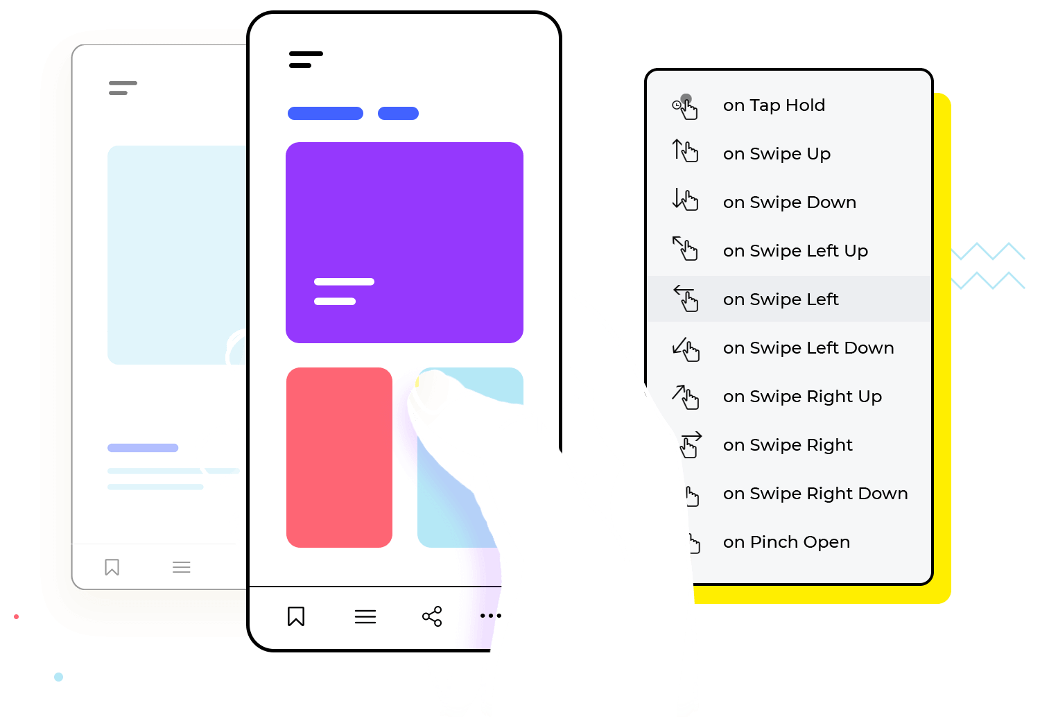
justinmind-logo

Guide to app interaction and gestures for iOS and Android

March 16, 2020
Guide to app interactions and gestures

What is app interaction and how do you get it right? How important is it to the user experience? All your questions answered in this post!

App interactions and user gestures can make or break the user’s experience. This is because they form a crucial part of your app’s UI; they are, in fact, the reason your app exists in the first place! Get either one of those design aspects wrong, and you can seriously hinder your product’s usability.

Start your app prototypes today. Enjoy unlimited projects!

download cta

Read on to learn more about what gestures and app interactions are, how they differ from each other and how to nail them in your next design with the Justinmind prototyping tool.

Difference between app interactions and gestures

Many people mix up gestures and interactions, but the truth is, they’re not the same thing. Although they’re often used synonymously, there’s one very important aspect that distinguishes one from the other: users gesticulate and apps interact.

When it comes to building gestures and interactions into your apps, you need to be aware of that crucial difference, along with the tight-knit relationship between user gestures and app interactions. Why? Because if you do it right with a prototyping tool, it leads to great UX!

App interactions and gestures: a two-way street

Let’s start with the gesture from the user. A user performs a gesture on a screen to carry out a certain task. Through gestures, users interact with the visible elements in a UI. The UI then does two things: it offers feedback confirming the gesture and responds. Consider the following situation:

User makes gesture, app interacts with user

Imagine the user wants to open up a menu on the top left side of the app so they tap on the hamburger menu icon. The resulting app interaction simultaneously highlights the icon to show the user their action was successfully registered and that the menu option is selected, while opening the overflow menu. In many respects we could consider interactions and gestures as being like two-way communication between the app and the user.

In the era of touchscreen technology, there are a myriad of different gestures a user can make to complete a task that work on pretty much any device platform:

  • Pinch
  • Tap
  • Scroll and pan
  • Swipe
  • Rotate
  • Long press
  • Drag

Mobile gestures usually come into play at a later stage in the design process, being included in a high-fidelity prototype.

The user can deploy all of these techniques to interact with the UI of the application on their cell phone or tablet screen. In your mind right now, what app interactions can you think of that would follow these gestures? Here are some straightforward examples that we see everyday:

  • Content on a page moving up or down when user scrolls
  • Dropdown menus opening when user taps on arrow
  • Overflow menus sliding out when user swipes left to right
  • Cards moving position with a tap or swipe mobile gesture
  • Images resizing as a user pinches and zooms
  • Numbers, letters and symbols appearing in a field when a user types with the keypad
  • Buttons depressing, changing color and bring the user to another screen
Different gestures solicit different app interactions

However, when designing app interactions, it’s important to solicit user gestures that are specific to the device’s platform. Depending on the device the user is accessing the app on, they will have to use different gestures to accomplish certain tasks. It’s also important to note the difference between system navigation gestures (general device navigation) and app navigation gestures.


Let’s look at the two most common platforms on the market: Android and iOS.

Start your app prototypes today. Enjoy unlimited projects!

download cta

Exclusive gestures for Android

There are some gestures for Android that you won’t find on iOS mobile devices and vice versa. When designing an application for either platform, it’s important to be aware of some of the main differences in system gestures. In many cases, these differences will affect the types of gestures the user will deploy.

An example of a gesture that’s exclusive for Android is the one for going back a page.  Android mobile devices have a built-in navigation bar with a back button. This means that basic navigation doesn’t have to be built into the application, because the Android system allows users to do it independently.

App interaction - Android navbar

Another consideration to make is the fact that Android users don’t have to swipe from left to right to go back a screen. This affords designers the opportunity to create specific app interactions to this gesture by opening an overflow menu in response.

We created a tutorial in case you want to try to prototype a grocery app.

Exclusive gestures for iOS

Lately, iOS is focusing on providing an even more immersive experience to its users than ever-before with the abolition of the home button. That renders it now an entirely gesture-based experience.

However, one thing that has never changed is that apps have always typically allowed users to toggle back and forth between an app’s pages by swiping from left to right.

If you’re building or designing an app for the iOS platform, it’s important to be aware not to use swipe gestures from left to right to invoke menus or other elements. iPhone users will have a well-buffed muscle memory for using that gesture!

iOS has unique back and forth gestures

Many apps can get around the limitation of not having a built-in navbar by building the interaction into the app itself. An example of this would be a back arrow at the top left of the UI.

When it comes to images or closing an app, most iOS users are accustomed to specific navigation gestures by default, such as flicking to get out of a selected image in a gallery app or in Instagram and to close an app.

Check out our post about iOS UI design to learn more about the nuances of designing for this platform.

Start your app prototypes today. Enjoy unlimited projects!

download cta

Interaction patterns for Android and iOS

Graphic

The most obvious app interactions your UI can provide users with are graphic interactions, that is, visual feedback. Pretty much any GUI (graphic user interface) app has interactions, even those that claim to be static. The simple act of letting users navigate through different screens is in itself an interaction.

Here are the main app interactions that we can see in both Android and iOS mobile devices:

Sliding elements in list format

Making elements such as vertical card lists slide with a swipe such as those seen in Gmail is one way of letting a user take action to delete or archive the email.

Cards

Another strong example of a UI element that elicits interaction is the card. Cards are very conducive to app interaction because they mimic real life objects and users can swipe horizontally or vertically through lists of them.

Users can also tap on cards to expand them or to navigate to another page. They can also drag, drop and rearrange them.

Cards make for a great interactive UI

Images

Images, like cards are another example of a rich source of app interactions on both Android and iOS platforms. Users can intuitively manipulate an image using hand gestures. You can design app interactions to respond to the following gestures users might perform:

Making an image expand, zoom out or pan by means of pinching, dragging and releasing gestures. Cards can also respond to the user by being dragged and dropped in specific locations.

App interaction - image gestures should be natural

Buttons

Buttons are another type of element that is prominent in app interaction on both the Android and iOS platforms. Buttons states often change by being highlighted or depressed when a user taps them. The app then further interacts by navigating the user to another screen or by causing something else to happen on the screen.

Overflow screens

Another way in which we can see app interaction with the user in both Android and iOS devices is in the form of overflow menus that occur when a user taps a hamburger menu icon, for example.

Another example could be an arrow button on a calculator app which calls for a swiping gesture from the user. The app interaction here would be when an overflow card opens with an extra layer of controls, icons and symbols.

Multiple selection app interactions

Many apps also interact with their users by allowing them to select multiple elements. They do this by letting them select one element with a long press which subsequently reveals check boxes next to all other selectionable elements.

App interaction - long press for multiple selection

Text input fields

Even the simple act of making fields appear ready for keypad input via a blinking cursor is an app interaction, as is showing the letters, numbers and symbols a user types in with their system keyboard.

Start your app prototypes today. Enjoy unlimited projects!

download cta

Sound

Another great way of interacting with a user is through sound. Sounds can provide feedback and confirm a user’s actions, as well as enhance the overall user experience. It can also be a great way of helping build user delight.However, you should avoid using sound app interactions in isolation from visual interactions. Instead, focus on using it to enhance any visual app interaction to increase intuitiveness by reinforcing feedback. It’s an excellent way to build consistency into a UI by associating certain elements with distinct sounds.

A further benefit of this type of app interaction is that you can use a sound to inform a user whether an action was correct or incorrect. You can also use it for indirect purposes, such as to express brand identity. Sounds that link user gestures to elements or state changes are generally referred to as earcons. Earcons can either be skeuomorphic or abstract in nature. Consider the following example:

App interaction - camera with skeuomorphic shutter sounds

Imagine an app that accesses the camera on your mobile device. The shutter sound might reflect a real-life camera to indicate you’ve successfully snapped a photo. The theory behind skeuomorphic sounds is that they mimic everyday sounds to help the user become more familiar with an action.

On the other hand, an abstract sound might simply be a bell ring or a mini jingle of sorts that helps users identify whether or not an action that they have taken has been successful or not. Nevertheless, the most important thing to note with sound interactions is never to go overboard: the last thing you want is an electronic rave of a UI that will quickly cause user fatigue.

Tactile (haptic)

Last but not least, app interactions do not merely stop at visual and sound interactions. They also include haptic interactions. These types of interactions are tactile in nature and often involve vibrations to provide feedback. By engaging the user’s sense of touch, designers can further enhance the experience of interacting with the onscreen UI elements of the app. It’s also a way of helping them learn how to use your app.

For example, if a vibration follows a long press, then they know the app has registered their action. A natural follow-on from this would be an earcon or visual interaction showing them if their gesture has been successful. Imagine the following scenario:

A user is wielding a song recognition app that comes with a big button on the UI which they must press and hold down for a few seconds while a song plays in the background. If they do this, then song recognition should occur.

App interaction - long press with haptic feedback

How does the user know that when they press the button, the app is doing its job? There are several ways this can occur. The button can change color or a spinner can replace it as the recognition software does its work. Then there is another way: it can vibrate. This shows that the song recognition software has been activated by the user’s long press gesture. Read more about button states on our post.

However, much like audio interaction, and indeed any kind of app interaction, designers should use it sparingly, otherwise they risk overwhelming the user with vibrations. You don’t want your app to become one long vibration experience like those old Addams Family Shockers!

Designing app gestures and interactions for iOS and Android is sped up more when you use the free UI kits we have available for both platforms!

Start your app prototypes today. Enjoy unlimited projects!

download cta

5 Best practices for interactions and gestures

1. Respect current mental models

Make sure you respect your users’ mental models when considering the types of gestures they will need to navigate and affect the content on your app. It’s especially important to take this into account when devising the appropriate app interactions for their gestures.

We recommend doing a bit of research into what your user personas are most comfortable doing. If the majority of users generally expect to find app content by scrolling vertically downwards through it, that means your app interaction should be applied in a way that complements this model. The content they scroll should move upwards or downwards depending on their gestures.

2. Provide feedback for every gesture

One highly important app interaction that you should build into your designs and test would be feedback interactions. These are app interactions that let a user know their gesture has been registered.

For example, when a user taps on a signup button, they may expect it to take them to a form where they can fill in their details. However, that doesn’t mean you shouldn’t include some form of microinteraction. That might be something such as highlighting the button and causing it to depress, signalling that their gesture was successful.

App interaction - microinteractions boost intuitiveness and user delight

Next, in the time it takes to load the form page, provide a spinner or a progress bar design to show them that the result of their action is currently in progress, otherwise they’ll think something went wrong.

Check out our post on inspiring sign up form design for some pointers on how to net users with easy-peasy data entry!

3. Don’t interfere with system gestures

When considering which gestures and app interactions to use in your app, take into special consideration the platform your app will be used on. It’s vitally important that the gestures for your app do not interfere with the general system gestures of the user’s device.

To avoid user frustration, don’t build in gestures that are initiated from the edges of the screen, which are generally used for the device’s system navigation.

4. Make fields, buttons and links big enough

People with small fingers can still use a UI with large elements, but those with large fingers often struggle with apps that have tiny fields and buttons. It makes sense then to ensure that your fields accommodate even large fingers. Design your UI with the Hulk in mind, not Tinkerbell.

5. Solicit gestures instead of text input if possible

Lastly, for mobile device users, gestures tend to reduce interaction cost and therefore cause less cognitive load than adding text input. For this reason, you should try and solicit gestures from your users where possible, instead of asking for text input.

App interaction - gestures reduce cognitive effort

A classic example of this would be the sign up form. Instead of making them type in their birth year, let them instead scroll through the years in a dropdown menu.

Find out more about how to reduce the user’s cognitive load when filling in forms in our guide to form design!

Start your app prototypes today. Enjoy unlimited projects!

download cta

10 awesome app interaction examples

1. Instagram

Social media app, Instagram, has taken a unique approach towards app interaction with the user through their AR Story filters.

App interaction - Instagram

When the user wants to add a special filter to their story, the app presents them with a list of cards at the bottom of the selfie view camera that they can swipe through. The fact that these filters can detect your facial position and expression to give you a pair of doggy ears is testimony to Instagram’s advanced app interactions.

2. Timepage

Timepage offers users smart alerts for weather conditions and gets its app interactions right. From the homescreen, users can tap on an umbrella icon for rain alerts where they’ll be brought to another screen letting them choose light or heavy rain alerts.

App interaction - Timepage

They can then tap the arrows left and right of the umbrella icon and see the varying degrees of precipitation that’s reflected in lighter or heavier rainfall against the umbrella. With each gesture, the users are treated to an intuitive and pleasing app interaction.

3. Swarm

Swarm, a lifelogging app by Foursquare offers up a brilliant example of a screen refresh app interaction.

As the user drags the screen down to refresh, a unique loading spinner starts at the top indicating that the app is loading the latest data. While they wait, the user is also treated to a bumble bee following a path. It’s all in the details!

App interaction - Swarm

Here, Swarm provides functional app interaction to give basic feedback in addition to some pleasant eye candy.

4. Google Primer

Google Primer is a marketing pedagogy product. Its app interactions make the navigation seem effortless and natural.

App interaction - Google Primer

For example, the user has to swipe up through a list of cards to see different facts. the app interaction makes the cards move at the same speed as the user’s finder before being tossed away. This gives the user the impression they’re interacting with real life, physical cards.

Start your app prototypes today. Enjoy unlimited projects!

download cta

5. Oak

Oak introduces the user to a unique approach to meditation by gamifying the experience.  In the app, the user can tap on a card to choose if they want to meditate on loving kindness, learn mindfulness or choose other meditations.

The user can select the gender of the instructor’s voice with a popup menu that reveals itself on a card that slides up from the bottom of the UI. They can then change the background noise by pressing an arrow button that takes them to another screen where they can scroll down through a list of natural sounds.

App interaction - Oak

All of these intuitive interactions let the user set up their meditation session as they’d like, while providing some variety in the app interactions.

6. Wish

Wish is an ecommerce app with a feature called blitz buy. Blitz buy gamifies the whole online shopping experience. The user taps to spin a roulette wheel with a pointer that lands on a different number of products they can get a discount on that day.

App interaction - Wish

Once the pointer lands, they are then presented with a big call to action button tempting them to shop! They then have to add all the products they want to their cart while a timer runs in the background, increasing the gamification experience.

While this type of impulse shopping might not be everyone’s cup of tea, it just shows the power app interactions to transform the user’s experience.

7. Sift

Sift is a news app that focuses on the user’s mental wellbeing by allowing them to access news feeds that filter out pieces that might increase their anxiety.

Their onboarding experience is quick and easy. The user is presented with a series of screens on a carousel which they can swipe through.

App interaction - Sift

After they tap “let’s go” they’re then taken to the homescreen where a popup notification asks them to immediately choose whether or not they want to enable notifications. Simple app interactions like this one make for a painless user onboarding experience.

8. Mucho

Mucho is a recipe app that injects a bit of playfulness into its interactions and provides us with a great user onboarding example.

The recipe categories  available to the user are displayed in little floating bubbles, such as Healthy Living and Eat Fit. The user has to tap each bubble for the recipes they want to follow.  On tapping, each bubble expands, changing background and font color.

App interaction - Mucho

On the next page, the app asks them how many mouths they need to feed, from which they have large numbers displayed on the screen that they have to swipe through as if it were a scale.

9. Coinbase

Coinbase is a cryptocurrency wallet with app interactions the user can avail of before they even sign up or log in!

The first screen of the app they land on lets them select the different cryptocurrencies they want to view. They then get to see that currency’s price against the dollar, along with a graph of its rise and fall during an hour, day, month or year.

App interaction - Coinbase

This is a great way to reel a user in, by letting them get lots of information in just a few taps, making them feel a sense of accomplishment before they even signup!

10. Hopper

Hopper is a great example of how a few basic, well-thought out microinteractions can make a huge difference to the user experience.

Hopper, an application to predict hotel prices and the prices of flights, lets the user change their profile picture to a comical rabbit avatar. A dotted circle is in the center of a horizontal list of rabbit mugshots.

App interaction - Hopper

The user simply slides the rabbit of their choice into the circle. Once a rabbit lands inside the circle, a “save profile” CTA button pops up immediately, indicating that they have completed that phase and can move onto the next screen.

This adds a sense of immediacy and fluency helping the user feel like they’re accomplishing quite a lot in just a few seconds.

Start your app prototypes today. Enjoy unlimited projects!

download cta

Prototype and test gestures and interactions in Justinmind

Let’s say you want to prototype some basic interactions for a few screens on an ecommerce app. Sound complicated? You can put it together in Justinmind quicker than you can say swipe! Or almost as quickly.

So let’s assume you want to help a user choose their desired product category from the home screen, then navigate to a product screen to select the exact product they want. They’ll tap a thumbnail of a blue blouse and then we’ll take them to the product screen!

Step 1: create your screens

Open a new prototype and select either an iOS or Android mobile device as the canvas. Next, add some captivating images of your products – in our case, they’re clothes! You can vary the size and position of each image to your heart’s content. We’ll rename this screen “Home Screen”.

Ecommerce home screen and product screen UI design in Justinmind

Next, add a second screen and call it “Product Screen”. Drag and drop a Dynamic Panel onto your Product Screen canvas and add another two panels.Now we’ll drag and drop each of the large images onto a different panel.

Remember: make sure Panel_1 contains the image from the Homescreen so that’s the first one they land on when they get to the product page, otherwise it might be a bit confusing!

Step 2: add interactions

Now it’s time to add in some interaction! First off, on the Home Screen select an image to link to Product Screen. In our case, we’ve selected the blouse category. That will be the first image the user sees on the Product Screen. Add a new event and select on Tap as the Trigger, then link it to the Product Screen.

Finally, on the Product Screen, we’ll add a swipe gesture that takes the user to the next product and simulates the gesture their finger makes across the screen.

To do this, we simply click add event for the first image. For the Trigger we’ll use an on Swipe Left gesture and select the active panel as Panel_2. Next, for some extra pizazz, you might want to add in a Transition Effect to Slide left. This will make the gesture feel more natural.

Adding app interactions and gestures in Justinmind

Once that’s done, all we need to do is copy and paste this interaction onto the rest of the panels to avoid repeating the same work. However, just don’t forget that you need to change the new active panel for each image!

Hit Simulate and see how your new interactive ecommerce screens work!

Don’t forget that you can also add swipe right interactions for each image to go back to the previous one!

The takeaway

App interactions and user gestures are not the same thing, although they are closely related. Many app interactions depend on some input from the user in the form of gestures. We can think of user gestures and app interactions as being like a conversation between the user and your app.

App interactions are a way of informing the user that their gestures were successfully registered. They also cover pretty much anything that follows user gestures, such as navigation and task completion.

One thing is for sure: you should always test your app’s interaction and gestures in a prototype. Until then, the statement that a UI is intuitive is little more than a hypothesis.

PROTOTYPE · COMMUNICATE · VALIDATE
ALL-IN-ONE PROTOTYPING TOOL FOR WEB AND MOBILE APPS
Joseph Downs
In-house UX copy-slinger, foodie and classic motoring enthusiast