Free Windows 10 UI kit: prototype apps and software

How can you design apps with the most popular operating system in the world? The answer is with Justinmind’s Windows 10 UI kit!
Due to the sheer popularity of the Windows 10 operating system, our designers here at Justinmind decided to add a free Windows 10 UI kit to our repository.
We based our kit on the father of the Windows 10 operating system – Microsoft Fluent Design, so you can quickly and efficiently design screens and prototypes for Windows apps, plugins and add-ons.
See how to get started designing Windows 10 app UIs today!
Our free Windows 10 UI kit lets you quickly design interactive Windows 10 app prototypes to demonstrate UI screens and functionality.

These prototypes can be for the Windows 10 OS itself, or for anything from web apps amalgamated with windows 10, to app add-ons. You can also design native Windows 10 apps for iOS and Android devices!
The Windows 10 UI kit is diverse and any apps you design with it can work well on any device or OS. This is mainly due to the versatility of the design system we based it on: Microsoft Fluent Design.
Microsoft introduced Fluent Design as an overhaul of the former Microsoft Design Language 2, which they used in Windows 8 and on Windows Phone.
They devised Fluent Design with the idea of creating a more consistent multi channel user experience. Fluent also takes cues from other design systems, such as Apple’s Human Interface Guidelines and Google’s Material Design.

In fact, Fluent Design shares many similarities with the latter, as they are both inspired by the natural physics of motion and depth, yet are still based around a Flat UI. Windows 10 apps are able to create subtle changes in their flat iconography by deploying a sense of depth, using light, shadow and translucency.
Tip: For best results, partner up the Windows 10 UI kit with the Windows 10 Icons UI kit!
Take a look below to see what you can find in our Windows 10 UI kit that will help you start designing Windows 10 app UIs in no time at all!
Justinmind’s Windows 10 UI kit has two main sections for light and dark mode, meaning you can now design a Windows 10 app that is compatible for both modes.
It’s only fitting, really, as it was Windows Phone that originally started the now increasingly popular trend of dark mode! This trend is likely to continue due to its supposed benefits on eye health, energy levels and sleep quality.

In our kit you’ll find an exhaustive range of interactive elements and components that you can use to put together a Windows 10 prototype in no time!
In the Basic Components category, you’ll find some of the main foundations for creating Windows 10 UIs, such as grid panels where you can mount those bespoke tiles.
All you have to do with these pre-designed panels is drag and drop them onto your canvas and duplicate to produce the number of panels your UI requires. You can then go on to add multi selection grid items, both with and without check interactions for multiple selections.
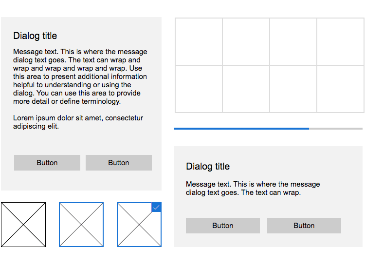
In this category you’ll also find a progress bar, partial and full screen dialog box.
In the lists and menus category, you’ll find a wide selection of list components specially designed for Windows 10. The best thing about these lists is that they already have all the basic interactions built in, which you can see just by clicking “Simulate”. This means that all you have to do is add text and link them up to other screens or items.
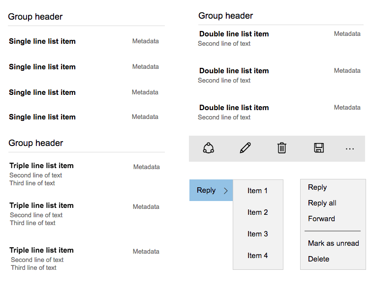
The lists range from single, double and triple line views. You’ll also find various types of context and cascading menus, in addition to command bars with various icons that are commonly used throughout the Windows 10 OS.
In the navigation category is a general navigation panel that includes options for many commonly used icons such as a hamburger menu and a settings symbol. You can place this to the left of the UI screen that you’re designing by simply dragging this component to the canvas.
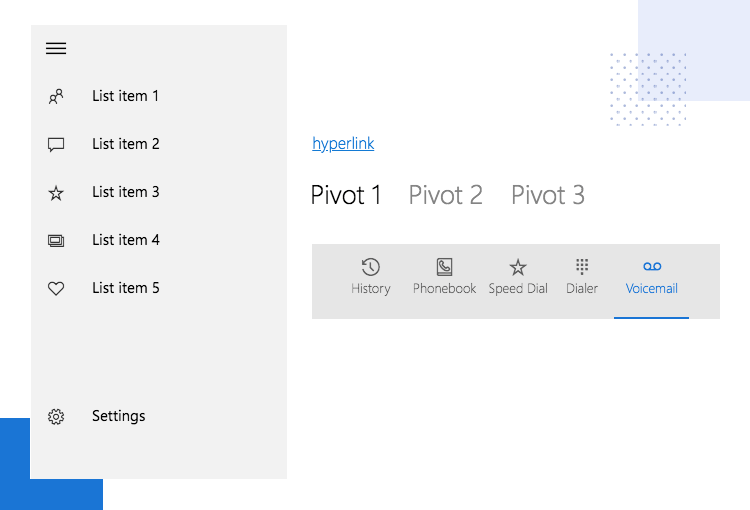
In addition to that, you’ll also find a tabulation component with icons that have built-in interaction, in addition to hyperlinks and a pivot element.
A well-designed form makes a huge difference to the user experience. When designing them, it’s always best to consider what users are most accustomed to. The form elements and components in the Windows UI kit mirror the fields and icons commonly used in Windows 10 apps, in addition to the settings options on Windows 10 desktop.
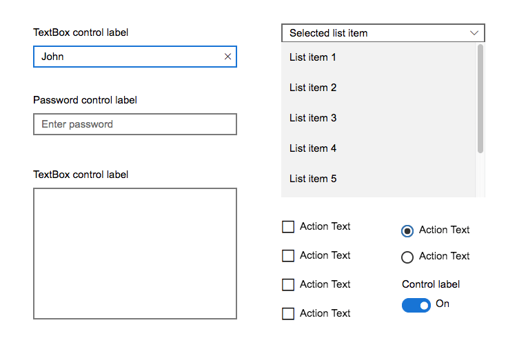
In this category you’ll also discover text and password fields, multiline textboxes, combo boxes made for clicking and touching interactions, checkboxes, checkbox lists and a toggle switch, as well as radio buttons.
Due to the consistency and relatively simple design characteristic of Windows 10 apps, you’ll find just three main buttons that you can utilize throughout your designs in this category.

Here you can expect to see both a standard light and dark push buttons, as well as a disabled push button with the text greyed out, in addition to a toggle button.
Text was an important makeover in the new Fluent Design system and hence our Windows 10 UI kit is no different in mirroring these new texts.
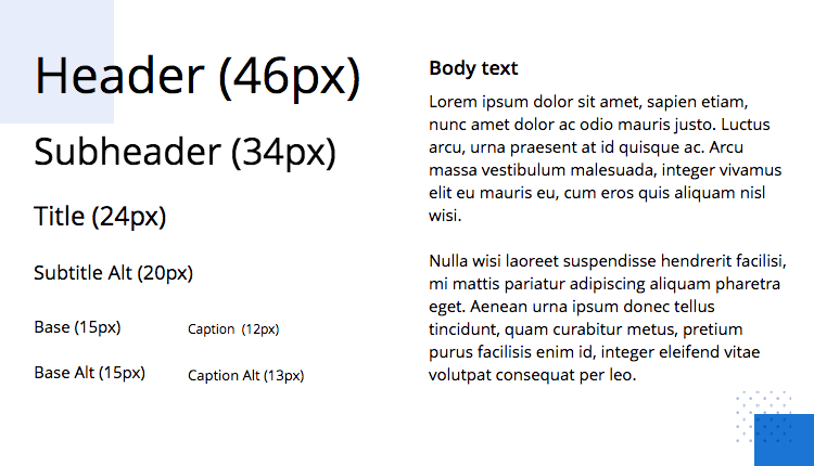
This category has a range of different text sizes and arrangements in the Segoe Sans Serif range and include header, subheader and title texts with the appropriate sizes, a subtitle text as well as base, caption and body texts.
To get started designing your Windows 10 prototypes, the first thing you have to do is download our prototyping tool! Then just follow these short and simple steps below:
- Download the Windows 10 UI kit from our UI kits page
- Unzip the version (light or dark) you wish to use to a folder on your computer
- Open Justinmind on your desktop
- Navigate to widgets on the menu bar
- Select “Add/remove libraries”
- Under “Default libraries”, scroll down till you see the Windows 10 Light/Dark Theme
- Click “Add to widgets”
- Have fun designing your screens!
Let’s take a look at what you can do with our Windows 10 UI kit. All we have to do is open up Justinmind on the desktop and select a new web prototype. Then, once we’ve added the Windows UI kit by following the steps above, we’re all set to go.
For this example, we’ll create a personal dashboard for a media management app. This app will give the user an interface to easily manage and share all types of media and files on their desktop. To get started with, we’ll add in a nav pane to the left, with various options such as albums and favorites.

Next we’ll drag and drop the progress bar from the basic components category to demonstrate the amount of storage that’s been taken up by our file-hoarding users! Following on, we’ll add one of the headers from our text category and call it “My Items”.
For the next step, we’ll experiment a little by adding the Windows 10 icons UI kit as well. Using this kit, we’ll add an avatar to the right. Then we’ll top it off with an upload button and an interactive dropdown menu from the forms category.
For the last part, we’ll add in one of those typical Windows panels so that we can add in our thumbnails with icons from the Windows Icons UI kit that will take the user to a list of each media type. Note that you can select panels with checkboxes and without to demonstrate the multiple select feature in your Windows 10 prototype!

For our second screen, we’ll copy over the side menu, the H1 header, upload button and avatar and this time just have one H2: “My Documents”. This will demonstrate that the user has clicked on the shared or featured documents on the side menu and this is now the following screen that it leads into.
For this screen we’ll have a list using the document icons from the Windows 10 icons UI kit. To the right, when the user hovers over each list item, we’ll add in an interaction to display a taskbar with the editing options for each document. We’ll add in a share, save, trash and edit icon for good measure!
All we have to do now, that we’ve demonstrated the main functionality, is add the remaining screens and link them up before we have a fully-interactive Windows 10 prototype that’s ready for testing and coding!
Taking inspiration from its earlier predecessor, Metro Design, Fluent Design is based on a flat interface but with a special focus on light, depth, motion and translucency.
Here is how you can make use of the Windows 10 UI kit to design an app based on Microsoft’s Fluent Design principles:
Depth will help bring your Windows 10 apps to life and will be in keeping with Fluent’s guidelines if you use it right. Use lighter levels of shadowing for items such as tiles.

To draw particular focus to more isolated experiences, like dialog boxes, dropdowns and command bars, you’ll want to go for slightly heavier shadows.
The trick when making an app for Windows 10 is not to overdo the color. When you do use it, make sure it’s for headers, commands, outlines and states.
For backgrounds and controls that are in an interactive state, be sure to use neutral grey tones.
Movement and animation is important as long as it has a purpose. As with most modern design systems, motion is intended to communicate with the user and provide feedback on their actions.
Use motion where possible in your Windows 10 app design in response to certain clicks or gestures carried out by the user.
For the best results, try and make that movement feel as natural as possible, as if the element that is moving is behaving according to real-world physics.
Typography is kept simple in Windows 10. For the best results, use a mix-up of Regular and Semibold to achieve the optimum font contrast in your UI.
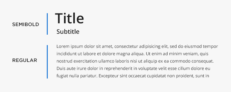
For example, use Semibold for headers and subheaders, then use Regular for normal text or paragraph text.
The selection of typographies available in our Windows 10 UI kit should help you make fast decisions and short work of the typography design in your UI.
With Justinmind it’s easy to start designing interactive Windows 10 prototypes. Getting started takes a couple of minutes, then it’s a simple case of using the elements in our kit to design the screens you need for your new Windows 10 web app, desktop app or app add-on.
What are you waiting for? Try out the kit today and see what you can achieve with it!