Salesforce prototyping with Justinmind’s Lightning design system UI kit
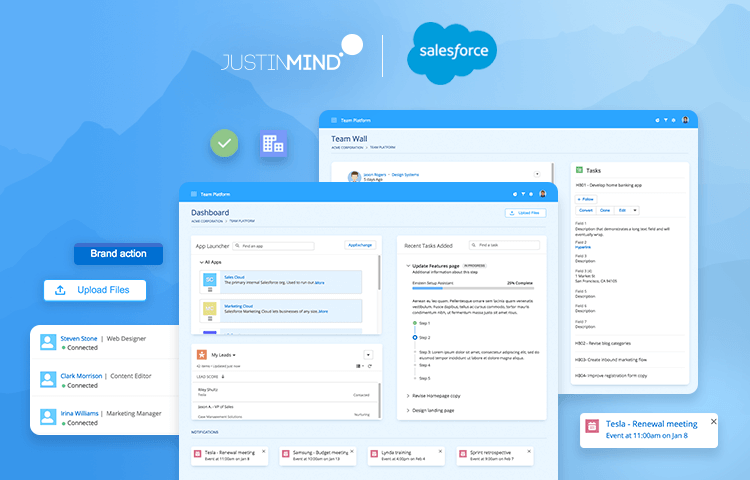
Prototype pixel-perfect Salesforce apps and products with Justinmind’s new Lightning Design System UI library
Is there a Salesforce app design project on your horizon? Then you need Justinmind’s Salesforce UI kit.
The Salesforce Lightning Design System (SLDS) is used to create responsive enterprise web apps for mobile and desktop devices. By prototyping these apps with Justinmind’s new Lightning Design System UI kit, designers benefit from a quicker, clearer and more customized design process in the lead up to coding.
Justinmind’s new UI library includes everything designers need to prototype and validate Lightning Design System interfaces. You’ll be able to get creative while sticking to the Salesforce Lightning principles and design language.
With over 250+ readymade UI elements at your fingertips, you can focus on the overall user experience, interactions and user flow, instead of spending precious design time rebuilding UI elements and screens from the ground up.
In this post, we’ll explore how Justinmind’s Lightning components help designers speed up the process of creating Salesforce apps and interfaces. We’ve even thrown in a mini-tutorial to help you get started designing apps in our prototyping tool right away.
- Salesforce apps and interfaces
- Guidelines for the Lightning Design System
- Justinmind and Salesforce – what’s in our Lightning Design System UI kit?
- What can you make with our Salesforce kit?
- Get started with Justinmind’s Lightning Design System UI kit for wireframes & prototypes
- Wireframing an app with Justinmind’s Lightning Design System UI kit
Salesforce is the number-one global enterprise CRM platform. The Salesforce software enables product teams to build and deliver enterprise apps that easily integrate with business processes and engage customers.
Lighting Experience is a Salesforce user interface built upon a set of UI elements, patterns and guidelines known as the Lightning Design System. As Principal Developer Evangelist at Salesforce Christophe Coenraets explains, the Lightning Experience is focused around building business apps. It therefore provides designers with specialized components for manipulating data, as well as the traditional Salesforce components.
Apps made with this design system are usually scalable, customizable and built for the cloud. They automate business processes, improve connectivity with external applications, and deliver optimal mobile experiences.
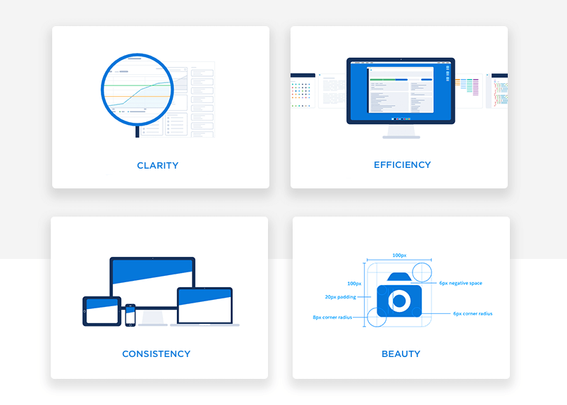
Following Salesforce’s Lightning design guidelines – clarity, efficiency, consistency and beauty – and unified design language means you’ll be able to create a consistent look and feel across your Lightning apps, as well as clean and intuitive experiences for users.
What’s particularly special about the Lightning Design System is that it encourages rapid, efficient turnaround. With the infrastructure and operations-side of app production taken care of, teams can focus on designing and writing great applications. For designers, this means creating powerful enterprise applications using the SLDS pre-baked components, without writing a lick of code.
Speaking of code-free design, let’s take a look at what Justinmind’s new prototyping kit for SLDS is all about.
With Justinmind’s Lightning Design System kit, you can quickly and easily prototype or wireframe custom Lightning apps before getting into code. Our UI components have all been designed in line with the Salesforce Lightning Design System so that you don’t have to build components from scratch.
When you wireframe with Justinmind’s Salesforce UI kit, you’ll have access to over 250 UI components to help you get started. These components are organized into eight categories:
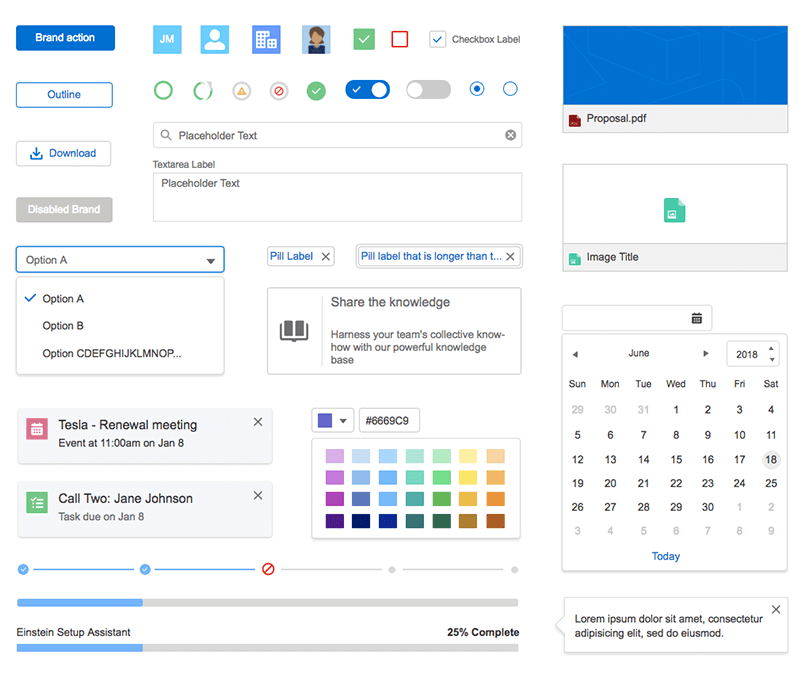
- Buttons & Navigation – these widgets provide the user with visual iconography that is typically used to invoke an event or action.
- Cards & Notifications – cards are used to apply a container around a related grouping of information. Notifications serve as a feedback & confirmation mechanism that comes into the page at the top right.
- Components – a selection of components (such as avatars, badges, spinners and pills), and UI patterns (such as accordions, picklists and carousels)
- Data tables – enhanced versions of HTML tables used to display tabular data
- Files – Panels & Popovers – files represent of content uploaded as attachments, panels display supplemental information or form inputs and popovers are non-modal dialogs
- Feeds – Chats & Tiles – fields are lists of recurring elements of similar types (e.g. discussion feeds), chats display real-time and past chat logs between service agents and customers and tiles are groups of related pieces of information with records
- Forms & Controls – contain HTML labels and elements
- Welcome & Setup Assistant – readymade screens and cards (e.g. Welcome mat)
Basically anything. From collaboration, customer service and finance, to IT and admin, marketing and sales, you can easily build out tons of web and mobile app prototypes with Justinmind.
For instance, you could reproduce eCommerce and retail apps with search functionality and slider filters, mapping and geolocation apps with the map components, or recruitment apps, using the avatar and badge components.
If you need inspiration, take a look at the Salesforce AppExchange for ideas. Any app that supports the Lightning Experience (aka is “Lightning Ready”) can be made with Justinmind’s new UI kit.
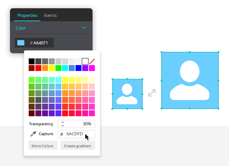
All of the components in Justinmind’s Lightning Design System kit have been made with SVG vectors – just like the Lightning Design System itself. SVG vectors are adjustable, which means you can modify their size and color without worrying about loss of quality. If you haven’t used them before, read more about why designers love SVG vectors.
In addition to this, all of the components in our new UI kit have been built using Atomic design. Break Lightning widgets down to their core and build them back up again, customizing size, color, position etc., to fit your design brief.
Ready to start prototyping enterprise web and mobile apps? Just follow the simple steps below:
- Download the Justinmind prototyping tool
- Download Salesforce Lightning Design from our UI kits page
- Open Justinmind and create a new web prototype
- Import the UI kit into Justinmind
- Have fun designing Salesforce apps!
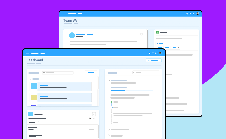
Now why not try reproducing the Team app example below? You’ll need four screens: Dashboard, Wall, Resources, and Chat. To create a new screen, go to the Screens palette (in the top left-hand side of the editor), click the ‘+’ icon and give your new screen a name.
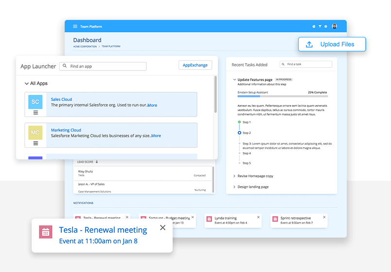
Let’s start by wireframing our dashboard.
To create the screen and text box background layers of your dashboard, drag two Rectangle widgets (from Justinmind’s Basic widget library) to the canvas. Resize and customize their color to match our examples. The first Rectangle (the screen’s background) should match the size of the canvas and be given a light blue (Hex #2BA5FF) with 90% transparency. You can change all of this information in the Properties palette.
The second Rectangle (the header) should be resized to 100 x 59 pixels and placed at the top of the canvas. Change its color to match our example (Hex #2BA5FF), leaving the transparency as is.
Then, give your screen a title. Drag a Text widget to the canvas and place it under the header. Rename it as preferred.
Let’s start with the site navigation. We’ve opted for Breadcrumbs, but you could use any of the additional navigation components available in the Salesforce Lightning Design library (e.g. tab navigation, menus or vertical navigation).
From the Buttons & Navigation section of the Salesforce Lightning Design library, drag a Breadcrumbs widget to below your site’s title. This will helps users identify the path of a record and navigate back to parent items.
Next, drag an App launcher widget (from the Components section) below your Breadcrumbs. From here, users will be able to choose an app to work with.
Then, drag a Split view widget from the same section of the widget library below the App launcher. The Split view is used to navigate between records in a list while staying on the same screen. We recommend adding a background layer to this element to offer some contrast from the screen’s background. To do so, drag a Rectangle to the canvas and position it underneath the Split view (change the order by right clicking).
Drag a Summary detail complex title widget (Components) to the right on the canvas. This element can show or hide details of a task or project, while always showing a summary. We’ve added a Progress bar (Components) to our example, as an additional visual aid for users.
Additional widgets you might want to include in this screen are the File Selector and the Avatar Circle, to make your dashboard more personalized.
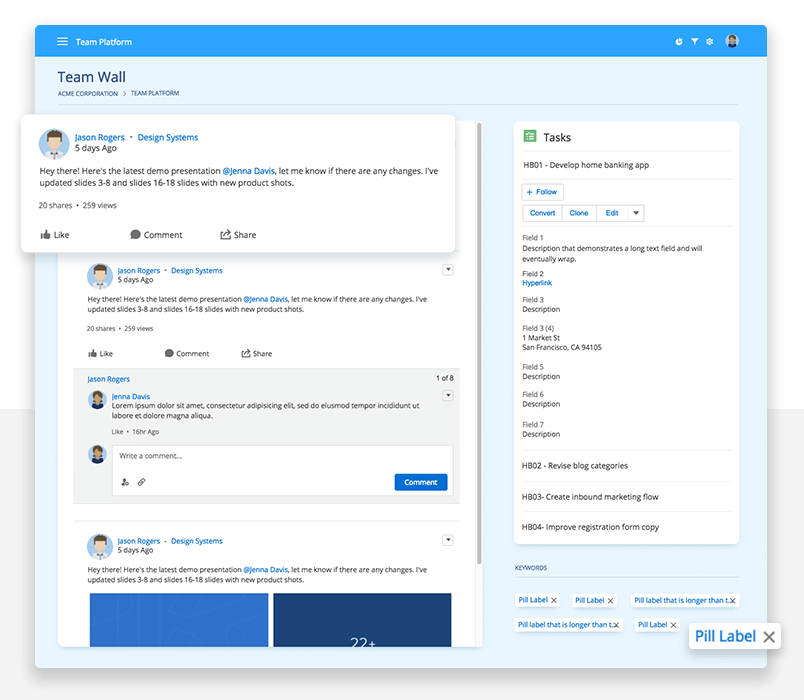
This screen will allow team members to view their colleagues’ updates and activity in a constantly updating list – much like Facebook’s News Feed. To get started, give your screen a background, header, title and set of Breadcrumbs as before.
If you want to avoid repeated work, you can create a template with the most frequently-used content. Then, every screen you apply that template to will contain all of those elements. There’s something deeply practical about reusing content in your prototypes.
To create the list of activities, we used Post feed widgets. To reproduce our example, drag Post feed, Attachment post feed and Replies post feed widgets from the Feed – Chats & Tiles section of the Lighting library to the left-hand side of the canvas.
If you want these elements to be scrollable, select them all, and right click. Select the “Group in Dynamic Panel” option and then go to the Properties palette. Here, select the option “Scroll auto” from the Vertical Overflow section. Dynamic Panels are container widgets that allow sets of elements to work simultaneously, and with the same interaction.
On the right-hand side of the canvas, we’ll create a dialog that contains information about the selected project (much like the issue dialog in Atlassian Jira). Start by dragging a Loading card widget from the Cards & Notifications section of the Lightning library to the left side of the canvas at the top. Then, drag a Record home widget (Components) below it.
Finally, drag four Pill truncated widgets (Components) below these elements to serve as tags.
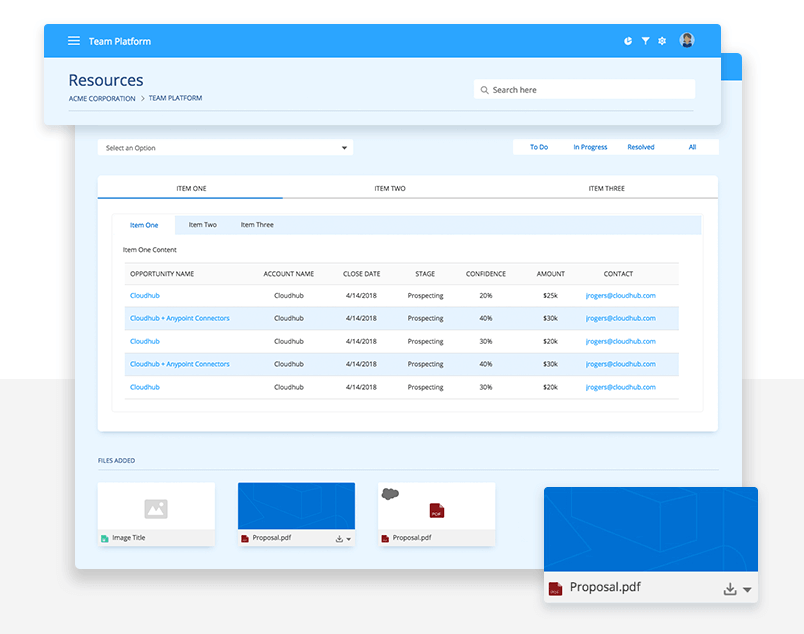
This screen contains resources and materials related to their projects. It includes search and filter functionality, as well as file attachments. As before, give your screen a background, header, title and set of Breadcrumbs.
To create this screen, you’ll need a set of Scoped tab and Nested tab (Buttons & Navigation) and Striped data table widgets (Data tables). Tabs are used to keep related content in a single container, and Data tables are used to display tabular data. Rename the default data as preferred.
To create the search and filter functionality, drag a Base combobox (Forms & Controls) above the tabs. From here, users can perform manual searches for specific items, as well as select and unselect options.
To include file attachments, take a look at the Files, Panels & Popovers section of the Lightning library. You’ll find many different types of file attachment displays to choose from.
Finally, add a set of Neutral buttons (Buttons & Navigations) on the right of the canvas. These will serve as an additional filter functionality. Ours allows users to filter according to project/task progress.
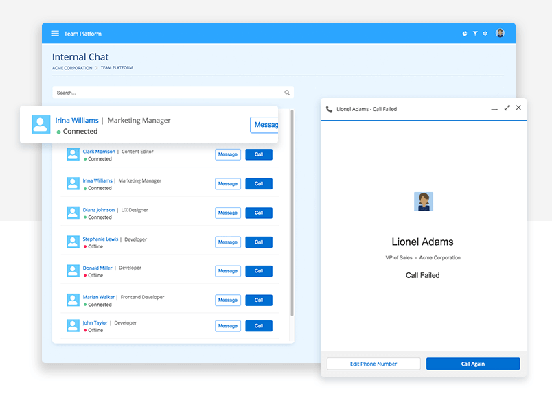
And last but not least, the Chat screen. Here users will be able to chat with their colleagues and save contact information.
Once you’ve created the base of this screen (as before), drag a Base lookup widget (Forms & Controls) to the top-right of the canvas. The Lookup is an autocomplete combobox that will search against a database object. From here, users can search for contacts.
Below, this, drag a set of Tile task widget (Feeds – Chats & Tiles). This is where information about the contacts is displayed.
Finally, drag a Voice widget (Components) to the left of the canvas. We’ve used the Voice failed widget, but feel free to use any of the available widgets. This area displays the most recent chat activity.
And that’s it! Your Lightning app is now complete, hurray! Now it’s time to take a look at your finished prototype. To do so, click “Simulate” in the top-right of Justinmind’s editor. Use the vertical navigation on the right in the simulation window to move between your screens. Enjoy!
As you can see, all it takes is a few drag and drop Lightning components to create amazing app prototypes. Prototyping is the perfect way to stay focused on the user experience, and avoid all the repetitive app design tasks.
Justinmind’s Lightning components will help you do just that. So if you haven’t already, make sure you download Justinmind’s Lightning Design System UI kit. You’ll be prototyping Salesforce apps and interfaces in no time!