Justimind’s free Angular Material UI kit is the perfect starting point to get your application prototype ready as quickly as possible.
Our latest Angular Material UI components kit features an extensive collection of thoughtfully crafted UI components that you can use to kickstart any app or web design project.
Angular Material has adapted Google’s Material design for Angular and follows its patterns and principles. Justinmind’s Angular Material UI components are the perfect starting point to get your application prototype ready as quickly as possible.
From personal projects to professional or enterprise apps, the Angular Material UI kit is the perfect tool for a faster design process. Our free library will help you create better user experiences from the earliest design idea up to the final high fidelity prototype, and developer hand-off.
The UI components in this kit are based on the latest Angular framework and can be easily customized and fine-tuned for any project and at any stage of the design process without the need to start from scratch, allowing you to focus on usability, and creating tailored experiences unique to your brand or project.
With this UI kit we’ve managed to create a one-stop library with all the most popular Angular Material components to help you design amazing applications or websites faster and easier.

This library will help you create seamless and consistent UI and UX that fit inclusively but not exclusively Angular based applications –No need to be a specialist in the Angular framework, our prebuilt high quality components are drag and drop and can be easily tailored to use them in any web product project. Using our UI components will significantly improve and facilitate your design process, not to mention it will save you a lot of time and reduce costs.
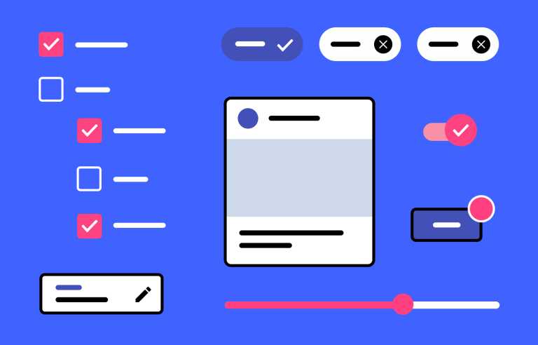
The kit includes: forms, selects, Date and Time pickers, drop-downs, pagination, and many more. Check out below the complete list of the categories included in Justinmind’s free Angular Material UI kit.
From buttons and forms to ready-to-use cards and dialogs, and also including pre-built animations, this UI kit includes everything you need to be more productive and efficient. All the assets in this library will make sure you’re on the right path from the beginning and stay there throughout.

Here’s a list of the UI components you can find in this library:
Texts: here you’ll find a wide range of text components to suit the specific purpose of the text content you’ll be displaying.
Buttons: our collection of pre-built buttons includes Basic, primary, accent, warning disabled and link buttons in plain, raised and stroked variants, as well as Fab and mini Fab components, all according to Material Design styling.
Forms: our form fields, include a variety of text inputs that typically appear in forms and dialogs. With built-in interactions, you will find filled and outlined options as well as fields with text indicators, error messages, etc. In addition, we have included reactive forms, radio/checkbox groups and a variety of steppers.
Selects: here you’ll find different selection UI components that allow users to specify options. This category gives you all the different select menus variants -from basic native select to more advanced options including reactive forms and multiple selection.
Lists: the components in this category will serve you to display data in different list formats including basic lists, and single and multiple selection lists with built in interactions with checkboxes or radio buttons.
Controls: in this category you’ll find all the components that allow users to make selections, filter and enter data such as chips, datepickers, toggles, sliders, accordions and expansion panels.
Menus: by default menus are crucial when designing the navigation patterns of your layout. Here you’ll find a variety of menu options that you can easily adapt to your design.
Toolbars and Navigation: in addition to menus, toolbars and navigation are also essential to find your way around any web or mobile app. In each category correspondingly you’ll find toolbars ranging from simple to multi-row options, as well as different pagination options, tab organizers and sidenav and drawer components to add collapsible side content.
Tables: here you’ll find a collection of convenient pre-built tables with different configurations that you can use to display any type of data. For example, a table with pagination or a table with select capabilities as well as one with expandable rows.
Badges: here you’ll find a wide range of badge components in different shapes and sizes that you can use to add notifications or statuses to your UI elements.
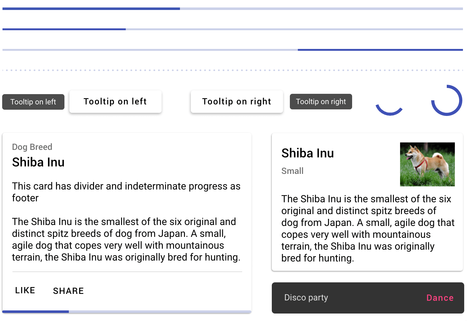
Feedback: this category includes components that will give feedback about any elements, this includes a variety of tooltips, progress bars, snack-bars, etc.
Cards and grids: cards and grids are the perfect UI components to present and organize your content and actions into sections. For example, basic aligned cards, cards with multiple sections, cards with footers, with images and in different sizes. You’ll also find basic and dynamic grid lists.
Dialogs: this category includes different dialogs that you can use to provide users with details about a particular task, required action or crucial information -from simple dialogs to dialogs with scrolling content, you customize them to fit your design goals.
Drag and drop: here you’ll find all the drag and drop options needed to design any feature that allows to drag elements around the page, such as free dragging, horizontal and connected sorting of elements for reordering or transferring items.
To get started, you must first download the Justinmind prototyping tool if you haven’t already. Follow the steps below and start designing.
- Download the free Angular Material UI kit from our UI kits
- Justinmind will open on your desktop
- Navigate to the Libraries palette, where you should see the Angular Material library
- Browse, select and tailor to your needs!

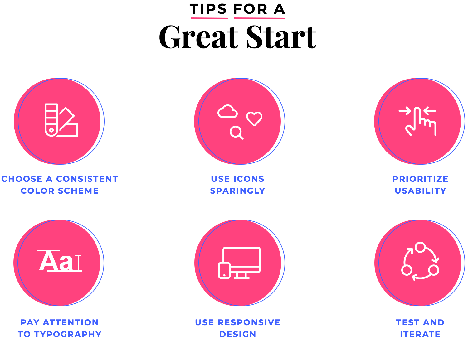
Before you get started, we highly recommend you check out the following tips to make sure you are off to a great start.
Choose a consistent color scheme: Angular Material offers a range of pre-built color palettes to choose from, but it’s important to pick a color scheme that aligns with your brand and appeals to your target audience. Consistency in color usage is key for creating a visually appealing and cohesive interface.
Use icons sparingly: While icons can be a great way to add visual interest to your design, they can also clutter up your interface and make it difficult for users to find what they’re looking for. Use icons judiciously and make sure they’re easily recognizable to your users.
Prioritize usability: our Angular Material library provides a range of UI components that make it easy to create an intuitive and user-friendly interface. Make sure you prioritize usability in your design, focusing on elements such as clear navigation, easy-to-understand labels, and a logical layout.
Pay attention to typography: Typography can have a big impact on the readability and usability of your interface. Make sure to choose fonts that are legible and easy to read, and use font sizes and weights to help guide users through your content.
Use responsive design: With everyone relying on their mobile devices, it’s important to design interfaces that are optimized for a range of screen sizes. Our UI kit provides a range of components that can help you create an interface that looks great on any device.
Test and iterate: Finally, make sure to test your design with real users and iterate based on their feedback. This will help you create a design that meets the needs of your users and provides a great user experience.
Also, managing your UI components doesn’t have to be complicated, save time by creating your own custom libraries. Once your UI components are tailored to your needs you can save them to your own library and reuse them as needed! You can learn more about how to create your own custom library to speed up the design process and improve collaboration in our learning center.
This Justinmind UI components library is based on Material design, which means any product you design using this kit can be used universally and across devices. With a collection of fully interactive Angular Material components and cards, it is simple and uncomplicated to start designing interactive user interfaces that you can test with users and hand off to developers.
Get started now and start a seamless experience from start to finish, and discover how using Justinmind to create mockups, wireframes and high fidelity prototypes will highly impact your entire project, and make the overall design process more efficient and cost-effective.
PROTOTYPE · COMMUNICATE · VALIDATE
ALL-IN-ONE PROTOTYPING TOOL FOR WEB AND MOBILE APPS
Related Content
 Justinmind 10.7.5 now includes Samsung Galaxy S25 & S25+ simulators, allowing designers to create high-fidelity prototypes with accurate dimensions and real-world interactions.1 min Read
 Justinmind 10.7 is here with the iOS 18 UI library, new device frames like iPhone 16 and Pixel 9, and integrated design templates for seamless prototyping. Experience smoother workflows and intuitive design.3 min Read
 Justinmind's groundbreaking innovations in prototyping technology have earned it the prestigious Proddy Award for Best Prototyping Product of 2024.4 min Read


