Create a fluid grid
Fluid grids can adapt content to the screen size. For web screens, content might look better in three columns, while on tablet-sized screens, content might look better in two columns. For mobile screens, content might look best stacked in one column. Fluid grids defined with events allow you to achieve this.
Follow along the steps below to create one. We’ll first style each type of column, and then we’ll add the events and conditions to make it interactive and responsive.
Three column grid:
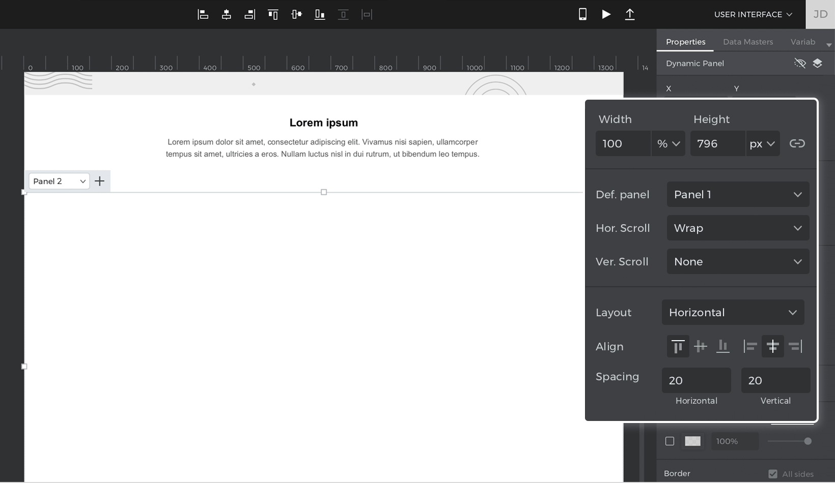
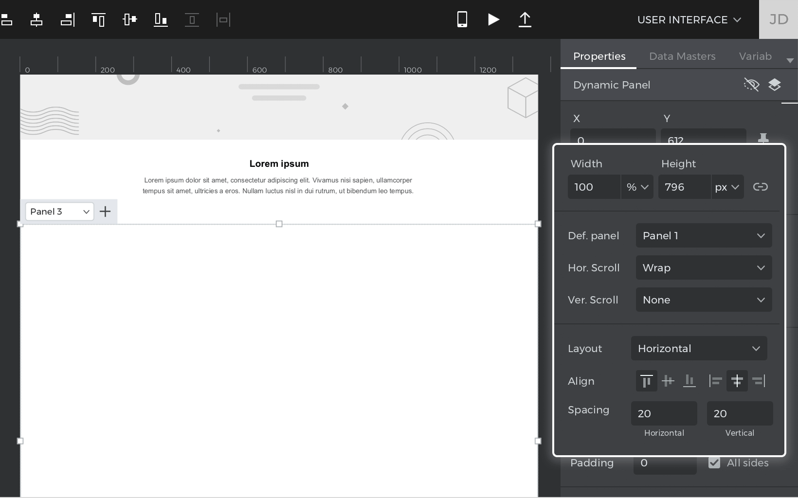
- Drag a Dynamic Panel onto the Canvas and change its width to 100%. Then, change its layout to horizontal, and its alignment to center. Make sure horizontal overflow is set to “Wrap” and add 20px of vertical and horizontal spacing.
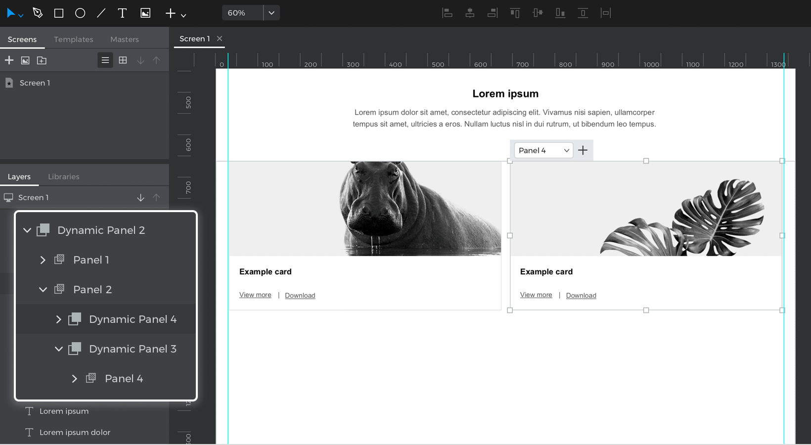
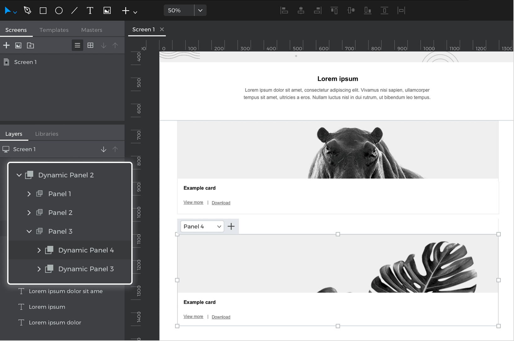
- Inside this panel, drag another Dynamic Panel, which will be the first container of the content in the grid. Set its width to 31%. Drag some elements into the Dynamic Panel to serve as its content. In our example, we’ve dragged a Rectangle with a background image and three Text widgets.
- Select the Panel you created and copy it by pressing Command/Control-C. Then, click on the base Dynamic Panel you created, and press Command/Control-V. This will duplicate the panel and place it next to the other panel you just created and copied.
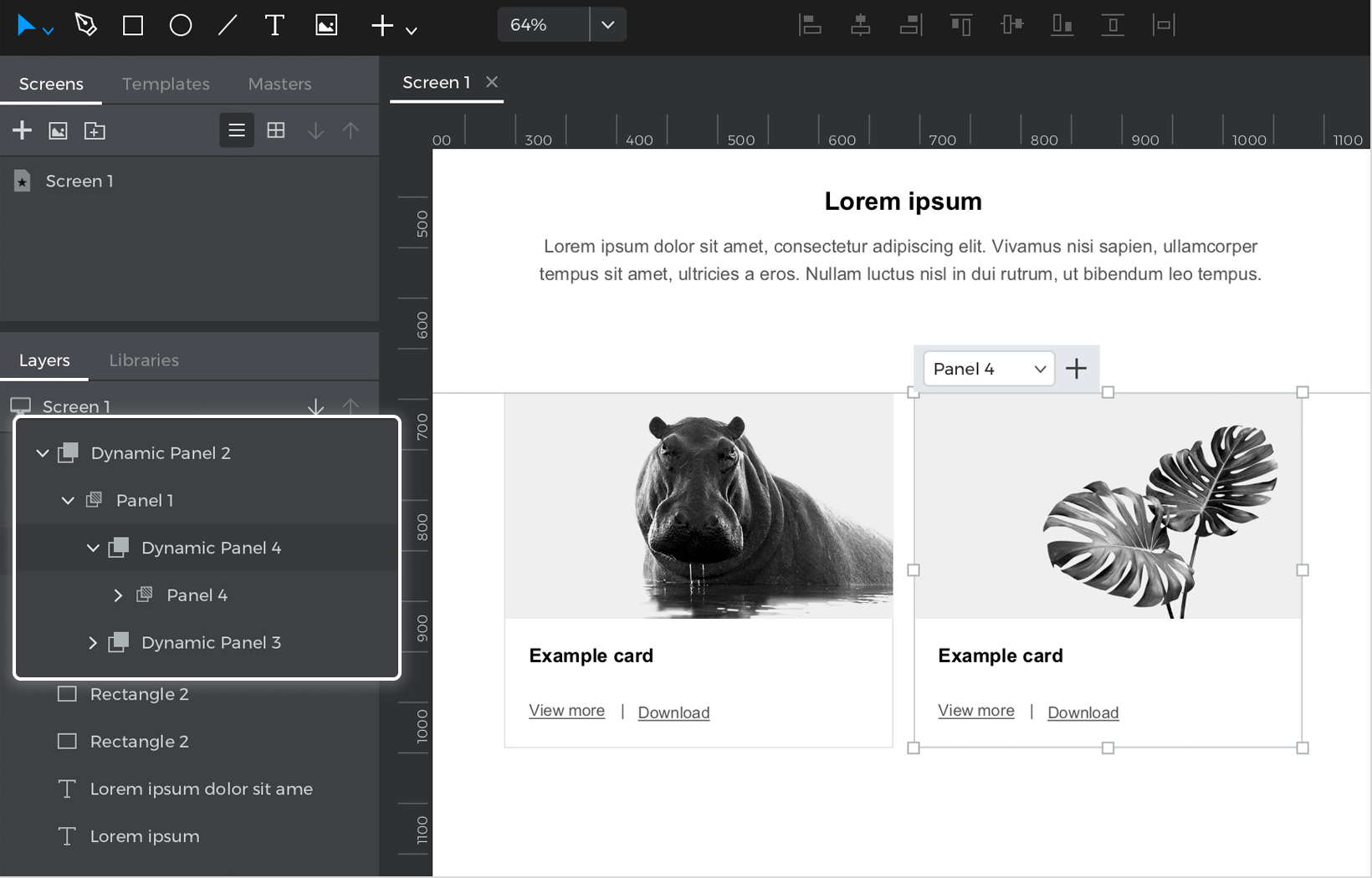
- Alter the content within that panel and change it to whatever you’d like.
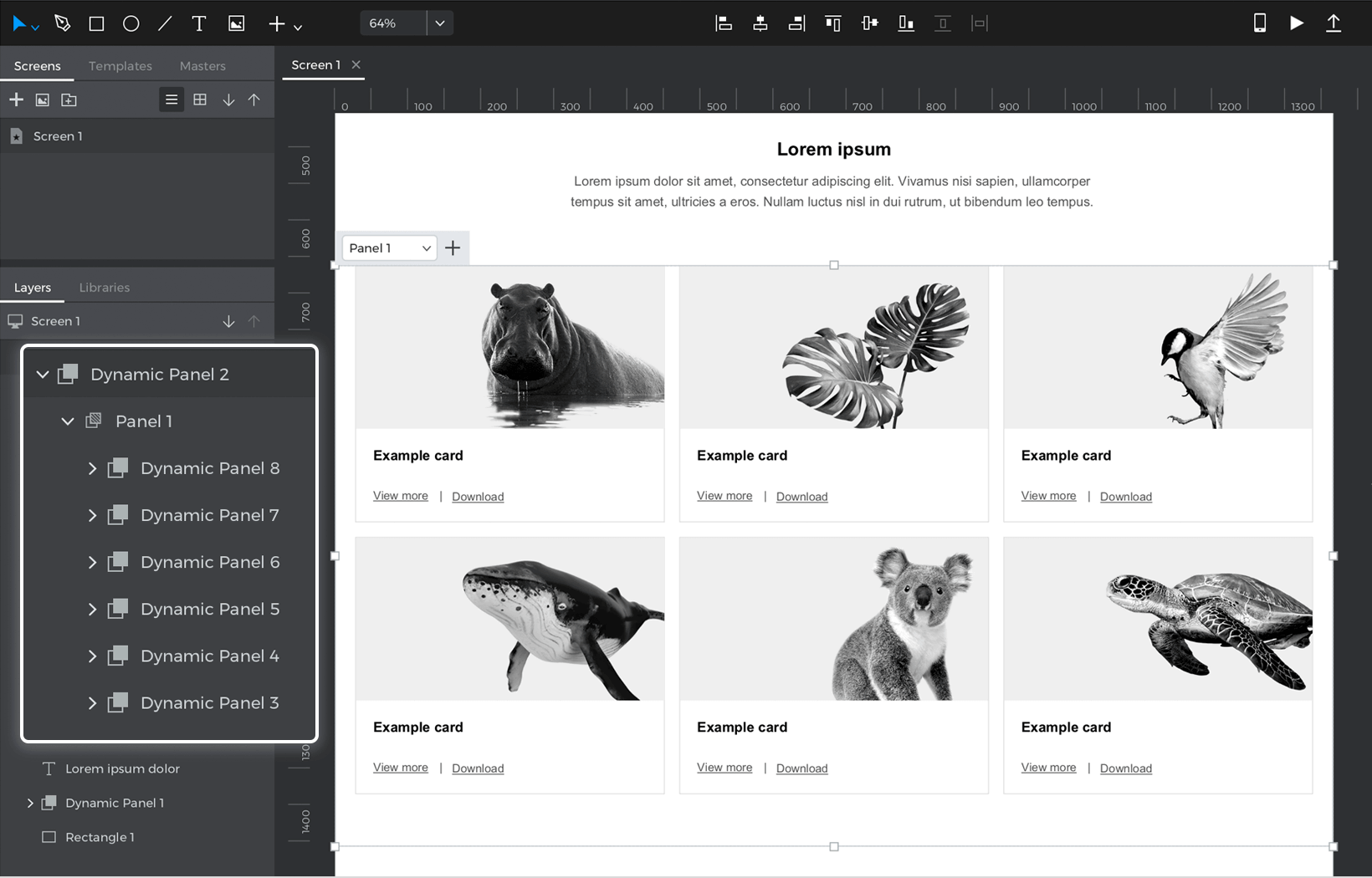
- Repeat steps three and four a few more times until you have six panels.This is how your three column panel should look:


Two column grid:
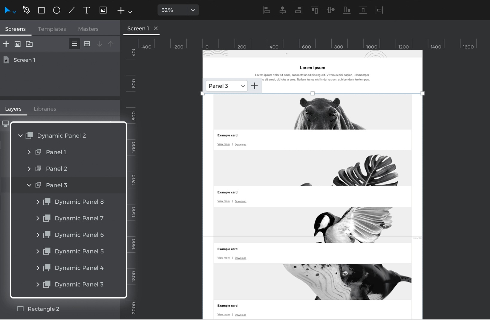
- Look back to the base panel, and add another panel. This will be the two column grid. Change this panel’s width to 100%, its Layout to horizontal and its alignment to center. Make sure horizontal overflow is also set to “Wrap”. Add some padding and spacing to the grid, if you’d like.
 Note: because the content in this grid will be longer rather than wider, you might have to increase the height of this new panel to be longer in order to fit all the content.
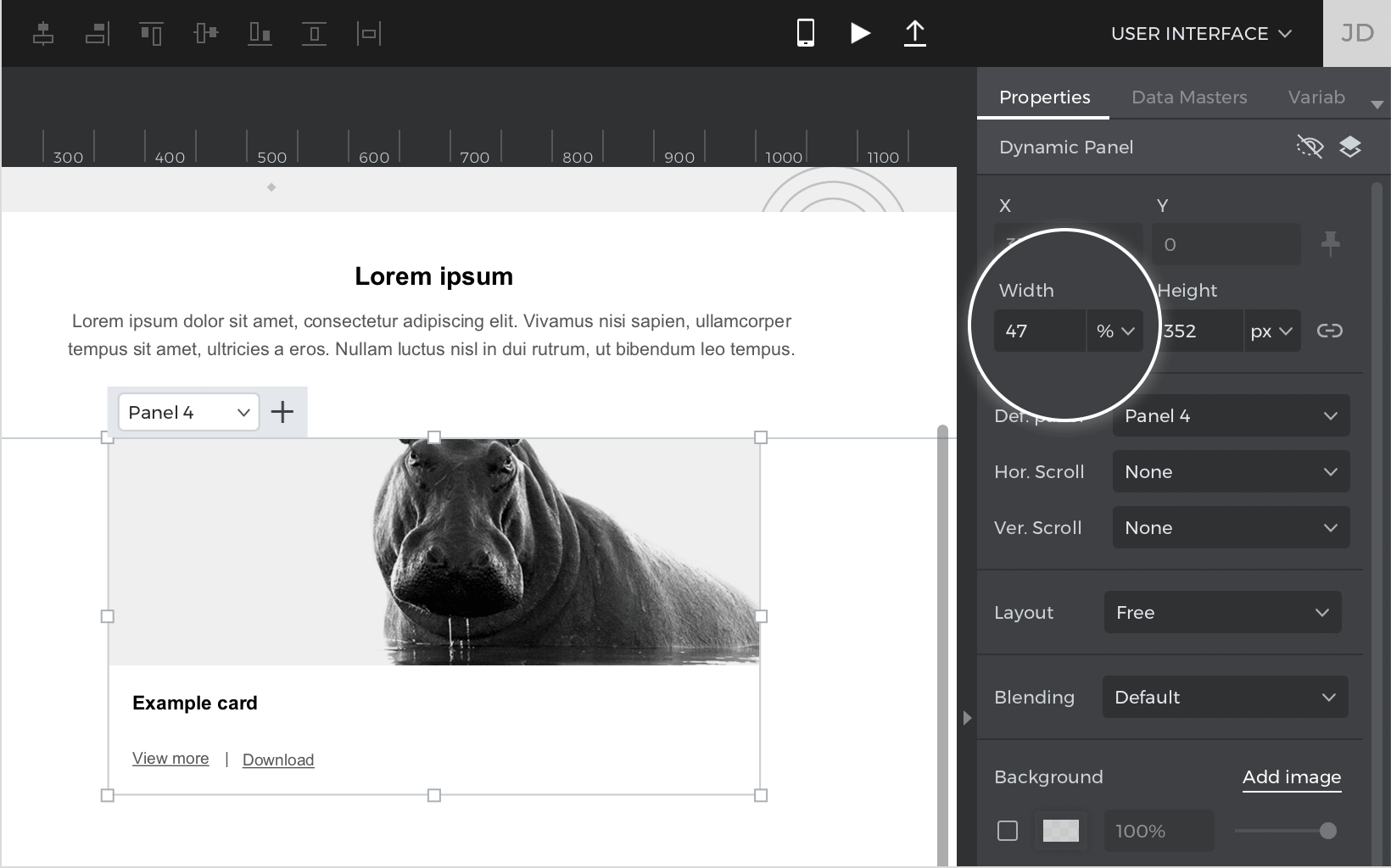
 - Inside this panel, drag another Dynamic Panel. This will be the container of the content in the two column grid. Set its width to 47%. Drag some elements into the Dynamic Panel to serve as its content.

- Select the Panel you created and copy it by pressing Command/Control-C. Then, click on the base Dynamic Panel you created, and press Command/Control-V. This will duplicate the panel, and place it next to the other panel you created.

- Alter the content within that panel and change it to whatever you’d like.
- Repeat three and four a few more times until you have six panels.This is how your two column panel should look:


One column grid:
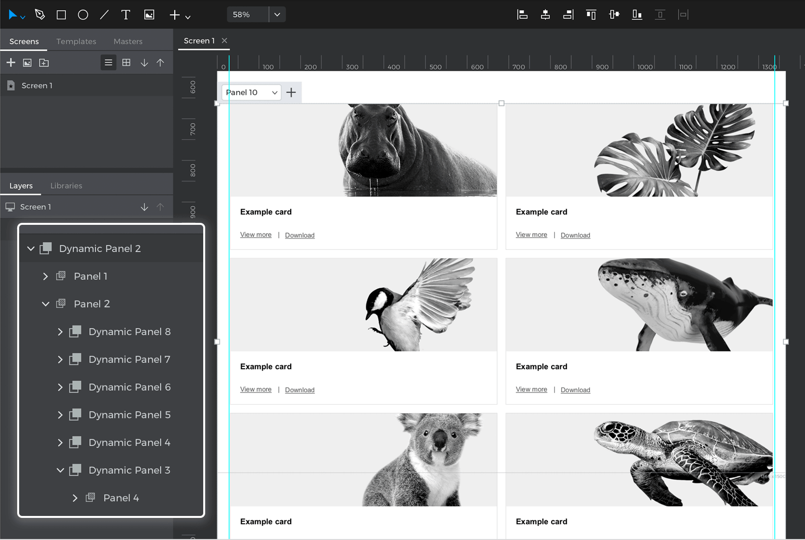
- Add one more panel to the base panel. This will be the one column grid. Inside this panel, change its width to 100%. This time, change its Layout to vertical, but keep its alignment to center. Feel free to add some vertical spacing and padding.
 Note: just like the last column, because the content in this grid will be longer rather than wider, you might have to increase the height of this new panel to be longer in order to fit all the content.
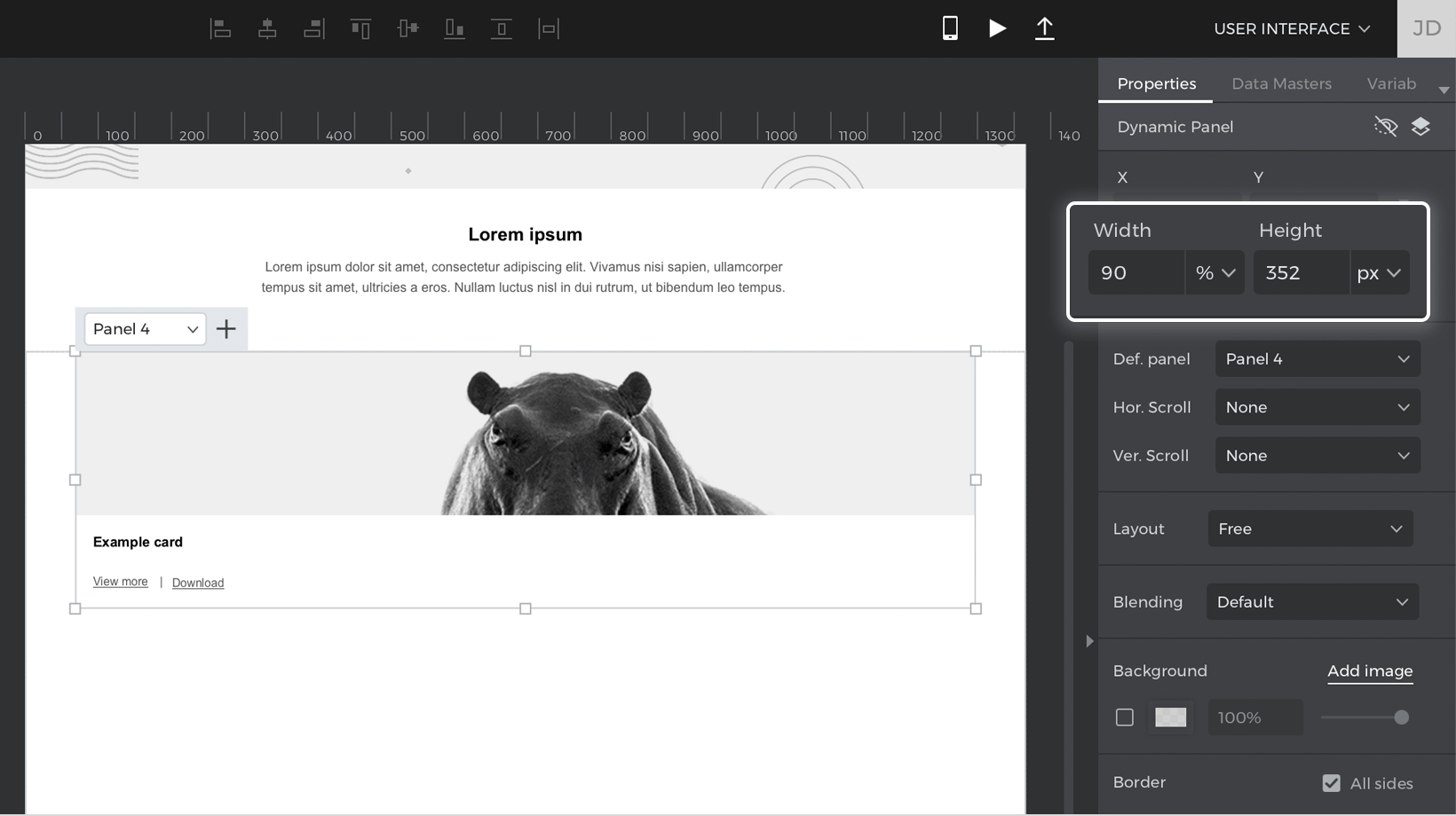
 - Inside this panel, drag another Dynamic Panel. This will be the container of the content in the grid. Set its width to 90%. Drag a Rectangle and three Text widgets into the Panel. This is the content of the grid.

- Select the Panel you created and copy it by pressing Command/Control-C. Then, click on the base Dynamic Panel you created, and press Command/Control-V. This will duplicate the panel, and place it below the other panel you created.
- Alter the content within that panel and change it to whatever you’d like.
- Repeat steps three and four a few more times until you have six panels.This is how your one column panel should look:


Breakpoints
Now we’ll create the breakpoint events that will shift between the column views depending on the screen size. Follow these steps to learn how:
- Select the base Dynamic Panel and create an “On Window Resize” + “Set Active Panel” and select the three column panel to be set as active.
- Create a condition for this action so that the three column panel will be visible when the screen size is bigger than tablet sized. Click on the “Add condition” text. The Conditional Expression builder will appear. Follow these steps to create the condition:
1. Click on the “Constants” tab. Drag the ‘Window Width’ icon into the open space in the expression.
2. Click on the “Functions” tab and look to the “Comparators” section. Drag a ‘Greater Than’ (‘>’) icon next to the ‘Window Width’ icon.
3. Lastly, in the open space that appears next to the ‘Greater Than’ (‘>’) icon, double click and type in 900.
4. Click OK to finish building the condition. - Click on the “Else” text, which will open the Events dialog. Create an “On Window Resize” + “Set Active Panel” event, and select the two column panel to be set as active.
- Create a condition for this action so that the two column panel will be visible when the screen size is smaller than Web, but bigger than mobile. Click on the “Add condition” text. The Conditional Expression builder will appear. Follow these steps to create the condition:
1. Drag the ‘Window Width’ icon into the open space in the expression.
2. Drag a ‘Less Than’ (‘<’) icon next to the ‘Window Width’ icon.
3. In the open space that appears next to the ‘Less Than’ (‘<’) icon, double click and type in 900.
4. In the “Logic” section, drag an And (‘&’) icon next to 900.
5. Next, drag another ‘Window Width’ icon next to the And (‘&’) icon.
6. Drag a ‘Greater Than’ (‘>’) icon next to the ‘Window Width’ icon.
7. In the open space that appears, double click and type in 600.
8. Click OK to finish building the condition. - Let’s create the last event, which will switch to the one column grid when the screen size is small. Click on the “Else” text again, and create an “On Window Resize” + “Set Active Panel”, and select the one column panel to be set as active.
- Create a condition for this action. Click on the “Add condition” text and follow these steps to create the condition:
1. Drag the ‘Window Width’ icon into the open space in the expression.
2. Drag the ‘Less Than’ (‘<’) icon next to the ‘Window Width’ icon.
3. In the open space that appears, double click and type 600.
4. Click OK to finish building the condition.
That’s it! Click “Simulate” and drag the screen size to be smaller and bigger. The grid will automatically shift to the different columns depending on the screen size.

You can download our example here.