
can you split a data grid such that it appears across multiple rows?
I have created a data master with many pieces of data (about 23). I have attached a data grid to it so I can simulate what a report of this data might look like. My issues is that the data elements are too close together to be readable. ideally, I would like to somehow format the data-grid such that I have 3 distinct visual rows of data for each row of data within the data-grid itself so that there is a section for employee info on one row, followed by company info on another and finally the details section on the third. All of these are appearing now in the data-grid as a single compressed row which is ugly and unreadable.
You can design each row of the data grid as you want. By default when the data grid is created each field of the data master have its own column, but you can modify the grid and add more columns or delete some of them.
Also, you can change a row cell to make it look like it have 3 groups of data, you can resize it or add some rectangles, labels and other components, there is no restriction. Just design the row as you design any other part of the screen.
I should clarify. Before simulation the row has two sections; one on top of the other. Labels over data. The label section has a gray color. What I want to do to a datagrid row of 15 columns is to have the first five columns appear on top of the second five columns which are over the last five columns. So the single data-grid row will now appear be three distinct "rows" and the second data-grid row will appear to be the second set of three rows and so on. Each record will appear across three separate rows on the fake report. Can this be done?
I should clarify. Before simulation the row has two sections; one on top of the other. Labels over data. The label section has a gray color. What I want to do to a datagrid row of 15 columns is to have the first five columns appear on top of the second five columns which are over the last five columns. So the single data-grid row will now appear be three distinct "rows" and the second data-grid row will appear to be the second set of three rows and so on. Each record will appear across three separate rows on the fake report. Can this be done?
I don't know if I understand you correctly, maybe an image showing the layout you want to accomplish could help.
Anyway if I understand you correctly, this can be done. What I will do is to remove all columns until yo have one column only. Then I will select the data row(not the header row) and I will resize it to make it bigger because this row will be contain three fake rows inside them each one with five columns. To do the fake inner rows, you can use any component you want, the idea is to organize and move the components like you desire and change the style of them. Take a look at this tutorial.
Thank you so much for including the mini-tutorial. It works exactly as I want now!!
Thank you so much for including the mini-tutorial. It works exactly as I want now!!
I'm glad to hear that.
I'm glad to hear that.
From the tutorial : " Arrange all the content inside that cell until it matches the example." - I can seem to arrange anything I just see each label followed by the field in brackets - this is to wisiwig interface - just text. Should I be "arranging", by knowing the exact locations that I want to place each field at?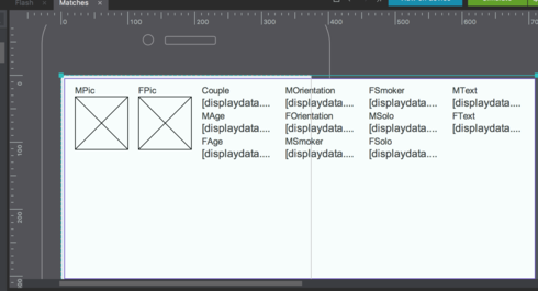
From the tutorial : " Arrange all the content inside that cell until it matches the example." - I can seem to arrange anything I just see each label followed by the field in brackets - this is to wisiwig interface - just text. Should I be "arranging", by knowing the exact locations that I want to place each field at?
Replies have been locked on this page!